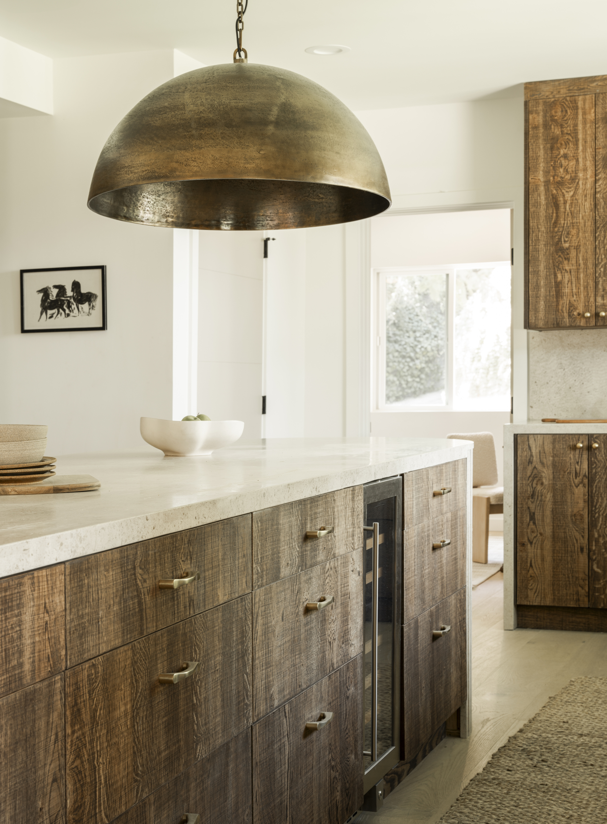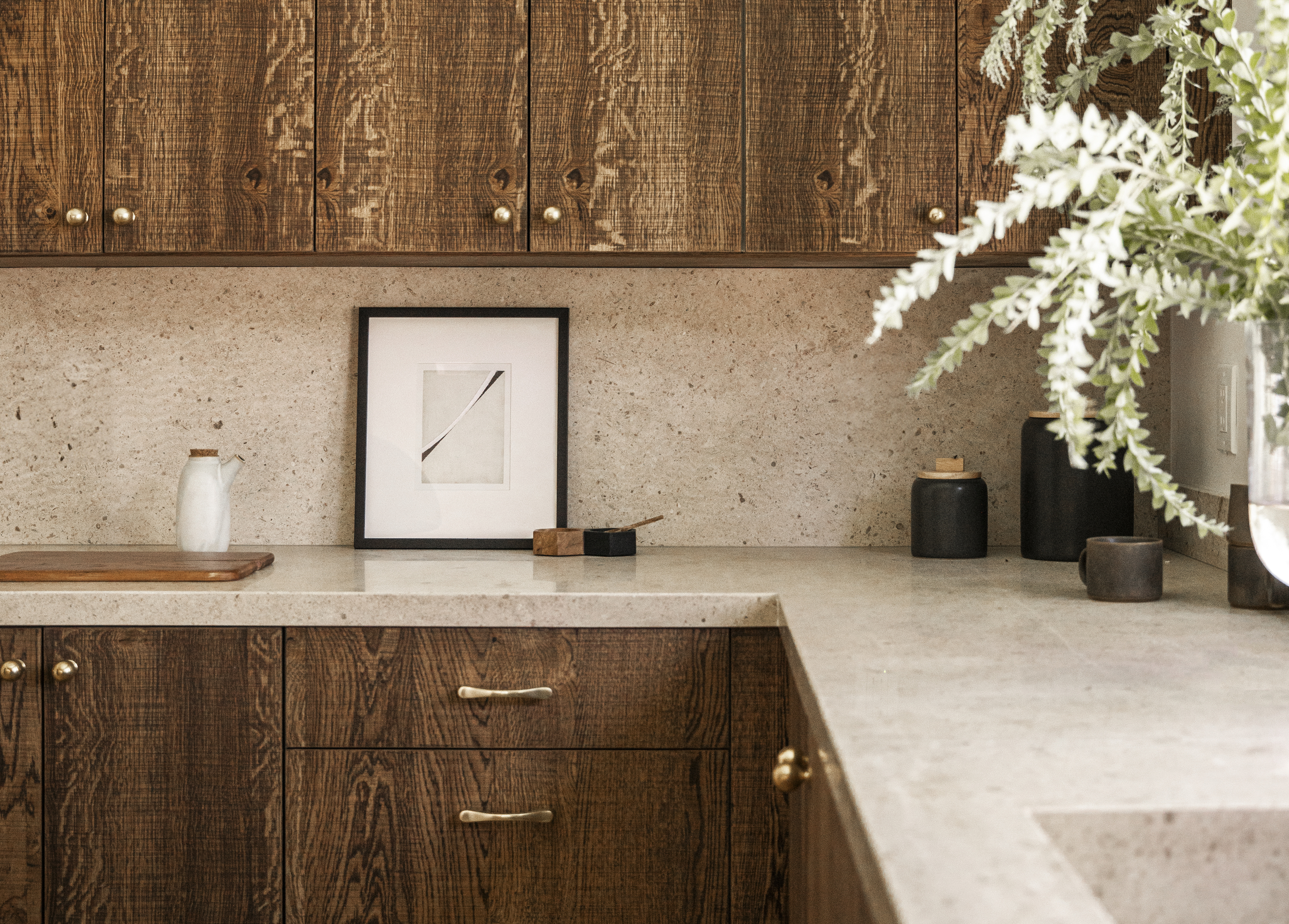
Dark kitchen cabinets receive a lot of bad press. Considered outdated and gloomy, the more popular aesthetic among current designers is for a light and bright wood or stain that feels fresh and minimalist. This family home in Studio City, Los Angeles, proves that it's not always the case, with a once dark and dilapidated 80s-style kitchen brought to life by Amanda Leigh and Taylor Hahn of House of Rolison.
The team opened up the kitchen and created a light and airy feel, using dark wood cabinets to their advantage and grounding the design with a neutral palette, textured materials and statement pendant lighting that hangs over a custom-made fluted island. To find out more about the decision to embrace the dark side, I speak to the designers of this modern home.
The kitchen before
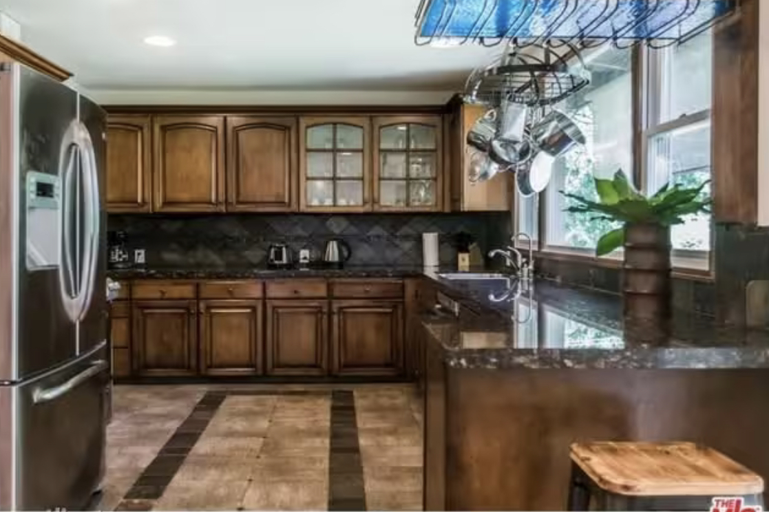
Before the designers got to work on renovating the space, the kitchen was drab, dark, and seriously dated. The palette showcased the worst of wooden kitchen cabinets, mixed with near-black countertops and kitchen backsplash that only created a color clash. Despite large windows looking out onto the backyard, the space was dimly lit, and in real need of a revamp.
The brief was to create a space that felt cocooning and cozy. 'If you ever have the intention of bringing warmth and having a sense of space that's livable and cozy - incorporate dark woods,' advise Amanda Leigh and Taylor Hahn of House of Rolison.
'This project, in particular, was on more of a kitchen than we typically do so we wanted to bring in some rich textures and depth to really warm the space up creating an inviting environment.'
The kitchen after
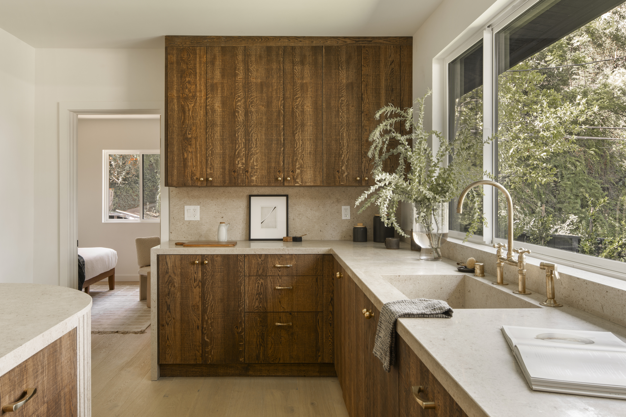
The result is a modern kitchen that feels airy and elevated and banishes rumors that dark wood is outdated once and for all. 'Dark wood is absolutely not outdated,' say Amanda and Taylor.
'Designers are finding ways to reimagine and reintegrate dark woods all of the time. Natural material never goes out of style and we are actually seeing the want for darker woods more and more.'
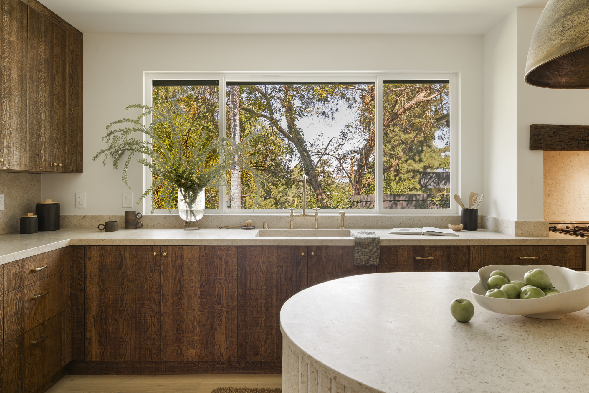
To achieve the desired effect, the designers opted for Querkus white oak with a custom stain. 'Depending on the stain you use, it will highlight different parts of the grain. We chose Rubio Monocoat,' say Amanda and Taylor.
To make the wood pop and balance it all out, the designers picked an off-white kitchen emulsion paint that feels neutral yet warm. Hardware was selected in a brassy metal for warming pops of metallic. 'Wood is versatile. We find warmer colors are easier palettes to accessorize because so many colors have warm hues,' say the designers. 'We prefer black and brass metals with a warm wood.'
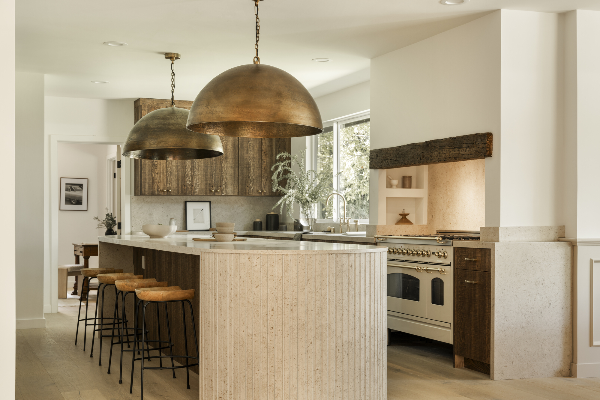
Fluting is another kitchen trend we're seeing incorporated into lots of designs, including this one, seen on the surface of the island. In this instance, it works alongside the dark wood to bring added texture.
'Fluting just provides another layer of texture that tends to always compliment wood very well,' say Amanda and Taylor. 'Texture on texture is something that allows the eye to jump from one space to the next in a way that flows seamlessly, and it's just a fun little subtle detail to discover when looking at a space.
The kitchen island is fully custom. 'We first assembled boxes and established size and layout, then worked our way backward from there,' the designers say. 'The stone feeling like one cohesive component wasn’t easy, and we didn’t want the island to feel like it was overfilling the room, so adding the round edge softened it.'
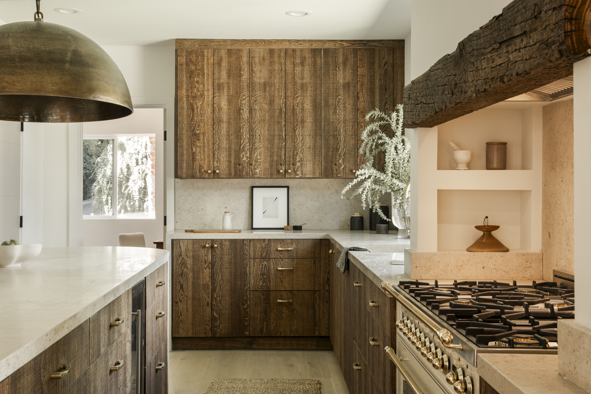
To add drama, pendant kitchen lighting hangs over the island. 'We love when light fixtures are almost obnoxious and on the overstated side,' say Amanda and Taylor.
'It instills a sense of confidence in the delivery of the design and gives a “here I am, look at me” stand-out feeling,' say Amanda and Taylor. 'Watching people’s reactions to these types of elements is always fun.
