As the temperatures drop, tree leaves turn brown and pumpkin spice lattes pop up on every cafe menu, it’s clear we’re officially in the midst of autumn. This time of year is perfect for giving your home a cocooning, warming update for the cold months ahead – and that includes turning to cosy but at the same time stylish autumn colour schemes.
Whether you slightly shift your living room colour scheme by swapping out the cushions and throws for the season or turn to the bedroom walls with some paint ideas, the ways in which you can incorporate these autumn colour schemes into your home, both on a small and large scale, are endless. Each of them will make you feel nurtured and cosy as they are largely based on the colours nature takes on for the autumn season.
‘Like when you transition your wardrobe from summer to autumn, swapping out light airy fabrics for richer textures and deeper shades, more and more people are doing the same within their homes,’ says Lucy Mather, interior expert at Arighi Bianchi. ‘Updating home decor to reflect the changing seasons is not only refreshing but also brings warmth and comfort during the cooler months. This is why so many Autumn colour schemes naturally lend themselves to nature-inspired hues.’
So if you’re after some cosy living room ideas and inspiration, then an autumn colour scheme will help you get there, says Michael Rolland, managing director at The Paint Shed, ‘Redesigning a home in autumn often brings with it a desire to focus on connecting with nature. As such, we expect many designers and DIYers will be drawn to shades that bring a natural, grounded aesthetic to the home, which can help them capture autumn’s cosiness.’
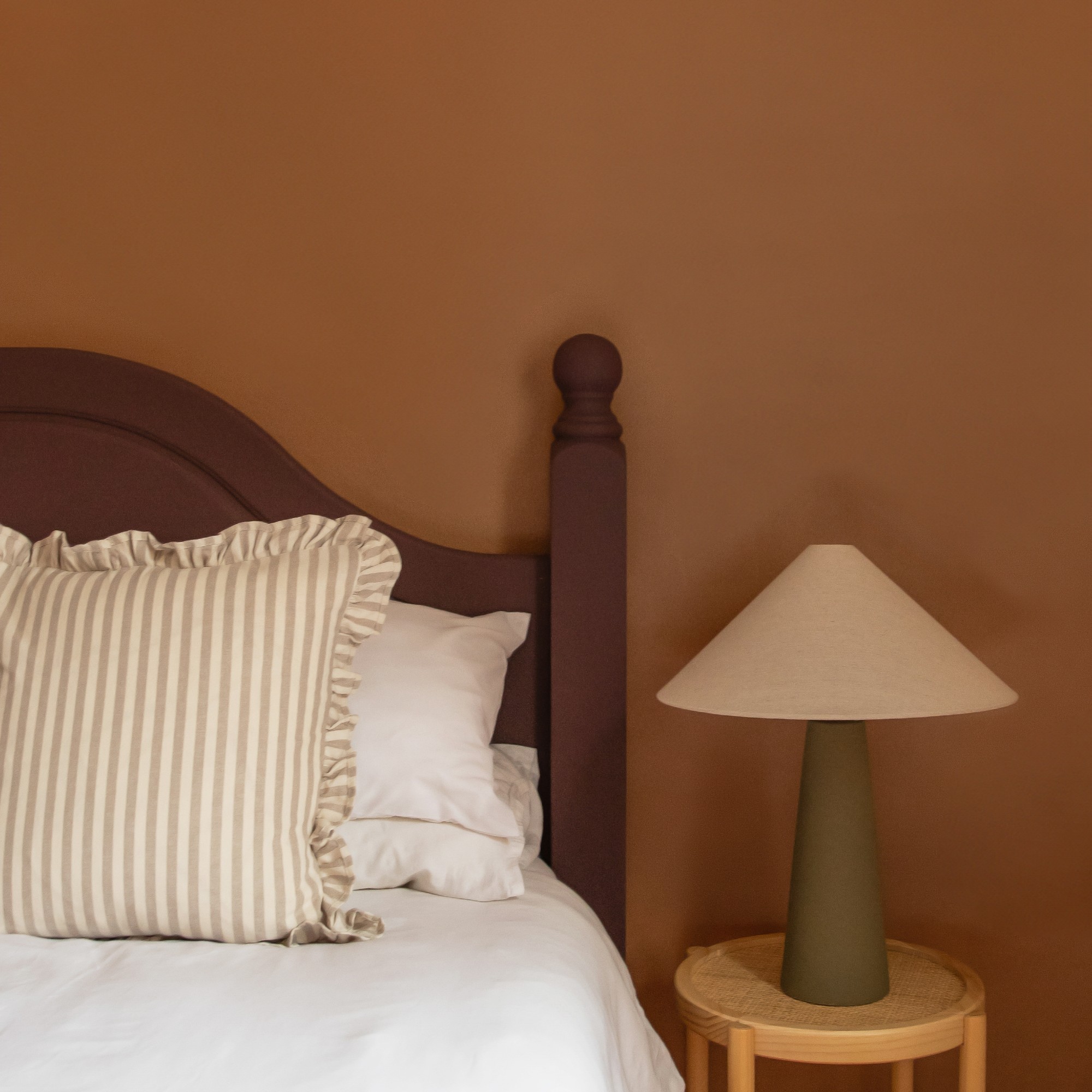
1. Embrace rich burgundy
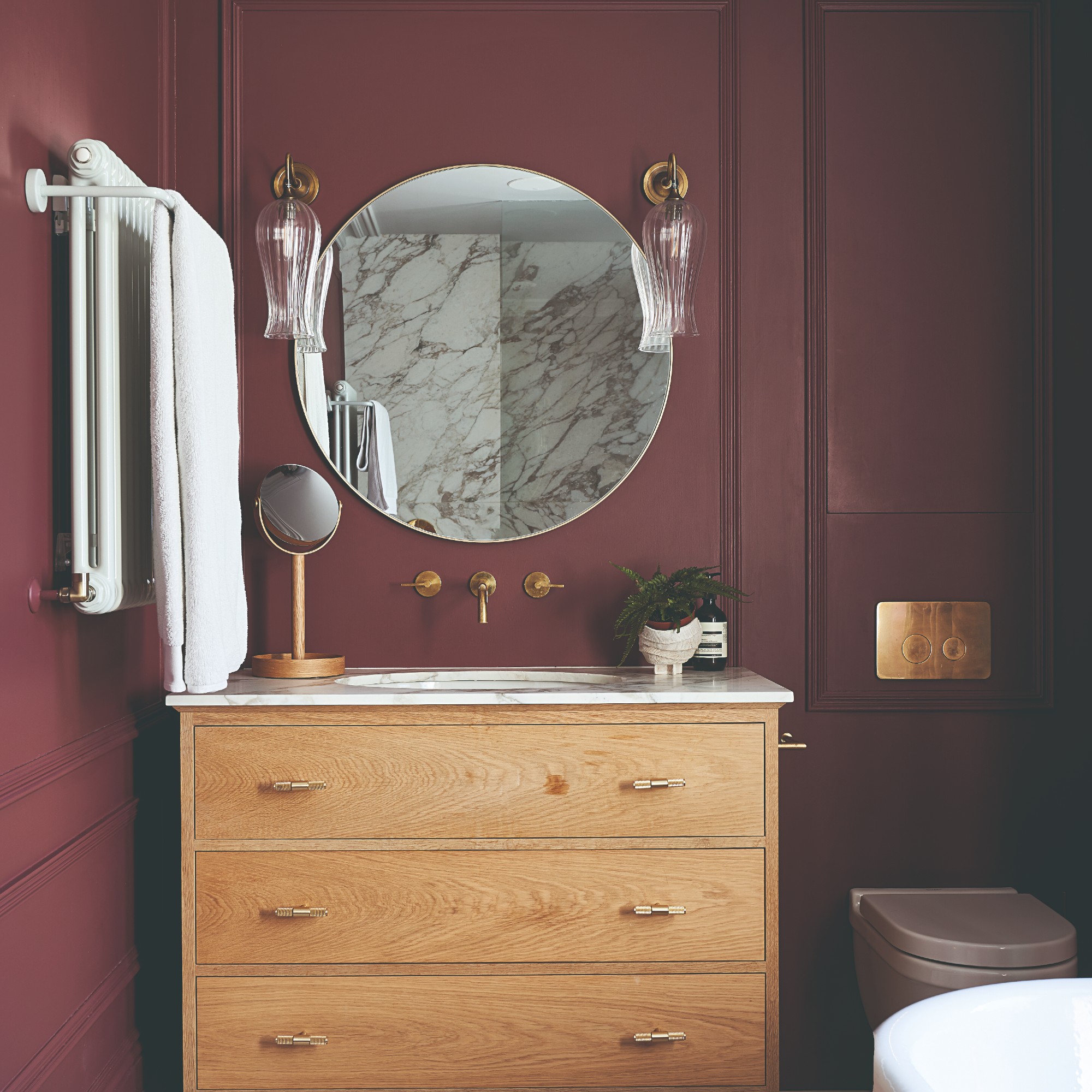
Burgundy, maroon and rich wine reds are one of the biggest colour and paint trends of this autumn season. At the beginning of September, Google reported that searches for the colour maroon were at a five-year high. So why not embrace this beautiful shade? Whether that’s through paint, accessories or even pieces of furniture like an accent chair or a side table.
‘A standout colour we're seeing dominate trends this autumn is burgundy, along with rich variations such as oxblood red. Like with many influences on our home decor schemes, this colour trend is coming from wider cultural influences outside the world of interiors. The fashion houses are awash with rich shades of burgundy and rich reds that can easily be teamed with most “base” shades such as greys, warm white and natural wood,’ Lucy at Arighi Bianchi says.
Made from solid wood, this nesting side table set boasts an almost sculptural structure which we love as much as the colour itself.
Addison Ross and its bobbin salt and pepper mills have become one of the most popular and Instagrammable table accessory since the start of the bobbin home decor trend last year. And now it's available in this burgundy shade, too!
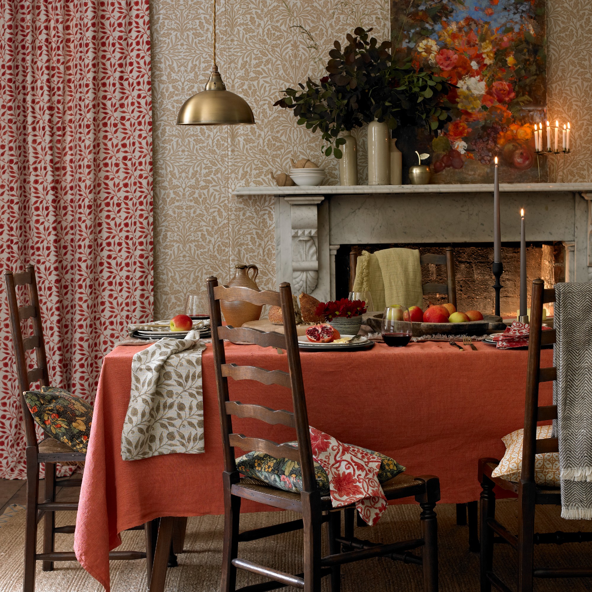
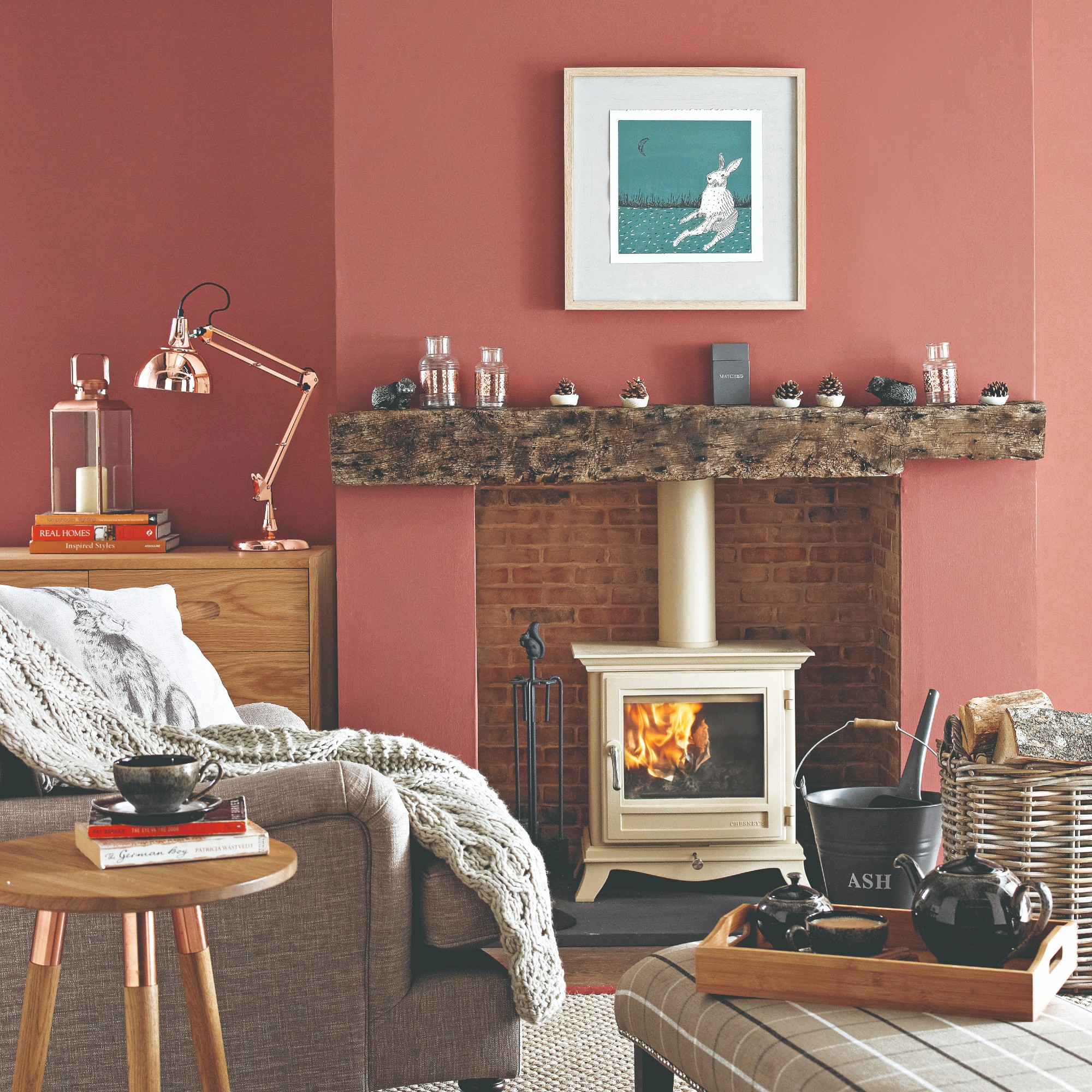
2. Reflect the colour of the leaves
As already mentioned, the autumn season is largely defined by the changing colours of tree leaves, going from solid green to a collage of browns, yellows, oranges and reds. It’s one of the most beautiful things about the season. So it only makes sense to mimic that colour palette at home.
‘Autumn may be when the weather turns that little bit chillier, but it’s when things can really heat up in our homes,’ says Stephanie King, content and creative lead at Dulux. ‘Warm browns, oranges and reds reminiscent of crisp autumn leaves are a great way of adding a touch of comfort to any scheme, while celebrating the colours of the season. And let’s not forget about yellow. Yellow is synonymous with sunlight, which always looks beautiful through the autumnal evening golden hour. To get the autumn feels as well as bringing that sunshine feeling, use our Colour of the Year True Joy, offering warmth but also radiating a feeling of optimism.’
Lucy at Arighi Bianchi agrees, ‘Yellow is another autumn colour to expect to shine through this season. Mustard yellow – that reflects the falling leaves and soft glow of winter sun – is ideal for keeping decors uplifting and cosy. Introducing rugs, cushions, and throws in mustard tones instantly adds a cosy glow to living rooms and bedrooms.’
Pairing this golden yellow shade with a velvet finish is genius as it makes the colour come across even warmer and cosier. We also love the subtle yet noticeable detail of the striped piped finish.
Wireless lamps have become a major lighting trend in the last year. And the portable mushroom table lamp from John Lewis has been one of the most popular designs, also becoming one of the brand's bestsellers. The retailer adds to the colour offering with each season and we're obsessed with this auburn shade.
3. Opt for warm neutrals with colourful accents
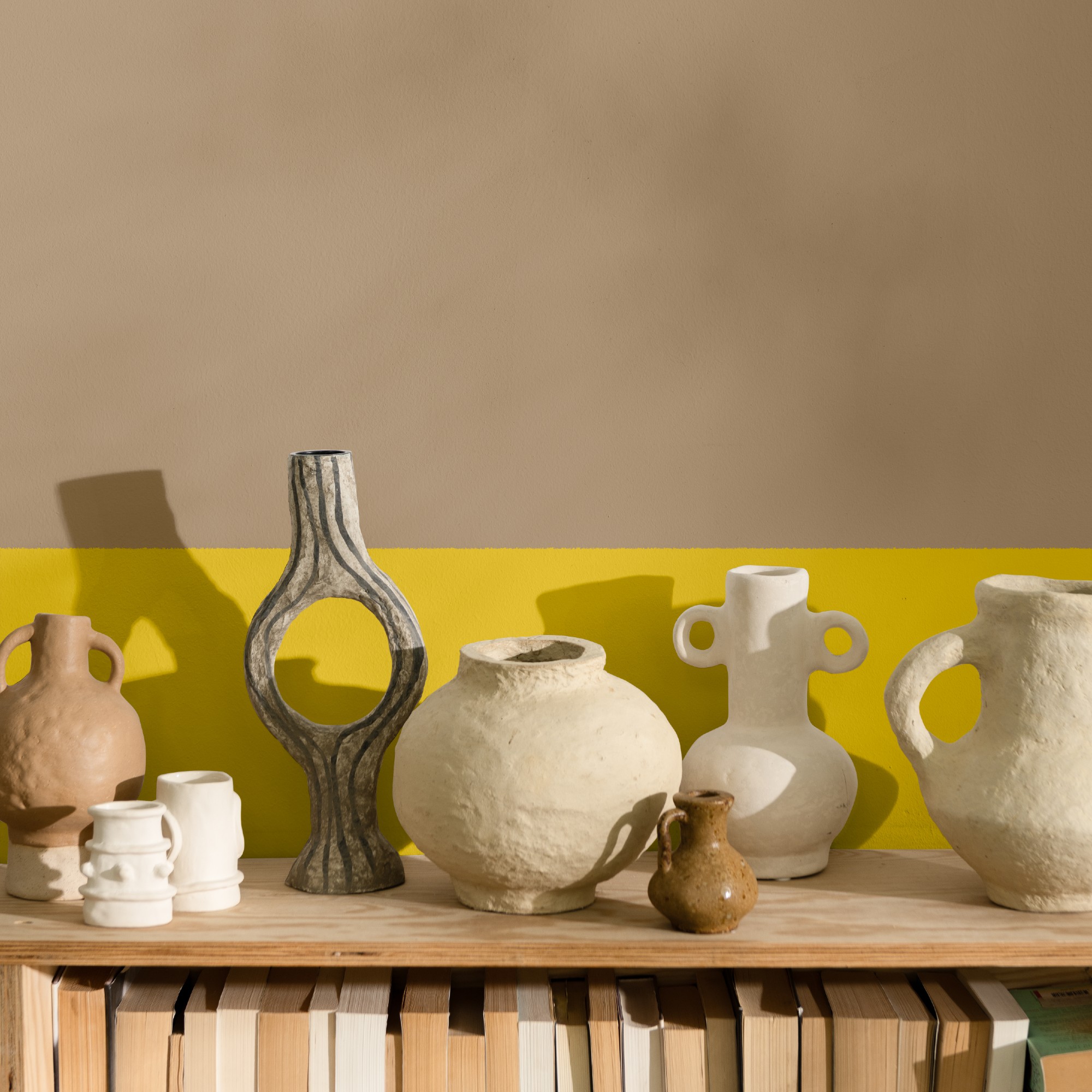
Autumn decorating doesn’t necessarily be all dark or about the colour of the leaves. But it’s about cosiness and warm neutrals which you can decorate with all year round will provide that look and feel for your home. But to avoid a flat look when using neutrals, opt for a mixture of different textures and don’t be afraid to incorporate a pop of colour through small accessories here and there.
‘The autumn months typically see people slowing down after summer, and thinking about how to create comforting and calming home environments to unwind in,’ says Tash Bradley, director of interior design and colour psychologist at Lick. ‘For the neutral lovers out there, opting for a soft neutral colour palette of colours with balanced yellow undertones like Lick’s Beige 01, Beige 02, Brown 02 and White 03 will make you feel very comforted whilst also giving you a neutral, almost spa-like feel.’
‘Inspired by nature, this soft autumnal colour palette has a lot in common with Japandi style. The colours create a tonal, natural backdrop, without it being bland, whilst a splash of Red 03 is a little bit of energy on a crisp autumnal morning. Together, they create a colour palette that’s light, bright, yet still warm,’ she adds.
Dulux's Egyptian Cotton went viral this year. It is loved for its neutral, warming shade which is easy to pair with anything.
There's something very cosy and autumnal about a patchwork motif. Which is why this cushion design from M&S is the perfect addition to your autumnal colour scheme. but better be quick as it's selling fast!
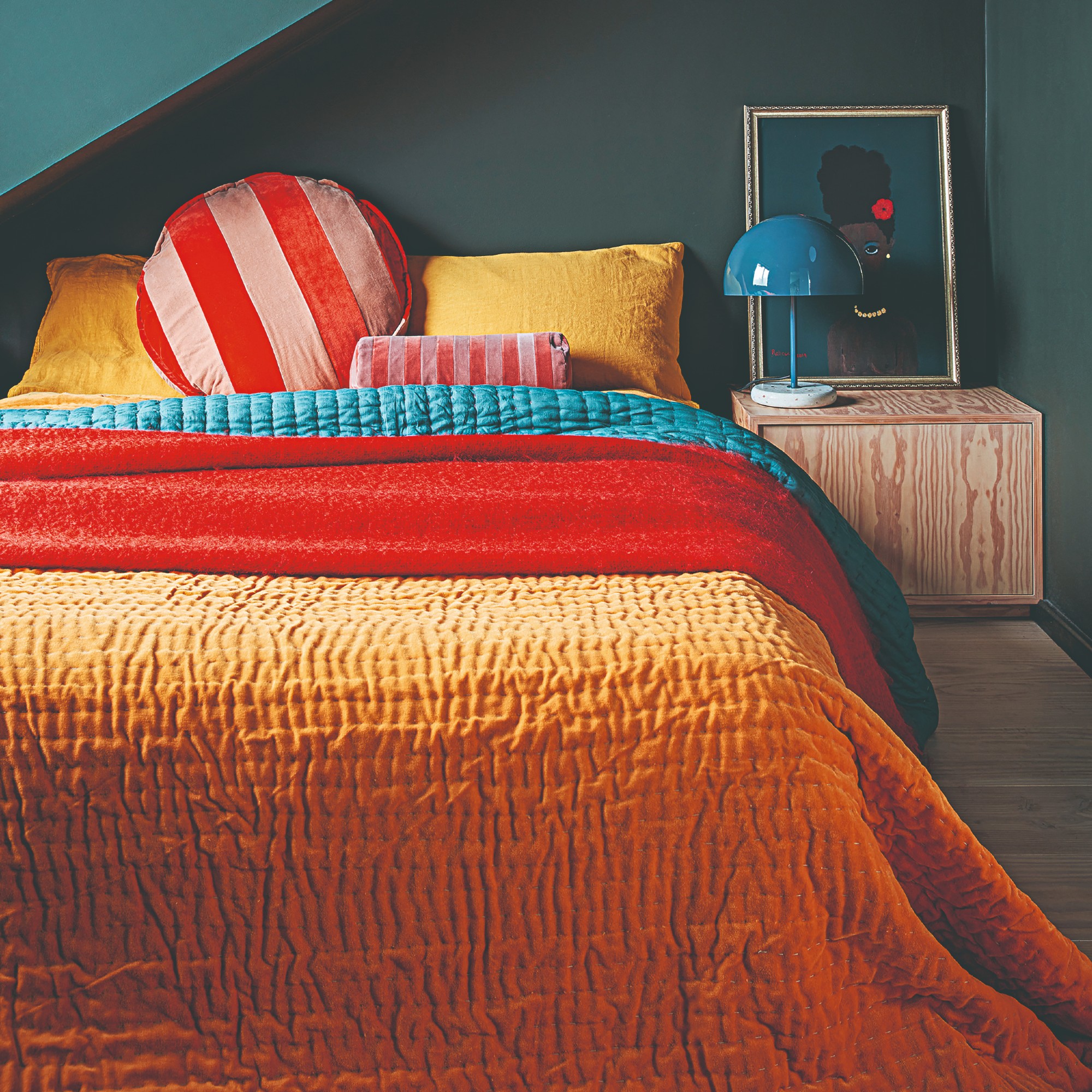
4. Create a delicious palette with espresso brown and caramel
Yummy food and drinks also play a large part during this time of year, whether that’s the aforementioned pumpkin spice latte or a hot chocolate. But one autumnal colour combination that goes particularly well together is dark brown, whether that’s chocolate or espresso, with lighter caramel brown.
‘DIYers often avoid using rich browns, such as deep espresso shades, as they think it might make a room too dark. While it's true that darker colours can sometimes create a more enclosed feeling, when browns are used thoughtfully as accent shades, they can add warmth and depth to a space without overwhelming it. Much like the great snacking combination of espresso, cream, and biscuit, these colours also tastefully complement each other in the interior world. Pair rich browns with caramels and neutrals for a satisfying, stylish aesthetic that works every time,’ Michael at The Paint Shed says.
The caramel colour of this chair is already delicious but even the angular shape reminds us of fudge and toffee. How very autumnal!
The wax of this Malin+Goetz candle is coffee brown, set in a clear glass jar. But even the leathery, amber scent is perfect for the season.
5. Go for earthy clay and terracotta tones
Using earthy terracotta and red clay tones is one of the biggest living room trends of the moment. And while these shades work well all year round, they feel especially fitting for autumn given their warmth and nature-centric focus.
‘While green shades have recently surged in popularity for the fresh and organic feel they create within interiors, we believe that homeowners may want warmer shades. I predict rich clays and terracotta shades will have a shining moment in autumn because of this,' Michael at The Paint Shed says.
'These shades can look great across all walls, but it's essential to ensure there is plenty of natural lighting to prevent the space from feeling too heavy. Pair clay and terracotta tones in smaller, darker rooms with neutrals and soft greens. Wooden accents, rattan furniture and rustic wicker features can also elevate the organic aesthetic of your autumnal home.'
Changing the bed linen is the easiest way to update your bedroom for autumn. Opt for softer, warmer materials and shades - instead of linen, go for brushed or washed cotton like this Dunelm set and swap pastels and white for terracotta.
If you love red but are afraid of its boldness then Lick's Red 01 is perfect for you. It's a muted, earthy clay red that will soothe you and warm you up.
6. Pair olive green with natural browns
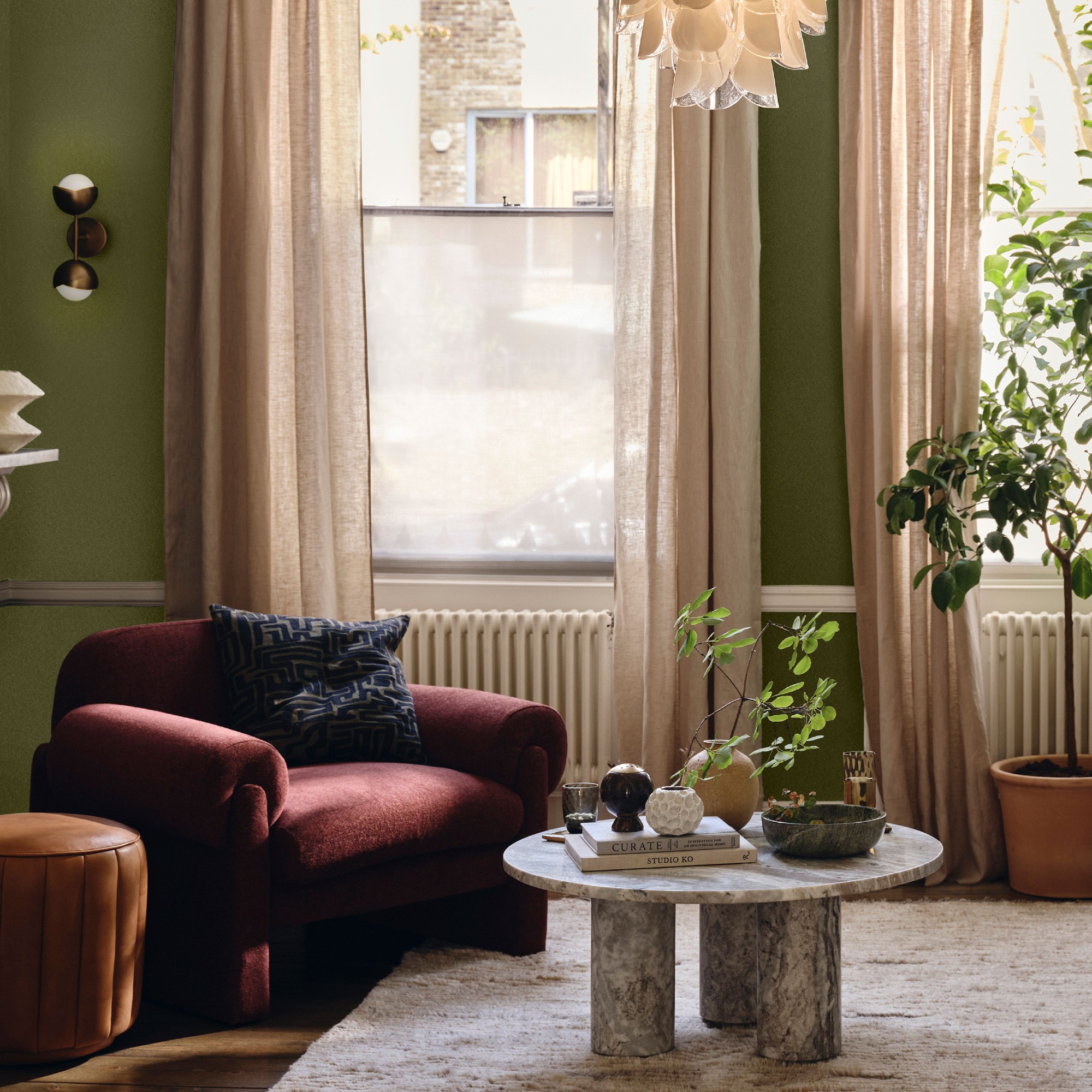
Olive green was one of this summer’s trending shades of green. But now that we’re going into autumn, it’s the one that stands the test of time best due to its deep, rich quality.
‘In contrast to many green shades, olive is a versatile colour which can be paired with a wide range of other shades, depending on the space it’s used in and the desired effect,’ Michael at The Paint Shed says.
But olive green looks especially lovely paired with darker wooden accents, making the green sit against natural browns.
‘Pair olive green shades with brown wood furniture and decorative pieces. Oak, chestnut and walnut browns are a perfect pairing for the warm green tone, sitting harmoniously together without creating a drastic contrast. The organic neutral shades of wood browns create a serene space perfect for living rooms and bedrooms alike,’ Michael adds.
If you're after a true olive green paint colour then Little Greene's Olive Colour is the one. Even our Editor-in-Chief, Heather Young can attest to that as she's painted her spare room ceiling in this shade.
Made with oak wood, this warm shade of wood along with the Scandi design that reads very 'hygge' will be perfect for an autumn colour scheme.
Talking about all the great things about cosy season, including the beautiful and chic colour schemes makes us excited for the season ahead and mourn the end of summer a little bit less. Brat green who?! But which one is your favourite?