What you need to know
- A demo video of how Google's new At a Glance widget will function shows how the widget plays off its Material You design language.
- The widget notably misses out on counting down to an event and only displays the time it will occur.
- Google could be preparing this new widget for the launch of Android 14 ahead of its Pixel 8 series.
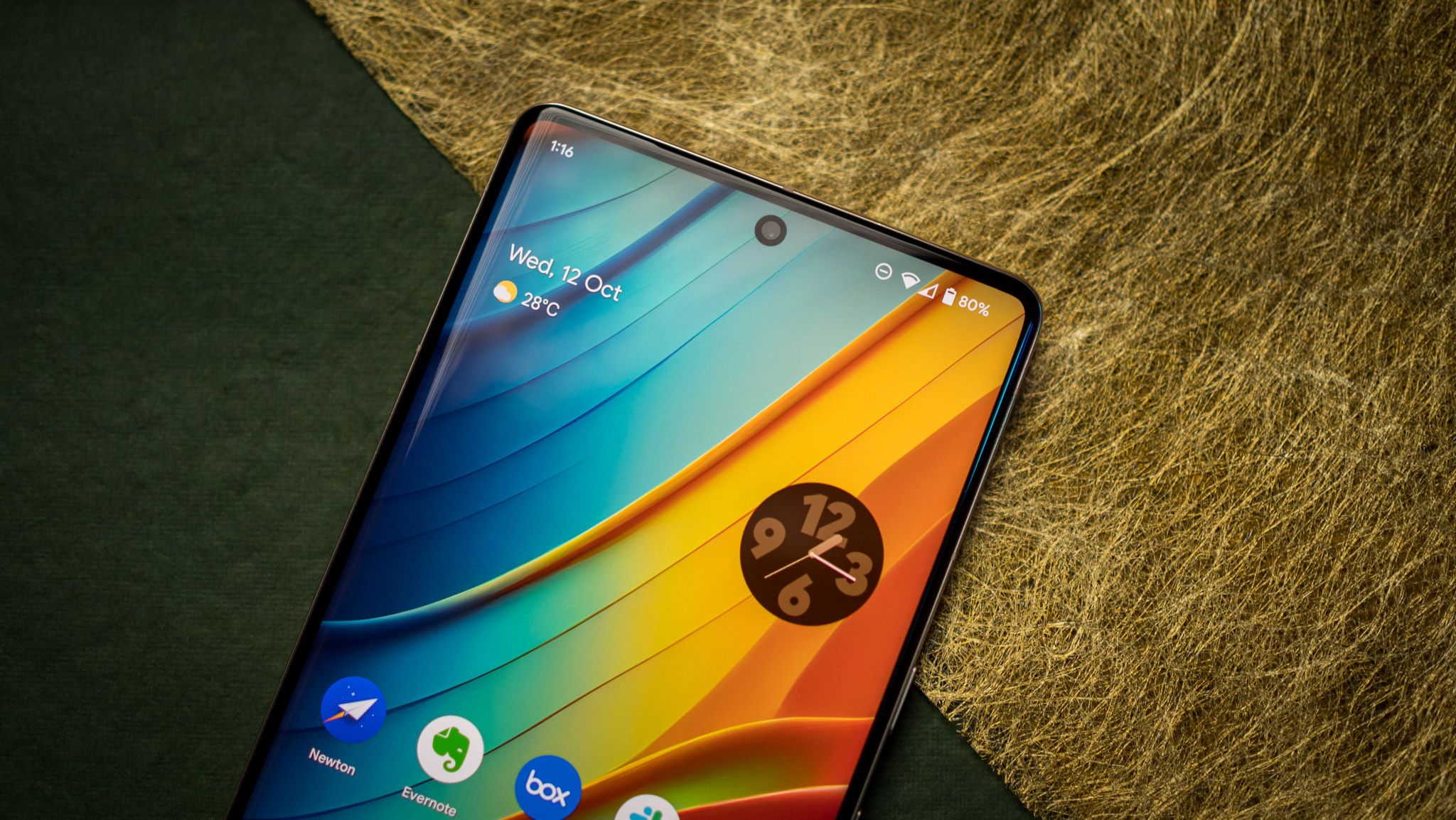
We've seemingly gotten a better visual representation of what Google's new At a Glance widget may look like once it rolls out for non-Pixel smartphones.
Known app deep-diver AssembleDeBug on Twitter posted a short one-minute video of the different style options for the widget alongside a slight information change (via Android Police). One of the notable changes design-wise is the widget has gone from being completely transparent to falling into a pill shape.
The demo shows off its three design styles: semi-transparent, transparent (with a colored outline), and solid (white background).
The clip shows how the widget reacts to an upcoming event, and this is where things differ. The current live At a Glance widget displays how much time is left before that event takes place. However, Google's upcoming plans seem to toss that feature to the wayside as it only offers the time it takes place.
New Google at a glance widget. I know it's known. But just showing how this is gonna work. All we have seen till now is just screenshots. 🙊 pic.twitter.com/rMoInKLBXhAugust 1, 2023
The design language also fits seamlessly with Google's Material You. The gear-like weather icon appears to rely on a user's background so it can complement that much like the colored outline for the completely transparent widget style. The widget also appears to change the color of its "solid" style depending on if your device is set to a light or dark theme.
The "hide content" button is seen to function similarly to how does is currently, taking away any displayed information and opting to only show the day and date.
We've seen the design changes previously after an APK deep dive was conducted. This initial view gave us a look at the At a Glance widget's slightly reworked overflow menu, which displayed a short questionnaire on whether or not the information provided was useful or not. While the demo video didn't show this, it did show the option to "hide" the information displayed in the widget.
Google is still clearly in the development stages of this new At a Glance widget, and more changes could occur as time goes on. The widget recently gained an update by way of swipeable cards on a Pixel phone's lock screen in July. It was a way for a user to see all of their relevant information quickly without having to unlock their phone.
AssembleDeBug noted that the new widget should be present on both Pixel and non-Pixel phones, but we'll have to see what we get later this year. The changes are most likely in preparation for the release of the Google Pixel 8 series later this year and for Android 14, which is expected to roll out its stable version to the public sometime in August.
The Google Pixel 7 Pro features a 6.7-inch vibrant display with a maximum 120Hz refresh rate for smooth videos and gaming. The Pixel 7 Pro strengthened by Google's own Tensor G2 chipset with improved performance and speed. The company's latest Pro model will ensure you're the envy of the party with its Pixel-exclusive updates.


