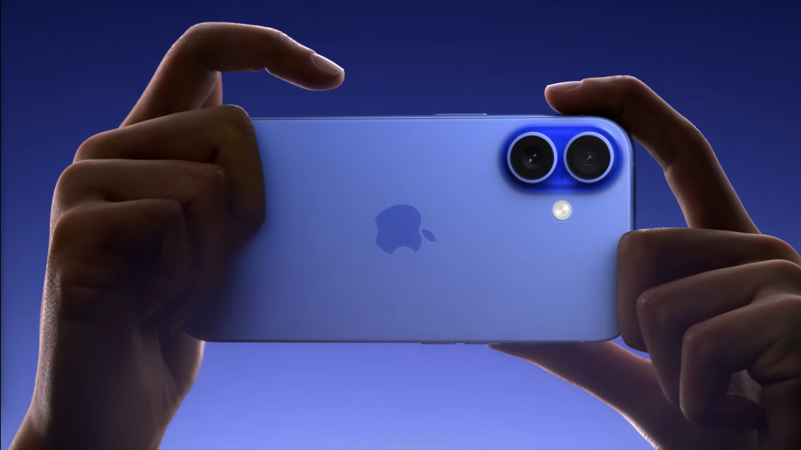
A new 48MP ultra-wide camera and a 5x telephoto camera are both excellent upgrades that feature in select iPhone models for the first time with the release of the iPhone 16 line-up. But as a photographer, it’s the new Camera Control button on all the new phones that really floats my boat.
My long-in-the-tooth Pixel 6 is most often the only camera I have on me. It’s not my top choice for outright image quality – this isn’t one of the best mirrorless cameras or even one of the best camera phones available. However, its processing power and computational photography modes often blow me away, easily capturing ready-to-go portraits, night scenes, documentary snaps and sweeping vistas at the tap of a button.
However, the one thing I'd change for my phone, or any phone for taking pictures, is the handling. Despite its photography chops, I wish my phone handled better for the creative art I love. It has wonderful attributes such as being truly pocketable and discreet, and automatically performs the lion's share of editing for ready-to-go snaps, but ultimately it's awkward to hold and operate to capture those moments around me.
Such frustrations look set to be eased for iPhone fans with the introduction of a new touch-sensitive Camera Control button in the new iPhone 16, iPhone 16 Plus, iPhone 16 Pro and iPhone 16 Pro Max models.
As TechRadar’s Cameras Editor, features that improve the photography experience grab my attention. And so despite the introduction of a best-ever wide-angle camera, plus the 5x telephoto zoom previously exclusive to the Pro Max model making its way onto the smaller and cheaper iPhone 16 Pro, it’s the Camera Control button that excites me most, here’s why.

Could the Camera Control button deliver iPhone’s best photography experience yet?
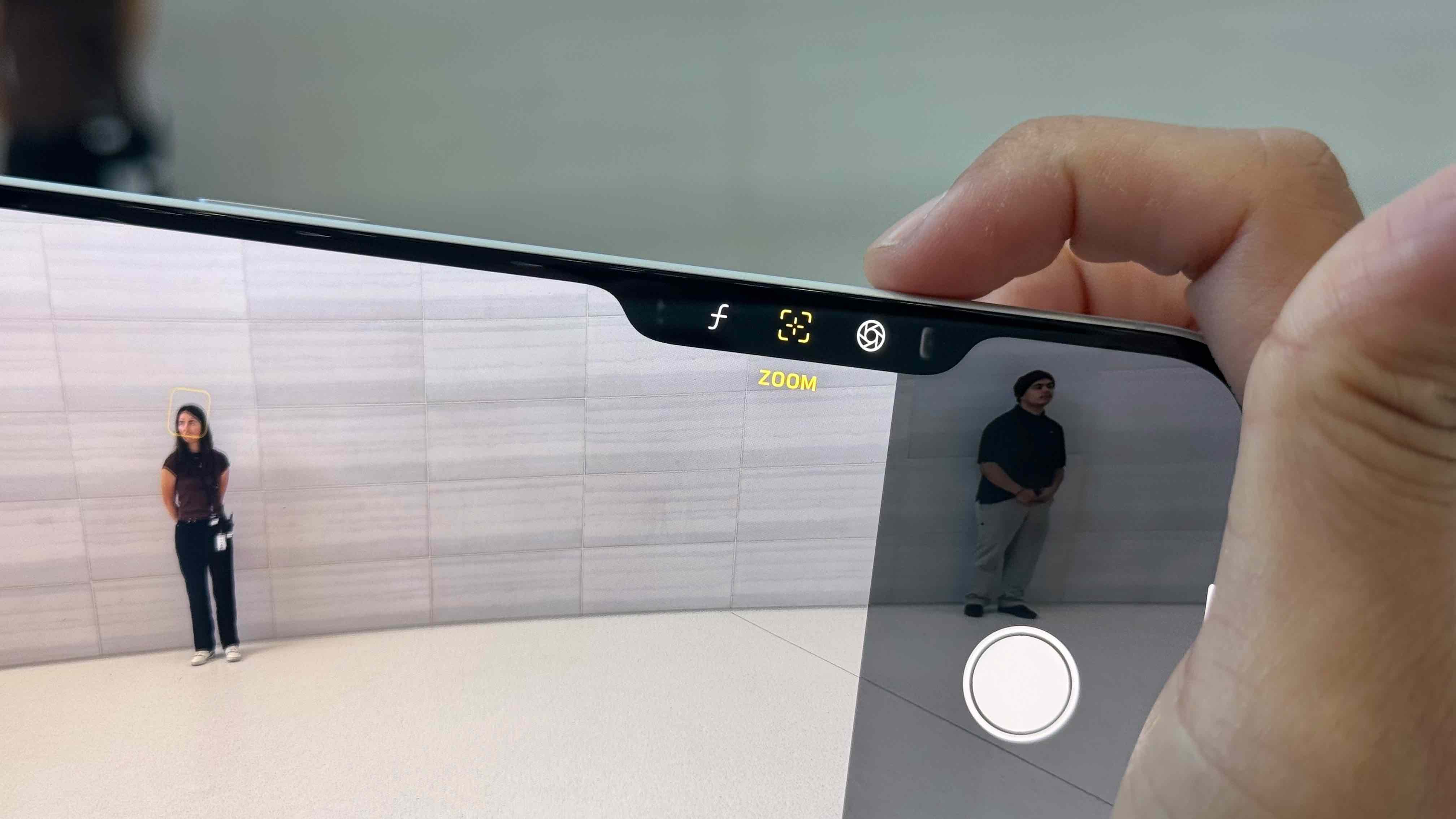
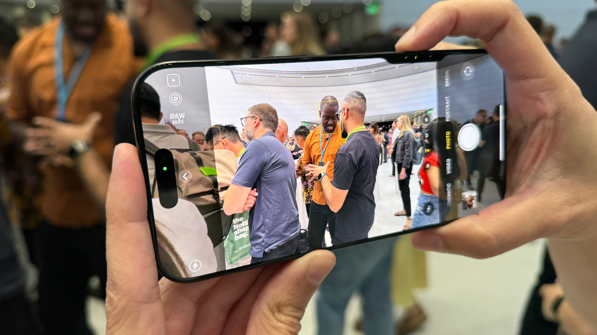
Apple has included the all-new touch-sensitive camera control button on the right-hand side of all the iPhone 16 models, under the power button, so when the phone is in landscape orientation it's positioned where your index finger naturally rests, on or near the shutter release button, when you're holding a ‘proper’ camera (see above). Neat.
The new button is easily located without you needing to look, although I'd rather it was pronounced – it's recessed, with a sapphire crystal covering and smooth texture, surrounded by a stainless still rim.
One press of the button immediately initiates the camera app, avoiding the time sink of waking up your phone and selecting the camera app’s icon on screen.
Another press of the button takes a photo, while holding it downs starts a video. Simple stuff, but that's nothing new per se: the iPhone 15 and 15 Pro Max already possess an Action button that can be used to trigger the camera, and this button with also features on all four iPhone 16 models.
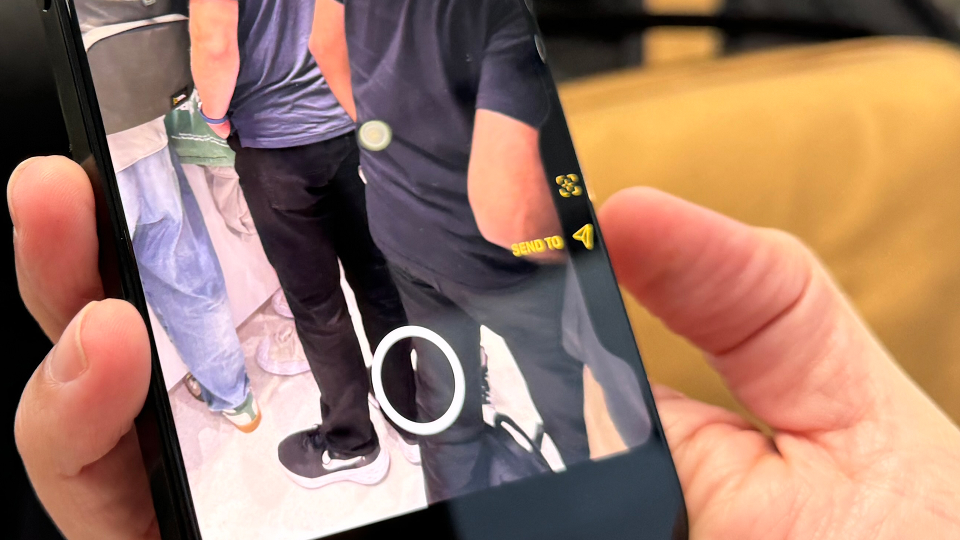
So what extra does the iPhone 16’s Camera Control button bring to the party? Well, it's built with both force and touch sensors that supports various gestures. Think of it like a touch bar – you can swipe your finger across for controls such as zoom, and to adjust exposure and so on. Press it lightly and it can activate other controls, including aperture (depth of field) control.

During the 'Its Glowtime' presentation, Apple also said the camera control button will receive an update soon that could make it the real deal for photographers: you'll be able to use a light press to lock focus and exposure (brightness) on your subject.
That sounds a lot like how my pro mirrorless camera works: you can lightly press down the shutter button to focus and set the exposure, and then fully press it down to take a picture.
This kind of touch-sensitive feature is enormously useful if you want to set the autofocus and exposure information, and then recompose the photo with that info locked in.
Pair the Camera Button and the Action button, which can work in tandem, and we’re potentially looking at one of the most intuitive and capable camera experiences of any phone.
In addition to improving the photography experience, the Camera Control button will also work with Apple's new Visual Intelligence – think of it like Google Lens.

One button, however, doesn’t solve all my iPhone photography headaches. A button doesn't transform the ergonomics, which are largely the same – this is a phone after all.
You still have to hold what is a slimline phone with no obvious features to get a firm grip on, although I think having the shutter button on the top-right of the phone enables you to get a much more secure hold than if you're tapping the screen to get the shot. But if you want a truly camera-like hold of your iPhone for photography, you'll need an accessory such as the Fjorden magsafe grip.
Still, if you’re a happy snapper with your iPhone, the new Camera Control button looks set to make that whole experience all the better. It could even be a reason for photographer me to switch from my aging Google Pixel 6 phone. Who knew a button could be so exciting?


