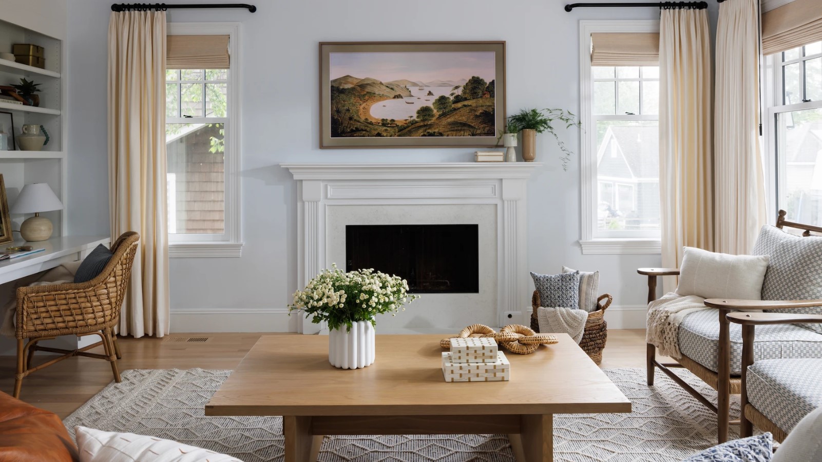
We all know the feeling of walking into someone’s house and instantly becoming uncomfortable. It can be difficult to pinpoint what’s wrong, but the thought ‘oh, this place feels a bit depressing’ registers almost before we can do anything about it.
Of course, when it’s someone else’s home, we shrug it off because we don’t have to stay. But what if you’re getting that same feeling in your own home? If your house feels a bit sad and dreary, could it be that you’ve made design or house layout mistakes that are preventing it from being as beautiful and cheerful as possible?
We’ve spoken to interior designers and home maintenance specialists to get their view on the most common layout and design mistakes that make people’s homes feel depressing.
Design and layout mistakes making your home feel depressing
Fortunately, all of the design and layout mistakes listed below are easy to fix. Our experts have also provided useful tips for what to do to make sure your interior design is lifting you up - not letting you down.
1. Not thinking about the purpose of a room when decorating
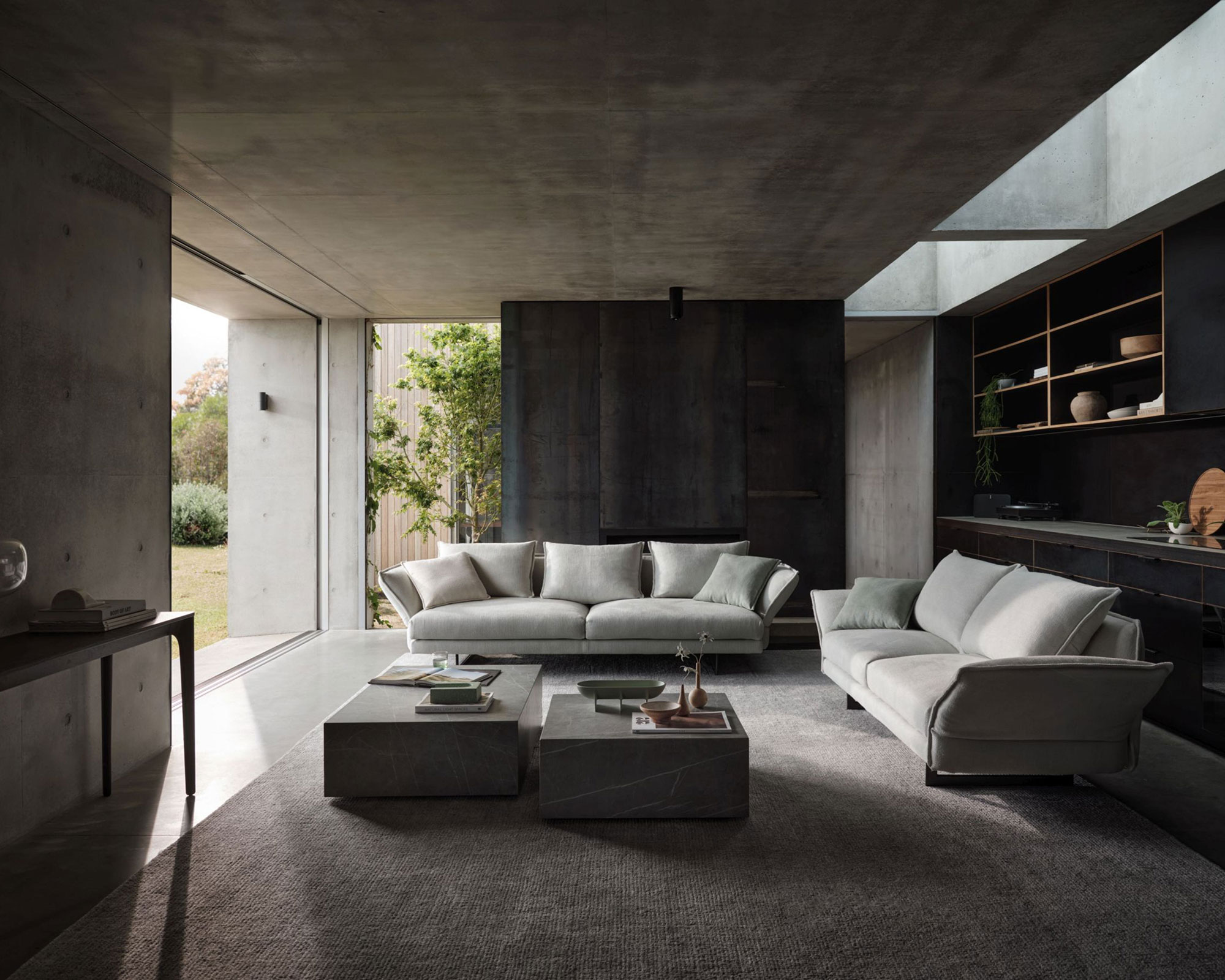
The number one thing that makes people’s homes feel depressing has nothing to do with specific interior design choices. Instead, the mistake is ignoring what the primary function of a room is and decorating it without thinking about how the space is used. An exaggerated example of this would be painting the nursery room black or installing a disco ball in the bedroom.
More subtle (and common examples) of this mistake are having too little furniture in a room that’s supposed to be a comfortable family living room or a bedroom painted in an agitating color (e.g., bright red). Interior designer Madison Lussier of Madison Nicole Design tells us that her goal is ‘always to ensure the functionality and ease of a space first and foremost, and then the aesthetics.’ In practice, this approach involves the ‘intentional use of color, texture, and materials.’
Think about what you want from a particular room. Do you want to feel relaxed and cocooned in it or alert and productive? Who will be using this room - is this a highly personal sanctuary just for you, or a family room that needs to accommodate the needs of several people? The answers to these questions will dictate how bright and colorful (or muted and minimalist) a room should be.
2. Not making the most of available natural light
Overly dark homes often look drab and depressing. Of course, not everyone likes floor-to-ceiling windows and open-plan layouts. Some of us prefer a more cozy interior. However, it’s a good idea to try to have balance in your home. Try to increase natural light in at least a few areas in your home.
Think about your personal preferences and what feels good. Perhaps you are an early riser and like sunlight flooding the bedroom when you wake up? In this case, avoid heavy curtains and overly dark colors in your bedroom. Or maybe you do your best work in bright daylight? In this case, choosing the brightest room as your home office is a must.
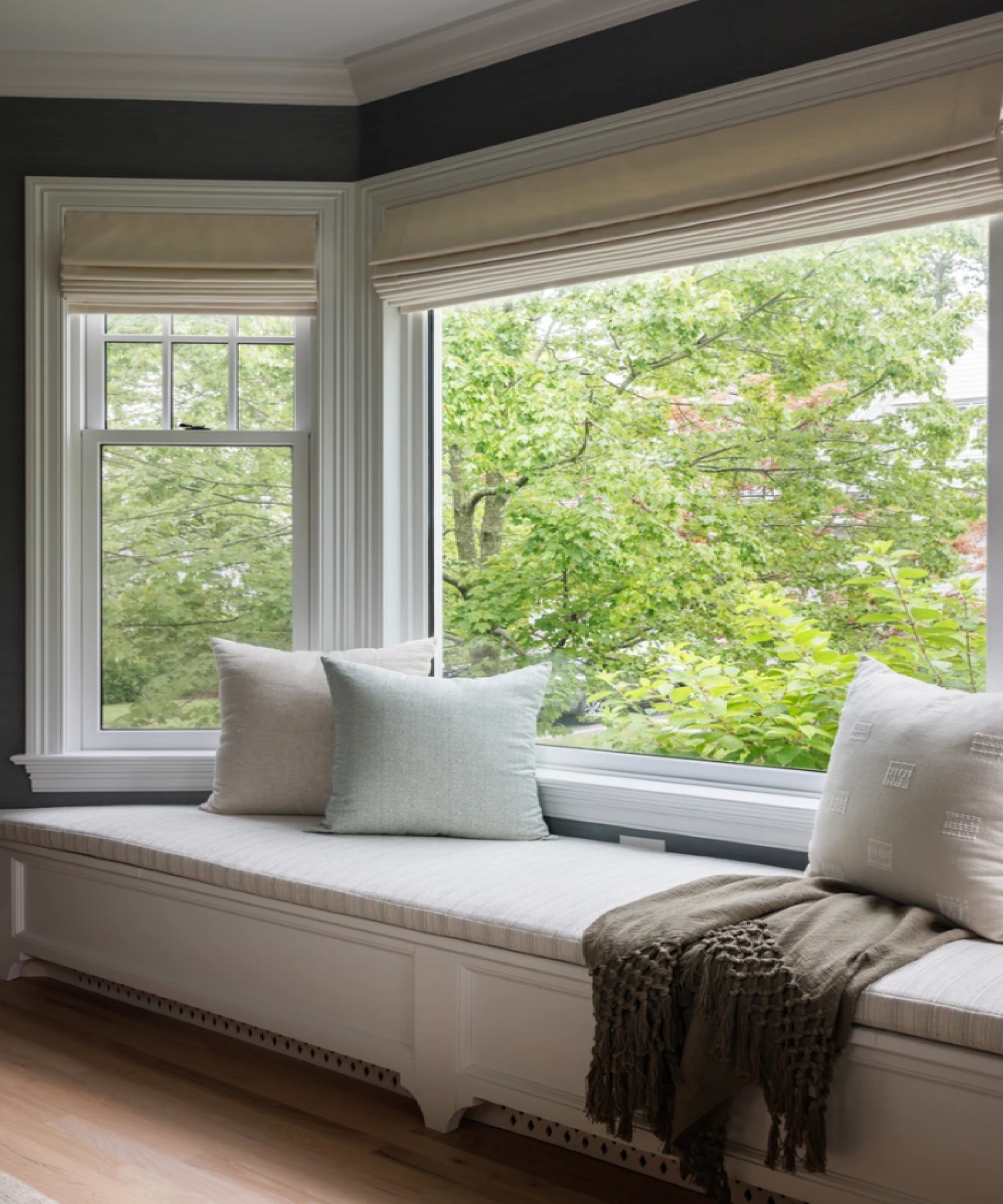
One thing that is worth remembering is that a window is always an opportunity. Before you cover it up with blinds or curtains, consider maximizing the natural light that comes in by adding a window seat or repositioning your desk in front of the window.
3. Choosing old-fashioned colors for your decor
Note that we’re not saying that dark colors are automatically depressing. Dark and dramatic decor can look just as cozy and inviting as a room decorated with light colors. However, there are color schemes that will weigh down even the most beautiful home, making it look old-fashioned and, yes, somewhat depressing.
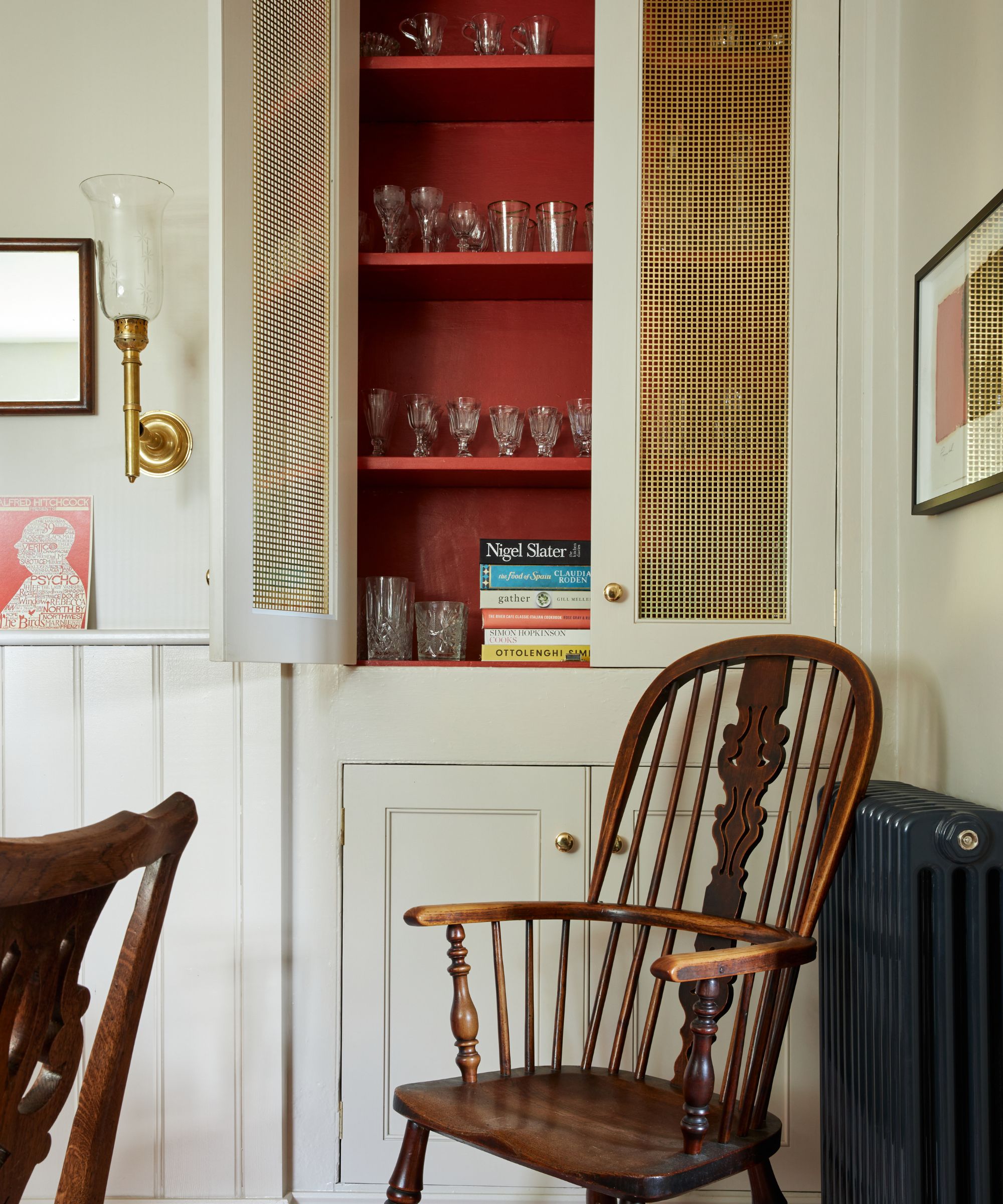
Typically, dark or overly bright reds can make a room look gloomy and drab. The burgundy shades so beloved by many people’s grandparents often make homes look dreary and dark, especially when combined with dark furniture. Michael Roland, Managing Director at The Paint Shed, calls these shades ‘stark reds’ and warns homeowners that these will ‘make a room feel intense and dark.’
If you do love decorating with red, Roland recommends you use them ‘sparingly for a brief pop of color.’ Some people like the look of a traditional home office or library that’s been painted red. In that case, choose a more modern shade of red.
We like red paint shades from Farrow & Ball - they're lively without being overly bright and reflect rather than sucking up all the light in the room.
4. Having no live plants in your home
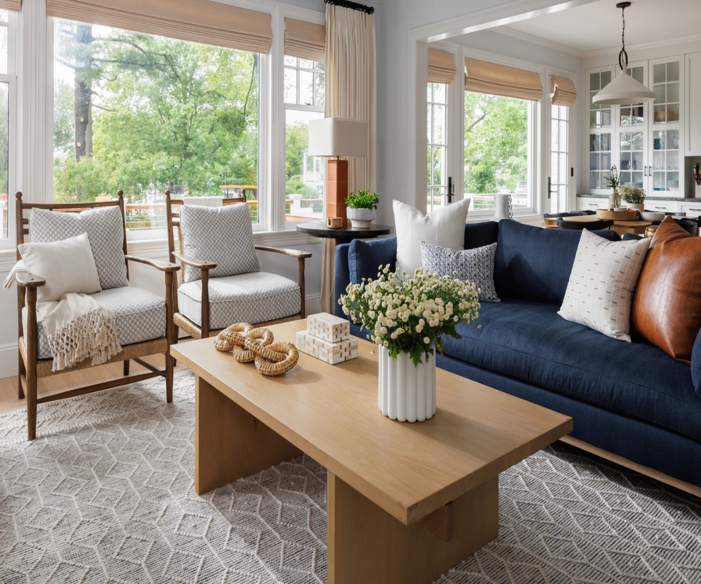
Homes that don’t have any indoor plants in them can feel sterile and sad. This doesn’t mean that you have to have a lot of plants if you don’t have the space or don’t want the responsibility of watering many plants all the time. Even a single plant on your coffee table or desk can instantly cheer up a room. Madison Lussier says that at her studio, ‘we always try to include live plants that help breathe life into a space.’
There are plenty of low-maintenance indoor plants you can choose for your home, and there even are plants that will thrive in relatively low-light conditions (read: north-facing rooms).
If you aren’t keen on adding indoor plants to your decorating scheme, introducing fresh flowers’s another way to liven up your decor. Although this is a more expensive option (you will need to keep replacing them), a bouquet of fresh flowers is unparalleled for its ability to uplift a room.
5. Not personalizing your home decor

One of the surest ways to leave a home feeling a bit depressing is by not adding any personal elements to the decorating scheme. We’ve all seen at least one house that’s like this: nothing on the walls, not a single framed photograph, no knickknacks or personal mementos. Spaces like this can feel more like showrooms than homes, even if they’re otherwise tastefully decorated.
Some people indeed prefer a minimalist scheme. The thing with minimalism is that it’s not about depersonalizing a room; instead, it’s about the thoughtful decluttering and editing of your decor that will allow a room to breathe. Less can indeed be more, but that’s not the same as having nothing at all that is personal or whimsical in a room.
Madison Lussier’s advice is to work toward creating a space that feels ’lived-in, collected, and interesting without crossing over into feeling cluttered.’ You can start personalizing your home decor with a single painting on a wall or a vase or decoration that appeals to you. Of course, if you don’t want a room to look too busy, you can leave it there. Or you could start a gallery wall that will keep giving you joy the more you add to it.
6. Blocking windows and passageways with too much furniture
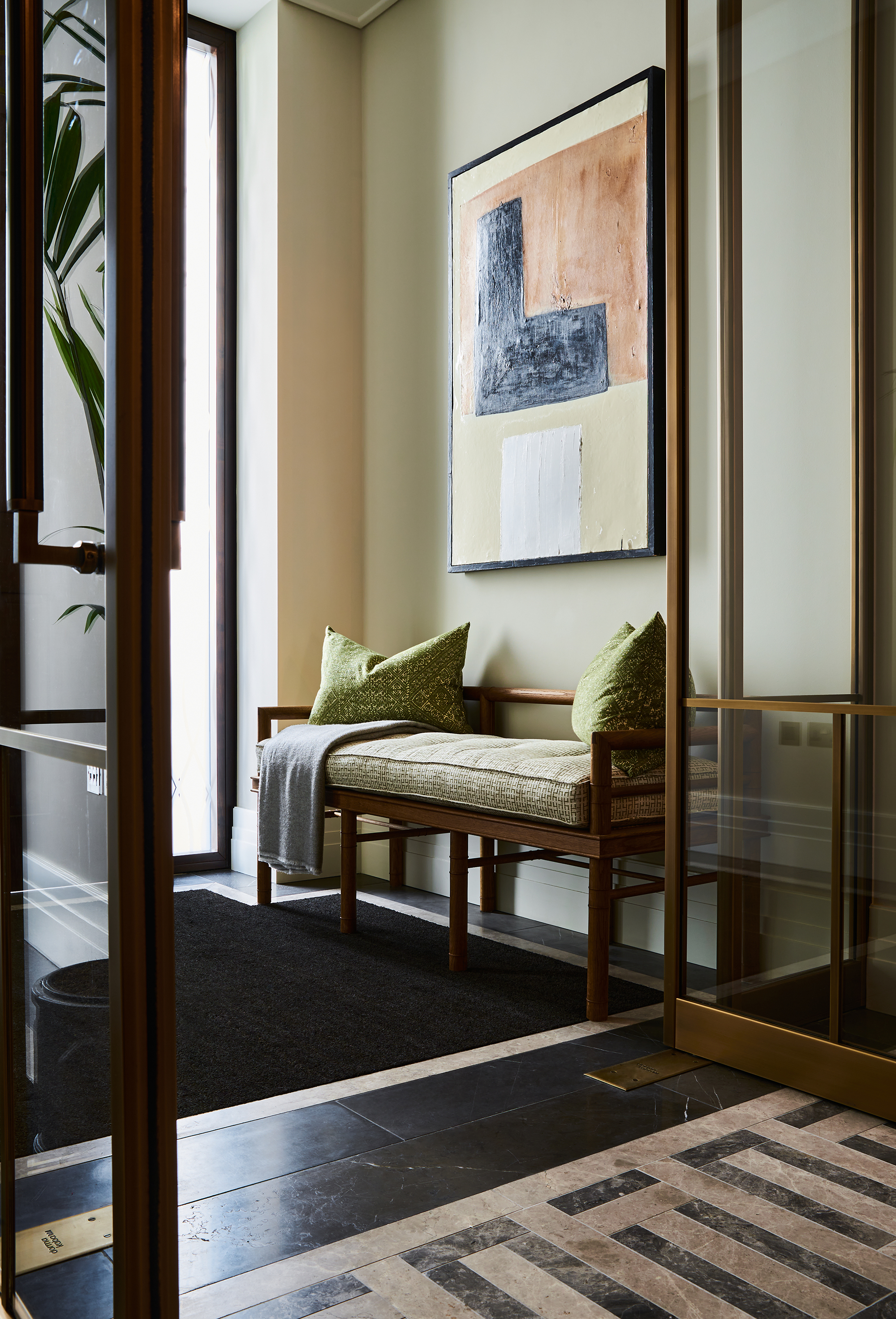
This is a classic layout mistake many people make, especially when trying to maximize space in smaller homes. In an attempt to fit more furniture into a space, people will often position couches and armchairs in a way that blocks windows and doorways, making a room feel dreary and physically difficult to move around.
Docia Boylen, owner of Handyman Connection of Golden, Colorado, recommends ‘having an area that is clean and tidy and not full of stuff or furniture. You want the area to be inviting with comfortable places for people to utilize the space for what it is intended for (i.e eat in the dining room, sit in the living room, etc).’
If this means throwing away an old couch, so be it. Or, if you’ve had to downsize, consider replacing your old furniture with more slimline designs that fit the new size and layout of your rooms.
It's a well-documented fact that our interior design choices can affect our emotional well-being. So try to curate a home that brings you joy every day and uplifts you through carefully considered color and design.


