Web browsers are more powerful than ever, but using them can be soul-sucking. The Browser Company wants to change that.
"We open our browsers today and we feel nothing," says Josh Miller, co-founder and CEO of The Browser Company, which makes its own browser called Arc. "We just feel absolutely nothing."
Together with co-founder Hursh Agrawal, Miller knows it's the challenge of a lifetime to not only build a modern web browser specifically made for how we connect on the internet in 2022, but also to convince people that there can be an alternative to Google Chrome, and it can be beautiful, and more fun, and more functional — more human.
"My wife and I had our first child as Arc was being developed," Miller tells Inverse over Zoom. "It's been really interesting playing with kids' toys for the first time literally in my life while making this new browser that is trying to do new things to be approachable. A lot of the inspiration for the interface and the metaphors has been playing with kids' blocks and kids' setups that I've never seen before."
Miller and his team of 40-something people describe Arc, which is built on Chromium (the open-source, browser project that also underpins Chrome), as a "web browser" for a "marketing and people understanding perspective" but they really view the software as a web browser-based operating system, not unlike Chrome OS, where you essentially accomplish everything within one app.
“We open our browsers today and we feel nothing. We just feel absolutely nothing.”
Arc is currently in private beta and only available on macOS. It's been a month since I installed Arc and then very quickly committed to it as my default browser. I have not been able to contain my enthusiasm. I was a child when Netscape Navigator and Internet Explorer ruled supreme. I was an angsty teenager when Firefox landed on the scene. I was coming of age when Chrome swooped in and began its conquest. But because of its ubiquity, Chrome's product team has no reason to blow things up in service to the user. It's why we're stuck with its bloat and battery drain on laptops.
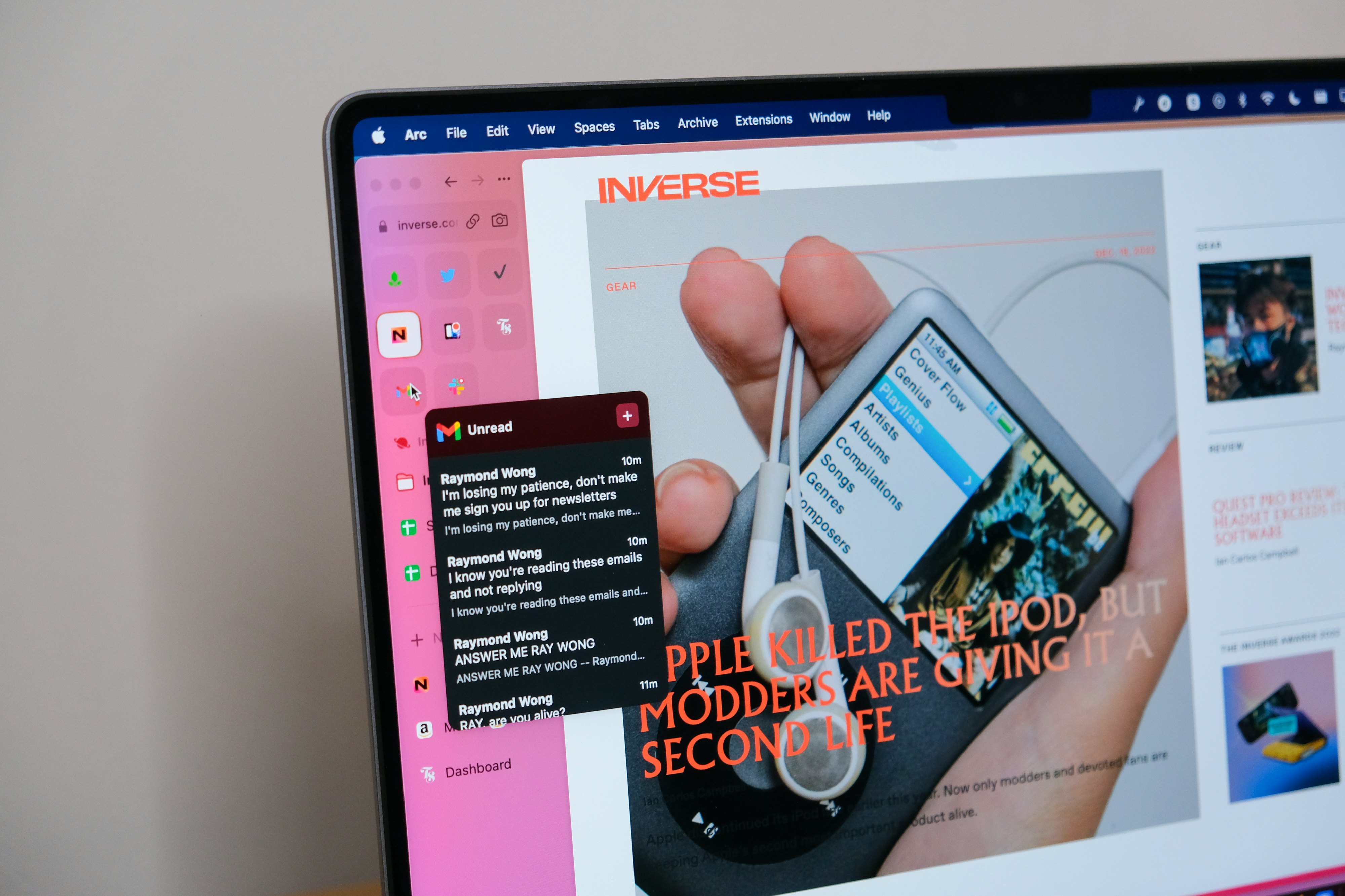
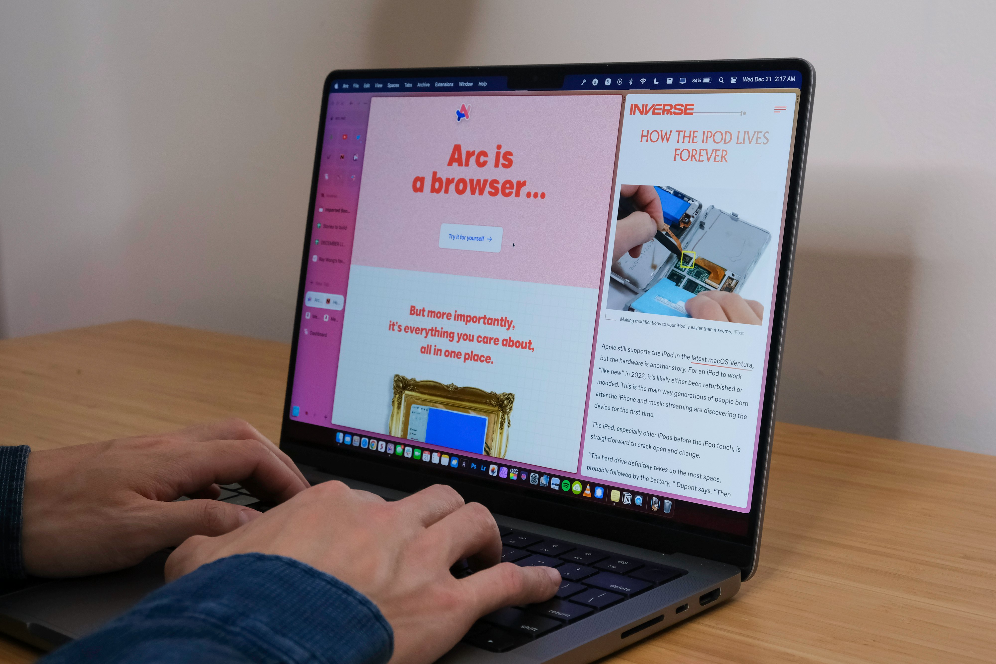
Arc has no baggage. The web browser is starting with a blank slate, designed for today's needs with features like a versatile sidebar instead of a tab row, the ability to hover over a pinned tab like Gmail to "preview" your inbox, and a built-in split view system for opening multiple tabs side by side. There's even a way to rename tabs so you can actually keep track of them instead of trying to decipher the SEO keyword salad in each tab’s name. And while building for the present is core to The Browser Company, so is designing for the future with forward-thinking features like a built-in notes scratchpad and an "Easel" space where you can dump text and images to create mood boards and then share those spaces with a single link. Arc is very much a browser from the future, and I think it's got a really good shot at knocking Chrome off its lofty throne.
Why do we need a new browser?
On December 25, 1990, English computer scientist Tim Berners-Lee released WorldWideWeb, the first web browser with a graphical user interface (GUI), to access the World Wide Web (with spaces) through a series of networked pipes called the internet.
WorldWideWeb connected Earth's population and provided access to all kinds of information at a speed and convenience that vastly outpaced the printing press and telephony. As users hooked up their personal computers to the internet, Mosaic, Netscape Navigator, and Internet Explorer would all become household web browser names in the dot com rush of the 1990s, serving as windows to the text and images uploaded onto the web.
By the early 2000s, Internet Explorer was so widely used — commanding 95 percent of the market — the United States opened an antitrust case (United States v. Microsoft Corporation) against Microsoft. The tech giant was accused of using its monopoly of the PC market to preinstall the web browser on Windows and unfairly gain market share and stifle competition all in one go. The landmark antitrust case eventually led to the long, slow decline of Internet Explorer.
With Internet Explorer maimed, something incredible happened in the mid-to-late aughts: web browsers flourished again. Mozilla challenged Microsoft with its open-source Firefox in 2004, boasting its faster website-rendering engine. Apple's Safari, briefly, felt like a breath of fresh air as Macs became inseparable from college campuses and coffee shops. And if you remember dabbling with Opera or Camino, well, none of this is new to you.
Then, all that innovation started to dry up by the end of 2008.
That December, Google released the public version of its first web browser, Chrome, and reshaped our portal to the internet by popularizing features like tabs, extensions, and Incognito Mode. Chrome started off with seemingly good intentions. It was faster than Firefox, better designed, and kept adding more features to improve the web browsing experience.
Today, 14 years after its release, Chrome is practically synonymous with the internet — it's the Internet Explorer of our generation — and its original lightness is unrecognizable compared to its 2008 release. We use Chrome because work or school requires it. We tolerate its bloat because it knows everything about us (the places we visit online and in real life, our logins and passwords, our credit card information), seamlessly tying all of our online data to a Google account.
But 14 years is too long — practically an eternity — for one web browser to dominate the way we access the internet. Chrome's UI and UX is so ingrained that it feels like a Herculean task to switch to a new web browser, let alone one that looks, feels (yes, feels), and works differently.
“I think over the last decade, slowly then quickly, more and more of our lives have moved to the browser.”
Miller and I commiserate over how boring, uniform, and unintuitive Chrome had become. We turn on our computers, open up Chrome, and then it's just one stressor after another as tabs and windows pile up and bookmarks folders burst at the seams. Figuring out how to do stuff uses more time and energy than doing the task we originally intended.
Chrome came out in 2008, and sure, it's received a few facelifts throughout the years, but it's still fundamentally the same web browser it was 14 years ago. Miller tells me the epiphany for Arc came a few years ago when he noticed a new wave of web-based desktop apps that weren't just functional, but really beautiful. Apps like Notion and Figma were leading the way — productivity apps that inspire you instead of causing dread.
"When I left college and started in the industry [it was] mobile, mobile, mobile, mobile, mobile, mobile, mobile. There was this moment before we started The Browser Company, we were looking at what Notion was doing and Figma was doing," says Miller. "And we were so inspired. Because if you had told me someone was making a new application that looked like a word processor, I would have been like, there's literally few things I could care less about than trying a new word processor. But it was such a fresh rethink saying, 'What is it that people want to express on their computers?' Toss out these nouns and what do people want to do, and same with Figma and Airtable. There are all these companies."
To an older generation, Microsoft Excel, Word, and Adobe Illustrator would have been the equivalents to Airtable, Notion, and Figma, respectively. But these new apps that Miller says were part of a "renaissance in desktop software" didn't just have more or better features — they were rethought from the ground up to meet user needs that had changed. Notion didn't become everyone's favorite notes app overnight, it happened gradually as people realized that the UI mattered just as much as the UX. There was new value in an all-in-one app that connected your notes with your to-do list with your calendar, and more.
"The observation we had was, not only is there a renaissance in desktop computing and desktop interfaces as expressed by all these new products popping up that are really rethinking things from the ground up, but really there's a renaissance in internet software because they all relied on the web browser,” Miller says. “I use Airtable in the web browser; I use Notion in the web browser; I use Figma in the web browser; Github in the web browser. That was really new. That struck us because when you look at this frame that you were using around these very modern tools where you're rethinking things from the ground up, they hadn't changed at all.
"It was one of those things where if you had told me a decade ago that I was going to be working on a desktop web browser in 2022, I would have said, 'What went horribly wrong in my career?' Because I think everyone is blind to the fact, including myself, that we do spend so much time in these frames called web browsers because it happens slowly and then quickly. I think over the last decade, slowly then quickly, more and more of our lives have moved to the browser."
Arc is the product, not you
Miller shared another reason why his company is trying to reinvent the most important way we work, socialize, and play; and why Google — and its huge budget — is unlikely to reboot Chrome.
"Okay, the browser hasn't changed in a couple of decades,” he says. “There's actually a clear explanation: business models. There's a reason that the key players do not want to change the browser: because it hurts their business model."
Unlike Chrome, Miller insists Arc is not a Trojan horse for advertising. It's not trying to track you across the web to sell you the latest Allbirds sneaker or Away luggage. The Browser Company has taken three rounds of investor funding, totaling over $30 million, since the company launched in 2019.
"One thing we are not doing, ever, is we are not going to sell your data to anyone," he says in a Twitter video. "We're not trying to dominate the browser market. We don't want to be a monopoly… we don't like the way the browser market is trending… the internet is becoming more and more important, and there's basically one browser, Chrome, that almost everybody uses and their whole business model is basically, 'We're gonna basically spy on you? But it's chill, don't worry you can trust us. And we're gonna watch what you do on the internet and sell it to advertisers.' Just keep in mind our motivation is we don't want to live under the golden arches of Google."
“Our motivation is we don’t want to live under the golden arches of Google."
So how will Arc make money? If you aren't the product, then what is? Miller says "Arc for Teams," a way to collaborate together, is one idea, referencing a freemium model used by apps like Notion, Figma, and Slack. "You give it away to individuals for free, forever, and then charge their companies if they use it for work." He also alludes to "Boosts" — an "early experiment reimagining the extension developer experience as 10x easier, faster, and more enjoyable to use" according to the company's help resources page — sold through a digital marketplace as another potential way to monetize Arc.
A browser you want to use
Monetization is top of mind for the future (as for any company), but right now, the spirit of The Browser Company is very much focused on building a great product. Miller's genuine enthusiasm for the product — not the business model — isn’t lost on me as we talked about Arc.
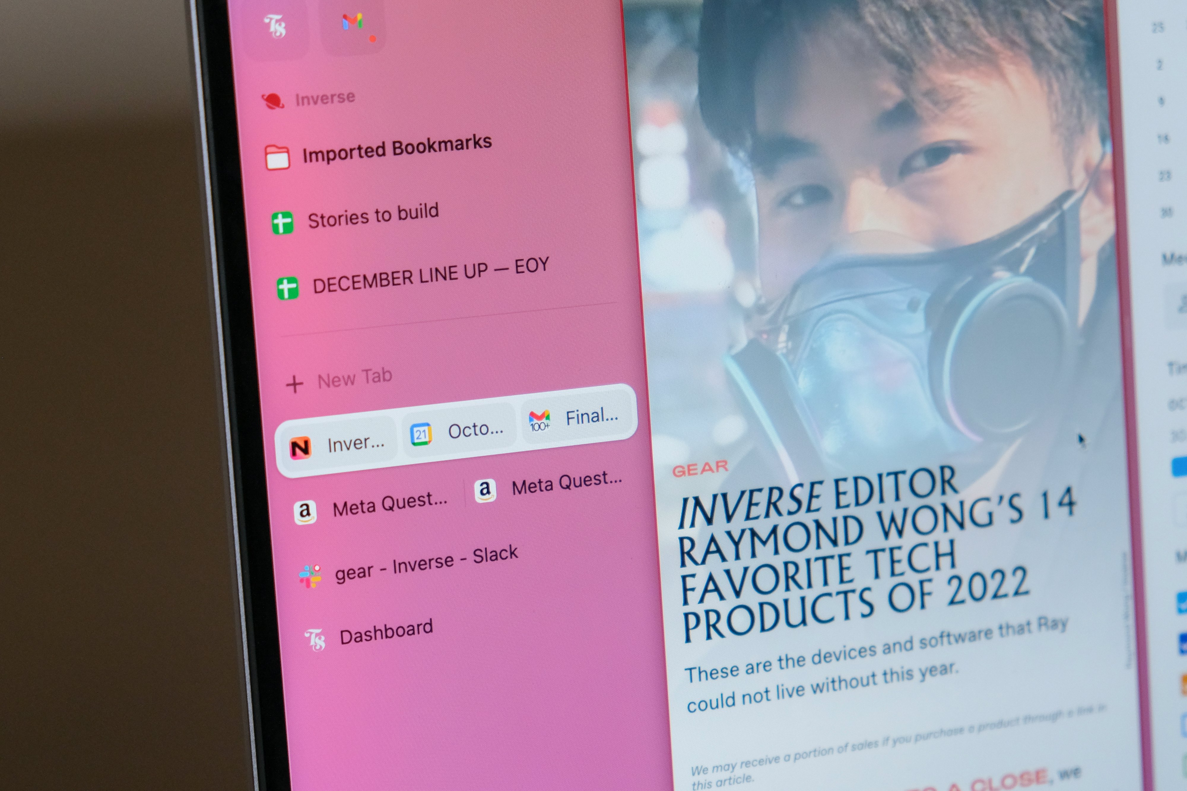
"What if we just tossed it all out? What if we literally started with a blank page [designing Arc]?" Arc users don't need to look far to find the new ideas Miller is talking about. Instead of a row of tabs at the top, there's a sidebar similar to the Vertical Tabs feature in Microsoft Edge. Some pinned "Favorites" like Gmail and Notion support previews where you can hover your mouse over their icons and get a look into, say, unread emails. And, this might not sound groundbreaking, but I assure you it will change the way you browse the internet: tabs can be opened in Split view in two, three, and four side-by-side "Splits". If you're like me and you frequently need to reference two or more websites, Splits are a game-changer. They're great for online shopping when you need to compare two or more products. My Black Friday and holiday shopping was a piece of cake this year thanks to Splits.
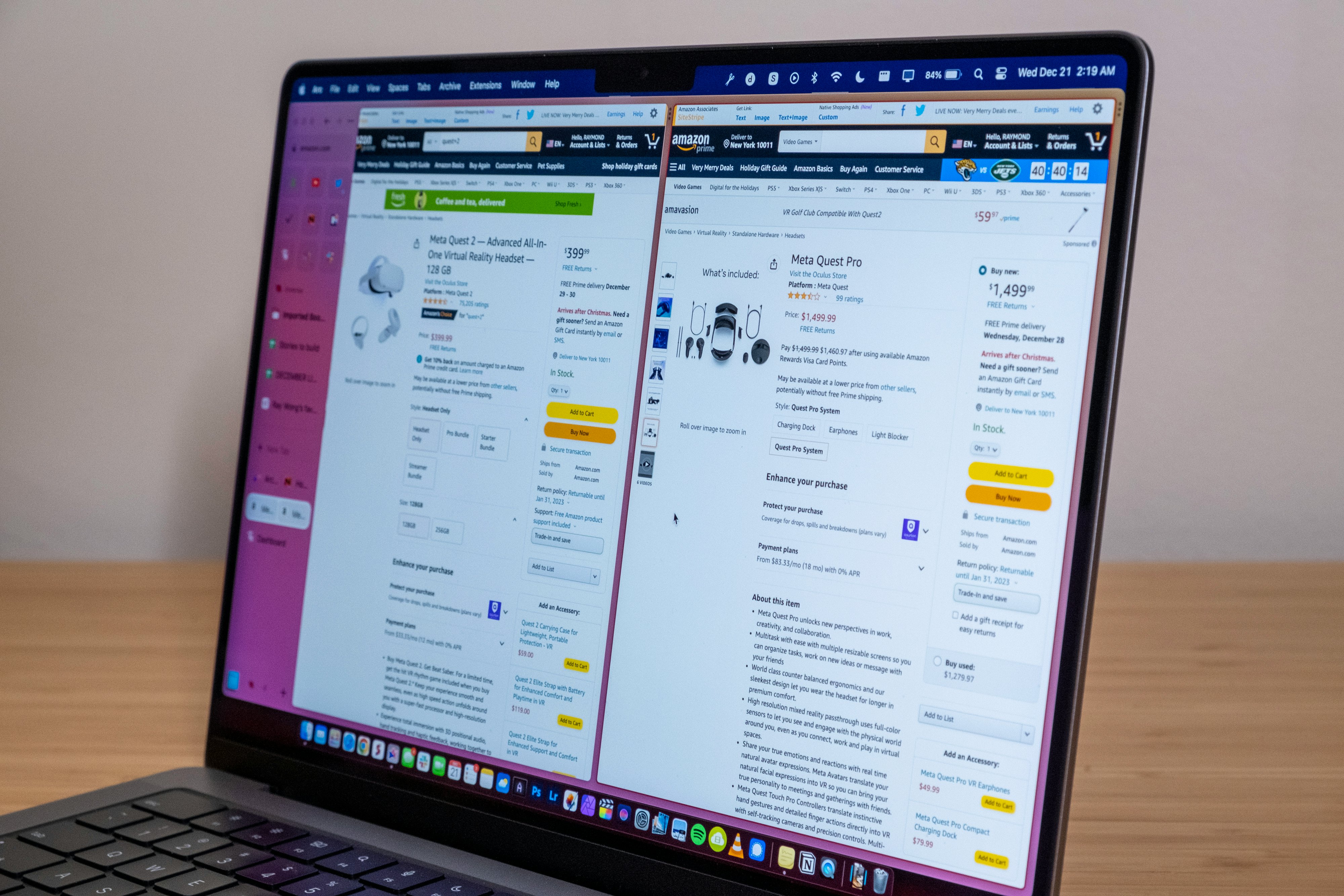
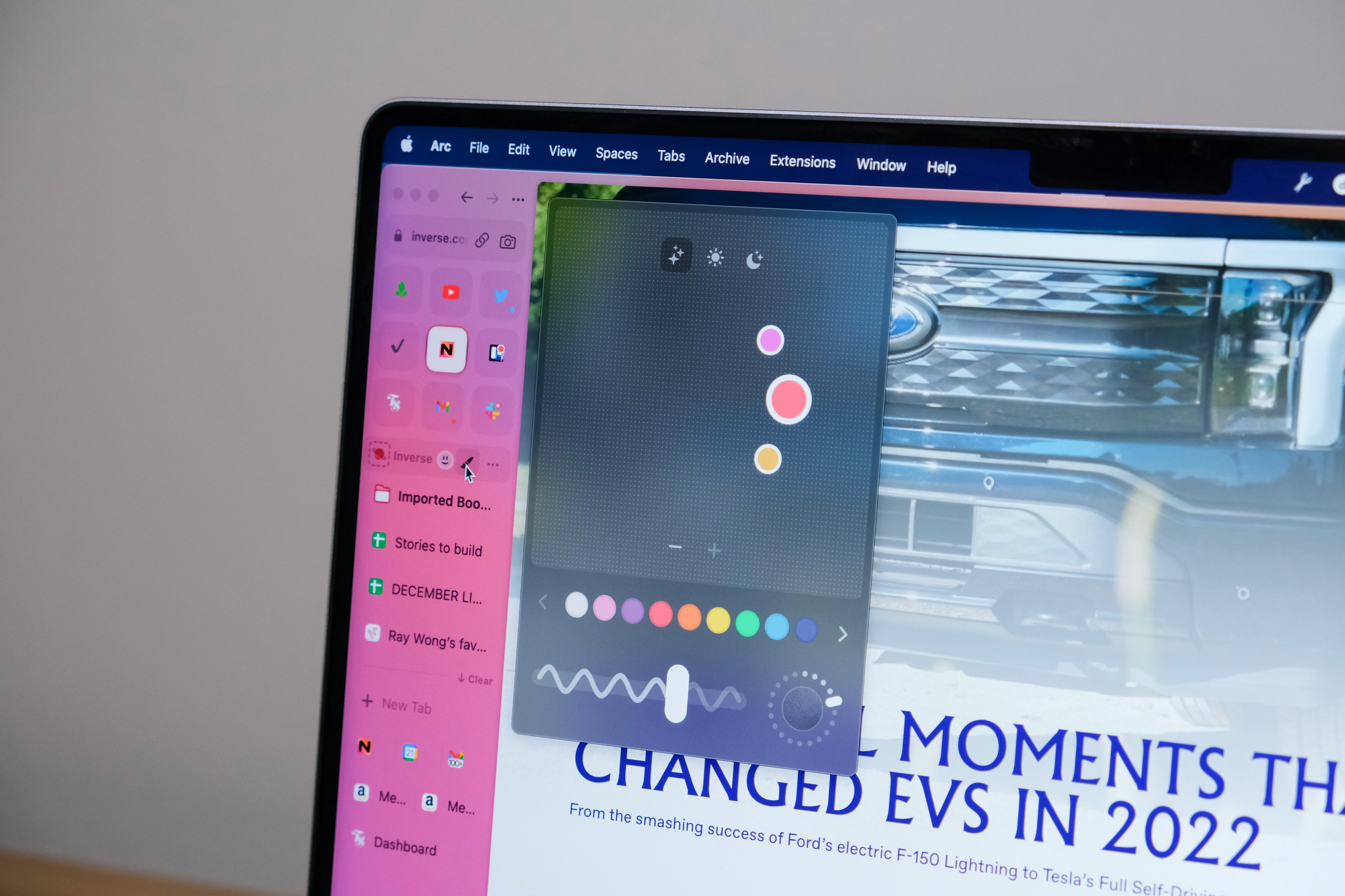
Together with the customizable frame (personalization that is highly encouraged), Arc is the first web browser I've used since Chrome, or even Firefox, that looks and feels uniquely modern. Just like how past macOS (née OS X) UI made use of the Aqua interface (first as liquid-like and then brushed metal form), Arc's frame (or "scrim" if you will) is meant to be visible — unapologetically present and tuned to your personal preference through colored themes and even grainy texture. Arc looks different, playful, and fun.
"We view Arc as much as an artistic expression as we do a utilitarian tool. What I mean by that is a lot of companies, especially browser companies like to think of themselves as, 'We're this invisible frame that should get out of the way and you shouldn't have noticed.' We take the opposite approach. We take Arc as our very subjective, very opinionated perspective on how one might use the internet."
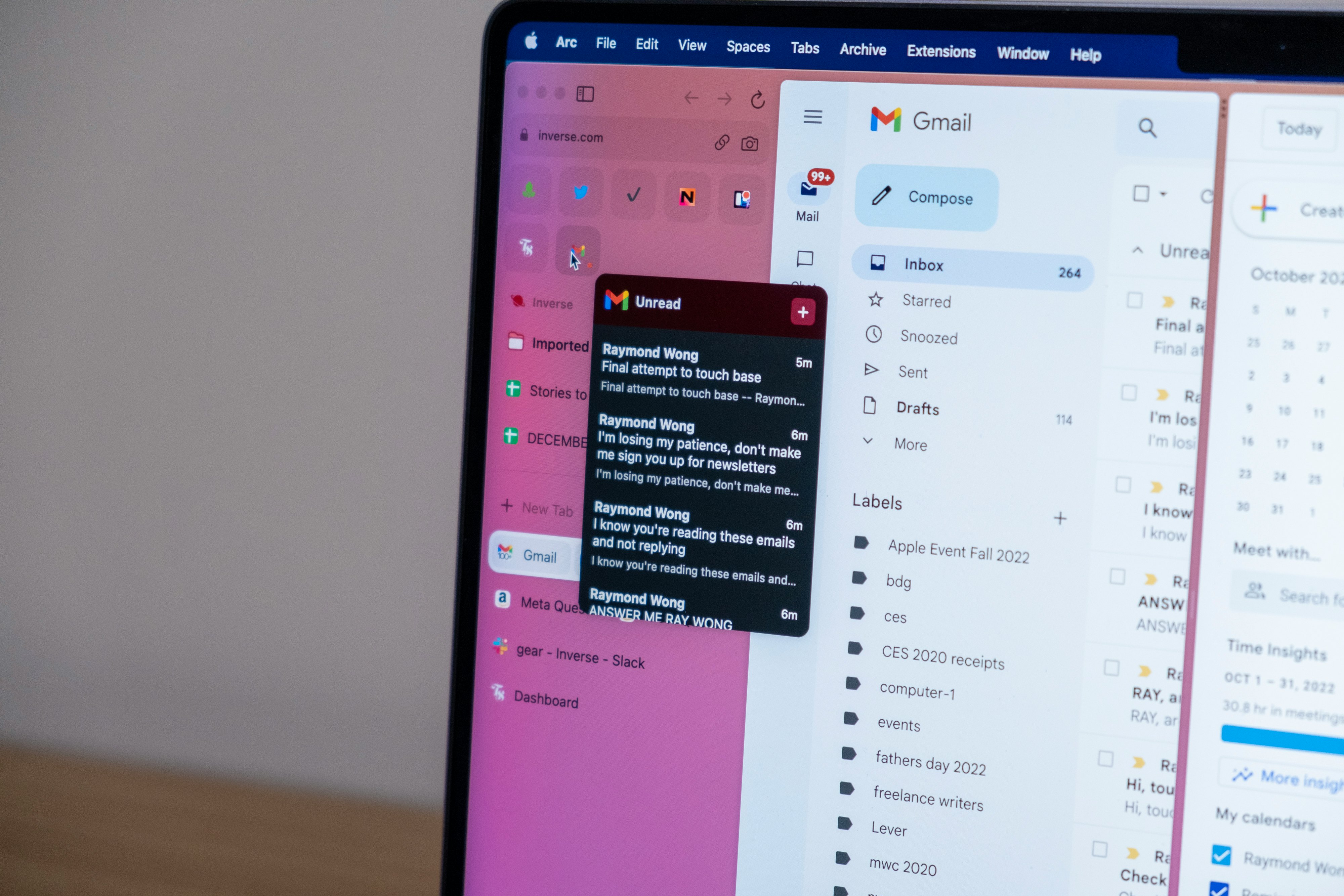
I'm with Miller that it's time for some change in not just how our web browser works, but how it looks. It's clear Miller and his crew have taste — they're using more than a single brush technique and color palette than today’s monotonic software design that many developers derived largely from Apple's products and the rise of mobile.
“I love Apple, and I am so bored by that Apple aesthetic right now.”
"I love Apple, and I am so bored by that Apple aesthetic right now. Not because it's not gorgeous, it is gorgeous, but life is depressing living under one regime of aesthetic," Miller says. "So part of what we're trying to say when we do things like distortion and noise and a little bounce over here is not to say that's better design, but just to say, 'Let's bring some more humanity to [your] day. What does [the user] want? What does [the user] think is nice? Not just like the [macOS] Big Sur background. Big Sur is beautiful, but not for a decade."
Made for humans
I know that sounds stupid. How can Arc be any more for humans than Chrome or Safari or any piece of software that is made for and used by millions of humans every day is for humans? And that's fair. But good design — software or hardware — is when it's so simple and so natural and intuitive, you wonder how it could be anything else. To steal Steve Jobs' favorite line whenever he announced new Apple products: "It just works." Or said another way, it's the opposite of the trainwreck that is Stage Manager on iPadOS 16. Software that's made for humans should not make you think very hard about how to do something.
"We didn't give a sh*t about Chrome," Miller says when I ask him how The Browser Company went about designing Arc. If you're ripping out the walls and flooring, but still keeping the foundation and plumbing (Chromium), where do you start? Focus groups? Surveys? Miller, who was a sociology major in college, says it was none of these. Instead, they took an anthropology-like approach to understanding what people want in a browser.
"Instead of saying we have to put the tab over there — these things called tabs and they go at the top — we said, 'What do people do on the internet all day?' Let's actually do almost like an anthropological study and look at 'Alright, Ray wakes up. Ray has coffee or his tea. He opens his laptop. Then what does Ray do? And then what does Ray do?' Really, just forget nouns, any sort of naming. That's how you see things like Favorites pop up, which should be big, they should be prominent, they should be in a very convenient location. They should look really fucking good. It wasn't some technical, intellectual, philosophical thing about what Chrome got wrong."
“We didn’t give a sh*t about Chrome.”
Miller tells me they hired a diverse team across different fields and disciplines to get a real-world sense of how different people browse the internet. Then they people-watched each other. He says they went around to each other's desks and looked at how people browsed to learn their pain points, and from there figured out how to make ways to do things better. For example, Arc's video player, which automatically plays in picture-in-picture mode when you open another tab, is one of those quality-of-life features that you don't know you need. This feature originated from observing people watching lots of videos, sometimes while they work, and them not wanting their boss to potentially see.
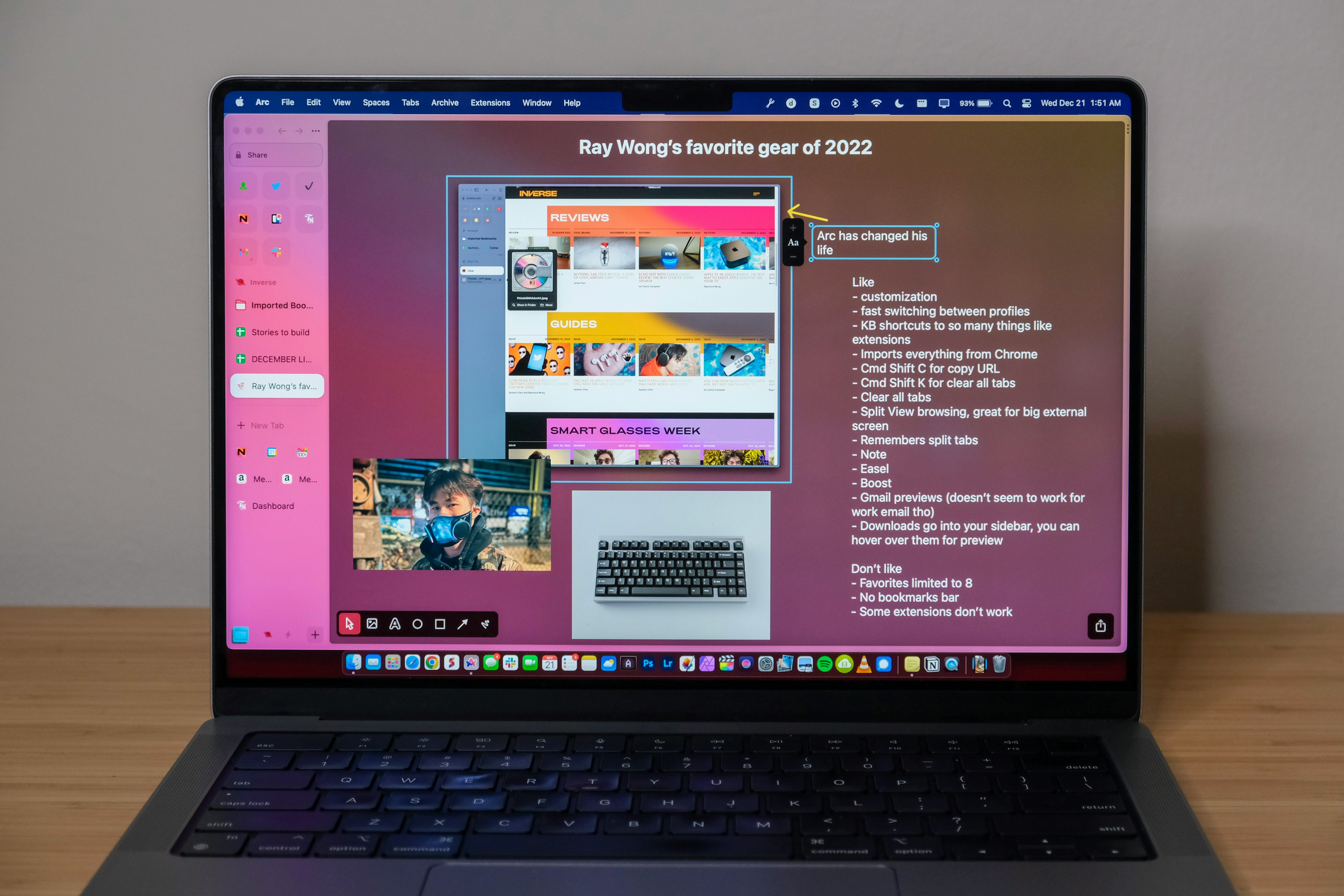
Another feature that I absolutely love is Cmd+Shift+C, a shortcut that copies a URL. Its creation was born from similar frustrations to what I described to him: as an editor, I grab links for backlinking in stories hundreds of times a day, and existing methods are time-consuming and tedious. In Chrome, I have to go to the address bar, do Cmd+A to select all, then Cmd+C to copy the selected URL, then Cmd+V to paste the URL — a three-shortcut process in total. Or I could do Cmd+L (select the URL), then Cmd+C, then Cmd+V — still a three-shortcut process but at least I don't need to move my mouse up to the address bar. It's annoying! In Arc, that 3–4 shortcut process is a three-key shortcut. Or in my case, when mapped to my mechanical keyboard as a shortcut macros, a single press on my right shift key and then Cmd+V. I've been using a mechanical keyboard with Chrome for years, but it's so much better with Arc that I pretty much consider it an essential to be an Arc power user. I even have a key mapped to open a new Split (Control+Shift+=).
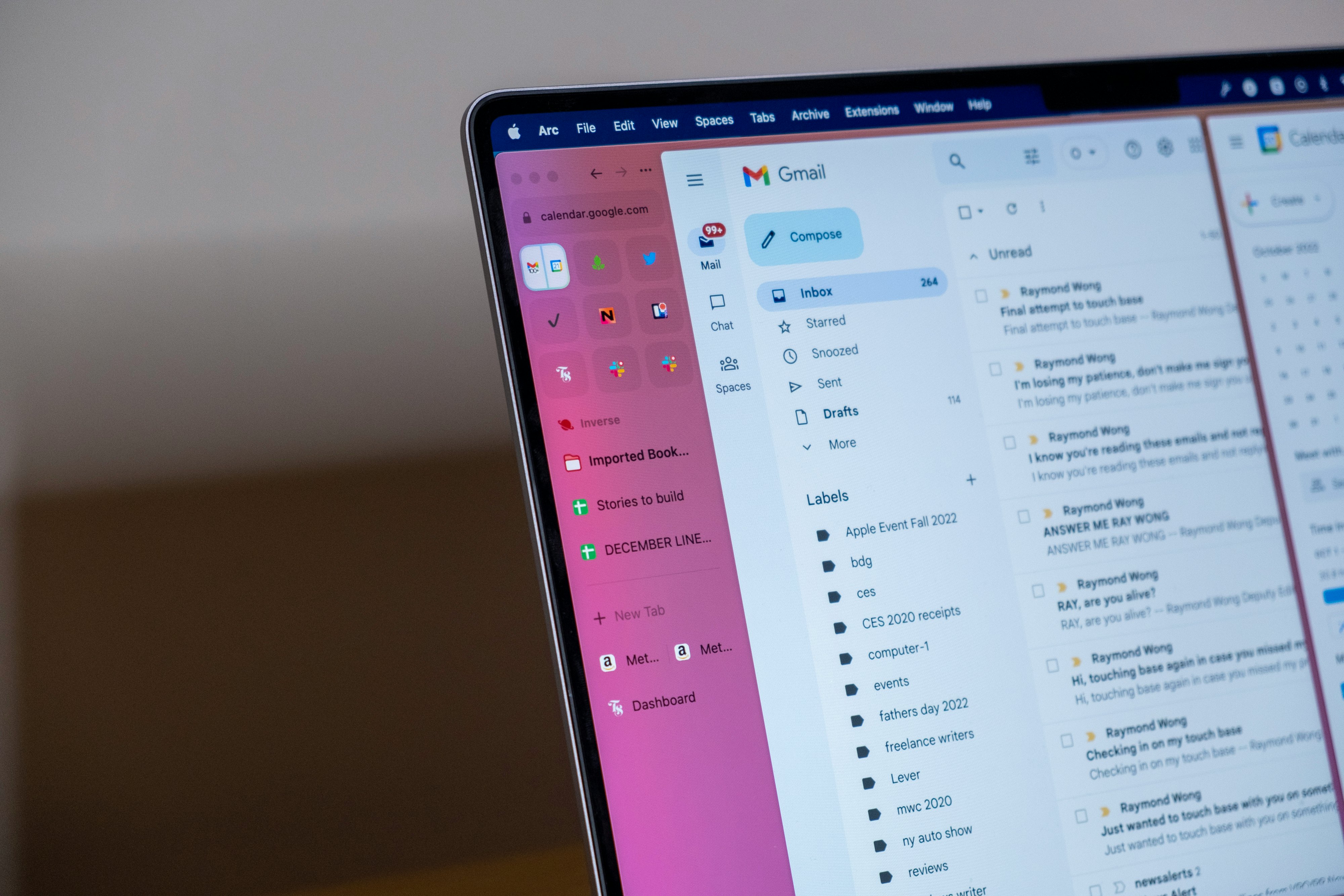
Maybe the most fascinating origin story is how Split view came to be. I wasn't prepared to hear it involved Miller's toddler. His kid, for example, put two blocks together side by side, and to his limited understanding of physics, that's how he joined two things — just mash them together and there's a little bit of force that bounces off. That little force, which Arc design engineer Ben Cunningham tells me in a separate interview, is what's called a digital version of kinematics, the properties of motion in an object. Without knowing it, seeing that small almost-imperceivable bounce when dragging a tab and dropping it to create a Split, assures you that the action you're trying to perform is being done correctly. Plus, it's also extremely satisfying, like watching gelatin jiggle at the slightest poke.
"A lot of people in a role like mine take inspiration from the world of kinematics and springs and magnetism," Cunningham says. "There are all these really powerful primitives in the universe that your brain is well-equipped to understand, we actually have a really deep understanding of how things should move in the real world."
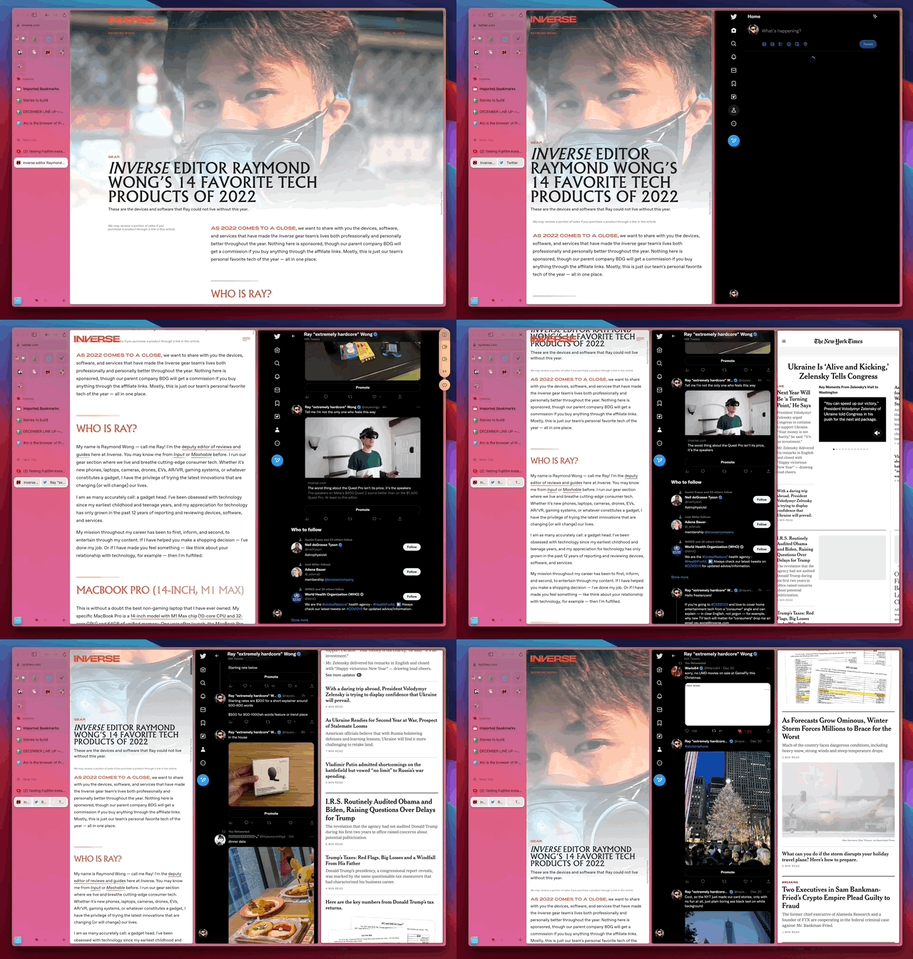
"I know it sounds silly, and to some extent it is — I'll probably be made fun of — one of the things we tried to do is like, okay, [you] need two things side by side. Let's not think how Chrome does this or Microsoft Windows does that," says Miller. "What is just a really human child-type way to figure that out? If you look at Split, There's one thing over here, and then I have this other tab bubble thing over here and I want them next to each other. What if I dragged it next to it? And then, as I'm dragging it to where I want it to go, what if it morphed into this big bubble thing that clearly shows if you let go of it? It's going to turn it into this new thing and put it right next to it.
"Our approach to split screen isn't 'let's go index the market of all the split screen controls and figure it.' It is ‘how would a child think about getting this thing over here next to that thing over there, but also wanting this thing to look like that thing?’ Cool, they're probably going to drag and — bloop — drop it, right? That's how Split came about. That's how [picture-in-picture] came about — thinking about it through that child-like lens."
Right from the setup, when you can feel the haptics on a MacBook trackpad for adjusting the color gradient and adding grain using on-screen squiggles and dials, it's immediately apparent that The Browser Company has invested time into making Arc feel alive. There's music during the setup process, but the kinematics are what make Arc extra satisfying to use.
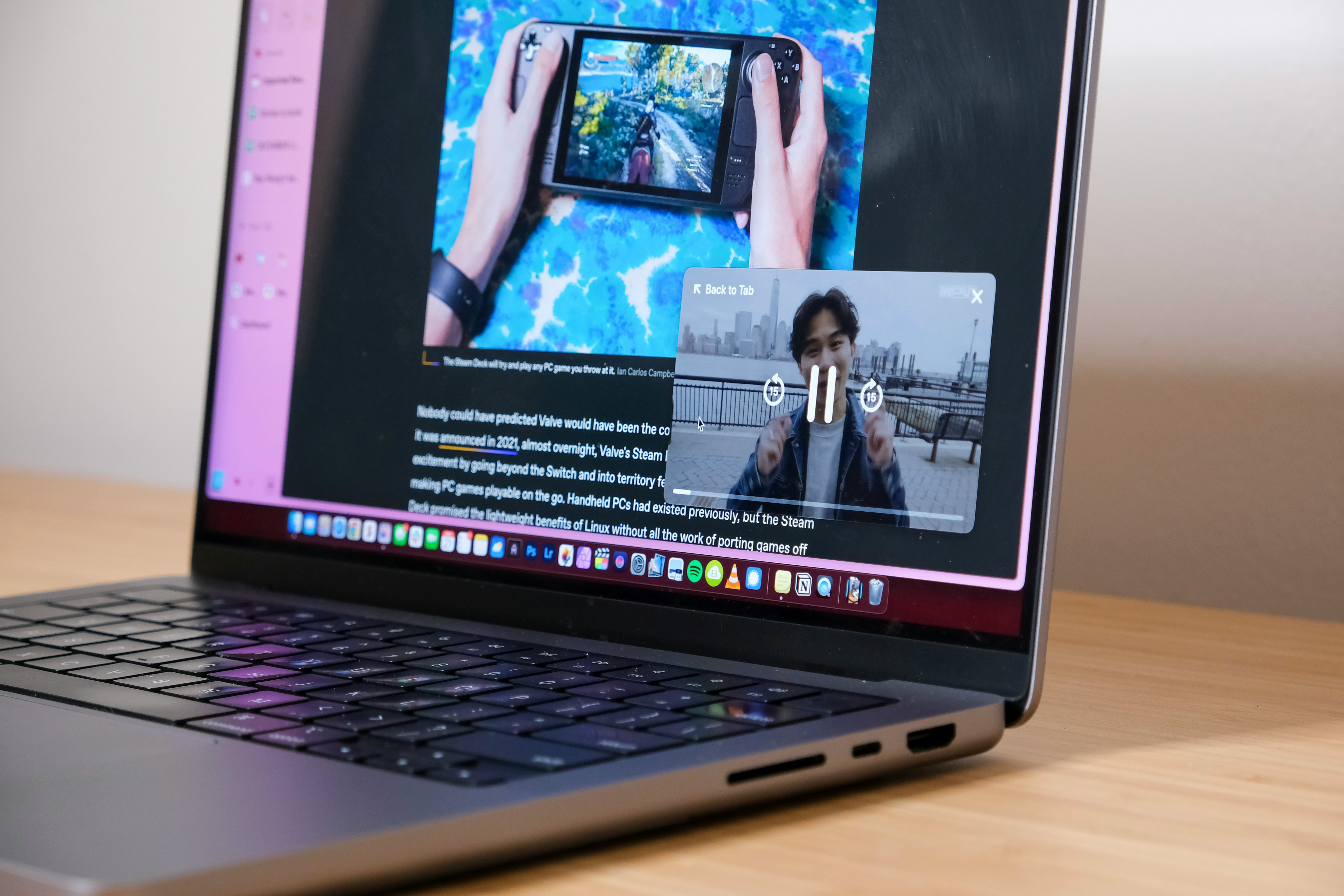
"The new video player is super stripped down, but it has a lot of nice tactile stuff baked in," Cunningham tells me. "The part that I'm most proud of is that we built this video player on top of the supercharged windowing system on macOS."
He's, of course, talking about the picture-in-picture video player that can be zoomed in and out using a pinch-to-zoom gesture on a Mac trackpad as you would on an iPhone or iPad. "When you pinch past its minimum size, it kind of rubberbands a little bit and gives you resistance, and you can fling it to different corners. And there's no click where you have to click this thing and do that. It's just immediately available and accessible to your fingertips."
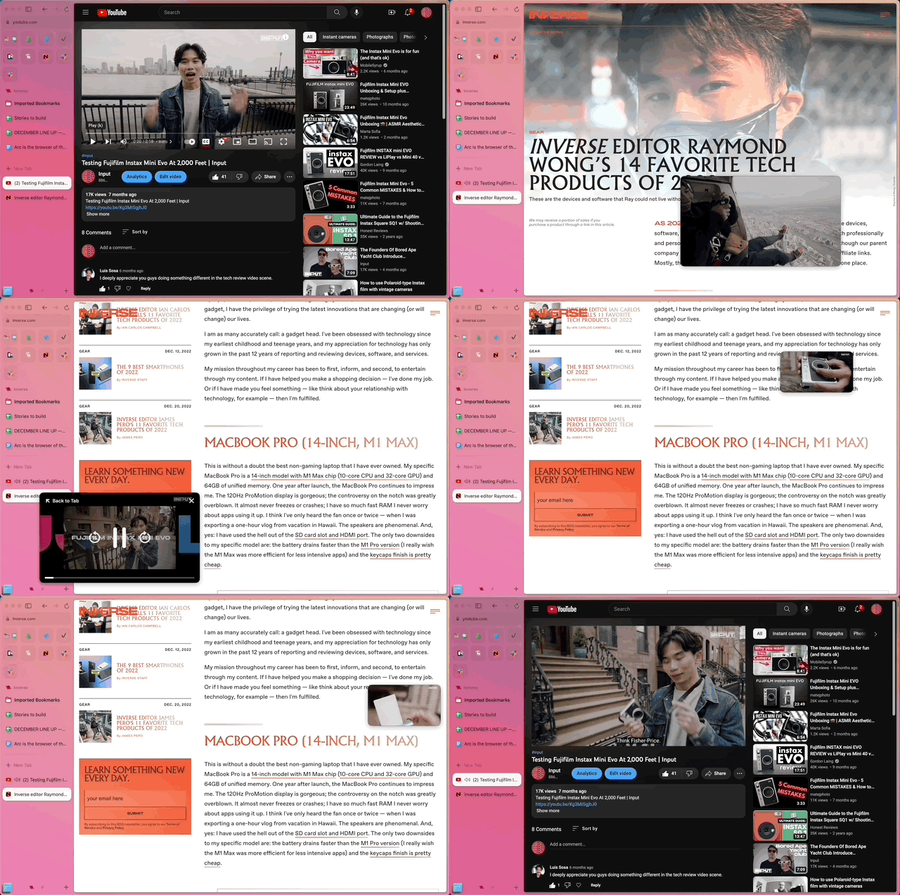
"I spent the most time [in my career] on mobile and that's where the most forward-looking interaction design and interaction hardware has gone. But the Mac still has really great capabilities," says Cunningham. "The trackpad that ships on a modern Mac just dunks [on Windows laptops]. It's beautifully smooth. It's very well-tuned. A lot of macOS windows and interactions still feel very stiff and they haven't risen to the level that people have come to expect and enjoy in the rest of their computing life as on their phone or iPad or whatever."
“A lot of macOS windows and interactions still feel very stiff.”
These tactile details are lost on users who use a mouse instead of a trackpad. (It's also probably one reason why Arc is in development on Mac first since everyone who uses a MacBook has the same responsive trackpad.) But in making these tactile interactions — this "invisible world" that's "hard work" to create and implement — Cunningham's team is giving software, and specifically Arc, an "energizing principle" where you can "feel it." The best analogy I can come up with is comparing this tactile interaction to driving a stick shift on a manual car; you feel one with the machine, or in this case your laptop and Arc.
These "shiny details" are not the easiest to discover, but when you do — like when you're swiping between Spaces (profiles) and you reach the very end there's this springiness to swiping harder to add another Space — you can't help but smile. So many times, with a grin on my face, I nodded with approval at the small joys in the software. Even if for a brief second, Arc — and this is going to sound goofy — felt warm, inviting, friendly. Cunningham says he really hopes users will "feel the humanity coming out of it."
The biggest roadblock is…
There's no bookmarks bar. While I've largely felt the bookmarks bar in Chrome is redundant to pinned tabs, I missed its utility. You can add way more shortcuts in the bookmarks bar, and here at Inverse, there's an essential bookmarklet shortcut that we use to quickly jump into the backend of any on-site article. For me, all of the pros of Arc far outweigh the cons, so I didn't mind losing the bookmarks bar. (It also helps that you can preview pinned folders).
But every person — and I do mean every one of the 15 or so people that I've manically gifted the private beta to — has told me they didn't get past the lack of a bookmarks bar. My evangelism for key features like Split view tabs, swipe-based switching between profiles, downloads that go right into the sidebar for easy finding, and tab renaming were all things they could see value in. But to my surprise, none of them could let go of the bookmarks bar. That was an automatic no-go, and their Arc journey stopped right there before they could even give the rest of it a shot.
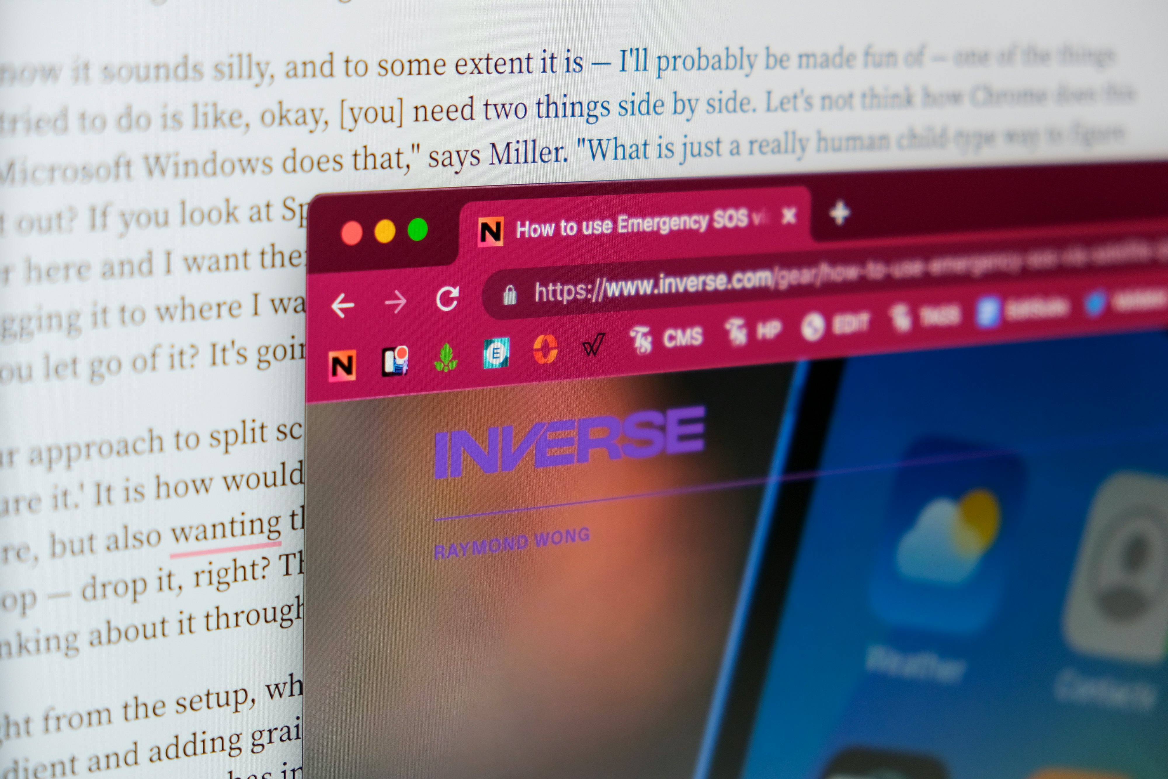
When I brought this up with Miller, he acknowledged that people missed the bar, but Arc doesn't want you to depend on it. The Browser Company thinks the bookmarks bar is an ugly, outdated, clutter of a design where you hoard a bunch of sites that you think you need access to, but probably don't. Obviously, all my friends can't be wrong. So what is the middle ground? Give the option for a bookmarks bar? Is that horizontal or is that integrated vertically — again similar to Vertical Tabs in Edge? Miller is hoping Arc users will stop hoarding bookmarks altogether.
"Everyone asked for bookmarks. You know, the number one thing people hated about their old browser," Miller responds without wavering. "The way that we would approach that is not to think about bookmarks. What are these people saying when they say they want bookmarks? Because we have a huge [sidebar] that is actually easier than bookmarks to save things. You can see the full titles, you can have many more of them, but agreed, everyone says they miss bookmarks."
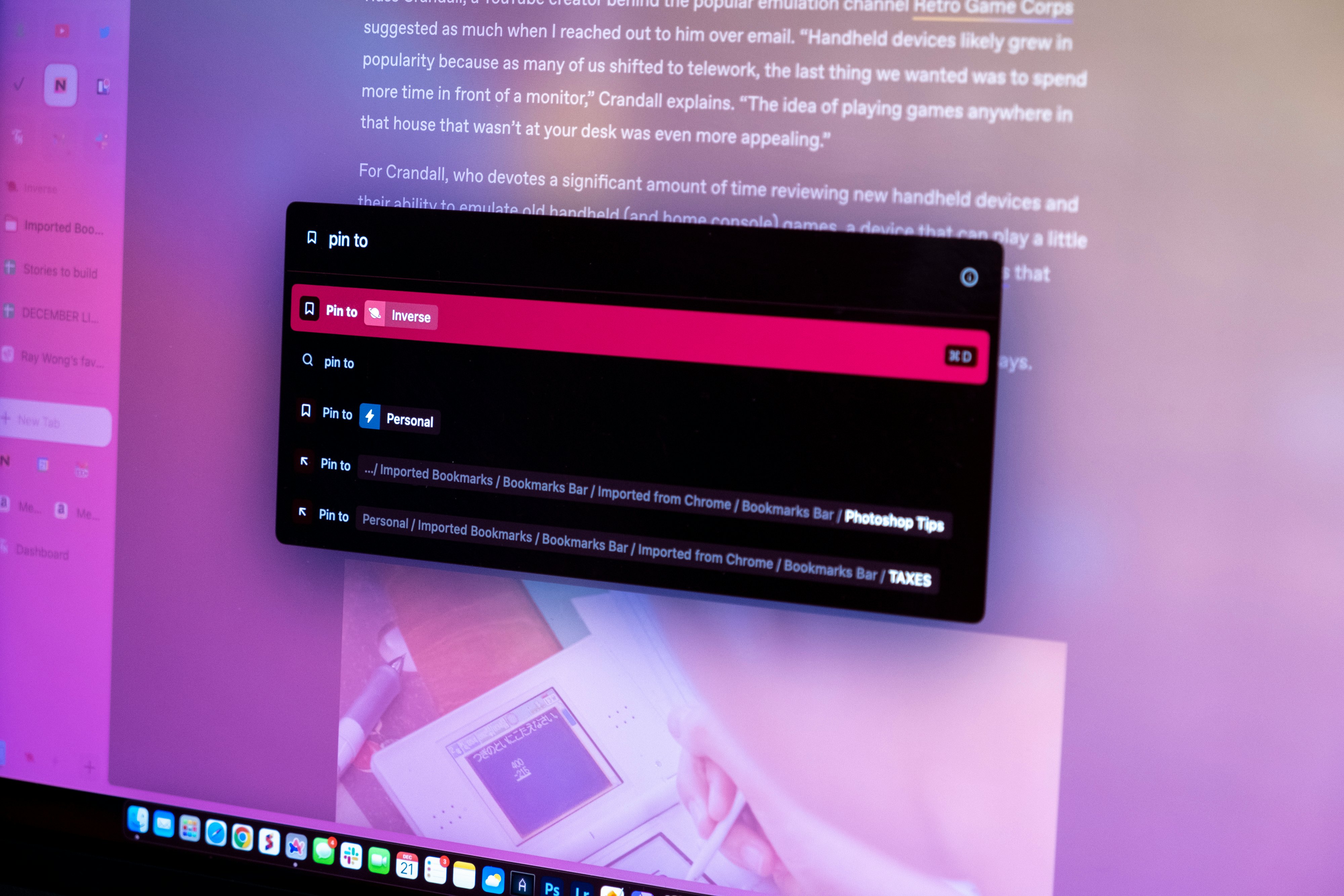
Miller believes the solution will be some kind of intelligent search. Rather than a bar full of favicons or folders nested inside of folders, he says, "Imagine if you could just type 'tax' and [Arc] knows because it can understand what's on the web page, locally, privately under your computer, you're probably talking about this [site] and you didn't even have to add it to anywhere."
The future looks like Arc
The Browser Company is not the first company to make a new web browser aimed at the modern user. Opera, Brave Browser, Sidekick — you name it, and I've used it or tried it out. But what sets Arc apart from those other web browsers is the willingness to start from scratch and not get bogged down by dogma or tradition. Arc's not totally from scratch (Chromium is under the hood, after all), but the front end, and even some of the back end, is not just a Chrome lookalike focused on privacy or with extra security. The Browser Company is rethinking the very definition of a web browser and the front end that users spend their time looking and interacting with. Familiarity can be good, but only because we’ve been conditioned to accept a status quo. That's why artists, designers, and engineers create — to make something better. Someone has to try, and I'm sure as hell glad The Browser Company is doing it, because I’ve never felt joy in seeing a software update for a web browser until I started using Arc. Even the way they share the changelog updates — as notes snippets initialed by staff — is comforting; I feel like I know the people who are making the thing I spend so many hours a day in.
"We think the concept of a general-purpose web browser is outdated. What we're really trying to do is — this will take time — we want to feel like, wow, there's a web browser made for [you] by [you], and then every individual feels like they can morph [their browser] in a very simple way like my son's block set," says Miller. "Because that's what we're bumping up against is when you have billions of people using this single piece of software and then you break down all the different kinds of personality quirks, and ways of organizing, and the only thing we're going to be able to do is be able to eventually hand over the keys of the kingdom."
A modular web browser that you can tweak to your exact liking is the kind of innovation we've seen on smartphone home screens, but not desktop web browsers. "Our challenge will be: how do we let your friend make their dream sidebar? Maybe the whole thing is Favorites. Maybe there's no Favorites. Maybe when you click on tabs they do something different. This is going to take time, but over time, we want it to feel much more like a modular, moldable piece of software that you can get it out of the box — and it'll be our recommendation, our opinion on how you should use it — but if you really want, you can spin a dial or tweak a thing here and there just to make it right for you."
As I mentioned earlier, Arc is still in private beta. You can sign up and get on the waitlist, or if you're lucky, someone who's already installed it can "gift" the download to you. There's a certain level of exclusivity to Arc via this invite program, but that will be opened up next year. The plan is to release a Windows version of Arc in 2023. But before that, an iPhone browser is coming. Miller says to stay tuned for a big announcement about that in January. I'm very curious as to how much differentiation The Browser Company can make with Arc on iPhone given that all iOS browsers (even Chrome) use Apple's WebKit rendering engine. Although that could quickly evolve if a report that Apple is planning to allow third-party engines to comply with the EU's Digital Markets Act is true.
"Mobile is going to drop within the first few months of next year," Miller says. Similar to Arc on desktop, The Browser Company is going to make it a unique experience, likely one that has more intelligent syncing. "If we don't toss out 9 out of 10 ideas for anything — bookmarks, mobile themes — then we're not doing it right. So in that phase, we'll focus on iPhone and then as soon as we nail it, then we'll do Android right away."
“If we don’t toss out 9 out of 10 ideas for anything — bookmarks, mobile themes — then we’re not doing it right.”
Mobile versions of Arc won't mean the desktop apps get neglected. In the same Twitter video, Miller said they're going to simplify the browser further. "We're gonna sculpt it down. We're gonna refine it," Miller says. "Scott Forstall [former head of Apple software design before Tim Cook fired him for the disastrous Apple Maps rollout] gave us some really great feedback. You've built a saxophone; musicians love saxophones, but they are really difficult to master, really difficult to figure out. You gotta make Arc into a grand piano now. How can you just walk up to it — no one needs to know how the white and black keys work — you just start poking around and you can end up like Mozart one day."
Additionally, Miller says there are big plans to "put people at the center of the internet.”
"If you look at software over the last decade, when you add people to it, it makes things better,” he says. “Why is the browser the only single-player piece of software left? How do we make Arc the best place for working on side projects with other people, collaborating with colleagues, doing stuff with friends?" Doubling down on Boosts and Arc as a development platform for third parties to plug in (i.e. with Previews) will also be an investment area.
On top of it all, The Browser Company is continuing to add talent to build out Arc. In November, Darin Fisher — who has worked on Netscape, Firefox, and Chrome — joined the company's growing ranks as a software engineer. It's a huge get. And without naming specific names, Miller tells me a former engineer who worked on Paper by FiftyThree, an award-winning iPad sketch/journal/notebook app from back in the tablet's early days, will be joining "soon." Similarly, a design engineer from Apple who worked on iOS's springboard animation framework (aka, the layer that controls the home screen) will be joining as well. These two hires should tell you all you need to know about how important human computer interface design and interaction are to the company's products.
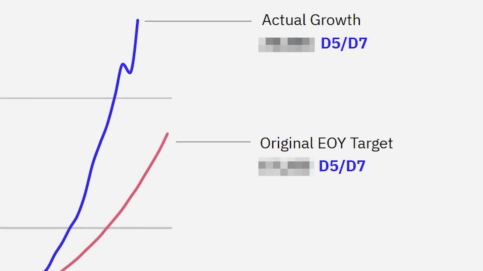
All of this is just the beginning, with growth trending in a hockey stick curve.
"The number of people using Arc every day has been growing daily, 12 percent a week for many, many, many months," Miller says. "If you plot 12 percent growth weekly on tens of thousands of people, the exponential growth curve looks really fun right now, which is pretty wild. We're thrilled about it."
And with investors from the founders of "Instagram, Stripe, Shopify, LinkedIn, Twitter, Zoom, Figma, Notion, Airtable, and so on" according to Miller, The Browser Company has the right advisory board to help it navigate into the future.
Despite humble intentions that supposedly aren't grounded in desires to slay Chrome, Arc could end up carving itself a sizable chunk of the web browsing market. Maybe not immediately, or overnight, but just like nobody saw Firefox or Chrome coming, Arc is starting to make a lot of noise. It got my attention, and even though I've only spent a month using the web browser, it's already my most-used app by a wide margin.
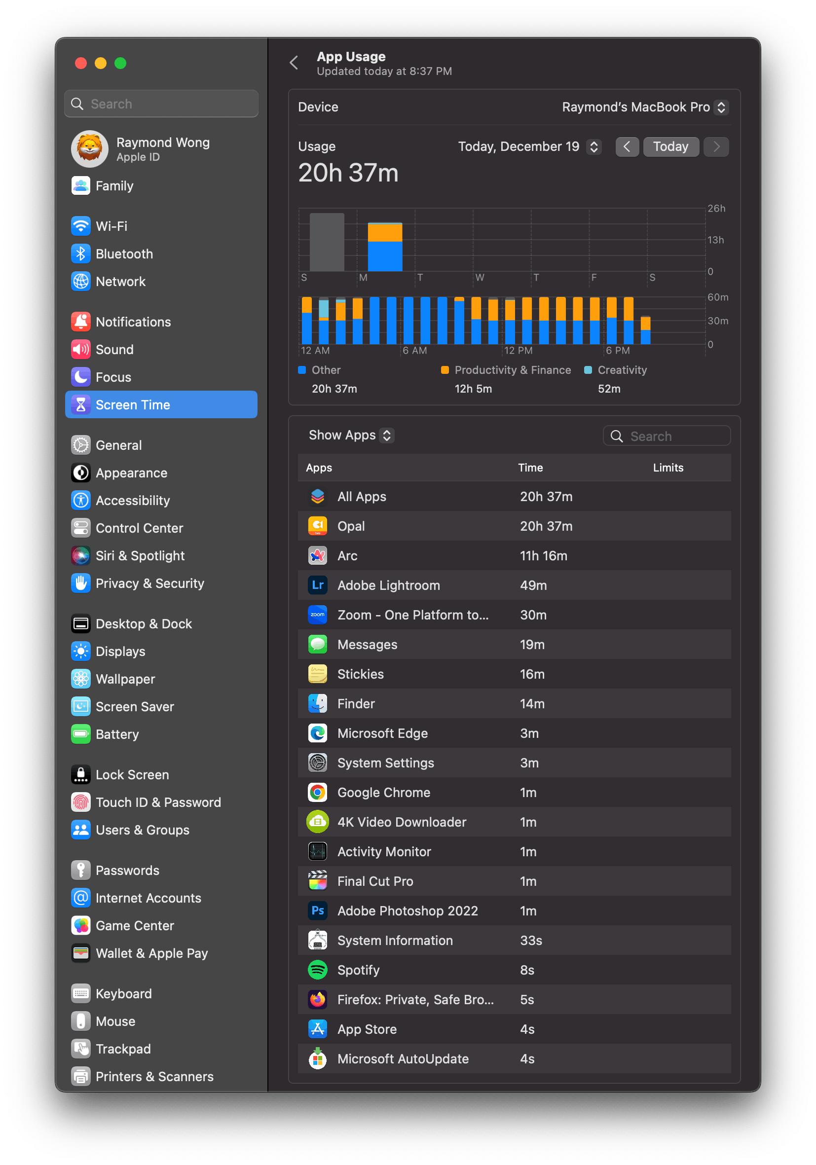
I want to do more inside of Arc — for example, Favorites is limited to eight but will support 12 soon — if only to have fewer apps open and windows to manage in macOS. It takes a great deal of effort to convince anyone, let alone stubborn me, to switch web browsers, but Arc did it. Arc is the best web browser of the year — nay decade — and it's not even out of private beta yet.
INVERSE celebrates the best of the best in entertainment, gaming, science, and technology of 2022. Go to the INVERSE Awards hub.


