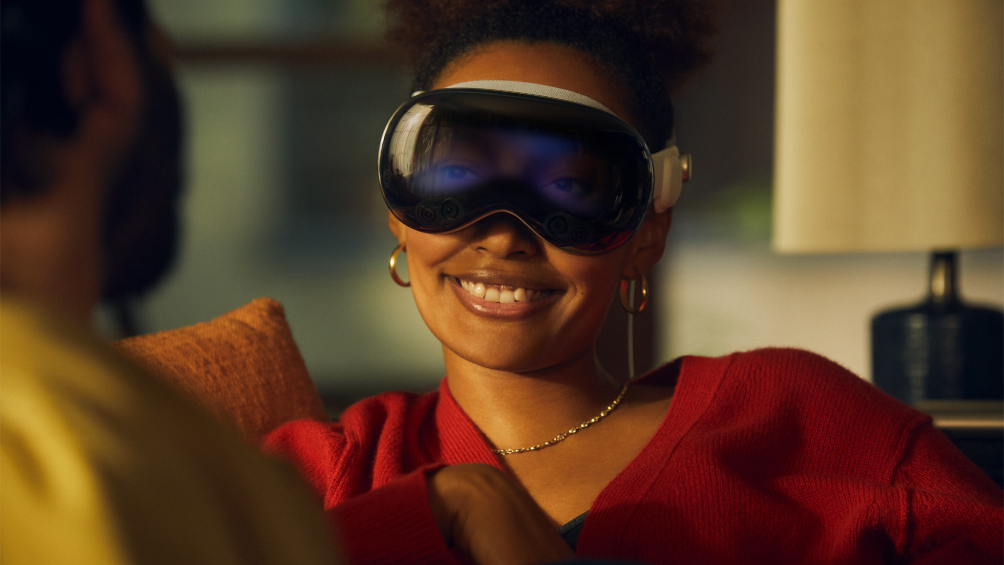
Ahead of Apple Vision Pro’s launch on February 2, the very first wave of hands-on reviews and impressions of Apple’s spatial computing headset is here, and one of Apple’s riskiest features has not come off well.
Apple Vision Pro reviews that went live this week cover a range of different aspects of Apple’s revolutionary new product, such as the comfort of the device, the setup process, and the levels of immersion provided by environments and passthrough viewing.
While most of the impressions of the headset have been generally positive, one feature did not make a good impression on reviewers and has sent the internet into a tailspin mocking it. I am, of course, talking about EyeSight.
Eyesight or eyesore?
Vision Pro’s EyeSight feature is described by Apple as “an extraordinary innovation that helps users stay connected with those around them.” Vision Pro has a front-facing display that shows the user’s eyes on the outside of the device when approached by someone else nearby. When first announced, the feature raised eyebrows, with some even suggesting that rumors of the feature ahead of its unveiling were “an internal joke that had been taken as real.”
“The most surprising takeaway from all the Vision Pro reviews/videos is how universally awful the EyeSight display is,” Snazzy Labs said on X. “Until today, I expected it to be super important to the “I’m still in the real world” experience. Now, I’m 95% sure it’ll be canned by the 2nd gen.” While some dissenting replies disagreed, the general consensus seems to be that the first iteration of Eyesight on Vision Pro is a bit of a letdown, to put it mildly.
“The EyeSight display looks really, really bad,” one commenter stated, yet another added, “I really thought it was gonna be really cool... Never thought Apple would release something like this... Might as well have left it out…”
The EyeSight display looks really, really bad 🫠 pic.twitter.com/l1TxYJux7PJanuary 30, 2024
The Verge’s Nilay Patel described the EyeSight display as “a low-res, ghostly image,” contrasting the real-world experience to Apple’s press photos, which made it look “like a big, bright screen that shows a video of your eyes.” Patel says the feature “might as well not be there” and says that the display is very difficult to see in “most normal to bright lighting,” adding that “the idea that you’ll be making real eye contact with anyone is a fantasy.” In his accompanying video, Patel says the eyes themselves are “pretty creepy and offputting” and that he’s not sure the feature works like Apple wants it to.
Apple Vision Pro EyeSight in reality 👀via @verge pic.twitter.com/2R1ApY2fD5January 30, 2024
There’s sure to be more EyeSight discourse when the headset is launched on February 2, but as it stands, it sounds like Apple might have dropped the ball with this one. Mercifully, it sounds like the hardware is less of an issue than the software rendering of the eyes, such that Apple could patch and improve it through a visionOS upgrade. We’ve reached out to the company for comment.


