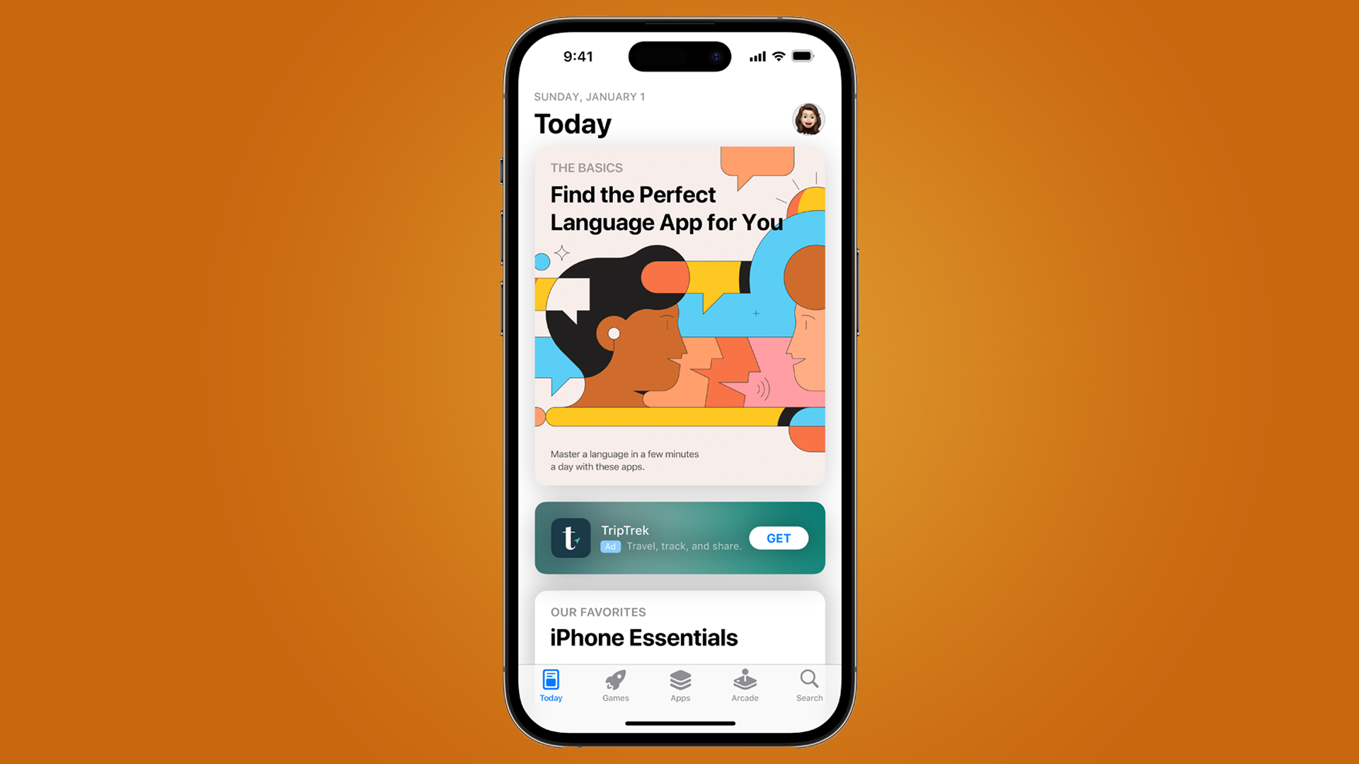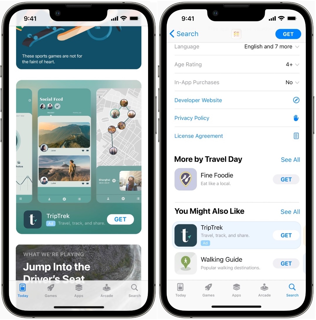
Ads in the Today tab on the App Store for your iPhone will finally be getting a redesign to make them more approachable and less of an eyesore when reading through the tab's curated content.
On a new post on its Apple Search Ads site, Apple shows the ad will instead just have an icon, the title, and a brief description in a rounded green box to better tell you that it's an ad.
Since the Apple Store was first announced in 2008, there were no ads to be found as you browsed it until ads were announced in May 2021 as Search Tab Campaigns, and it was a surprise to many, as there was an unwritten understanding that there would be no ads whatsoever.
But times change, and Apple has seemingly decided that ads make sense in the App Store - but this update seems to finally improve how ads look after two years.
Not great, but not terrible either

Ads in the App Store have been a sore point for developers and some users - mainly because there have been glitches where gambling ads would appear when searching for therapy apps.
It was a highly bizarre misstep for a company that has made billions in profits from its many products over the years, and while Apple clearly rolled back some changes here, it still thinks that some ads can work in the App Store.
This new format will run on iPhone devices using iOS 16.4 and later, so anyone updating to iOS 17 will be able to see these changes once they launch later this year. It also helps that if you've already created an ad campaign with the previous design, it will be moved over to this updated one in July, so you won't need to do any extra work.
It's a small improvement to an awkward topic of ads in the App Store, but any positive here is good for everyone, regardless.


