In the world of interior design trends, the pendulum has swung wildly between minimalism and maximalism, and it has seemed that 'style' requires fitting neatly into one of these boxes. For 2025, designers are predicting a merging of the two extremes. Meet midimalism.
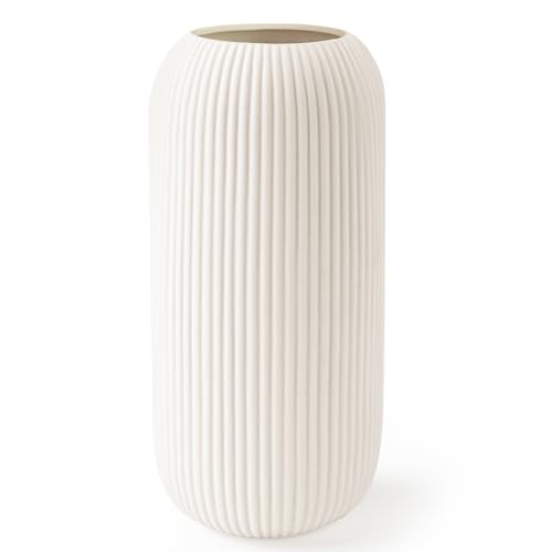
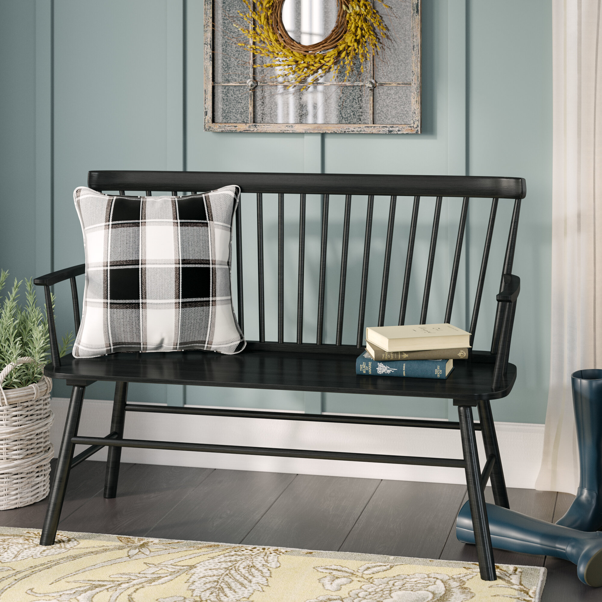
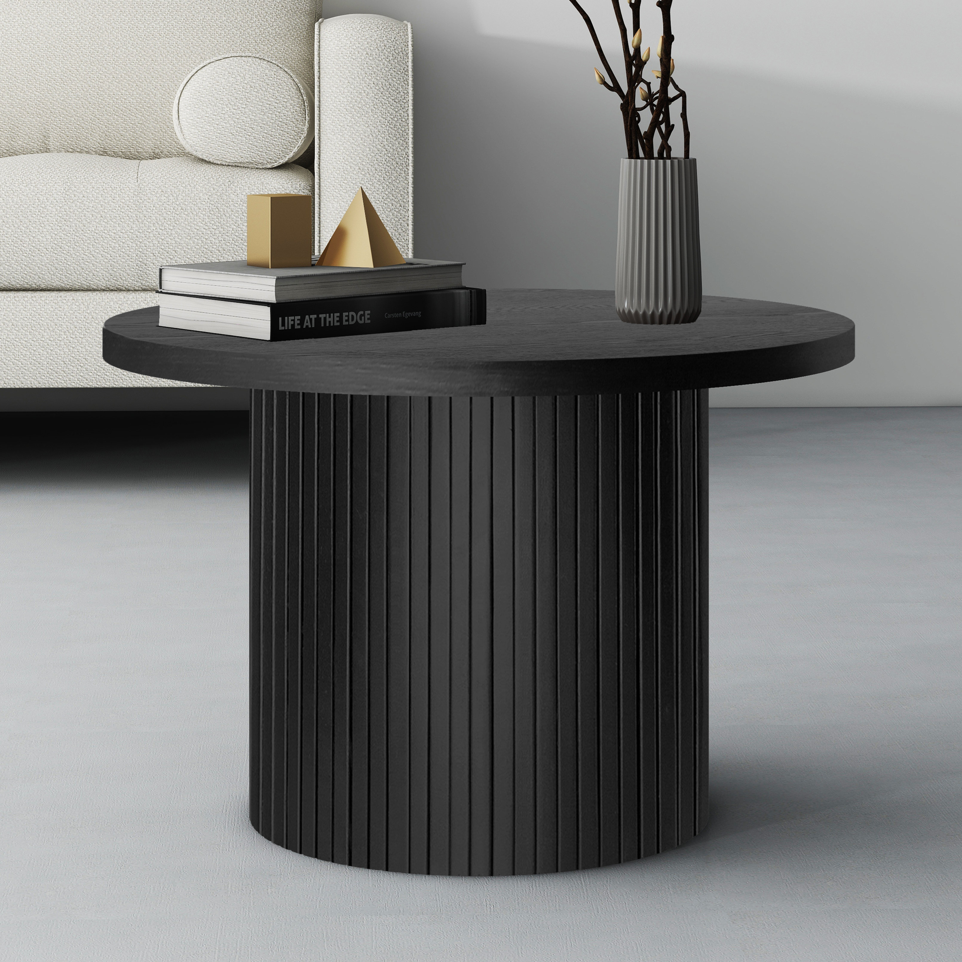
No space better embodies this balanced trend than Anne Hathway's entryway. The actress uses an innovative, minimalist layout to counterbalance the lively color scheme and patterned flooring of her foyer. Hathaway's interior designer, the acclaimed Studio Shamshiri, arranges a spare bench on the left side of the room, with a small rounded coffee table perched in front. A white, matte vase sits on the right side of the room. Gold and black statement lighting hangs down in front of the door, centering the space.
The layout is minimalist, but intentional, combining artfully with the bolder patterns and colors in the room for a midimalist sensibility. 'The midimalism trend is all about balance,' says Chelsea Clark, interior desgin expert at Henderson Design Group. She states: 'Borrowing sleek lines and uncluttered spaces from minimalism, it then adds bold colors and patterns in thoughtful doses. The trend offers flexibility for those looking to introduce personality without overwhelming a room.'
Though the trend looks stunning in any space, a midimalist layout is especially stylish in as an entryway idea. Westchester-based interior designer Nina Lichtenstein tells H&G: 'An entryway is more than just a transitional space; it is the initial impression your home makes on guests. A well-staged entryway sets the tone for the entire house, reflecting your style and offering a warm welcome.' Anne Hathaway's space makes us feel immediately invited in.
As seen in Hathaway's home, the right entryway furniture is the best place to start with creating your own midimalist foyer. Lichtenstein recommends beginning with seating. She states: 'A bench or a pair of chairs add practicality and comfort to an entryway, as well as storage underneath. They provide a place to sit while putting on or taking off shoes, making the area more user-friendly. Live edge wood or upholstered seating can introduce texture and color, enhancing the visual appeal.'
Avoid a common entryway layout mistake by mixing up shapes and integrating a circular table, like the one seen in Hathaway's space. Lichtenstein suggests: 'A console table offers both style and functionality. It provides a surface for decorative elements like vases, lamps, and trays while offering storage for keys, mail, and other essentials. Choose a table with a design that fits your space—sleek and minimalist for modern homes or rustic and ornate for traditional ones.'
Beyond furniture, entryway color is an important consideration when recreating Hathaway's midimalist foyer. 'A neutral base is key to midimalism, offering a blank canvas to experiment with bold accents,' advises Clark. She continues, 'Use neutral tones on walls and floors, then introduce vibrant upholstery. This creates an anchor for the overall look of the room whilst still allowing you to play with statement pieces.'
Shop the Edit

This modern, matte vase is similar to the one in Anne Hathaway's entryway, with additional fluted detail for added visual interest

This simple black bench looks like the one adding a touch of minimalism to Hathaway's foyer

This Way Day Deal makes this stylishly patterned pedestal coffee table even chicer
Pattern is also an essential element of what makes this design style special, but it can be tricky to nail. There are many ideas on how to get it right, and Anne Hathway's striped walls are just one. Clark suggests, 'Midimalism celebrates pattern, but in a way that doesn’t overpower the space. Small-scale patterned wallpaper, particularly in subtle prints, add interest while maintaining an airy and spacious feel.'
No matter your design style, a versatile take on midimalism will make it more interesting.


