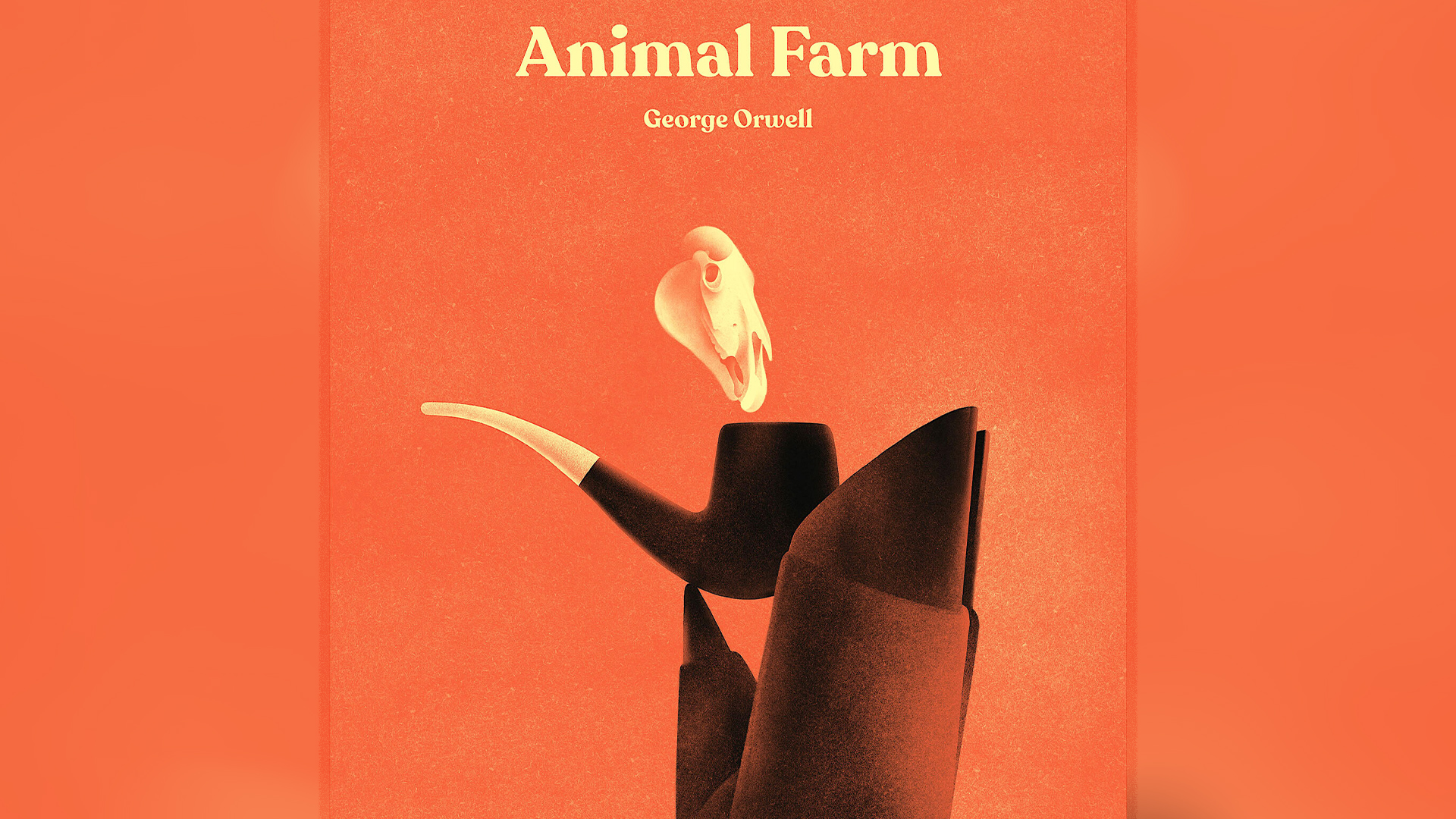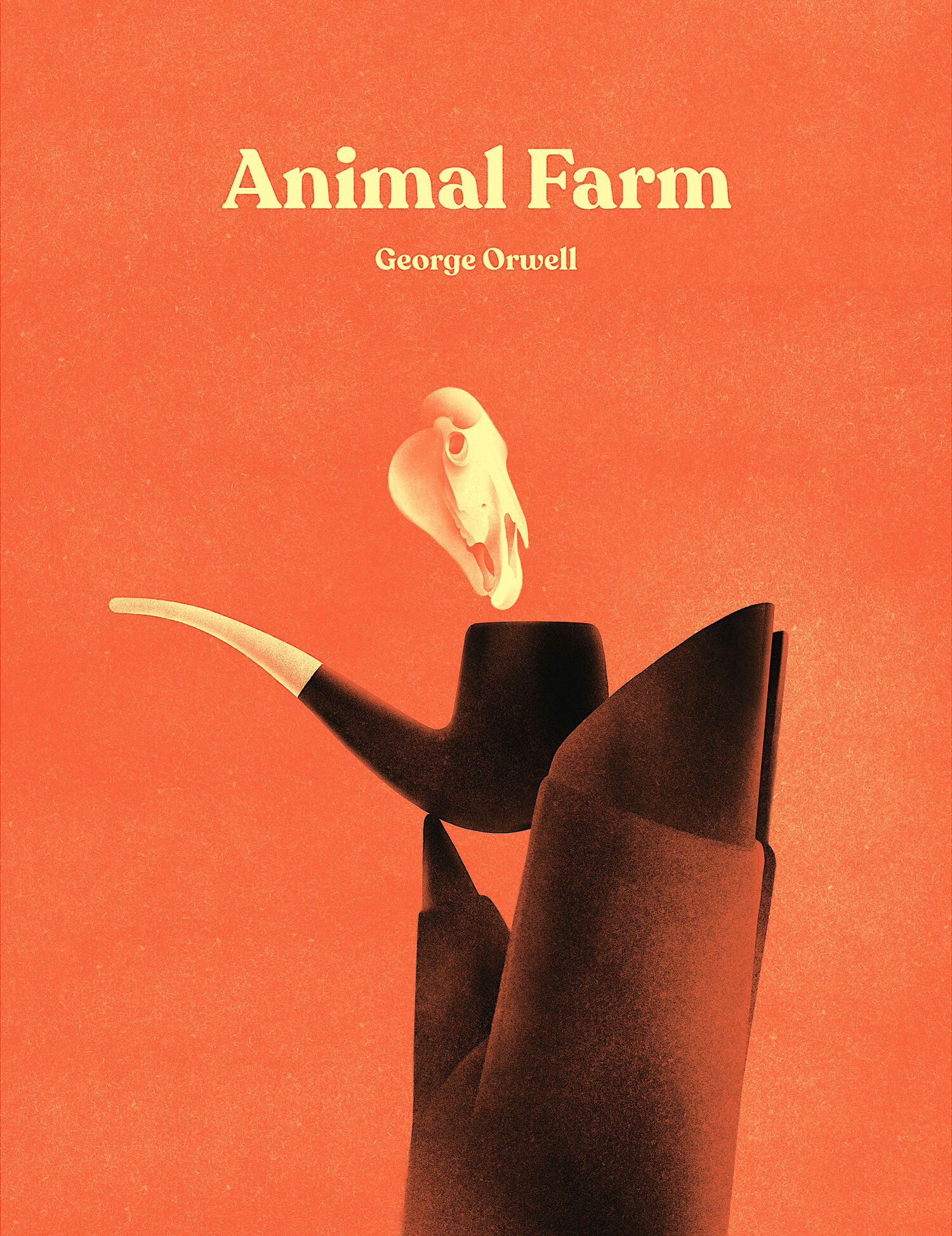
I'll admit that I'm a bit of a book snob – I definitely judge a book by its cover – so when I saw this ingenious edition of Animal Farm I was instantly in love. George Orwell's 1945 classic haunts the mind of many a literature student (including mine) and has seen an array of different covers across the years, but this simple design is arguably an instant classic.
While it's easy to get caught up in design trends, this simple book cover is a prime example of the less-is-more approach. With sleek imagery, clean typography and an ingenious hidden detail, it combines style and function to create a timeless look that's appealing to old and new readers alike.

Created by illustrator Karolis Strautniekas, the stunning design extracts key elements of the classic tale, expertly transforming them into visual storytelling features. The offbeat imagery of the pig's trotter balancing a pipe speaks to familiar readers while garnering intrigue for fresh eyes. A closer examination reveals that the puff of smoke resembles an animal skull. The cleverly hidden imagery is a foreboding symbol that promises mystery, threat and death for those who dare to read.
If you're a fan of the design you can buy the official print here. For more stunning design, check out the new band logo book that explores the history of music and design. If you're after more classic cover designs, take a look at the unsettling (yet brilliant) Lolita book cover that went viral on Reddit.


