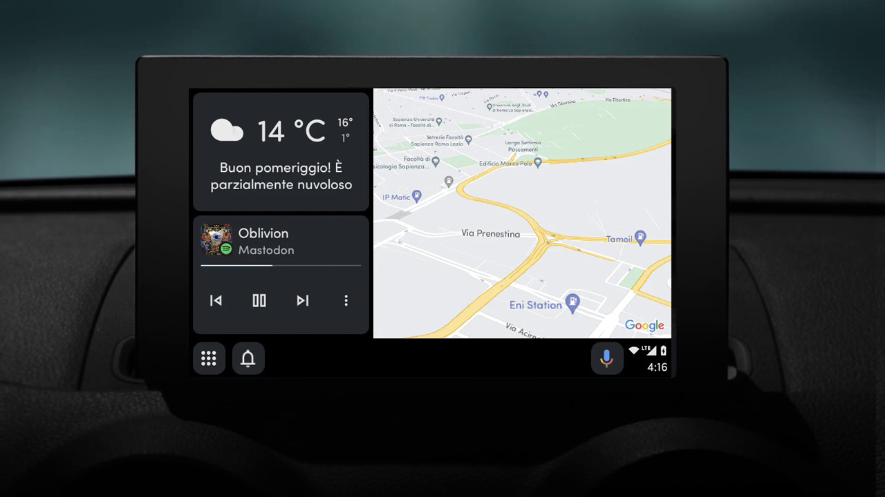
A change to Android Auto could move Google Assistant's waiting interface off the bottom of the screen.
It's yet not clear how wide the rollout is or who will get this new interaction.
If you own an Android phone then there's a good chance that when you get into your car, Android Auto instantly fires up.
If so, you'll also know that Android Auto isn't known for getting regular updates. In fact, it's been pretty slow to evolve over the past few years – but there is one software upgrade coming that might remind you of something from Apple CarPlay.
One of the advantages of Android Auto is that it uses Google Assistant to respond to voice commands. That allows you to control Android Auto, as well as ask all the questions that Assistant is good at answering. Often, this means that Google Assistant will replace (or be available alongside) the stock voice assistant in your car.
A new user interface has appeared for some Google Assistant interactions on Android Auto (as spotted by 9to5Google). When you talk to Google Assistant, the familiar four-coloured line appears on the display, but it's here that the change seems to be coming.
While the coloured line appears when you first talk to Google Assistant, there's now a round animation at the bottom of the screen for continued conversation – and this looks a lot like what appears when you're using Siri on Apple CarPlay. It appears when Google Assistant is waiting for a response from you.
It's not clear if this is just a UI change or part of something bigger. It looks like the new interface is part of Android Auto v12.5 – I tried it on a couple of devices but it wasn't there, even on one with Android Auto v12.5 – so it's not clear who will get it and when.
What does the Android Auto change do?
The change in the user interface looks to lift Google Assistant's "waiting" notification off the bottom of the display.
Under the current/old setup, if Assistant is waiting for a response from you, the bottom bar is occupied. That means you can't tap on the icons that reside there normally, such as the apps menu or the shortcuts.
If could be that the change in UI is to open this area up and have it less dominated by Google Assistant. If you don't get the response that you want, but Google is waiting for you to say something, then that would lead to a situation where you can't immediately hit the button you want.
There remains the question of whether Gemini will move into Android Auto and take over too.
Google seems to be in a bit of a muddle, with Gemini on some devices and Google Assistant on others. Gemini can do things that Google Assistant can't, but at the same time, Gemini lacks some of the basic app-access functions at Google Assistant has offered for years.
We'll have to wait to see what the company plans to do with Android Auto in future, and if it will finally shake-up the experience.


