Get all your news in one place.
100's of premium titles.
One app.
Start reading
PC Gamer
PC Gamer
Elie Gould

'An absolute eyesore': Marathon's biggest issue seems to be its poor UI design that's confusing players, 'I have no idea where I'm at, what I'm looking at'

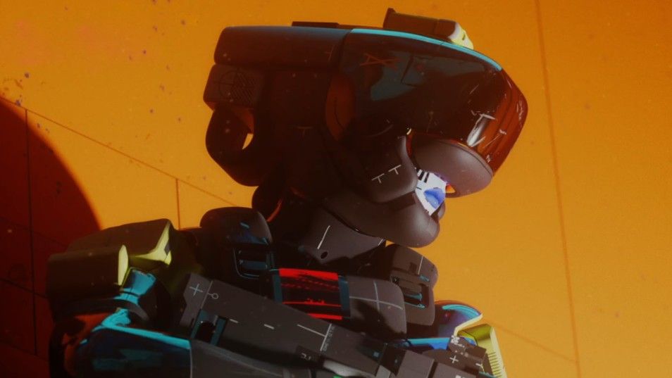
Screenshot from Bungie's Marathon reboot. Do not use until 12 April 2025, 11 PDT.

The time is finally upon us, Marathon's server slam has begun as players now get to see what's on offer over the course of the weekend. And while initial reactions seem to be pretty positive, if not quite bloody, there is one thing that people just can't seem to get over: the UI.

"Marathon gotta be the first ever fontslop game," streamer Kelski says. "There's like 20 different combinations of fonts, boldness levels, sizes, spacing, all caps vs regular caps, all on one menu page. Just an absolute eyesore. They really need to pull back on the whole 'abstract' thing for the UI'."
Sign up to read this article
Read news from 100's of titles, curated specifically for you.
Already a member? Sign in here
Related Stories
Top stories on inkl right now
One subscription that gives you access to news from hundreds of sites
Already a member? Sign in here
Our Picks
Fourteen days free
Download the app
One app. One membership.
100+ trusted global sources.