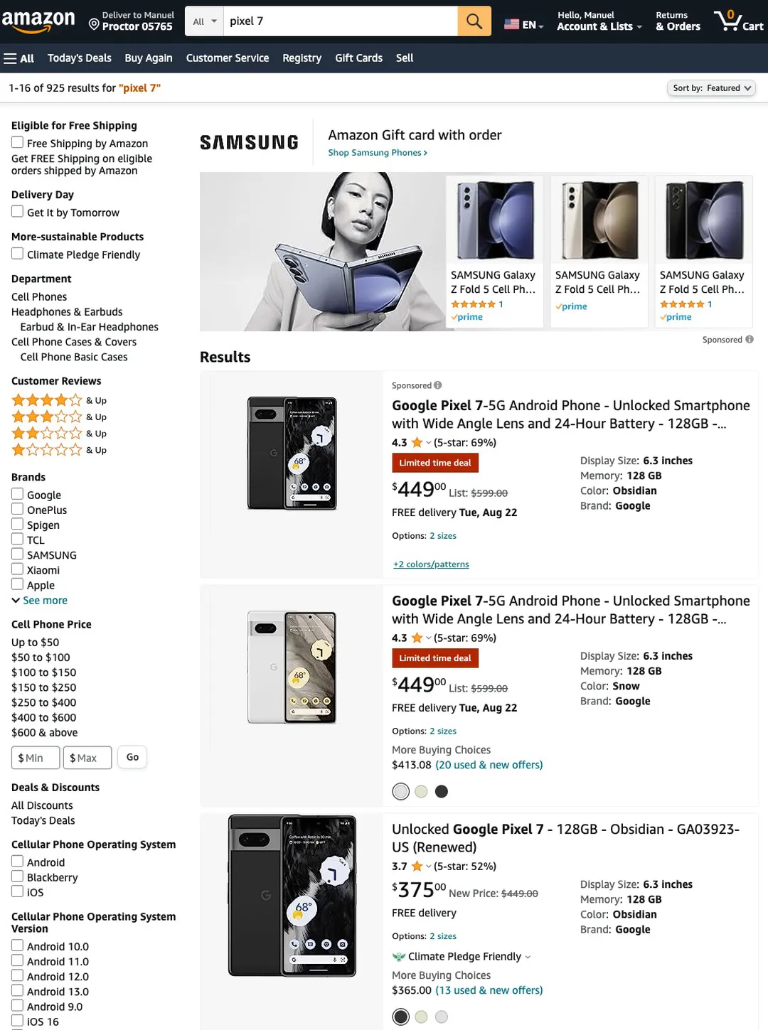
Amazon is testing a new way for star ratings of products to appear in search results - and it kind of sucks. The supposed new system appears to make hunting for good quality products more difficult than normal.
The new system was spotted by Android Police in the layout for Amazon India on mobile, as well as on the Amazon Germany website and on the global site when accessed from within Germany.
With the new star ratings, when you search for a product on Amazon the rating layout is now changed. It will show an average star rating, with a single star icon, and in brackets next to that star will be the percentage of reviews are were five stars. It sounds a bit complicated even just explaining it to you here, but the screenshot down below should help.

So, in the screenshot from Android Police above you’ll notice that instead of the usual five stars that are colored in according to average rating, alongside the number of reviews, with the new layout you only get one star icon with an average and percentage.
Personally, this layout is incredibly confusing, and takes away how easy it is right now to know that a product has plenty of reviews, so whatever rating it’s been given is accurate. When I’m scrolling through Amazon on my phone or on the web, I will always consider products that have a certain number of user reviews, as you’re likely to get a better idea of just how good (or poor) a product is. If something has a few reviews but very high ratings, I’ll be more cautious than if it had hundreds of reviews and mid-range star rating.
Hopefully the new changes continue to inform customers, and we won’t have to think too hard about our impulse shopping!


