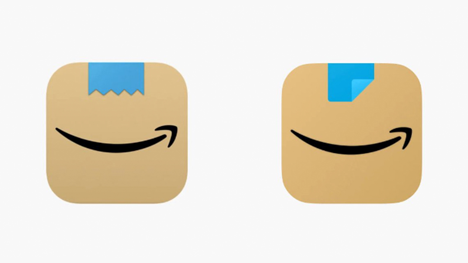
Amazon refreshed its mobile app icon back in 2021, replacing its rather basic shopping trolley design with something simpler, designed to resemble a cardboard box featuring a strip of tape. But to some users, it resembled a certain Adolf Hitler, prompting Amazon to fix the design.
And now, the company has once again tweaked the icon, adding stripes to the blue moustache tape – leaving some users momentarily confused.

According to Daily Mail, users were surprised by the change, with some (apparently) unable to find the app on their homescreen.
The paper even talked to an expert from digital marketing agency Intero Digital, who offered the insight, "Amazon's recent update to its app icon is an example of its ongoing strategy of refreshing its brand image. This change may be initially puzzling for some – especially considering apps are recognised through visual cues that build muscle memory over time."
Right now, it's unclear whether the update is permanent, or designed to attract attention to the app in the lead up to the festive season.
I guess we’re getting the @amazon #Christmas/holiday app icon a little early this year. Still doesn’t make me want to use #Amazon for shopping. pic.twitter.com/nTk5GPpnVVOctober 22, 2024
We've seen plenty of incredible iOS app icon designs over the years. But with the advent of iOS 18 and its vastly increased personalisation options, some homescreens are getting a little messy.


