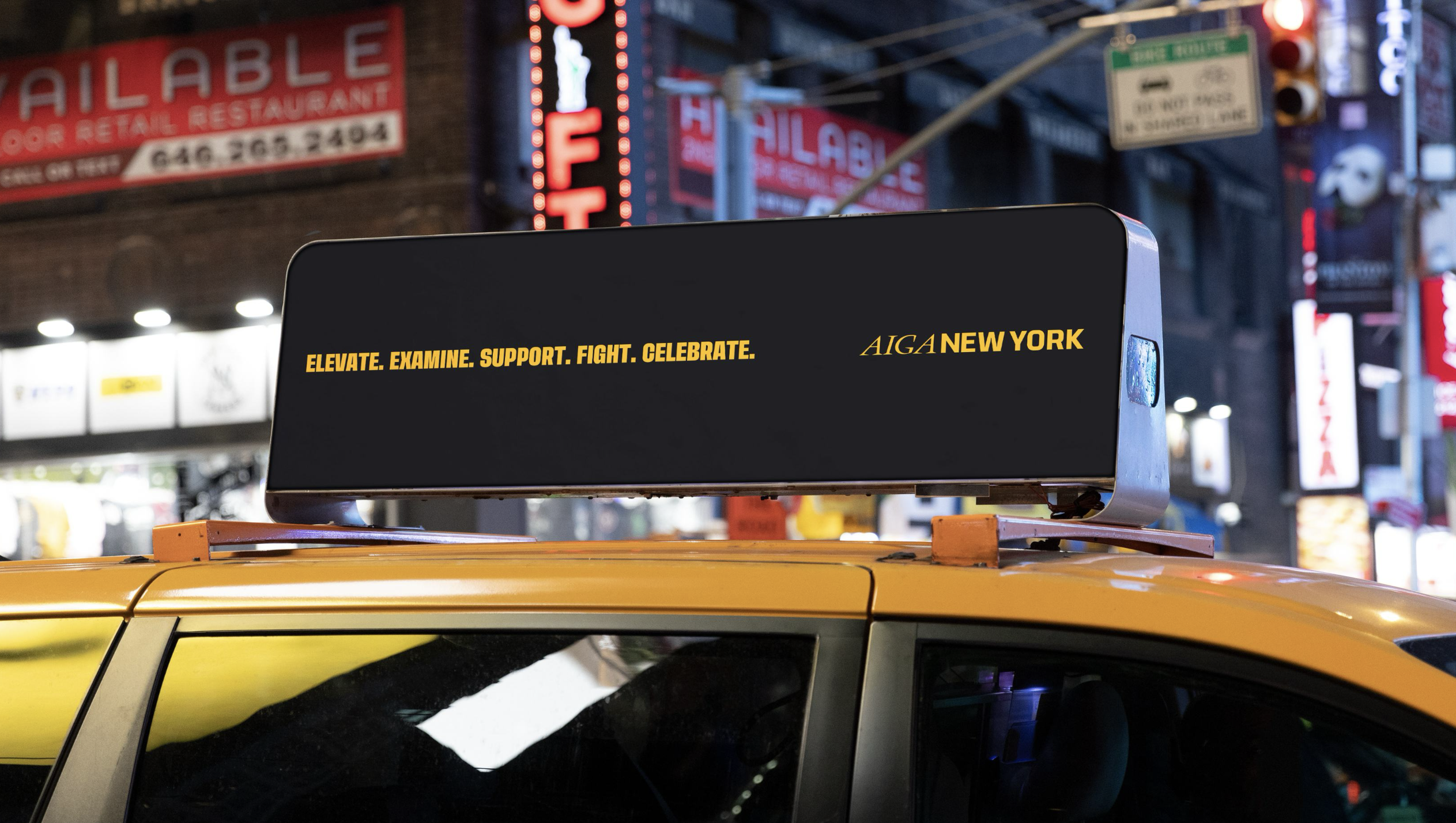
The American Institute of Graphic Arts, New York Chapter (AIGA NY) has unveiled a slick logo marking a bold new strategic direction. As the largest chapter of the United States' oldest professional association for design, AIGA NY's new look marks a confident rebirth as a unified space for conversation, learning and innovation.
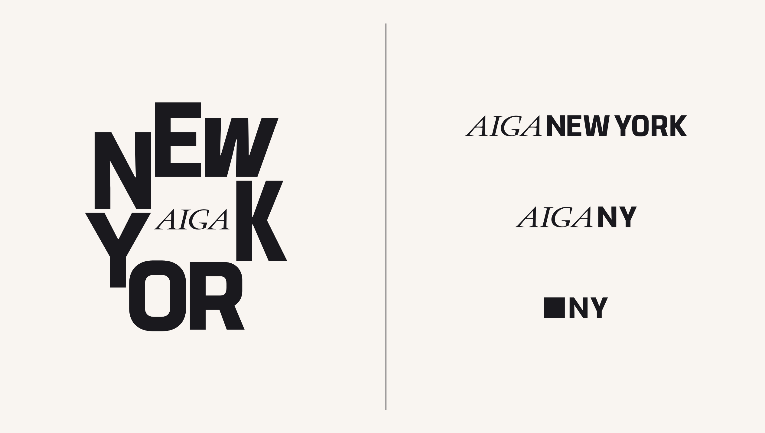
The best logos often convey a message through intentional design alone, and AIGA NY's new identity is no different. Inspired by everyday New York, the logo is delightfully contemporary with flourishes of timeless design that encompass over 40 years of creative community.
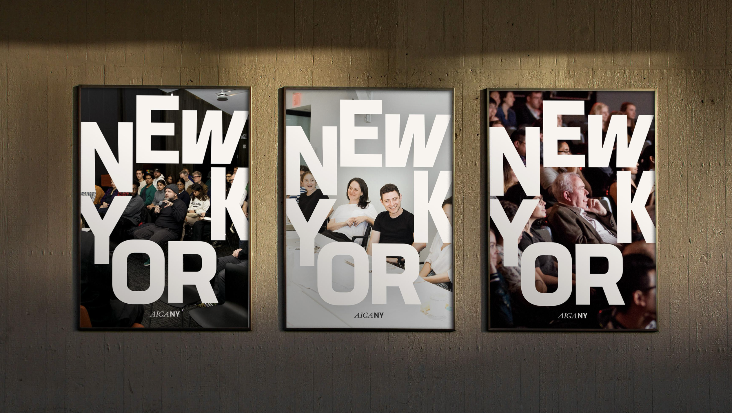
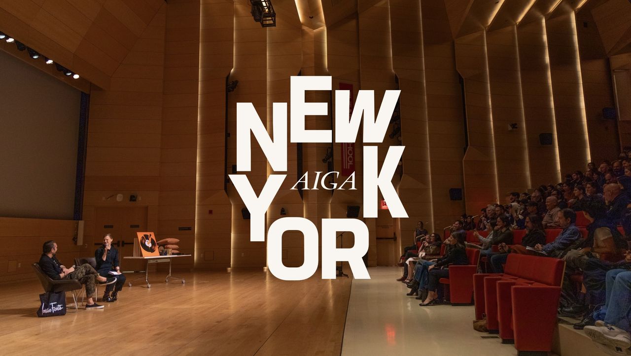
Central to the new identity is a bold, modern logo that blends the institute's community-centred refocus with the spirit of New York. Drawing on "the city’s magnetic draw, syncopated flow, diverse voices and multifaceted visual culture," the design is a symbol of space where ideas can coalesce.
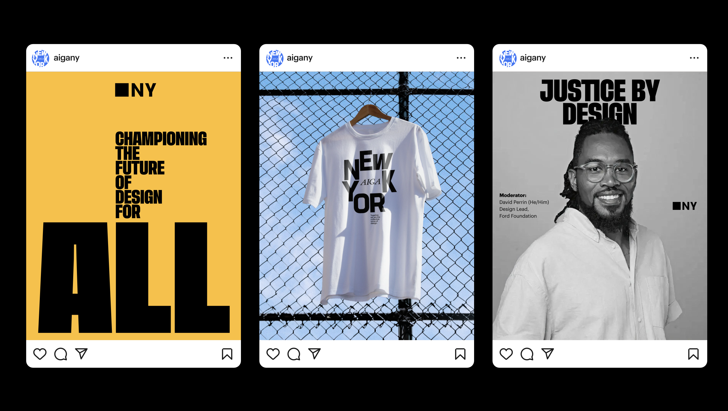
Created by native New Yorker Christopher Guerrero, with typography and design support from former board member Raven Mo, the logo's letterforms create negative space that forms the visual motif of a community town square. "It acts as the meeting place within the mark itself, a space where creatives gather, exchange ideas, challenge each other, and access the wider community," the press release explains.
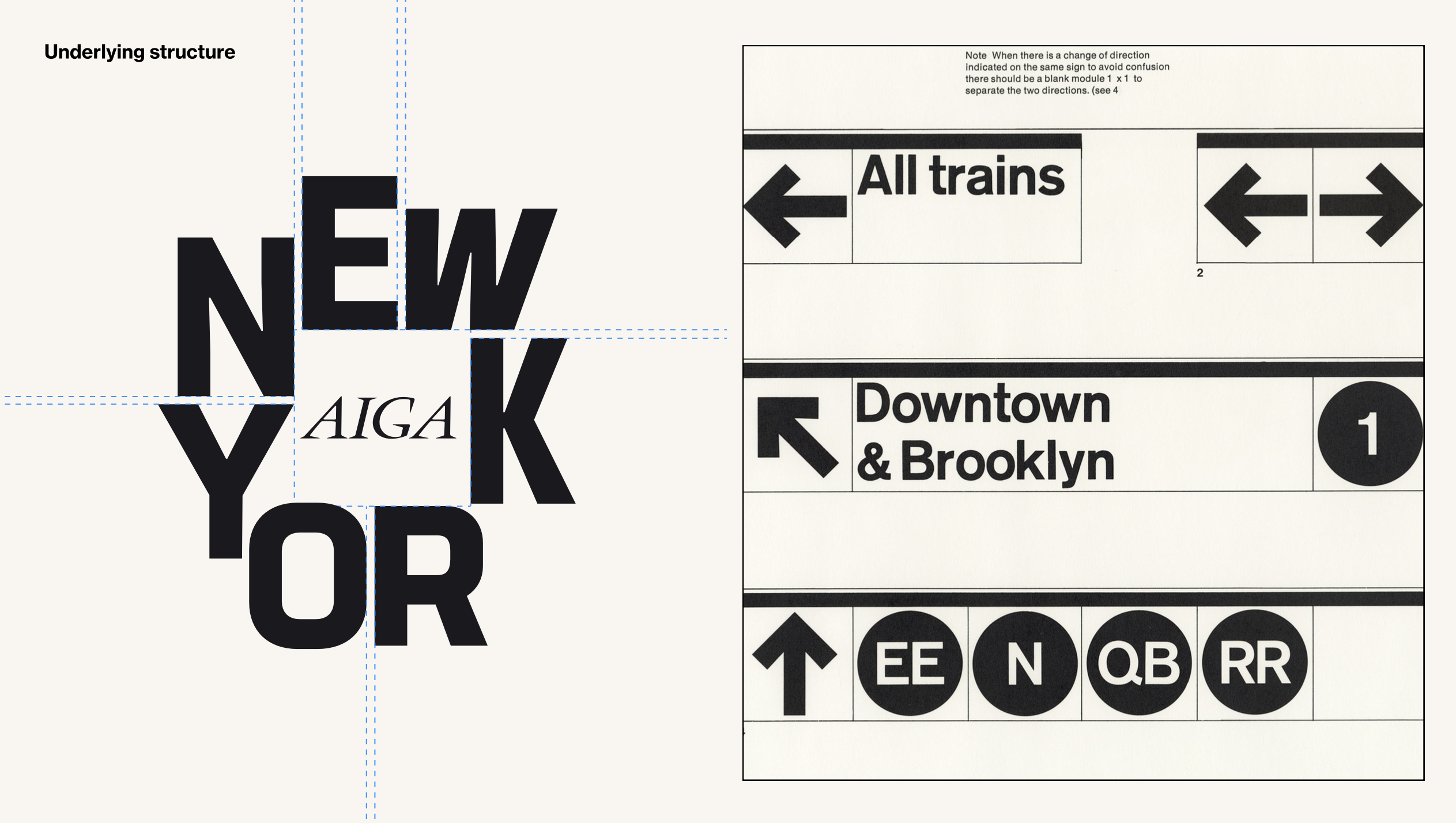
Approaching the logo as a piece of key art, rather than a static design, Guerrero prioritised a flexible identity to give the system freedom of play. The colour palette was specifically chosen to avoid clichés, with Guerro explaining, “instead we looked at things like the deep green of scaffolding, the charcoal black of pavement, and the warm off-white of sidewalks. Even the lighter green nods to the Statue of Liberty. It’s all about capturing the city’s essence in a way that feels authentic and familiar."
“This new identity is more than just a logo; it’s a reflection of who we are as a chapter and as a community," adds Stacey Panousopoulos, executive director of AIGA NY. "We’ve always been about creating spaces where designers can come together, share ideas and feel represented. This logo is a conversation starter, a symbol of our legacy and town square.”
The refocussed brand strategy aims to address past misconceptions about AIGA NY, positioning it as "a civic space for design." Reinvigorated for a new era, the new identity "celebrates and encourages open dialogue, shared learning, and collective ambition, shaped by a belief that "progress happens when we come together."
While it remains connected to its national roots, the NY chapter aims to take a more active role in conversations around design ethics, policies and community engagement. “The DNA of AIGA is New York,” Panousopoulos says. “We take that DNA, make it shine – and want to encourage other chapters to do the same, to activate and celebrate what makes them unique.”
For more branding inspiration check out the Royal Albert Hall rebrand or take a look at the unapologetically bold art of Soho Rep theatre.