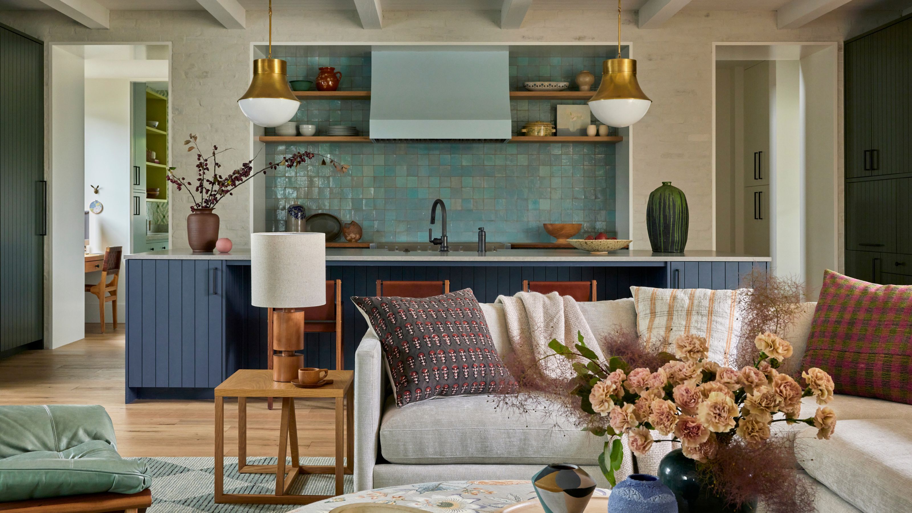
It’s not often that it’s the homeowner pushing for a more daring design scheme. That was the reality behind this newly-built family home in Southern California, though — a collaboration between Regan Baker, founder of interior architecture and design studio Regan Baker Design, and architect Eric Olsen.
‘One of our biggest sources of inspiration for the palette was our client herself,’ explains Regan. ‘She even pushed us in some cases.’ As a result, whimsical patterns, time-worn patinas and pops of colors underpin the modern home's playful yet cozy aesthetic; a trending interior design style Regan refers to as 'grandma chic'.
'Our client's love of 1920s style manifested itself through the tile selections,' she adds, noting other nostalgic nods in various design details including the powder room's cafe curtains, and a mint green Lawson Fenning accent chair in the living room that was 'inspired by a photo of a vintage chair the client loved.'
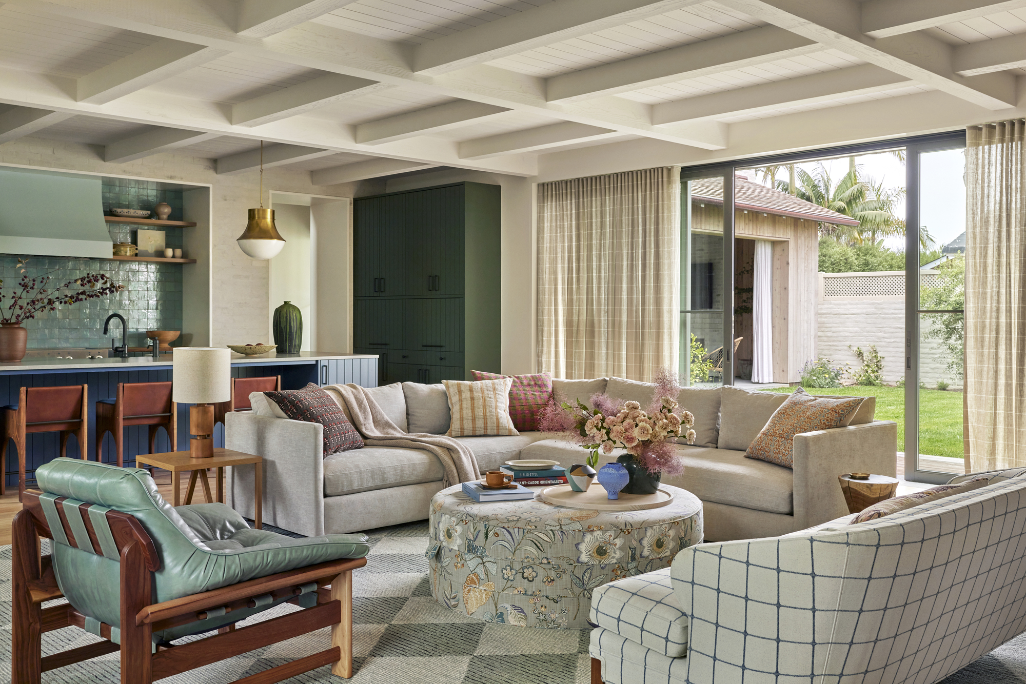
But it's not just sweet on the eye. The design of this new home is just as hard-working, with storage secretly hidden away in almost every corner, and a unique layout that makes it fit the needs of the active family — and particularly their two young boys — to a tee.
The front entrance to the home almost immediately opens out onto an large internal courtyard, wrapped by two separate wings. 'The idea by architect Eric Olsen was to create a flow for guests into the outdoor entertaining spaces that didn't require them to walk through the main living spaces of the home,' explains Regan. It also provided a protected space for the kids to play, and a seamless biophilic connection between the interiors and the outdoors.
With so many clever design details incorporated throughout the space, asked interior designer Regan Baker to step us through each space of the modern home in a little more detail.
The Kitchen
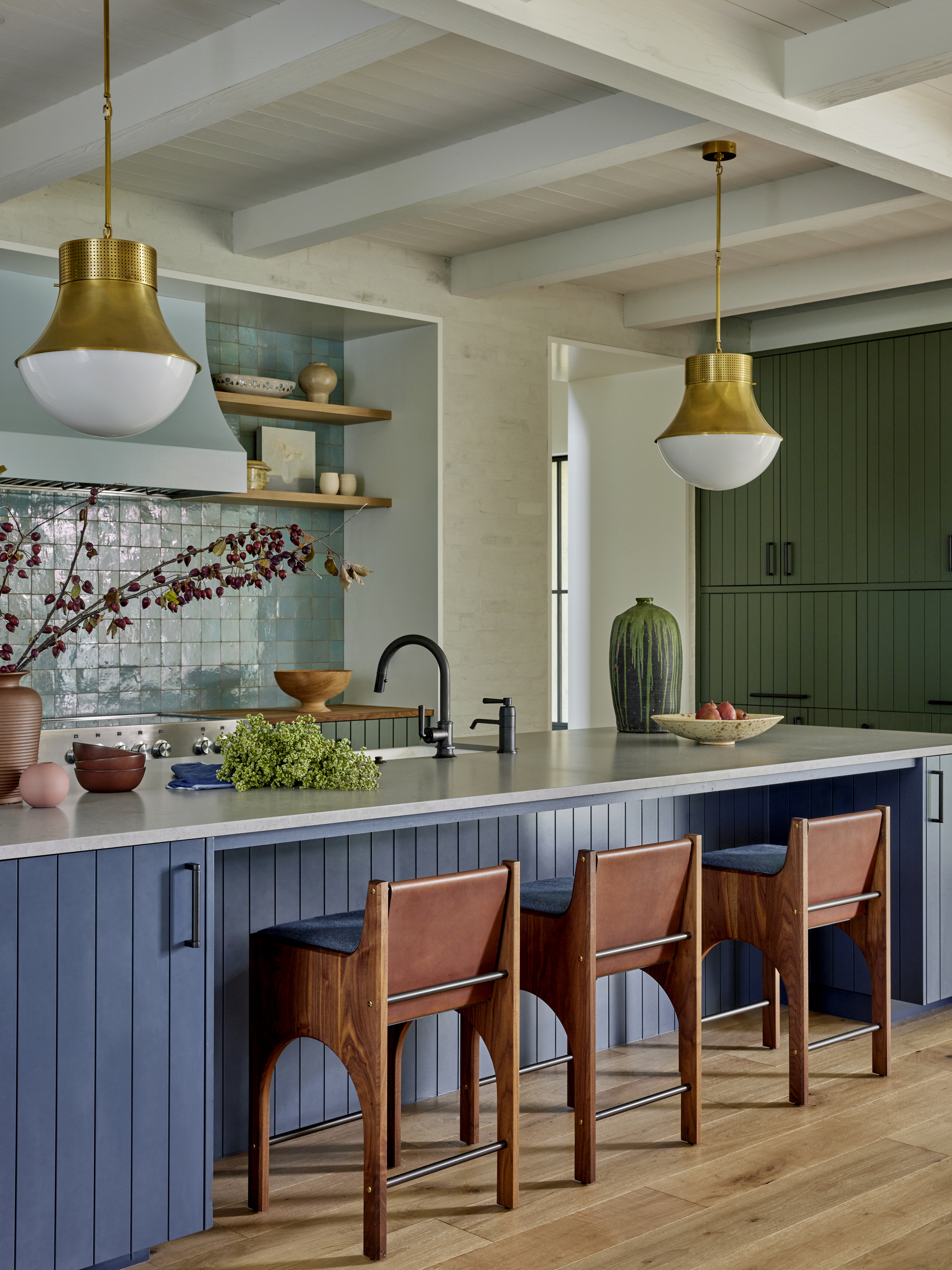
The kitchen is one of Regan's favorite spaces in the finish project, and it's not hard to see why. 'The color palette creates a moody contrast with the rest of the house and infuses traditional elements,' she explains. 'The use of texture and color creates an overall feel as compared to the abundance of pattern play throughout the rest of the home.'
With a mix of forest green and navy blue kitchen cabinets, a shimmering light blue Fez tiled backsplash, and both oak and Caesarstone counters, the space has been designed to 'embrace the southern California sunshine and the home's emphasis on indoor-outdoor living,' says Regan.
Apart from the finishes, the functionality of the space was a key consideration. Custom millwork includes an appliance garage with enough space for a beverage fridge and extra storage. 'It was designed to align with the top of the door height — leaving room for the ceiling rafters and creating an overall look and feel that mimics a piece of furniture,' explains Regan.
The Dining Nook
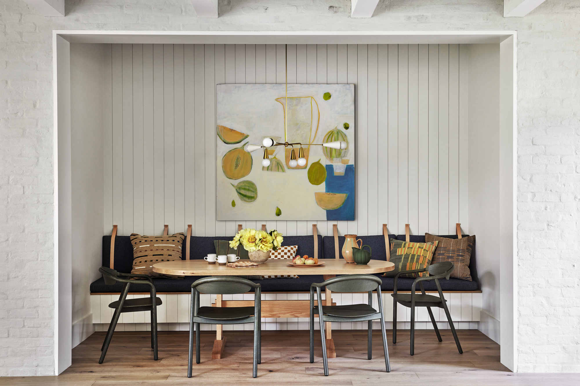
An intimate dining nook has been carved out of the otherwise open-concept space thanks to a custom built-in bench seat. Its materiality — with dark blue upholstery, earthy green chairs and an oak dining table — reference the kitchen, while also creating a focal point in the room.
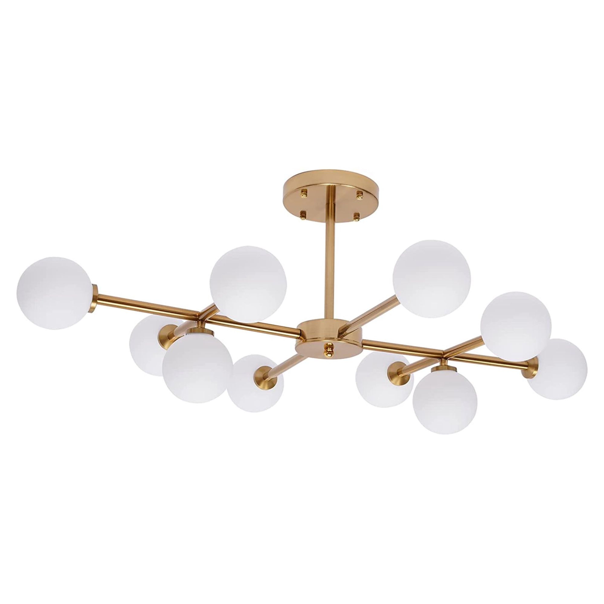
Price: $91.96
Material: Iron, glass
The Pantry
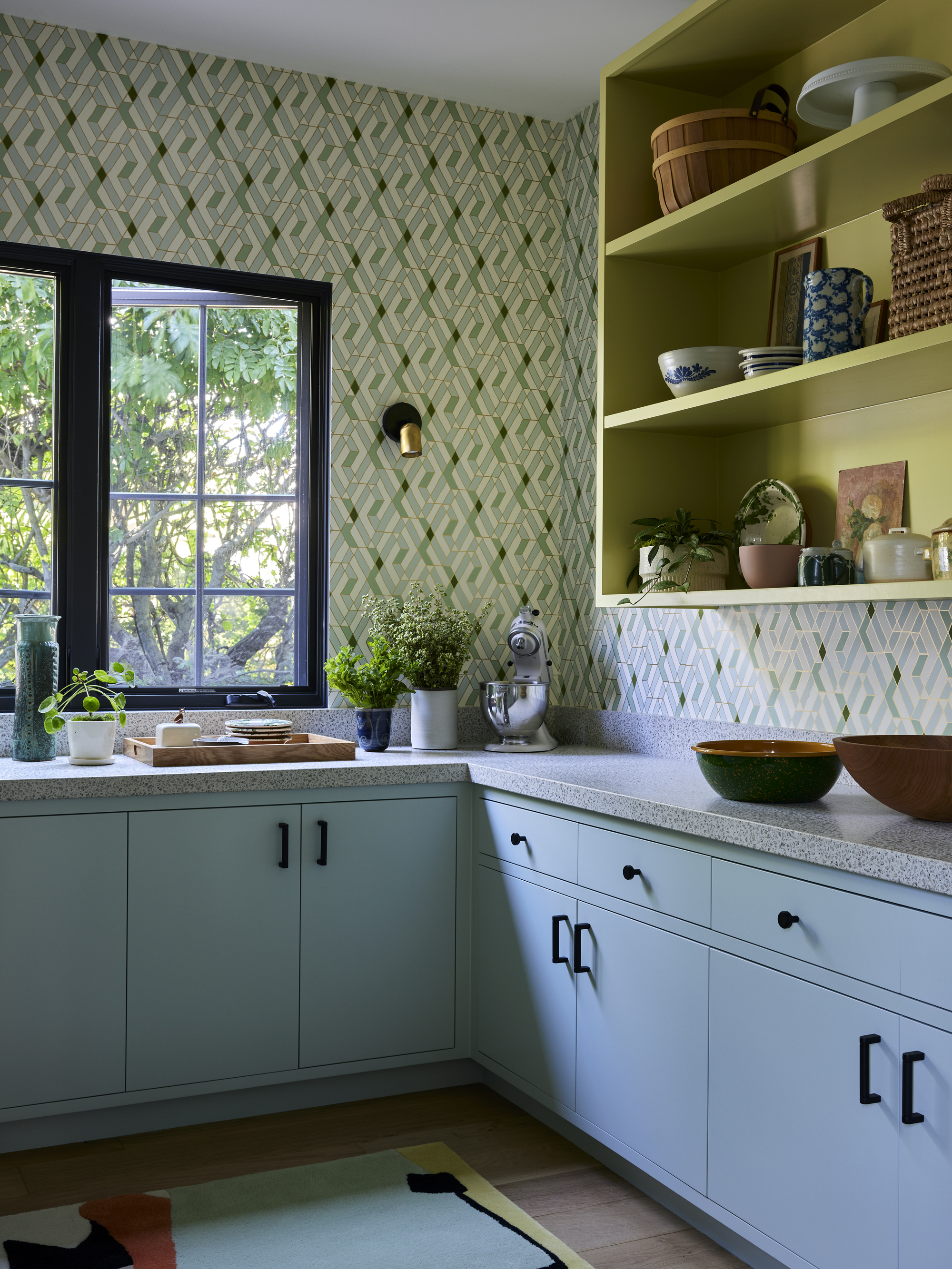
Perhaps surprisingly, the pantry is one of the homeowner's favorite parts of the design, with its playful combination of contemporary color-blocking and vintage-inspired patterns. 'This juxtaposition of styles creates an interior that feels warm, inviting, and truly personalized,' says Regan.
The choice to keep the upper shelving in the pantry open was an intentional one. 'Since there was a lot of millwork, our thought was to break it up and add more easily accessible storage,' explains Regan. 'This design solution also adds a sense of nostalgia to the space.' As well as the perfect place to display a collection of dishware, pottery and other decorative objects.
The Outdoor Living Space
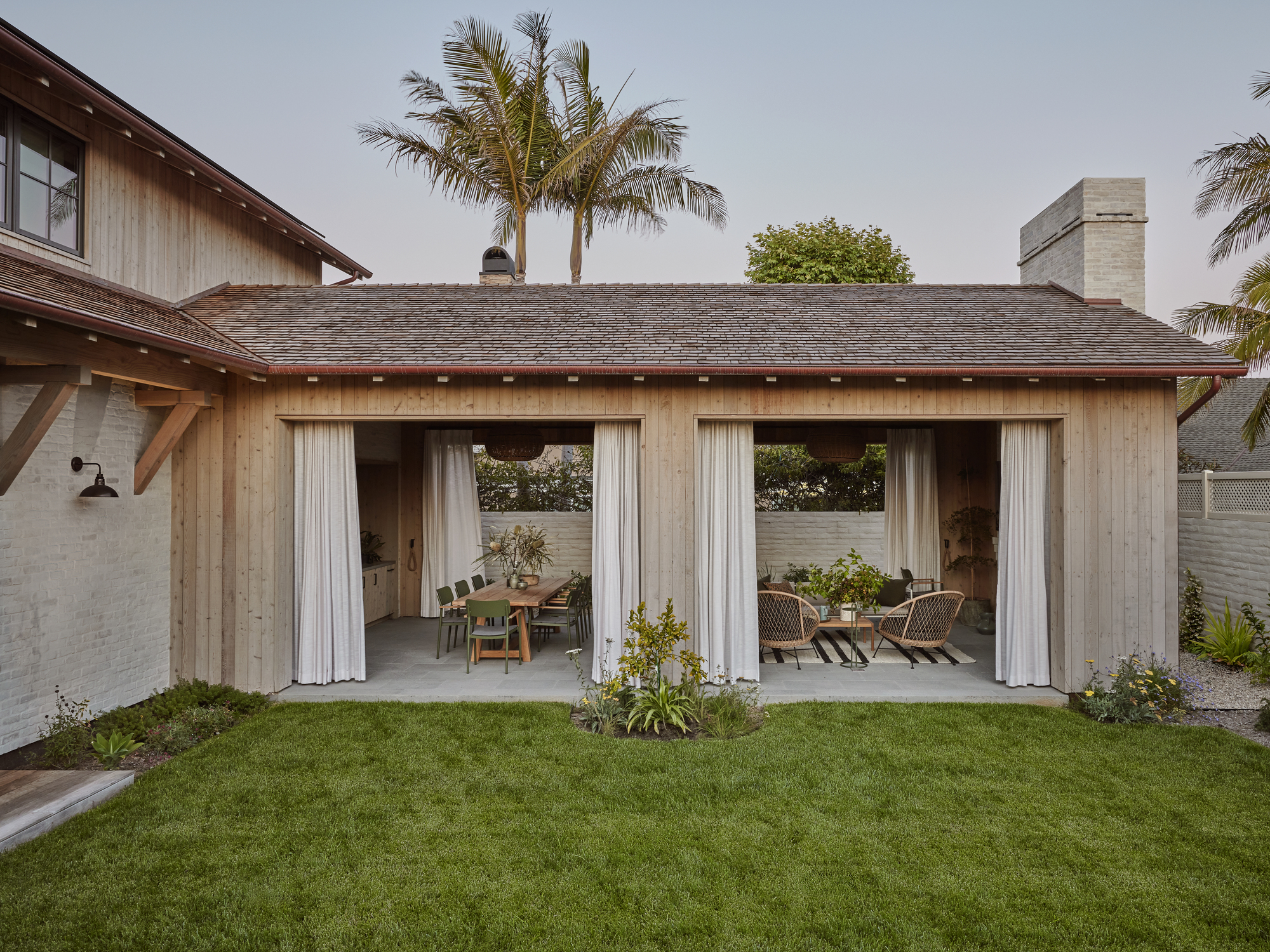
The design of this home centers around creating a seamless connection with the yard and no space does it quite like the outdoor living room, where walls and windows have been replaced with fresh air and floating curtains. 'We love the use of drapery outdoors,' says Regan. 'The way it moves with the breeze is beautiful.'
The Powder Room
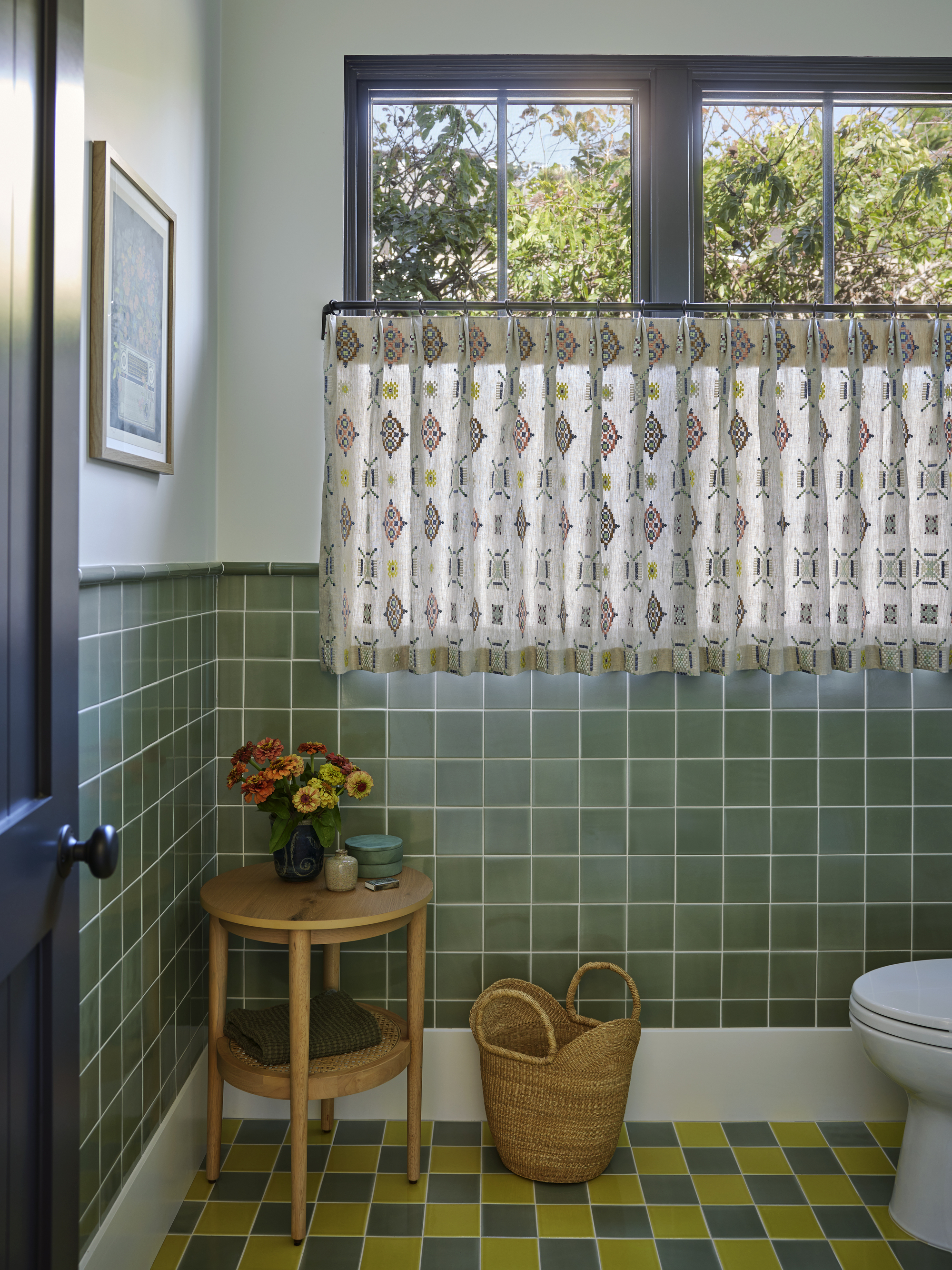
As a smaller space in the home, powder rooms often afford you the opportunity to be a bit more playful with your design, and that is definitely the case here, where Regan really dialled up the 'grandma chic' aesthetic.
Patterned cafe curtains skirt the windows, adding subtle texture and privacy, while the homeowner's love of 1920s style is very apparent in the rosemary and daffodil-colored tile selection, laid in a checkerboard pattern.
The Primary Bedroom & Bathroom
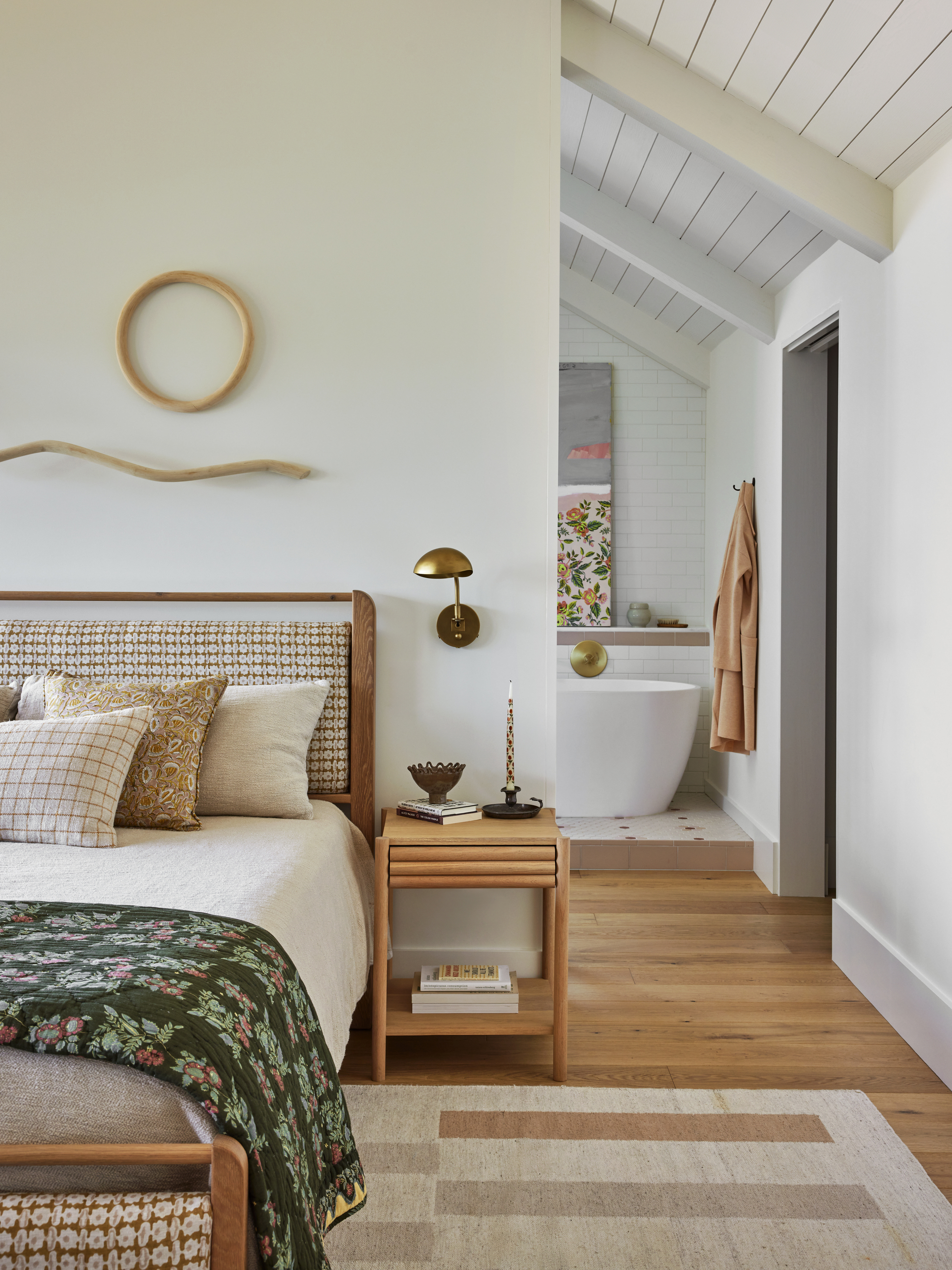
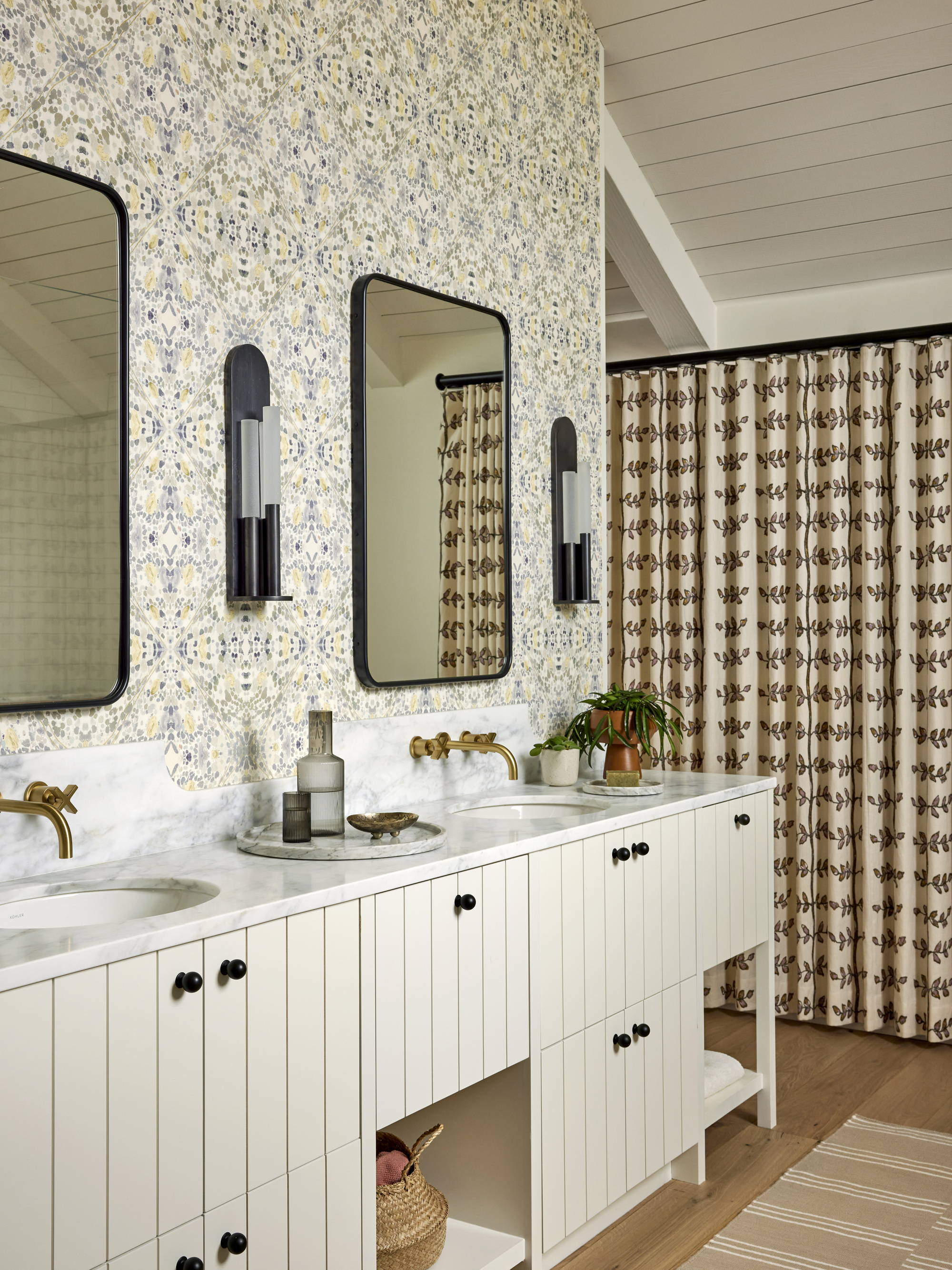
'The primary bathroom was one of the first spaces in the home to be designed,' says Regan. 'Its intricately patterned Holland and Sherry wallpaper was chosen early on and inspired the rest of the room's design to work around it.'
But the open-plan primary bedroom and bathroom also presented one of the biggest challenges to the build, due to the vast number of windows, the ceiling heights and transitions and limitations on furniture placement. 'Drapery spanning both bedroom and bathroom helps segment the expansive wall of windows across both spaces, and offers a more intimate and intentional feel in each room,' explains Regan.
In the bedroom, floral and geometric patterns calmly clash in warm and soothing tones, while a bent wood sculpture by artist Katie Gong makes for a beautiful above-the-bed decor idea, and helps draw a connection to the natural world outside.
The Kids' Spaces
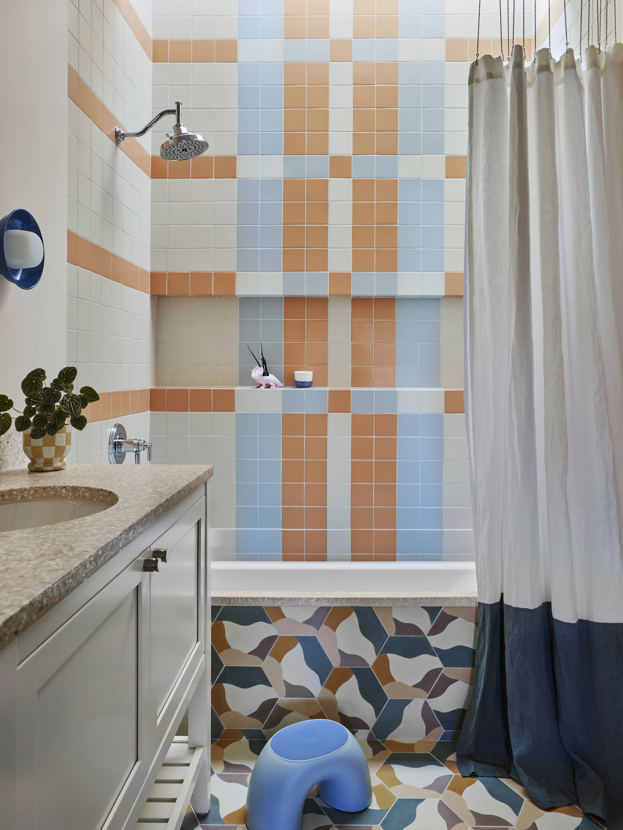
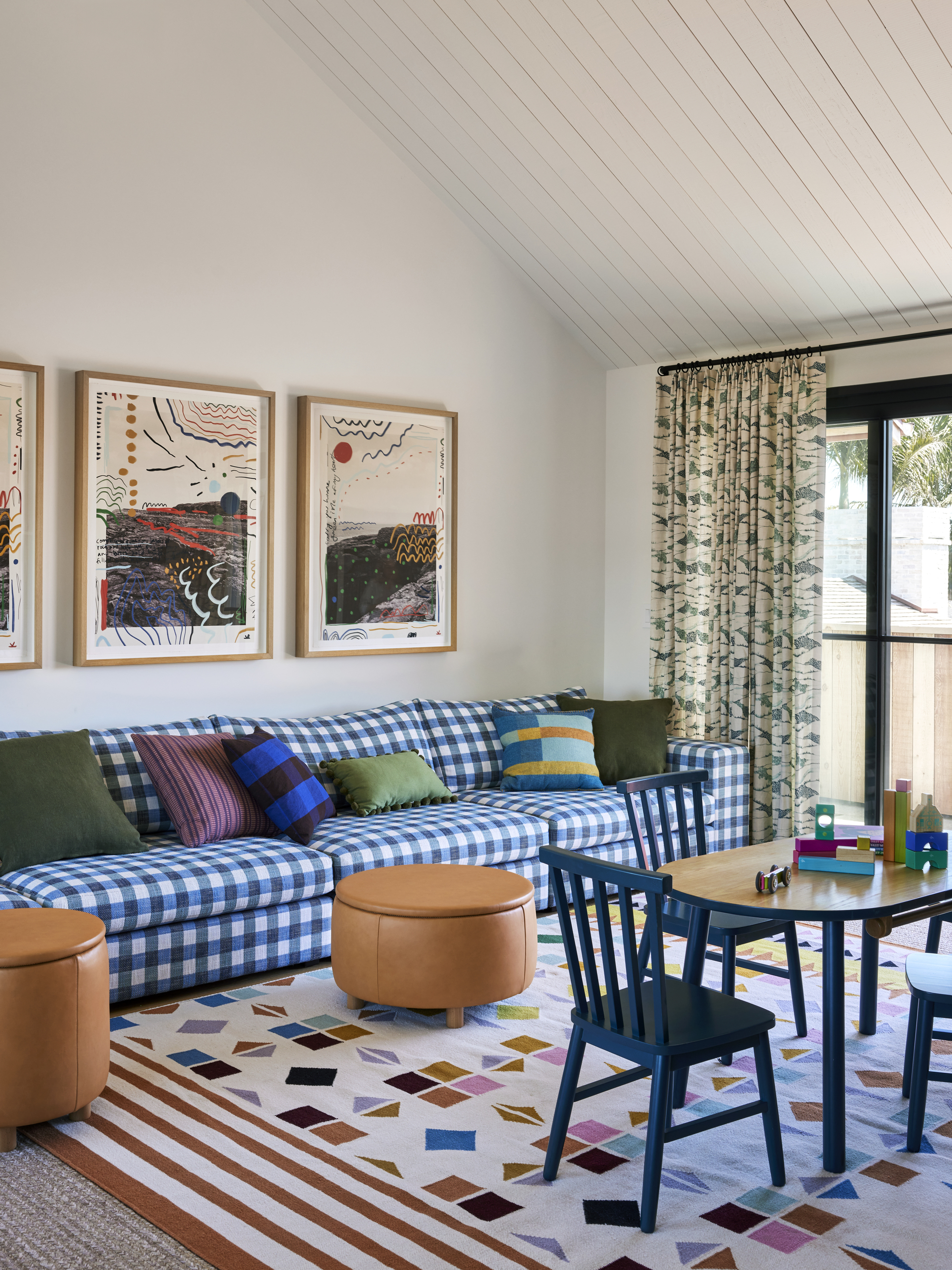
A sense of playfulism hits its peak in the primarily kids' zones of the home. Zesty orange and blue tiles have been playfully laid in a plaid pattern in the bathroom, popping against the patterned floor tile and terrazzo countertop and tub edge.
'The vibrant blue buffalo check sofa in the upstairs playroom is one of the homeowner's favorite pieces and is a design choice she really pushed for,' says Regan. 'Her desire to confidently embrace pattern made for a unique combination that feels both modern and vintage; surprising and still classic.'
Once again, squeezing in as much storage as possible was an essential part of the design. The camel leather ottomans not only provide extra seating in the room, but the tops also lift off to reveal hidden storage cavities within, and millwork
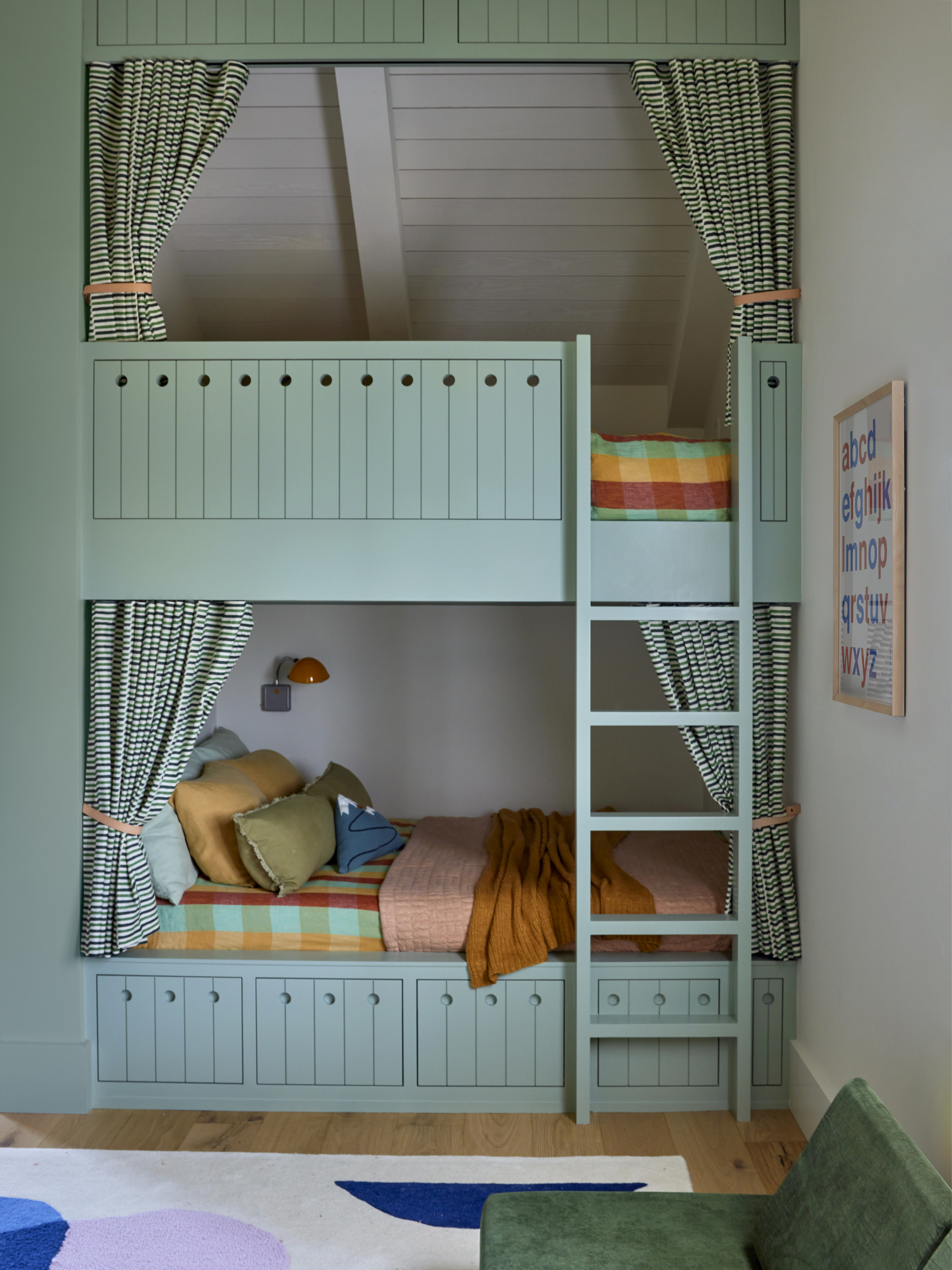
Curtains fitted to the custom bunk bed — painted in Benjamin Moore's soothing 'Garden Path' — ensure added privacy in the shared space, while drawers built-in to the bed base provide additional storage space for extra linens, toys and blankets.
'It was an odd-shaped room, but the alcove provided a perfect spot for full size mattresses,' explains Regan, also noting how a bunk bed leaves more floor space for playing.
The Mudroom
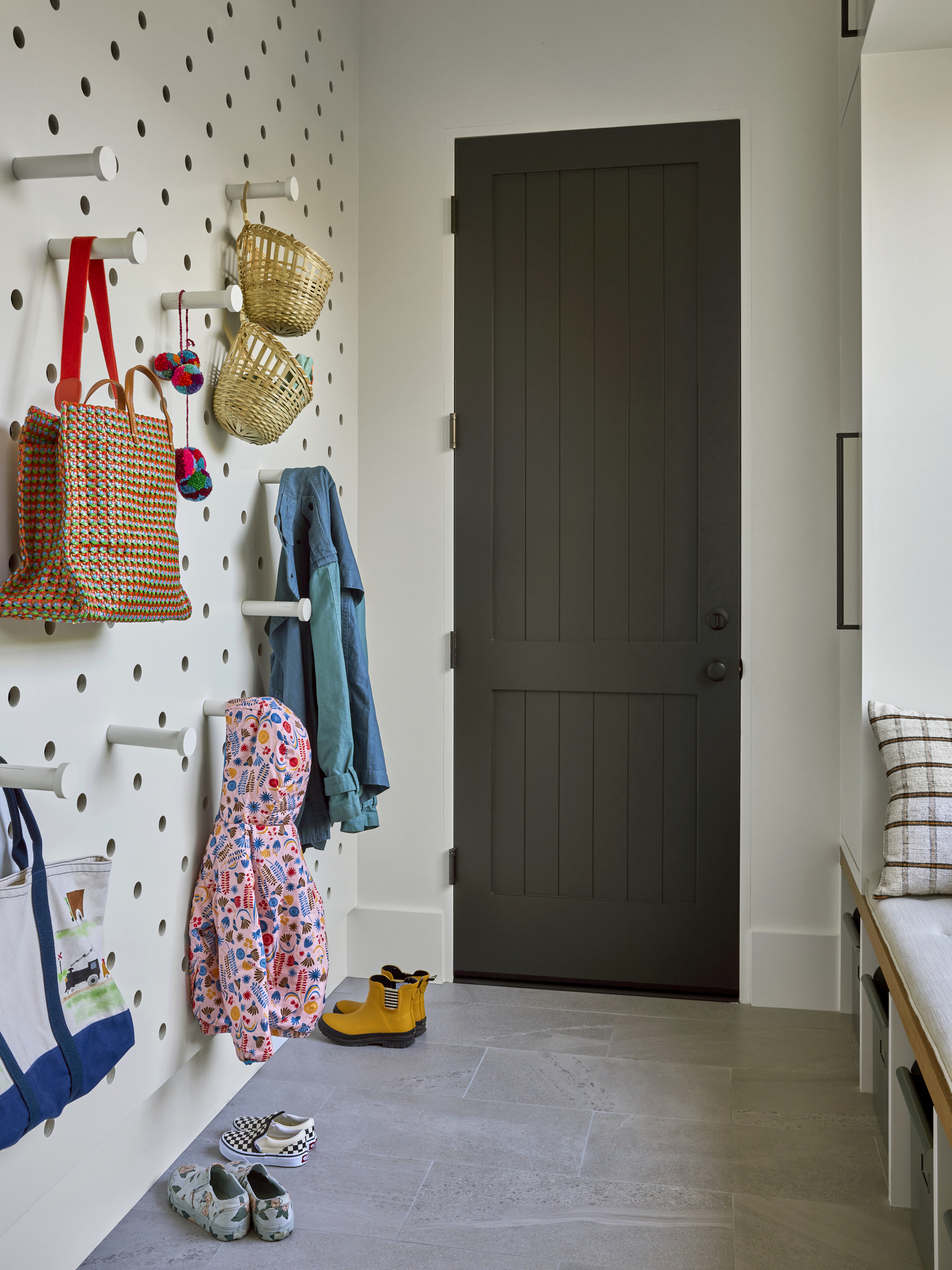
But perhaps the pièce de résistance when it comes to storage in this home is the rearrangeable peg system on the mudroom wall. 'It is a wonderful way to adapt to evolving storage needs,' says Regan, who combined it with custom millwork that provides plenty of space for tucking away additional storage bins and crates.
Considering the project as a whole, Regan says her client's confidence when it came to embracing color and pattern was really special, and made the process all the more memorable for her.
'This is the most colorful home we've designed and it was fun to collaborate with a client who wanted to amp up the color and pattern and do something exciting,' she says.
And that's what color can do in our interiors. It elicits emotions, and can transports you to another place and time, whether that's the outdoors, a sunny Californian coastline, a vacation you recently took, or, now, for this lucky family — home.


