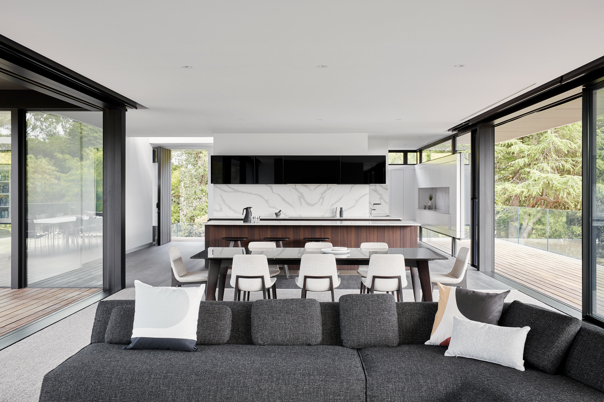
A new Melbourne family home on the Mornington Peninsula, Moat’s Corner is a multigenerational space that has been designed with an eye to the enduring style and appeal of classic West Coast midcentury modernist architecture. In fact, Vibe Design Group’s team had an American sojourn to explore some key influences.
Step inside this Melbourne family home
‘A midcentury modernist ethos encompassing honesty to materials, structural innovation and minimal ornamentation was at the core of the design,’ the Melbourne-based studio says. Founded by architect Michael O’Sullivan in 2006, Vibe Design Group specialises in residential work in and around the Australian city.
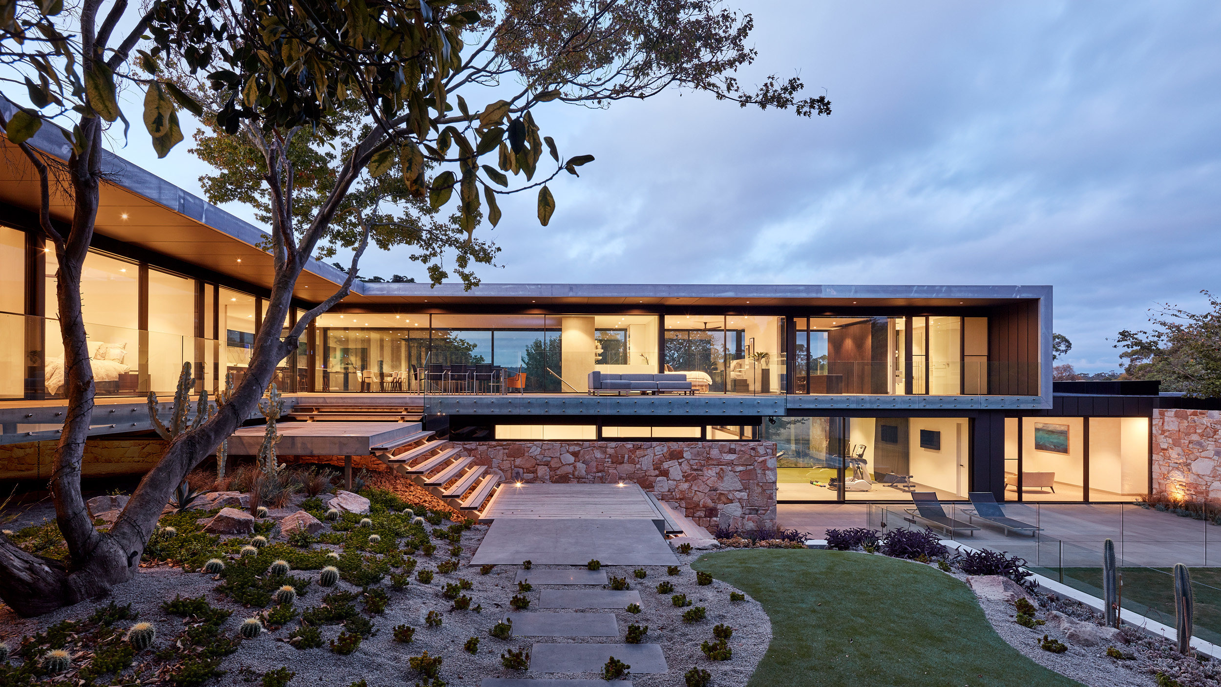
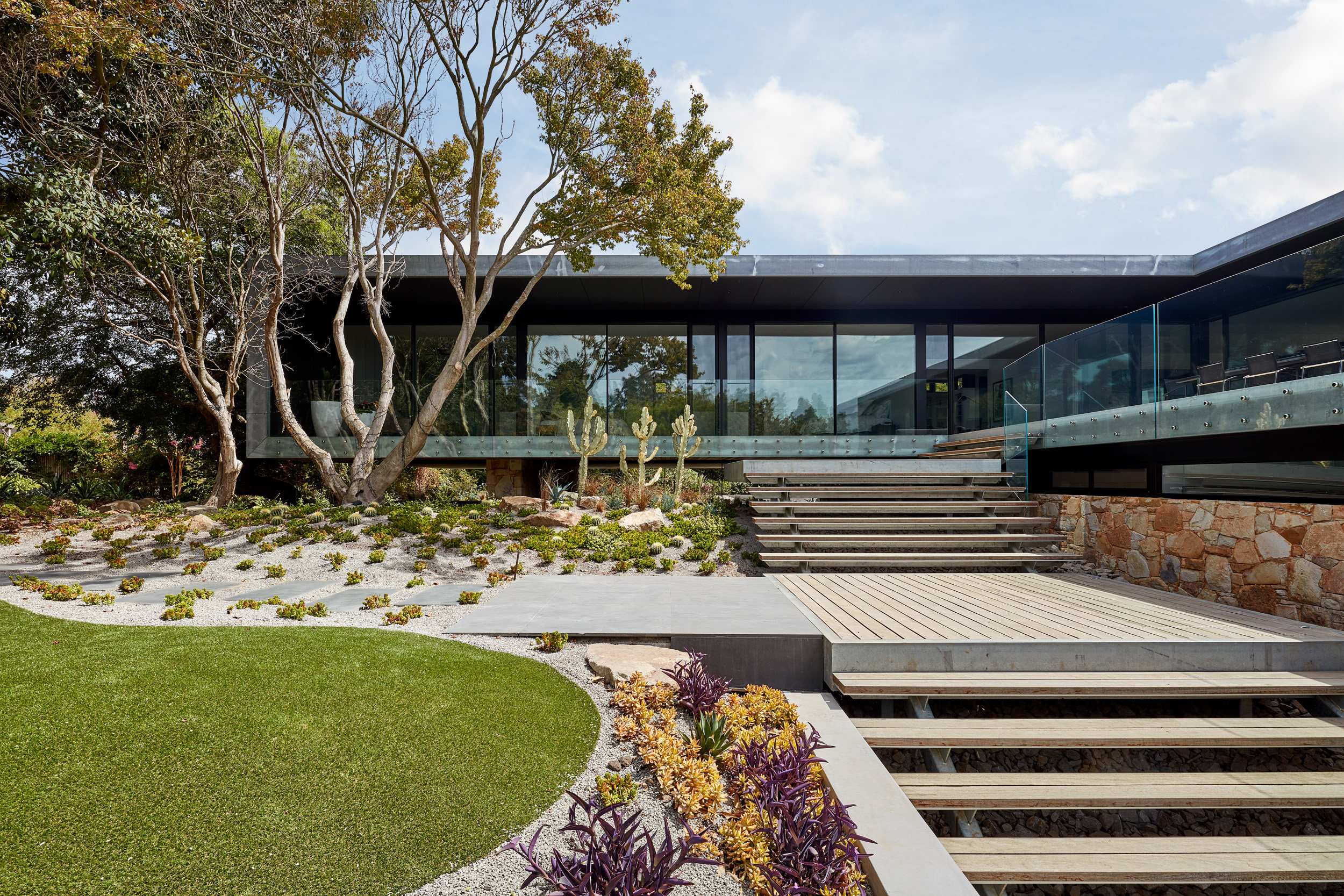
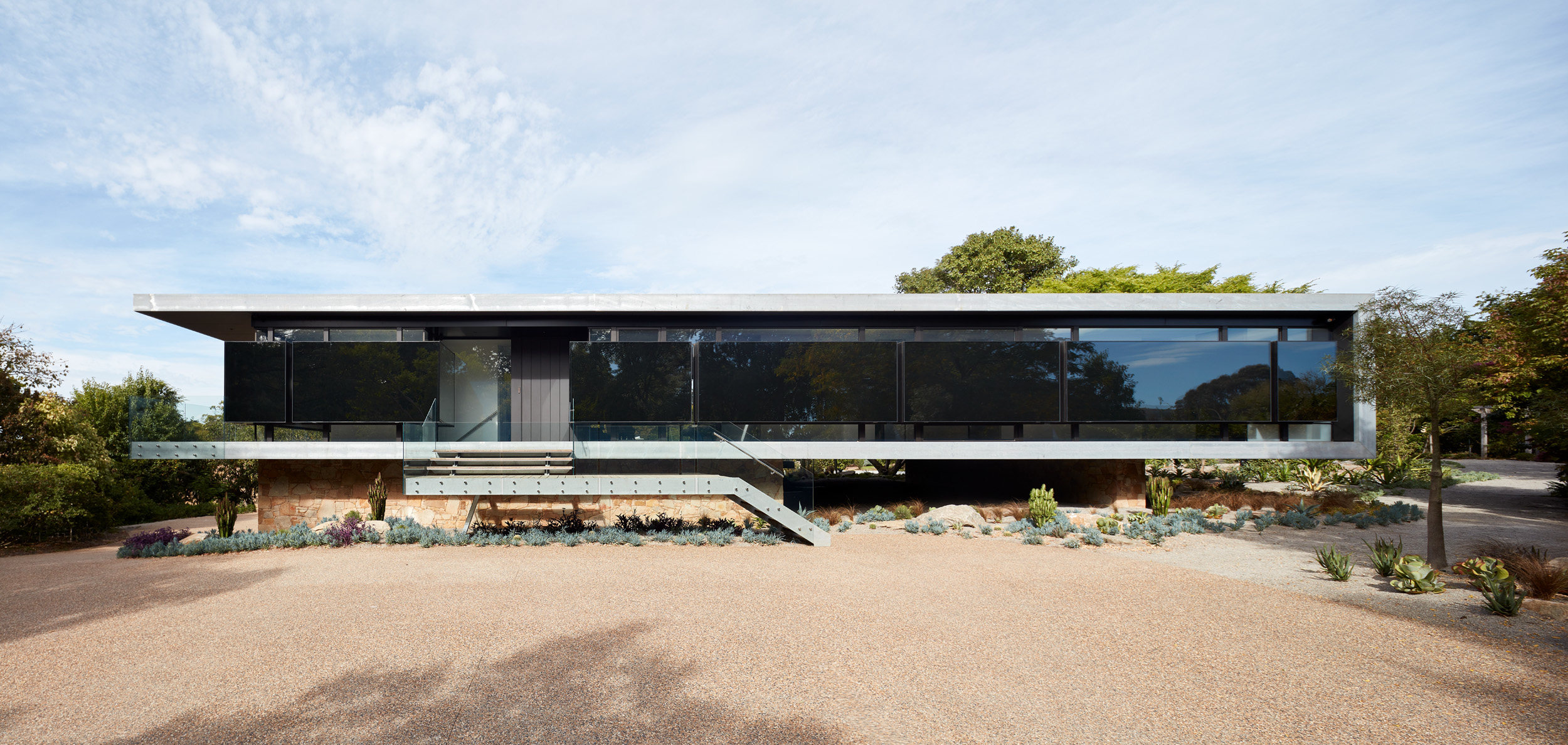
The Mornington Peninsula is a sought-after location and the new house sits on an impressive sloping site, surrounded by five acres of botanical gardens. The primary living spaces are raised up above the site, with an L-shaped plan flanked by decks on either side.
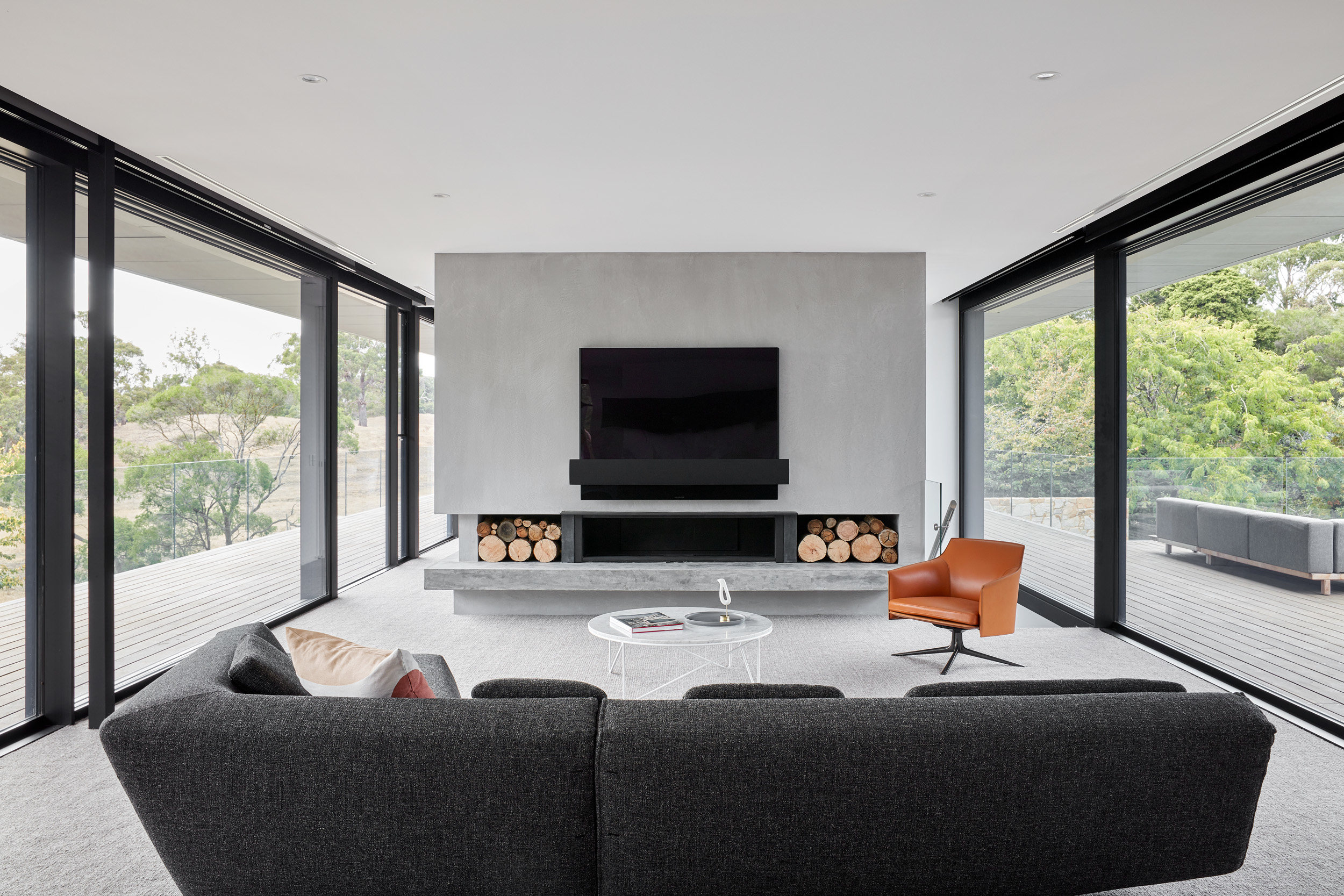
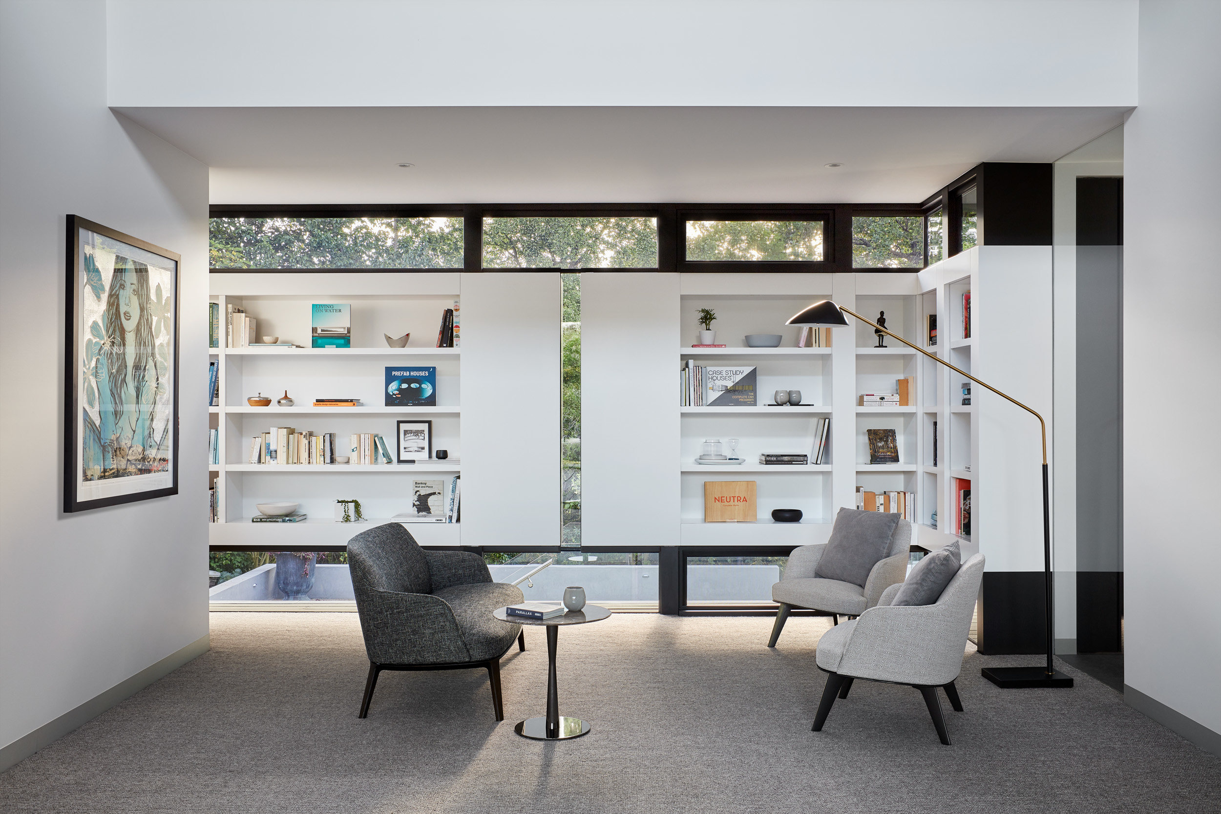
The living, dining and rumpus rooms are flanked by two wings of bedrooms, with three identical suites to the south, reached from a long library corridor on one side, with terrace access on the other. The principle bedroom occupies the eastern wing, a generously sized complex with a study, dressing room and bathroom.
The ground floor connects directly to the garden, with a large garage providing internal access to the house alongside an external staircase. A terrace leads to a pool to the south, with utility areas flanked by a gym, golf room and bar. This level also houses a self-contained two-bedroom annexe with its own private terrace.
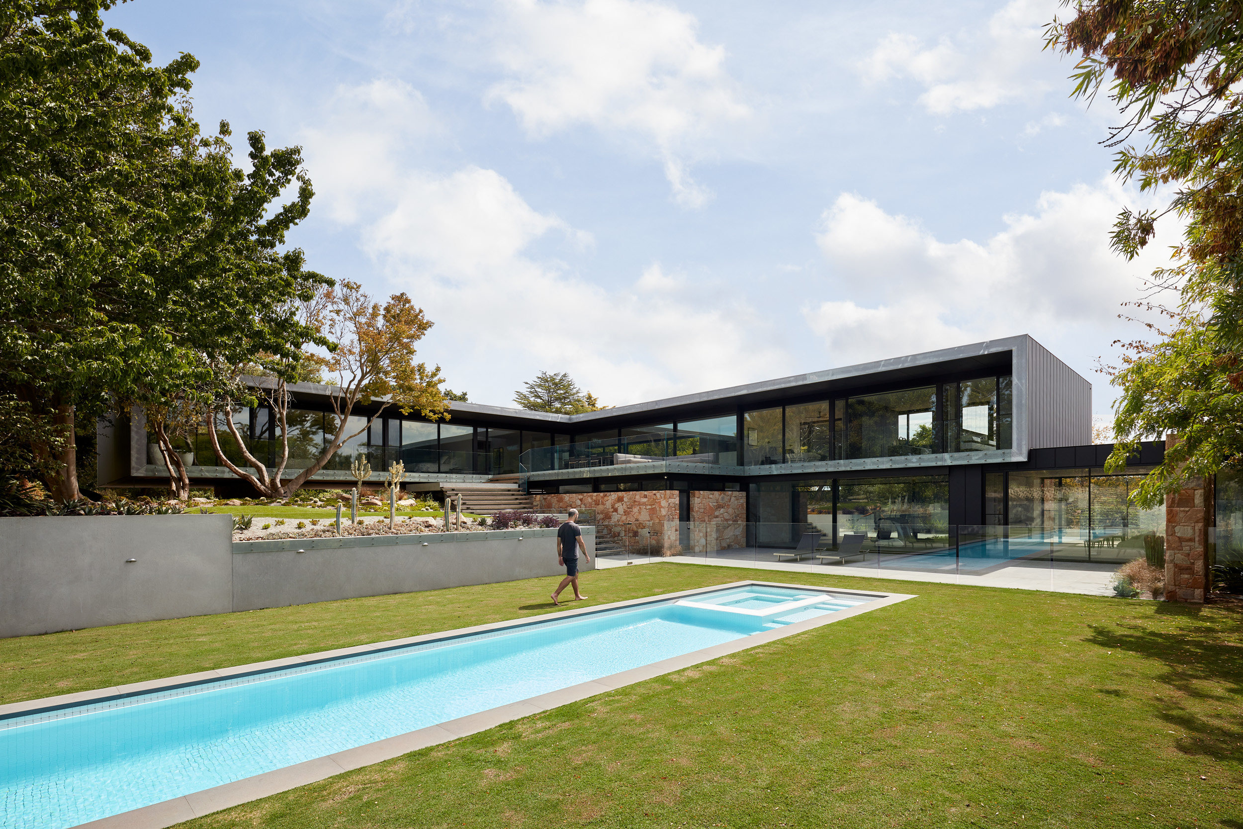
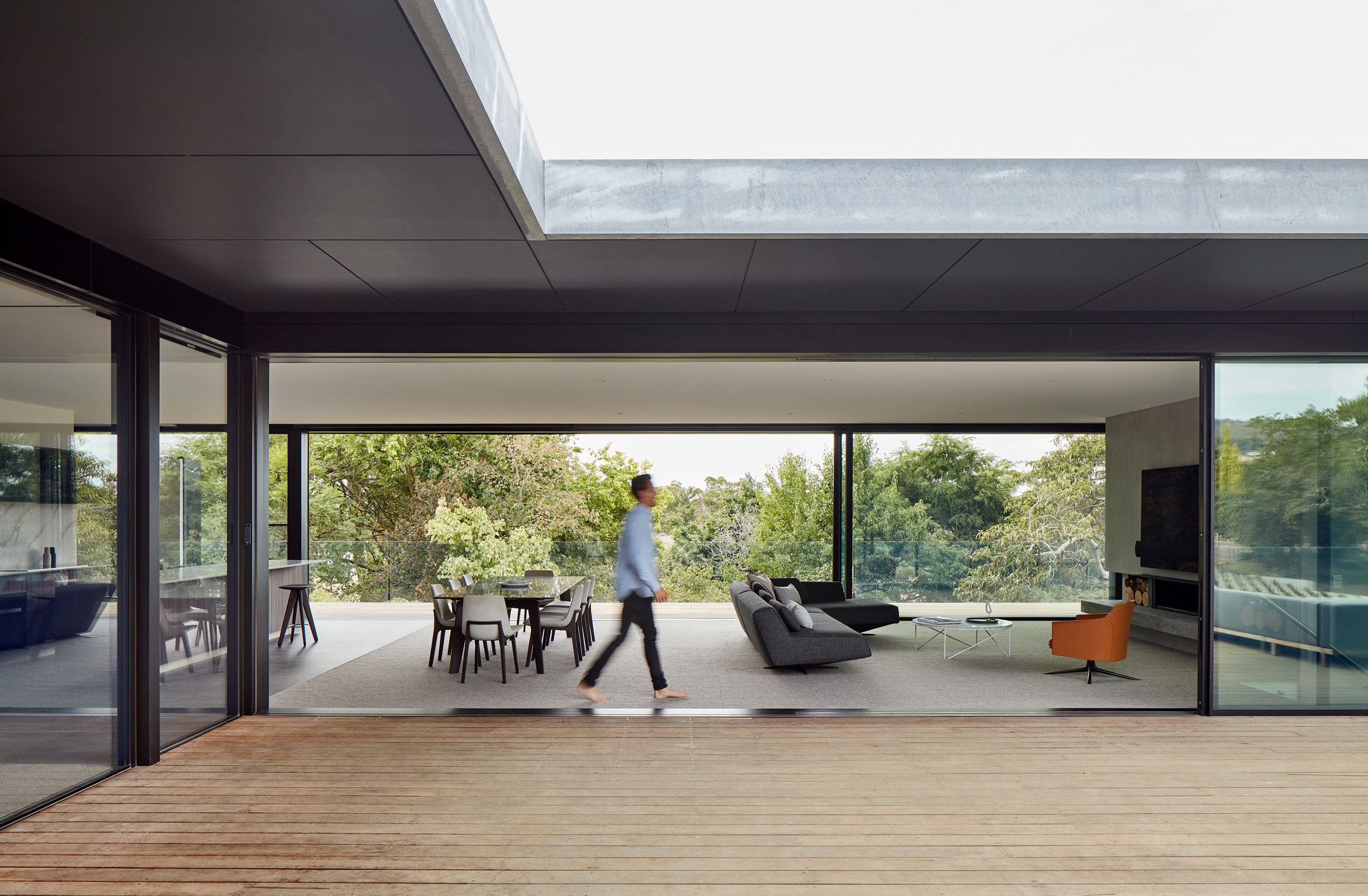
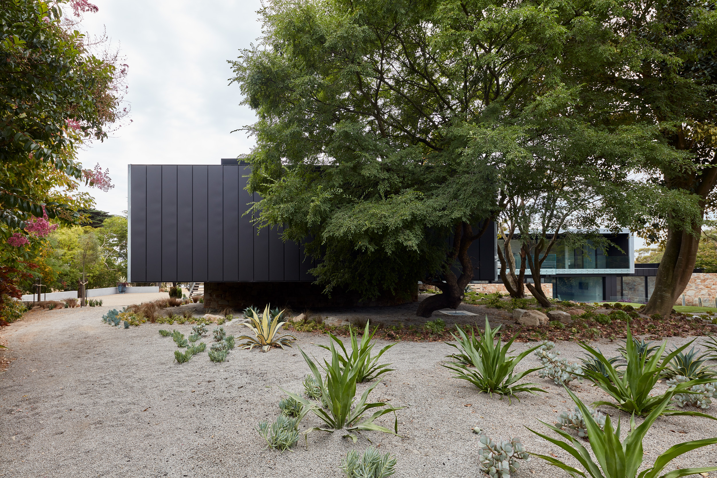
‘By virtue of the house design, to live in the home is to co-exist with the garden,’ the studio says. ‘The modernist-inspired style opens itself up to the garden at every opportunity – there is not a space within the home deemed principal or secondary that does not acknowledge the life that surrounds it.’
Particular attention was paid to maximising the sense of transparency, and the decks that flank the living space become an extension of the room when the large glass sliding doors are opened. Frameless glass balustrading adds to this sense of transparency all year round.
The linear emphasis of the design is highlighted by a main façade with high and low level windows paired with reflective black panels, bringing in light while retaining privacy and a sense of mystery. Each structural component is edged in metal cladding and sits up a stone clad plinth, which in turn blends in with the contours and natural planting of the surrounding gardens.
