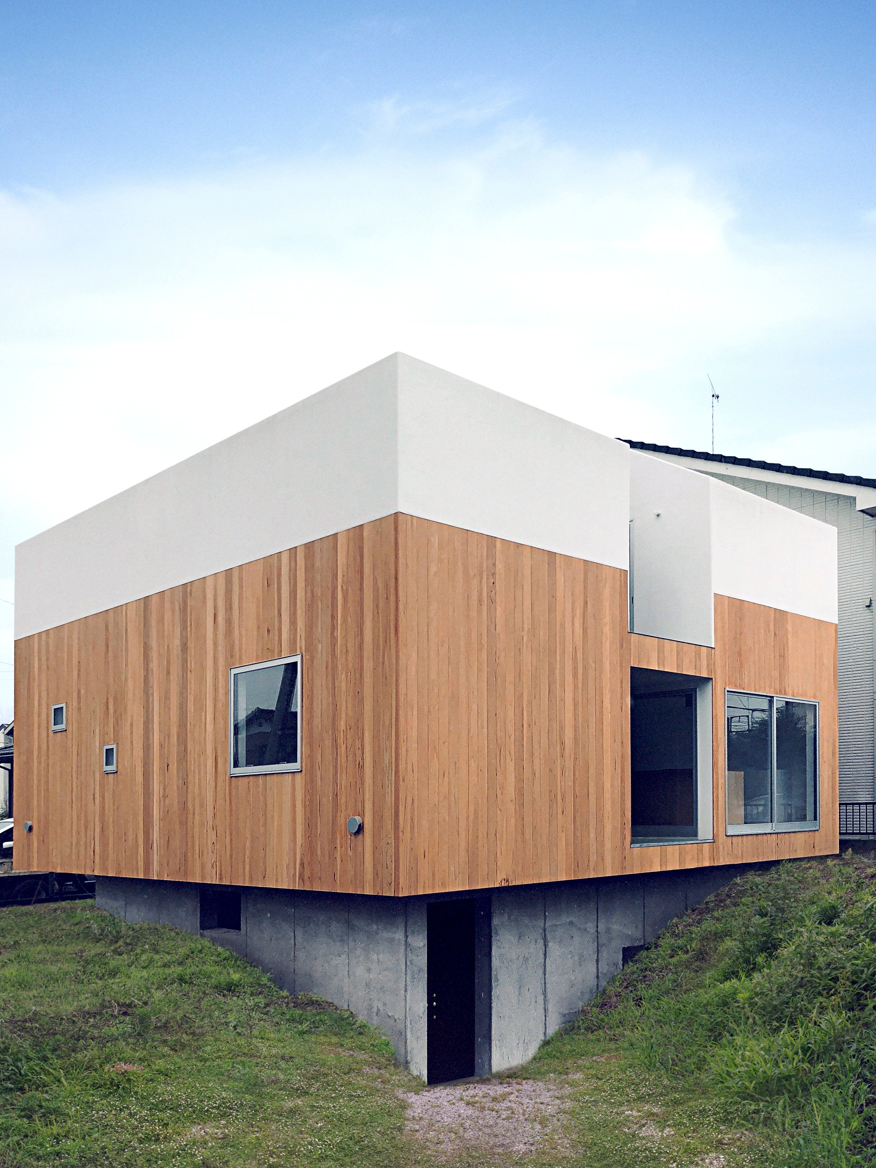
At just under 108 sq m, the Kumagaya House in Saitama, capital city of Japan’s Saitama Prefecture, conforms to the country’s compact, space-saving approach to private architectural design. Designed by Hiroo Okubo of the Tokyo-based studio Chop+Archi, the modest family house actually strives to push against the norm.
Tour this modern Kumagaya House
As Okubo notes, ‘the nuclear family structure, which the anthropologist George Murdock argued was universal, has been the predominant family structure in Japan since the postwar period’. Japan is no stranger to shifting demographics, however, and with this in mind, Okubo sought to create a plan that ‘released the pressure on families to be constantly united’.
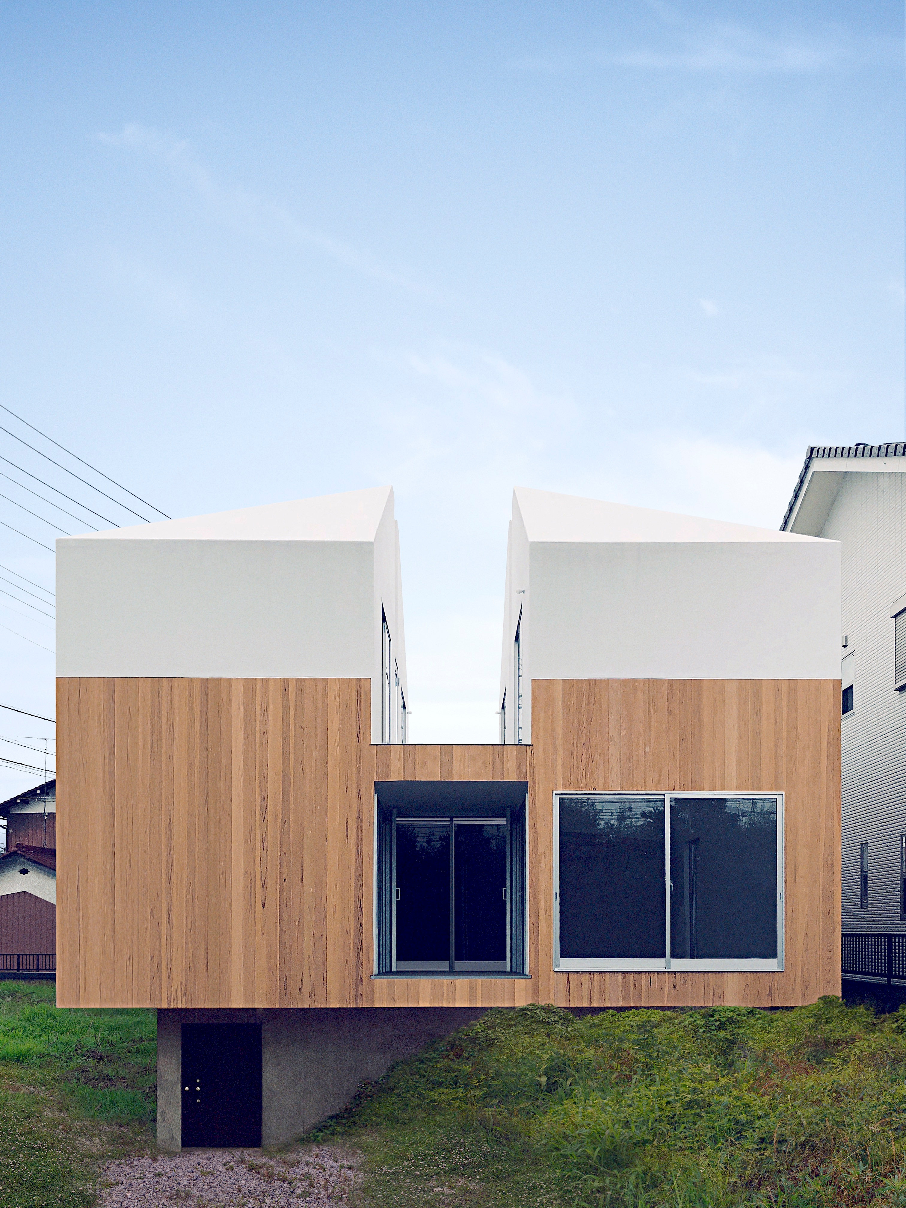
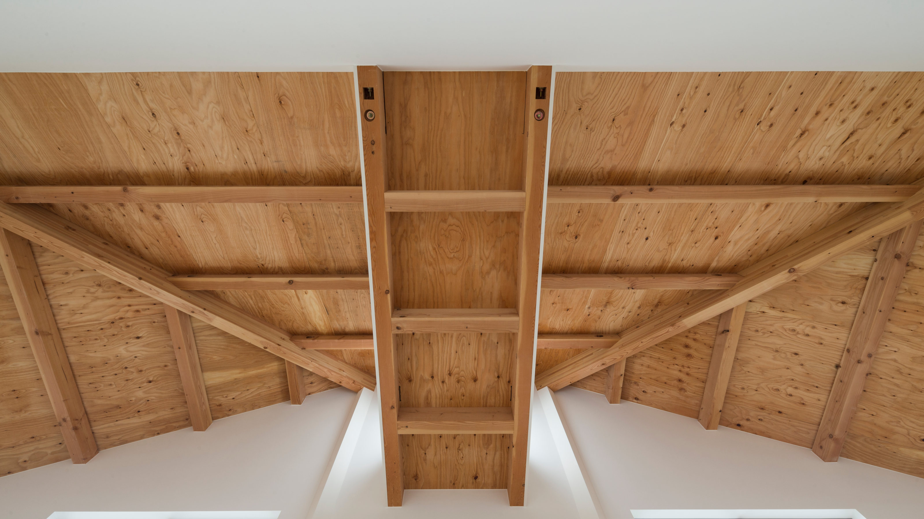
This was a tall order within such a small floorplan. The house is arranged as a cube, elevated up above a concrete sub-basement that serves as a storage spaces to keep the main living spaces and bedrooms as clutter free as possible. To achieve this, the house has a cruciform void space at its heart, a geometrically precise subdivision of the square plan that sees the first floor reach right up to the timber roof space thanks to two wedge shaped sections removed from the second-floor plan.
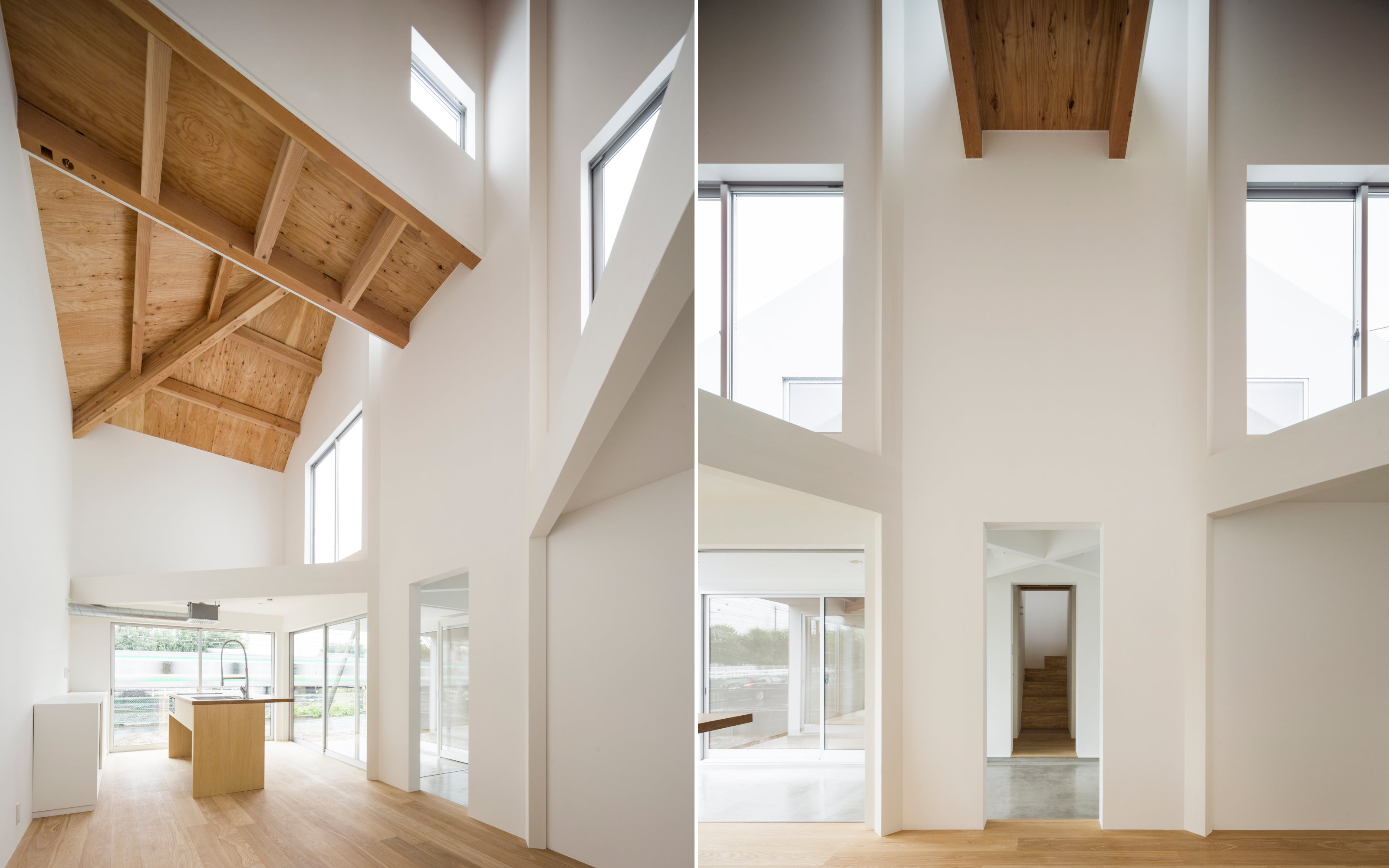
Access is up some steps to the raised ground floor, which is divided into two halves. One half with a living room and kitchen, the other with a dining space, laundry, bathroom and staircase. The entrance hall and terrace bisect the two sections. Up the staircase, two double bedrooms flank either side of the staircase, whilst the other half of the house is the upper level of the double height living space.
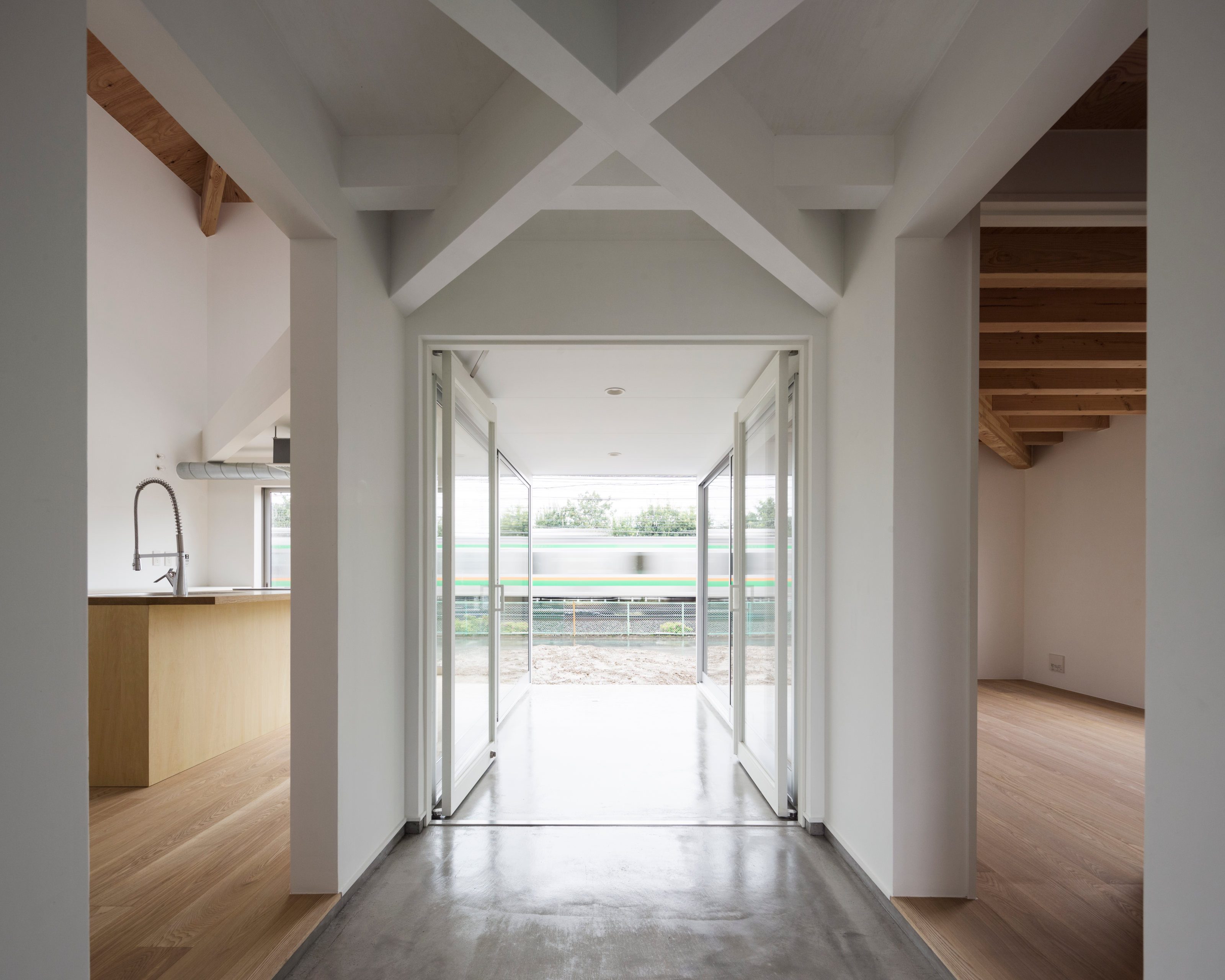
Between the two sections is a private balcony that runs east west along the length of the house, hidden from view by the pitched roof. Up here there are also twin loft mezzanines above the living space, left open but accessible to increase the floor area.
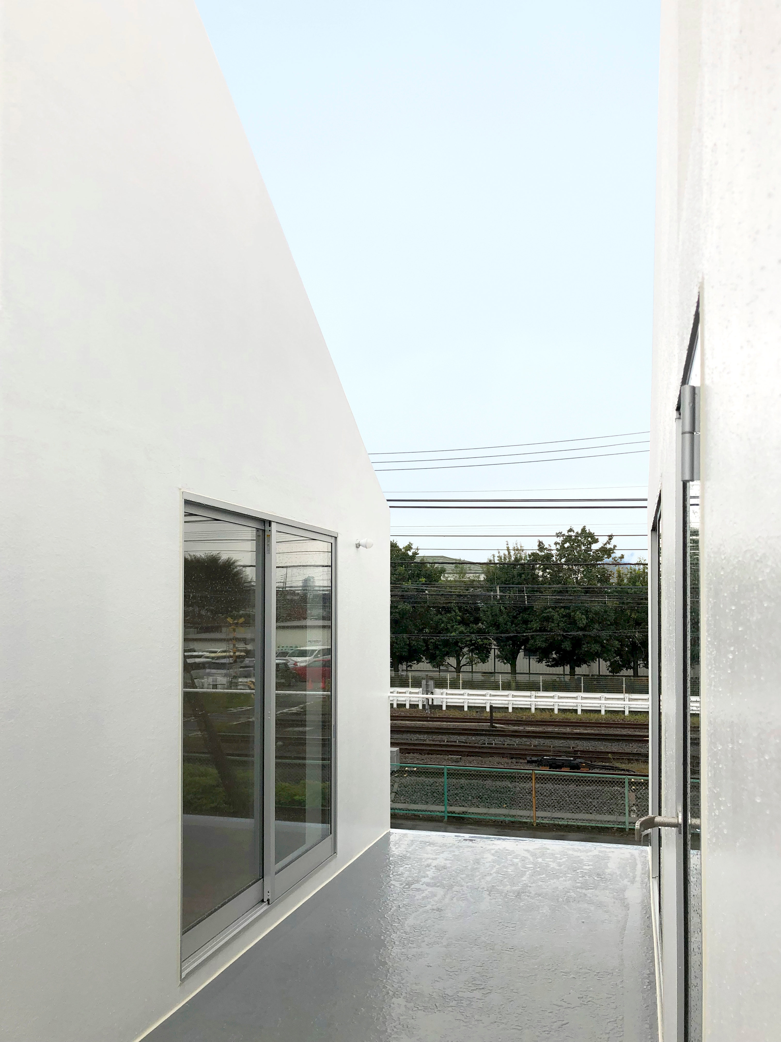
‘The layout is reminiscent of the residential floor plan known as “ta-no-ji”,’ says the architect, explaining that the term refers to the Chinese character for ‘rice field’, a square divided into four parts by two intersecting lines. The Kumagaya House avoids creating any overlapping or conflicting by using the void as both a buffer and a link, a connecting device that also keeps the different quadrants of the house separate without compromising their views or access to outside space.
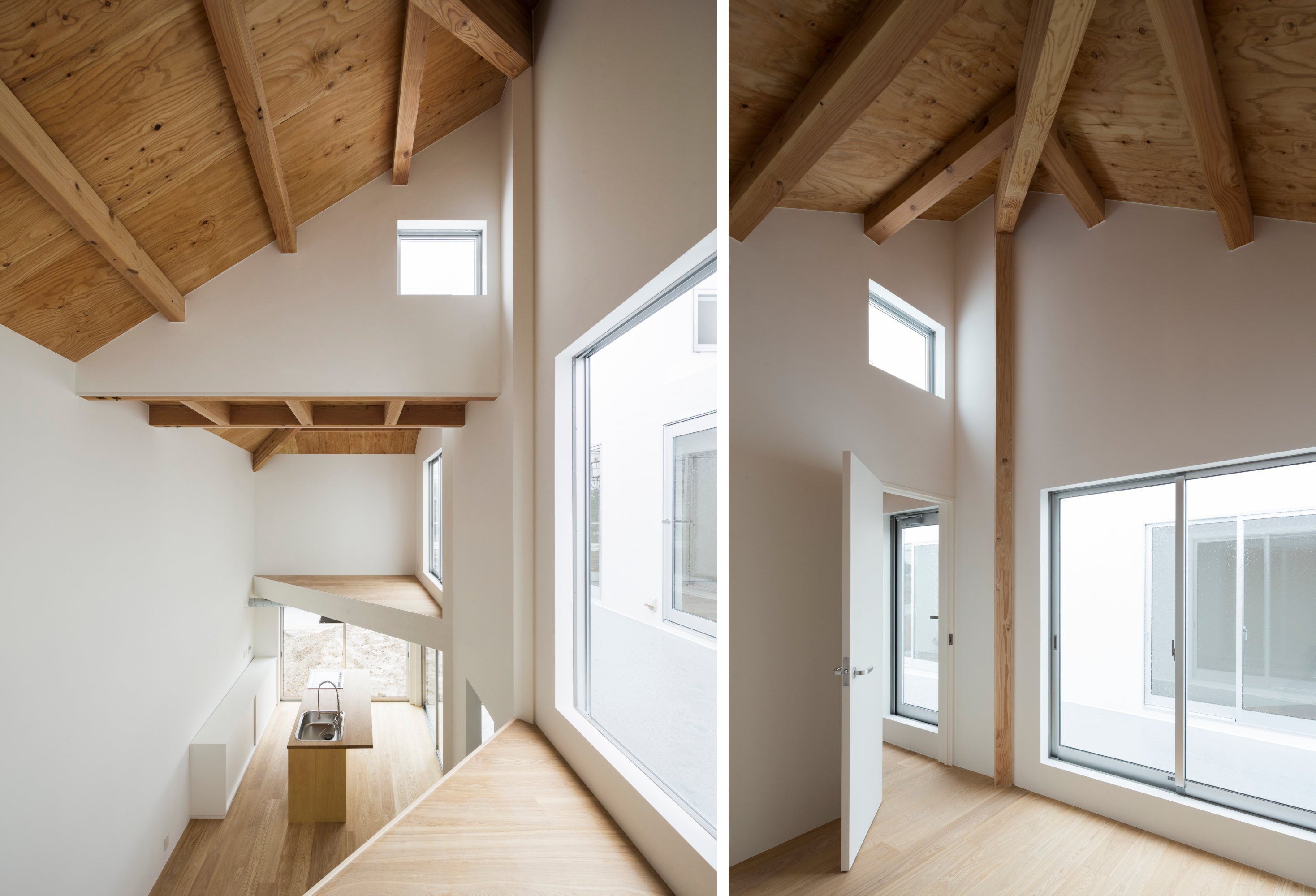
This takes us back to the tense cohabitation of the modern nuclear family. The void is ‘much like an air cushion’, Okubo suggests, ‘a buffer against friction among members of the household amid the pressure to constantly function as a cohesive unit’. Despite the house’s modest scale, the idea of ‘partitioning the space with air’ creates a spacious yet surprisingly private series of spaces. ‘It relaxes the atmosphere of the home, imbuing it with a sense of stability and balance,’ says the architect.
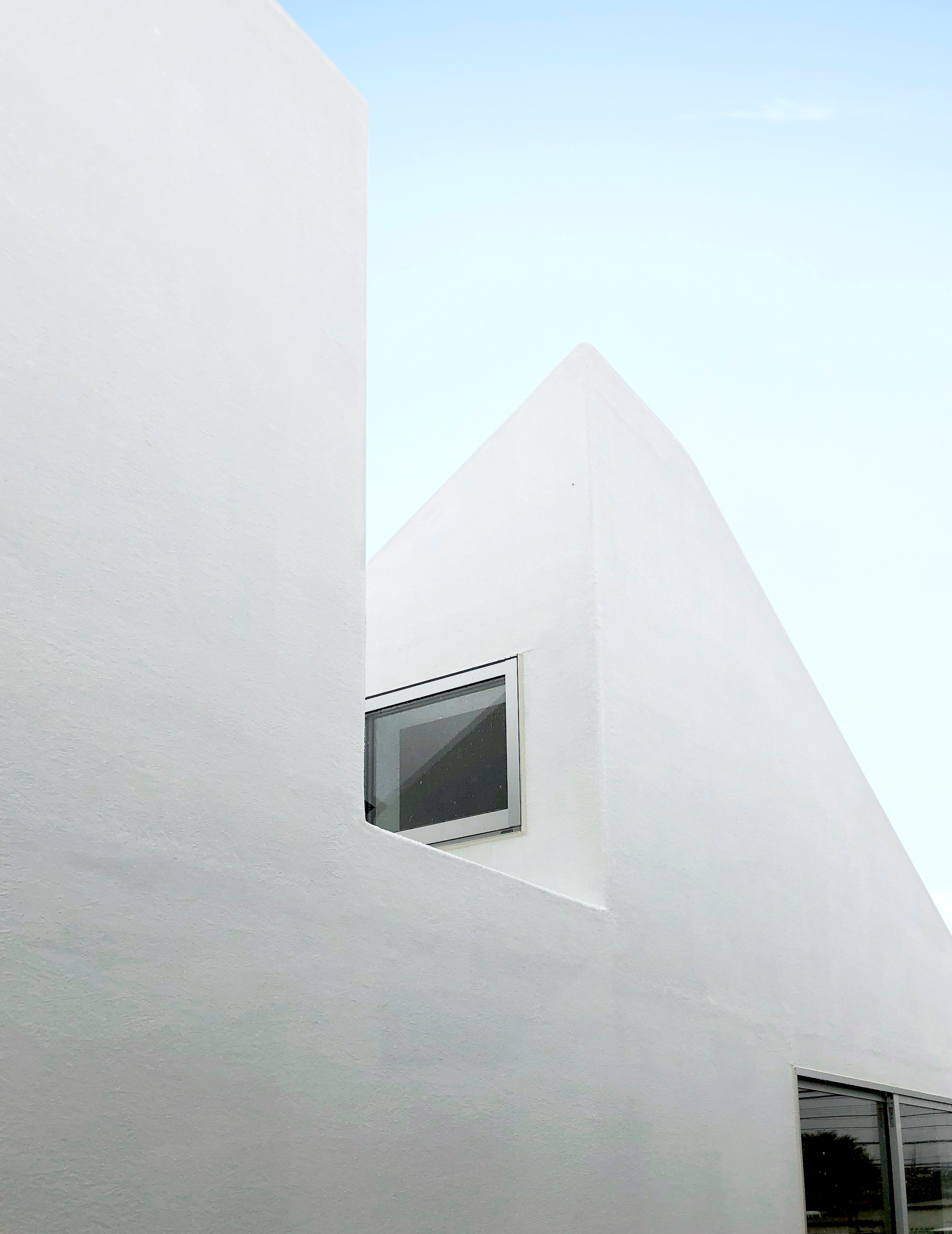
Structural engineering was by Shin Yokoo at OUVI and the house combines a reinforced concrete structure with exposed timber, especially in the monumental roof construction. The house has a minimalist aesthetic, with uncluttered planes, frameless glass and pared back details. Okubo trained as a furniture and product designer before turning to architect, but he retains an interest in creating furniture and products alongside his buildings.


