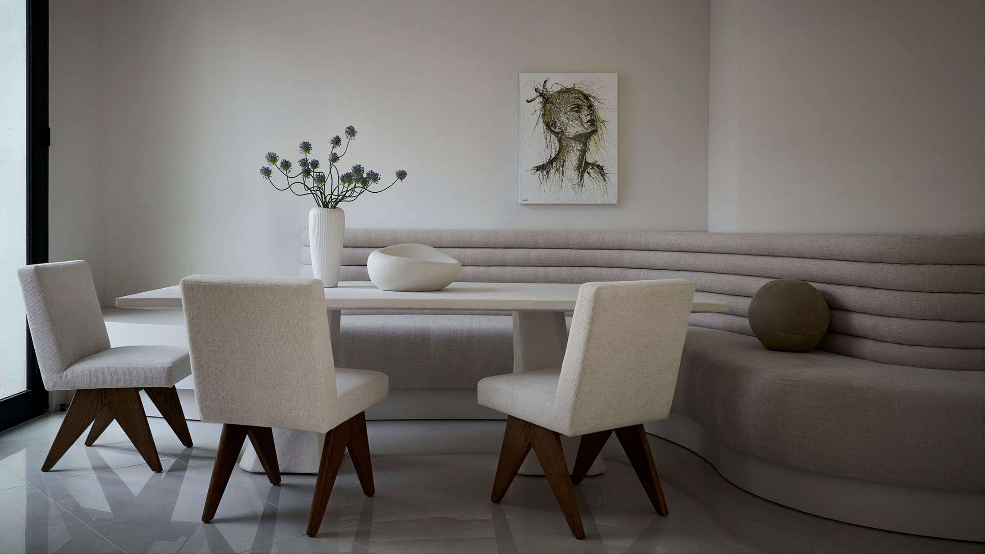
It can be hard to trace the origins of the minimalist interior design movement. Its core principles can be difficult to differentiate from that of modernism, not to mention contemporary design. Recognized for its pared-back, enduring architecture and interior style, minimalists champion a lot of modern interior design principles, removing all unnecessary embellishments so that the essence of a space — its materials and its form — can take center stage.
But it's not as simple as leaving blank space in a room. It's about filling it only with pieces that serve a purpose. "It's about creating spaces that are intentional, inviting, and free from excessive clutter," adds Emily Brown, the principal designer and founder of Southwest studio Emily Lauren Interiors.
Once you understand that every choice is weighed with function in mind, you can start to see the characteristic white walls in an entirely new way — a canvas for light, shadows and contrast. To capture the essence of minimalism, we spoke to experts to unearth what is means, why it's important, and how it takes form in minimalist interiors.
Defining Characteristics of Minimalist Interior Design
- Warm neutral and monochromatic color palettes
- Only necessary furnishings and accessories
- Clean, simple architectural lines
- A focus on natural light
- Open concept floor plans
- Discrete but ample storage solutions
- Natural textures
WHAT IS MINIMALISM IN DESIGN?
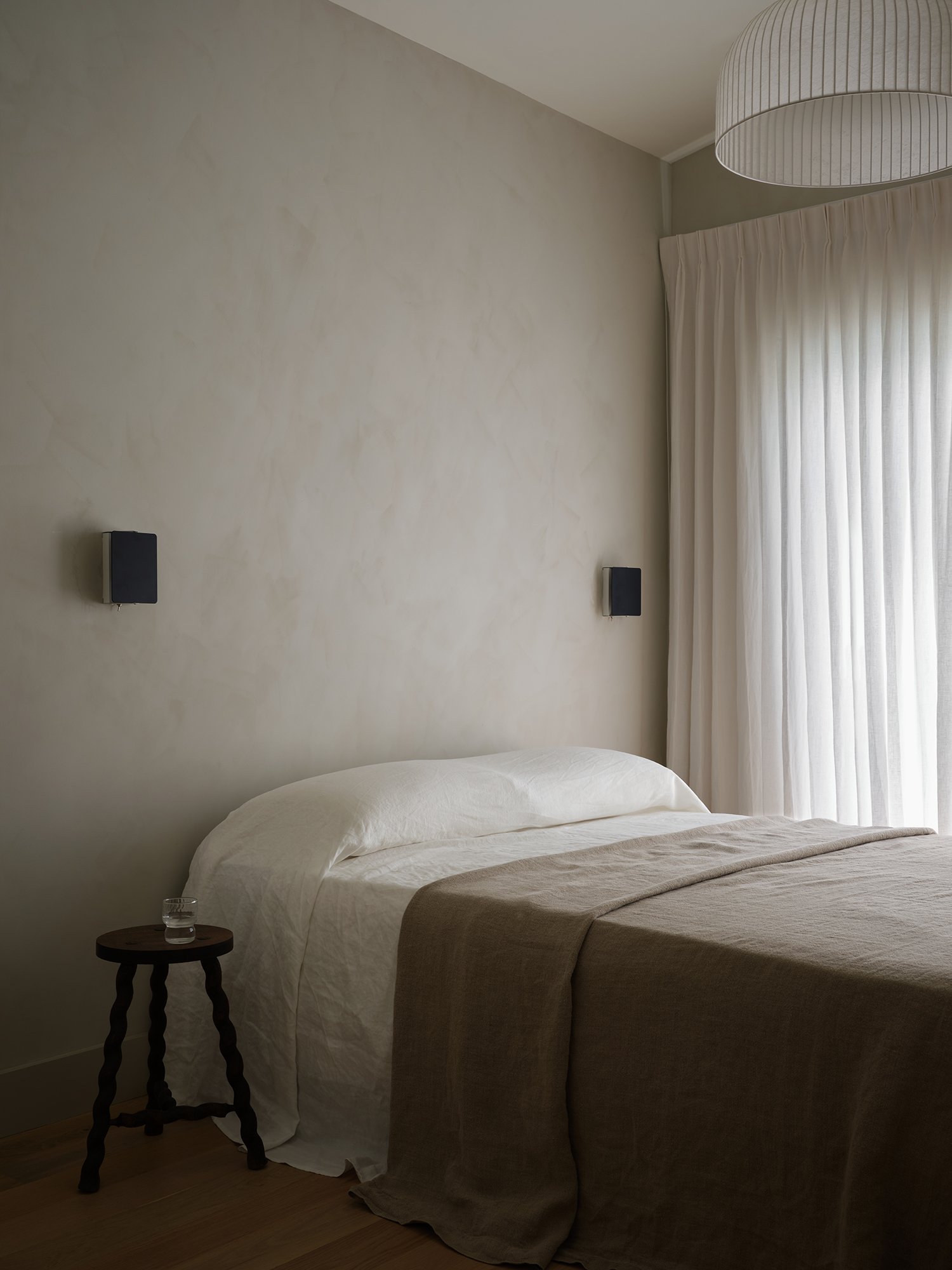
Minimalism, pure minimalism, is exacting even though the word itself is widely applied. You might think of it more as a principle rather than a visual style — its reverberant philosophy lends itself to some of the more striking interiors of the past century.
“Minimalism is about finding the core,” says Jonas Bjerre-Poulsen, founder of Copenhagen’s Norm Architects, who practices what he calls Soft Minimalism in the studio's take on architecture and custom furniture. He is a leader in why this has become one of the biggest architecture trends. “It is about a search for essence. By eliminating the superfluous, you emphasize core qualities of life, spaces, people. It's a way of practicing daily life that has been pivotal in many important cultures of minimalism throughout history — from Buddhist zen cultures in Japan to the Shaker culture in the United States.”
It’s hard to miss the almost spiritual resolve of minimalist designers, their reverence for the deeper meaning of space. The point is to reveal a natural beauty unobscured by ornamentation or decor; the idea isn’t to look good, but to feel good and true.
“As an architect, I’m interested in the emotional quality of a space,” says John Pawson, undoubtedly today’s foremost minimalist architect and interior designer. “When someone walks into a house, or a gallery, or a monastery I have designed, it is the atmosphere I want them to experience, before they start registering the details of the architecture.”
Similar to many of the ideas seen in Scandinavian design, in effect, minimalist designs are purified spaces that are timeless and pared down. And like in transitional style, you can expect monochromatic palettes, strikingly spare interiors, and clean lines.
“Minimalist design is defined by a great simplicity of lines that allow you to immediately understand the function of the space or the object,” say Hélène Pinaud and Julien Schwartzmann of Paris’ Heju Studio. “It is all about proportions and materials and is often much more complex than it looks. In our opinion, minimalism is also a way of life and a philosophy rather than a style or a trend in decoration.”
WHERE DID MINIMALISM COME FROM?
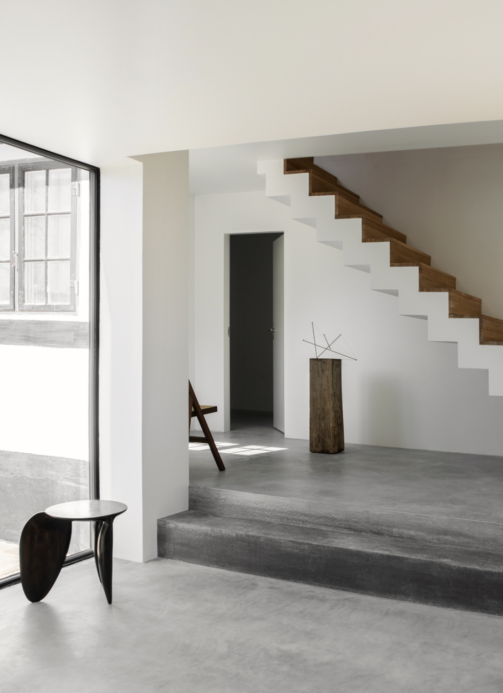
While the minimalist aesthetic has traditional roots in Japan's Zen Buddhism and even Scandinavian design (now seen today in beautiful beige living room ideas), a conscious minimalist movement began to emerge in the 1960s when a group of artists — Donald Judd, Carl Andre, Dan Flavin, and others — moved against Abstract Expressionism and focused on materiality. Rejecting excess, they created art that revealed simple geographic shapes and the form itself.
Naturally, the art movement gained traction throughout the design world. After the bold and brash aesthetics of the 80s, the 90s had their own revolt by exercising restraint. The result was austere minimalism, driven by clean lines (simple was chic) that made their mark in formative architecture by John Pawson.
The late Christian Liaigre may well have cemented the interiors movement with a signature sparseness in redesigns of New York City’s Mercer Hotel, noted for its sleek furniture rendered in dark woods or upholstered in white linen (his name is often associated with a coterie that includes Calvin Klein and Helmut Lang).
WHAT DOES A MINIMALIST SPACE LOOK LIKE?
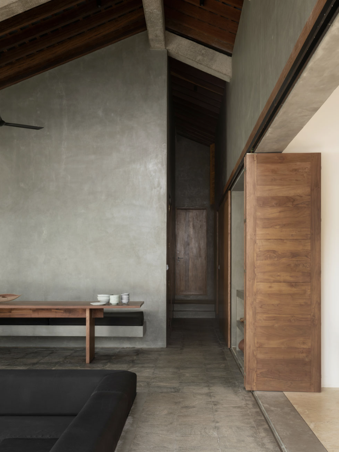
Minimalist spaces are deceptively refined. They are most known for clean lines and simple, sculptural forms. Interiors are uncompromisingly spare with no traces of clutter and limited, purposeful objects. Embracing the art movement’s focus on simple geometry, you’ll find plenty of right-angles alongside the occasional organic form. Like the principles of Scandinavian design, there is a focus on natural light, open layouts, and craftsmanship. Many open plan kitchen extensions now adhere to these principles, with overhead windows and a sparse palette.
This brings us to minimalism’s neutral palette, often anchored by shades of white. While minimalism in the 80s and even 90s interiors sometimes appeared rather sleek and cold (some would say artificial), today’s minimalist spaces tend to embrace a warmer, more natural palette.
“As human beings, we have a fundamental connection with natural materials that transcend cultural preferences as we are an integral part of nature,” explains Jonas Bjerre-Poulsen of Norm Architects, who embraces the Japanese philosophy of Wabi-Sabi (which emphasizes nature and all its imperfections) in his minimalist interiors. “Studies show how our mind and body are calmed when surrounded by natural materials in architecture. Even though all colors and most textures exist in nature, some are more predominant than others and the rays of light from muted browns, greens and blues that echo our natural surroundings, penetrate our skin and affect our organism positively in the same way that the sounds of waves make us feel at ease.”
For interiors, this newer, warmer minimalism continues to embrace tradition and timeless aesthetics. It works in many spaces - minimalist dining rooms, bathrooms, kitchens - there is no limit.
“Minimalist living is not only about having a clean home, it is also about celebrating nature and authenticity,” say Hélène Pinaud and Julien Schwartzmann of Heju Studio. “So we are not afraid to incorporate artisanal, vintage and homemade objects and furniture but always in a quiet, neutral palette (for instance a soft terracotta, a dark-blue gray, an olive green or a nude beige). We choose raw materials (like wood, stone, concrete) over imitations. These materials carry some imperfections, are not all identical and they will live over time. This patina will only make them even more beautiful. It gives a warm and welcoming atmosphere into a minimalist home.”
WHAT DO PEOPLE GET WRONG ABOUT MINIMALIST DESIGN?

Minimalism is often diluted with other contemporary styles, and some interiors masquerade as minimalist even when they’re just, well, plain boring. Certainly, minimalism has been ironically overused to the point of ubiquity. But it shares ideas with rhythm in interior design, about flow and cohesiveness.
To that end, its often sprawling label isn’t always well-received from designers — there’s a reluctance, and even flat-out rejection, of the label itself. The supreme and borderline vacancy of Kim Kardashian's Calabasas mansion, designed in part by the Belgian designer Axel Vervoordt, reads like a minimalist dream, and yet Vervoordt himself does not consider himself a minimalist designer.
“I often discuss with colleagues whether simplicity would be a better term than minimalism when it comes to describing our design approach,” says Jonas Bjerre-Poulsen of Norm Architects. “Due to the misconception of minimalism that was created in the last part of the former century, people often get the idea of minimalism wrong. This is exactly why we wrote the manifest, Soft Minimalism, when founding our studio in 2008. We wanted to express our love for simple timeless design without it being misunderstood and something cold and hostile.”
Today, a softer, warm minimalism is taking hold with a less rigid definition and more options to personalize space with warmer neutrals and cozier natural tones (according to interior designer Leanne Ford, known for her white-on-white signature aesthetic, this means picking from the best white paints for interior walls, creams, tans, and natural woods). Other designers inject their own perspective, making it a touch more personal, like French interior architect Adrien Dirand, who practices what he calls ornamental minimalism: unmistakably scaled back, you’ll find open plans with strokes of one-of-a-kind furniture rendered in sumptuous finishes like marble and stone.
WHY IS MINIMALIST DESIGN SO POPULAR?
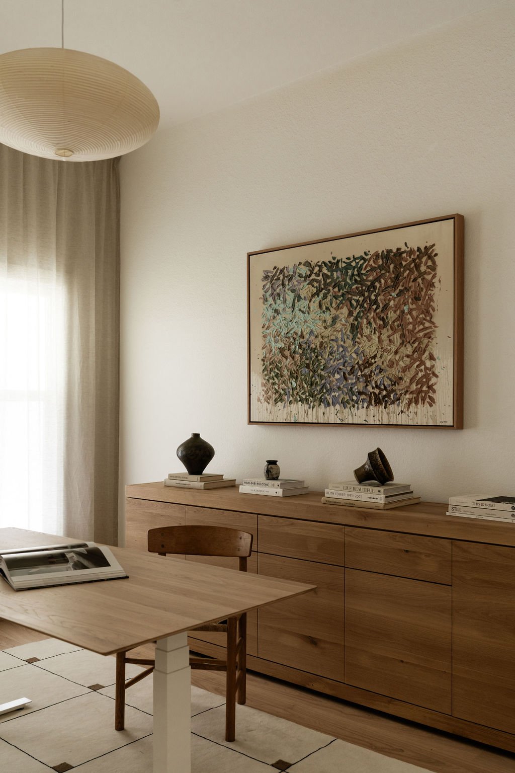
Certainly, there are plenty of people who believe minimalism is dead — the rise of maximalism in interior design is an obvious sign of changing times. And yet minimalism, or the pursuit of pure simplicity, is a timeless endeavor.
Minimalist living is so popular because In today’s world of wellness-oriented culture, where well-being has never been more valued and considered, minimalist principles have can make us feel better.
“We want to come back to a simplest and slowest life, be happy with little and find beauty in the simplest things,” say Hélène Pinaud and Julien Schwartzmann of Paris’ Heju Studio. “A minimalist and calming space helps to clear your mind and allows you to focus on the essential. We want to tidy up and get rid of things that serve little, create chaos and stress in your everyday life. So we keep only the essential and the inspiring!”
WHY IS MINIMALISM SO IMPORTANT IN DESIGN?
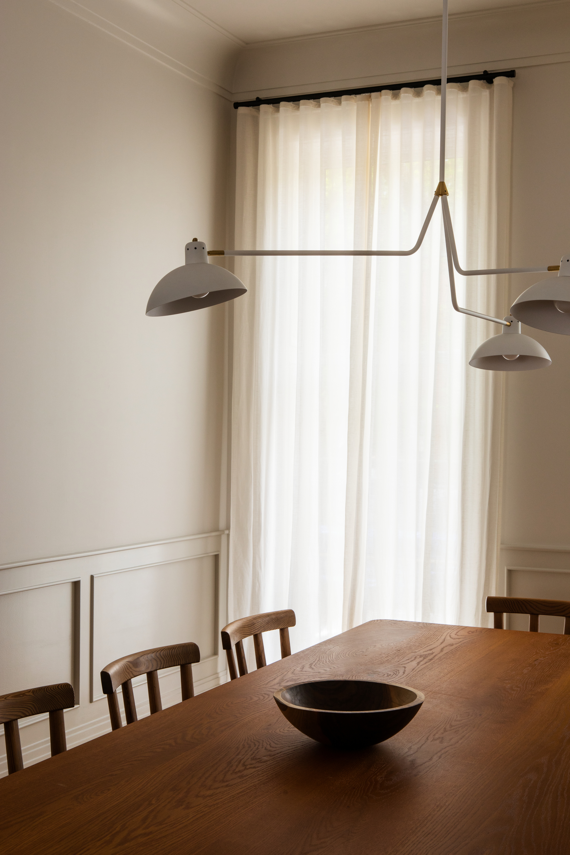
Minimalism is so important in design because of environmental concerns. “I think the accelerating climate crisis means that the move towards living with less stuff makes much more than just aesthetic sense,” says John Pawson. “Although I have never set out to ‘convert’ anyone and I certainly don’t judge anyone for wanting to do things differently, I increasingly believe in the social, ethical and moral value of living more simply.” The quest for sustainable living has made minimalism seem ever more popular.
Certainly, minimalism throughout history strikes a similar chord — excess is a distraction from the beauty that’s already there (not to mention an absolute waste).
“Function and aesthetics should not be considered separate entities, but as part of the same whole,” says Jonas Bjerre-Poulsen of Norm Architects. “We are greatly influenced by our surroundings, and for ages, humans have invested time, energy, and resources into creating aesthetically pleasing spaces to dwell in. It affects our wellbeing and is, therefore, an integral part of the aspect of creating functional spaces and designs; same as solving practical needs. Beauty solves mental needs.”
Function, after all, separates something that’s purely visual from something liveable — minimalist living can cut through the clutter and bring purpose to our everyday space. It doesn’t necessarily work against society’s timeless, tireless drive to create new things, but instead clarifies the beauty that was already there.
“We think about design as an evolution,” says Jonas Bjerre-Poulsen of Norm Architects. “We’re not able to revolutionize anything. Everything comes from something. We’re standing on the shoulders of thinkers before us and by holding on to millennia of knowledge and by understanding our heritage, we might aspire to make slight improvements in design that can meet the needs of contemporary life.”
HOW DOES LIGHTING CONTRIBUTE TO MINIMALIST INTERIOR DESIGN?
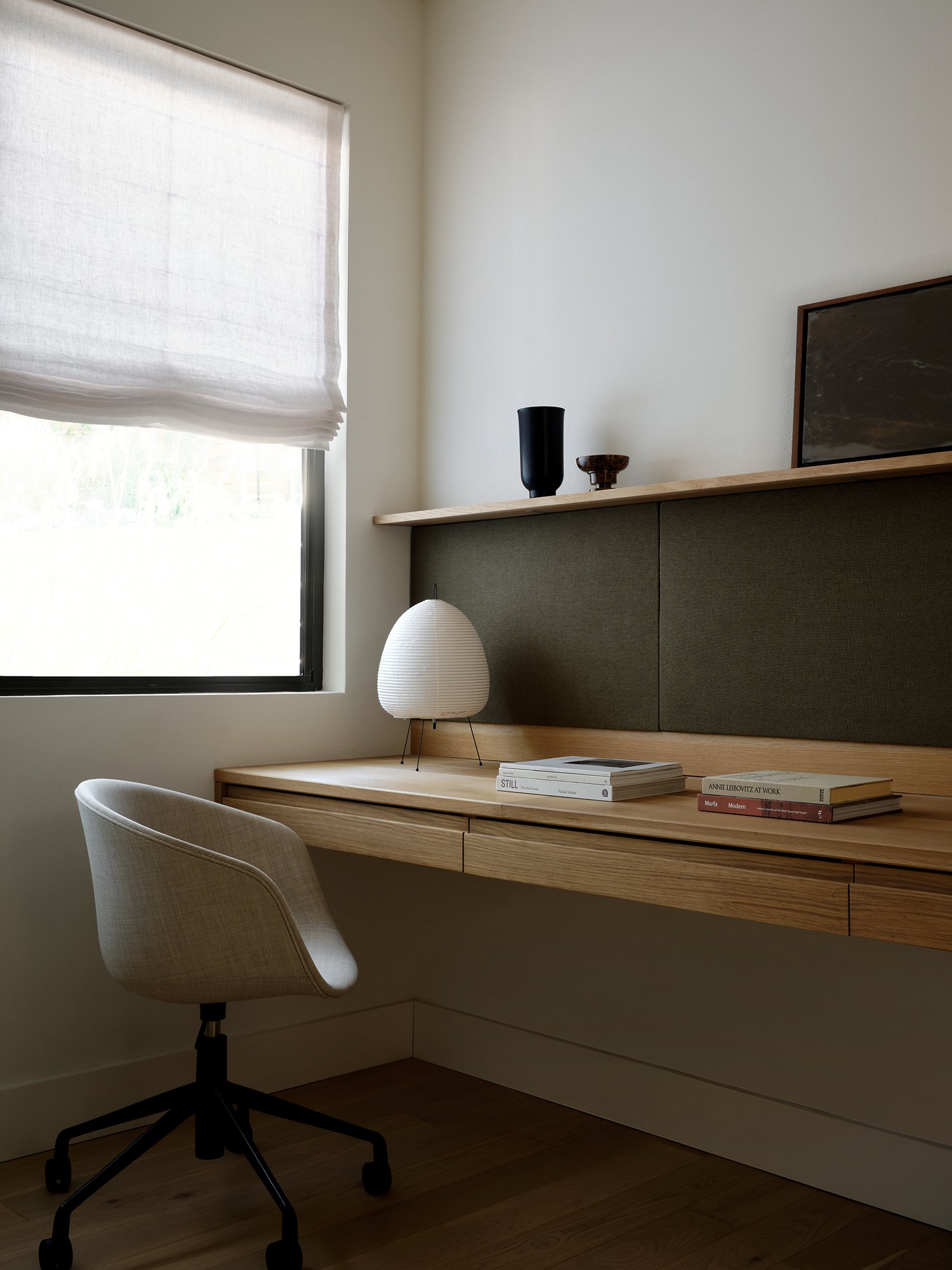
Lighting can be a critical element when it comes to creating a minimalist aesthetic. "Stay away from overhead recessed lighting and focus on the task and function in each room," advises interior designer Emily Brown, founder and principal designer at Emily Lauren Interiors.
For a bedroom, she says to consider sconces or minimalist table lamps for reading in bed, or "a soft linen pendant that will add an ambient glow if you need overhead lighting." You can also try mixing table lamps in the living room with floor lamps, sconces and drop pendants for "a focused moment, instead of a big chandelier."
Speaking on technicalities, Emily says: "Opt for warm-toned LED bulbs with a color temperature of 2700K to 3000K and avoid cooler, bluish bulbs that are 4000K and up."
A MINIMALIST COLOR PALETTE
Minimalist paint ideas span beyond the characteristic shades of white. "Stick with neutral warm colors like ivory, beige, brown, and warm charcoals," says interior designer Emily Brown, who also recommends complementing these shades with deep earth tones like greens, blues, plum, or ochre.

Price: $38.98/gallon

Price: from $55.99/gallon


