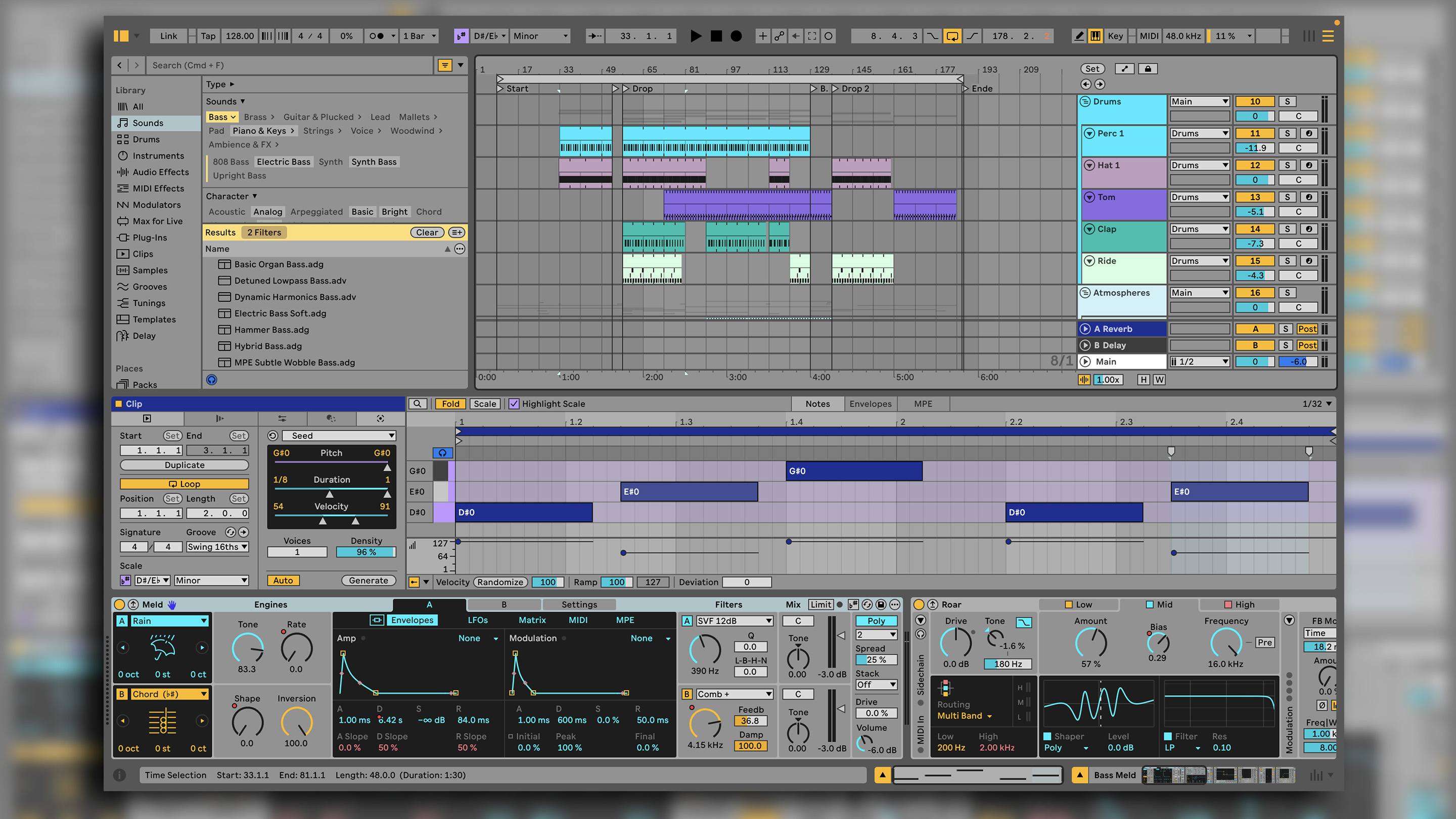
Ableton Live first hit the market in 2001. Over the past two decades it has established itself as one of the biggest names in music software and the go-to DAW (digital audio workstation) for countless musicians – particularly within electronic and dance music circles.
Released in March 2024, version 12 was the most substantial update to the DAW in over a decade, bringing changes to the UI and browser, new instrument and effect devices, new generative MIDI tools and a raft of other refinements. In the months that have followed, Ableton has added yet more new features via a pair of significant free ‘point’ updates.
With version 12.2 now out of its public beta period, we’re revisiting and updating our original Live 12 for 2025.
Ableton Live 12 Suite: What is it?
Most DAW updates are sold on the back of flashy new features, but really what a DAW lives or dies on is consistency. Whether used in a professional or hobby capacity, these are foundational platforms for modern music makers. A transition from one version to another needs to be as seamless as possible.
The promise of exciting new features might be what sells a user on paying for the latest updates, but it’s the small, incremental enhancements to an application’s workflow that make them stick around for the long term.
Traditionally, this is something Ableton has been good at. For all of the devices added in the 24 years since it launched, Live’s overall design has remained remarkably consistent. So much so that it would be possible to skip several versions when updating and still encounter few unexpected roadblocks, since most elements will be where you’d expect them: the browser to the left, devices down the bottom, clip launcher and arrangement living in their own individual UI views.
Version 12 is arguably Live’s most significant update in over a decade because it’s the first time that Ableton has risked messing with this familiarity.
UI and browser
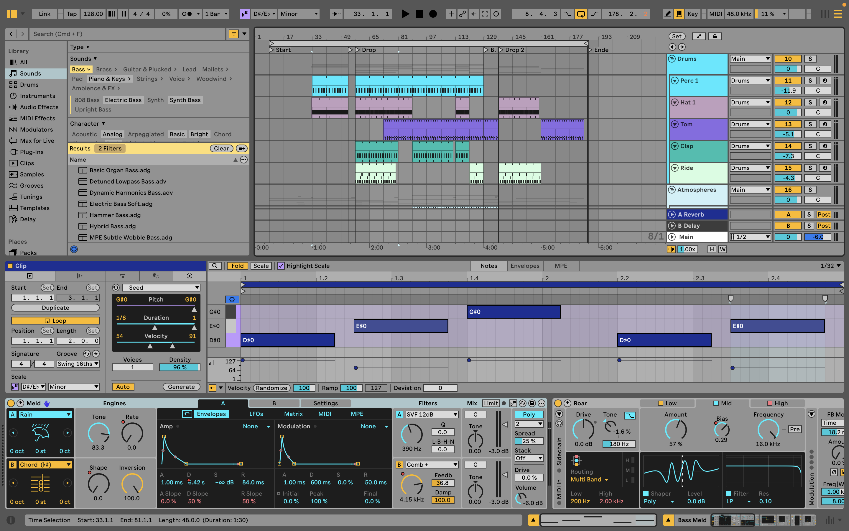
This is most evident in the layout of the UI. Previous versions of Live have maintained fairly rigorous constraints on how its workspace can be arranged. While it’s been possible to resize certain elements to an extent, and hide/show others, there have always been hard-and-fast rules about how Live is laid out. The clip launcher and timeline live in separate windows; the Mixer is only available in Session view; clip and device parameters can’t be viewed side-by-side.
Version 12 does away with a lot of these constraints and makes the UI far more flexible. While the divide between the clip-launching Session view and Arrangement timeline remains, it’s now possible to call up the mixer, clip and device panels from anywhere. This means you can use the Mixer alongside the Arrangement view, but also display MIDI or audio clips alongside device interfaces simultaneously, mostly within a single window.
Admittedly, this can feel a little on the cluttered side with everything displayed at once – particularly on a laptop screen – but the flexibility it adds to Live’s workflow is a real benefit. For those used to quickly tabbing between views and using familiar keyboard shortcuts to show/hide elements, the new interaction between these elements may take a little getting used to, but once it becomes familiar, there’s no going back.

• Bitwig Studio
Live’s closest competitor, also recently updated. Bitwig arguably offers more depth and flexibility, but loses some of Live’s slick immediacy.
• Apple Logic Pro
For Mac owners, Logic would be the best value DAW on the market, and recent years have seen it adopt more and more Live-inspired ideas.
• Image-Line FL Studio
Often wrongly derided as an ‘entry level’ DAW, like Live, FL Studio has a unique workflow that’s well suited to electronic music.
Out of curiosity, we returned to Live 11 after using 12, and the old UI immediately felt remarkably restrictive.
The UI element that took us a little longer to get to grips with is Live’s revamped Library browser. This modernises the way users find devices, clips, samples and other content, doing away with the previous system of sub-folders in favour of dynamic tags and filters.
The new system is objectively better – there’s more flexibility, particularly when it comes to saving custom search parameters, and it means there’s less of a divide between content types. A top-level search for ‘bass’, for example, will bring up a long list of device presets, clips, loops and samples, which can be filtered down by content type, source or sound characteristics.
If the resulting combination of search terms and filters is something you’re likely to use again, hitting the ‘+’ symbol next to the results will add it to the library sidebar, creating a shortcut that will be updated as new content is imported or tagged.
Thanks to the Auto-Tagging system added with Live 12.1, the browser now automatically applies tags to user sample content too, which strips away a lot of the prep required to get the most out of the browser.
This is one of several ways the new browser has been fine tuned by Ableton since the initial launch of Live 12, along with custom folder icons, better filtering and a new Quick Tags panel that makes tag admin less fiddly.
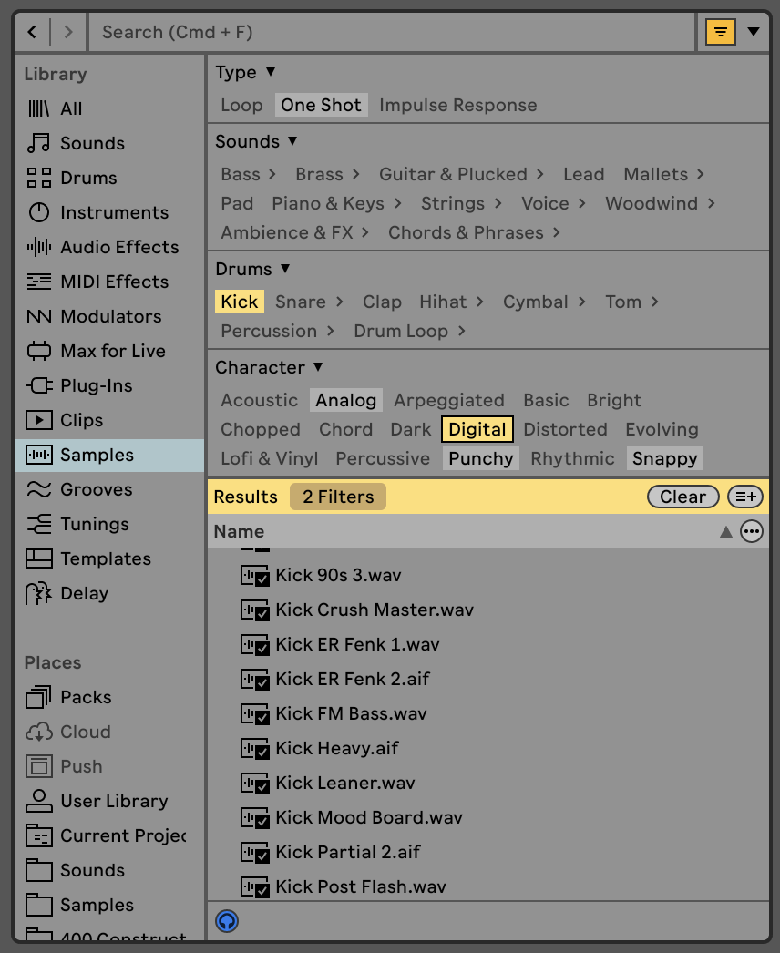
A highlight of the new browser tools is the Similarity Search. This can be accessed from the library or within a Drum Rack, and uses neural networks to suggest similar sounds based on a source sample.
While results can be a little hit and miss – it works best with percussion – it can be a hugely inspiring way to mix up the sound palette of an idea, particularly when used in the context of a drum rack kit, where it’s possible to swap out single elements or roll the dice on the full kit.
As I’ve settled into using Live 12, this has quickly become one of my most used features. I’ll regularly start a project using one of a few simple stock drum kits – a core 909 or 808, for example – and then use these tools to swap out the generic sounds for something more characterful.
MIDI tools
UI changes aside, one of Live 12’s most eye-catching additions is its suite of generative MIDI tools. These are an assortment of features within MIDI clips that are divided into two categories: Generators, which will fill an empty clip with MIDI data, and Transformations, which will alter existing MIDI patterns.
Within each of these categories are a variety of tools aimed at different use-cases. Generators, for example, include tools designed to build percussive patterns (Rhythm), melodies (Seed), chords (Stacks) or arpeggiated riffs (Shape). For Suite owners, these are expanded with the ability to use Max MIDI generators within clips too.
Transformations can do things like arpeggiate chords, adjust the quantisation or humanisation of notes, alter the position and timing of MIDI events, or embellish patterns with flams and ghost notes.
These MIDI tools are a fantastic, inspiring addition to the DAW, that practically beg you to lose hours down creative rabbit holes exploring their full potential. That being said, the implementation lacks refinement in places. It can be a little too easy to overwrite or edit previously generated patterns, and some functions don't feel quite as slick as they could.
Creating progressions with the Stacks chord generator, for example, involves manually altering the shape and root note of each chord, and it feels like it’s crying out for a function to auto-generate common progressions.

This is something addressed somewhat by the release of the Expressive Chords pack that comes free to all users with Live 12.2. This Max-based MIDI tool lets users perform chord progressions based on single note presses, making use of a variety of curated chord combinations. It’s also MPE compatible, meaning the results sound somewhat less static than some other auto-chord features can.
Live 12 also introduces a new master scale setting, whereby users can set a scale for the whole project, which is then automatically applied to new clips. This is handy, but it’s also easy to override by setting scales within individual MIDI or audio clips, allowing users to change key/scale mid-project or track, which is useful for live performance.
These scale settings take on added importance as of Live 12, as the DAW adds a ‘scale awareness’ mode to several of its stock devices. This allows for certain pitch-based parameters – such as MIDI effects, synth oscillator tuning, pitch-shift effects – to be locked to the current scale.
Not only does this avoid unwanted harmonic clashes (although it can be turned off, to avoid things sounding too ‘perfect’) it also means that changing from a clip with one assigned key/scale to another will cause all relevant devices to follow suit.
On a similar front, Live 12 also adds the ability to work with micro-tunings and non-Western scales. This is accessed via a tuning pool that functions in a similar manner to the Groove Pool. Engaging a tuning from this pool deactivates the global scale – which makes sense, since the two functions are effectively at odds with one another – and applies the tuning across all project clips. This pool also allows users to edit and import custom tunings.
New devices: Meld, Road and more
There’s a lot going on with this update then, and that’s before we even get to the headline devices. Live 12 adds a new synth, Meld, a new effect, Roar, and an update to the popular Max instrument Granulator.
Meld is a dual-engine synth with a variety of interesting oscillator modes that lean into digital sounds and textures. These range from simple virtual analogue waves through to creatively filtered noise, generators that produce interesting harmonic overtones, and animated rain and water textures. As of Live 12.2, its oscillators can also be used as 4-voice chord generators that allow for modulation to be applied to the chord shapes.

It also boasts filters that can double-up as resonators, distortions and comb filter effects, plus a powerful modulation setup that lets users apply transformations to the LFOs and route elements from one engine to the other.
Both in terms of structure and sound, Meld reminds me a lot of Arturia’s MiniFreak synth, which is no bad thing; both instruments combine complex digital synthesis ideas into a surprisingly approachable and fun package.
Roar is a multi-stage distortion, which allows up-to three stages of distortion to be arranged in a variety of ways. These can run in serial or parallel, be applied individually to different frequency bands, or to the mid and side of a signal. It also has an internal feedback routing, allowing Roar to act like a simple delay, whereby distortion can be applied to the input and feedback loop individually.
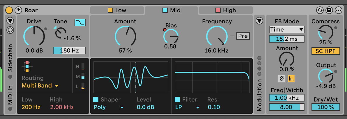
Like Meld, copious, flexible modulation capabilities do a lot to bring Roar to life, allowing it to work for broad applications such as refining the character of drum loops, adding resonant glitches to pads and creating lo-fi dub echoes.
The latest version of Granulator – more of a new instrument than a straight update – both refines and simplifies the granular concept, making it more approachable without sacrificing its depth. The biggest enhancements are the addition of MPE and improved capture capabilities that allow users to record directly into the effect.
Last but not least, it’s worth mentioning the work Ableton has put into adding to Live’s accessibility for version 12. This includes screen reader support, along with improved shortcuts, which make it all the easier to access every element of Live without using a mouse. I’m not somebody who requires either of these functions to use Live, so can’t really comment on how effectively they’ve been implemented, but it’s pleasing to see Ableton aim for advances in this area.
One year on: Live 12.1 and 12.2
After a few years that have seen Ableton balancing Live with some significant extra-circular releases – Note, Push 3, Move – the company appears to have settled down a little, putting the focus on updating its existing products rather than releasing new ones.
The year since Live 12’s release has seen some significant additions to the DAW, ones that have not only enhanced Live itself, but created tighter workflow ties between the desktop software itself and its various counterparts.
Probably the most significant addition on this front comes in the form of the new Drum Sampler device, added as part of the 12.1 update in late 2024. This new one-shot sampler is like an even simpler version of Simpler, formatted specifically for use with percussive sounds.

The general layout is more basic than Live’s other samplers, with just an AHD amp envelope available for shaping and minimal tools for sample adjustment, but Drum Sampler also adds a new FX slot into the mix.
This sits just before the device’s filter, and can be used for one of multiple processing functions, including looping, time-stretching, ring modulation, bitcrushing, as well as applying a pitch envelope, attack punch or a sub boost. In all cases, these effects can be adjusted using a simple X/Y pad.
Drum Sampler was launched alongside Move and is evidently designed with the Note and Move workflow in mind. Its simplified layout and X/Y pad are geared towards the limited hardware controls of Move and Note’s touchscreen interface as much as, if not more than, integration within Live. Despite this, it doesn’t feel like a lesser tool when used purely within the confines of the DAW.
While Drum Sampler might prove a little too simplistic for certain sampling applications, users still have access to both Sampler and Simpler in Live’s device list. With its range of effects, what it does provide is a quick and creative tool for shaping and automating percussion. For those that use Live alongside Note or Move, its cross-platform continuity is definitely very appealing.
The same can be said for Live’s revamped Auto Filter, which landed as part of the recent 12.2 release and also comes to Move, Note and Push’s standalone mode. Auto Filter is an absolute workhorse of a device, handy for a huge variety of different applications.
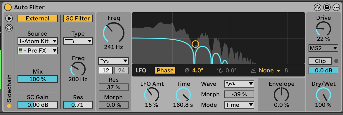
The new Auto Filter brings enhancements to every part of its toolset. Perhaps most significantly, it expands the range of filter types on offer, with additional emphasis on creative filtering.
The existing options – low-pass, high-pass, band-pass, notch, and a Morph filter – are now joined by a comb filter, vowel filter, resampling filter and bi-directional DJ-style filter mode. The Morph filter gains additional slope options, and the notch mode is joined by a notch + LP mode.
There are improvements to the analogue-emulating filter circuits too. Auto Filter now features a clean SVF model, Sallen-Key inspired MS2 and Ladder-style PRD modes, and a new DFM mode that, according to Ableton, “internally feeds back more of its distortion, resulting in a broad range of tones from subtle filter sweeps to warm drive.”
It’s an all-round welcome upgrade, which enhances every element of this thoroughly useful tool. Beyond the filters themselves, the onboard LFO has been massively enhanced too, with additional waveshape, rate and sync options – a highlight being the new Wander mode that creates a casually meandering, subtle form of randomisation. The device also gains a dry/wet control, which is another winning addition.
The other major new device added since Live 12’s launch is Auto Shift, a pitch tracking and correction tool that plugs one of the most significant holes in Live’s tool kit. This largely works as expected, adjusting incoming audio to match a set scale, with options to shift both the pitch and formats of that audio.
In terms of both capabilities and sound quality, it’s on a par with third-party rivals rather than offering a leap forward, but it’s pleasingly easy on the CPU – even in low-latency ‘live’ mode – and works well with Live 12’s new scale awareness functionality.
Verdict: Is it worth the update?
Live 12 has a lot to shout about. Compared to some previous iterations, there is a lot here that feels fresh and like it could have a significant impact on how users interact with the DAW.
The new updates impressed us at launch, but the workflow feels considerably more refined in the wake of two major updates. The new browser, in particular, has taken a few tweaks in order to reach its true potential, but we now couldn’t imagine returning to the old setup.
Having lived with Live 12 for a while, it’s the MIDI tools and Scale Awareness features that have left the biggest impression. Live has long been a creative powerhouse when it comes to things like synthesis, automation and non-linear sequencing, but the new tools unlock a layer of melodic compositional creativity that was perhaps absent from previous versions.
Taking versions 12 to 12.2 together, the new range of devices is exceptionally impressive too. Meld and Roar are both satisfying and refined creative tools, but it’s the appealing simplicity of Drum Sampler that stands out, making it an instant go-to tool.
Over the years, Ableton has become known for releasing updates that are incremental and often subtle, rather than revolutionary, meaning it can be difficult to decide how much it’s worth paying for the latest version. That’s not the case here – if you’re a user who’s been holding off on upgrading, Live 12 is the one you’ve been waiting for.
MusicRadar verdict: Recent free updates have ironed out some of the minor kinks in v12's major overhaul of Live – as well as adding some excellent new devices. Altogether, Live 12 is the best update we've seen in over a decade.
Ableton Live 12 Suite: Hands-on demos
Ableton
Ableton Live 12 Suite: Specifications
- KEY FEATURES: DAW update adding new tools, sound content, UI and workflow changes.
- PRICING: Live Suite: £539, Live Standard: £259, Live Intro: £69. Check site for upgrade offers.
- CONTACT: Ableton


