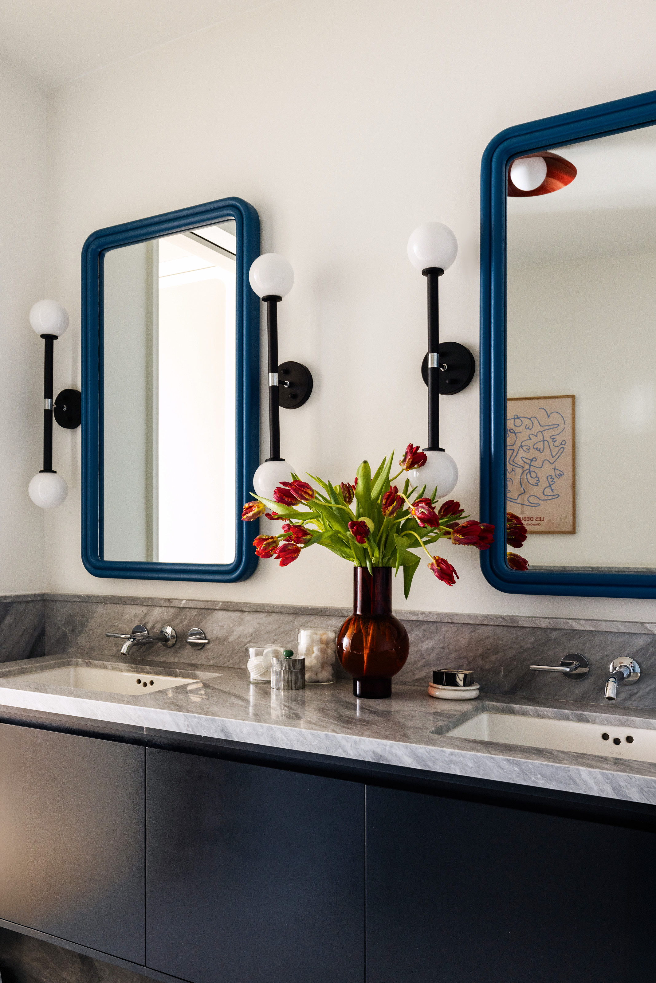
With the client being a film colorist and the designer a former artist, it’s perhaps not surprising that color was the cornerstone of this Greenwich Village apartment’s aesthetic.
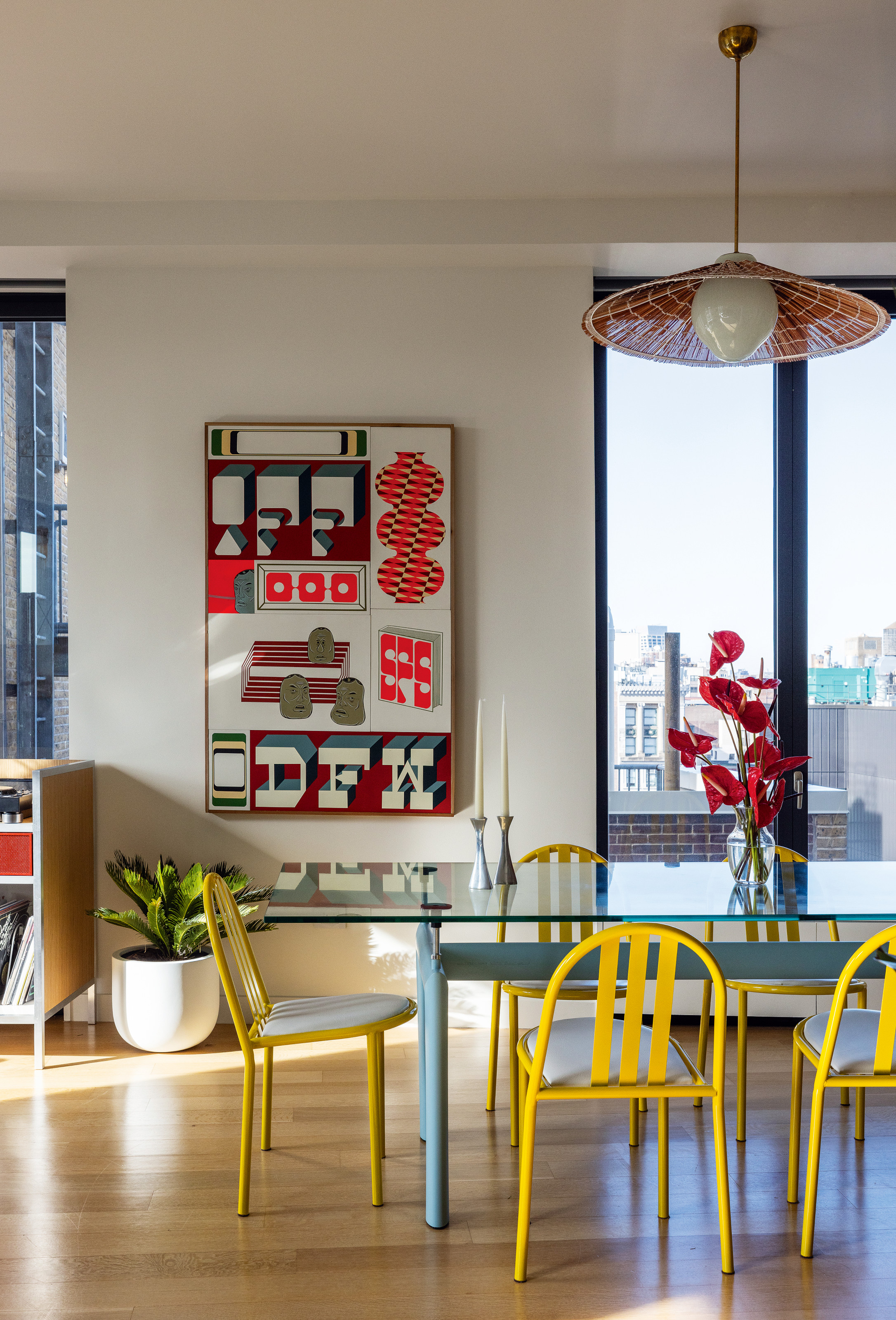
In fact, there were some pretty erudite references on the mood board for this modern home — for example, French film director Jacques Tati’s 1950s comedy Mon Oncle. "The film has these interesting colors," says the project’s principal designer, Keren Richter. "A lemon chiffon, a cherry red, a saturated blue — primary colors, but not super literal."
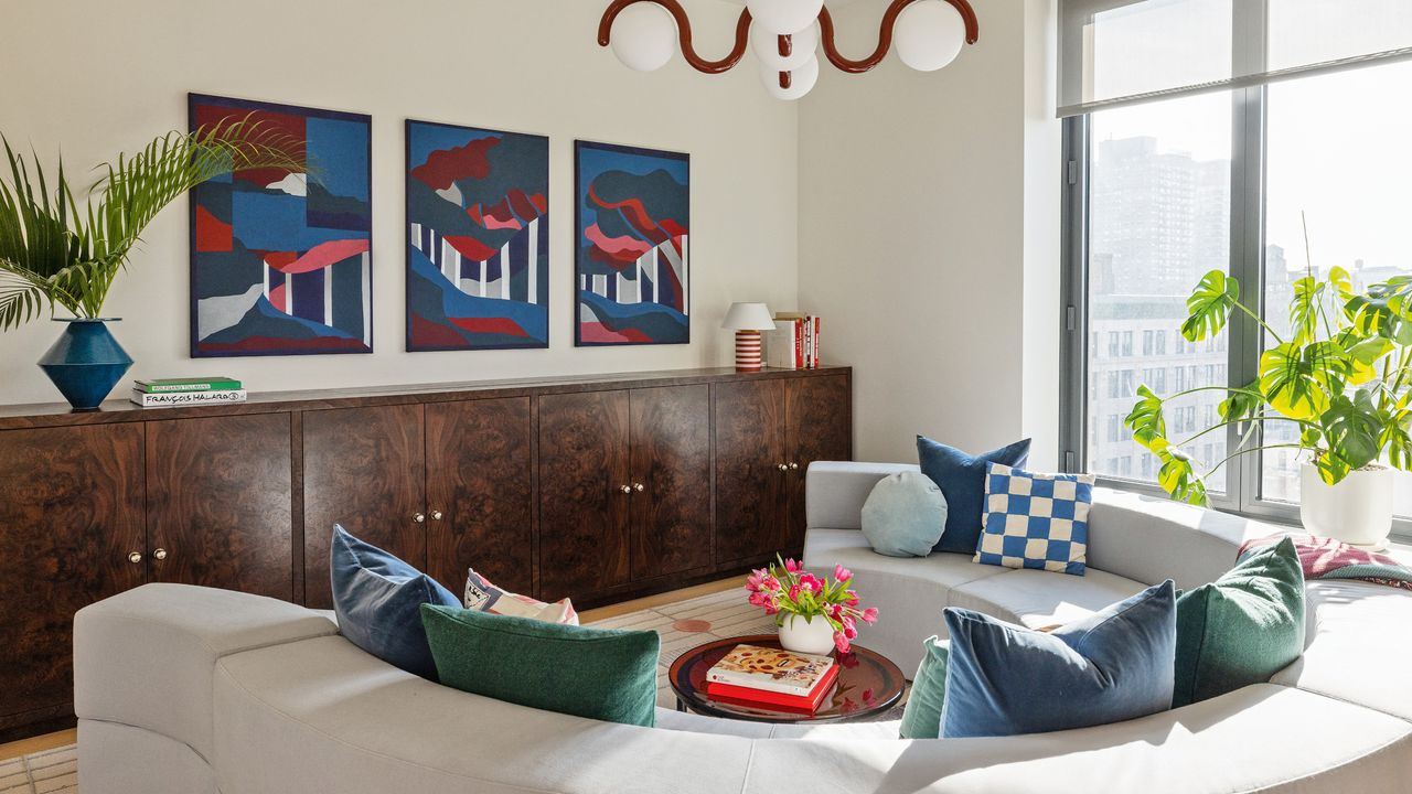
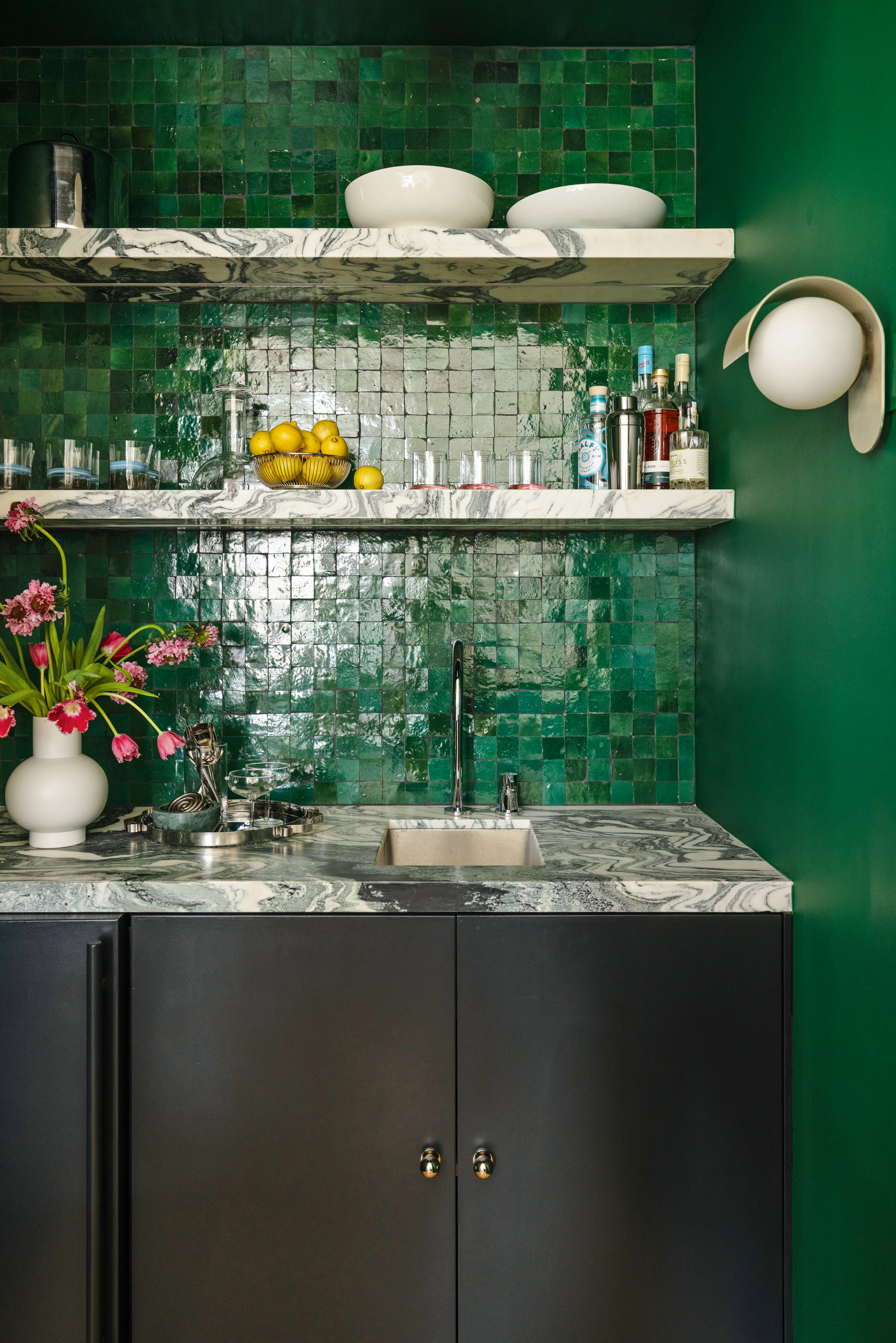
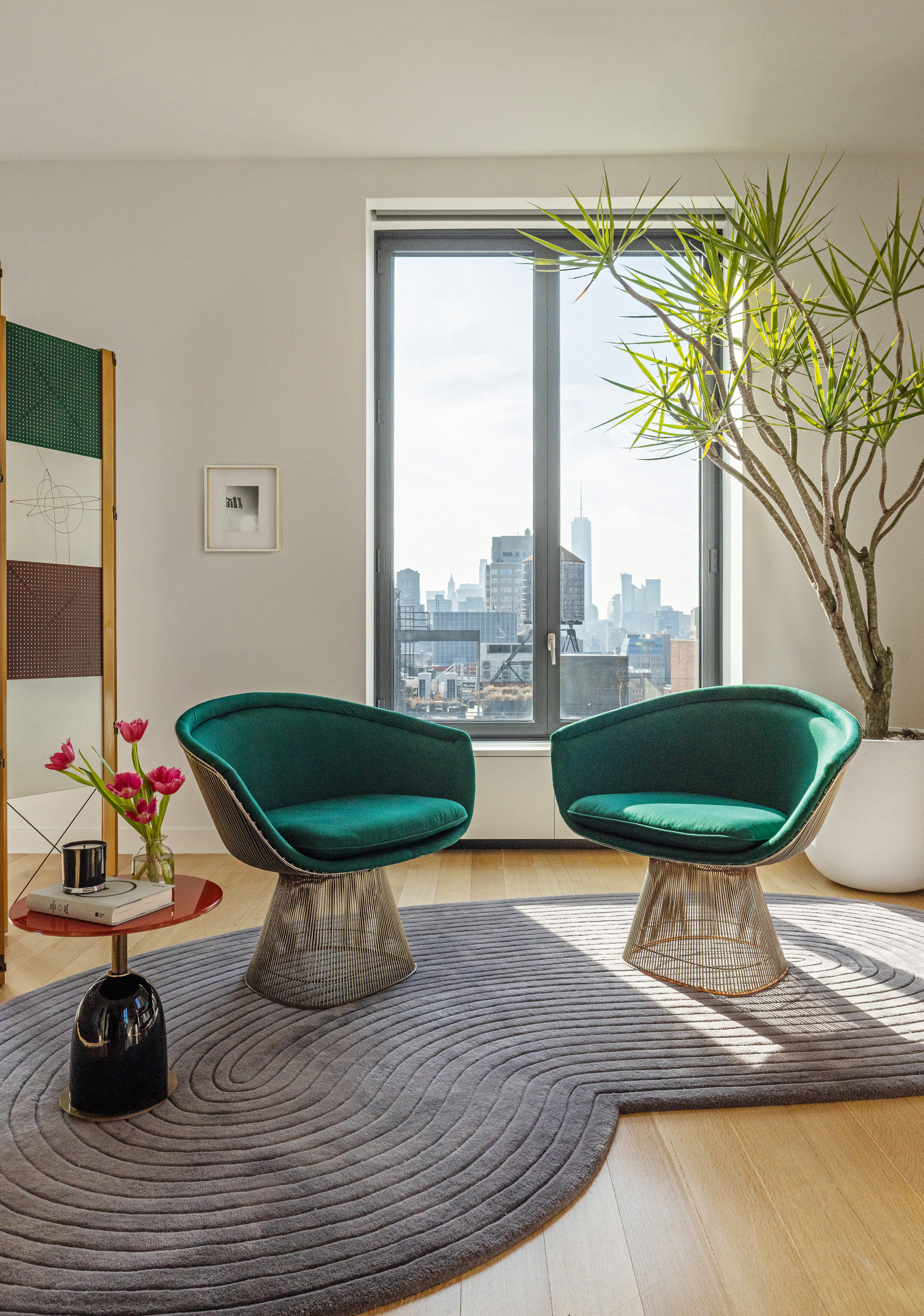
Playfulness was also an important part of the brief. The intention was to create a "joyful place that’s fun to share with friends", says Keren Richter, who is one half of New York design studio White Arrow. There’s a custom DJ station as the client’s boyfriend loves to DJ; a sofa spanning two-thirds of a circle that’s built for socializing; plus an immersive home bar.
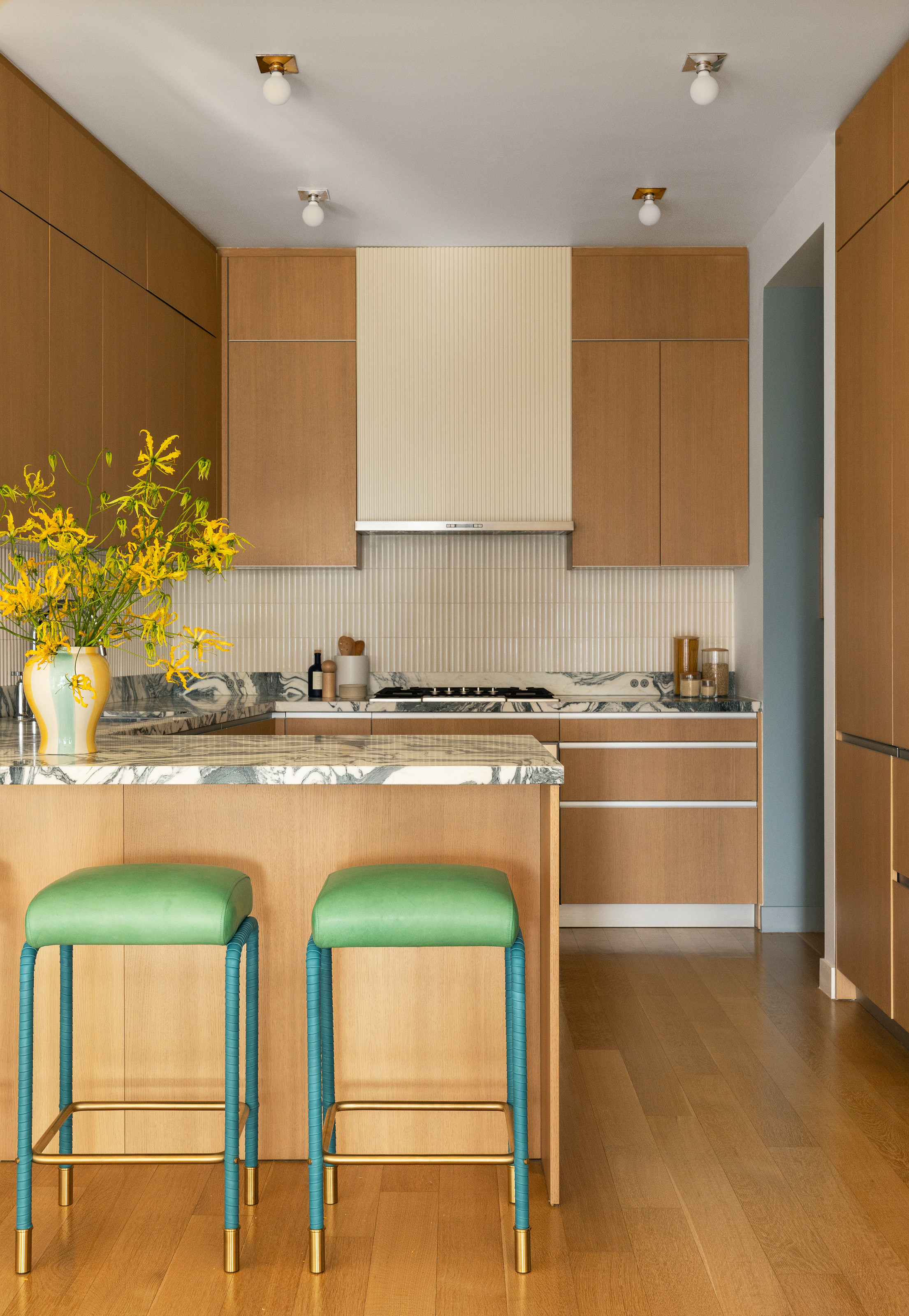
A fresh green bar stool adds zing to this kitchen — this one from Hay would be perfect, complete with a teal cushioned top.
Even the design references are lighthearted, albeit with a somewhat cultured take. "The sense of humor here is maybe not evident to everybody, but there’s something playful happening," Keren explains. So there are references to the art of American sculptor Alexander Calder, to the fresh, pioneering spirit of 1950s graphic design, and to the works of Charles and Ray Eames, "with really saturated, bold colors, but done in a very lively way".
Color was key in bringing the joy. "Blue and red are really fun together," says Keren, as are other Crayola colors, "although you don’t want something to feel like it’s a kindergarten classroom — it has to be done with sophistication."
While the existing apartment needed no structural or plumbing work, there were some practical issues to address. For example, the home lacked clever storage ideas, plus there were some "strong triangular shapes" in the floor plan that the client didn’t like, so Keren created a wall of cabinetry for clothing, which also "absorbed the irregularity of the bedroom".
A chunky framed mirror adds an instant injection of contemporary cool — we love this full-length option from furniture-brand-to-know Westwing.
And while the apartment was generously sized, Keren wanted it to feel intimate — so she zoned the open-plan area, with, say, a screen or a big rug, to create the sense of a room within a room. In addition, she harnessed pendant lighting "as a way of defining spaces" — in fact, she even lowered the ceiling throughout in order to install it.
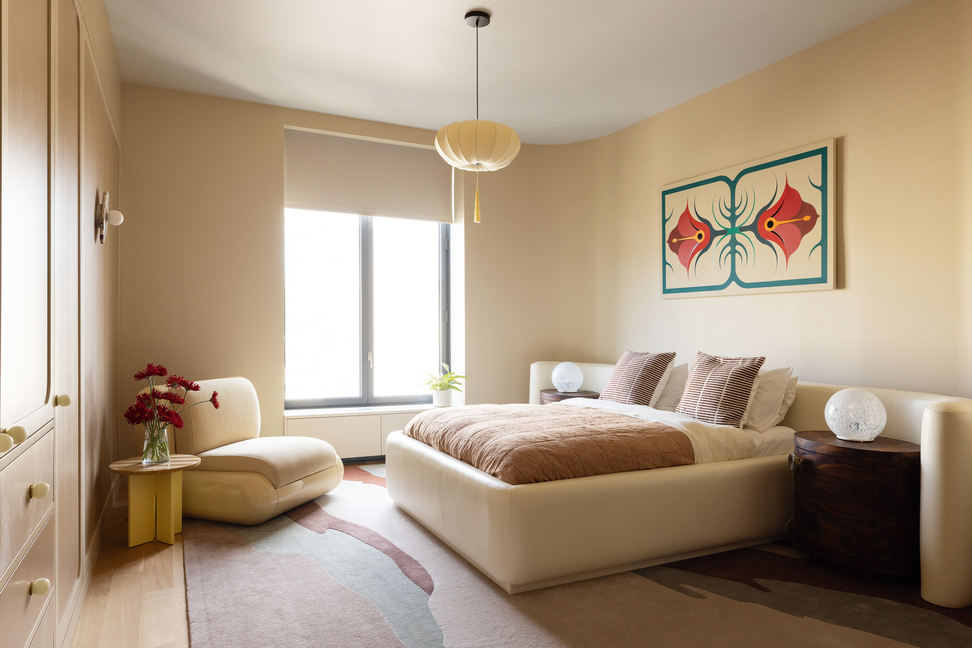
This fabric ceiling light is the perfect way to add some curves and tactility to your space.
The home is also filled with an impressive collection of design classics — yet not so many that it starts to feel like a showroom. The key, says Keren, is to strike "a balance between referencing the past, but also creating a space that’s rooted in contemporary design and today’s design language — that’s what makes it feel young and cool".
For more inspiring home tours and design ideas, subscribe to the Livingetc newsletter, and they'll land straight in your inbox.