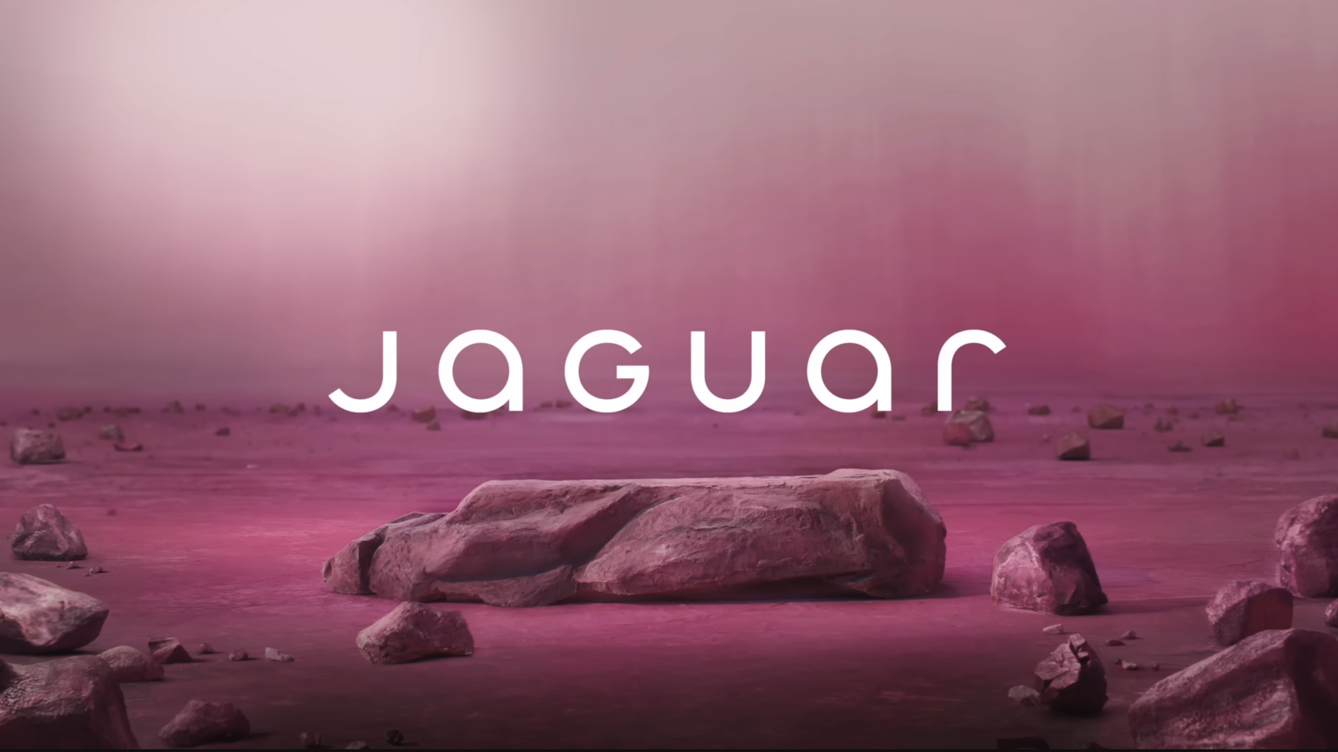
By now, you've probably seen the new Jaguar logo as well as the controversial Jaguar Type 00 EV design concept. A large section of the public seems to have taken almost personal offence to both (whether they're in the target market or not). So it's perhaps not surprising that a designer's attempt of 'fix' the logo has gone viral.
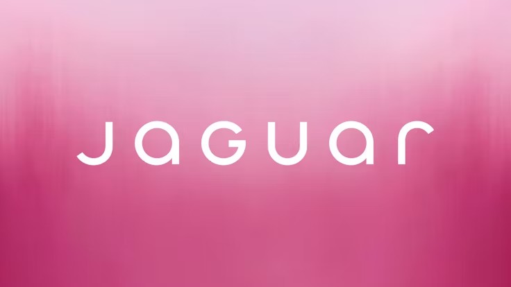
In fact, Allan Peters' TikTok video has picked up more views and likes than much of Jaguar's own social media content on its rebrand. But is it a better design? To recap first let's take a look at that new Jaguar logo again.

There's a lot of things that can be criticised about the new Jaguar logo. The wide kerning, the random uppercase 'G' in the middle of lowercase letters.
These are hardly things unique to Jaguar, but with such a historic car brand, people seem to expect that the logo should be... historic. That is, that they should retain a nod to their legacy even if they aim to look more modern (see our round up of the best car logo redesigns to see examples of the car brands that achieved that balance).
So Let's take a look at Peter's viral Jaguar logo redesign on TikTok:
@petersdesigncompany ♬ original sound - Allan Peters
Peters, who runs Peters Design Company, makes the same criticisms o the new Jaguar logo that we've heard from many. For his redesign, he turns to the one symbol that remains from Jaguar's past, the South American big cat itself.
He reworks the redesigned cat from the official logo to 'fix the geometry' and also comes up with a new logotype with typography that he thinks fits Jaguar's aim to communicate a forward-looking vision and its focus on electric vehicles while maintaining brand equity. And, of course, he ditches the new Miami pink brand and London Blue brand colours to return to the classic British racing green.
Given the vehemence of reactions to the Jaguar rebrand, it's not surprising that Peter's 'fix' has gone down a storm on TikTok. The video has picked up close to 128K likes. In comparison, Jaguar's own TikTok video on the Type 00 reveal received just 741 likes. It's best-performing post on Instagram about the launch received 87K.
"1,000 times better," one person commented on the video. But is it really? I'm not convinced that a return to racing green is forward thinking or that it fits the move to electric or the design of the Type 00 specifically.
As for the logotype, Peters' version is giving me Tesla or Skoda vibes. That might make sense considering that the Type 00's enormous low-poly-style proportion make it look like it was inspired by the Cybertruck, but it's not giving the originality that Jaguar's striving for with its bold new look.
Yes, Jaguar's new logo, and its cars, are a big departure from its past, but, to stay relevant, the brand needed to change radically, not pander to nostalgia. And don't be surprised if the new look ends up setting the logo design trends for 2025.


