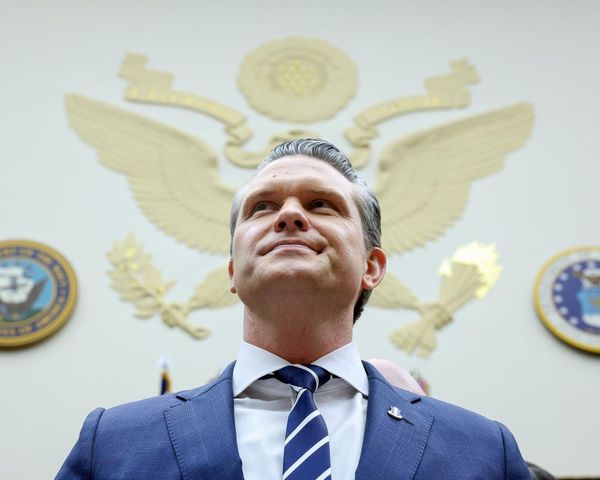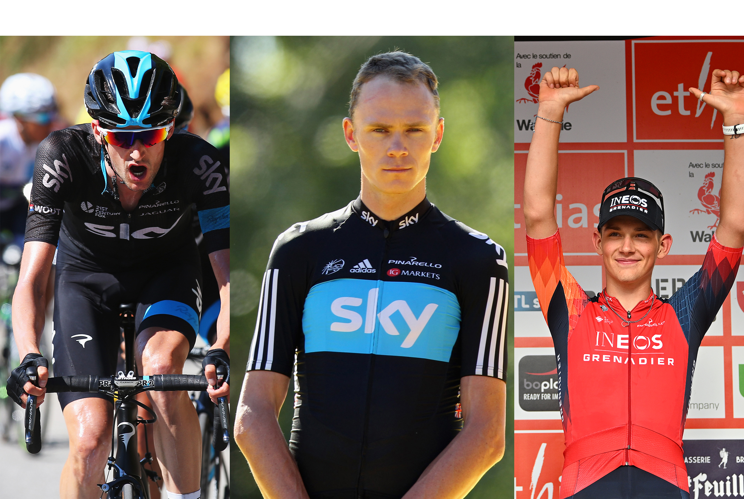
Now Ineos Grenadiers have officially announced their new kit for 2024, a largely orange affair from Gobik, we thought it was time to have a look back at the team's kits from its 15 years of existence.
We already knew what the jersey would look like, really, thanks to Egan Bernal accidentally leaking the kit on Instagram last week, but now we can acknowledge it in all its orange, red and navy blue/black glory.
It's not the first time that a colour other than black or blue has appeared on the jersey - last year was mostly red - but this kit is the first to be properly orange, much like the team's training one.
As for the new supplier, which took over from Bioracer, Gobik first appeared in 2010 when a cycling club in Spain’s Murcia region needed a new kit for racing and the brand started from there, so it has been a swift decade of acceleration from then.
In a press release announcing the new deal, Ineos confirmed that the team had agreed a long-term partnership with the brand which will see them take over from Bioracer as kit supplier to the likes of Geraint Thomas, Egan Bernal and Tom Pidcock.
Ineos Grenadiers - and Team Sky - have had a whole host of iconic kit suppliers over the years, from Adidas to Gobik, via Rapha and Castelli. Here's a run down of all the eras.
Adidas
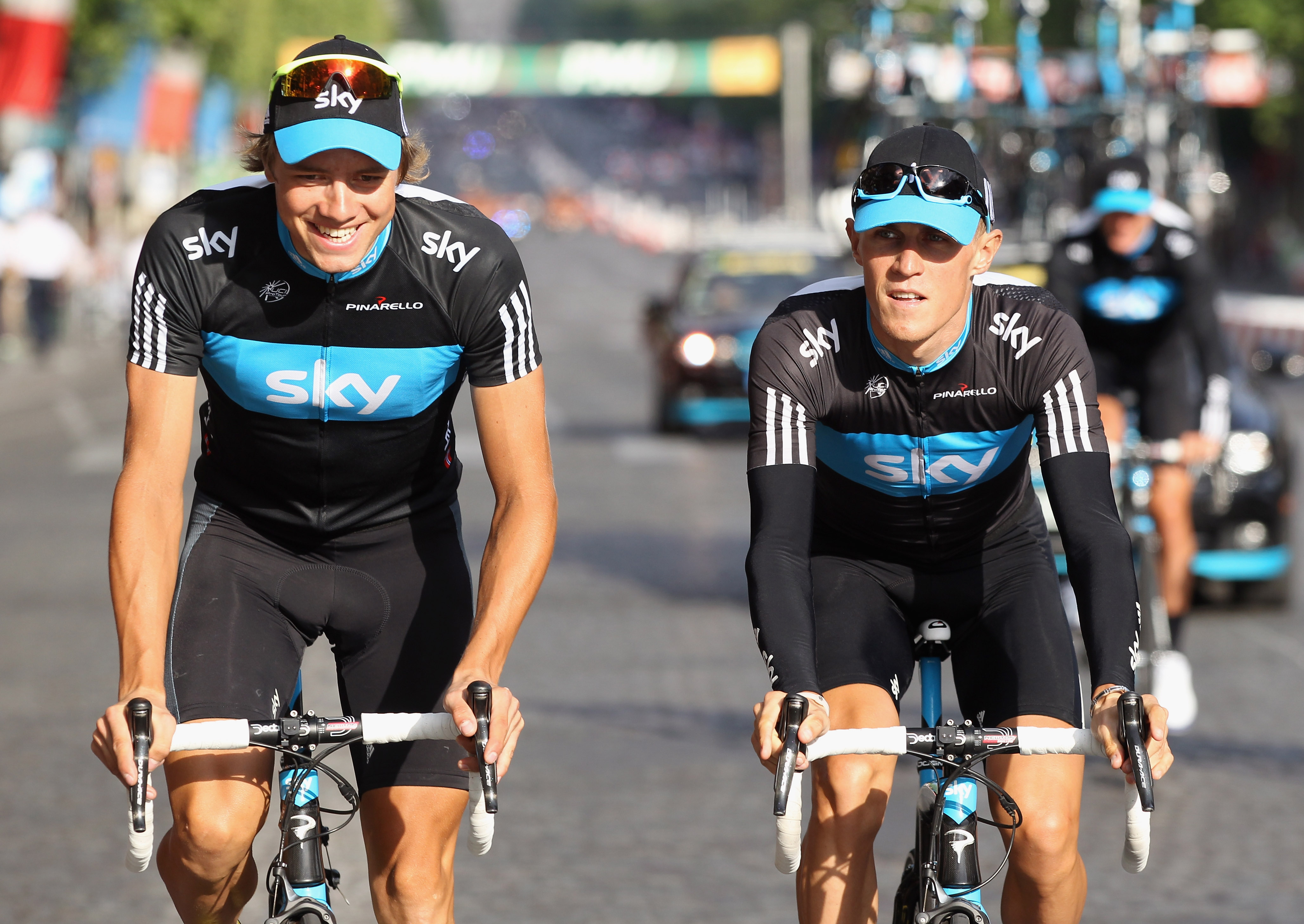
The British team first started out with German sports powerhouse Adidas as its kit supplier when it first hit the road in 2010. Bradley Wiggins and company lined up in a now iconic black and light blue kit at the team's launch in London and set the blueprint team's visual identity for almost a decade.
With the famous three stripes logo taking centre stage on the sleeves, the team’s first jersey featured a large blue panel through the middle with the Sky logo in white print with a blue collar and a thin blue strip running down the middle on the back.
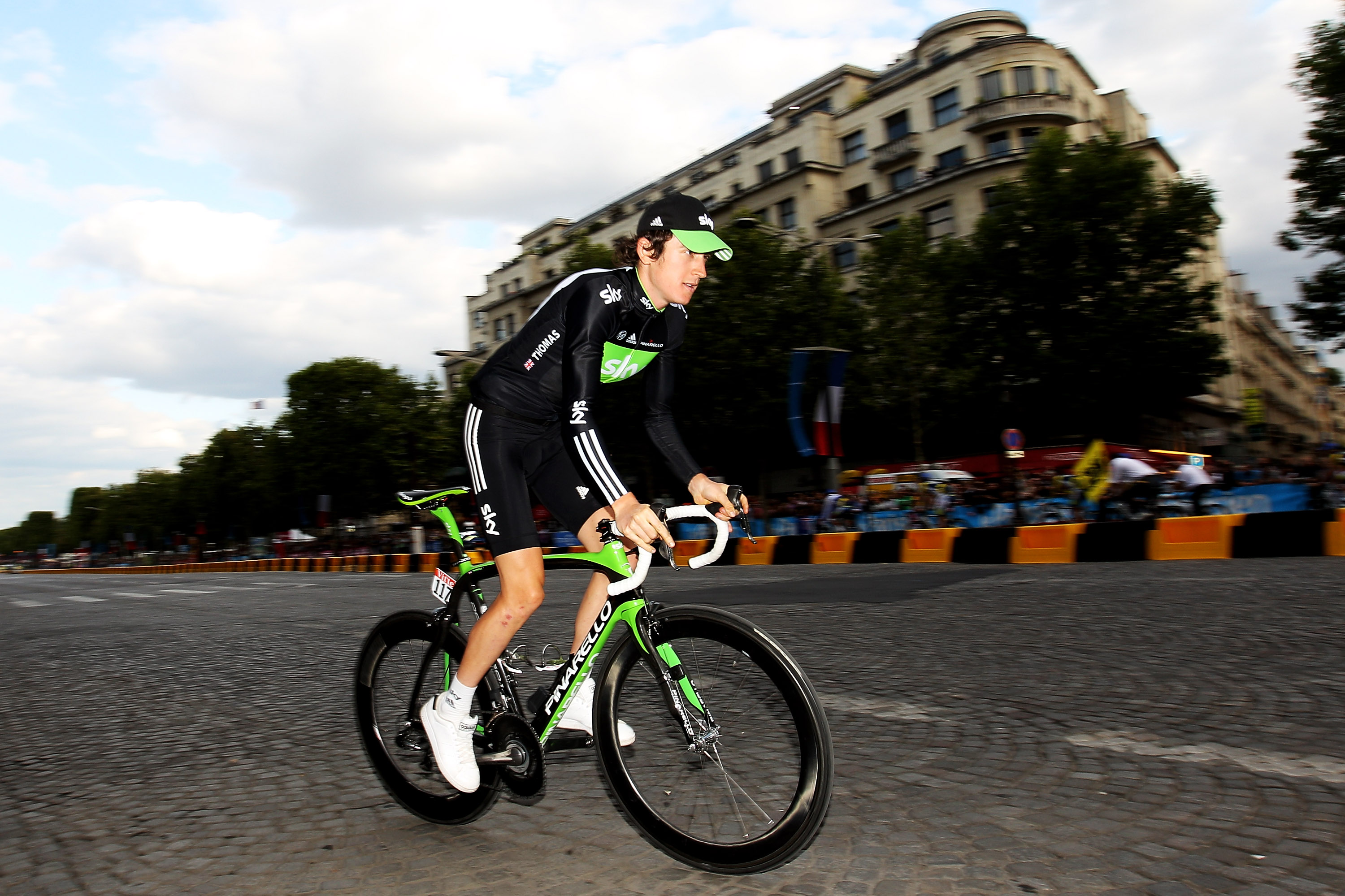
The jersey and team’s colours largely stayed the same for a while although the blue panel on the jersey was briefly swapped out for a ‘rainforest green’ version in the 2011 Tour of Britain which coincided with an environmental campaign being run by its main sponsor. The kit proved to be a hit and so it was worn in the 2011 Tour de France due to its success.
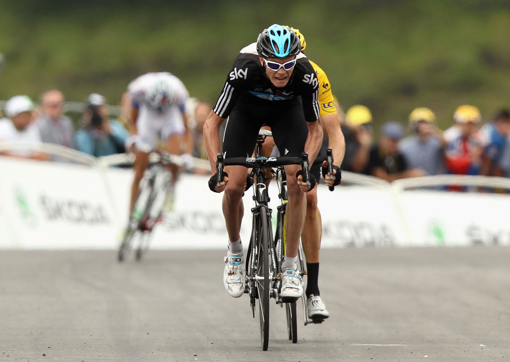
Adidas’ crowning moment as the team’s kit supplier was undoubtedly Bradley Wiggins' 2012 Tour victory. The jersey Wiggins wore was largely the same although more secondary sponsors had started to appear and a mini essay/poem had been added to the back to give more meaning to the blue line that first appeared in 2020.
It read: “This is the line | The line between winning and losing | Between failure and success | Between good and great | Between dreaming and believing | Between convention and innovation |Between head and heart |It’s a fine line |It challenges everything we do |And we ride it every day."
Sadly, that Adidas collaboration ran out in 2012 and the company has not been back to cycling's highest ranks since. A shame, we think.
Rapha
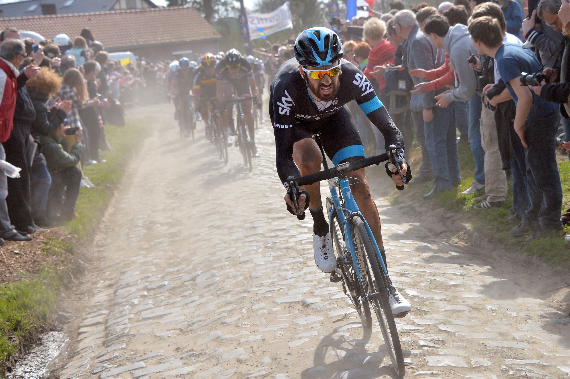
Adidas moved on after Wiggins’ success and were replaced by the relatively new but upmarket brand, Rapha.
The team’s colours largely remained unchanged from their early days, although Rapha’s signature armband was added to the jersey on the left sleeve in the same shade of blue. The first jersey Rapha supplied to the team was largely black other than the armband on the jersey and the corresponding band which featured on the left thigh of the black shorts.
Rapha kept the blue line on the back of the jersey although ditched the slightly cheesy poem.
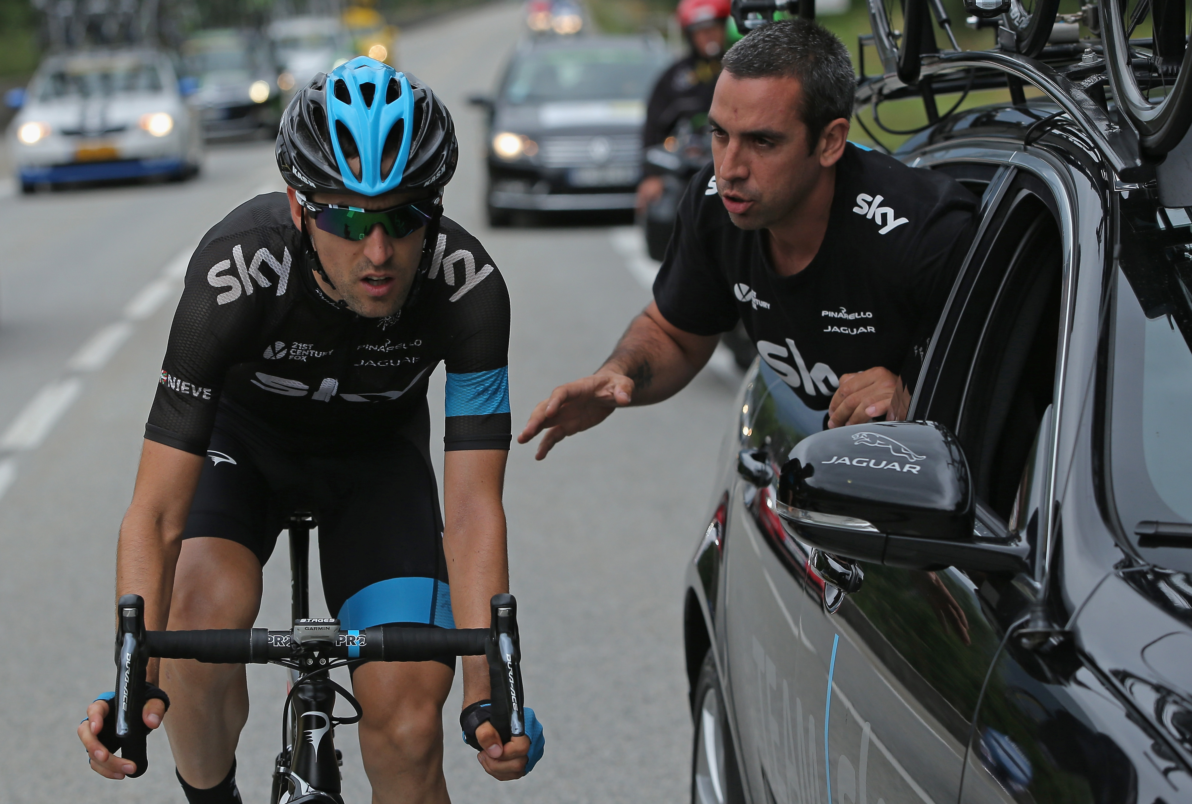
The following year, 2014, saw the exact same Rapha kit rolled out but with a few further sponsors added to the chest. Some fans saw that as too simple and boring, although that may have largely been associated with Sky’s supreme dominance left, right and centre as Chris Froome kept the Tour de France wins coming.
In 2015 the jersey was once again largely the same. It was the next year that Rapha started to really mix things up in its final stint as the team’s supplier. Horizontal blue and white lines were added to the jersey and featured both on the chest and rear, and the blue was slightly lightened to give it more of a sky blue feel.

Under Rapha, the team’s dominance continued with Froome bagging his third Tour title and Sky making a breakthrough in the Classics with Wout Poels winning the team’s first Monument, Liège-Bastogne-Liège.
Castelli
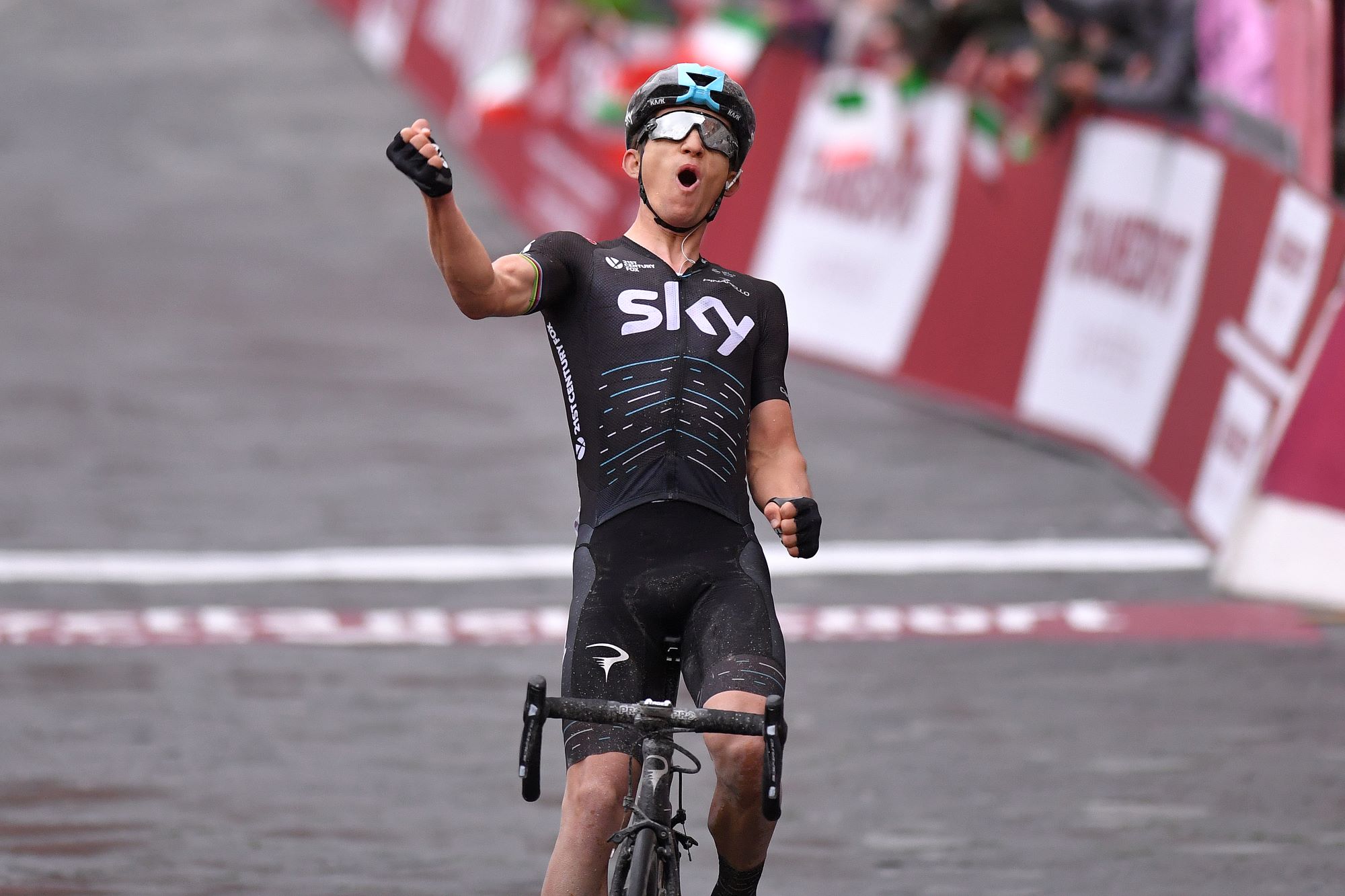
Italian giants Castelli took over as the team’s kit supplier in 2017.
Castelli kept the team’s simple jersey design largely in place in the brand’s first year with the Rapha bands on the front replaced with thin blue and white dashes, which denoted different wins for the team.
It was during that year's Tour de France when it all began to briefly change with the introduction of their special edition white kit. The team rolled out what was essentially a simple colour reversal of the first Castelli jersey with the main colour being white and the thin dashes across the middle now sky blue and black.
It was seen as yet another Dave Brailsford attempt at a marginal gain with white being supposedly cooler in the summer heat of the Tour de France. Whatever it was, it worked, as Geraint Thomas stormed to his first ever Grand Tour victory when the team kept white as the main jersey colour the following year.
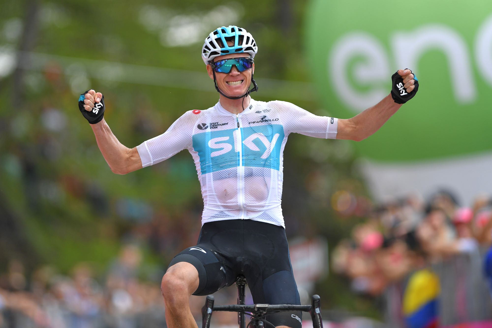
The first 2018 jersey was white with a blue panel across the chest featuring the Sky logo embossed in thick white print. It was the first time the team had returned to the central panel since the early Adidas kits. Its main highlight was Chris Froome’s sensational Giro d’Italia victory featuring that breakaway effort on stage 19.
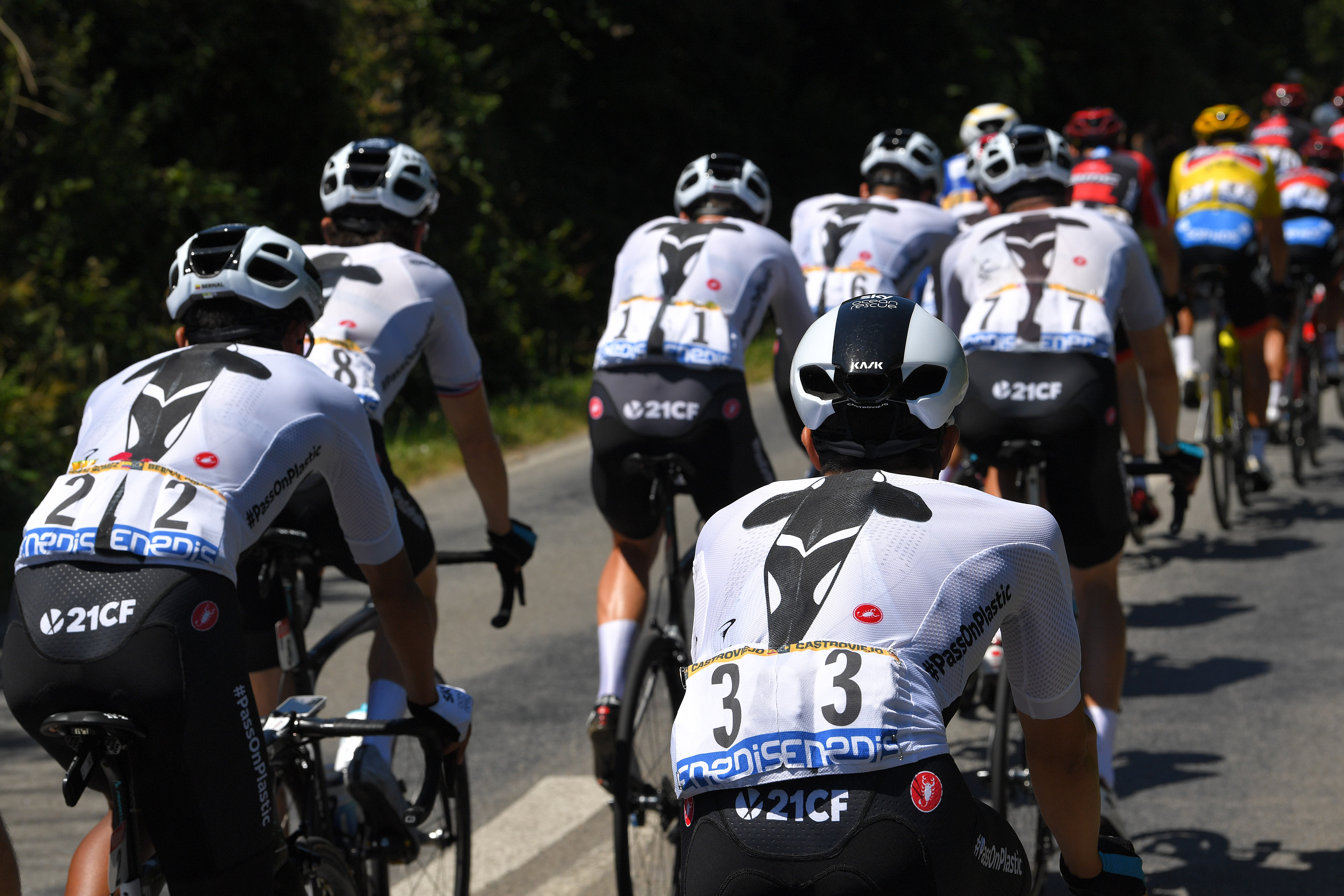
Yet another special edition kit was rolled out for the Tour, although the jersey was still white, as the team briefly became Sky Ocean Rescue as the television provider embarked on an environmental mission. The jersey’s most notable feature was a huge vertical image of a giant killer whale on the back panel.
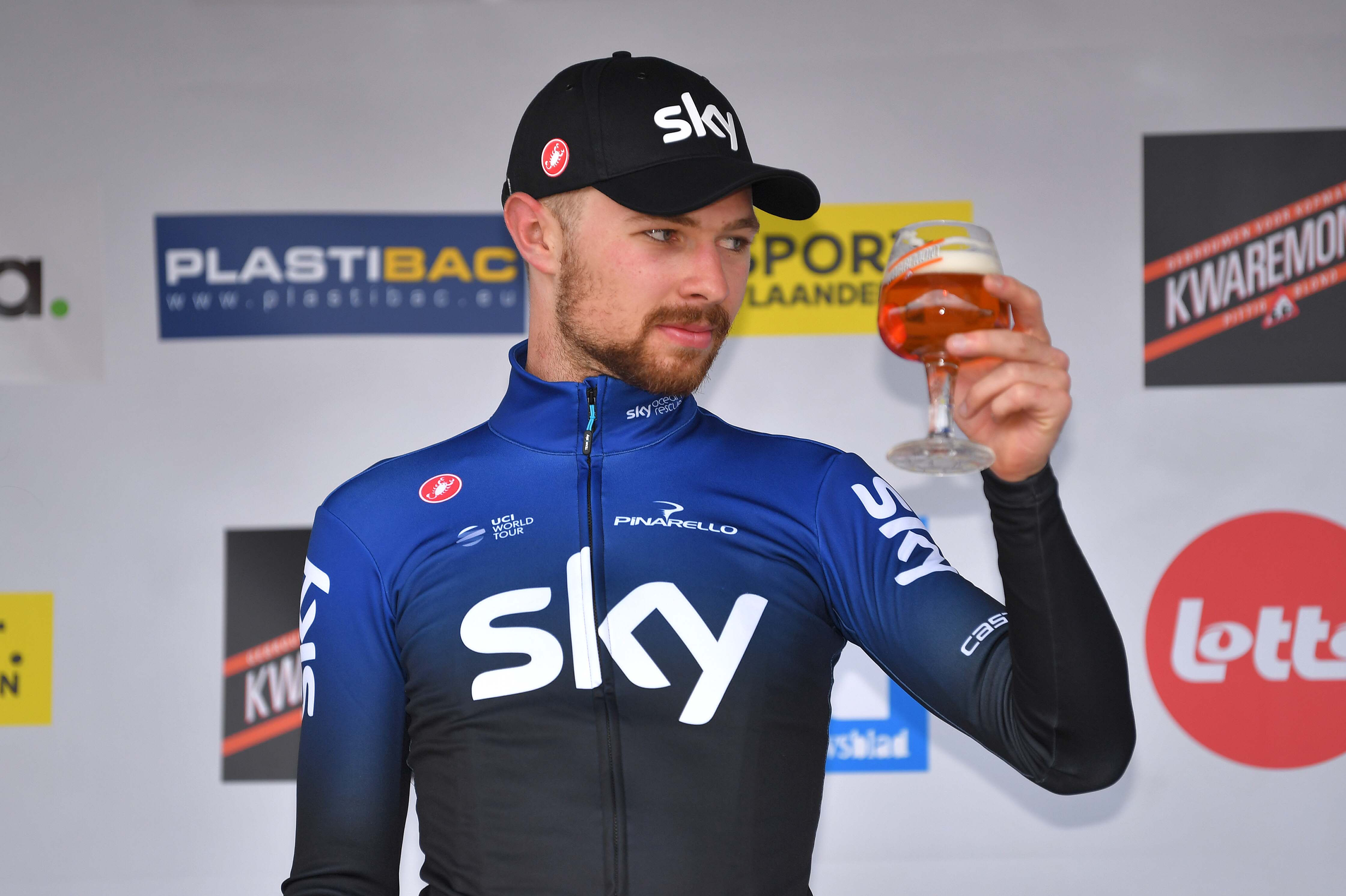
2019 was an interesting year for the team as Sky’s final jersey as a sponsor saw the team’s colours change at the start of the season to a royal blue fading to black on the jersey, but it was a kit which was only worn until March.
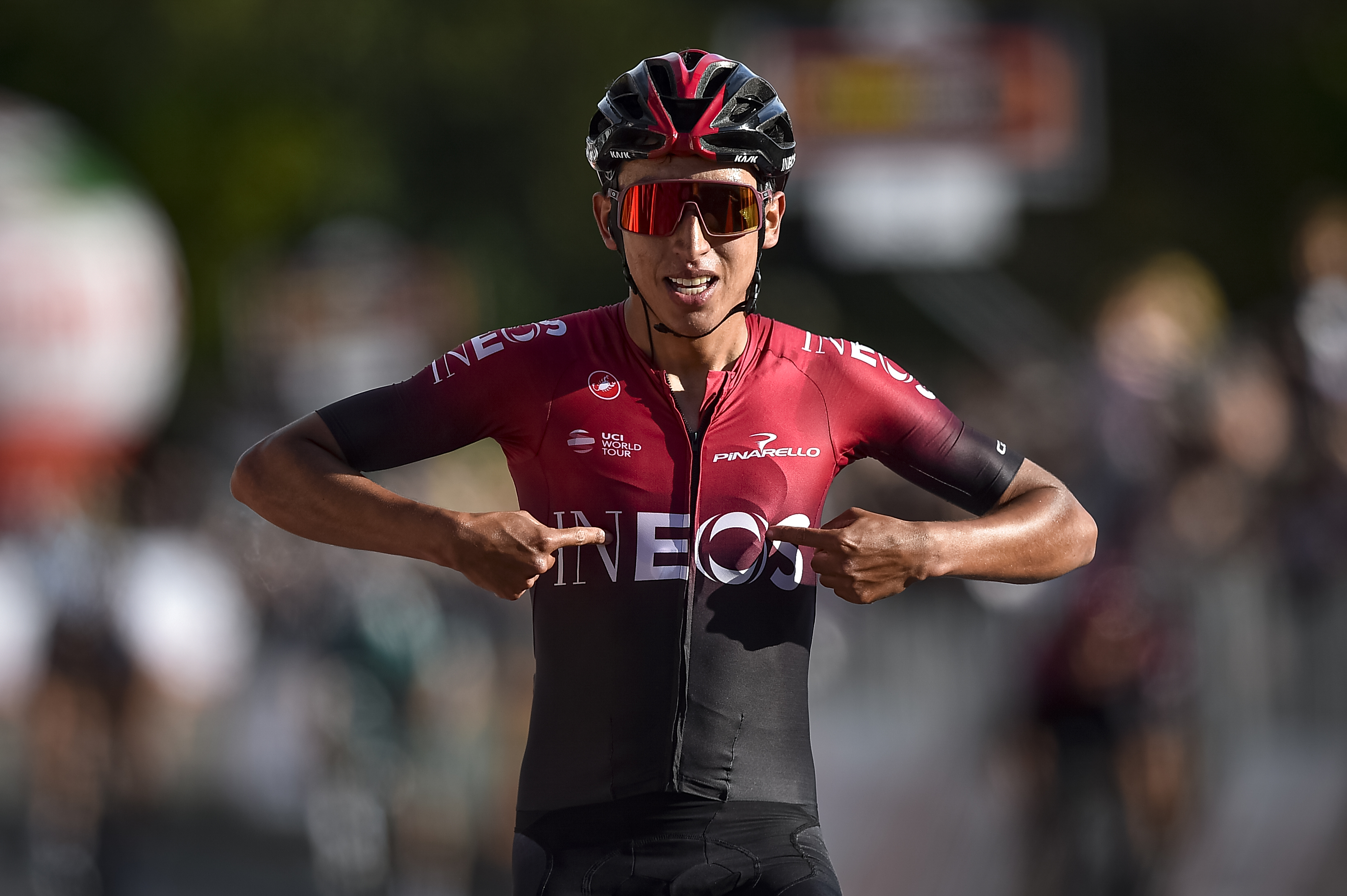
Ineos arrived as headline sponsor in the spring and Egan Bernal won yet another Tour title for the team as blue was kicked off the jersey design for good. The blue fade that featured earlier on in the year was replaced with a blood red colourway instead.
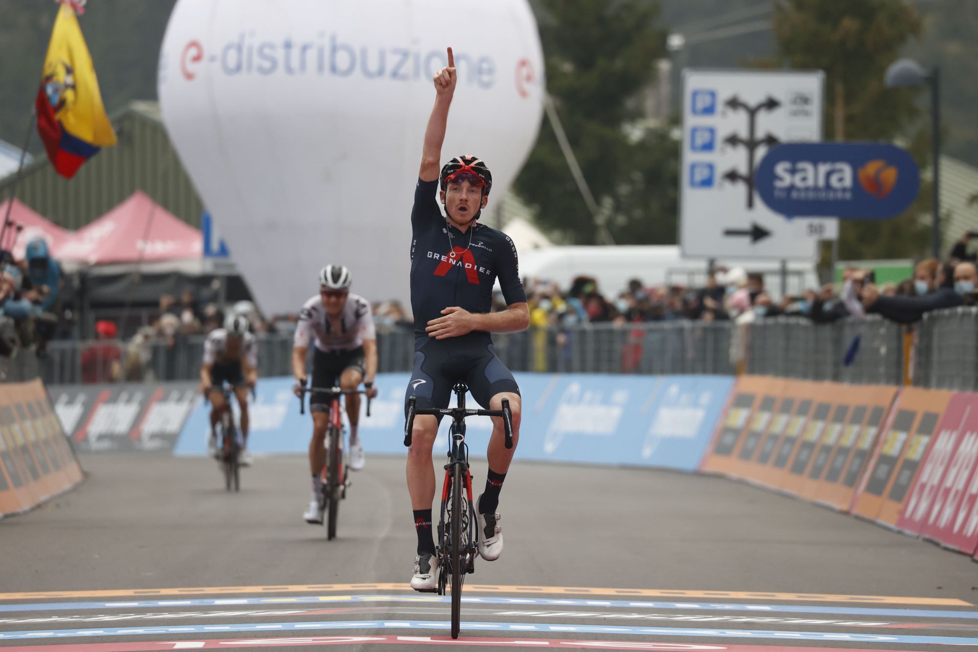
The following year a plain blue jersey arrived with the Grenadier logo - an upside down red V shape - taking centre stage in what would be Castelli’s final spell as the team’s supplier.
Bioracer
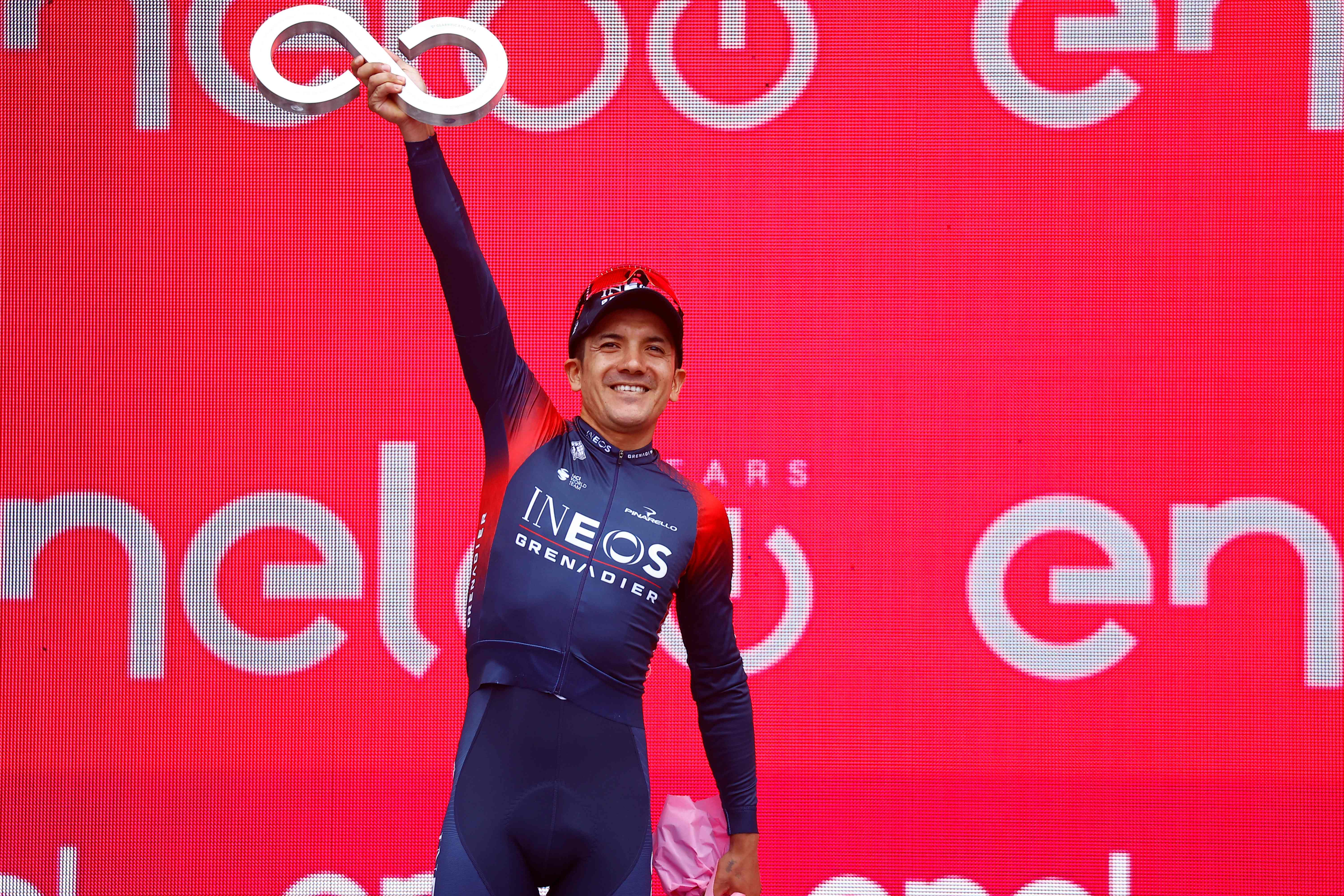
In 2022, Bioracer were brought in after the five-year deal with Castelli ended.
Red kept its place on the first kit brought in by the Belgian brand which was a continuation of the design first used at the 2020 Tour when the team first transitioned from Sky to Ineos. The upside down V Grenadier logo disappeared as red panelling was introduced to the shoulders which faded out into the largely blue jersey.
The main sponsor's logo changed back to a largely text based design which then featured vertically on the thighs of the shorts too.
According to Dave Brailsford at the time the Bioracer partnership was announced, he had “always hoped” that the Belgian brand and the British team would link up such was his high regard for Bioracer’s innovation and expertise.
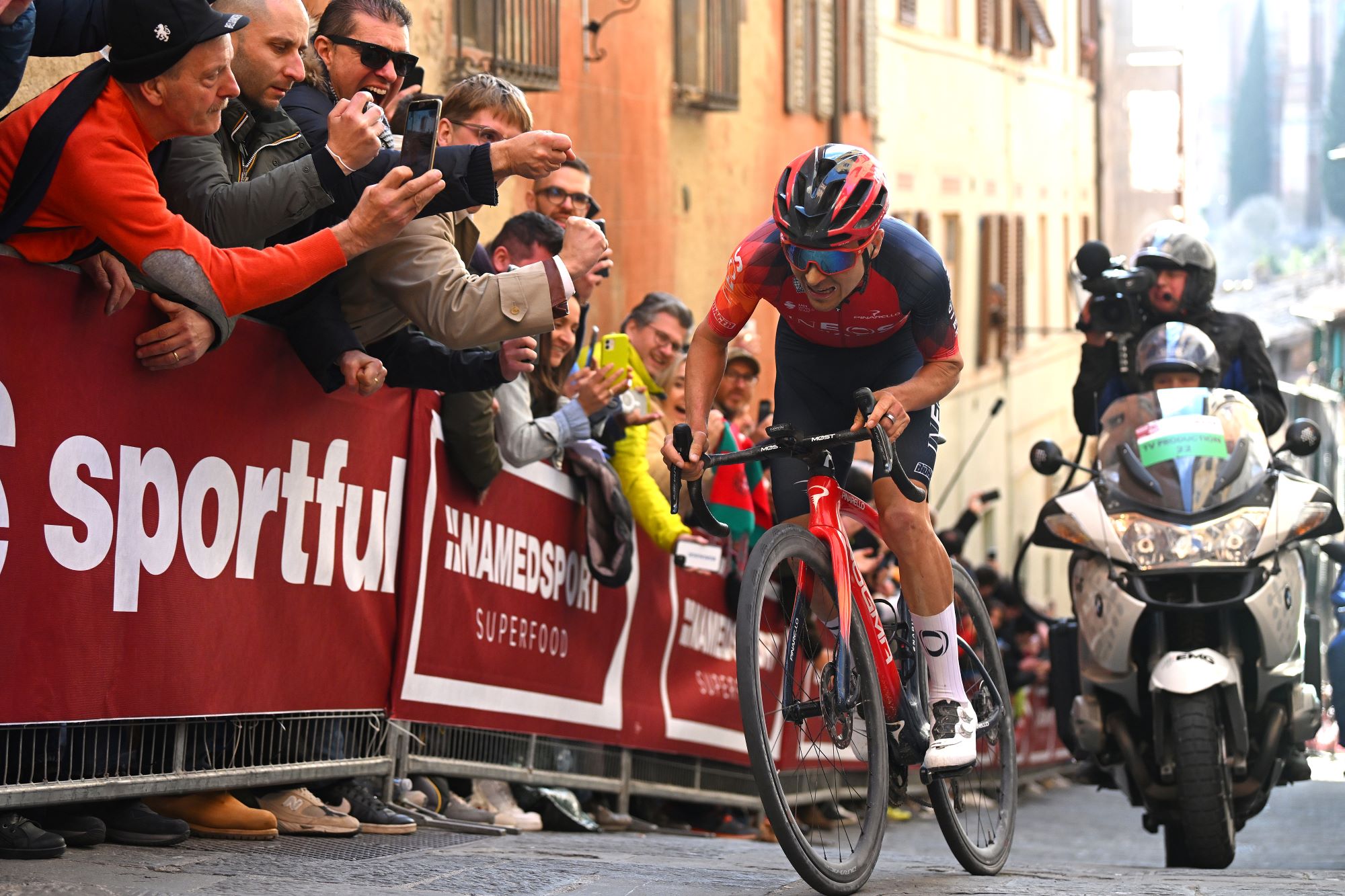
Bioracer’s final year as supplier to the team saw a sensational win for Tom Pidcock at Strade Bianche. The jersey featured a more orangey red as its central colour with an eye-catching diamond style pattern on the sleeves and simple blue shorts and white socks.
Gobik
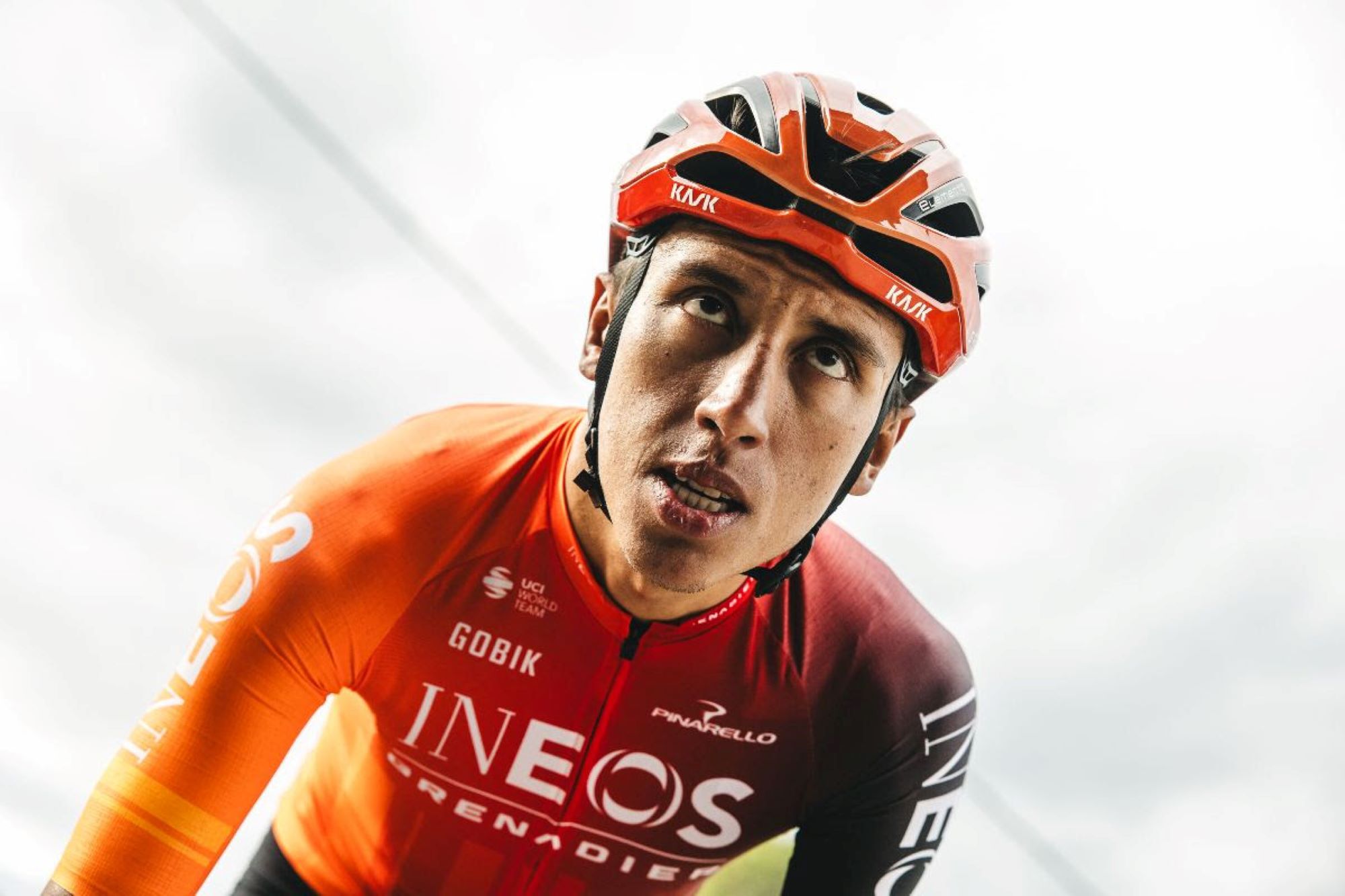
Now we are up to the present day, and there is very little black or blue on the Ineos Grenadiers kit of the modern day, no more stripe, and definitely no Rapha armband. It remains to be seen if the squad can get back to their former glory days in the new strip, but they will certainly stand out doing it.
Which kit was your favourite?
