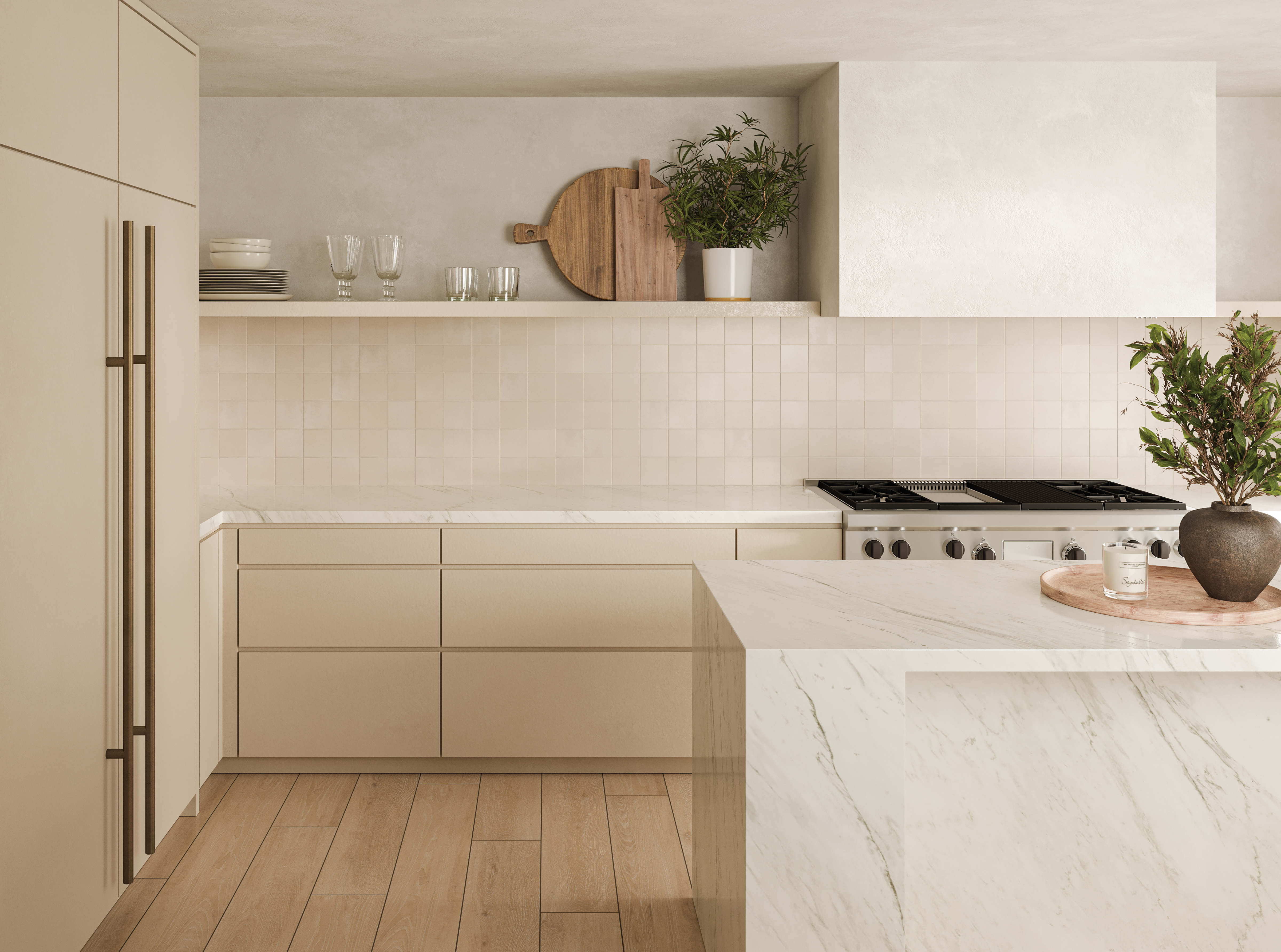
If you associate cream cabinetry solely with dated, butter-tinged designs from the ‘90s or overly traditional country kitchens, get ready to have a change of heart. With demand for warm neutrals showing no sign of waning, it’s little wonder that cream, alongside earthier shades of off-white, is creeping back into our kitchens.
When paired with streamlined designs and interesting material palettes, cream cabinetry is an effortless way to make a space feel welcoming, whether just on the warm side of white, or in richer, coffee-tinged shades. If you’re hoping to keep the balance firmly in the contemporary, modern kitchen corner, then it’s probably wise to avoid anything too yellow toned, as this will automatically lend your kitchen a more traditional feel.
In addition to keeping cabinet fronts simple, other ways to modernize a cream kitchen include understated or recessed hardware and textural touches, such as fluted details, honed stone worktops and handmade tiles. Implementing a few unexpected elements can go a long way too, helping avoid a cookie-cutter approach, which can make any neutral kitchen feel just a little too safe. Think mismatched shelving, vintage elements or even an injection of playful pattern.
Pairing cream cabinetry with open shelving can work particularly well if you’re hoping to introduce a little individuality, as proved by the New York loft kitchen (shown below) designed by Staci Dover and Space Exploration. ‘We forewent the upper units in favor of the open shelves to preserve the feeling of lightness in the space,’ says Space Exploration’s Kevin Greenberg. ‘We leaned into the idea of using the shelving to display an array of objects that contribute to the way the clients use the kitchen. We furthered the emphasis on utility by sourcing a pair of vintage accordion sconces to provide task lighting when required. The hardware is actually a hand towel holder repurposed here as a cabinet pull.’
On the lookout for more advice on how to keep cream cabinetry feeling fresh and modern? Read on.
1. CHANNEL MID-CENTURY STYLE
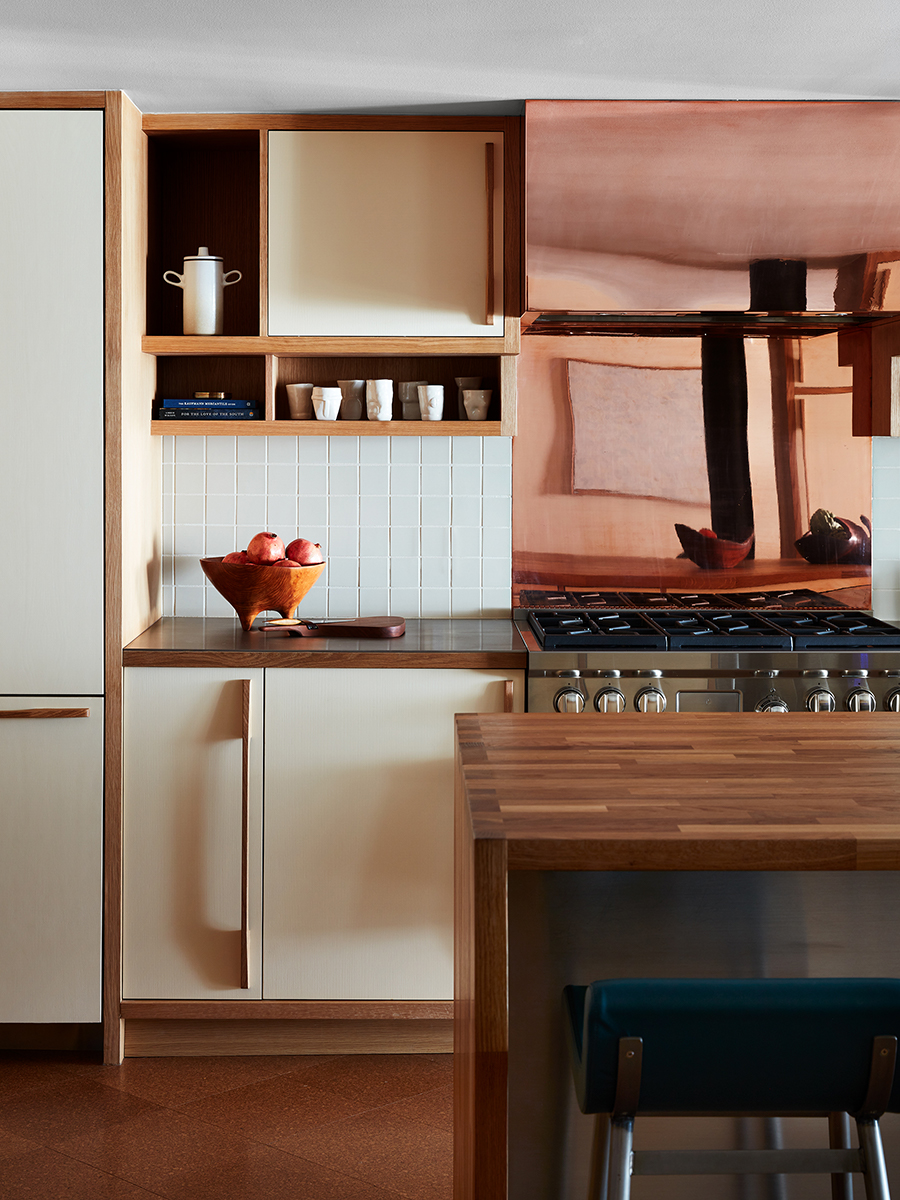
Commune Design’s renovation of this 1960s Santa Monica apartment included a sympathetic redesign of the mid century modern kitchen that draws heavily on modernist influences. ‘The client’s request to bring in the outdoors was achieved through the use of a color palette inspired by Le Corbusier’s Maison La Roche,’ says Commune co-founder Roman Alonso.
‘The kitchen details were inspired by Charlotte Perriand’s storage units and bookcases; the cabinets are all made from solid white oak with painted fronts,’ Roman says, referencing the timeless cream cabinetry, which is forms part of a warm, considered palette of cork, copper, wood and unglazed ceramic tiles.
2. ADD SOME UNEXPECTED ELEMENTS
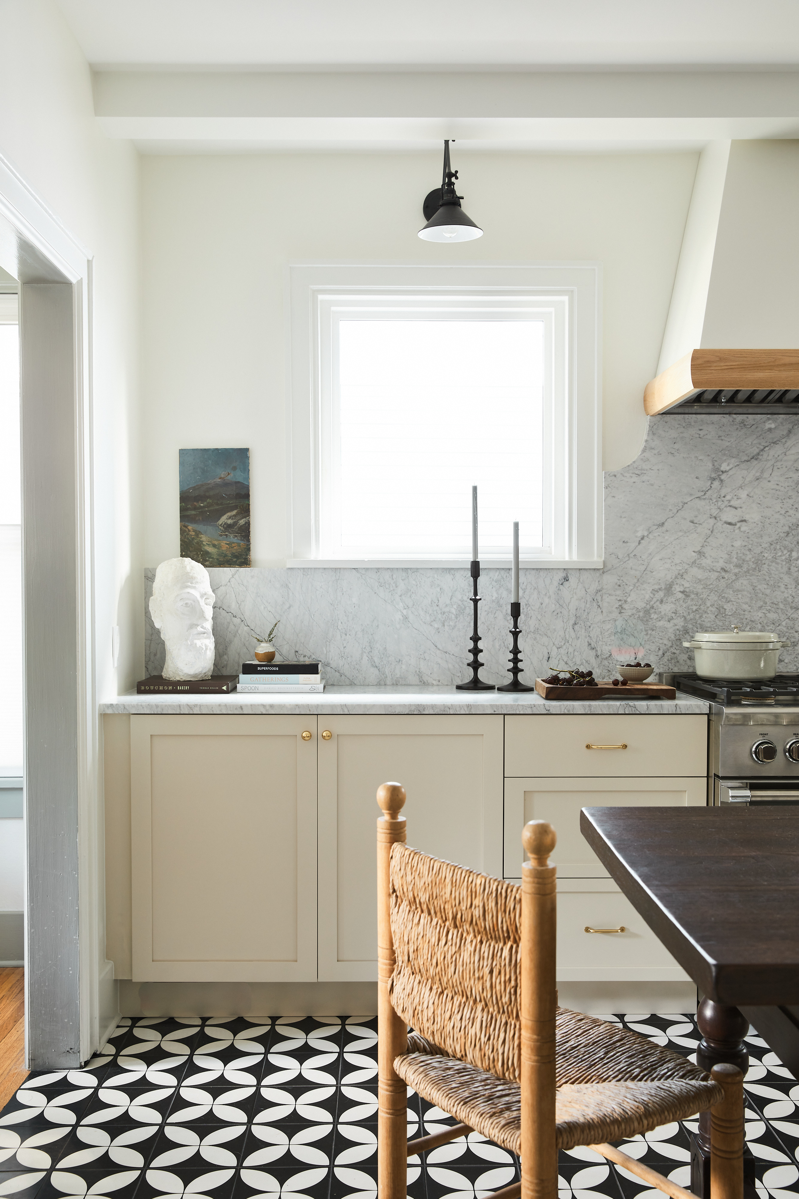
‘This kitchen was designed for a young family and they love that it feels classic, while also having some playful modern elements,’ says Nashville-based interior designer Lauren Bradshaw, referencing the black-and-white geometric floor. ‘We used a creamy beige tone on the cabinets, a brighter warm white on the walls, and grounded the space with black patterned tiles to keep it feeling fresh,’ explains Lauren, who elevated the entire scheme with a pale marble worktop and backsplash.
‘When using cream tones on kitchen cabinets, it's important to watch the undertones of the color and how it changes in the room throughout the day. You also need to consider the wall color carefully, and how the two shades interact, she advises.’
3. COMBINE DIFFERENT HARDWARE STYLES
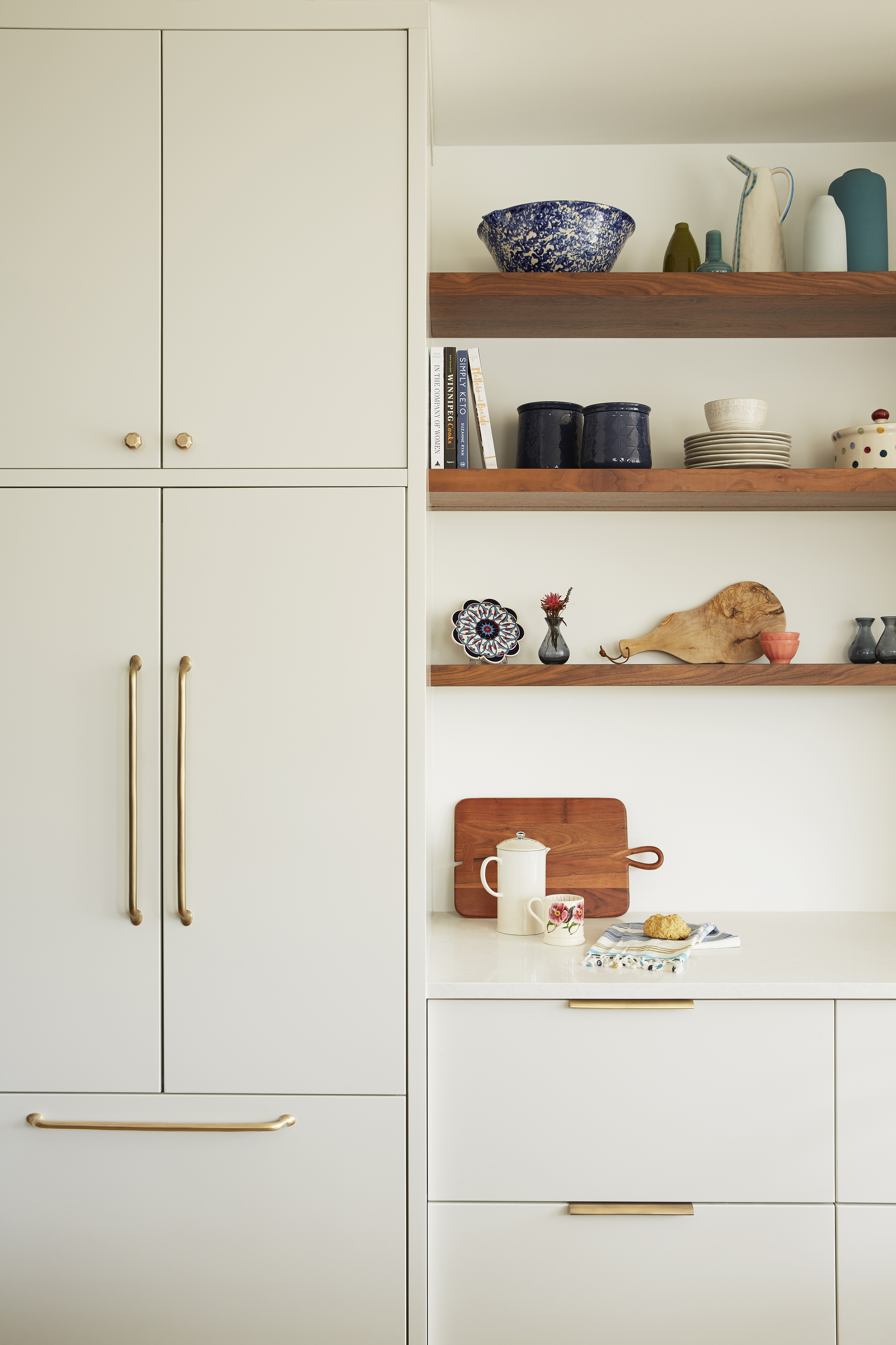
Keeping cabinetry streamlined and simple is an effortless way to ensure your cream kitchen feels contemporary. And as kitchen hardware trends come and go, we love this timeless idea from The Dickson Design Group as a way to inject some subtle personality without compromising a space’s fuss-free appeal.
‘We worked to create a perfect balance between classic and modern in this project, which features creamy white cabinetry and wooden open shelving,’ says Kate Dickson, the group’s principal designer. ‘Our one takeaway would be to embrace the mix! Choosing a combination of different cabinet handle styles worked here to bring a touch of character to this timeless kitchen.’
4. USE CREAM IN AN INDUSTRIAL SCHEME
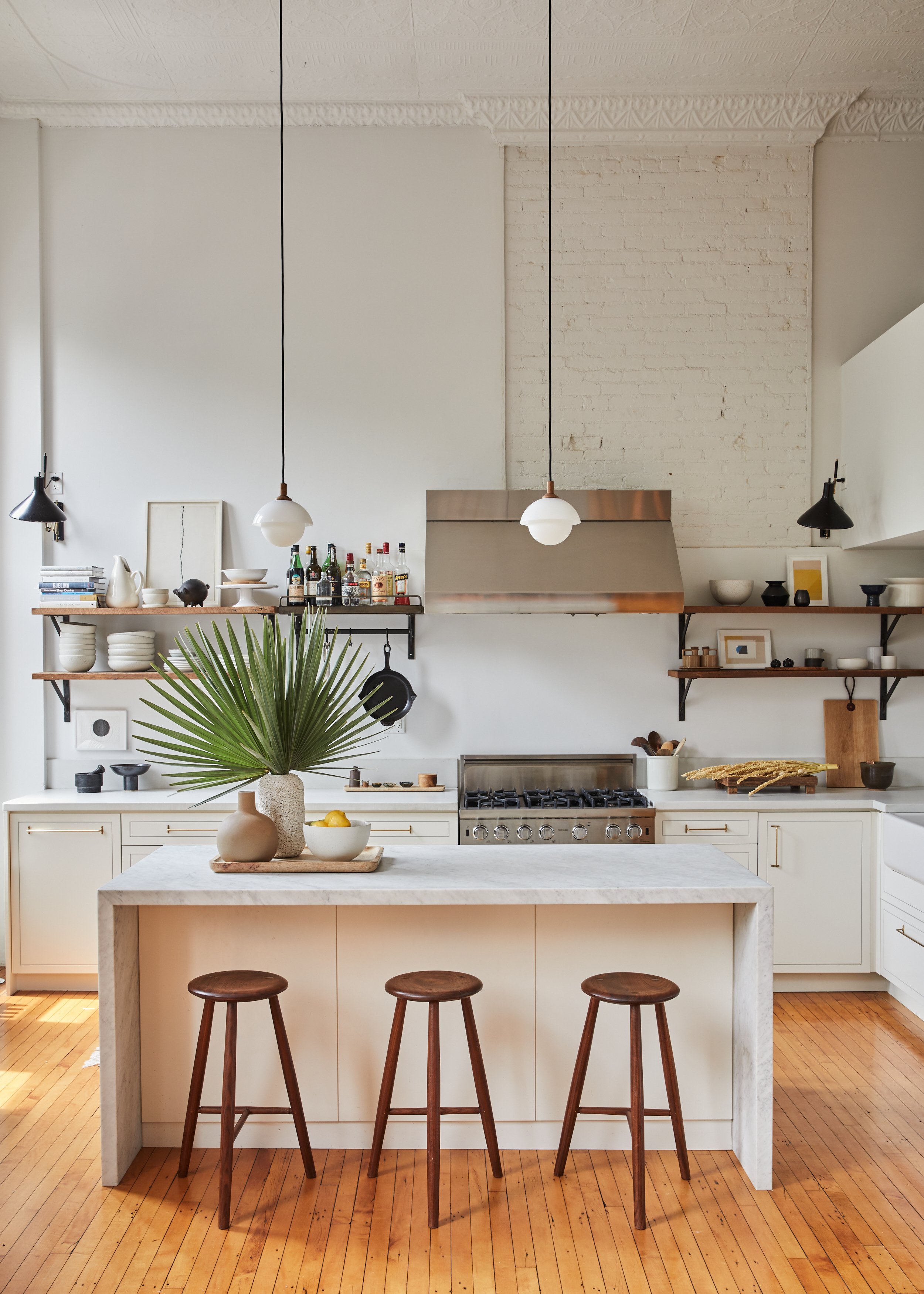
We love the combination of cream cabinetry and industrial elements in this Williamsburg loft apartment, which feels both inviting and in keeping with former schoolhouse in which the home is located. ‘Our clients wanted an update of their kitchen that would soften the industrial feel of the existing shelves and iron hardware, commercial stove and stainless steel hood,’ says interior designer Staci Dover, who collaborated on the apartment’s renovation with Kevin Greenberg of Space Exploration studio.
‘I wanted to add a little interest to the custom cabinetry, so I implemented a recessed inlay detail to create some definition, yet keep the clean lines. We had the cabinet faces painted in Farrow & Ball's Wimborne White and chose the Futagami brass pulls for the hardware. It gives a nice foundation that allows the curated kitchen ceramics and accessories to shine.’
5. ADD DEPTH WITH DARK-TONED STONE
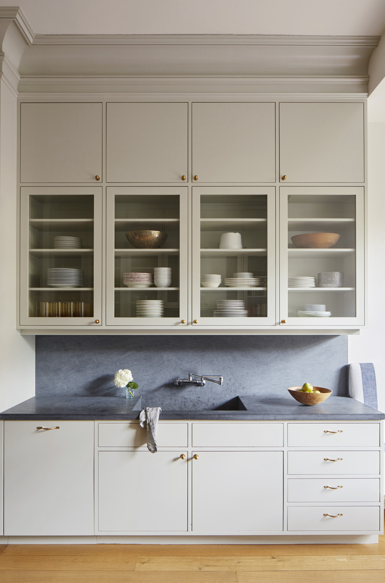
This four-story Italianate row house in Brooklyn was sympathetically reworked by Lang Architecture, who carefully restored all original period details and updated the home with a warm yet restrained interior. ‘In the kitchen, we used a neutral tone for the cabinets with dark-grey Pietra Cordosa countertops,’ says the studio’s principal Drew Lang of the design, which features glazed cabinetry and understated brass hardware.
The dark worktops nod to the frames of the newly added steel doors that open the kitchen up to a balcony overlooking the garden. ‘The combination of colors and textures softens the historic elements and creates a tranquil, modern living environment,’ Drew explains.
6. PAIR CREAM CABINETS WITH WARM WOOD
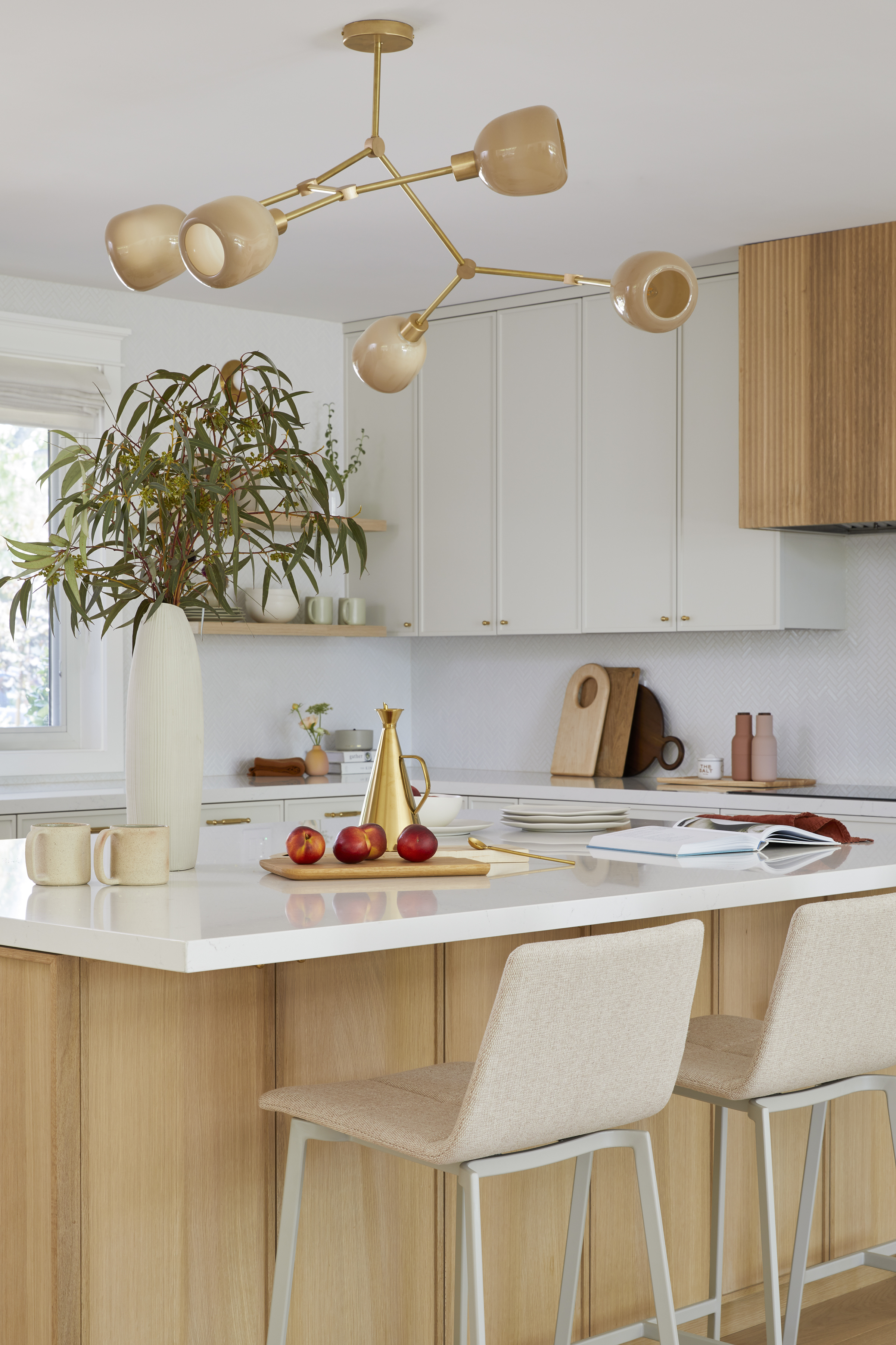
‘The homeowners naturally gravitated toward modern fixtures but wanted a timeless design for their forever home’ says interior designer Cathie Hong, who devised an enduring wood-and-cream scheme for this Californian kitchen in Saratoga.
'We satisfied the criteria by choosing a more modern 1/2" shaker profile for the cabinets, a textural fluted detail on the range hood, as well as brass hardware and light fixtures,’ explains Cathie. ‘We kept it timeless by combining a natural white oak stain with an off-white paint color. Micro-scale herringbone tiles and white quartz countertops complete the look.’
7. EMBRACE THE MODERN FARMOUSe LOOK
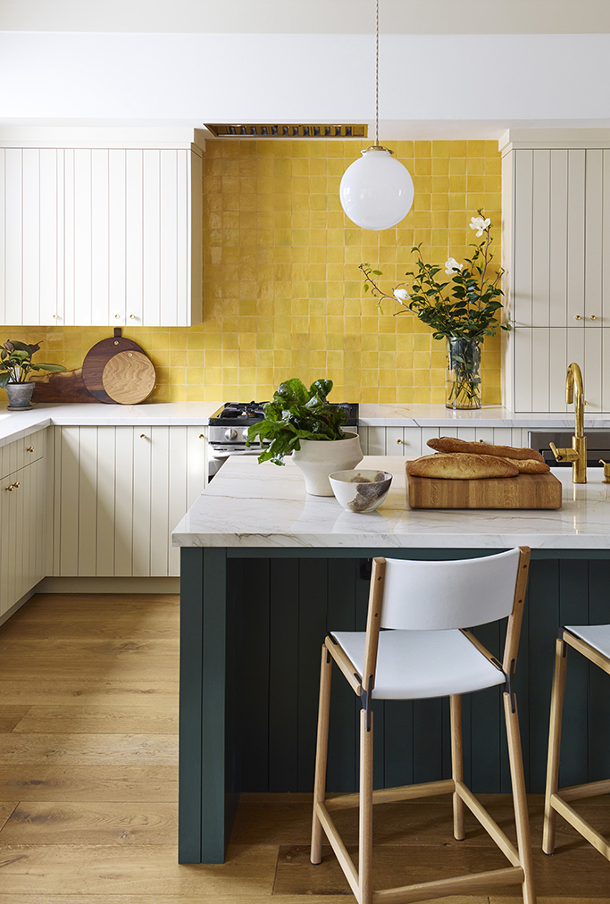
If you love the idea of a traditional cream kitchen but don’t want to veer into twee territory, then modern-country style might be the solution, as illustrated by this Californian abode designed by Landed Interiors and Homes.
'The contemporary touches we designed for this farmhouse-style kitchen included overlay cabinetry with a shiplap joint on the fronts, simpler shapes for light fixtures, and a counter with a eased and mitered edge, rather than a more detailed edge profile,’ says studio founder Lynn Kloythanomsup, whose clients were drawn to Early American and Shaker simplicity. ‘We also kept the backsplash uncluttered by installing the range hood into a soffit that keeps a clean line and also caps the upper cabinetry.’
8. TRY A NEUTRAL WITH COOLER TONES
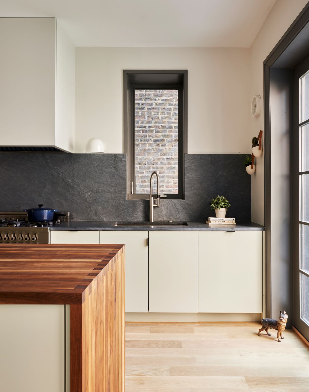
If you’ve tried to get on board with cream but the yellow undertones of this particular off-white don’t work well in your space, try a neutral with green or grey undertones instead. Architect Mollie Code of Studio Code did exactly that in the kitchen of her 1900s Chicago home, which she overhauled with help from En Masse Architecture and Design.
‘We used more historic elements at the front and contemporary at the back, where the kitchen is located, ‘ Mollie explains. ‘The kitchen, in particular, stitches the two styles together with color, finishes and details. The cabinetry reads as a neutral color, while the patina of the soapstone, warmth of the walnut island and subtle brass accents give the space depth. We balanced the splurge on materials with using Ikea/Semihandmade cabinets, and are so happy with the result.’
9. COMPLEMENT WITH EARTHY TEXTURES
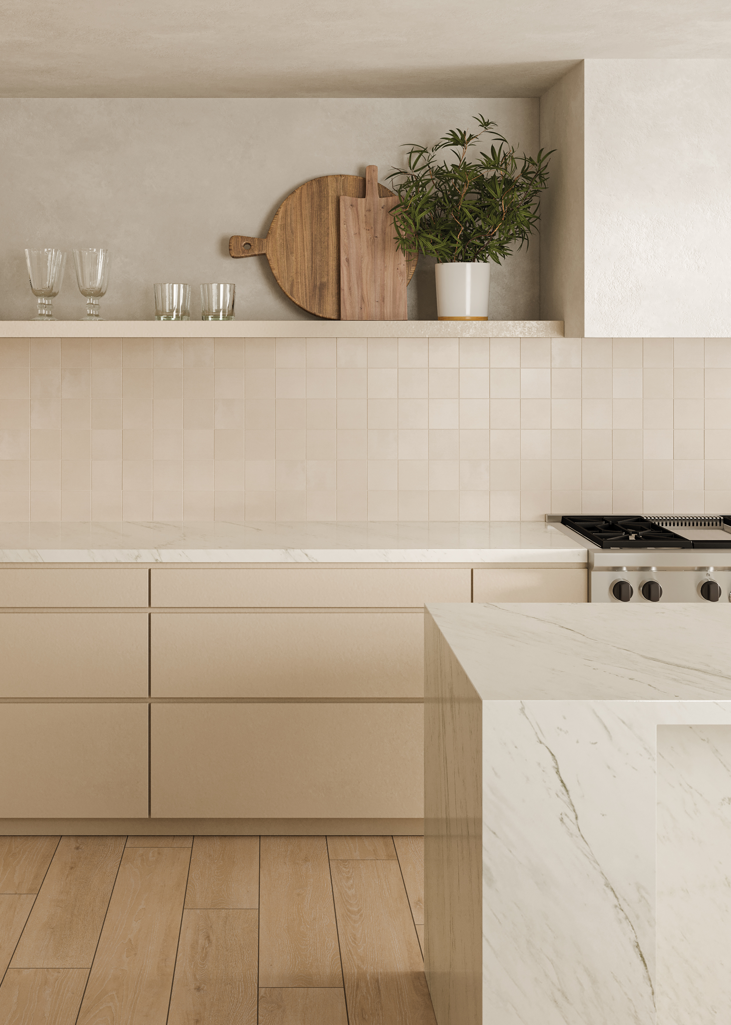
A surefire way to keep a cream kitchen feeling current is to pair simple, minimalist cabinetry with textural surfaces in earthier tones, which will further enhance the warmth and softness of a cream scheme.
Here, zellige-style tiles in pale clay shades from Bedrosians' Sahara collection complement cabinetry in pale, biscuit tones, which works equally well with the textural limewash plaster on the upper portion of the kitchen walls. 'The earthen tonal range captures the soothing warmth, crisp coolness and vast, untouched expanse of the desert,' say the brand.


