A grocery store is not designed for your convenience. It is a carefully crafted maze. The goal is to make you wander. When you wander, you spend more time in the store. You see more products. You make more impulse buys. Retailers use a number of clever store design tricks. They are all designed to disrupt your efficient shopping trip. They encourage a slow, profitable stroll through the aisles.
1. The “Decompression Zone” at the Entrance
The first ten feet of a store is often a wide, open space. Retailers call this the “decompression zone.” It is a deliberate buffer between the outside world and the shopping environment. This space forces you to slow down your walking speed. It helps you to transition from a “mission” to a “browsing” mindset. This sets the pace for the entire trip.
2. Placing Staples in Far-Flung Corners
Stores intentionally place high-demand items like milk and eggs at the very back of the store. This decision is not an accident. It forces you to walk the maximum distance. This path takes you past thousands of other products. This increases the temptation to make an unplanned purchase.
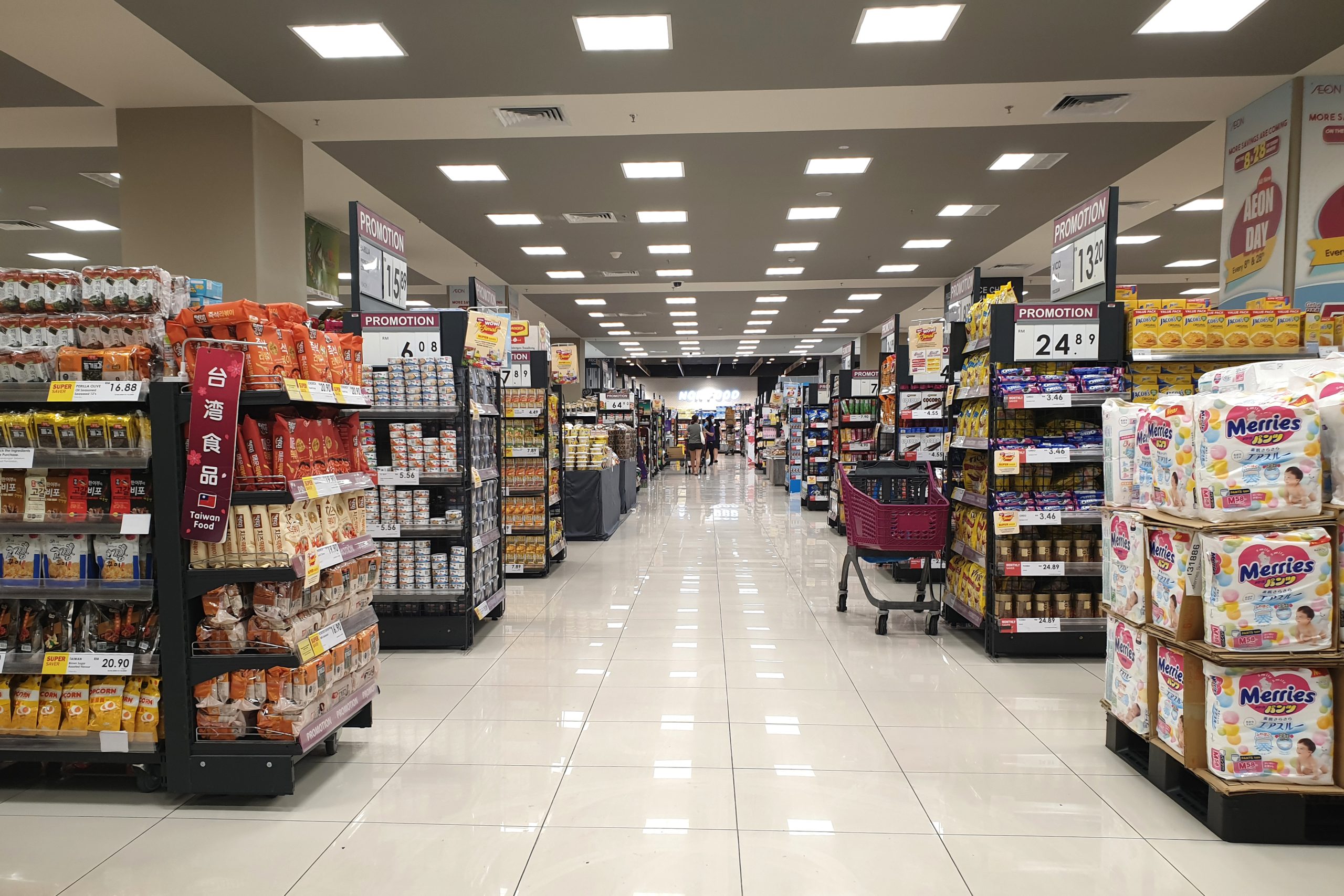
3. The “Racetrack” Perimeter Layout
Many modern supermarkets use a “racetrack” layout. This is the main loop that runs around the perimeter of the store. This design forces you to walk past all of the most profitable departments. You must pass the bakery, the deli, and the produce section. You do this before you can get to the center aisles. It is a long, guided journey that maximizes your exposure.
4. “Island” Displays as Speed Bumps
A store will often place a large, free-standing “island” display in the middle of a wide aisle. These displays are more than just a promotional space. They are a physical “speed bump” to break your long, clear line of sight. These islands force you to navigate around them and slow you down. It forces you to pay more attention to the products that are displayed there.
5. Limited Cross-Aisles
A grocery store’s long, main aisles are often not connected by many “cross-aisles.” This is a deliberate design choice. It prevents you from making a quick and direct path to the item you need. It forces you to walk all the way down one aisle. You then have to come all the way back up another. This is a much longer and more profitable journey for the store.
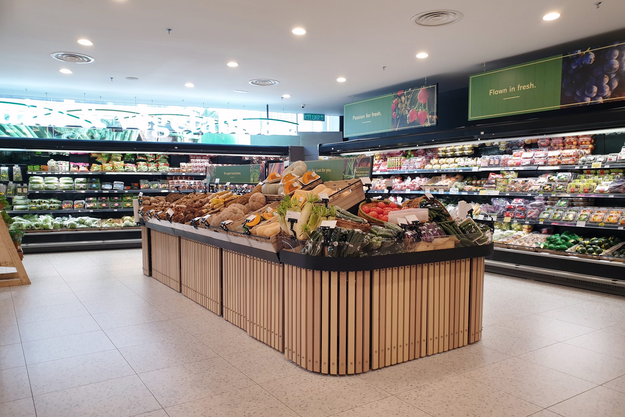
6. Sensory Stations as Anchors
A store will create “sensory stations” to act as an anchor that will stop you in your tracks. This could be a free sample station or a coffee grinding machine. The sounds and the smells of these stations are designed to make you pause. While you are there, you are much more likely to wander. You may browse the high-margin products in the surrounding area.
7. Confusing Signage
Sometimes aisle signage is unclear. This “controlled confusion” makes you search. Searching means more wandering and more exposure to products. The store is betting that you will find a few impulse buys along the way. This is a common tactic in large, complex stores.
8. The Serpentine Checkout Queue
The final maze you must navigate is the serpentine checkout queue. This single, winding line forces you to walk a long path. It is lined with candy, magazines, and other impulse buys. For the store, it’s the last and most effective chance to tempt you to add a few more high-margin items to your cart while you are waiting.
9. Different Flooring or Lighting
Retail designers will use different flooring materials and lighting. This is to subconsciously guide your behavior. A store might use a warmer, wood-like flooring in its premium wine section. This creates a more upscale, relaxed atmosphere. It encourages you to slow down and browse. They might also use a bright spotlight to draw your attention to a specific display.
The Architect of Your Choices
The layout of a grocery store is a form of architecture. It is designed to persuade. Every corner, every display, and every pathway has been planned. The plan is to influence your subconscious mind. The goal is to turn your efficient, planned trip into a slow, wandering journey of discovery. By understanding the map of this maze, you can learn to navigate it on your own terms. You can find your way to the exit with your budget still intact.
Have you ever felt like you were being led on a specific path through a grocery store? What design trick do you find the most effective at grabbing your attention? Let us know!
What to Read Next
- 9 Store Layout Changes Designed to Make You Spend More
- Do New Store Layouts Delay Your Exit?
- Are Digital Coupons Designed to Expire Mid-Scan?
- 6 Products Designed to Break Right After Warranty Ends
- 7 Menu Design Clues That Reveal a Restaurant’s True Character
The post 9 Store Designs That Encourage Wandering Aisles appeared first on Grocery Coupon Guide.