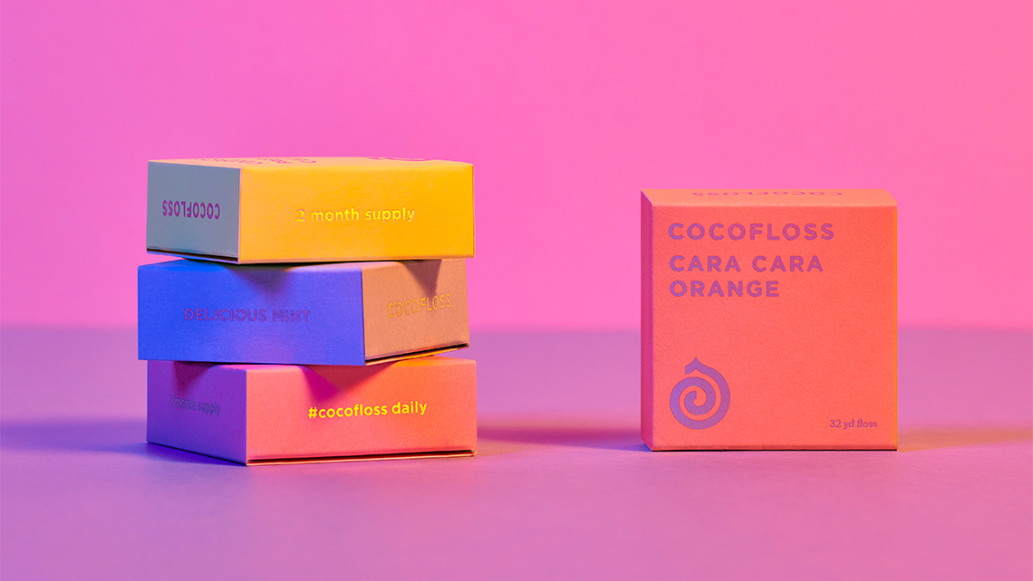
If you want to make your design portfolio the best it can be, you need to think about how you shoot your work. This is especially true for print and packaging designs, which can be challenging to capture effectively in static images.
In short, a creative, dynamic, and original approach to photography is essential for standing out. But where do you start? After checking out some design portfolio ideas, In this article, we share nine ideas of how to make things interesting, with examples of images that pull off each technique.
01. Add punch with a vibrant backdrop
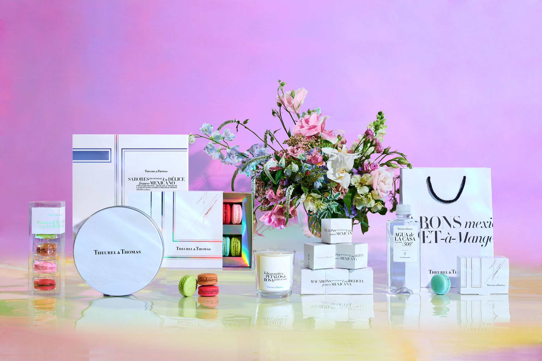
One of the simplest but most effective ways to add punch to your portfolio images is to shoot your work on a brightly coloured backdrop.
Although shooting on white and then adding a background colour later in Photoshop is always an option, coloured backdrops – perhaps even combined with coloured lighting – can achieve a memorable effect that leaps off the page or screen.
Mexican branding agency Anagrama used a fun background to create promotional images for patisserie Theurel & Thomas. With colour behind and below it, the white packaging stands out. The macaron also gives pops of colour, aided by the background and product reflections.
02. Art-direct the scene to add visual interest
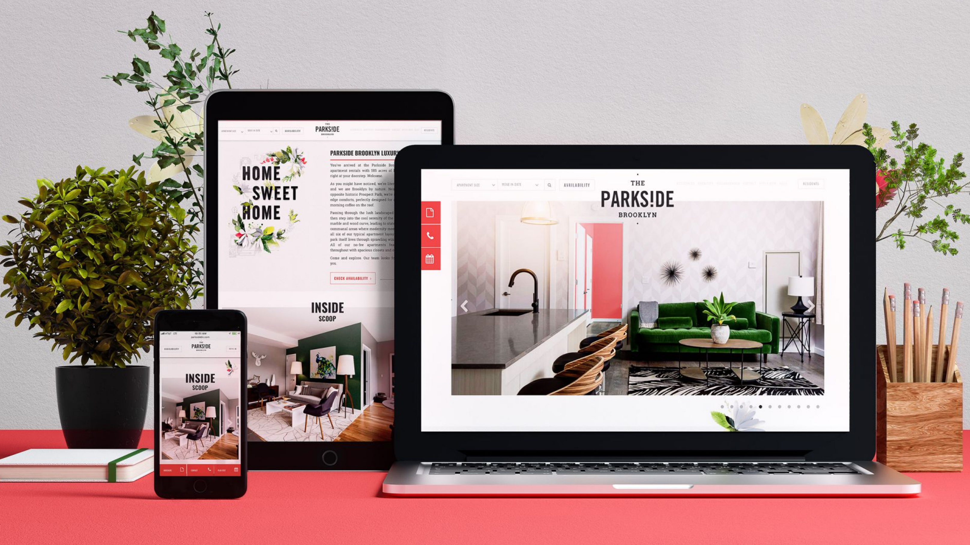
Stock imagery of laptops, tablets and smartphones can be great to mock up digital work in situ, and this can save time and money shooting the same hardware yourself over and over. But sometimes it's worth going the extra mile.
New York-based agency Vault49 did exactly that to show off its work for The PARKS!DE Brooklyn, a luxury NYC apartment complex.
Tasked with appealing to millennials with a lifestyle-driven message, the studio created a comprehensive branding system and accompanying promo materials, with refined handcrafted illustrations used to add a touch of sophistication.
In Vault49's online portfolio, the PARKS!DE Brooklyn website is showcased on a laptop, iPad and iPhone in a carefully art directed 'scene' that continues the lifestyle theme, complete with miniature shrubs, textured backdrop, and accessories such as a notebook and wooden pencil holder.
03. Be inventive and have fun with it
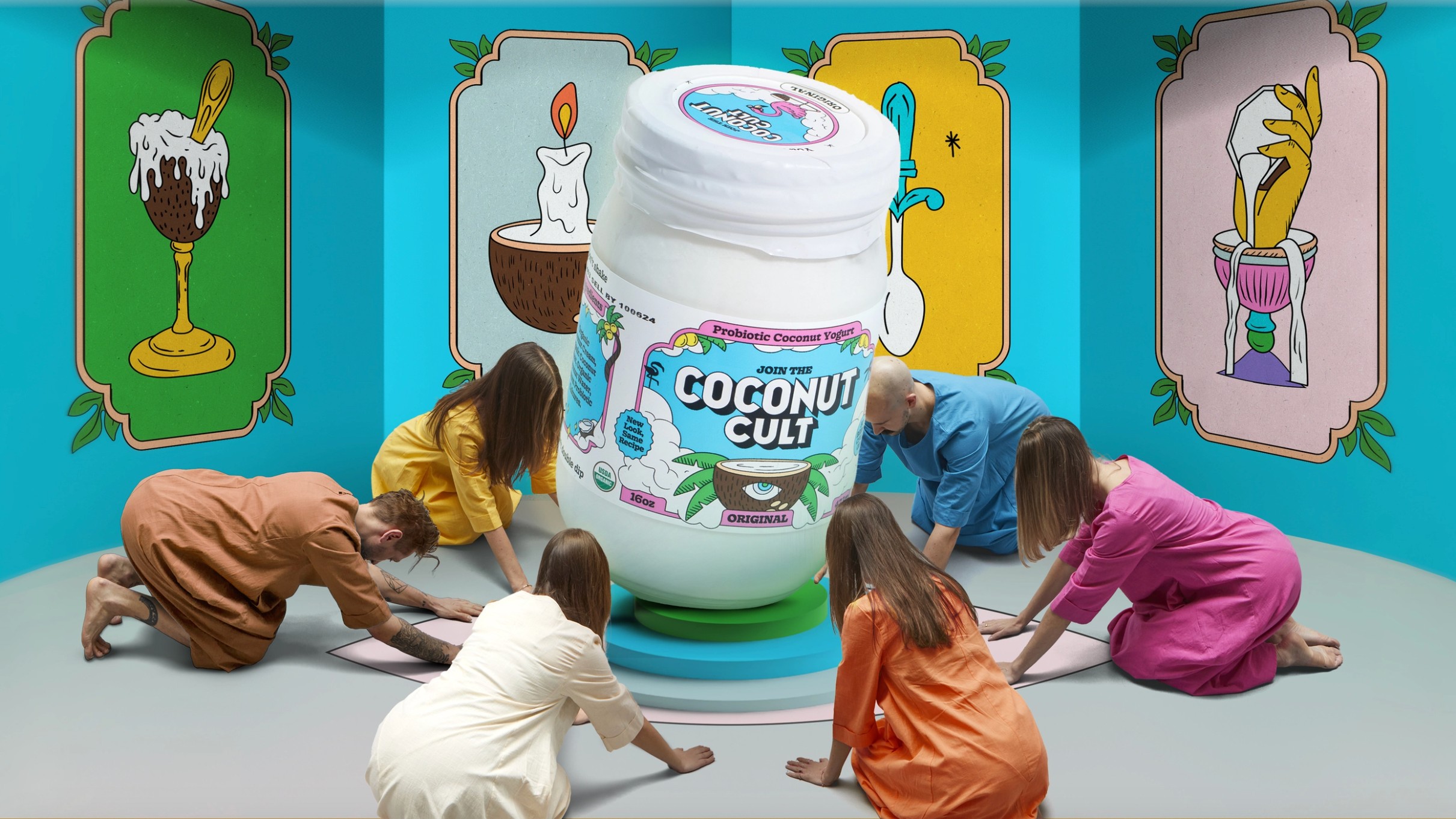
Without sounding too controversial, there are some designers who maybe take themselves and their work too seriously. There's nothing wrong with being serious and hard-working of course, but that doesn't mean that a sense of fun and playfulness doesn't sometimes go a long way.
Here's a great example. Recently, &Walsh rebranded probiotic yoghurt brand Coconut Cult to give it a more cohesive identity. Inspired by the surrealist film The Holy Mountain, the redesign incorporated mystical, cult-like motifs and geometric illustrations.
Given the playful nature of the designs, it made sense to also take a fun, colourful and inventive approach to their photography, with a confident variety of mixed-media styles: see the full range of images in this case study.
04. Use motion to demonstrate process
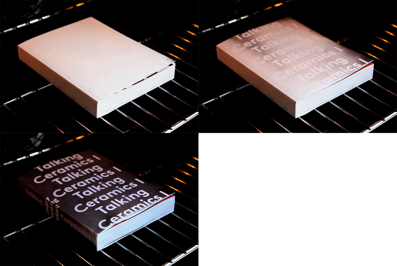
Sometimes still images aren't quite enough to communicate why people should care about a project, especially if there's an exciting creative process or dynamic interactive feature to show off.
Dutch studio Trapped In Suburbia has built a reputation for its innovative, boundary-breaking uses of special print treatments and engaging interactive technologies, and its Talking Ceramics book was no exception.
The book – white at first – must be baked in an oven to reveal the cover design. The agency created an animated GIF to show the book cover at different stages of 'baking', as well as producing a video explaining how it all works.
05. Add dynamism through motion blur
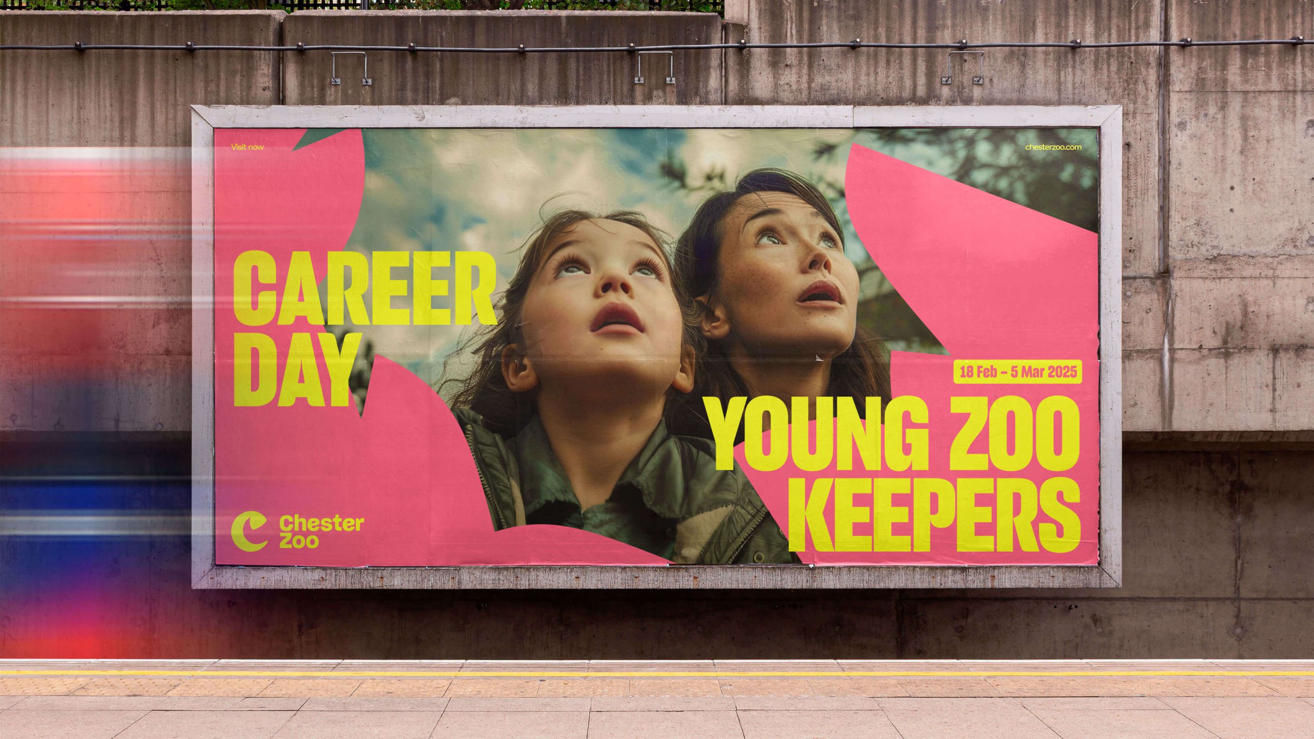
Motion design isn't the only way you can add a sense of dynamism to your work. You can instil even your still images with a sense of movement.
Above you'll see a great example from How&How's recent rebrand of Chester Zoo. The project centred around the idea of 'Force for Nature', and this image of one of the posters captures this idea nicely. Rather than just a static poster, the shot makes clever use of motion blur to add energy and life to the scenes.
Another technique you can use is long exposure. This involves a slow shutter speed to capture the flow of elements like water or light trails, suggesting time's passage or continuous motion. Or you could try zoom burst: changing the lens's focal length during a long exposure to create a dynamic zoom effect.
Even without literal motion, implied movement can be achieved through composition and subject placement, like positioning a subject off-centre, with space in their direction of their gaze.
06. Put things in piles

This is an easy tip, but it can be hugely effective. If your branding appears on a selection of small items, from bottles to business cards, then arranging them in an artful pile is a great way to showcase the work.
This technique is particularly useful if you have a variety of different coloured designs, as it allows you to fashion a kaleidoscopic scene without much in the way of effort. Above is a great example from Eat Studio's branding of EA Soundtrack FC 25, a collection of 117 songs from artists across 27 countries.
07. Think about surfaces
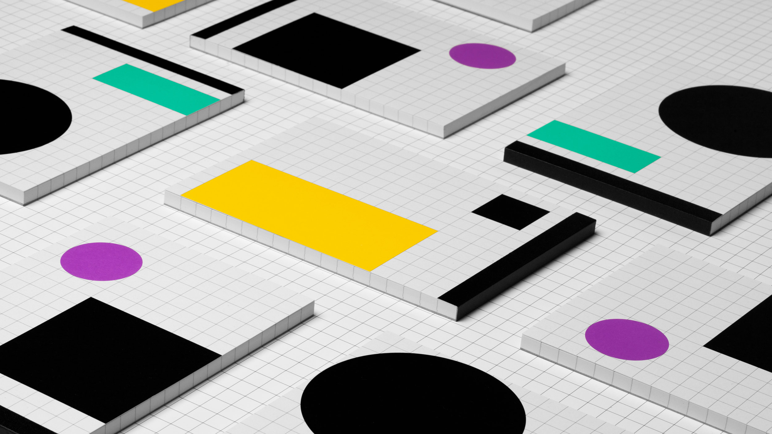
When you're arranging multiple items for shooting, the simplest approach is to use a plain background: that will certainly help focus attention on the work itself. But sometimes it's better to go for something a little more visually interesting.
A quick Google Images search, for example, will make you realise just how many similar shots of stationery there are. It can pay off to do things differently to suit the project at hand, or to establish a unique style of art direction for your studio.
That's exactly what Hey Studio did when they shot the image of their gridded notebooks shown above. They could have been shot on white, but instead they carefully aligned them on matching grid-patterned paper, for a striking effect.
08. Explore different angles and detail shots
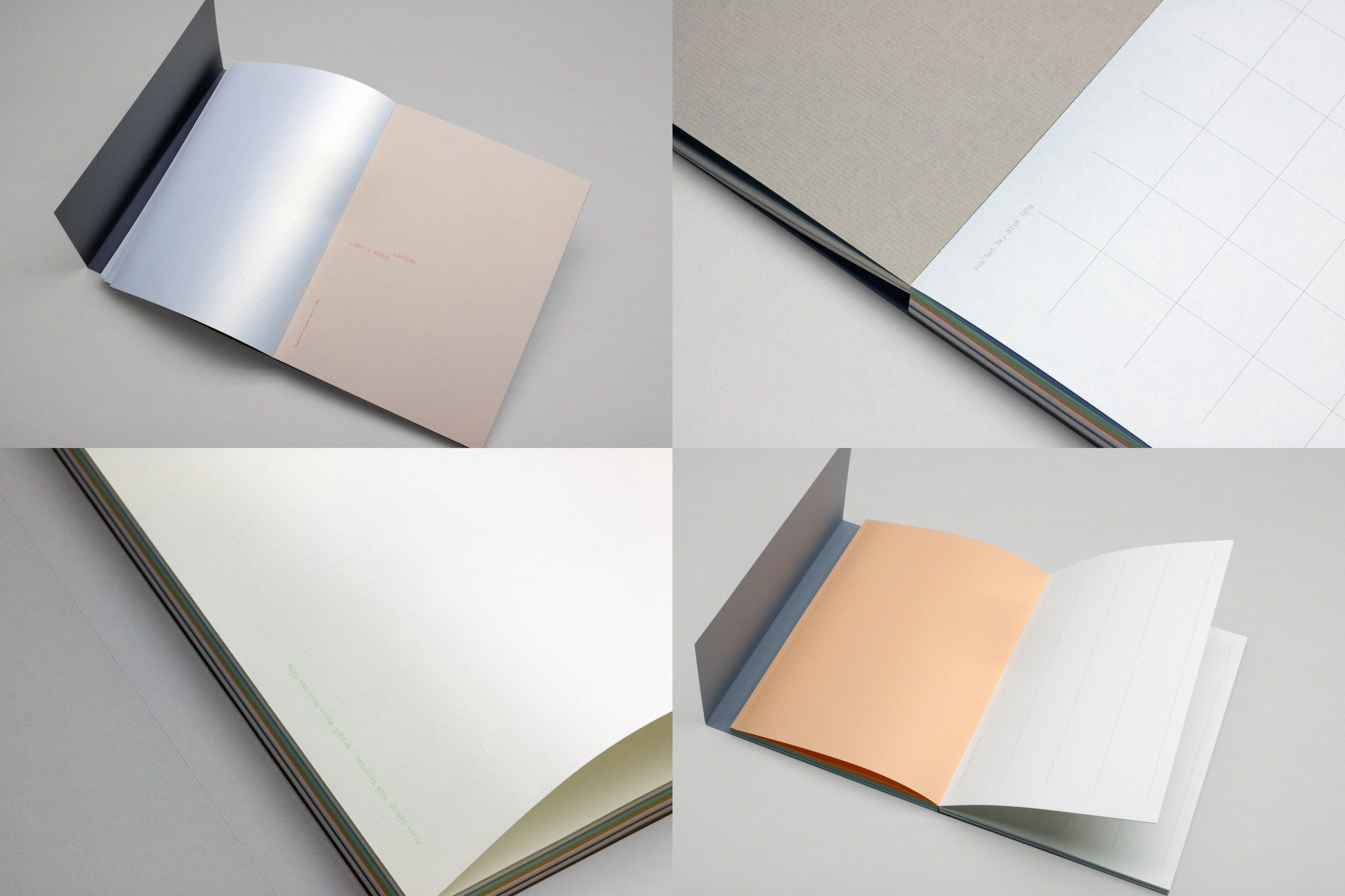
When it comes to printed portfolio items, particularly where different paper weights and textures, and special inks and finishes are involved, it's worth taking the time to shoot a range of different angles, to show it off to best effect.
For its promotional notebook for Arjowiggins Creative Papers, entitled Paper Wraps Stone, Leeds-based studio Build worked with a selection of different papers, as well as a debossed cover and metallic silver Pantone.
The final book has a matt grey cover with simple black type, and many of the colours inside are fairly muted, such as pale blue, beige and soft peach. If not shot carefully, it's the kind of project that could recede easily.
Accordingly, Build shot the book to accommodate a wide range of different angles and close-up details, ensuring a range of angles and perspectives as well as showing off the soft sheen from the metallic Pantone, the crispness of the binding, and the subtle texture of the special papers.
09. Combine video and stills
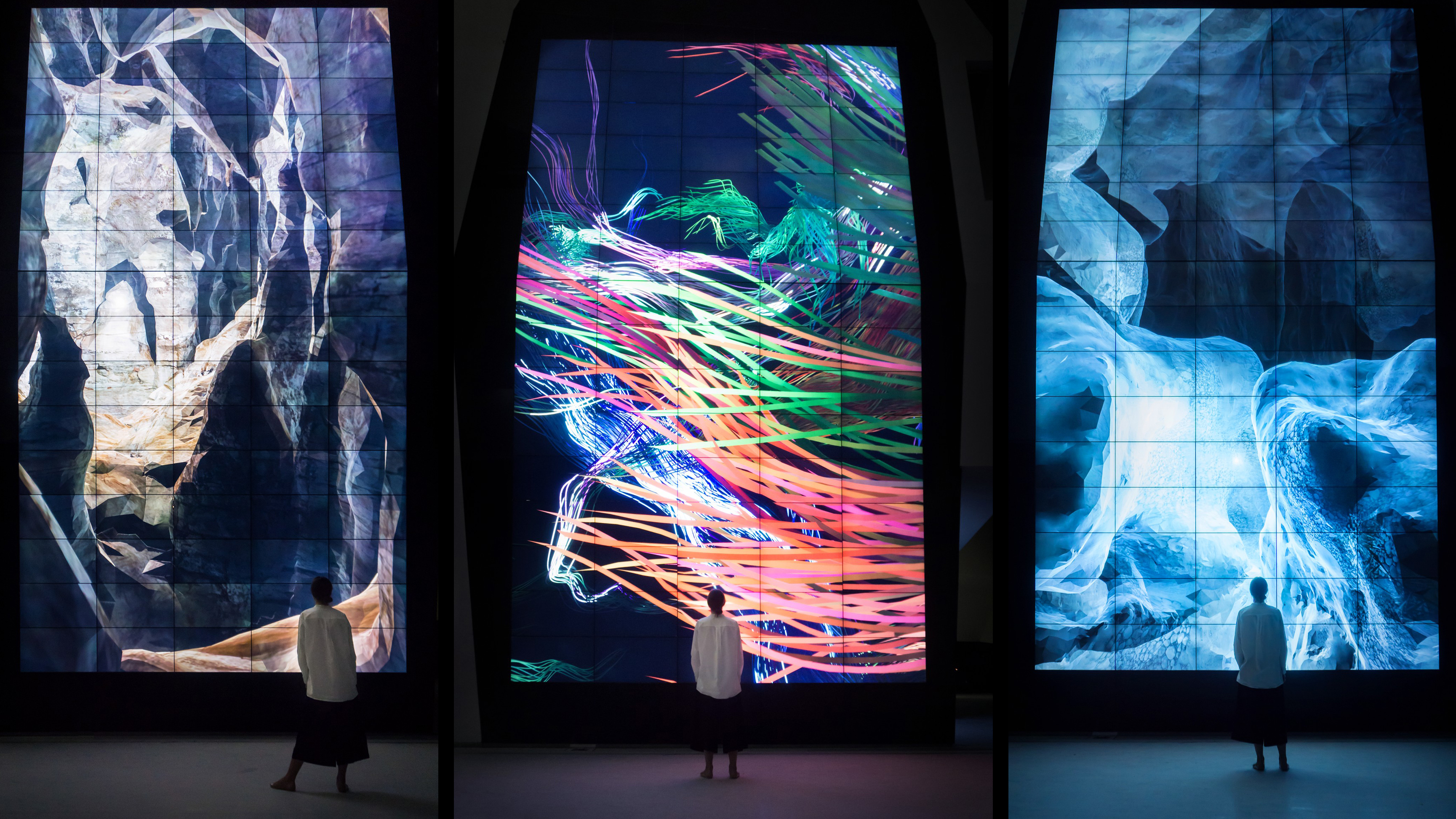
Showing experiential work in a portfolio is one of the biggest challenges a designer can face. Specialising in generative design and interactive, immersive installation work, FIELD has mastered the art of documenting this kind of work – and in most cases, it mean finding the right balance between stills and video.
A good example is its Vision Wall, a permanent installation of three ever-changing generative artworks in the KAPSARC Centre, Saudi Arabia, designed as metaphors for the spirit of scientific research.
FIELD leads the case study in its online portfolio with a screen-filling explosion of motion graphics, but then features a wide range of images of the giant screens in situ, with a mesmerised onlooker in the foreground to add scale.
As all the above examples attest, the best way to treat any given project in your portfolio depends largely on context, but the common factor is that taking the time and effort to document it effectively will really pay off in the long run.
For more on portfolios, see the best portfolio templates and our portfolio tips.


