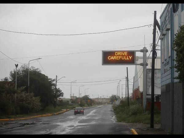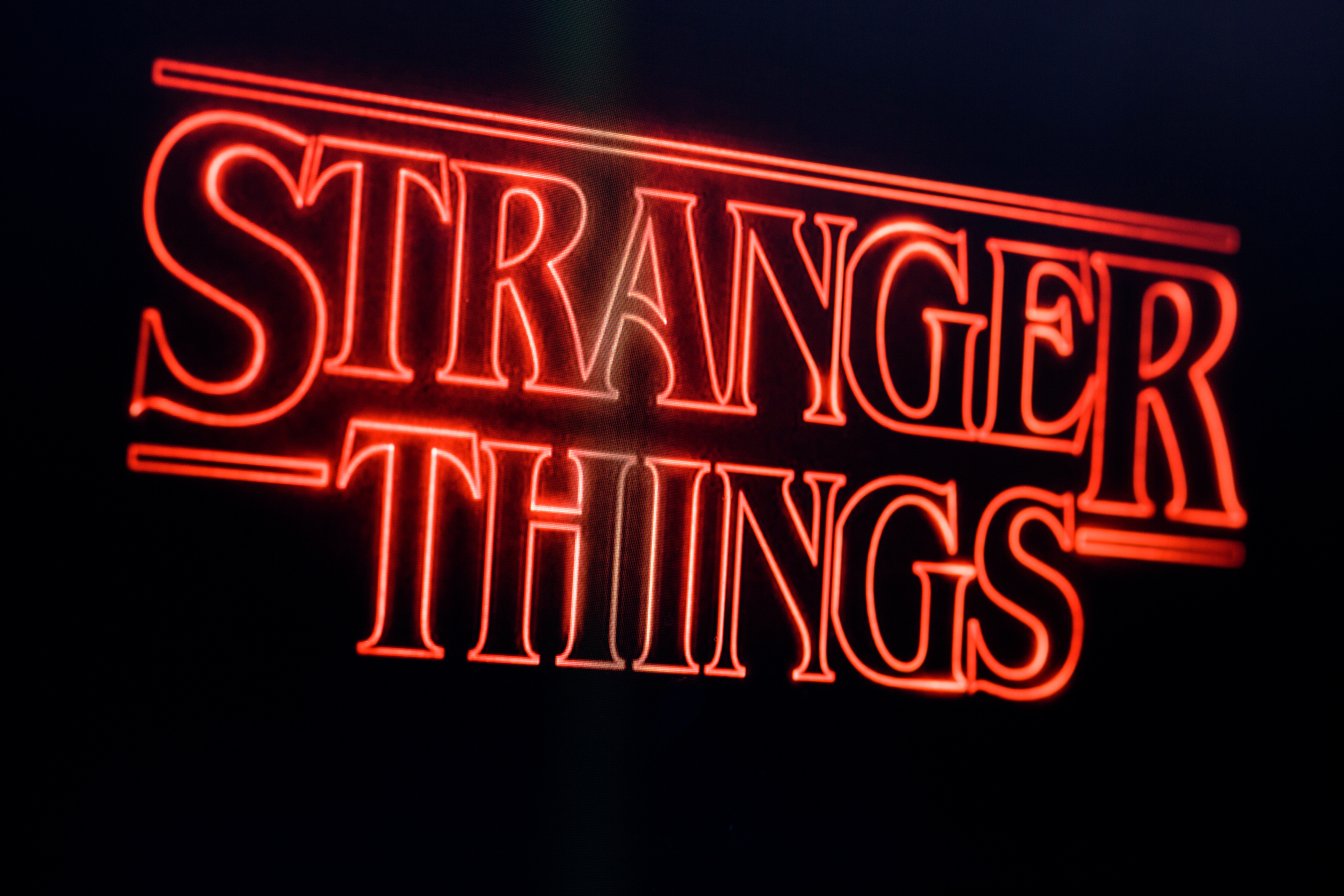
Ever seen a piece of text or type and thought, I’ve seen this before? There’s probably a reason for that. Sometimes, the type choices made on screen and television end up being as iconic and memorable as the features themselves and can set the tone in terms of visual storytelling even before a single word is spoken.
The right typeface can convey a stunning sense of time, place, emotion and genre, and from the classic to the contemporary, we run through here some of the most notable examples as well as exploring why they work so well, with experts weighing in with why these choices work so well.