Visual clarity and good signage are paramount! All your hard work and good intentions can go down the drain if you can’t communicate well… Or if you think that you’re a better graphic designer than you really are.
If your sign, book cover, poster, menu, or other visual masterpiece raises more questions than answers when people read it normally, your monstrosity might just end up being shamed in the popular DDOI online community. We’ve collected some of the most epic text fails to share with you. You’ll find them below. Oh, and remember to scare your artist friends with the worst of the bunch!
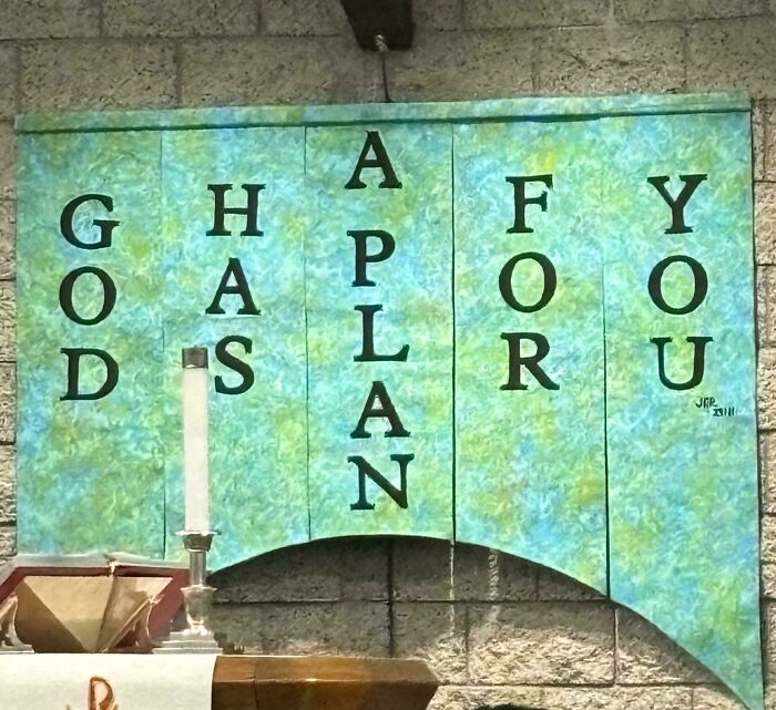
#1 We Don't Care. Stop
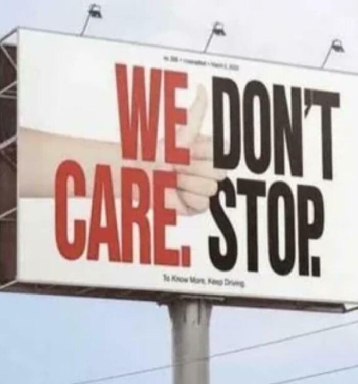
© Photo: Feeling-Cobbler-3581
#2 Run For Half, Autism Marathon
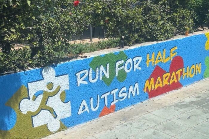
© Photo: MoaningMushroom
#3 No Added Apple Sugar Cake
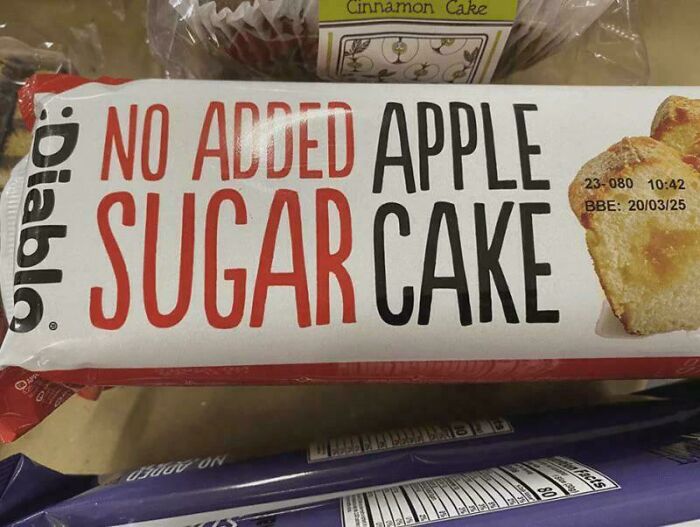
© Photo: zipniko
Even if you’re not a graphic designer, artist, or creative professional, you can immediately tell when a sign or book cover is ‘off.’ In a nutshell, visual communication needs to be as brief and clear as possible.
You need to pick a good font, make sure the colors don’t clash, and that the kerning (that’s the space between characters) doesn’t confuse your target audience or create some unfortunate letter combinations.
At its core, good signage leads to greater visibility and professional credibility, and better brand awareness and recognition.
#4 Bunk Single Metal Pine Beds Beds Beds Beds
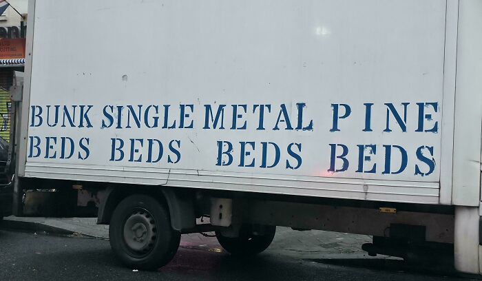
© Photo: nomanslandishome
#5 Be Hail, Gay Satan
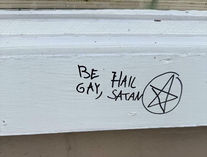
© Photo: Kaiawathoy
#6 Focus If I On My Can't Of The Then I Tiger Outcome Must
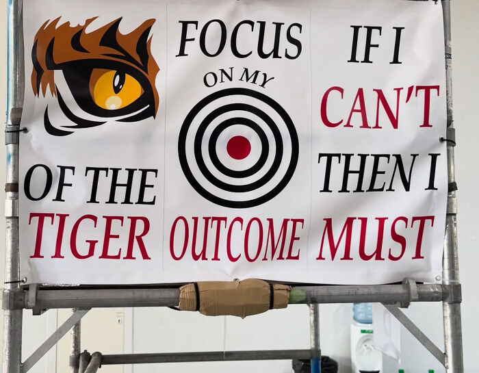
© Photo: kronograf
You have barely a moment to transmit your message to your target audience. So, if there’s any messiness or confusion in your design, you’re already failing at your task. If you’re an entrepreneur, business owner, or content creator, you are pushing potential customers away and harming your brand, reputation, and profitability.
However, some failures are so egregious that they deserve to be called out. The ones that we’ve compiled and featured here are examples of what to avoid doing at all costs.
#7 Can't Your Can't Your, Hear Horn See Finger 😔
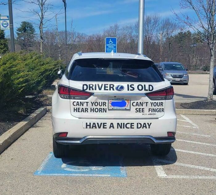
© Photo: reddit.com
#8 He's A Free
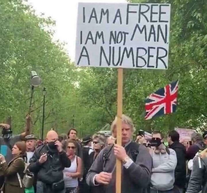
© Photo: brodino_maiuscolo
#9 Feed Me And Tell Me Tacos I'm Pretty
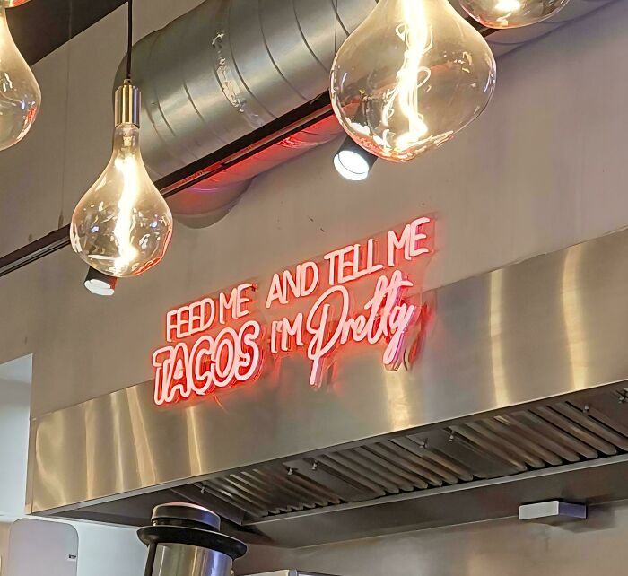
© Photo: LaChazzz
How you represent your brand, business, product, or services visually likely creates the very first impression your target audience has of you. To put it bluntly, if that impression is unfavorable, you’ll have a tough time attracting customers.
If your sign’s a mess, your posters are confusing, and your logo is unreadable, why should your customers trust you over your competitors? In other words, a lack of visual clarity raises questions about your overall quality. And, stating the obvious, you don’t want your customers to raise these questions about you. You want to instantly create a positive impression of trustworthiness and quality.
#10 Burbur Gerger?
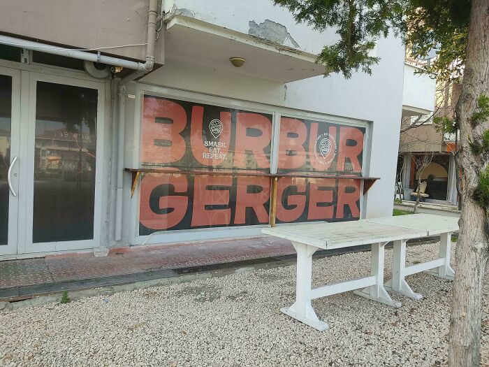
© Photo: haerien
#11 Insiemh!viblat?*
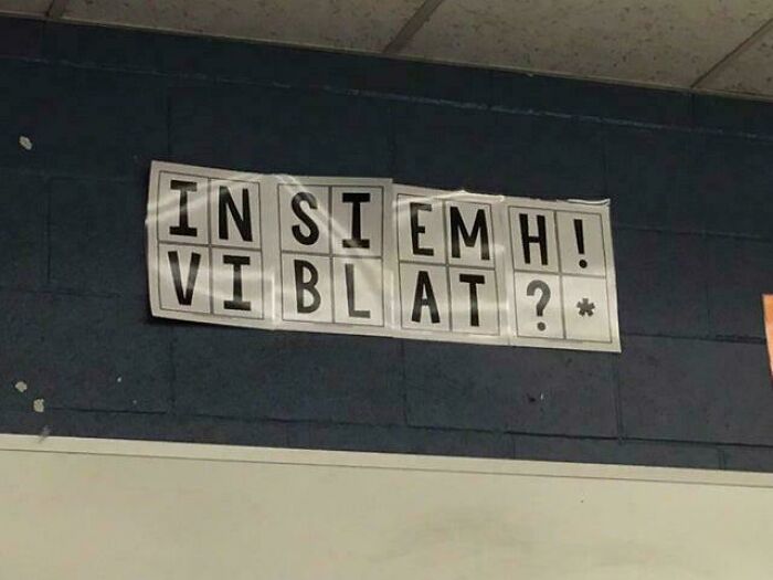
© Photo: fearless_moth56
#12 Ghafy Oapoo Dslru A N
© Photo: disboicito420
Good design means creating quality work within certain constraints.
Clarity and brevity aside, brands should also try to make their advertising interesting, catchy, and fun. So, designers should definitely toy around with the font size, colors, kerning, etc., while still keeping things simple and readable.
You also have to keep the brand’s overall identity in mind when working with signage. Some visual design ideas might be objectively great, but they might not work well with the company or clients you’re currently working with.
#13 Don’t Do Park Park Here Here
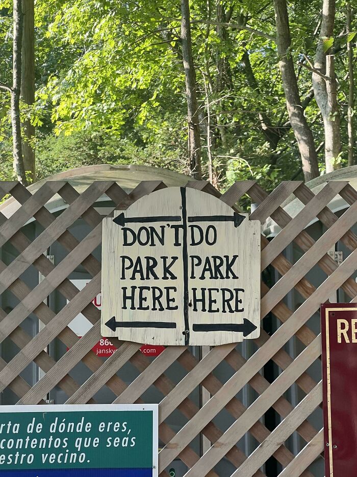
© Photo: reddit.com
#14 Tameawkenuay
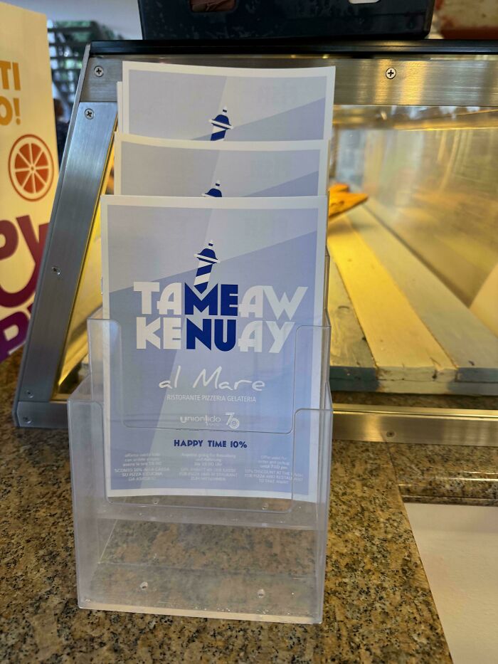
© Photo: Amutking
#15 I’m Not Human Data
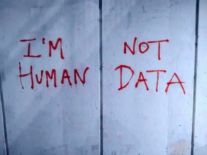
© Photo: djelijunayid
To be clear, everyone makes mistakes. Even veteran industry professionals. So, it’s never a good idea to publish the first draft of, well, anything, no matter how confident you feel about it. Take a break, spend some time away from your design, then look at it with fresh eyes.
Changing the medium through which you review and edit your work also impacts any potential mistakes that you notice. Switch to a different screen. Print out your work and look at it on paper. Do whatever you need to do to distance yourself from your work and look at it from a fresh perspective, as your target audience would.
#16 Be Pet Gay Dogs
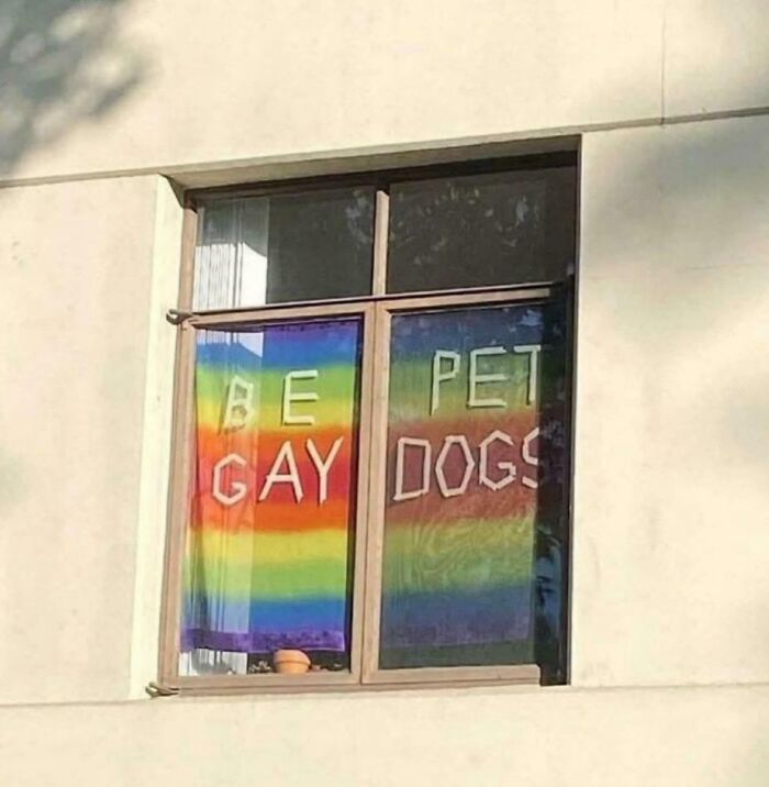
© Photo: HvyMtl1sLfe
#17 Don’t Rat Open Inside
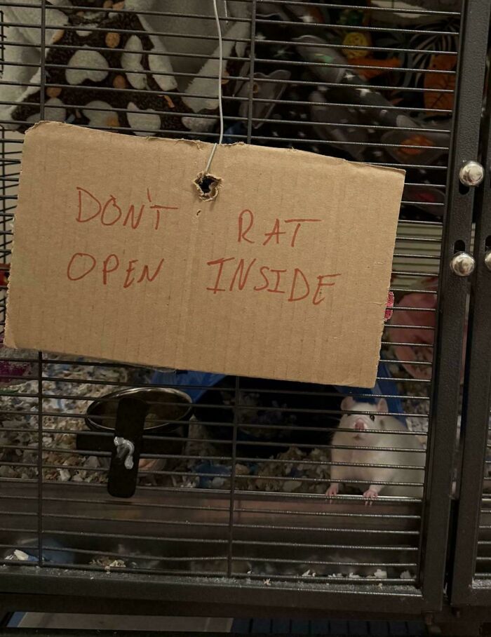
© Photo: Cool_Researcher4794
#18 So I Fart Old Dust
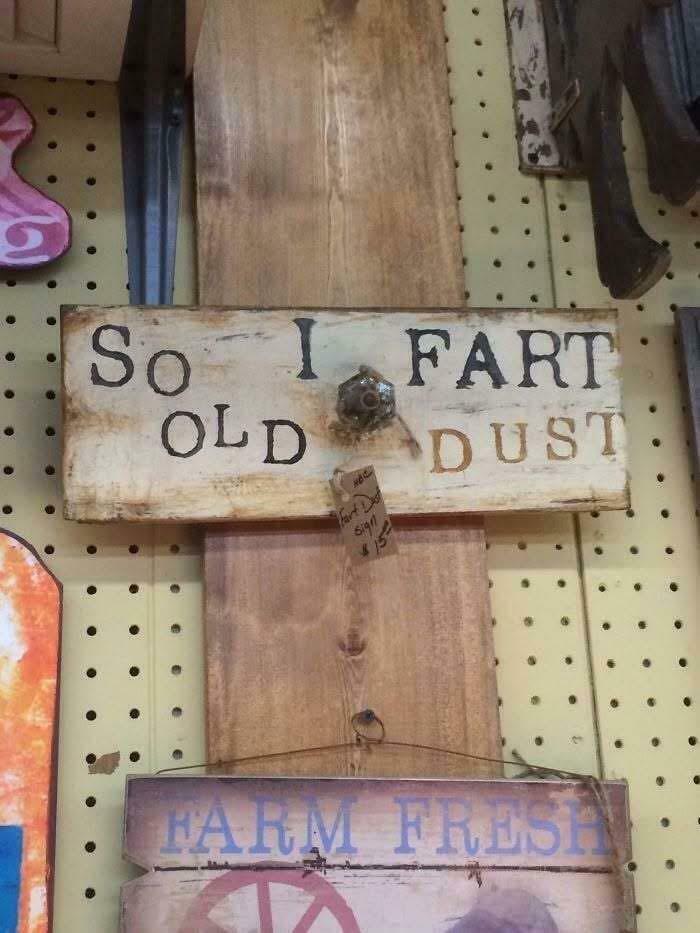
© Photo: OldActuary2297
You also need to be open to editing your work based on feedback. Ask your colleagues, family, friends, and complete strangers for their honest opinions on your work. Then, hone in on the constructive criticism while ignoring unhelpful feedback.
No matter how amazing you are at your job, true professionals recognize their limits and the value of getting impartial viewers’ opinions. (Even if their comments can sometimes be tough to take!)
#19 For Squeeze Service Me
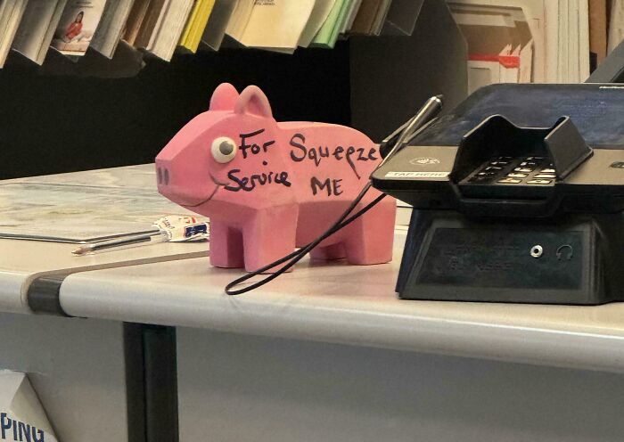
© Photo: Melancholy_Rainbows
#20 Yarn Factory Dragon Store
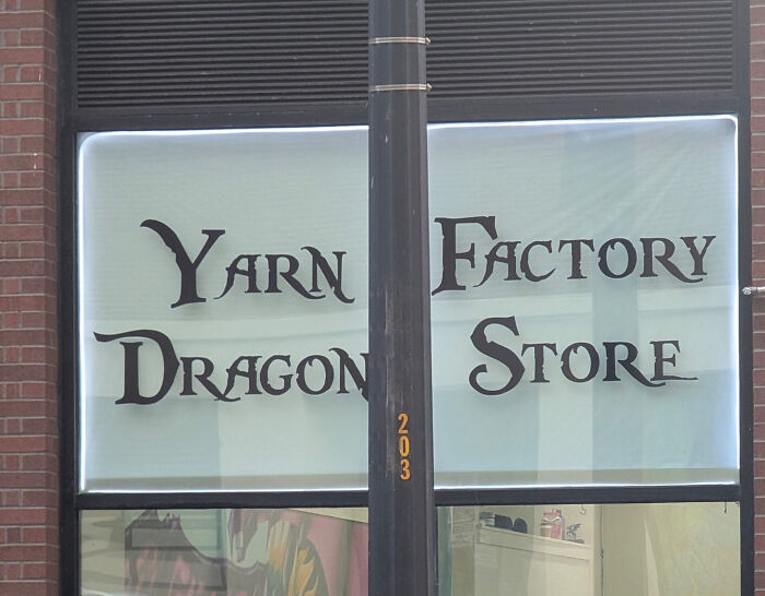
© Photo: Busy_Introduction_94
#21 It’s Gada Mey!
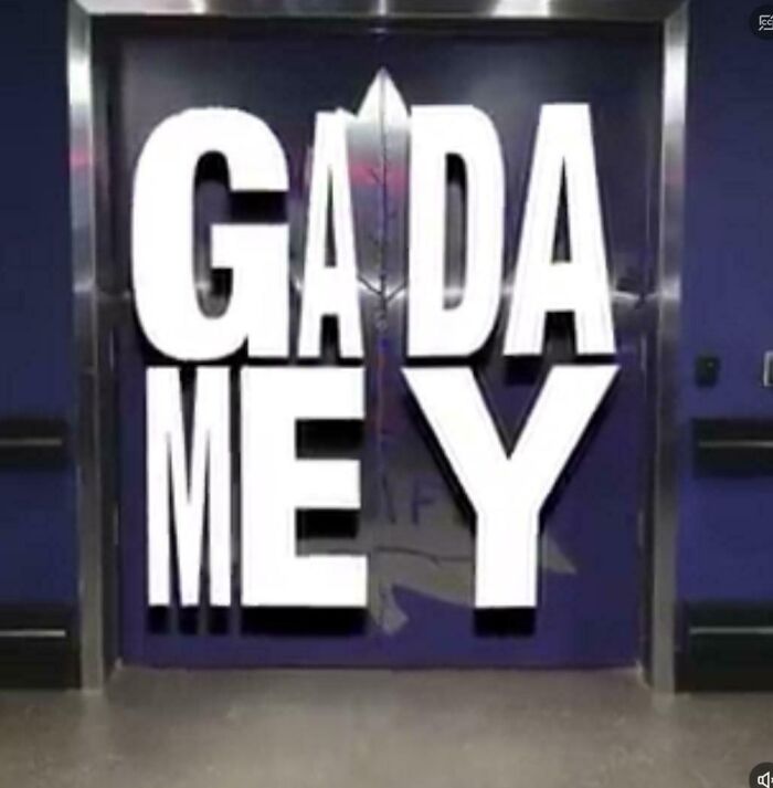
© Photo: leftnotracks
The inspiration for the DDOI online group comes from the massively popular TV series ‘The Walking Dead.’
The show had a promotional poster that, due to the bizarre spacing, warped the message written on a door. The signage here was so hilariously bad that it became a meme and spread online.
#22 Hot Smoke Fish Chicken Pork Pull Chop Pork
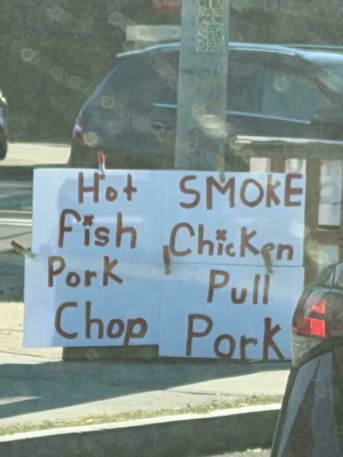
© Photo: breakfree89
#23 What What What
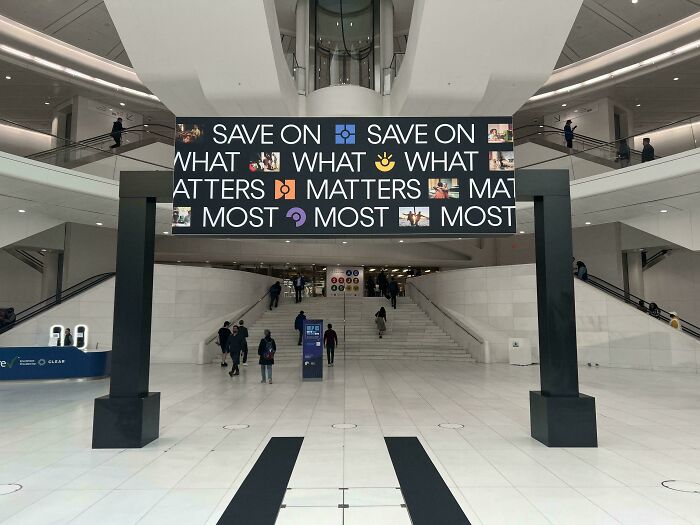
© Photo: Diligent_Office7179
#24 Think Trash Pink Cancer
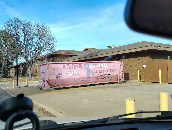
© Photo: FreshySqueeze
The DDOI online community is practically legendary by now. It has been calling out hilarious and nonsensical visual design fails since 2014.
Now, nearly 12 years after the group was started, it continues to draw in a massive crowd of gawking internet users and people eager to call out bad signs. At the time of writing, the subreddit gets 36k visitors per week.
#25 No Move So, Because Ok Lazy. To Leave Alone
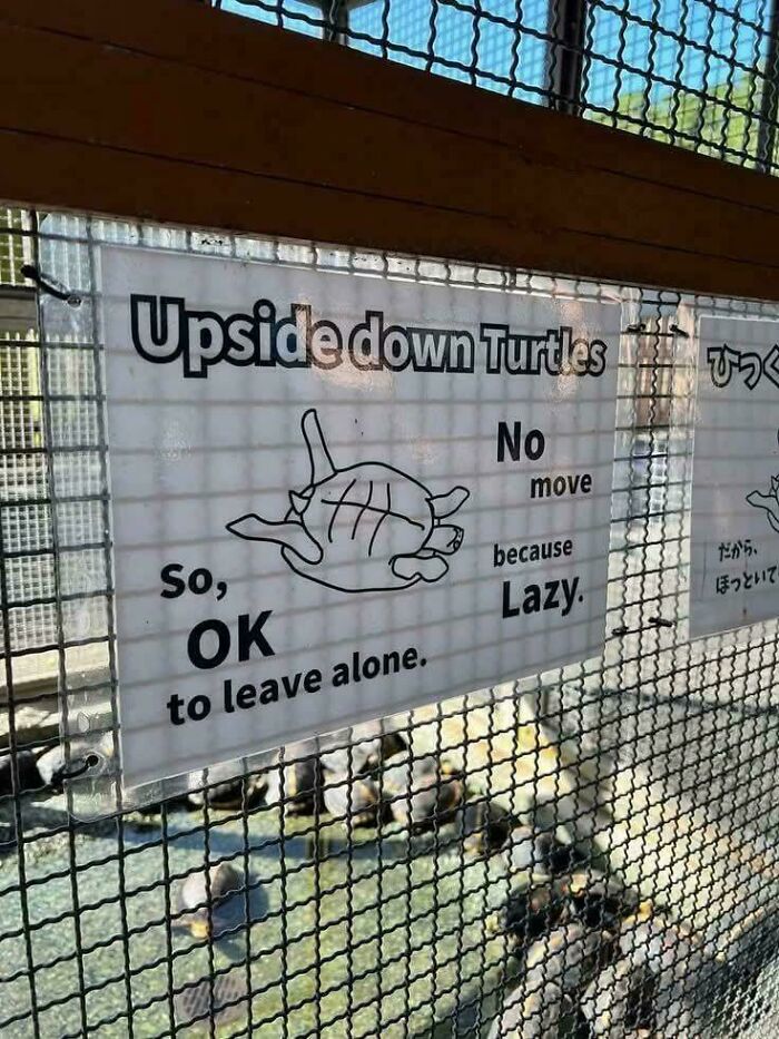
© Photo: Jesus_GB
#26 Pflugerqb Villegyn
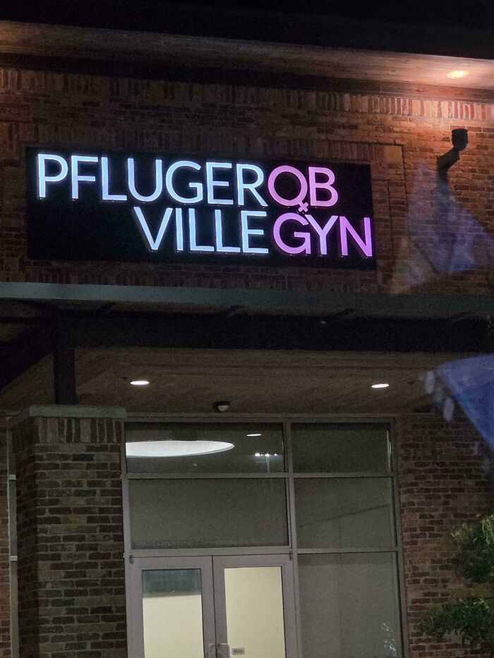
© Photo: Broke-Down-Toad
#27 We Bad. Fix Jobs
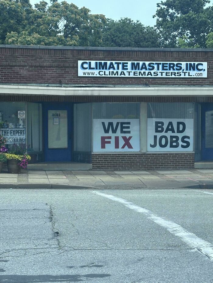
© Photo: purplemtnstravesty
The essence of the DDOI online group is sharing visual designs, signs, posters, and other examples of text that, when read regularly from top to bottom and left to right, end up confusing, nonsensical, and funny.
The subreddit revolves around English posts, and the mistakes should be instantly obvious. The moderators who run the group that the community should avoid forcing anything or posting something that could be easily faked or staged.
Meanwhile, posters are encouraged to share the incorrect way of reading the text in the title of their post.
#28 Don't Closed Open
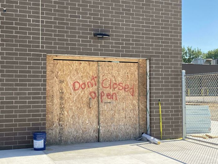
© Photo: davidbrit2
#29 Under No Construction Entry
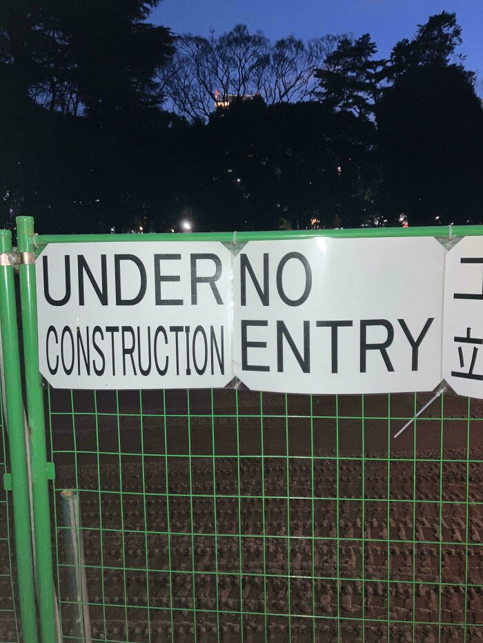
© Photo: 1MillionSpacebucks
#30 Hi Do Not Mix Please The Beans
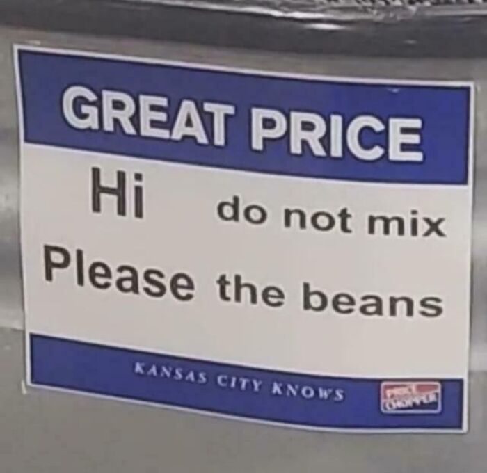
© Photo: fearless_moth56
Which of these hilariously bad sign fails made you wince and cringe the hardest, and why?
What are the worst examples of visual media that you’ve personally seen in your local area? In your opinion, what can all creative professionals do to become more self-aware of the quality of their work?
Share your thoughts with all the other readers in the comments.
#31 Happy And She Am I Called His Name Asher
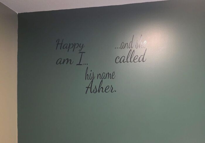
© Photo: Cambers-175
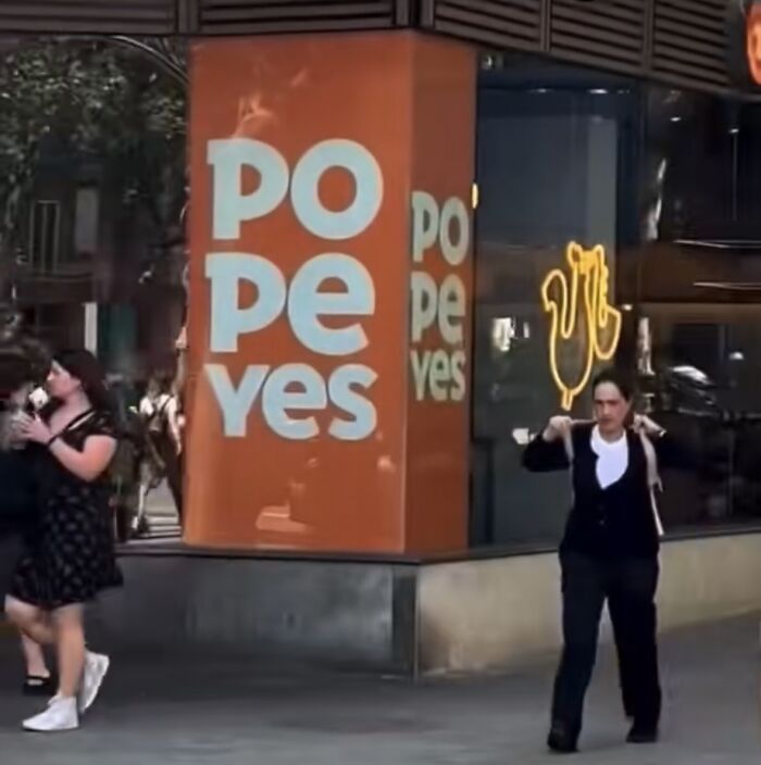
#32 Popo Pepe Yes Yes
© Photo: LazaroFilm
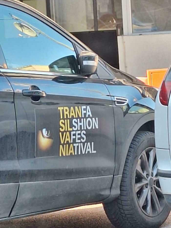
#33 Tranfa Silshion Vafes Natival 🤌
© Photo: RariCalamari
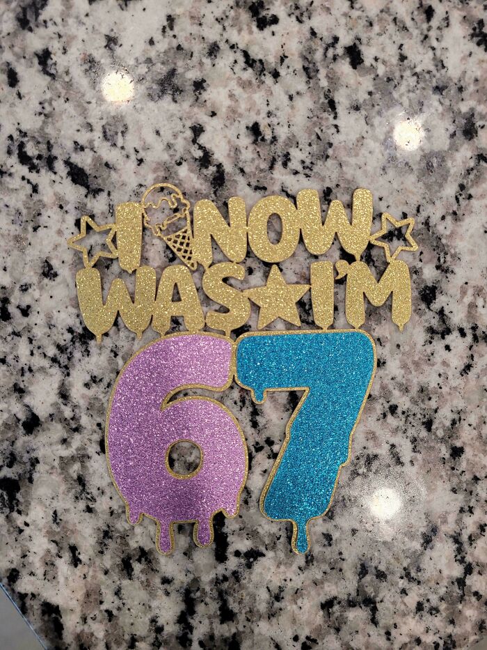
#34 I Now Was I'm 67
© Photo: Apprehensive_Emu9588
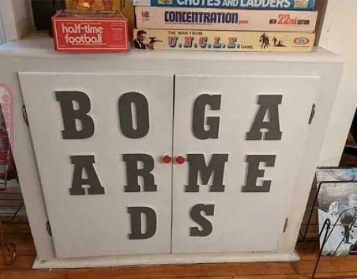
#35 Boga Arme Ds
© Photo: Po3ito
#36 Wet Be Floor! Careful!
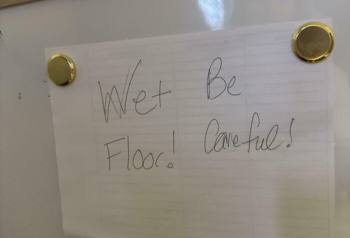
© Photo: BrokeTheInterweb
#37 If We Burn You Us Burn With
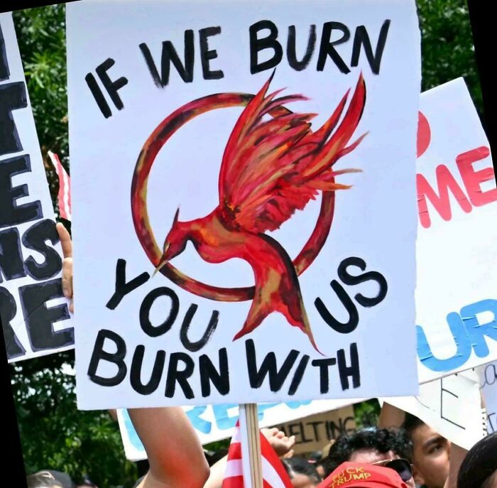
© Photo: Grammargambler
#38 Enjoy Mouth Popcorn Your Watering
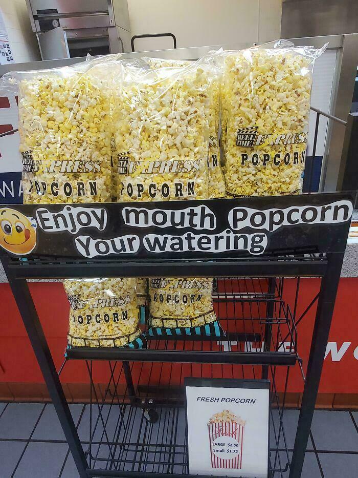
© Photo: Odd_Sir_5922
#39 Lucky Fried Geandma Skewers
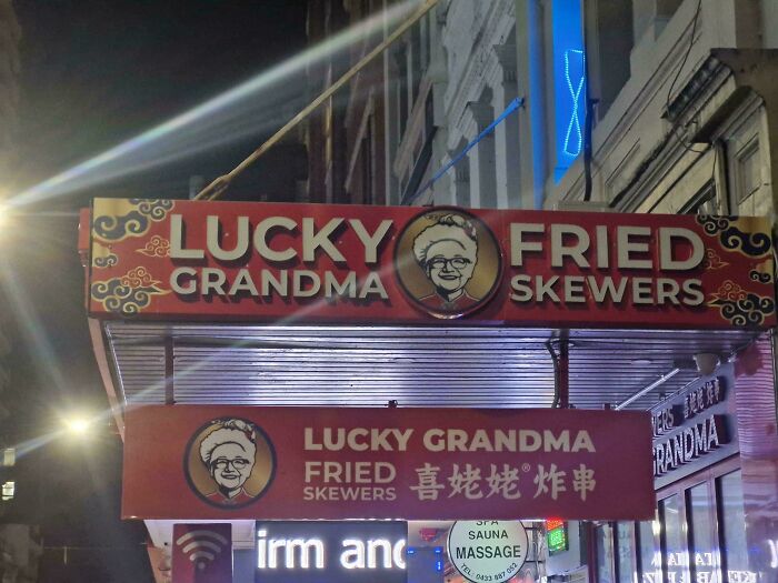
© Photo: cuavas
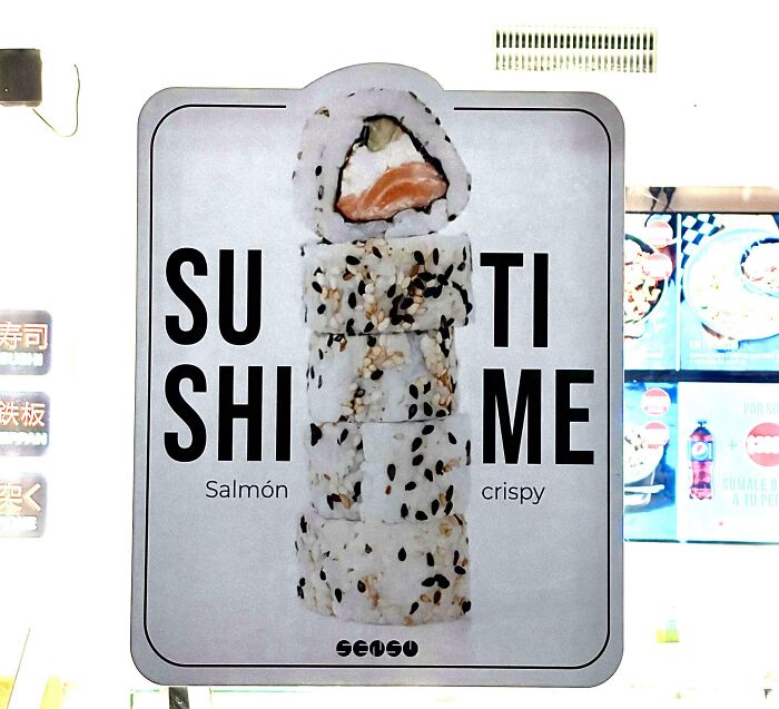
#40 Suti Shime
© Photo: jqn87
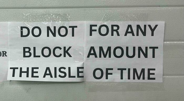
#41 Do Not For Any Block Amount The Aisle Of Time
© Photo: RunnySmoky
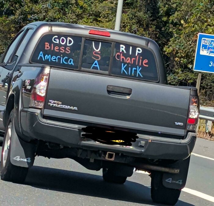
#42 God U Rip
© Photo: jaweissavl
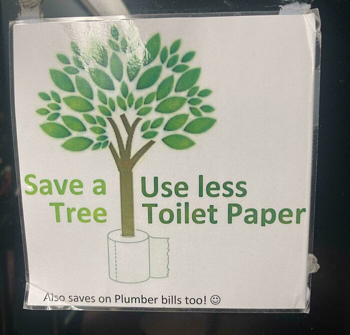
#43 Save A Useless Tree Toilet Paper
© Photo: mbelf
#44 If This Is… You’re All You Do… Missing Most Of The Gym
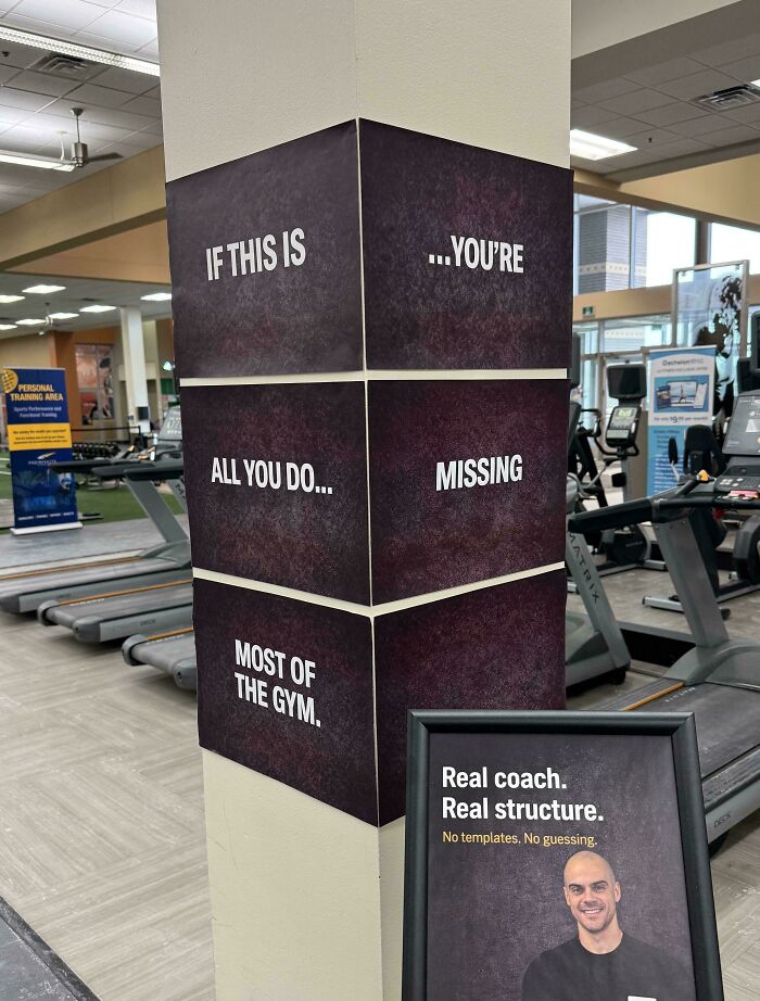
© Photo: Maka91
#45 Faki Stds
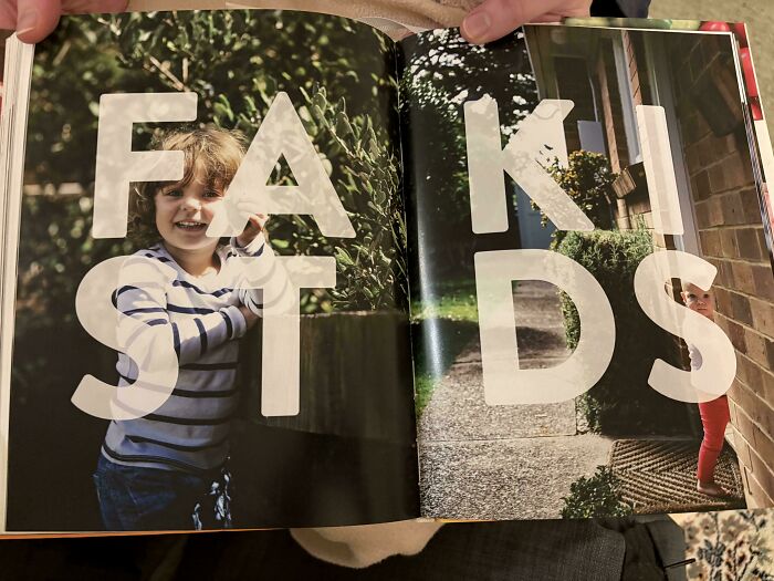
© Photo: jamelza11
#46 Go Baby Slow Deer
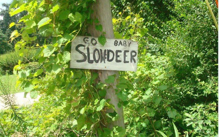
© Photo: mamafin77
#47 Please Snacks Open Inside
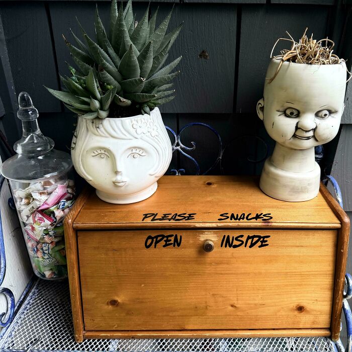
© Photo: drunkbettie
#48 Free Artificial Colours, From Flavours And Preservatives
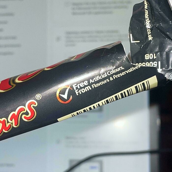
© Photo: robster98
#49 Please Skate, Do Not Board, Ride In Store
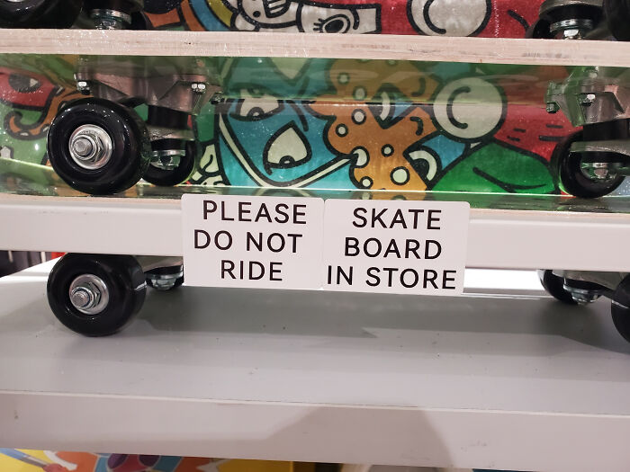
© Photo: SanaJisu
#50 Respect The Children Poop, No Dog
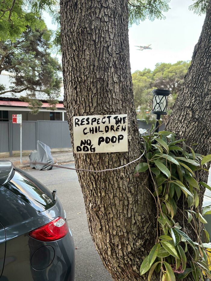
© Photo: swaanky
#51 We Am Arebitious
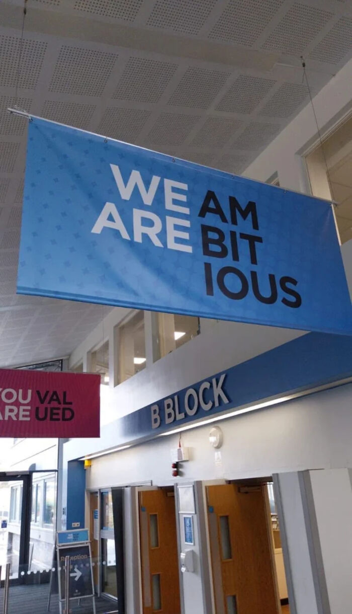
© Photo: WENUS_envy
#52 MS Eaglae
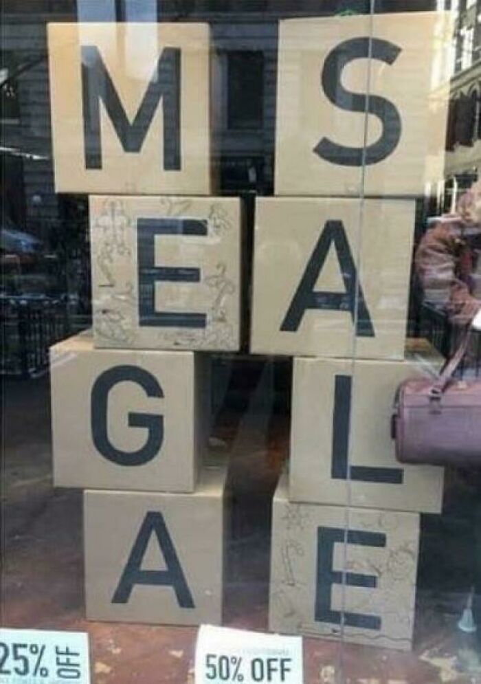
© Photo: MasterAinley
#53 Walz More Resign Ice
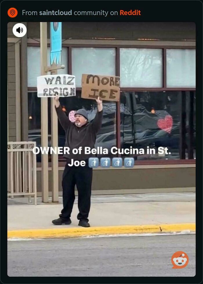
© Photo: Joes___Garage
#54 Please The Shoes Take Off
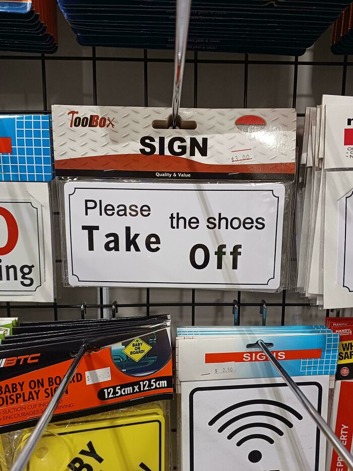
© Photo: Robert_Skull
#55 Don’t Don’t Don’t Let Let Let The The The Bad Bad Bad Days Days Days Win Win Win
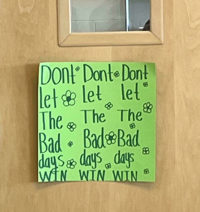
© Photo: evilducky6
#56 You Are The We Ever Best Dad Saw
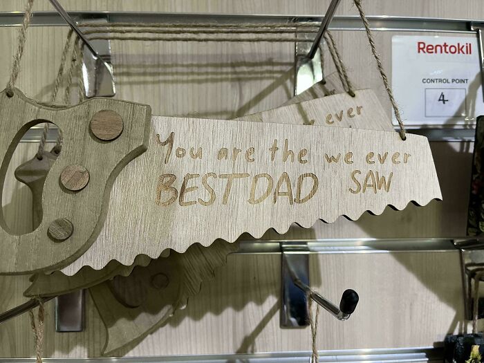
© Photo: StratInTheHat
#57 The MA Good RI Satan
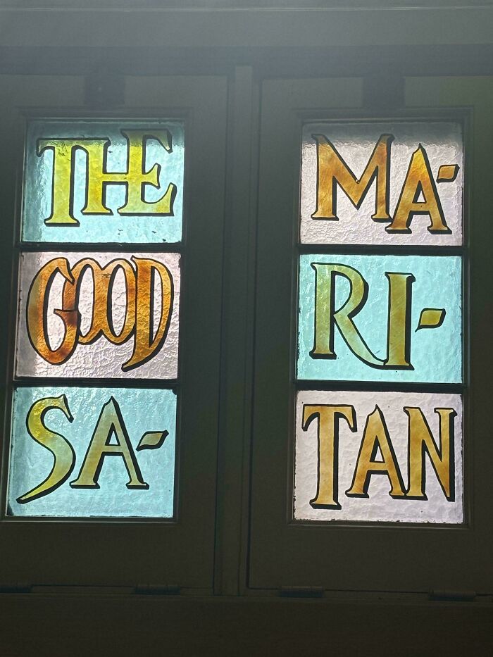
© Photo: superyoshi013021
#58 I Stand And Kneel For The For The
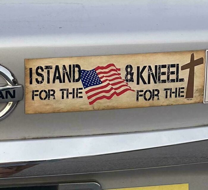
© Photo: BugsBub
#59 An Evening John With Legend
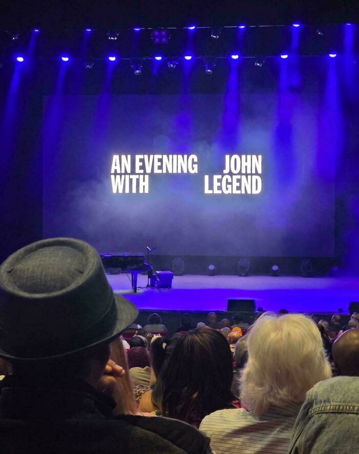
© Photo: Odd_Sir_5922
#60 Fourskin Co. Season
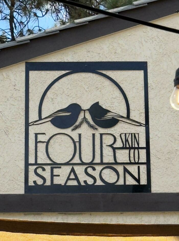
© Photo: calebthelee
#61 Make Not Art Trash
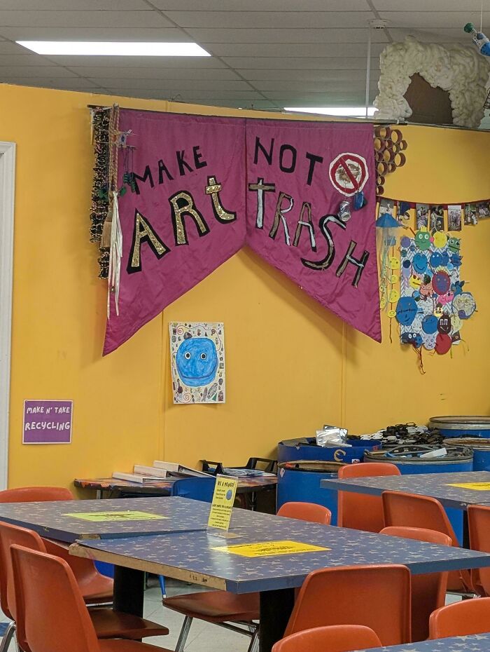
© Photo: rawfodoc
#62 Cn Aa Utg Tua Irs Oa Nl
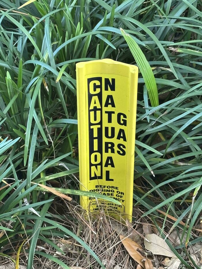
© Photo: JMDToaster
#63 Bloody Jugs Mary Mix
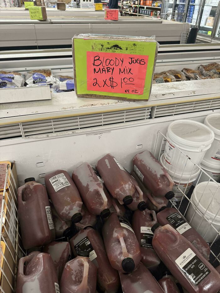
© Photo: humpbackwhale88
#64 Don’t My Beautiful Deport ❤️ Latinas
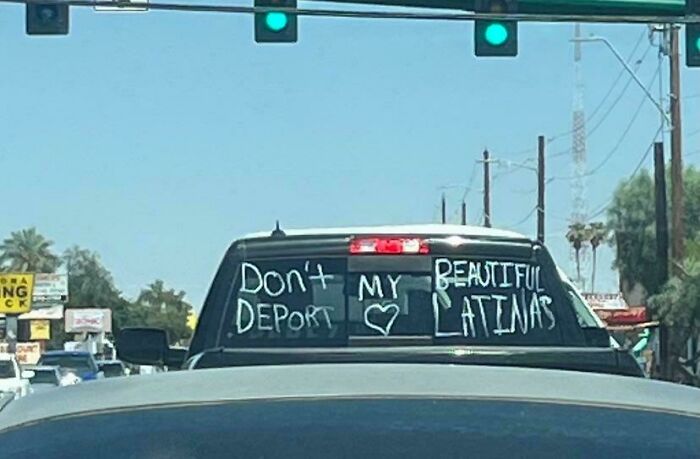
© Photo: jack_wolf7
#65 Lov Ray More Pard Eh
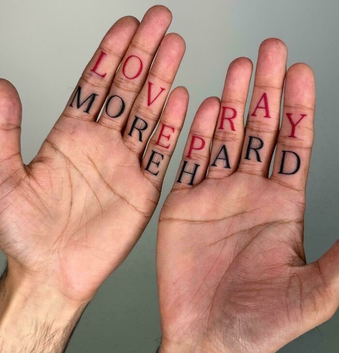
© Photo: puzl_qewb_360
#66 No You Perfect One Have Said To Be =)
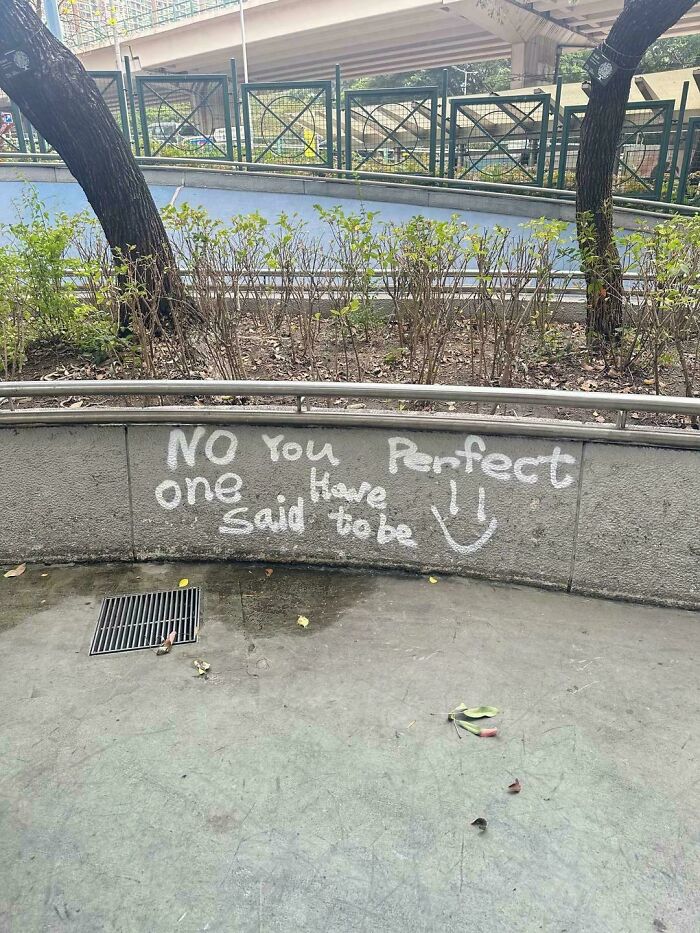
© Photo: encrcne
#67 Always Forgotten Remembered Never
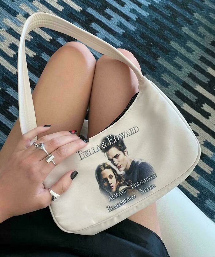
© Photo: Boomerloomerdoomer
#68 Printed Soy With Ink
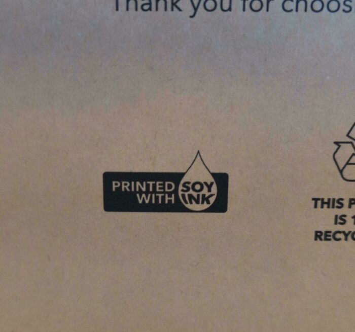
© Photo: Daniel_XXL_69
#69 Date 5 The 4 Save 26 (Supposed To Say Save The Date 5/4/26)
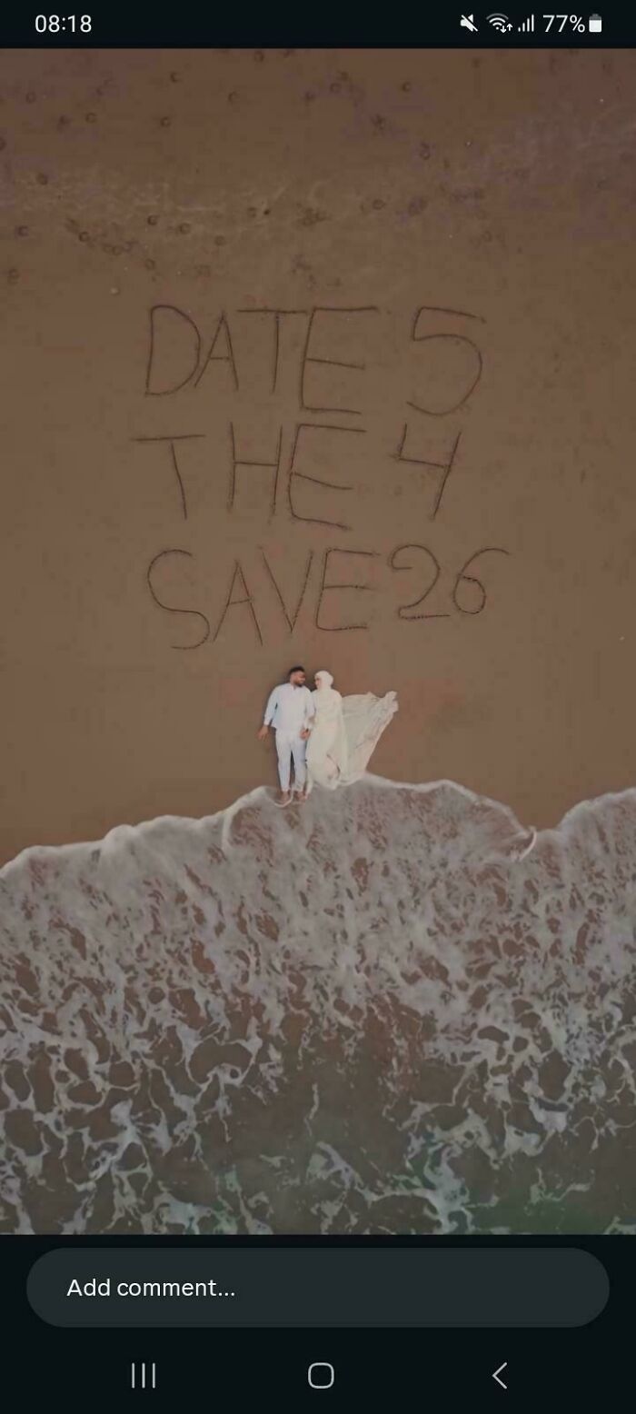
© Photo: lisahanniganfan
#70 One I Gonna Wings Day Am Grow
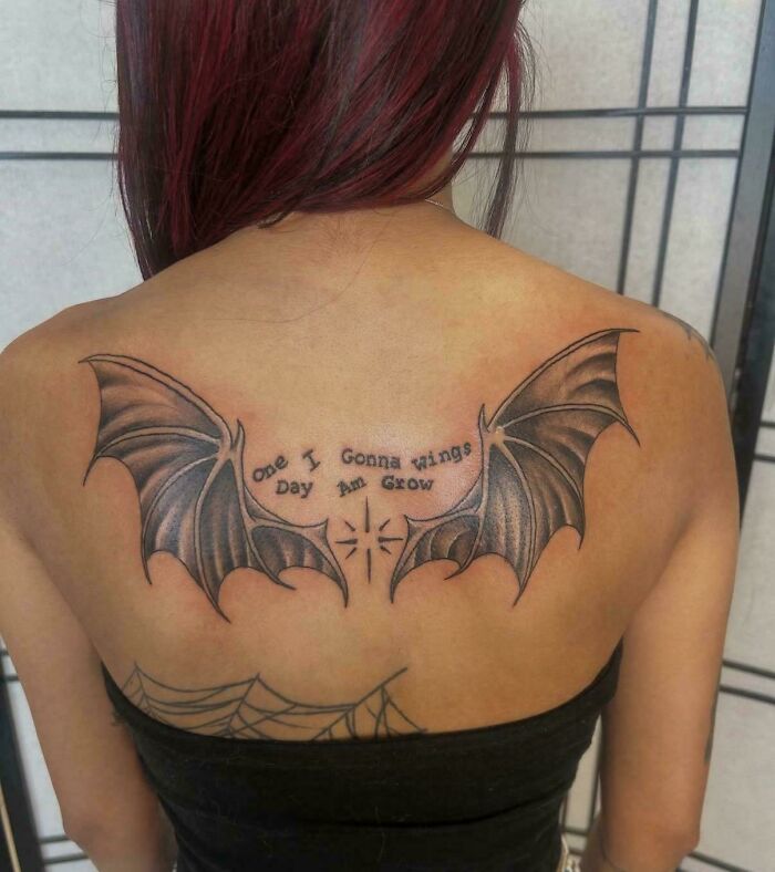
© Photo: FuckerJames
#71 Sandwich Take Salad Away
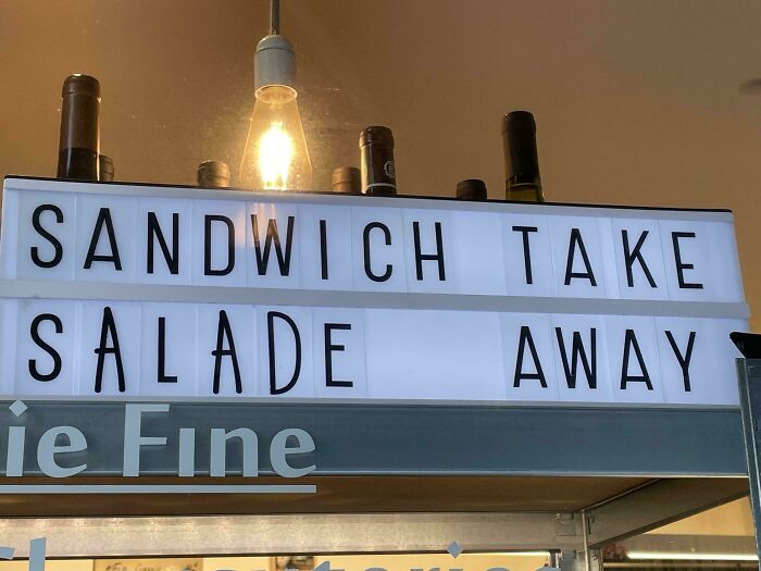
© Photo: RatatouilleinParis
#72 Don’t Bad Game Open Inside
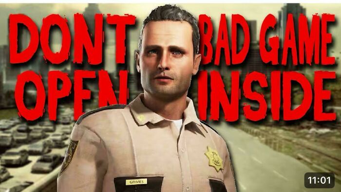
© Photo: lolwhatmufflers
#73 Welcome Bienvenido To A Trinidad & Tobago
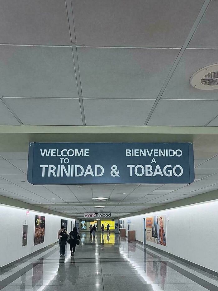
© Photo: Nkosi868
#74 Welcome Tattoo To The Street
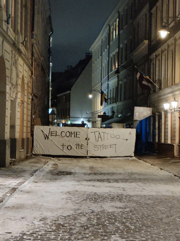
© Photo: man_120
#75 Jloves Ecares Sheals Uhelps Ssaves
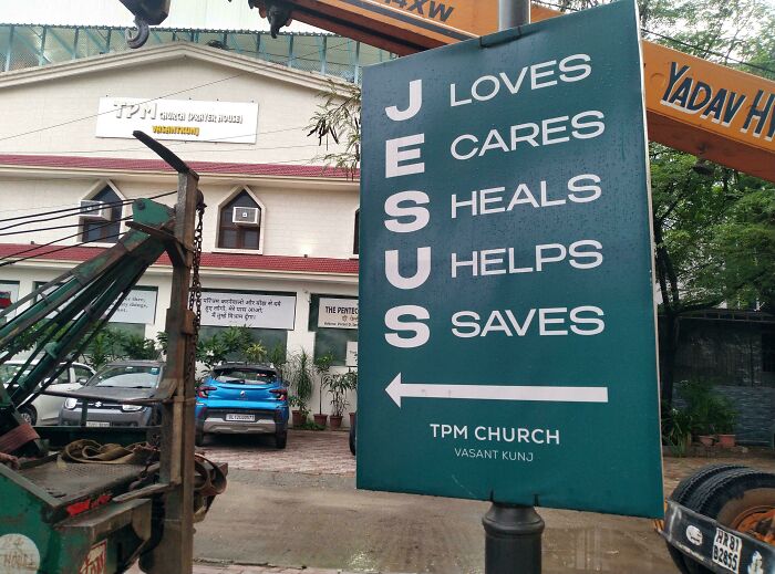
© Photo: pukkuro
#76 Don't X-Mas Open Inside
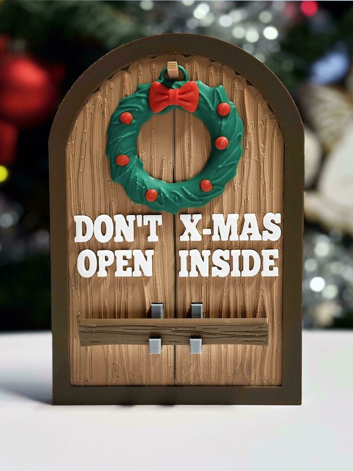
© Photo: I_have_a_dragon
#77 We Are Bus Drivers Hiring Bus Conductors
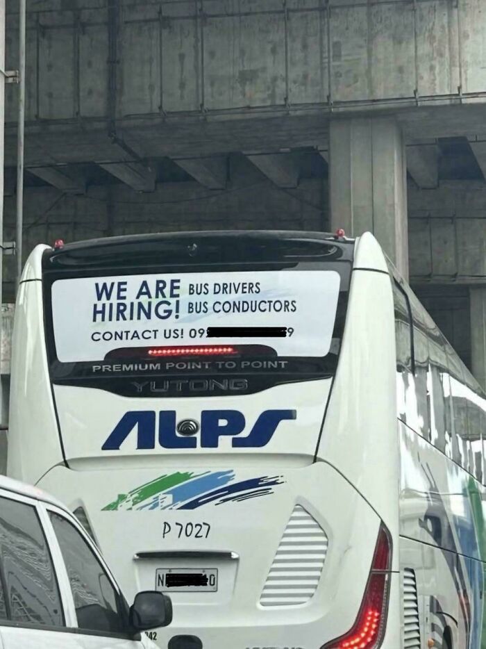
© Photo: valfsingress
#78 If Your Drink Reading This Water
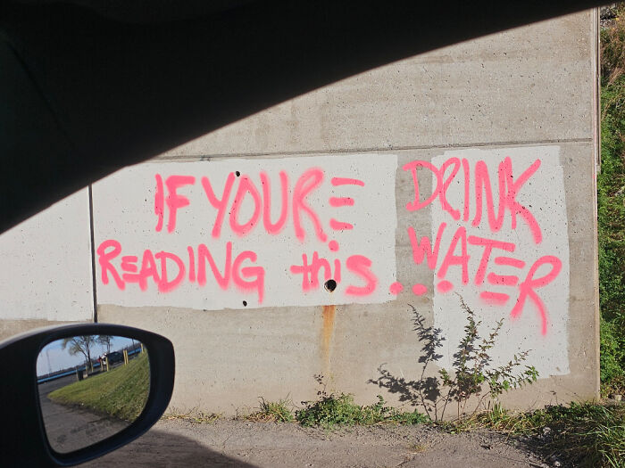
© Photo: Far_Performance_4013
#79 Jataorfo Paveieod Nernnt Seal
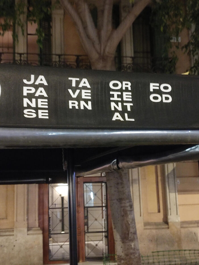
© Photo: HAVARDCH95
#80 Leftovers Smorgs To Take Only Cannot Be Go Can Be What You Taken Purchased Can Eat
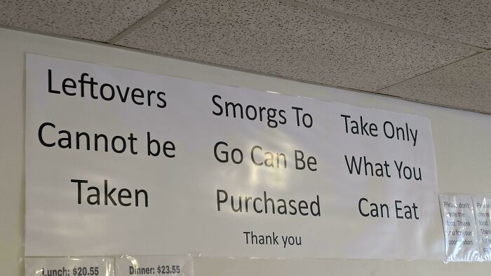
© Photo: yeehaw1005
#81 Made With Climate Plant Organic Positive Powered Chickpeas Goodness Protein
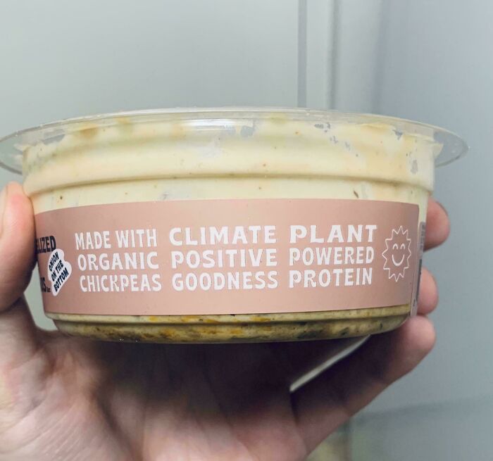
© Photo: sToTab