Apple has long been famous for its bravery—or, in the words of Apple executive Phil Schiller, courage, which he famously used to describe Apple's decision to "move on and do something new that betters all of us" by removing the headphone jack from the iPhone 7.
It was hardly Apple's first couragous act. It took courage to release the MacBook Air, a computer so thin it could house only two USB ports. It took courage to remove the iPhone's multifunctional home button. It took courage to start selling Earpods that only worked with the iPhone's proprietary lightning cable once the headphone jack was gone, and it took even more courage to sell some pricey new Bluetooth headphones at the same time. It took courage to release a MacBook with a keyboard so bad it clearly played second fiddle to making the design just a touch thinner (and cost the company $50 million in a class action lawsuit). It took courage to finally update the iPhone to USB-C—and then saddle it with USB 2.0 transfer speeds from, literally, the year 2000.
But y'know, it also takes courage to admit when you're wrong. And while Apple didn't say it was wrong while unveiling its new iPhones this year—admitting you ever made a mistake with a past product is not a very Big Tech thing to do—that's actually the message I took away from Monday's iPhone 16 presentation. After spending years patting itself on the back for the trend of removing basic hardware functionality in the name of pushing people to new products and more svelte designs, Apple's tactily changed strategies.
We're now in Apple's "buttons and ports are good, actually" era.
This new, throwback-to-the-old-ways Apple wasn't just born today, but I think the iPhone 16 reveal event did crystallize what has been a notable Apple trend forming for the last few years. The big new thing is this: the iPhone 16 has not one but two new physical buttons on it that last year's phone didn't have. One of them is the "action button," brought over from the iPhone 15 Pro. This is just a great button: you can map a range of functions to it, so you finally get to decide what it does instead of being stuck to whatever Apple thinks you'd use a physical button for the most. When a phone is in your pocket or you want something you can press without looking at the screen, it sure is nice to have a physical button!
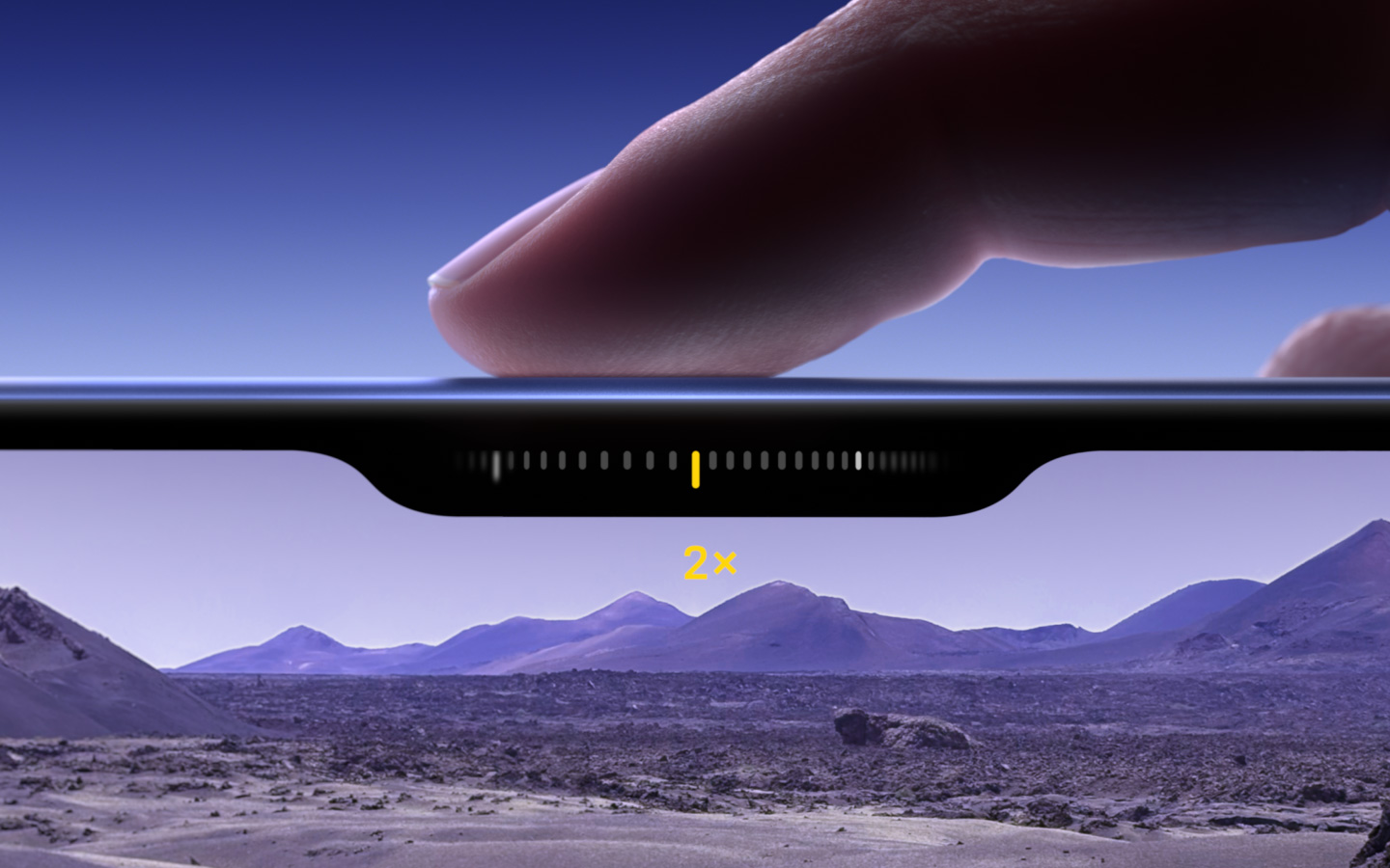
The other button, even more exciting, is the "camera control" button, which offers capactive feedback meant to somewhat mimic the experience of using a real camera shutter. You click it to open the camera or take a photo, but can also do a light press or double-tap to swap between camera settings before snapping a pic. That sounds pretty great to me, considering how often I feel like I'm awkwardly holding the camera with one hand while trying to use the other to slide my finger on the touchscreen adjusting zoom or exposure.
This move towards dedicated physical buttons feels to me like a complete reversal from the years of the iPhone 7 (when Apple ditched the headphone jack) and the iPhone X (when it ditched the home button), which were both watershed moments for the iPhone. For a few years in between the iPhone design has been more iterative, but now, it seems, the iPhone is worthy of physical controls again, without everything being shunted onto the same poor overworked power and volume buttons.
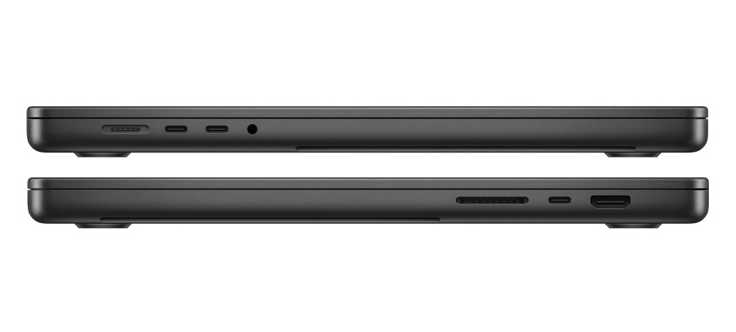
But like I said, this isn't an overnight change—the company has been slowly moving this way for awhile. In 2021, The Verge wrote that Apple was "ready to admit it was wrong about the future of laptops," when it ditched its disliked OLED touch bar and put some more damn ports back on the MacBook Pro.
"It’s hard to ignore the broader context of these improvements, which is that they effectively bring the company’s 2021 MacBook Pros back in line with the features they were already offering from 2012 to early 2016," The Verge's Jon Porter wrote at the time. "Arguably, the primary reason these new MacBooks are being greeted with overwhelming enthusiasm now is that Apple made the wrong bet on where laptop design was headed back then."
2016 was the year Apple reached its peak "who needs ports lol" design era, happily offering to sell you a laptop dongle for its MacBook's one (singular, uno, less-than-the-two-on-the-2008-Macbook-Air) USB port and getting rid of the MacBook Pro's HDMI, USB Type-A and SD card ports. That was the same year they killed the iPhone's headphone jack, bundling in a Lightning adapter for everyone's 3.5mm earbuds.
Even if you praise Apple for being forward-thinking in adopting USB-C on its laptops at the time—and I do think that was the right move!—it's really hard to see that decision as being anything but form-over-function at the time. Or perhaps profit over function; in the early days of USB-C there were limits to how many USB-C ports motherboard chipsets could support, and while I'm sure Apple could've spent a bit more money per unit to include the necessary hardware to support more ports if it wanted to, the priority was clearly on thinner, more aesthetically appealing laptops. (As annoying as the port scarcity was, the poor keyboard was clearly the biggest victim of that era of Apple laptop design.)

These days, by comparison, Apple's devices are practically swimming in physical ports and buttons. That crappy OLED touch bar on its laptop keyboards is gone, in favor of plain ol' clicky keys. The skinny MacBook Air still only has two USB-C ports on it, but at least that's in addition to MagSafe, meaning you don't have to surrender one port to charging. The iPhone 16 and iPhone 16 Pro both have two buttons on them. Even the Watch got an extra button recently with the bigger Ultra model.
One look at the PC world, of course, would've made it pretty obvious that people like things that click under their fingers. Mechanical keyboards are all the rage, we love the Steam Deck's configurable paddles and clicky, rumbly trackpads, and don't even get us started on the degree of personal choice that goes into binding those extra mouse buttons. Physicality has been sorely lacking in the touchscreen era, and I'll at least give Apple props for putting some buttons back on its phones while most Android phonemakers have settled onto the standard volume/power combo with nothing else. If they copied Apple in getting rid of headphone jacks, they should copy it in putting some damn buttons back on their phones, too.
While Apple is still lagging far, far behind the geniuses at Teenage Engineering who know how to employ buttons and knobs to astonishing effect, at least Apple's hardware isn't going even further down the path of EVs like Tesla's, replacing perfectly useful tactile functions that were once on a knob to touch screens you have to take your eyes off the road just to use. I guess we should be thankful there's no Full Self-Driving upsell package for the iPhone. Let's enjoy Apple's new button era while we can.


