Minimalist schemes are wonderfully pared-back displays of craft, color, and proportion but they can be confined to the colder side of interior design. Whilst minimalism eschews excess in favor of beautiful function, it doesn’t have to be void of comfort.
Interior designers use a library of methods to bring the best of minimalism to their schemes whilst retaining the warmth and welcome of more cozy interiors. Examples of this include rich and densely colored walls to temper the stark selection of furniture or natural materials like wood or wool to introduce texture to smooth and sleek interiors.
To help you get the best of both worlds, we’ve asked designers how they marry minimalism in interior design with comfort. They all offer a heavy dose of inspiration for your next project and ask you to consider how each element within the room impacts the scheme as a whole. From making the most of every inch of natural light to finding the perfect rug, each of them asks you to consider comfort and minimalism as friends rather than foes.
1. LOOK TO THE DARK SIDE
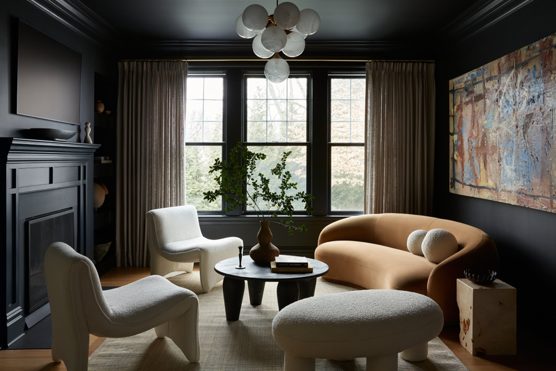
Challenging the idea that all minimalist spaces are soaked in a crystal-clean shade of white, this decadent minimalist living room from Far Studio’s Fairview project demonstrates the inviting nature of an inky deep hue. The minimalist forms of the sofa and armchairs deliver a soft contrast and center the space.
'We love using dark, rich, and saturated colors to add warmth to a space,' says Brittany Hakimfar, lead designer for Far Studio. 'In this home, we wanted to create a moody space to hang out with friends and enjoy cocktails or just sit on the sofa and read a book. the combination of black for the walls, ceiling, and trim with the brightly colored abstract art, cream boucle furnishings, and ochre velvet sofa create the perfect combination and a very warm and inviting space.'
The dark walls not only draw more attention to the furnishings but also create a cocoon-like effect, highlighting the feelings of comfort.
2. INTRODUCE TIMBER ACCENTS

It’s important not to forget the significant role your choice of accents can play in cementing the atmosphere of your interior. As proven in this expansive contemporary open-plan kitchen design by Greg Natale. The modernity and minimalism of the floor and kitchen are made that much softer by the timber accents. The designer himself advocates for the effects of trusted natural material.
'Timber accents can bring warmth to a modern space without compromising the minimal aspects of the design,' reveals interior designer, Greg Natale. 'For a house we recently completed in Hunters Hill, Sydney, the clients wanted a minimalist, modern home that emulated open-plan, apartment-style living. The foundation of the house has a clean, gallery-like feel, very modern with black marble floors and white walls, and we layered timber accents in the décor and furnishings for warmth and comfort.'
The warmth of the timber works incredibly well with the cooler-toned kitchen and floor, consider the interplay of colors and materials when designing your minimalist space with balance at the forefront of your mind.
3. CONSIDER YOUR LIGHTING SCHEME
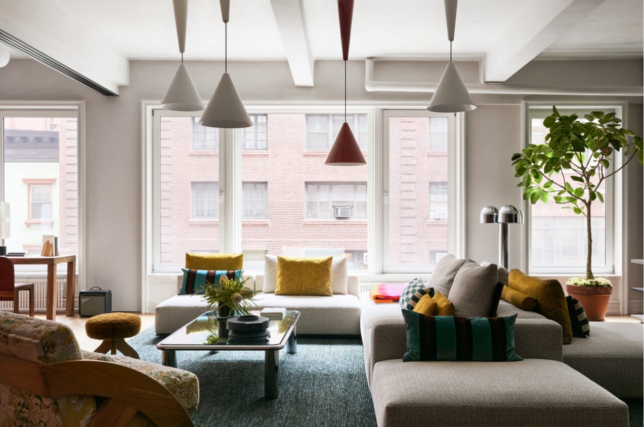
Lighting can be considered both an art form and a science and it plays an important role in how comfortable we feel. Softer lighting temperatures are more soothing to the eye but our spaces, like ours, are constantly evolving so it's important that however minimal your interior, even a minimalist lighting scheme can adapt to your needs.
This modern loft interior, designed by New York-based studio, MKCA showcases how minimal lighting can be both illuminating in form and function. 'We all know that lighting is key to making space more comfortable and functional,' says Michael K. Chen, co-founder and board president of MKCA. 'Generally speaking, it's important to mix lighting types to suit the situation. We mix general architectural illumination with decorative lighting and generally prefer to avoid overhead lighting as much as possible. Whether minimal or expressive in their design language, we find that any space with a particular architectural point of view can present some lighting challenges. This is really where some creativity and flexibility in the approach can be helpful. In this project (NoMad) we mixed a cluster of adjustable height pendants by Achille Castiglioni, with very discreet track lighting and floor lamps to produce a variable landscape of lighting.'
Michael highlights how each light addresses a different need and in turn, elevates the comfort the room provides for any given function. 'The track fixtures fill in when overall illumination is required, but the decorative lights are enough to illuminate general tasks like reading, lounging, and watching TV,' the designer says. 'The pendants helped us to break up the strong grid of the concrete building structure above. So, where the track lights obey the grid, the pendants don't. They follow the placement of furniture and provide light for the sofa and seating below rather than the room overall. Floor lamps were key here, as they often are, especially because the room is furnished with a sofa that is useable from all sides and no end tables for table lamps. But here the floor lamp also addresses the space between the pendants and where people sit, which is key for visual comfort and mood in the evenings.'
4. SURROUND YOUR SPACE WITH WHITE OAK
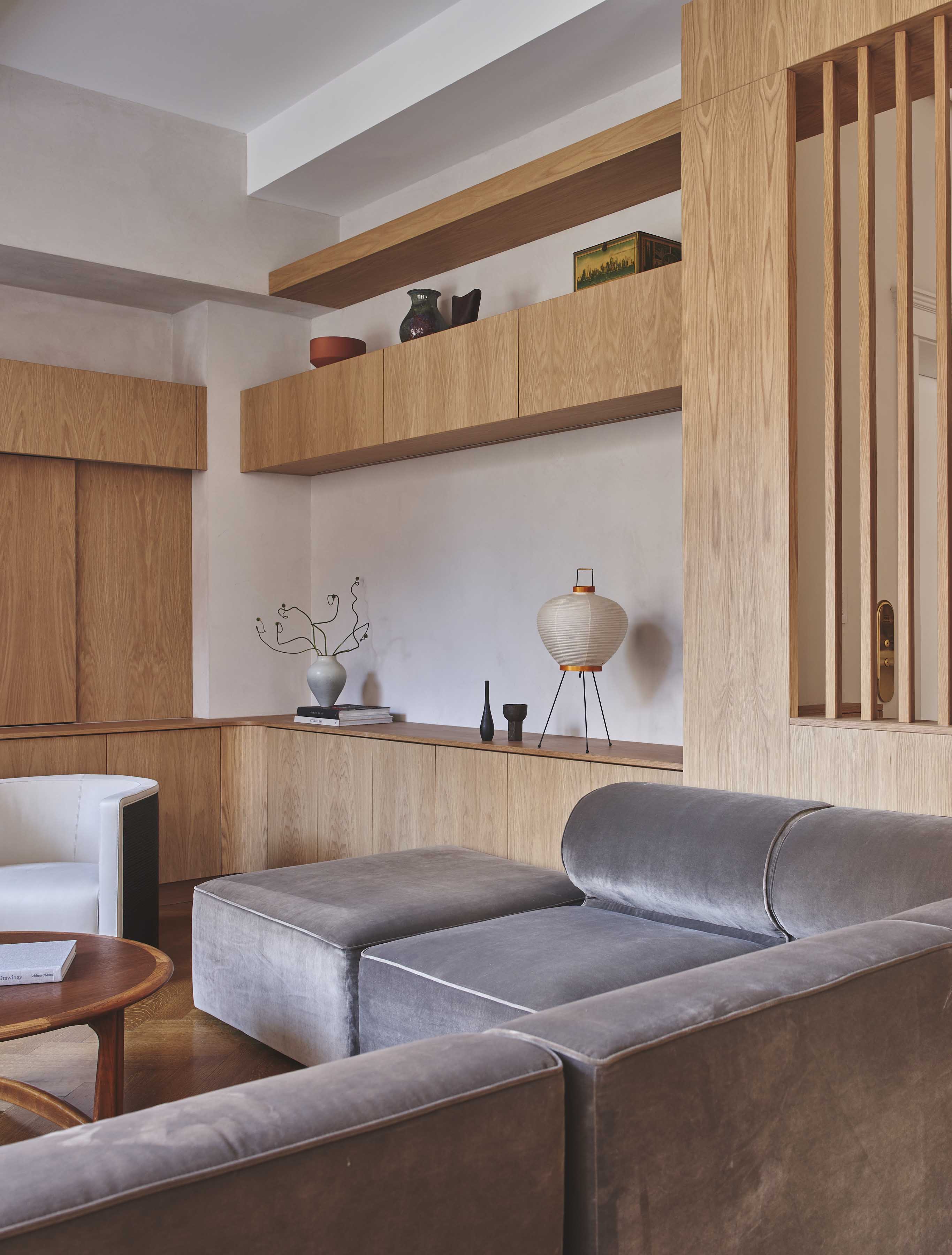
Oak is an age-old material that speaks to our minimalist sensibilities but also echoes the warmth and nostalgia of nature. This sentiment is perfectly captured in Studio Zung’s Maison Duane project with its refined and minimal aesthetic. The delicate grays blend beautifully with the warmth of the white oak, creating a space that feels contemporary yet comforting.
'We believe the place we call home must invoke feelings of both serenity and energy, creating an environment that allows us to balance living intentionally while remaining inspired. Our approach involves infusing subtle layers of warmth and serenity into every design detail, such as the Venetian marmarino walls that introduce an organic texture and enveloping coziness to each room,' says Tommy Zung, founder and principal of Studio Zung. Continuity also plays a role in comfort here as the designer explains. 'In Maison Duane, European white oak wood accents, starting from the entryway and seamlessly extending into the bespoke Studio Zung cabinetry in the living room, serve as grounding elements unifying the space. Enhanced by the beautiful curvatures of this Romanesque Revival pre-war building, and bathed in natural light, the wood infuses a timeless elegance and tranquil energy that resonates throughout the home,' Tommy adds.
5. SOFTEN YOUR INTERIOR WITH CURVES

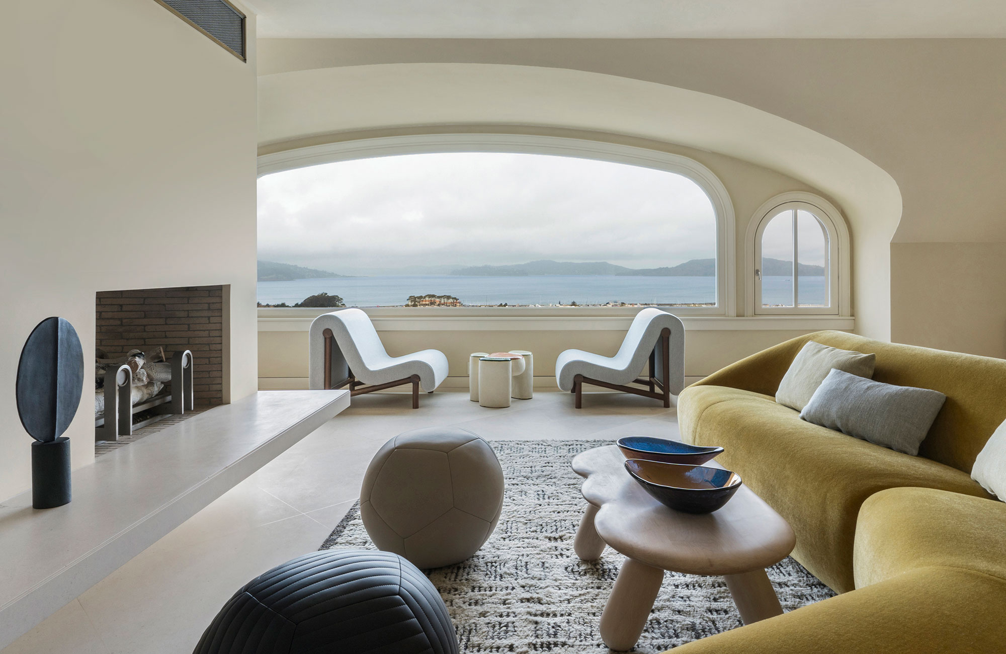
Minimalism can bring to mind a lot of sharp edges and straight lines and whilst these angles can create a sense of visual symmetry, softer forms and textures can work beautifully to balance your interior and introduce a sense of home comfort. 'Soft textural fabrics and rugs are ideal for more starkly furnished spaces. Organic round shapes are also comforting, versus all sharp 90-degree edges,' reveals San Franciscan designer Heather Hilliard.
The studio’s San Francisco project brings together softly inflated forms with its distinctive armchairs, coffee table, and sofa. Playing on the arcs of the curved windows, these shapes and the use of softly textured upholstery all give the grand space a welcoming aura. When designing your interior, remember to consider how the architectural vernaculars of the space can be maximized to create your minimal and comforting space.
6. CREATE A COZY CORNER

Making the most of your minimal interior, the comfort of a reading corner cannot be understated. This example from French studio Camille Hermand Architectures keeps the scheme minimal with its use of straight lines and a cool color palette. The nook feels cohesive with the rest of the scheme as it's complemented by modern shelving that sits abreast the fireplace.
'When you want to create harmony around a contemporary fireplace, the bench seat comes into its own. It provides a cozy corner and links the fireplace to the rest of the space. The horizontal line it creates is soothing, and all you need is a mattress and some cushions to make it cozy and warm,' shares Parisian designer Camille Hermand. To keep your nook in cohesion with the rest of your minimal interior, opt for upholstery and cushions that feel connected to the rest of your design.
7. LIGHT A FIRE FOR ADDED WARMTH

Pictures of comfort are often painted by the fire; we are drawn to its warmth and crackling embers. Whilst we may think of fireplaces as staples of traditional interiors rather than contemporary ones, this couldn’t be further from the truth. This example from San Franciscan studio, Form + Field’s Atherton Estate project demonstrates how a fireplace can lend a comforting lens to traditionally minimal materials like marble. “For this project, we modernized the fireplace with a custom marble mantel and surround. Through the cozy textures in the mohair of the vintage chair, the sheepskin rug, the warm wood, and the eclectic mix of the client's artwork and traditional vases, the room feels very comfortable and lived in,” says Christine Lin, Principal of Form + Field.
8. DETAILS MATTER: DON’T FORGET THE RUG
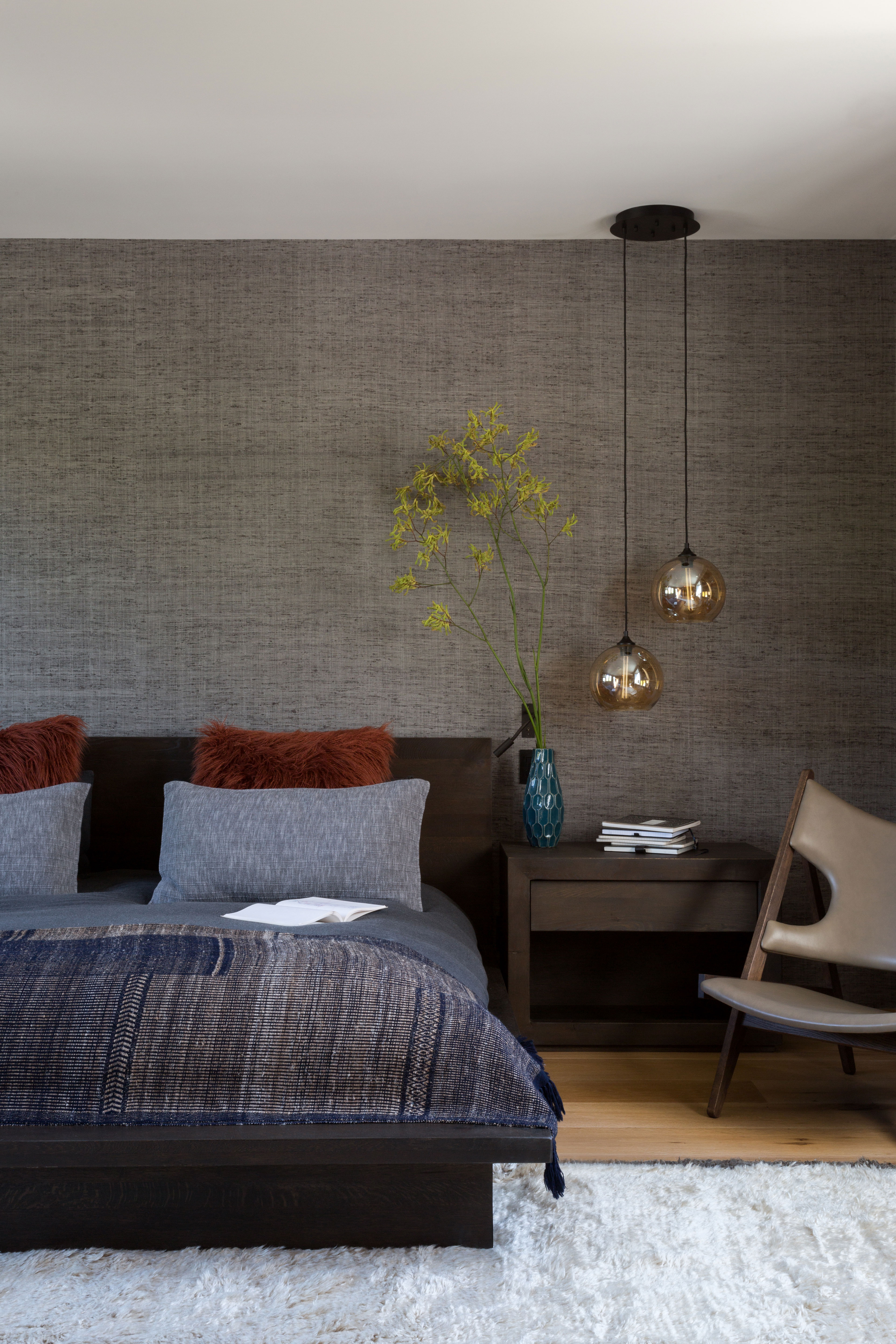
Minimalism may take a more refined approach to interiors but the details of your space should still be considered. Rugs in particular are often the last thing that we think of when designing our space but they play a huge role in introducing comfort to spaces. With its gently textured surface, the right rug can soften your minimalist interior. Venice-based interior designer, Kim Gordon takes this approach with her Pier project. The off-white rug adds some levity to this contemporary bedroom with its clean lines and sophisticated brown palette. The designer shares her thoughts on making a minimal home that much more comforting. “A minimalist home means that you have paid attention to every little space - but also moments. That level of detail needs to tickle all the senses. Invest in a smart home system that you can control to set the mood, lighting, and smell are just as important as an organized, edited, and simple floor plan. Delicious rugs in neutral tones will help define spaces and add a cozy softness,” says Kim Gordon.


