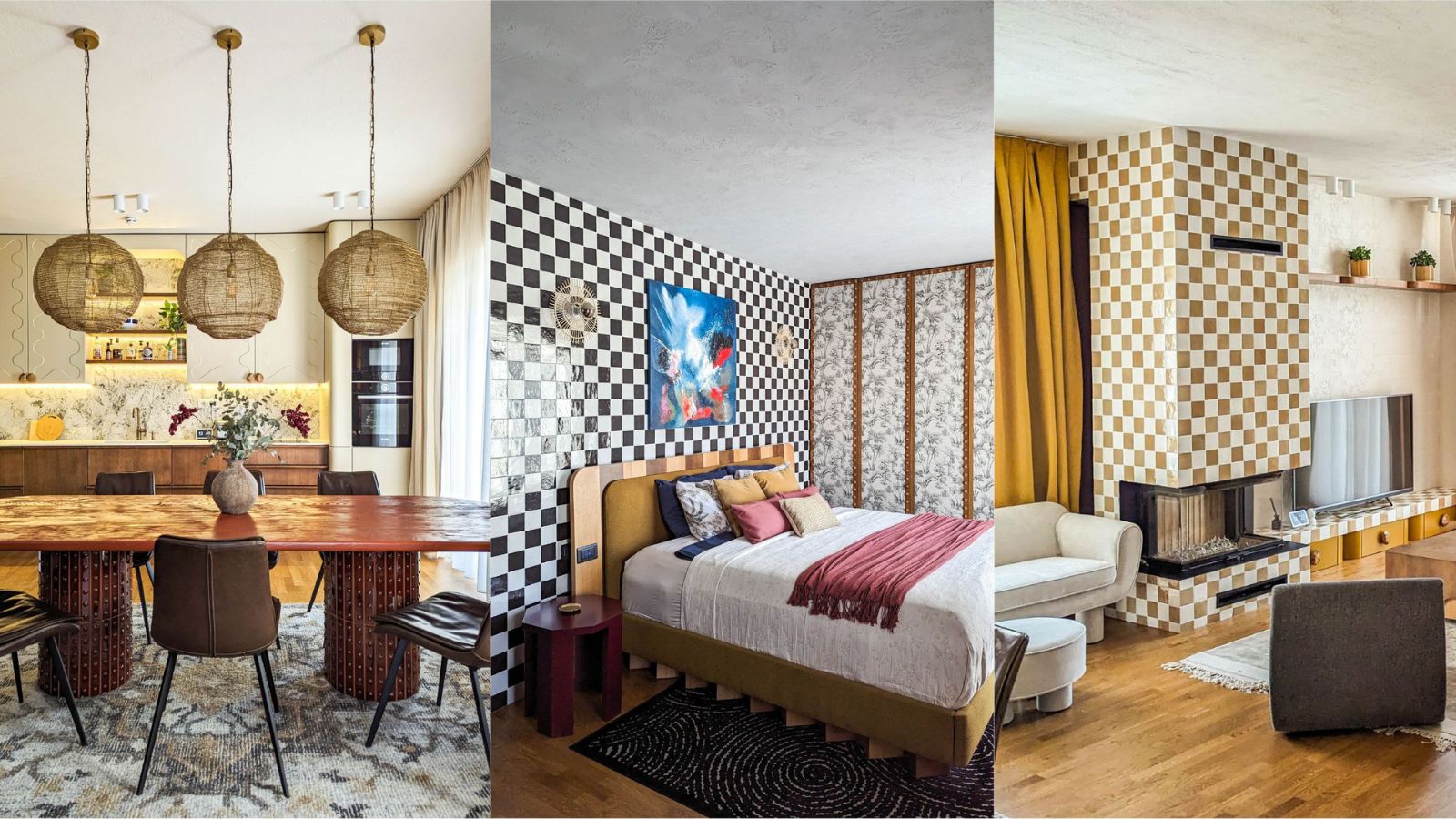
There are two ways of looking at a so-called blank canvas in house design. Either you keep things simple and embrace the clean-lined, minimalist look, or you roll up your sleeves and start to fill the empty space and bare walls with bold and exciting interior design ideas.
Interior designer Fitore Syla and architect Njomza Havolli, co-founders of Muza, are definitely team bright ideas. Their latest project, a new build in Pristina, Kosovo, is full of inspiration for adding character, texture, and color in your home. Fitore showed us round, sharing her tips for turning a blank canvas into a work of art.
1. Extend tiles beyond the fireplace for a bespoke finish
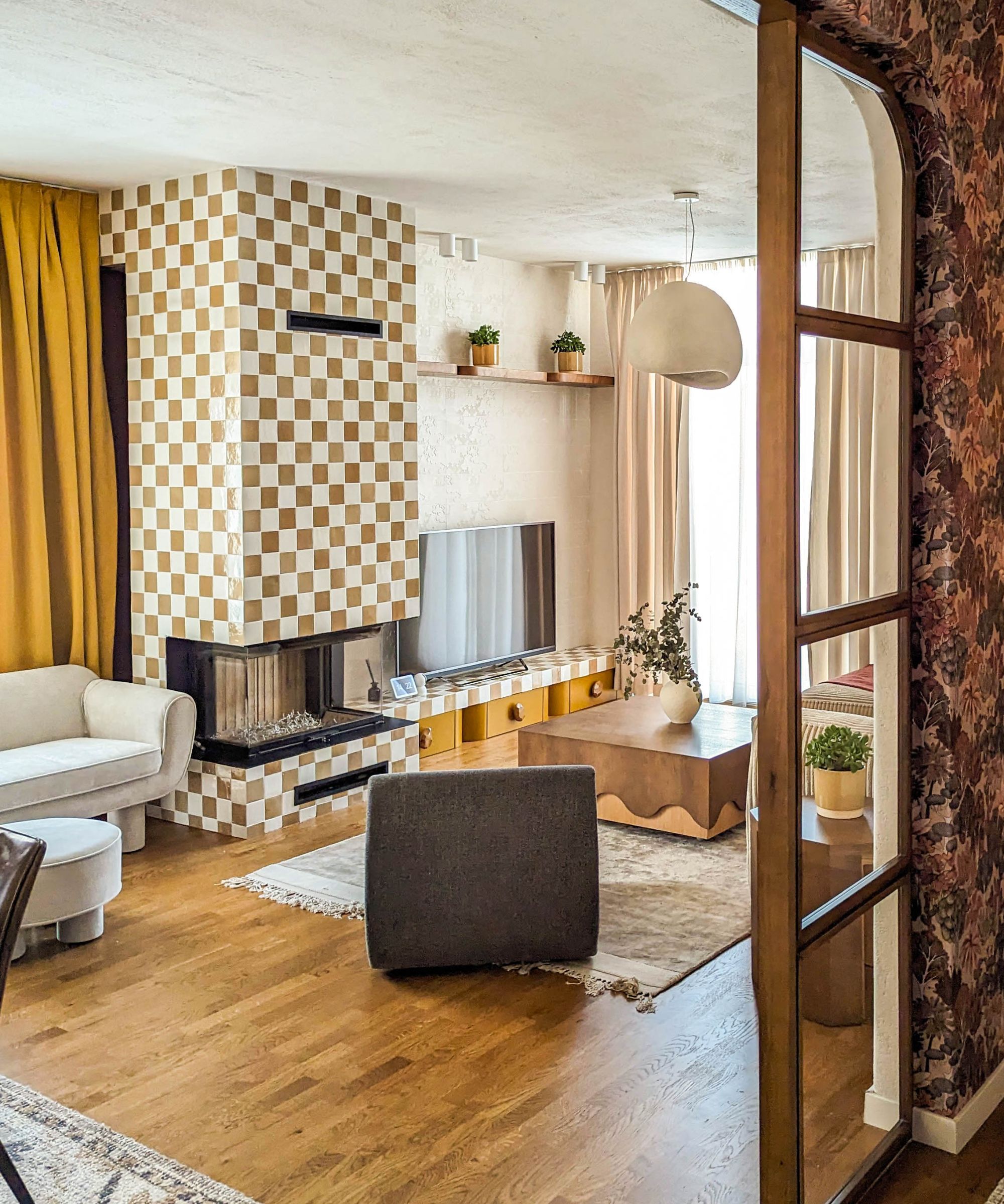
If tiles are an important part of your living room ideas, be sure to turn them into a strong style statement that will not only update a fireplace, but reach beyond it too. Here, bold checkered tiles extend across the whole chimney breast and onto the shelf beside it, contrasting with the simpler and more textured, handmade tiles on wall behind the TV.
By combining different styles of tiles in this way, Fitore created a bespoke finish that brings texture, color and pattern to the room, and balances the maximalist look with areas of calm. 'We love how this tile wall turned out,' she says. 'The handmade tiles behind the TV are by Patricia Urquiola and are simply stunning. They add a real sense of calm and tranquility to the space.'
2. Complement design themes with quirky details in furniture
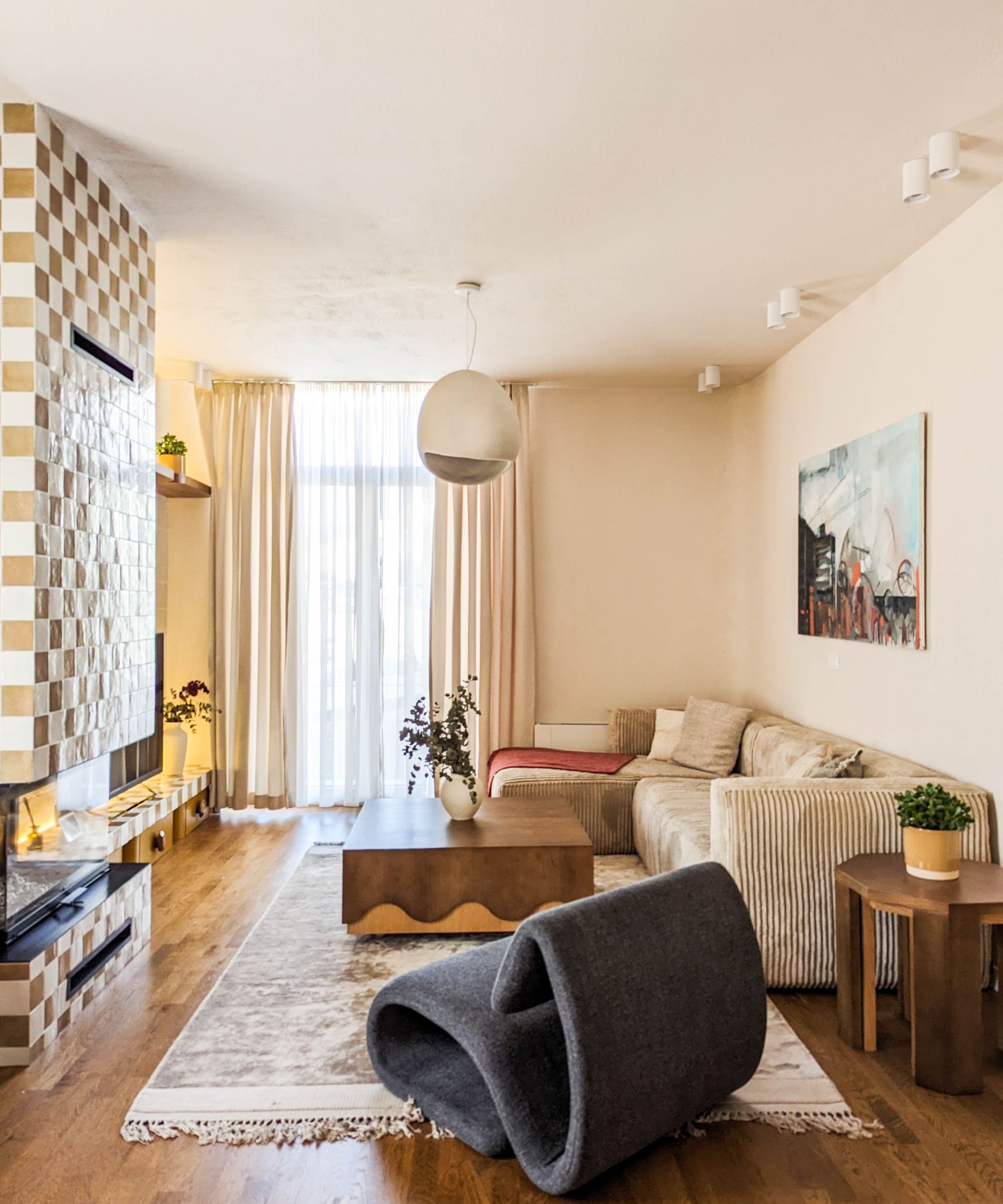
Alongside bold tile treatments, scalloped and wave details are a recurring theme throughout this house.
A sculptural, statement chair, like the wave shaped one here from Solos, will add character to the scheme, and if you're looking at coffee table options, consider a wooden one with strong detailing. 'With its wiggly elements and wood contrast, this table from Kolos Interior is a beautiful piece that is also functional and practical,' says Fitore.
3. Use tiles to customize a unique dining table
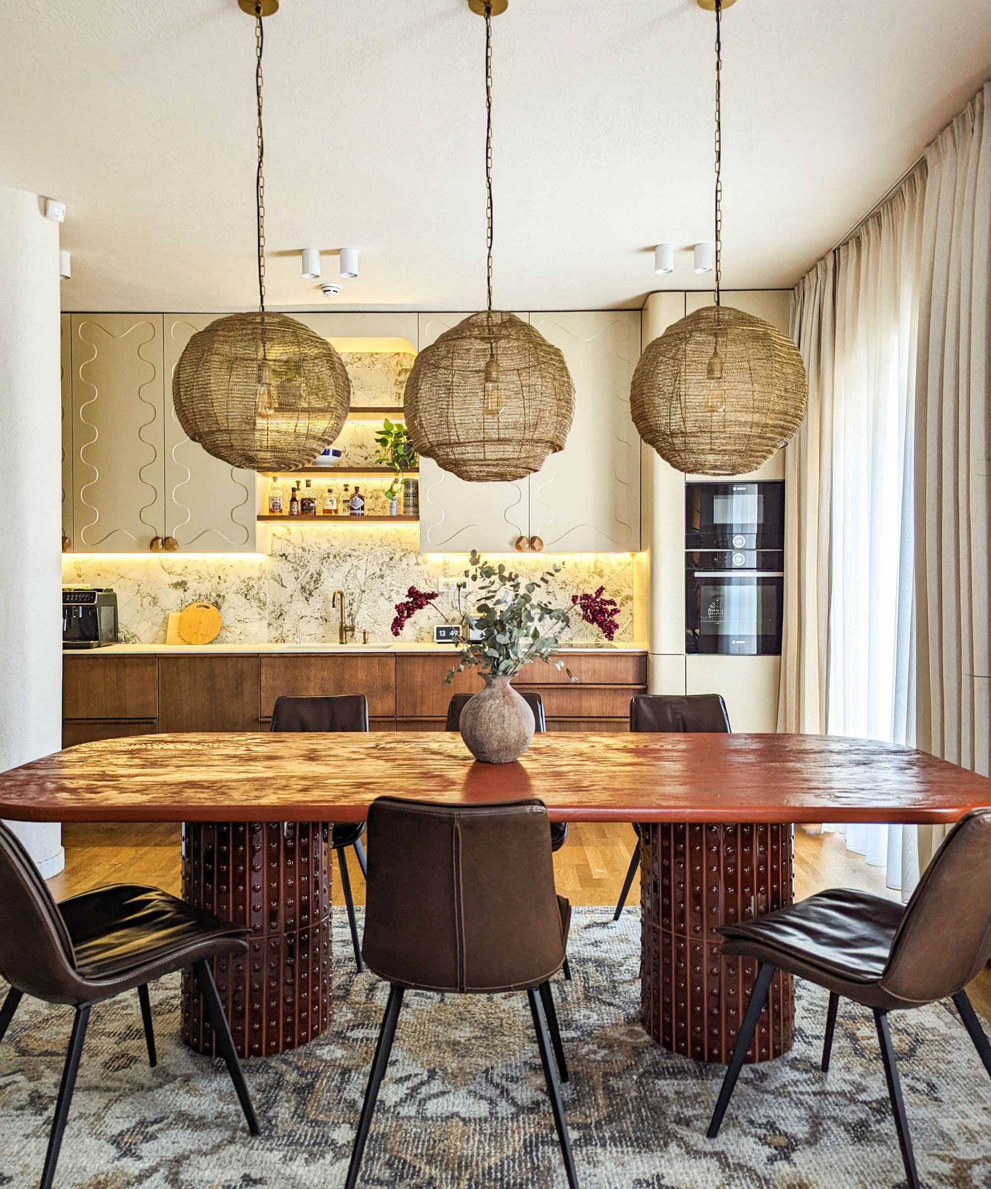
The impressive dining table is the focus of the family room in this home and is the first thing you see from the arched doorway. Designer Fitore knew the dining table would need to be special and deliberated long and hard over her dining room furniture ideas, before settling on a handmade tabletop, set on striking legs adorned with Punto tiles with a Ronan and Erwan Bouroullec design.
'That table really steals the show. A talented local carpenter named Kolos made it from old wood and put so much love into the carvings,' says Fitore. 'Sitting at this table, you are at the center of both the kitchen and the living area, capturing the essence of the space and making the dining table a true focal point.'
The rug, chairs and pendant lamps are all from Solos Studio
4. Bring the kitchen to life with playful shapes and textures
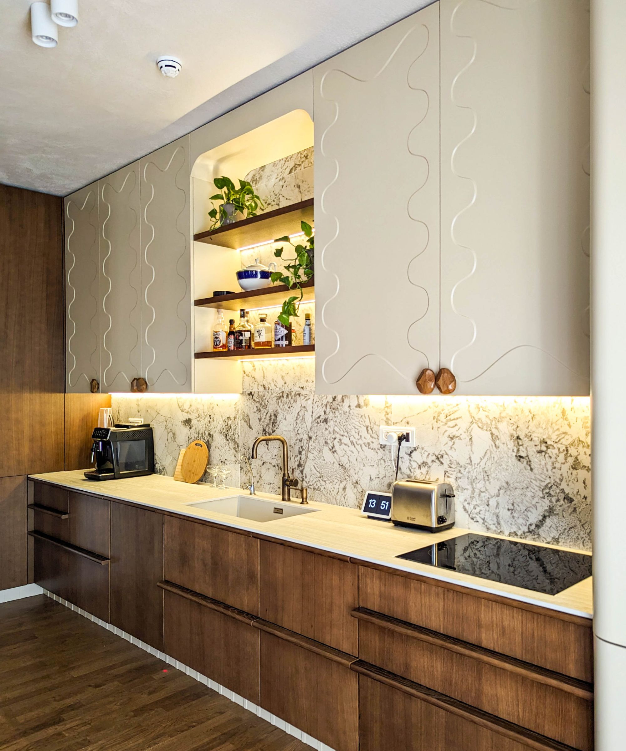
Why choose plain white kitchen cabinets when you can switch the look up with fresh shapes and textures all rolled into one? That was Fitore's thinking with her playful kitchen ideas.
The mix and match kitchen cabinets combine upper cabinets with a stylish wave relief design with striking rich-toned wood under-counter cabinets and smooth cupboard knobs as a finishing touch. 'It's a stylish and characterful look that took a lot of care and time to design,' says Fitore. 'We used curved shapes throughout to add a bit of softness to this unexpected space, and we absolutely love the backsplash tiles. They're like something out of a sci-fi movie – so cool and balanced. In fact, this kitchen, with all its detailed elements, truly shapes the house.'
5. Think heavier prints for a cozy and dramatic hallway
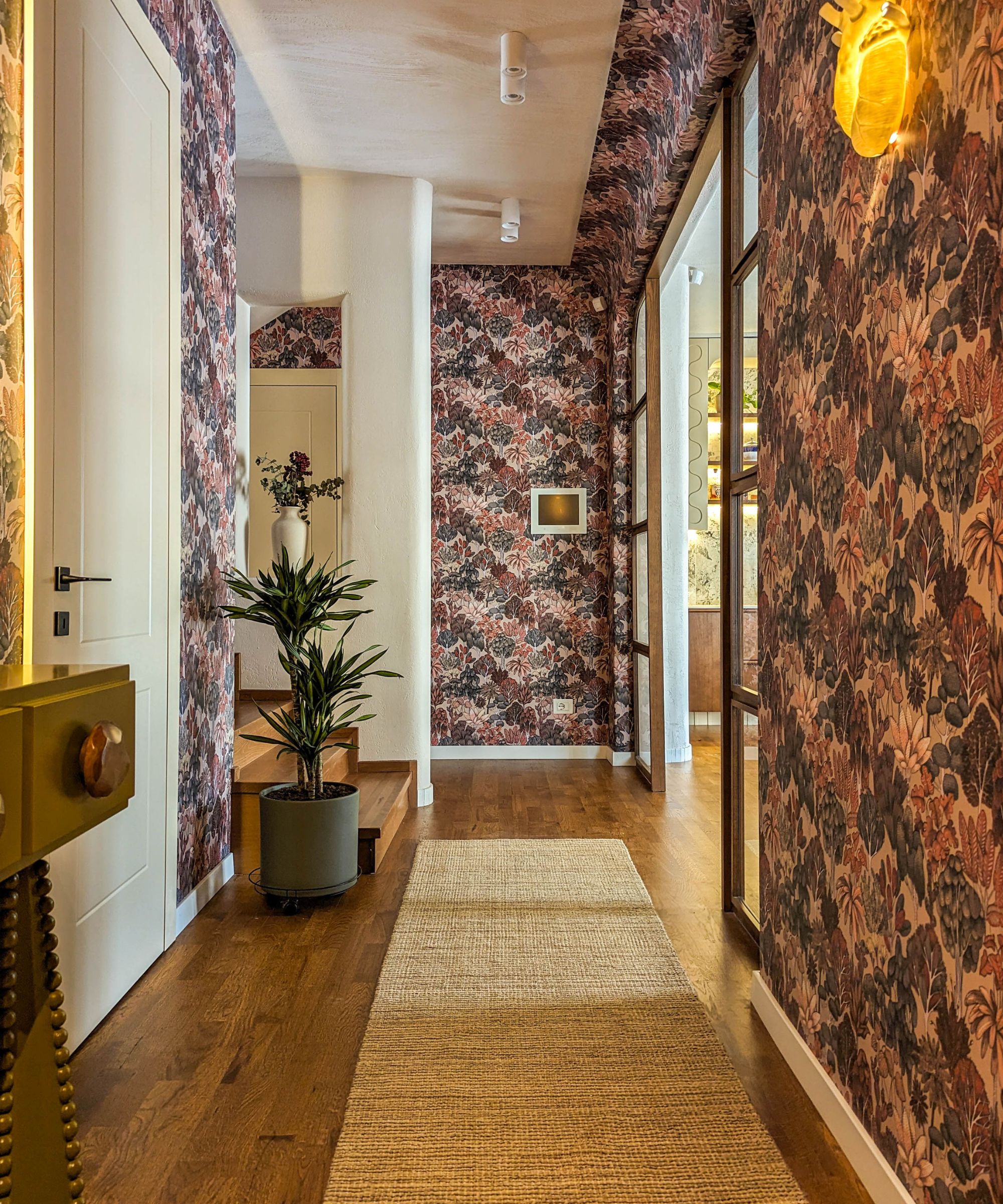
Think hallways always need to be light and bright? Think again – sometimes rich tones and cozy vibes are just as good. The heavily patterned wallcovering in deep autumnal shades works well here as there are sightlines into the brighter family room and dining space.
'We went bold in the hallway with a truly immersive wallpaper experience,' explains Fitore. 'The design creates a sense of wonder, like stepping into a lush jungle. It piques your curiosity, leaving you eager to explore the rest of the home, much like the anticipation of a movie you haven't seen a trailer for.'
The wallpaper was from Kosovo's Boston Group, House of Hackney's Foris Magna would give a similar effect.
6. Splash out on a tiled feature wall – in a bedroom
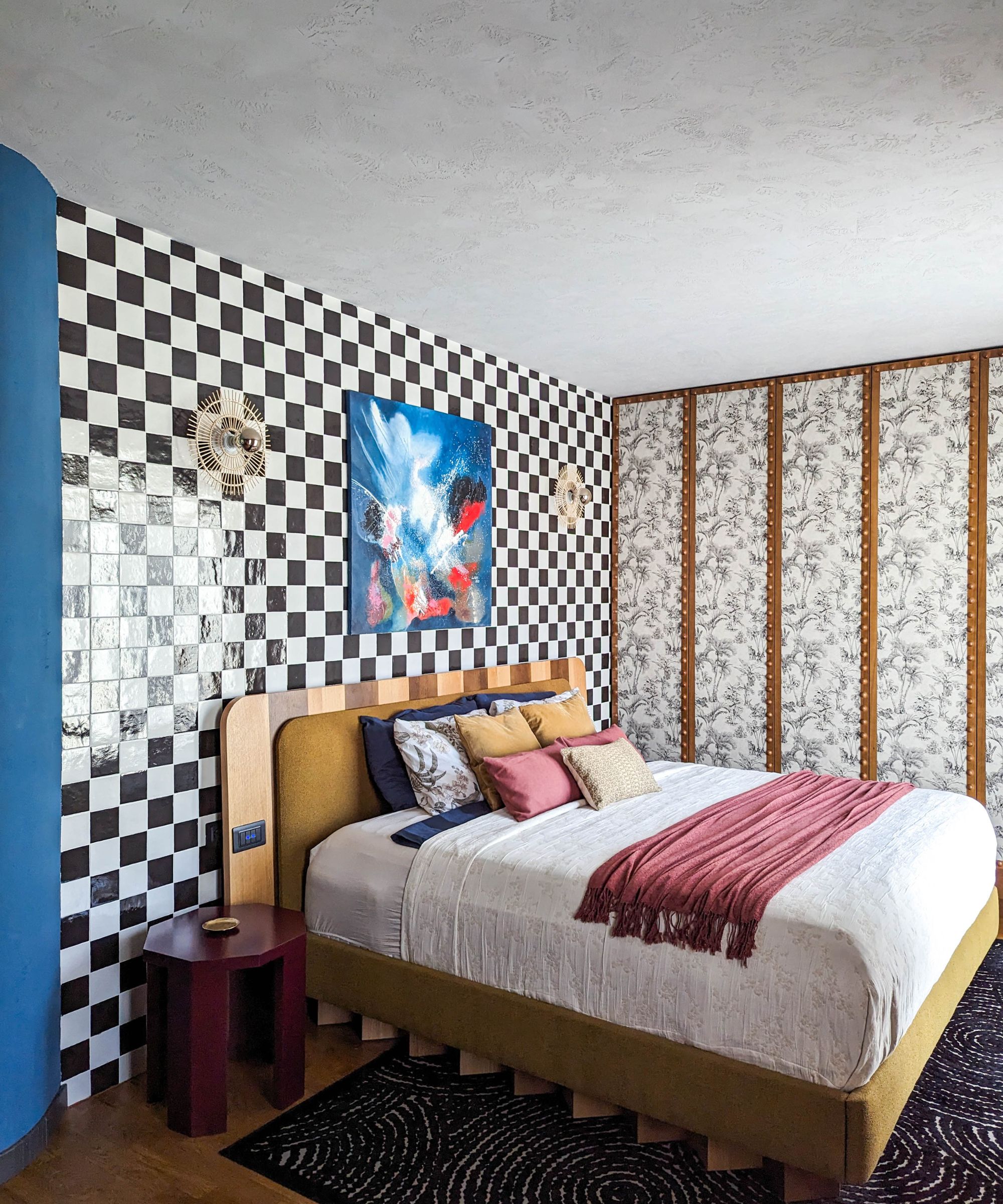
If like the owners of this home, you're looking for bedroom ideas that really challenge the norm, how about a tiled feature wall? It's not for everyone, but Fitore's clients are delighted with the quirky details in this space. 'They love the contrast between the textured blue walls, the concrete-effect ceiling finish, and the funky black and white checkered tiles behind the bed,' she says. 'It's a bold, confident mix of different eras and influences, showcasing personality and passion.'
The unique bedhead with its stripes of pale and dark wood is a custom creation by Kolos Interiors.
7. Use unusual textures and colors to spark the imagination
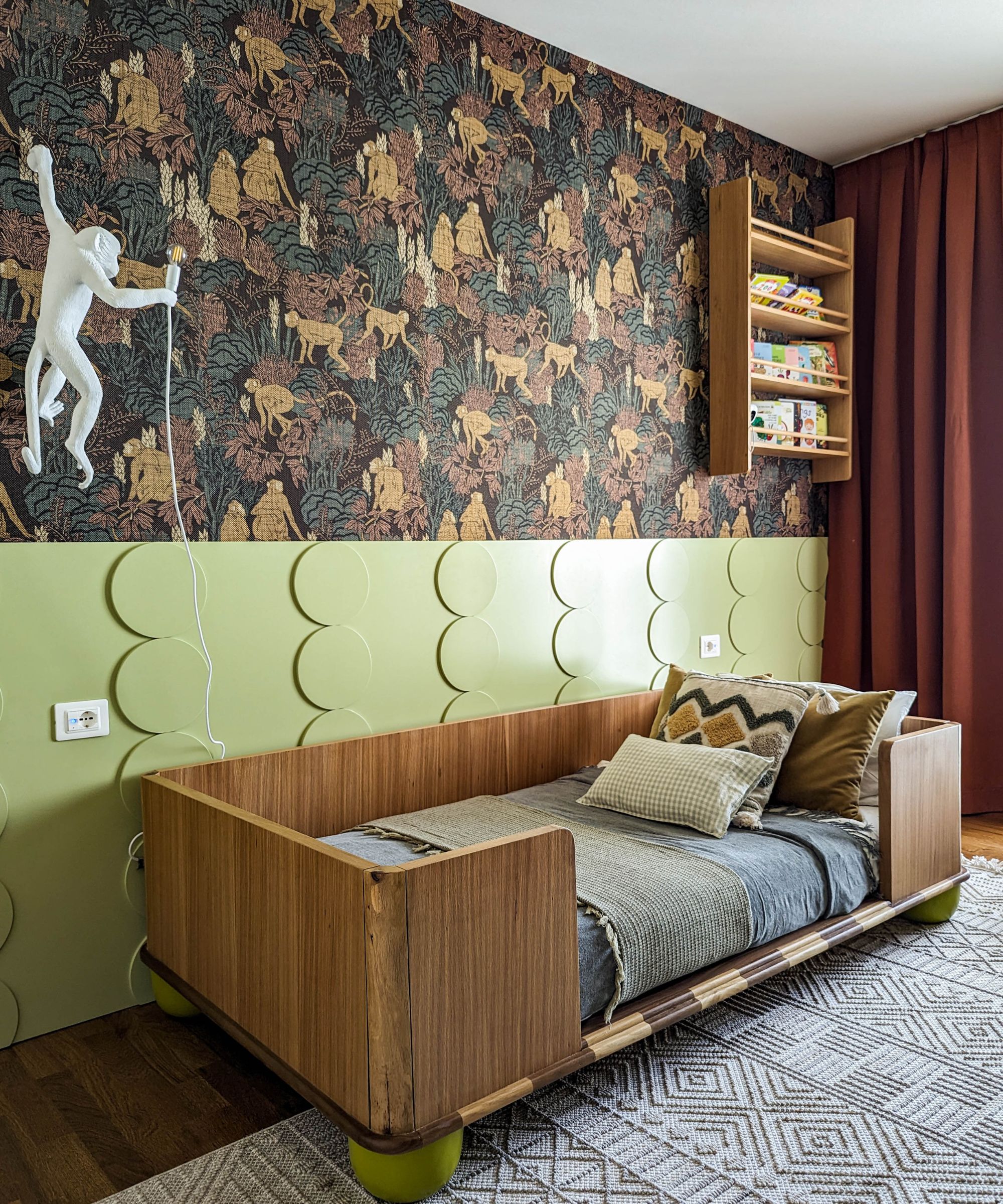
Where the primary bedroom is playful and bold, this room belonging the owners' four-year-old son is the height of subtle sophistication. And whereas kids grow up so fast, this room's warm, earthy color scheme will never grow old! Fitore consciously chose a design scheme that would appeal to a youngster and might take him through his tweens, avoiding the typical small kids' bedroom mistakes to create a more versatile, flexible space.
That said, there's plenty of appeal here for a four-year-old, with interesting textures, shapes and prints to fire a young imagination. 'We designed it to be spacious and playful, with everything a child needs,' says Fitore. 'We chose a beautiful monkey wallpaper that brings the outdoors in, and even a monkey wall lamp from Seletti.'
The textured panel in calming green picks up the wavy theme from elsewhere in the home and pairs perfectly with the teak shades and stylish cot bed.
'We put all our love into creating a room full of imagination and wonder, where their dreams can take flight,' adds Fitore.
8. Make the case for strong lines and warm textures
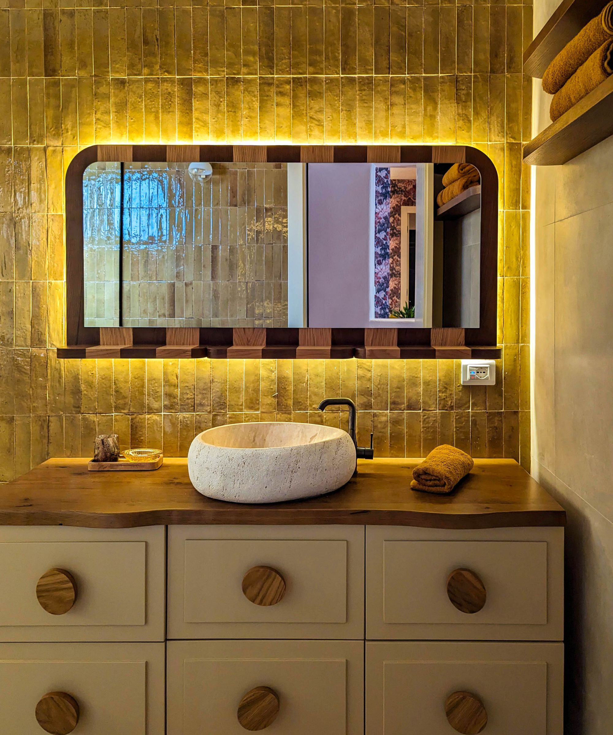
It may be part of the guest suite, but this dynamic space is all over the guest bathroom must-haves. Bold yellow tiles with a rustic, textural finish make a strong statement, combined with stripes of pale and dark wood around the custom mirror frame and largescale drawer pulls.
'All these details add up to create an energetic and organic atmosphere,' says Fitore. 'In the bathroom, as in the rest of the home, bold, maximalist elements are balanced by calming, smooth textures, creating a playful and unexpected haven.'
Interior design and architecture: Muza
Photographs: Fitore Syla


