Pink color palettes are what designers turn to when they want to create dreamy schemes that are adult, soothing, restful and sophisticated. For if you layer pink in just the right way you step away from the Barbiecore movement and all its sugariness and enter a world where pink is a neutral, it loses its baby connections and instead becomes a very grown up shade.
'Pinks are incredibly versatile and nuance-rich,' says the designer and color expert Dagny Thurmann-Moe of Koi Color Studio. As for colors that go with pink, she pairs them with reds, or with other pastels, with greens or even burgundies. The trick is in getting the tone of both right.
These eight pink color palettes are the ones designers love most right now, harnessing color trends for elevated schemes. So more more than simply pretty in pink, these rooms are setting the decor zeitgeist right now.
1. Pink with red and mustard
On paper, it might sound like pink with red and mustard is not a palette for the faint hearted. But wait! Because this studio apartment space designed by Portland, Oregon-based design studio Casework manages to use them in all in a space where there is no escape (the homeowner literally lives and sleeps in the same room) and it instead comes across as dreamy, warming, plush.
'When designing the pied-a-terre, we wanted it to feel bold, powerful, and ageless as opposed to young, sweet, and innocent,' says Casey Keasler, the design studio's founder. 'The pink is paired with warm tones of orange, gold, and red, along with graphic patterns, warm neutral walls, and black trim. The warmth in the pink and the saturation of it lend to a more sophisticated palette.'
Because the pink used on the couch is blush rather than Barbie, its peachiness is highlighted by the mustard pillow and fabric on the couch, the red behind the bed pulling out its richness. It's a neat look - just make sure to start with an orange-toned pink rather than a gray one.
2. Pink with gray and bright accents
In not all pink color palettes is pink used equally, and in this open plan kitchen living space by the Chicago-based design firm Studio Sven, the weighting goes to the bluer tones seen in the soft gray of the walls and the vibrant shade of the artwork. Why does it work? In color theory, because pink and blue are pretty close to each other on the color wheel, with only purple separating them, meaning there are tones within them that work in harmony if you work on a sliding scale (of having a soft blue as well as the bolder one).
'Misty blue walls and a neutral ceiling mural allow for pops of color in the artwork and furnishings to create a distinct dialogue,' says Lauren Svenstrup, the studio's principal and founder. 'The palette of this bachelor pad goes against the rules and invites the unexpected. Why not have a vibrant pink sofa, jade green dining chairs and Klein blue artwork? The palette provides a collected gallery feel for onlookers to stop and observe the design of each individual piece of furniture to appreciate how the value is in the sum of its parts.'
3. Pink with black and white
Pink has been called a 'new neutral' for so long now it's essentially an old one, having taken over from gray and off-white for years. It's perfect for use on walls a grounding color for stronger schemes, such as this otherwise monochrome dining space by Chicago-based studio En Masse Architecture and Design.
'The wide plank white oak floor and pink walls are pale, becoming neutral compared to the stronger contrasting colors,' says Lucas Golbach, the studio's partner and design director. 'Not wanting the space to feel too sweet, the warm glow of the sunset pink is offset with charcoal and black. This contrast keeps the space feeling crisp and modern. Touches of blue on the banquette seating and painting could feel juvenile if they weren't balanced with the natural wood and dark tones.'
4. Pink with fuchsia and purple
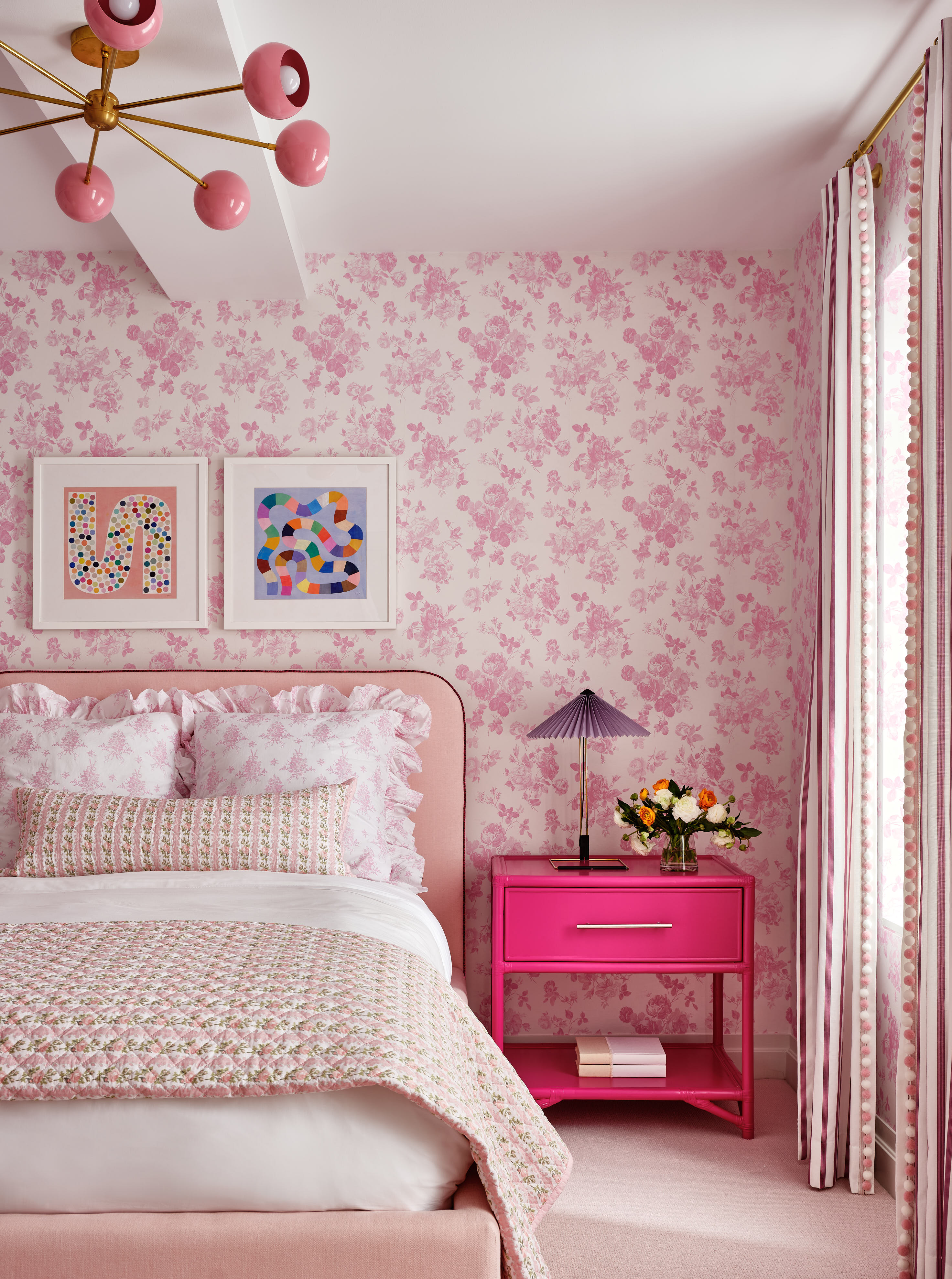
Of course, if you're really into pink color palettes there is an option to go all out. Pink comes in many shades — from soft grayed out versions to attention-grabbing fuchsia, and with the right design eye they can work together. The acclaimed design studio Chango created this pink bedroom which manages not to be overpowering thanks to the contemporary pops in the nightstand and lamp.
'The key to mixing pinks like this is to have a variety of saturations and hues,' says Susana Simonpietri, Chango's creative director. 'This room has rose pink, a peachy pink, and dark pink punched up with the bold highlighter pink nightstand. Smaller case goods, lighting, art, and accessories is where we'll tend to go bolder with color and all these layers of pink are what make the room interesting and tied together.'
5. Pink with yellow and green
In someone else's hands, this living room color palette created by the Illinois-based designer Alexandra Kaehler might have come across as twee. Baby pink, primrose yellow and green could have looked like a box of bonbons, or not had enough layers to be a room grown ups could relax in.
But happily, Alexandra has used just the right tones to create instead a sunny space that also reads as sophisticated, the green and pink so perfectly matched with both sharing the same amount of subtle gray undertones, while the more vibrant yellow provides the contrast. 'We were very conscious of this room not feeling juvenile,' Alexandra says. 'In an effort to have a level of sophistication, we used a more saturated yellow with the soft pink, to ensure the room didn’t read like an Easter egg.'
6. Pink with accents of yellow, purple and mint
Designer Nina Magon took the palatial features of this bedroom in and layered upon it a fresh air palette of pinks, tinged with the hits of yellow and purple in the artwork. Both colors sit either side of pink on the color wheel, sharing pigments and bringing out different features of the main hue. Then green is red's direct opposite, which means the mint in the artwork above the bed is a perfect contrast. It's a smart approach that has paid dividends in creating a sumptuous yet modern scheme.
'Nina's goal was to create her own signature version of a classical Palm Beach bedroom using a coral pink - Rosy Tan from Benjamin Moore - that we associate with the island paired with an accent of mint green in the large-scale photography by Horst P. Horst,' say Nina's team. 'Nina envisioned the young, fair-haired Italian Contessa in the Horst photograph, retreating to her bedroom in her Italianate Palm Beach villa longing for her lost love. All of Nina's interiors are greatly influenced by her love of all things Italian design, especially the work of the great Gio Ponti. While in Milan a few years ago, she toured some of his historic, landmarked private homes and were inspired by the ceilings and classical moldings that contributed to the beauty of his interiors. When approaching the design of Contessa’s bedroom, she incorporated all of these classical elements and merged them into a modern and futuristic design with distinguished furniture pieces, to create the Nina Magon version of a Palm Beach Interior.'
7. Pink with gray-blue and green
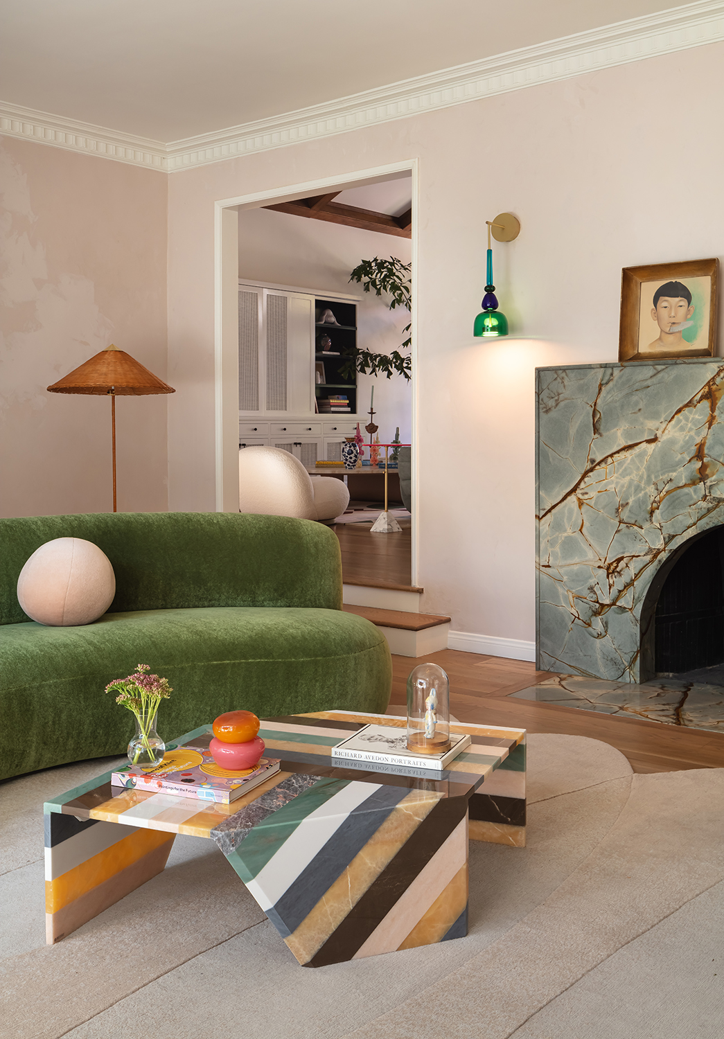
There seems to a be a lot going on in this elegantly contemporary living room by LALA Reimagined, but if you look closely it's a pretty tight color palette, and no shade appears only once. Underpinning the olive green and the grayed blue is the plaster pink of the walls, which crops up again in one of the stripes of the coffee table.
'Our intention was to use the coffee table - which was our original focal point of design in the room - and build the additional elements inspired around that,' says Azar Fattahi, one of the studio's co-founders. The wall is painted in Bardot Roman Clay from Portola Paints, giving it the beguiling texture of a plaster effect and allowing the other colors to layer on top. Why do they work? Because they are all just as grayed as the pink on the walls, meaning that the eye travels effortlessly across the space.
8. Pink and red
Anyone who has been anywhere near the decor corner of social media will be familar with the 'unexpected red' theory. It's been going viral all year, claiming that a pop of red is the perfect elevating touch to lift any other color palette - just like a red lipstick will do to an outfit.
The theory is certainly proved right by this pink living room created by Koi Color Studio. 'The idea that red and pink doesn’t go is what I claim to be “fake news”!' says the studio's creative director Dagny Thurmann-Moe. 'The reason for this, is that red and pink is actually the same color! Pink is a lighter shade of red, and most monochrome palettes work. I work with red and pink all the time, and it’s one of my “go to” combinations.'
Less is more when it comes to working red into a pink color palette - a little flash is more impactful than using it in the same proportion as the pink.