It's important to know which colors you should never paint kitchen cabinets before you make over your space. We all have our favorite colors to use in our homes, and with good reason, we're all individual and whilst some shades will lift us, others don't.
There are some instances where certain colors don't work, this could be because they'll make your kitchen feel too dark, too clinical, or are simply the wrong tone.
Choosing the right color scheme for your kitchen can be hard, and there are actually some colors you should never paint your kitchen cabinets.
Colors you should never paint kitchen cabinets
There are some colors that experts feel aren't right for painting your kitchen cabinets – so they offer some great choices instead that might work better in your kitchen. From sky blue and mint green to orange and yellow – check out our fabulous alternatives.
“If you’re going for a two-tone kitchen, then a neutral color matched with a bold color work well," says Francesca Wezel, founder, Francesca's Paints.
Prices were correct at the time this article was published.
1. Instead of cerise pink, choose a blush

Take a dark pink down a notch with a pretty blush shade instead. Deep colors have their place, but it does depend on your kitchen and the natural light it enjoys. If your space is darker, then swapping it out for a blush pink will brighten up your kitchen.
"Here at deVOL we stick to a fairly small selection of colors, only adding new ones once in a while. Our new blush pink, named ‘Princelet Pink’ after one of my favorite East London streets, has become everyone’s new favorite," says Helen Parker, creative director of deVOL Kitchens.
It also looks wonderful with certain accent shades, Helen adds, "The color is barely there, soft and skin-like, and matches perfectly with black and green, not as a contrast more of a pairing that just sits so quietly and unassumingly. I would say the most popular colors of the moment are definitely along these lines, quite soft and traditional.'
For a similar shade check out Benjamin Moore's Tippy Toes 1282, a dreamy pink that's on trend.
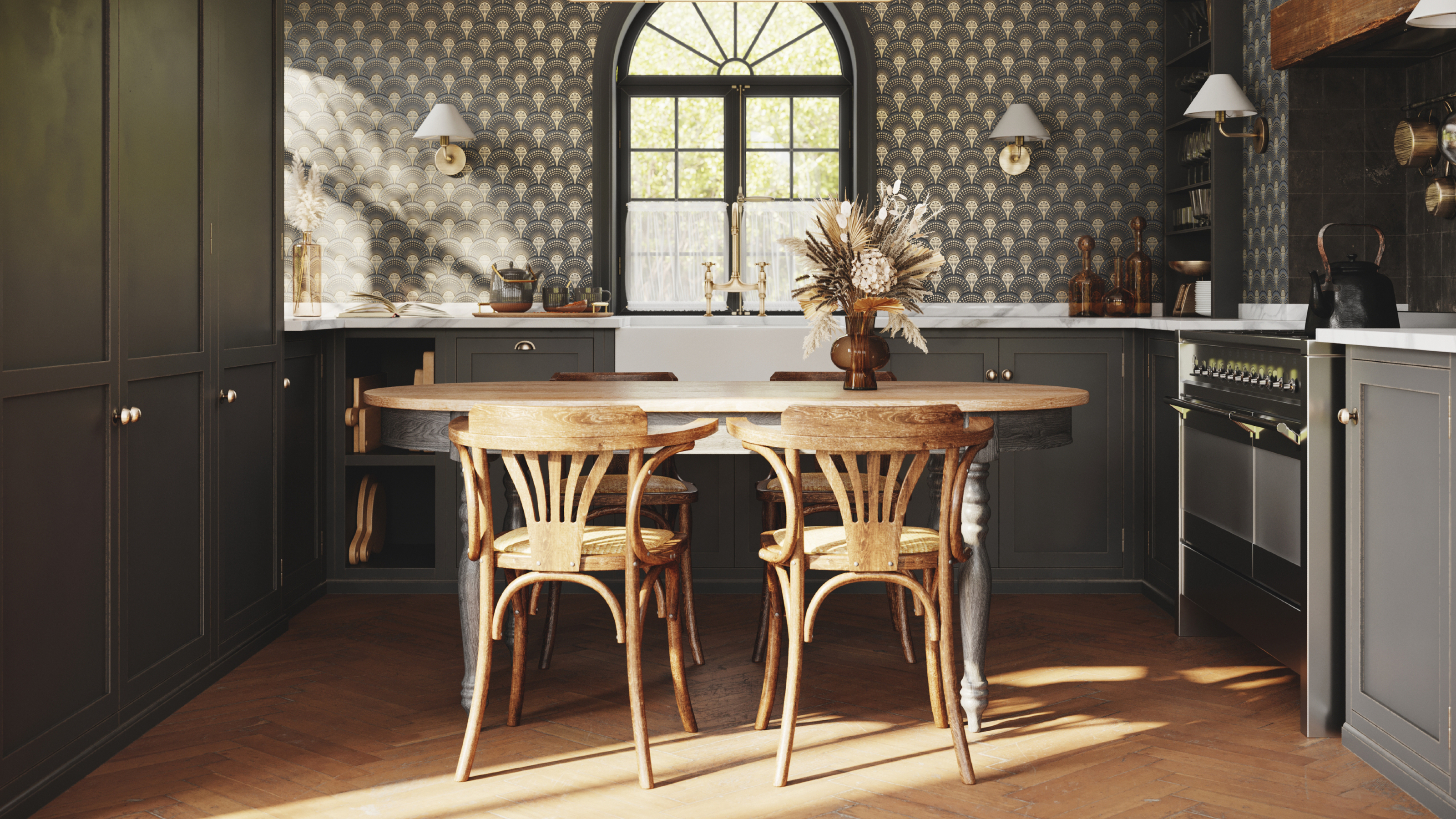
2. Choose dark charcoal over black
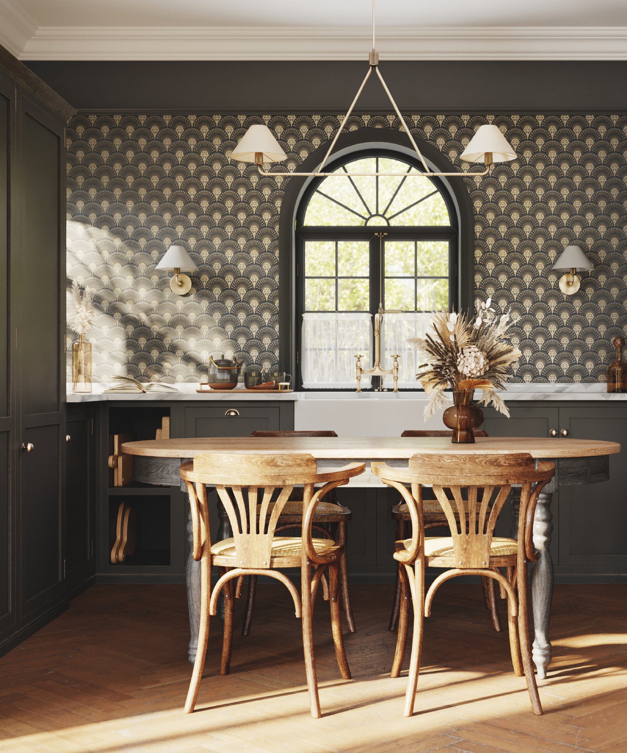
Black kitchens have become more popular over the last few years – dramatic and eye-catching, they certainly look great in modern settings. However, if you love the dark and moody trend but black feels a little harsh, then consider charcoal.
A gentler shade and one that certainly can add warmth, charcoal is a good natural that looks great in both contemporary and classic kitchens.
Jamie Watkins, co-founder at Divine Savages agrees, "Black can sometimes be too harsh for smaller spaces or kitchens with limited natural light. Charcoal, being a softer shade, can provide a similar aesthetic without overwhelming the room, it's a shade that tends to have undertones of other colors, such as brown, which can add warmth to the kitchen making it feel more inviting and cozy compared to stark black cabinets, which might feel more sterile or cold."
Combine your charcoal cabinets with these smart Borgo Porcelain subway floor and wall tiles by Wayfair.
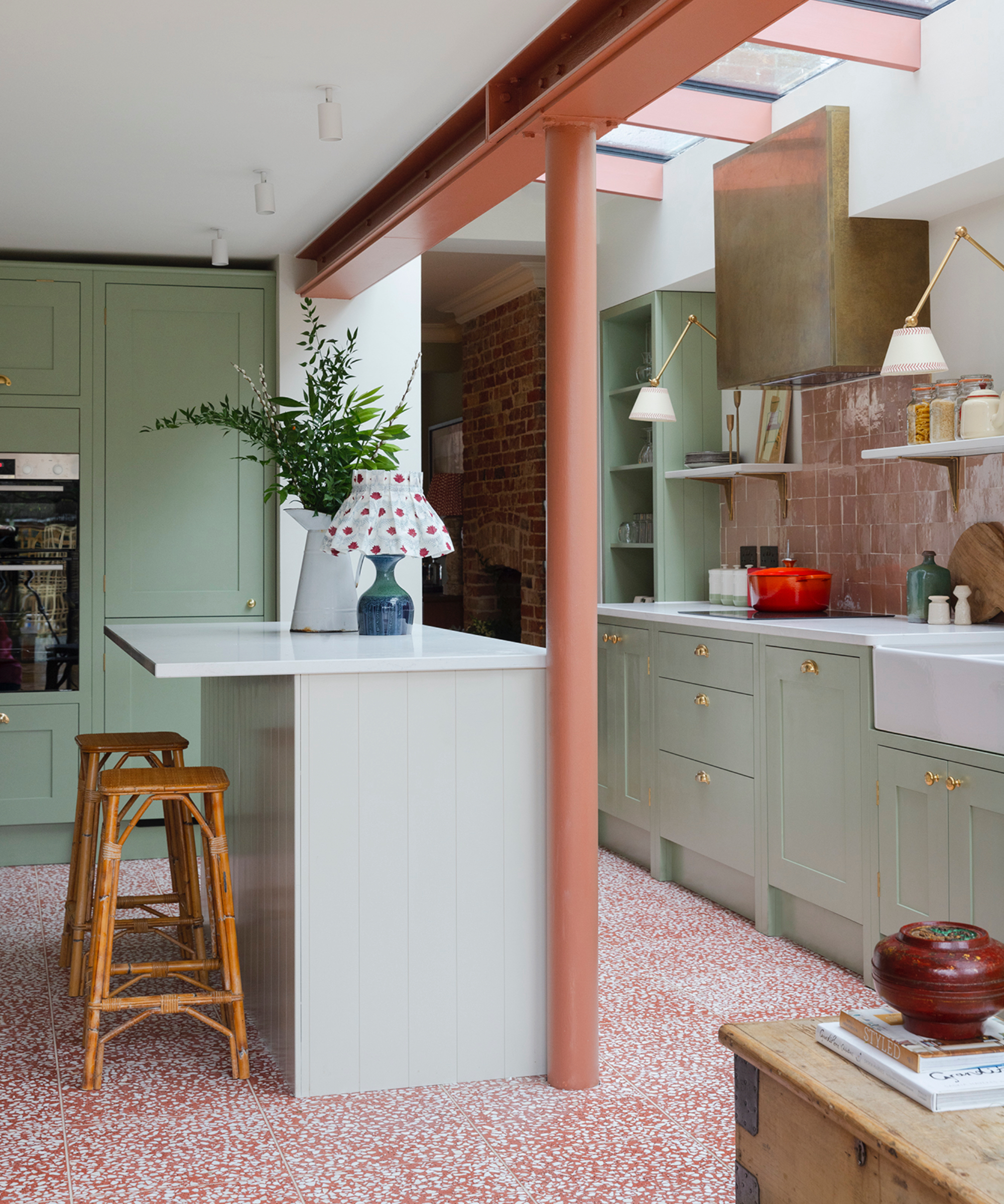
3. Ditch navy for orange
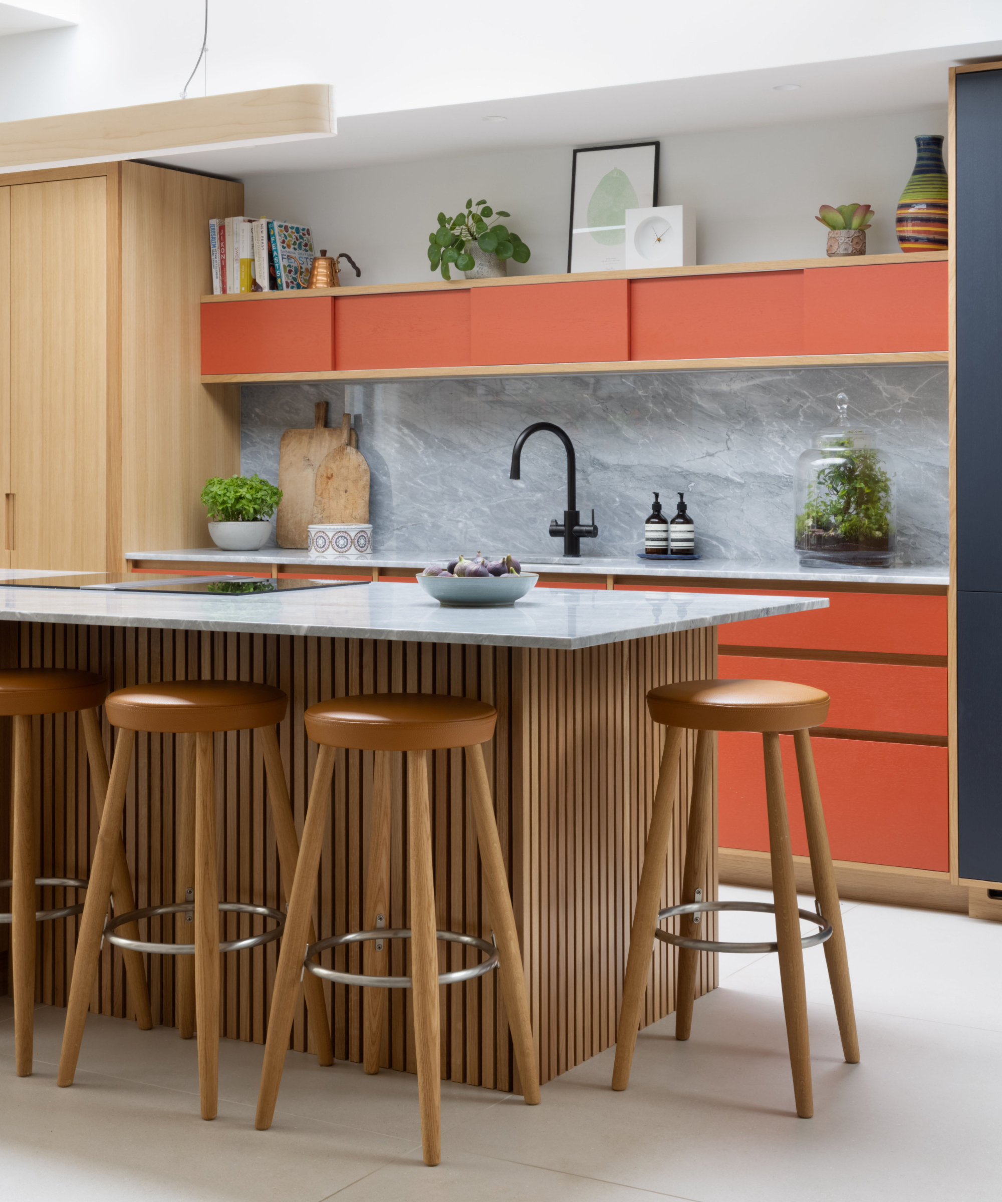
Navy blue kitchens have been extremely popular over the last few years, but we say it's time to be brave and choose a brighter more uplifting color instead.
Orange is one such shade – cheerful and energizing, it's a really good choice for a kitchen as it can warm up a north-facing room really well.
"There was a strong trend for blue for quite a while, however, we are starting to see different color preferences emerging – such as purple, pink, green, and orange," says Francesca. "Using a bold accent color is an easy way to inject personality into the kitchen and has really beautiful results."
Below we showcase our top three orange buys that will bring this vibrant shade into your kitchen.
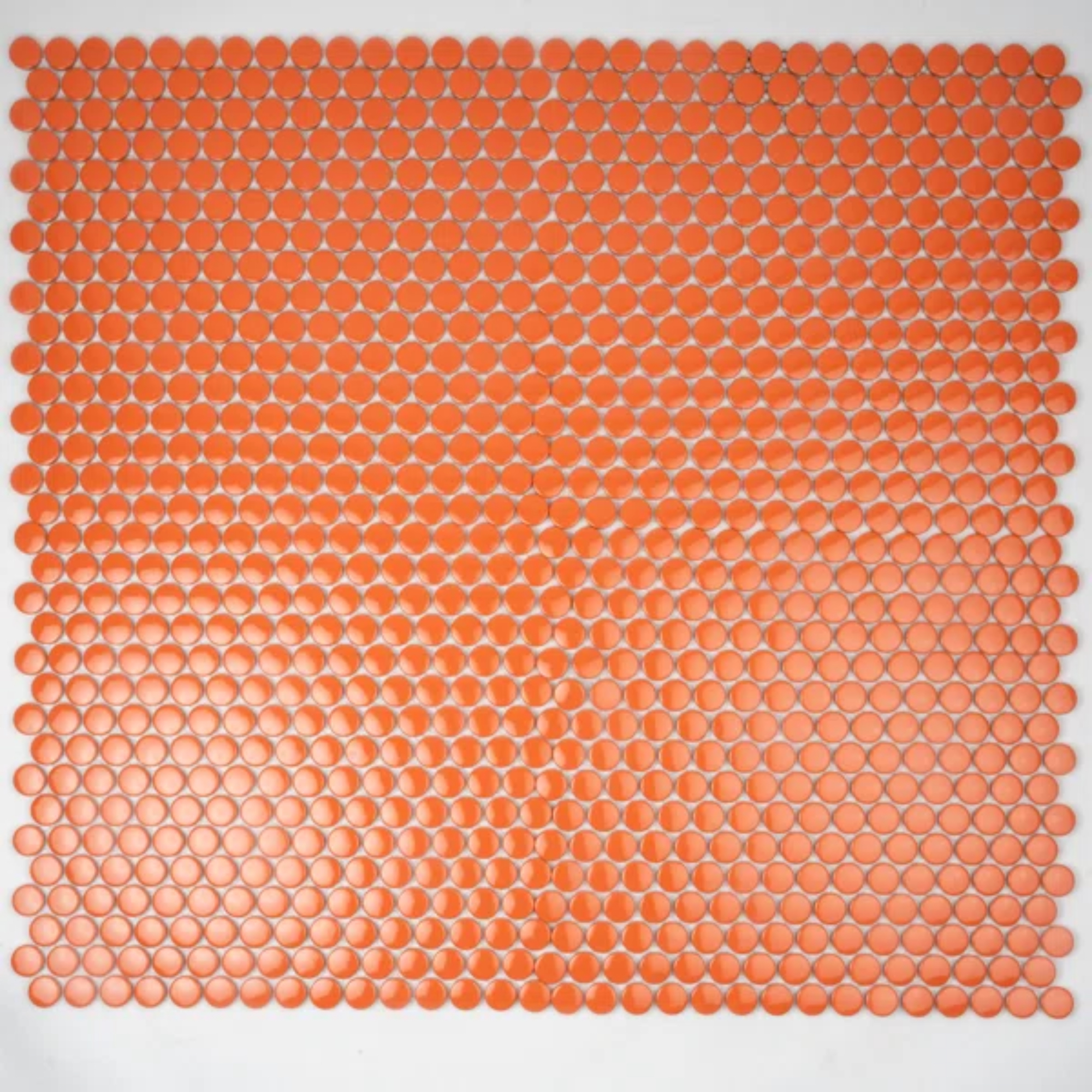
Price: $122.29 for one box
Size (in): W11.46 x L12.4
Use these vibrant mosaic tiles for a backsplash, they will look great with a white countertop.
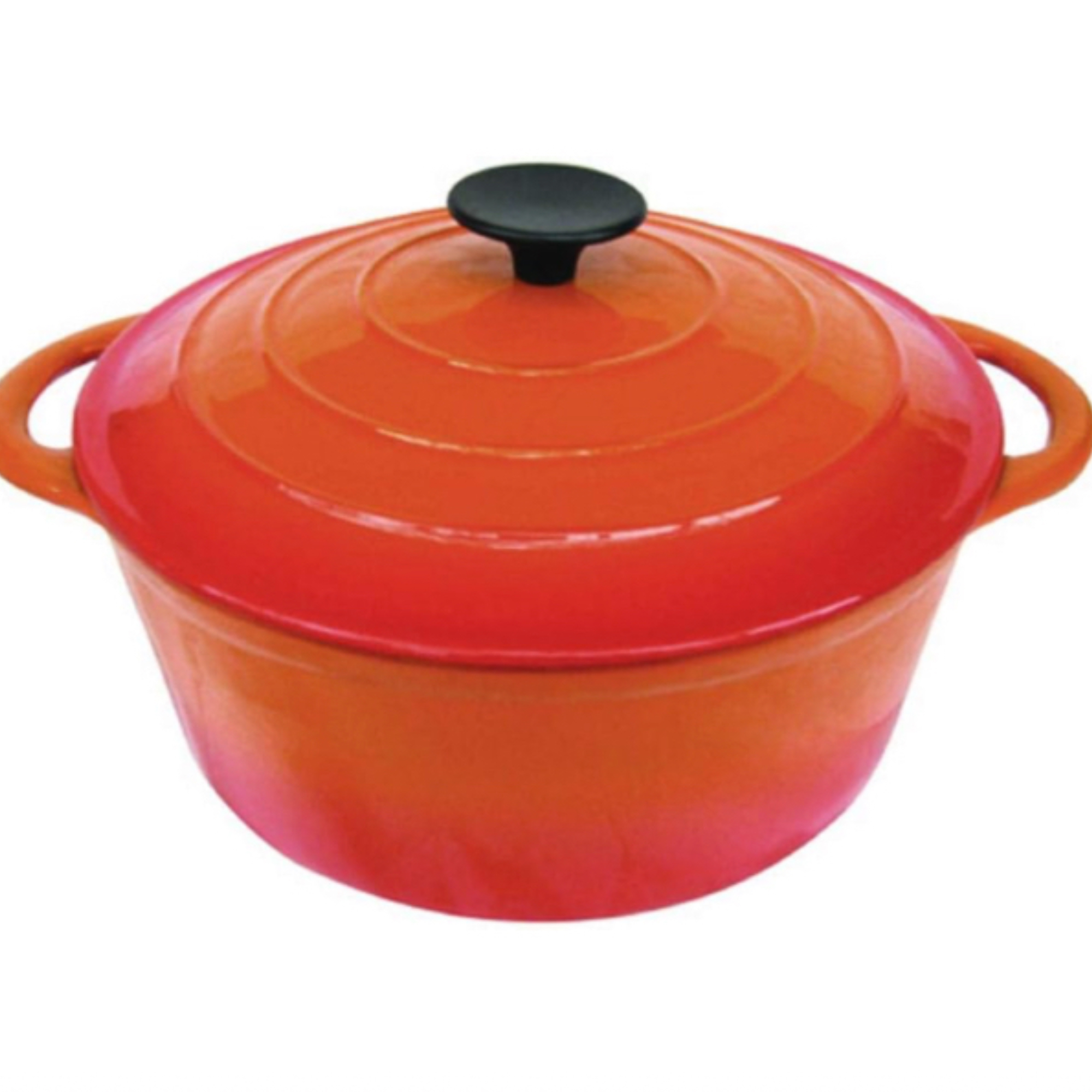
Price: $59.99
Size (in): W12.99 x H10.24
This cast iron orange casserole dish holds 5.5 liters and is ideal for use on the hob or oven.
$1.06 for a color card sample
A lovely orange red that will add warmth to a north facing kitchen.
4. Switch sage green for mint
Trends come and go, and although sage green has its merits – we love how it warms up a kitchen visually, there's something fresh and stylish about mint green.
On the cooler end of the green spectrum, mint green looks great with crisp white as an accent and an orange/pinky coral. It's the ideal shade if you want to add a contemporary feel to your kitchen this season.
Add a few extra green accents with Anthropologie's Recycled Glass Bud Vases and pop in some seasonal blooms.
5. Instead of white try sky blue
Whilst white in a kitchen has its place - it certainly does lift and brighten – it can feel a little clinical sometimes depending on the orientation of the space. This is where painting your cabinets in a new color can update an otherwise tired scheme. Paint and color expert, Annie Sloan CBE, explains:
"White kitchen cabinets may seem like the safe choice, but where's the fun in that? I believe in color that breathes life into your space. White can feel a bit bland and generic, lacking the character and warmth that color brings. Plus, let's face it, white cabinets show every speck of dirt and wear, making upkeep a constant chore. I’m all for making your life as easy as possible, which is why Greek Blue Chalk Paint is a great choice, this finish has its one-of-a-kind no prep, no prime, goes-on-anything formula, and white cabinets are demanding."
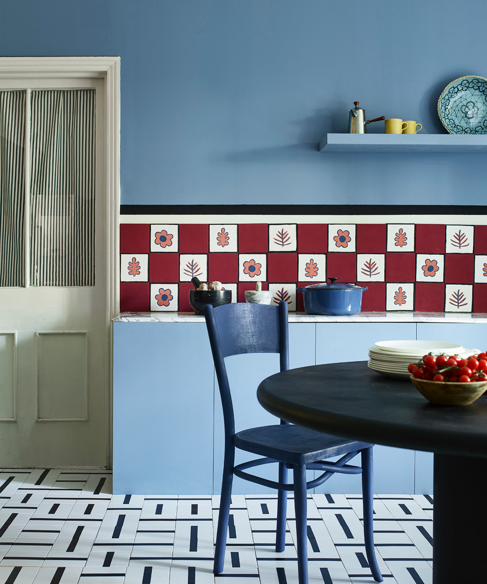
6. Opt for claret over coral
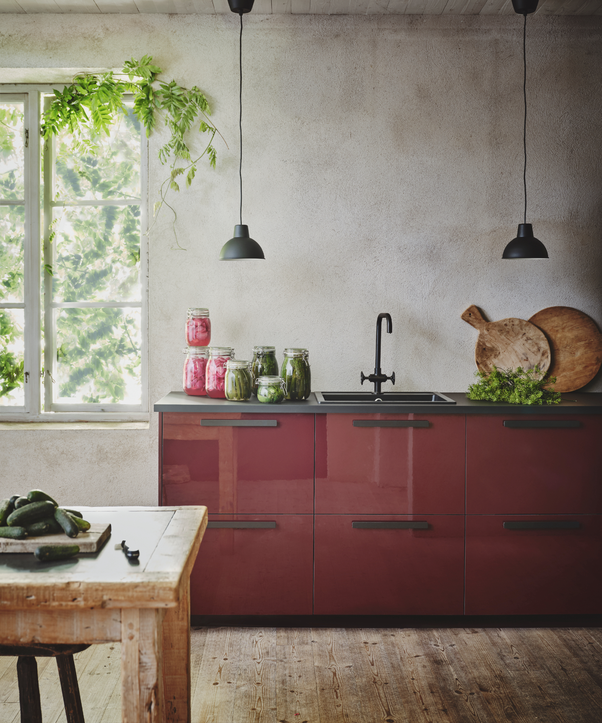
Love coral but fancy making more of a statement? It's a great shade to start with but for more impact opt for claret.
Claret red is a great punchy color and is perhaps one of the most vibrant shades to pick for a kitchen, but you don't need to let it take over, instead, choose it for one length of cabinet and team it with a more rustic approach for the rest. Team with a black countertop, sink, and handles for a little cohesion.
Choose claret red elements to tie the look together with our favorite buys below.

Price: $2.50 for a peel and stick sample
A rich red that's got a touch of blue, team with navy for a striking accent.
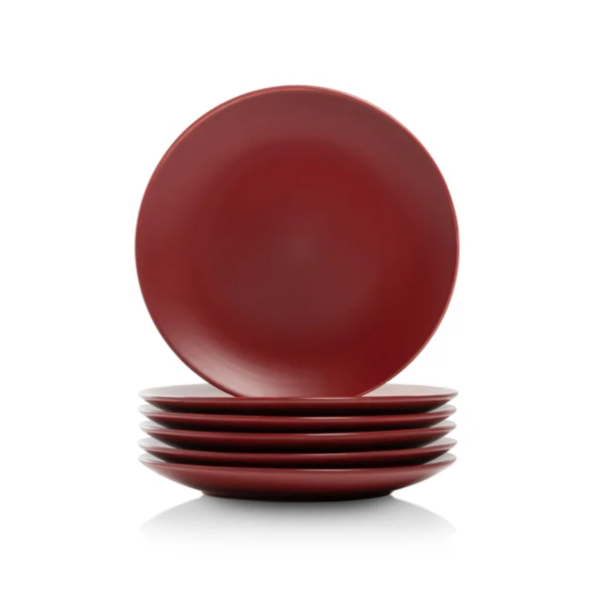
Price $34.50 for 6
Size (in): Dia 7.75
Crafted from stoneware, this set of 6 salad plates will be ideal for a dinner party or family get together.
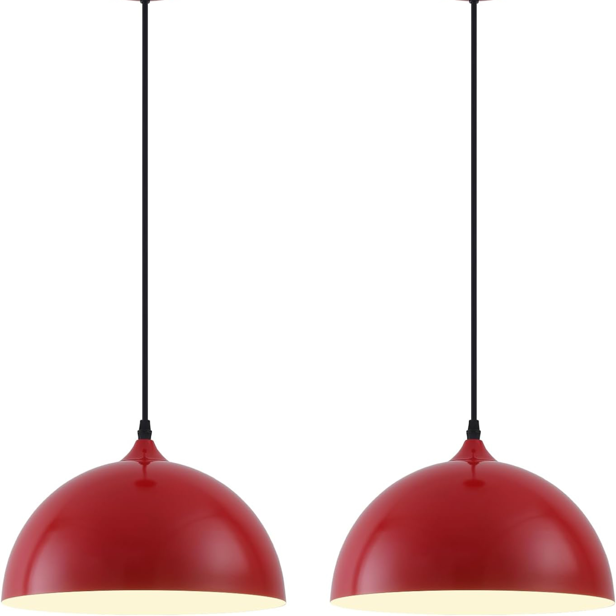
Price: $68.99
Size (in): H10 x W7 x L7
Add a modern feel with this pair of red metal pendant lights that are uber stylish.
7. Consider pale gray instead cream
Cream is perfect for traditional-style kitchens and certainly has a classic appeal, but for a more elegant look consider swapping it for pale gray.
You can start small by painting your kitchen island first to see how you like it, it will add depth to your current scheme and provide a good neutral background for the rest of your scheme.
A good place to start with gray is Lick's Grey 03 Matt, it's not too 'cold' as it has purple undertones.
8. Pick sunshine yellow instead of beige
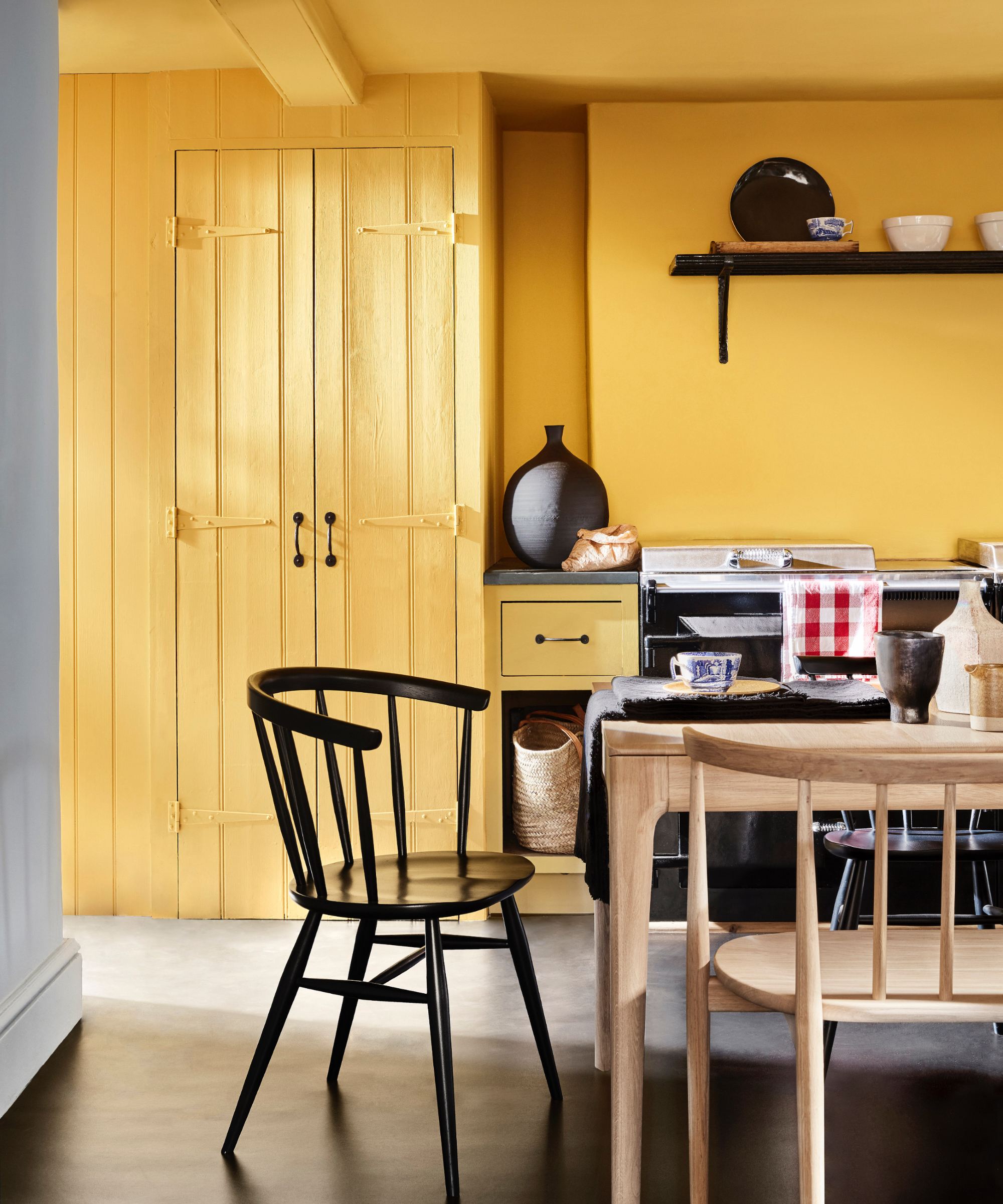
If your kitchen is on the dark side, it's tempting to go lighter with a neutral like beige or stone, but for a contemporary and fun look then change it up to sunshine yellow instead.
Even if it's a north-facing space, a yellow kitchen color will warm up the hub of your home in no time and it looks stunning with black.
Pop up a print or two like this Yoga Nude in Yellow from Nordstrom, it's bright and joyful and will look fabulous on a white wall.
There are no hard and fast rules to kitchen cabinet colors as personal preference plays a big part, but some shades do work better than others.
"Use colors that are easy to live with, as kitchens tend to be the most used room in the home. Look to schemes that have integrity and that you won’t tire from. This doesn’t mean bland, just restful," advises Patrick O'Donnell, brand ambassador at Farrow & Ball.