Choosing the hues to introduce to your kitchen is an important decision. It has a huge impact on the overall look and feel of your space, so picking out colors that bring you joy is always the best option.
And this year, designers are recommending a few unusual kitchen color combinations you never thought to try. While you might not have considered bringing these hues together before, they take kitchen color ideas to new heights, adding warmth, interest, and personality to your scheme.
But what are these unusual kitchen color combinations, and what's the best way to decorate your scheme with them? Here, interior designers and color experts take us through their favorite pairings and the best way to make them look utterly stylish.
7 unusual kitchen color combinations to try this year
From bright, saturated hues to deep, moody tones, these unusual kitchen color combinations are endlessly stylish with something to suit every interior design style.
1. Yellow and oxblood red
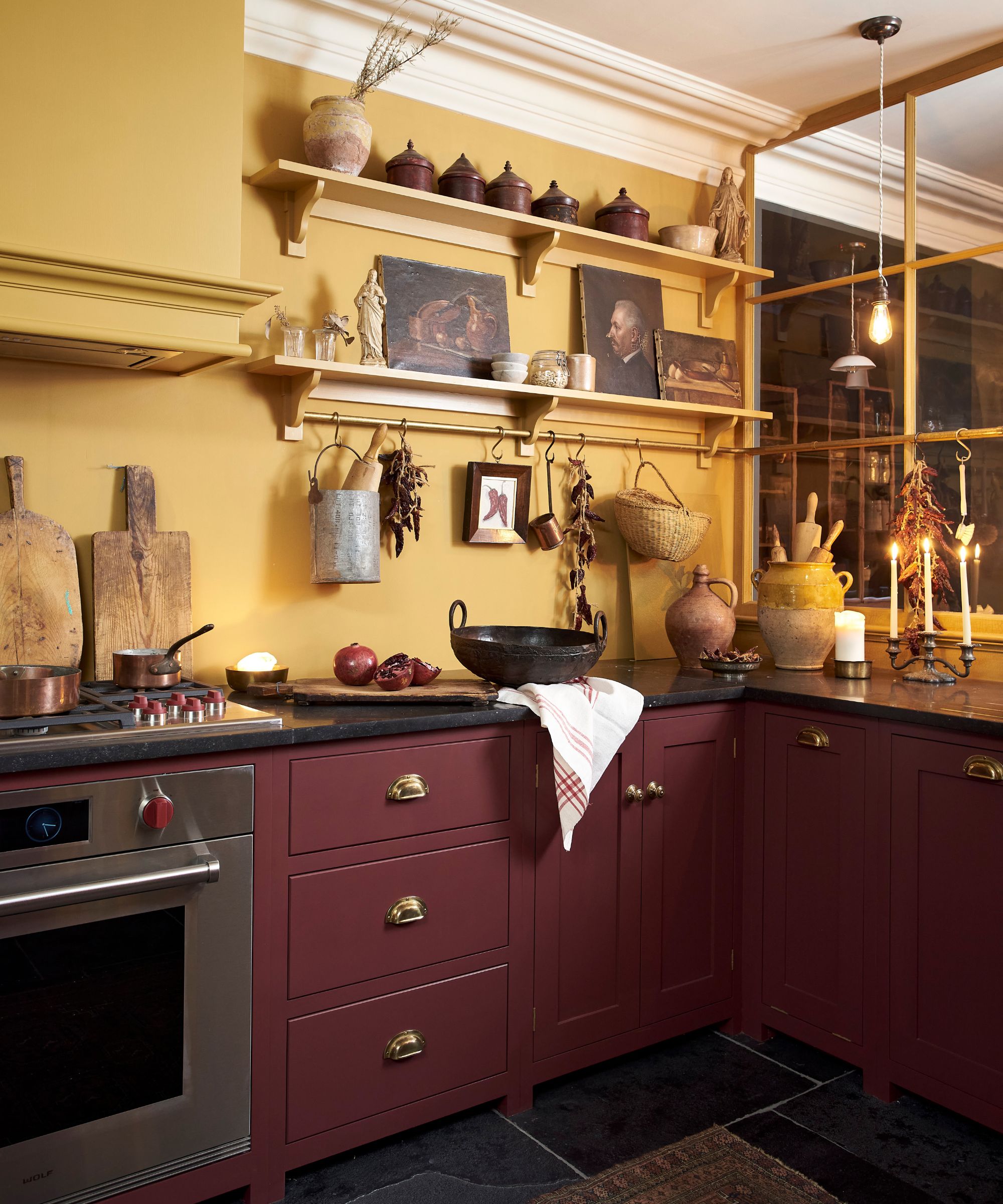
Usually, if you introduce a bold, bright color to a kitchen, you balance it with a calmer, more neutral hue. However, as reds continue to be popular into 2025, interior designers say you should pair them with an equally bold color.
'We've been itching to do a yellow kitchen, loving the warm, sunshine vibe. To temper it, we would mix in an edgier pairing, like straw with deep oxblood or marigold with fresh powder blue,' says Heather Peterson, principal at Heather Peterson Design.
In this deVOL kitchen, red has been used on the cabinets while yellow has been drenched across the walls, shelves, and range hood. To make the unusual color combination feel a little more elevated, consider the materials and textures you introduce.
'Mix in natural wood on the island, a pantry, or another standalone piece. Mix in the complement in the backsplash and tie it all together with multi-hued fabrics on window treatments, towels, or in the art,' says Heather.
2. Pink and blue
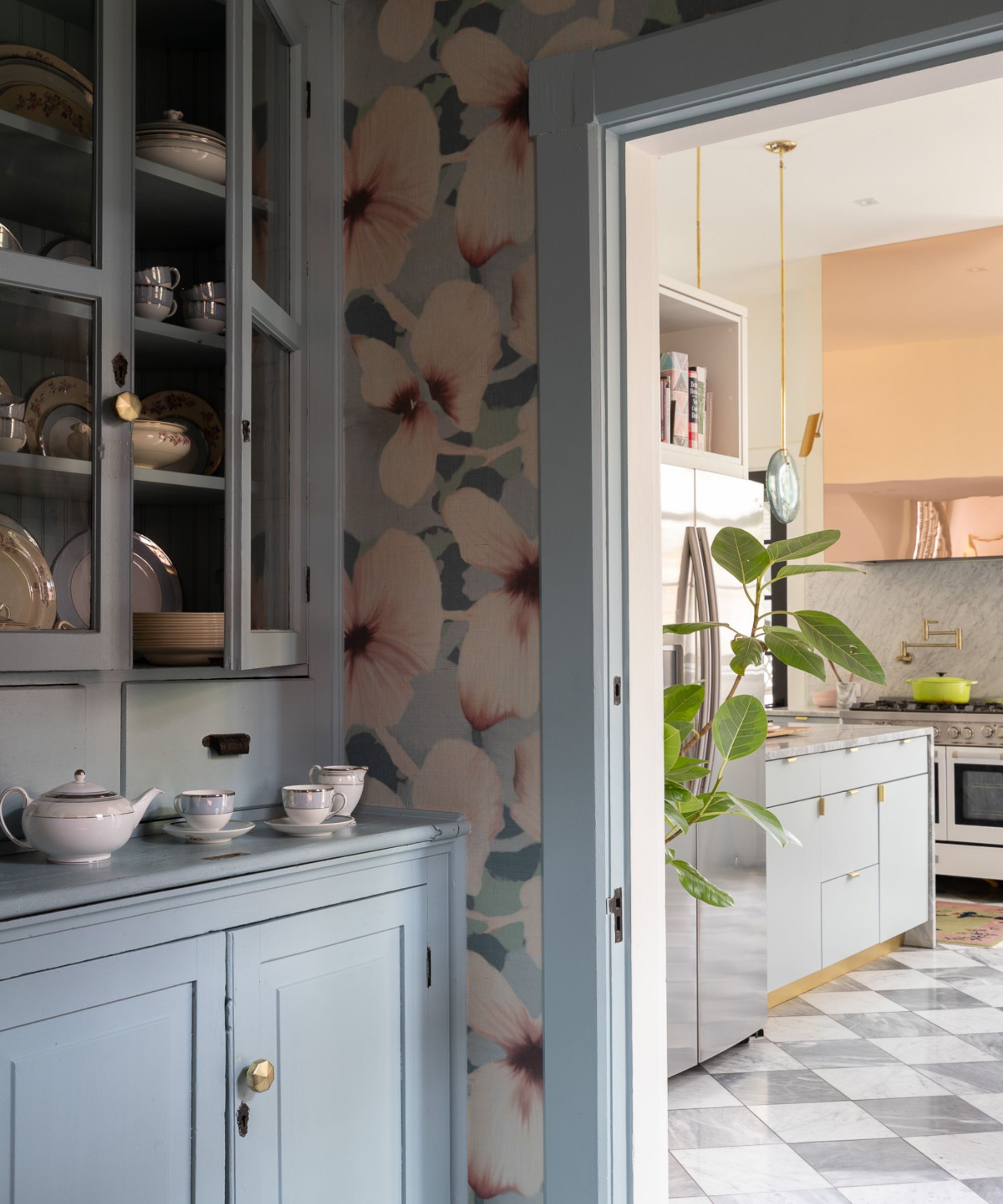
While a lot of the unusual kitchen color combinations this year seem to lean towards bright and moodier hues, softer colors are also having a moment, perfect if you love pastels and dusky tones.
'Pink and blue is the "out there" kitchen color combination that is surprisingly easy to adopt. While the idea of a pastel kitchen is reminiscent of 1950s advertisements for appliances, the look is surprisingly modern,' says Bethany Adams, of Bethany Adams Interiors.
'The softness of the colors is what makes this unexpected combination so easy to live with. If you feel intimidated by committing to two strong colors, pick one – say blue, for extra reassurance – and paint your lower cabinets in that shade,' she suggests.
You can then bring in pink hues through your decor and smaller pieces. 'Introduce the pink in accessories like your mixer, stools, or lighting: the things you could swap out more easily if you tire of the look in a few years.'
3. Yellow and moody tones
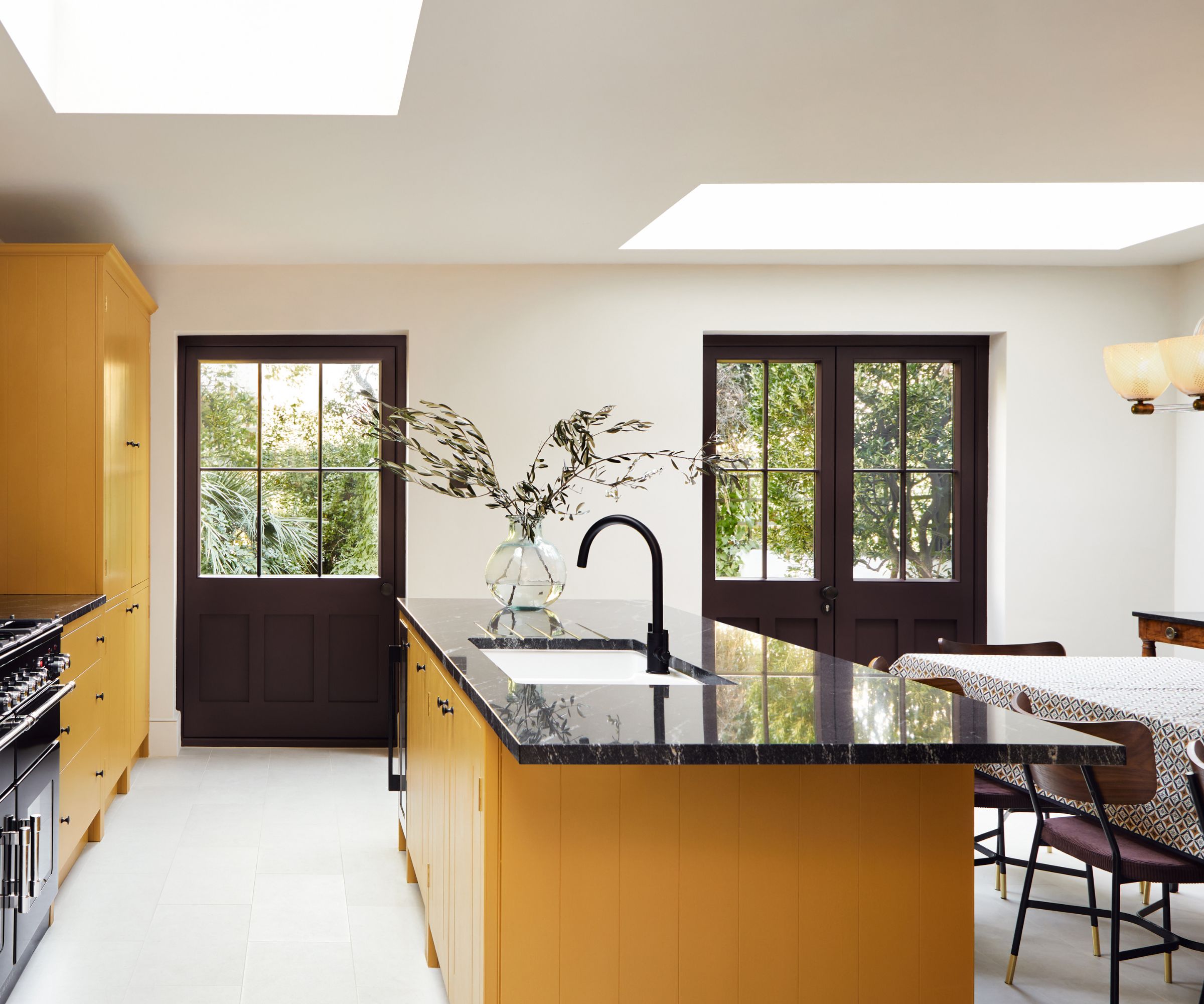
Opting for a more unexpected color pairing in a kitchen doesn't mean you have to go for a bold, colorful scheme. If you introduce the colors in a more nuanced way, you can still create a bright, light space – and this color combination is a great way to achieve it.
'Bright yellow can be a divisive color, but in almost every culture, yellow invokes feelings of warmth, happiness, and comfort, which makes it a great choice for your kitchen,' says Dominic Myland, CEO of Mylands.
'While its boldness can be off-putting for some, yellow is an incredibly versatile shade that can brighten up any space. Mustard yellows such as HaymarketTM No.47 and Freegrove Mustard have a slightly more muted look that work well with dark shades just as well as it does with whites,' he explains.
This yellow kitchen is a perfect example of how yellow and darker, moody tones can pair without creating a kitchen design that feels dark or overwhelming. Yellow cabinets are balanced with black countertops and white walls. The moody tones have been introduced via the dark brown painted doors and the dark wood dining chairs upholstered with a deep plum fabric.
4. Navy and olive
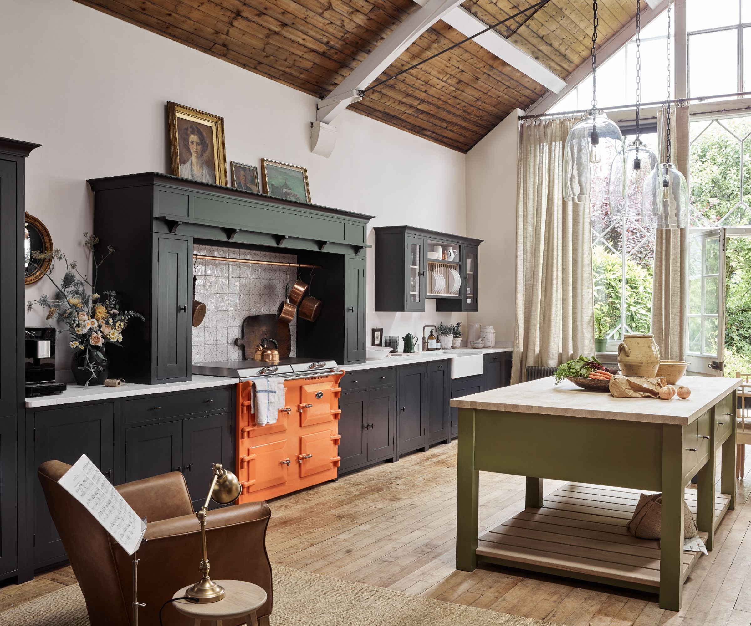
If you prefer a more pared-back scheme without bright colors throughout, look to color pairings that feature hues that act as neutrals. In this kitchen, navy and olive green are the colors of choice – unusual, but totally stylish.
'Two-tone kitchen cabinetry allows you to create an unusual space with character and individuality. Consider applying a darker color to the base cabinets like Ink, a very deep navy, and a lighter shade to the upper units, or introduce a contrasting color like Olive for the island to create a feature,' says Fred Horlock, design director at Neptune.
You can also bring in the secondary color in a more creative way, especially if you just want to introduce a pop of contrast. 'At Neptune, we also offer the option to paint the interior of your cabinets in a complementary color which acts as an unexpected detail that is only revealed when the doors are opened, or a more subtle accent within glazed cabinetry.'
5. Pink and green
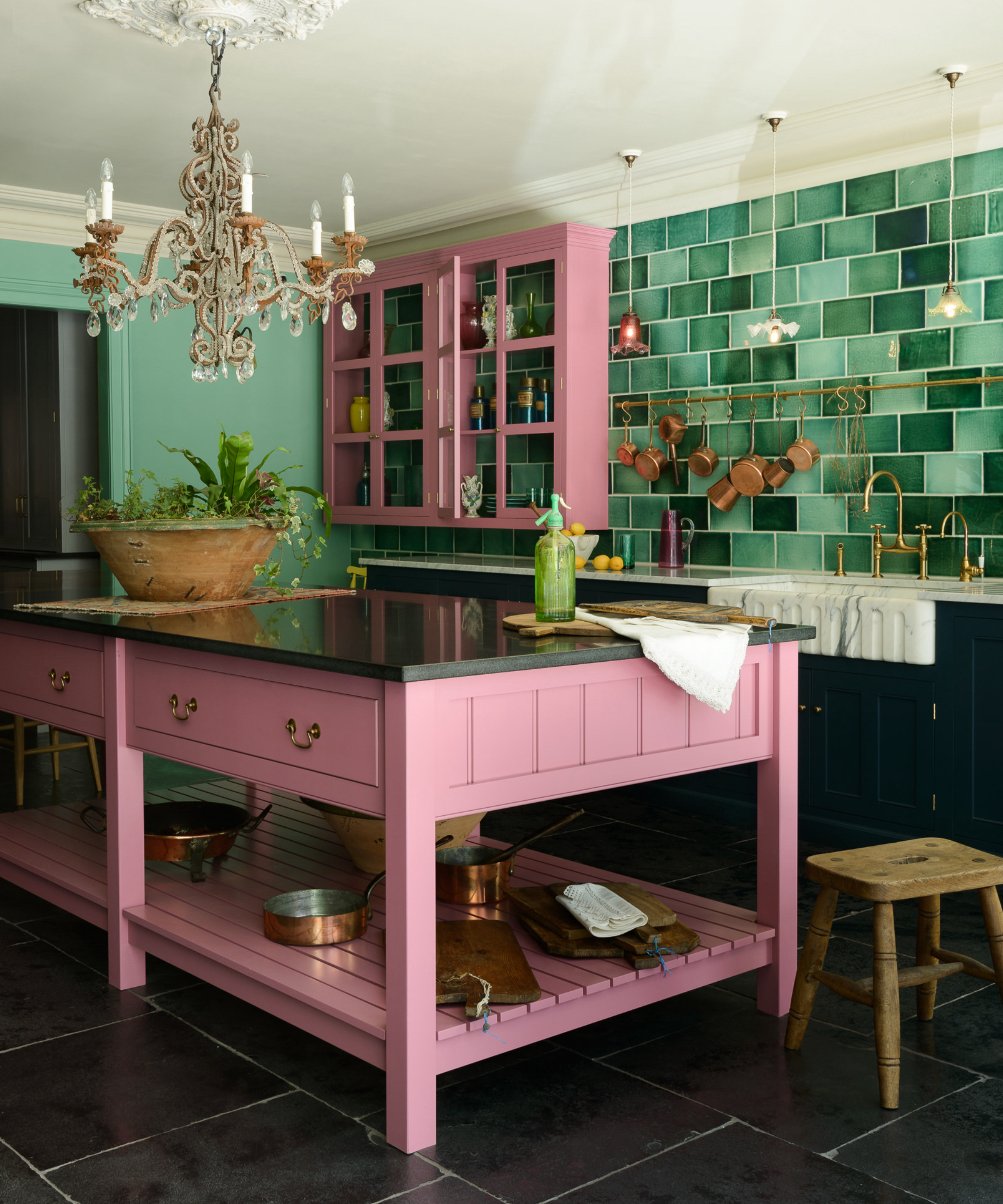
You might not be new to this unusual color combination, but it's making a comeback in 2025 for more youthful, playful kitchen schemes. But how you introduce them is key to a sophisticated design.
'The Wicked movie truly had us all in a cultural chokehold in 2024, even influencing our interior style and homes. It would be so joyful to see us carry Wicked's iconic pink and green color combination into our kitchen schemes next year, as this pairing is the perfect balance of playfulness and timelessness,' says Laura Styles, resident style advisor at Yester Home.
'I recommend teaming this look with polished, unlacquered brass hardware for a grown-up feel and a touch of luxury. To refresh this scheme for 2025, opt for a pop of bold cherry red, a huge upcoming trend according to Pinterest, with painted standalone furniture pieces, cookware, and decor,' she suggests.
6. Light rustic wood and blue
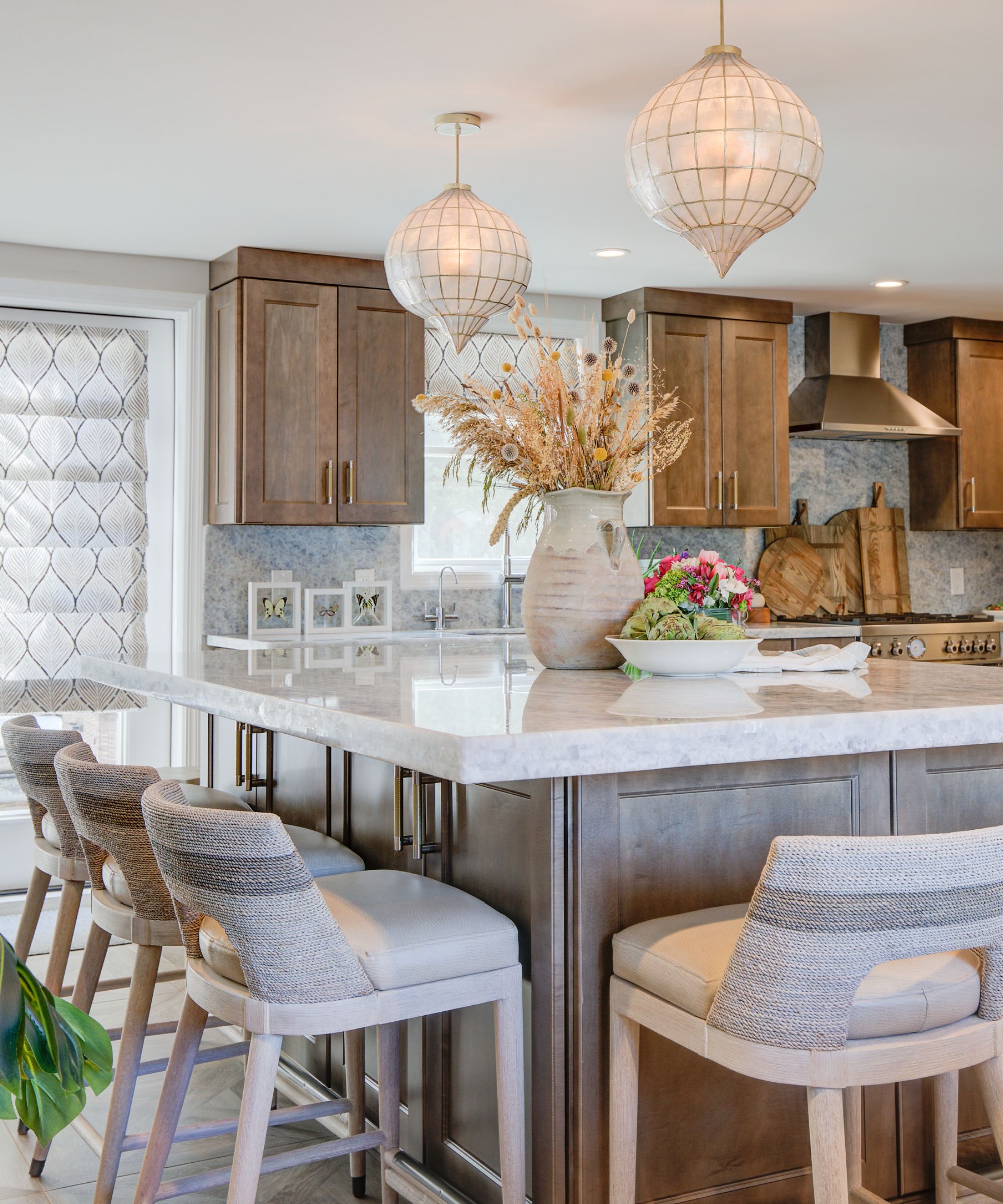
Pairing certain materials and finishes together can create an unusual yet visually appealing kitchen design. In this scheme, rustic wooden cabinets paired with blue quartzite gives the space a vintage coastal feel.
'Morrell, a soft driftwood-inspired brown, and Twilight Blue Quartzite mix together to create a sophisticated and unexpected pairing, resulting in a serene yet distinctive coastal aesthetic,' says Allison Kaminski, lead designer at Lola Tucker Interiors.
'This pairing aligns perfectly with 2025’s design trends, particularly as Pantone’s Color of the Year, Mocha Mousse, highlights warm, grounding tones. Incorporating Morrell into cabinetry can establish a natural, inviting foundation.'
7. Light and dark reds
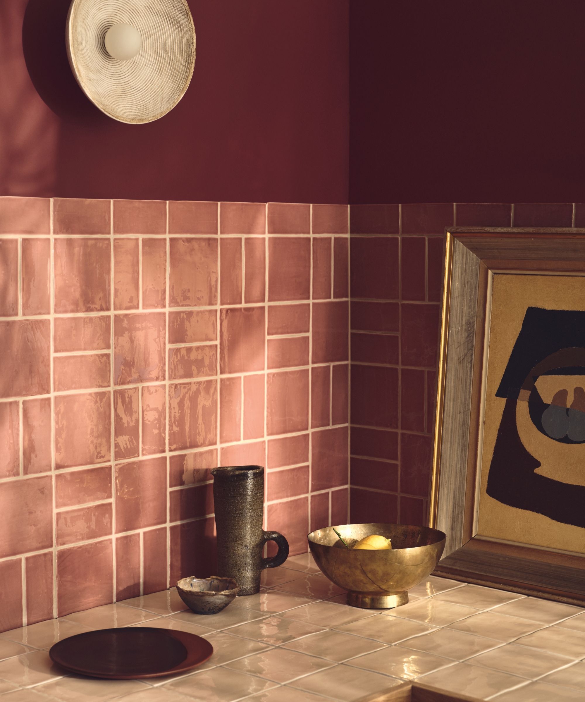
When you think of a color drenched kitchen, tranquil tones or moody hues probably come to mind. But in 2025, a less-expected color choice is creating bold, daring schemes,
'An unusual kitchen color combination we’d like to see more of in 2025 is the pairing of rich, fiery reds like our Dragon’s Blood paint with soft glazed textures like our Jaipur Pompeiian red tiles,' says Carly Allison, head of product design at Fired Earth.
This mix of a deeper red paint color and a lighter, textural tile creates a color-drenched scheme that has plenty of visual interest. 'This bold duo brings unexpected energy to the space, creating a kitchen that feels daring and energizing,' Carly adds.
While these kitchen color combinations might seem unusual at first glance, they are tried-and-true pairings to create a stylish and personality-filled space. Whether you embrace earthy hues or go bold with shades of red, 2025 is the year to try something new.


