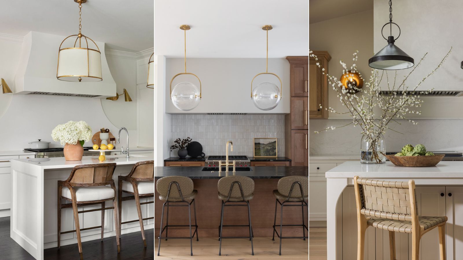
When it comes to designing an enduring scheme, there are a few things interior designers say you don't need in your kitchen if you want to create a stylish, functional, and elevated space.
There are so many kitchen ideas nowadays – different interior design styles call for contrasting layouts and features, which all require an alternative approach, so it can be tricky to know what to include and which features to avoid.
However, regardless of the style and size of your space, interior designers say there are a few things you don't need in your kitchen, and some of them have much better alternatives that will completely elevate your design.
7 things interior designers say you don’t need in your kitchen
Before you finalize any design choices for your kitchen, consider these things interior designers say you don't need in your kitchen to ensure you create a space that is as stylish as it is functional.
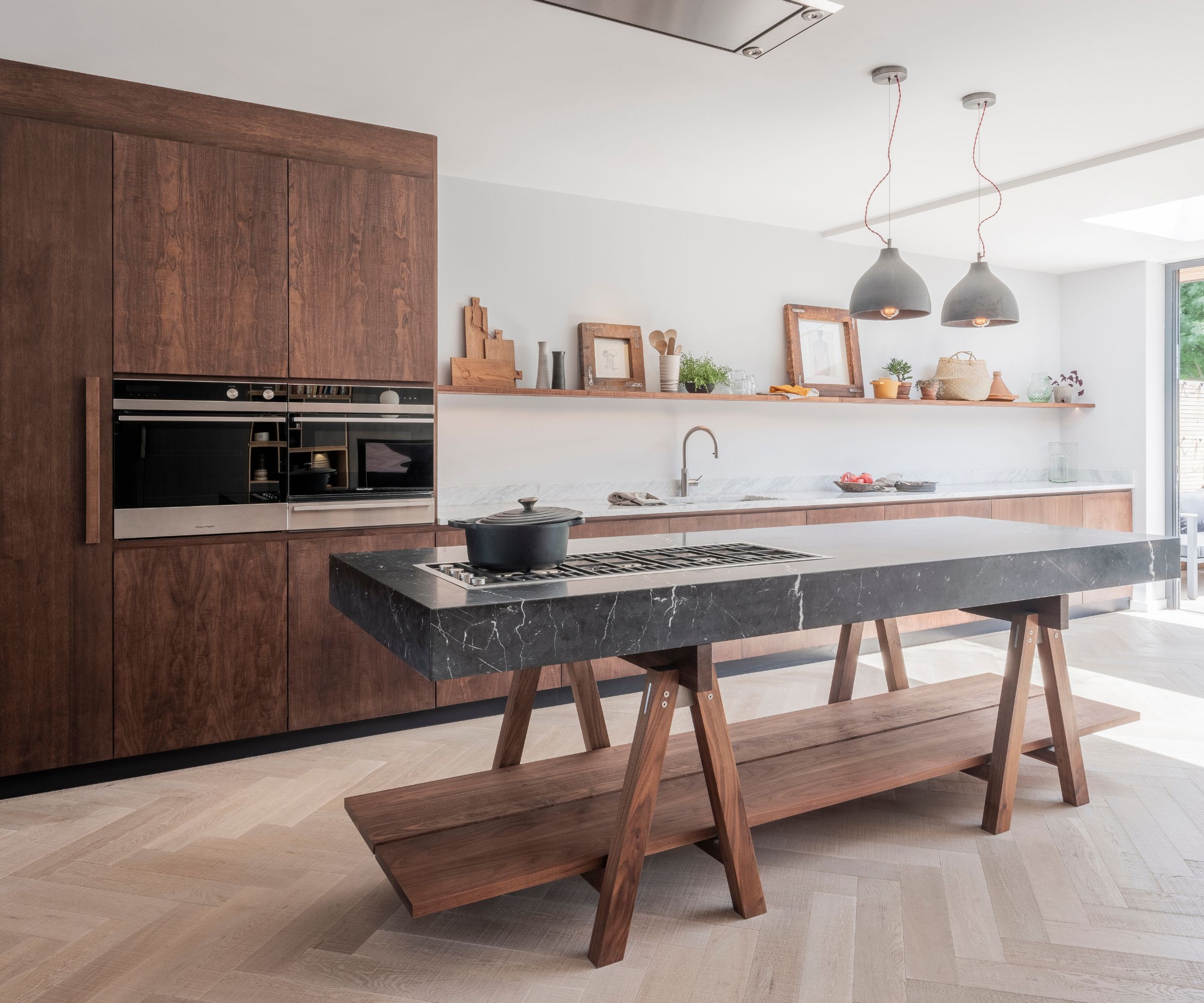
1. A cooktop on your kitchen island
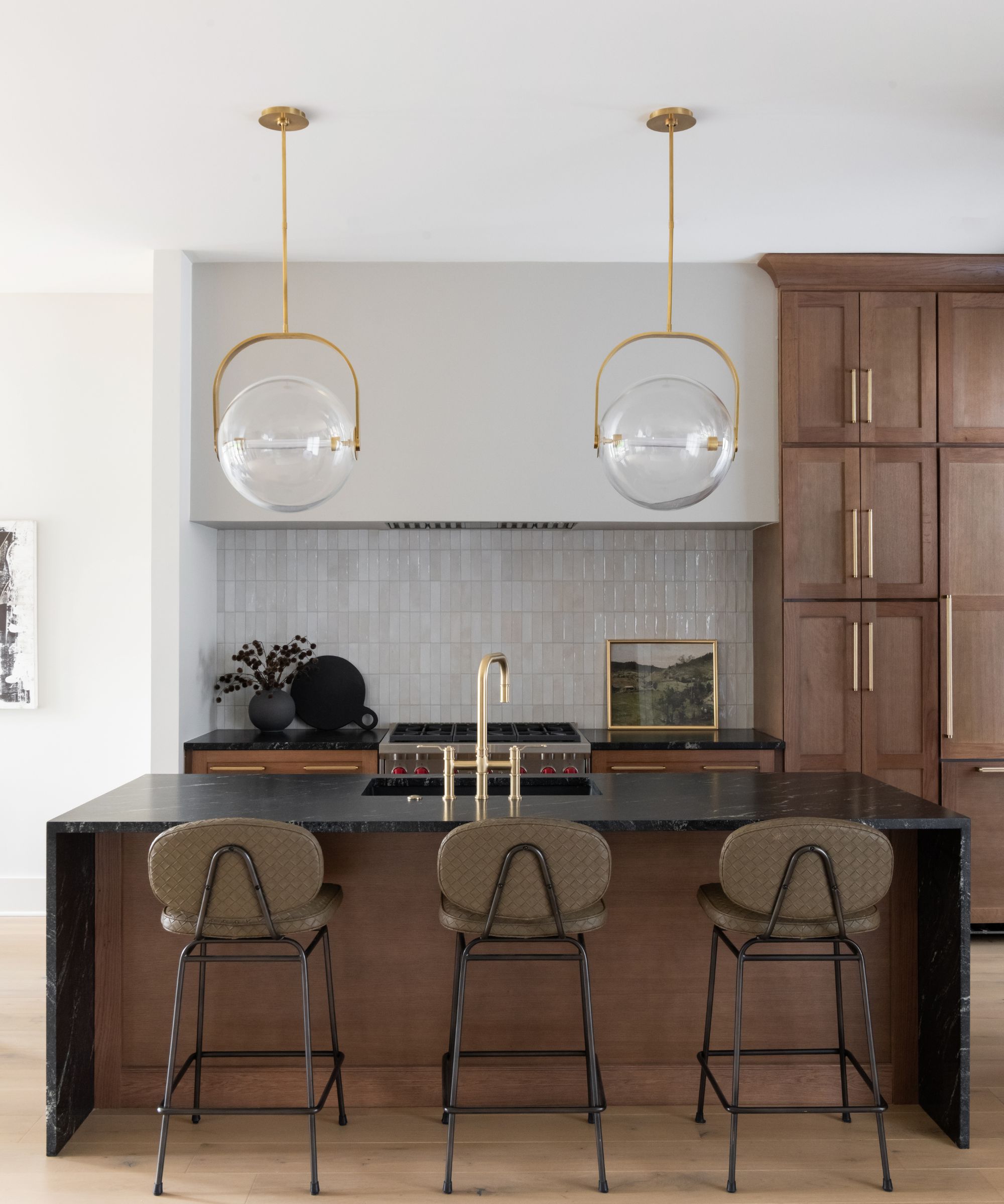
A kitchen island is an incredibly stylish and useful feature to add – as well as increased storage, it offers an additional place to house appliances. However, there is one essential feature you don't need on your kitchen island.
'I would recommend not adding a built-in cooktop to your kitchen island. While it might seem stylish, it can cause several issues. It’s less safe, as it increases the risk of accidents with hot surfaces in a high-traffic area. Ventilation can be a hassle, often requiring bulky and less effective options,' says Carolyn Cerminara, founder and principal designer, Cerminara Design.
'The cooktop also eats up valuable prep space and can disrupt the natural flow of your kitchen. Plus, it complicates plumbing and electrical needs, driving up costs and limiting future design flexibility. Keeping the cooktop on a traditional counter with proper ventilation is a better choice,' she adds.
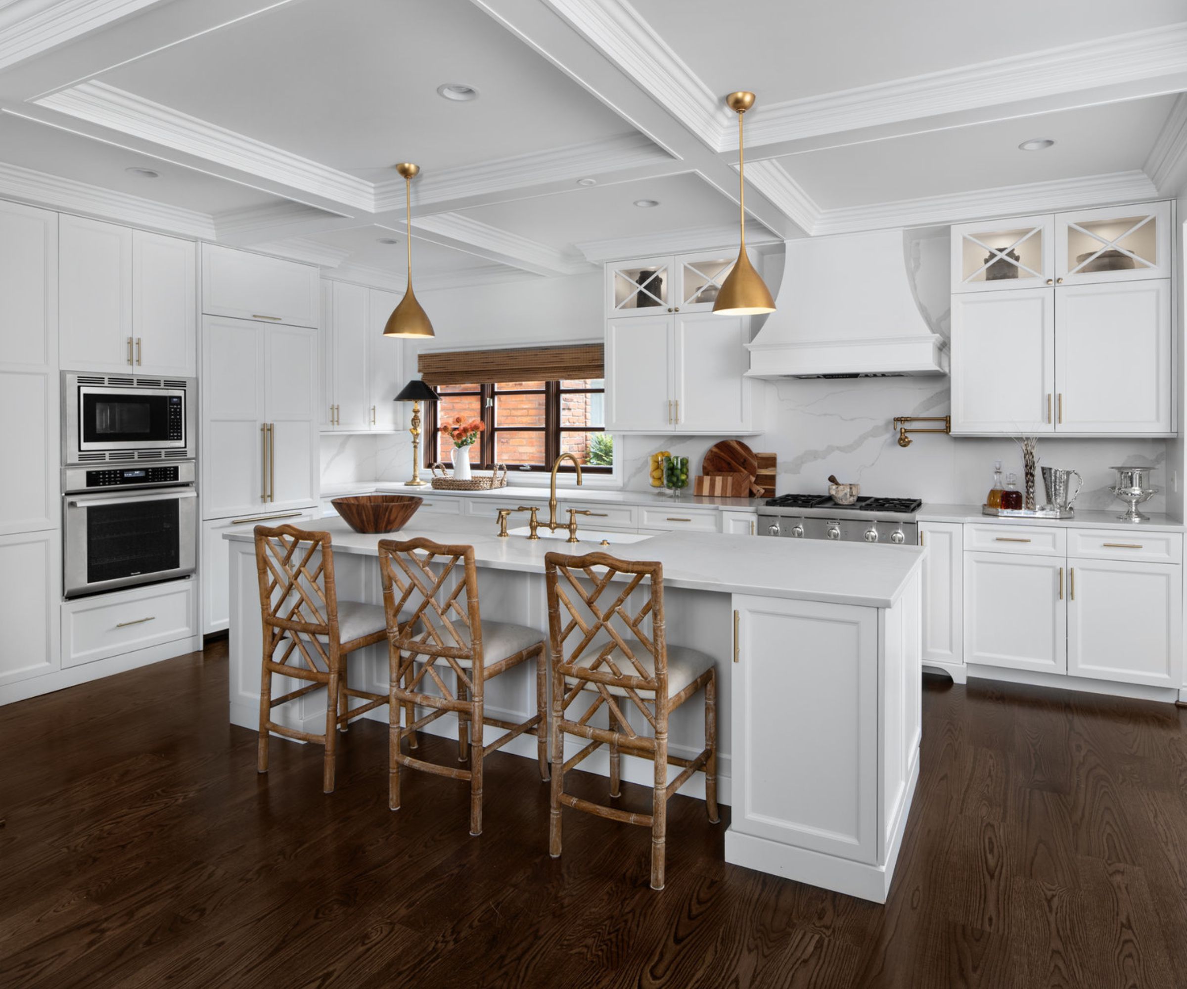
2. Upper cabinets framing a range hood
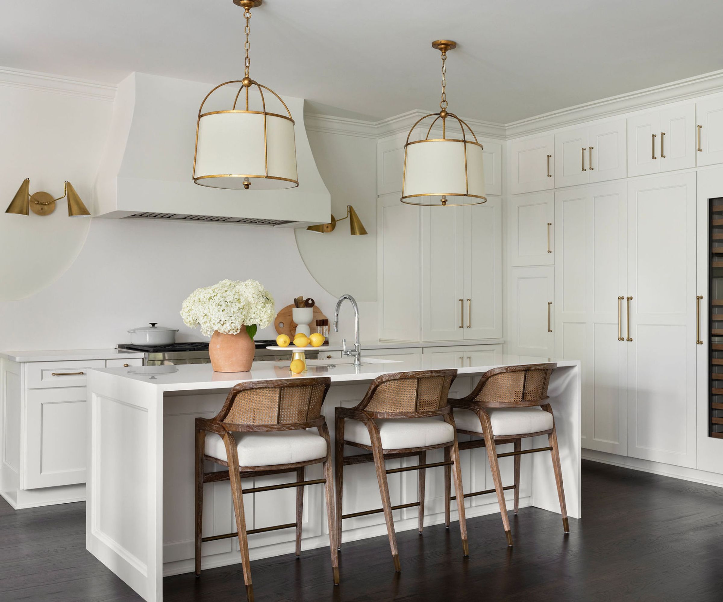
Range hoods have become the focus of some recent kitchen trends, going from an inconvenient feature to a place to create a statement design. And as the extractor hood is usually in a central, focal point in the kitchen, Carolyn says it's best to ditch the upper cabinets that sit beside it.
'I would recommend not adding upper cabinets to the sides of the kitchen range hood. If you allow negative space it creates the illusion of spaciousness and gives the kitchen a more sophisticated look,' she explains.
The extra breathing space will instantly elevate the look of your kitchen, and Carolyn assures it won't impact the functionality of your space. 'While you will lose some storage, you can compensate by creating full-height cabinets in other areas.'
3. A busy backsplash
This year's interior design trends are really targeting characterful, lived-in style, so adding eye-catching and interesting features might be at the top of your list. But when you're designing a kitchen, try to avoid adding anything too busy in areas that can't easily be changed.
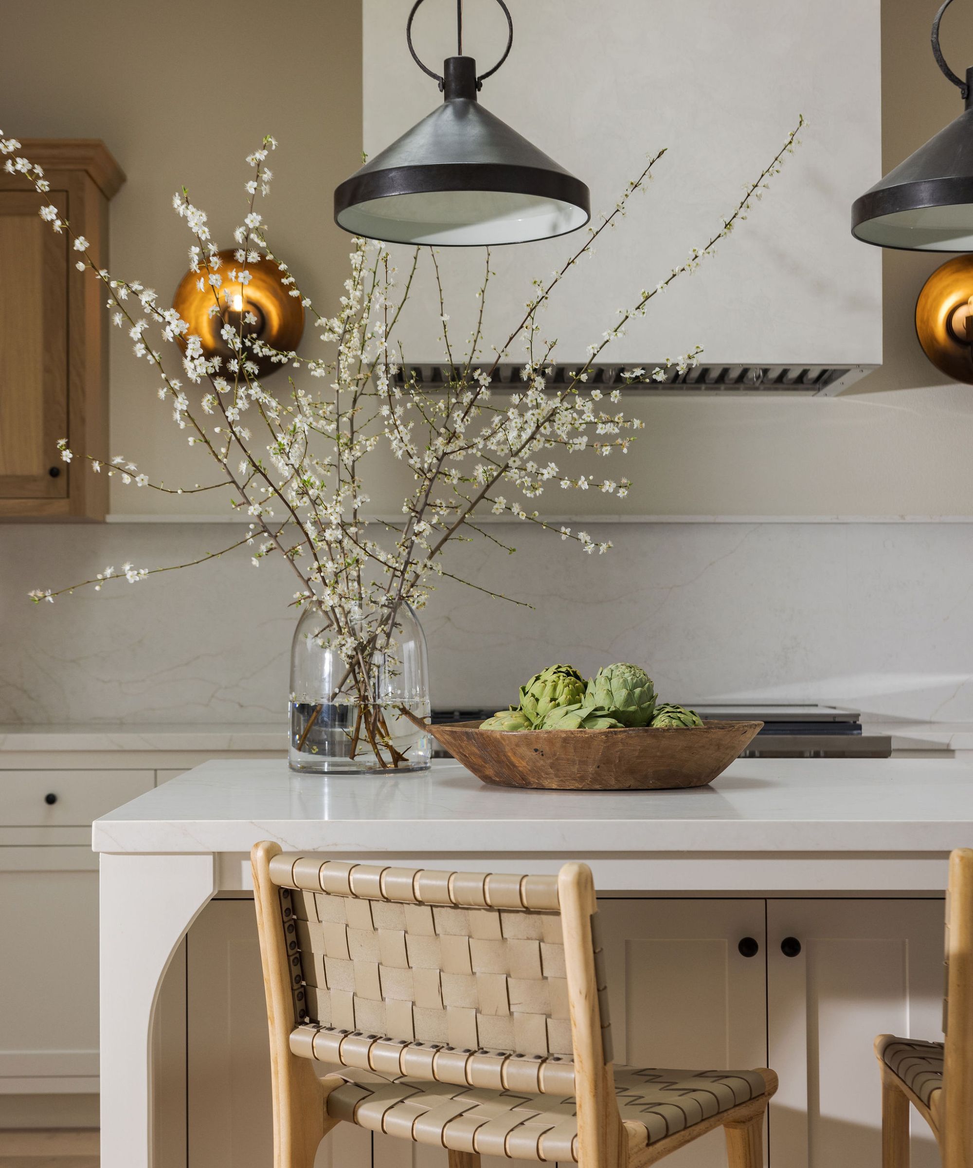
'You don’t need a busy backsplash to create interest if there are other elements that add layers and interest,' says interior designer Tama Bell. Instead of adding bold tiles or intricate patterns, look to ways you can add interest through texture and more subtle colors.
'In this Sea Ranch kitchen, we used plaster, oak, and painted cabinetry, as well as counters and splash in the same material, and different finishes in the lighting to add the quiet interest we were looking for,' she explains.
4. A microwave installed above the range
For many homeowners, integrated appliances are the go-to thanks to their sleek appearance and streamlined design, and while they have been long-championed, some kitchen appliances have been somewhat slow to catch up.
'I recommend avoiding over-the-range microwaves. They are not ideal from an accessibility standpoint and don’t offer much design flexibility. Modern kitchens benefit from more streamlined appliances,' says interior designer Aman Than.
'Instead of an over-the-range microwave, I suggest a built-in microwave. There are many options available for every budget and they work well with modern designs while being highly functional.'
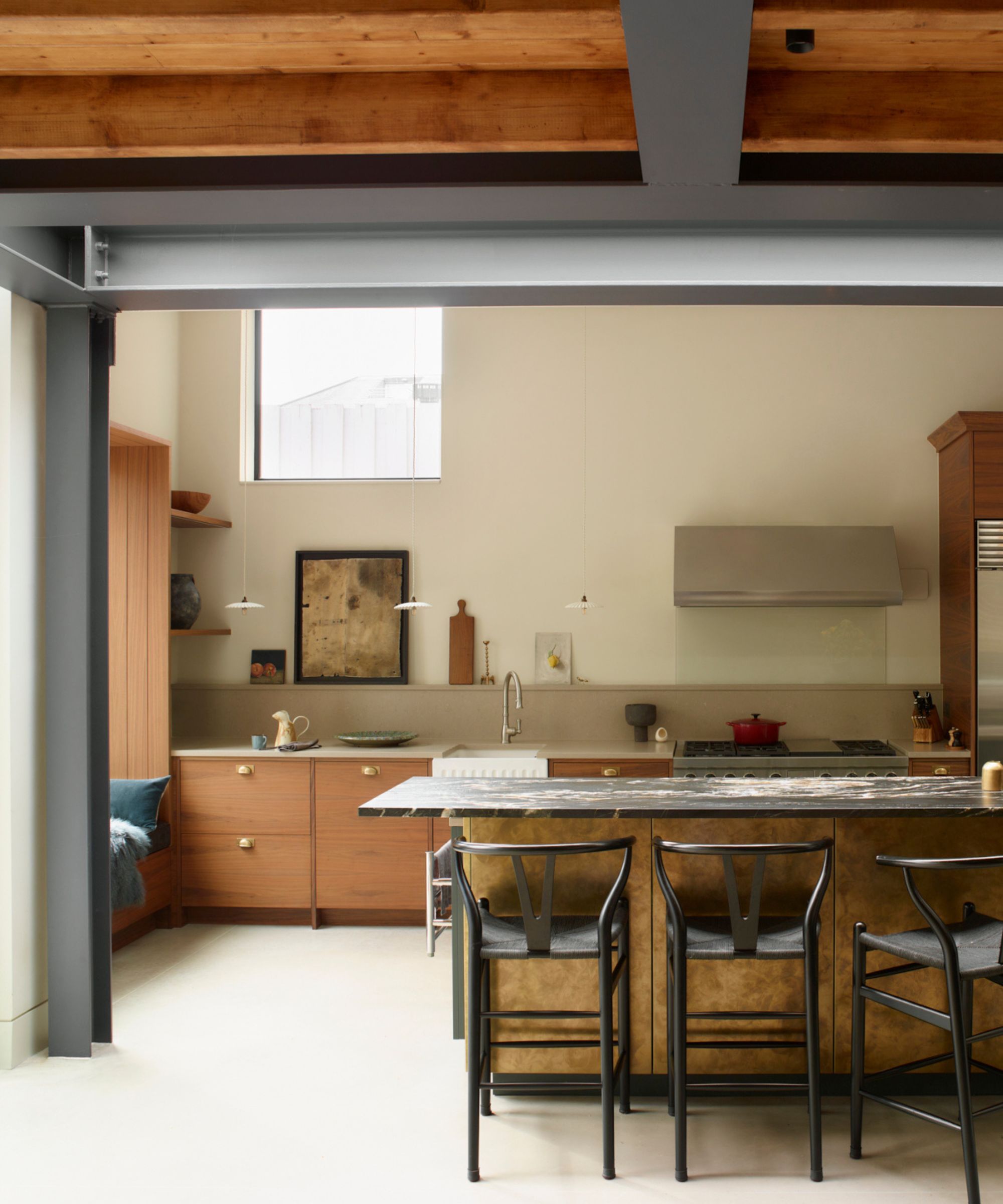
5. Open shelving
Storage is key in kitchens, especially in smaller spaces. So, ensuring you make smart decisions is fundamental to ensure your kitchen remains functional rather than simply looking great.
'Open kitchen shelving has been trending for a while and it looks great in photos. I find it to be impractical. Open shelves can easily become cluttered and our perfect spots for dust to collect,' says Aman.
While there are some instances where open shelving might be the practical solution (especially in cottage kitchens or spaces with sloped ceilings), there are better designs to introduce. 'Instead, I recommend closed cabinets. They provide a clean organized look and help keep your kitchen clutter-free.'
6. Cluttered countertops
As much as kitchen design is all about creating an aesthetic scheme, ensuring your space is functional is crucial. While the re-cluttering trend has been proving popular recently, the kitchen is perhaps not the place to practice it.
'The number one thing you don't need is clutter. In a kitchen, everything should have its place. There are great ways to organize cabinets and refrigerators so that you can work in your kitchen with ease. A well-designed kitchen is beautiful and practical,' says Alexis Elley, founder at Textures Interior Design.
Smart practical storage will help to keep clutter to a minimum. 'A few things I love to use are roll-out drawers (so you can reach the back of the shelf), larger drawers specifically for pots and pans, and beverage drawers in the fridge are essential for when space is tight.'
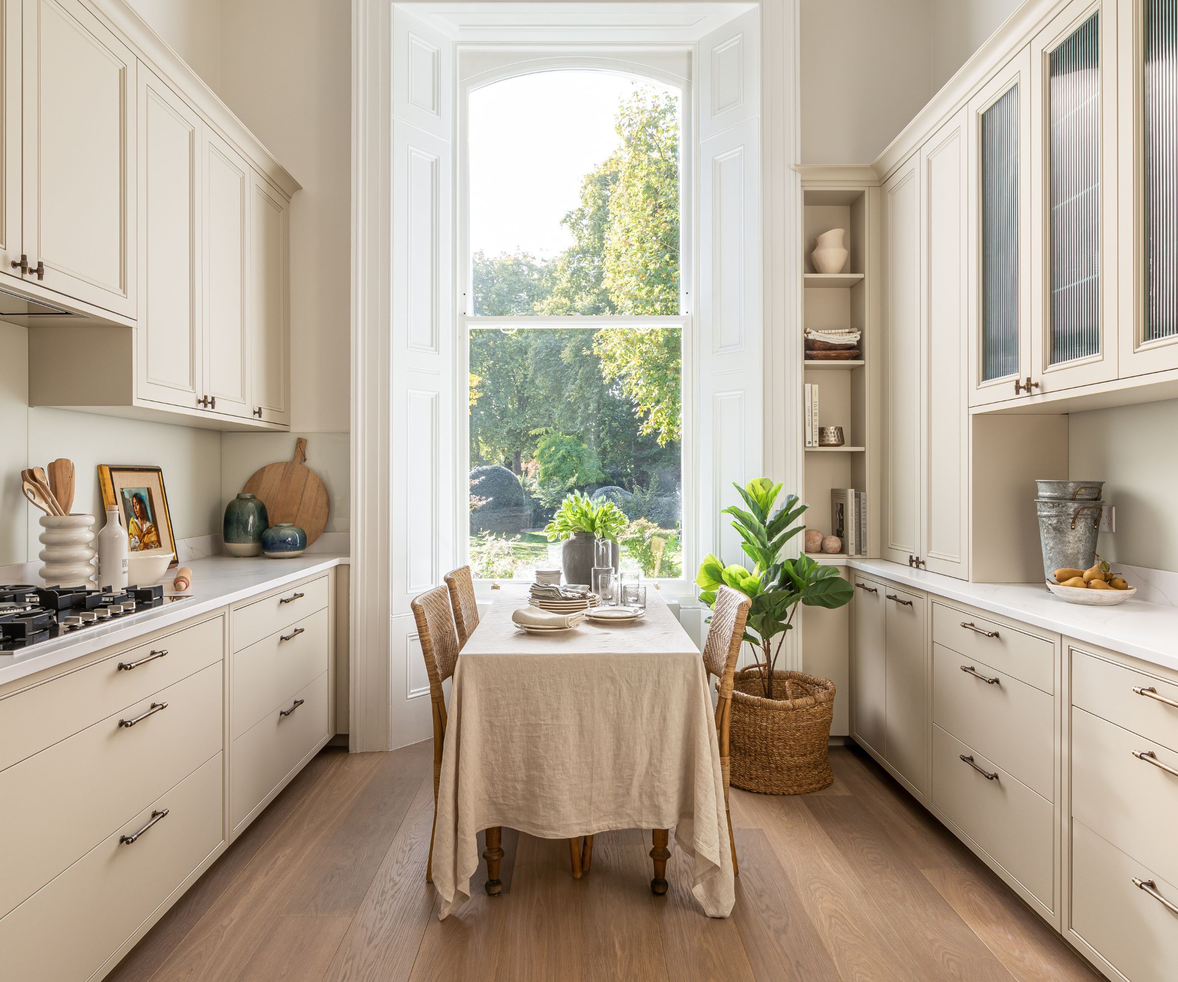
7. Too many wall cabinets
It can be tempting to pack your kitchen full of storage, especially if you're working with less space. However, too many bulky cupboards can negatively impact your scheme, making the space feel cramped and over-filled, which is why interior designers suggest you don't need quite so many wall cabinets.
'Contemporary kitchen designers are using fewer wall cupboards – aren't the easiest to use from a practical point of view, and they also tend to make a room feel more cluttered and small. Reducing the amount of full-height wall cupboards can help the room feel more open and calm, rather than closed in,' says Matt Payne, designer at Roundhouse Design.
To ensure you still have enough storage space while balancing a sense of openness, Matt suggests 'either slimmer top opening wall cupboards or open shelves where possible. It's not always possible to remove all wall cupboards entirely so just make sure to keep them only where necessary.'
How you design your kitchen is all about the space you have and your personal style. However, taking onboard these things interior designers say you don't need in your kitchen will ensure your scheme balances function and beauty.


