Interior design trends come and go fast, and their oscillations shape our tastes, too. Movements affect what we think of as beautiful and desirable, the looks that are out of fashion become almost ugly.
In my twenty years as an interiors editor I've seen looks come and go – sometimes more than once – and the trends that are currently in style have all, at one point, been shied away from.
But now designers are subverting these dated interior design trends to make them beautiful, looking at them through fresh eyes and using them to answer the new ways in which we now live. All of these rooms below are exceedingly beautiful, and highlight how that which was once considered 'ugly' can – in the right hands – become super chic.
1. Asymmetric furniture
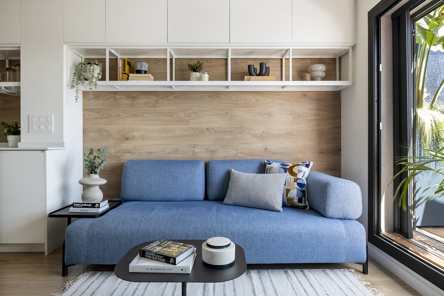
For years, symmetry reined in design. A classic approach, it felt ordered, and considered, it was shorthand for beauty. Anything less regular just seemed odd – even ugly – in contrast. But modern design has changed all that, and asymmetric furniture is increasingly seen at even the most luxe Italian design houses.
It brings a more relaxed sense. 'When you bring in this style, it’s like telling your space to loosen up and chill,' says Luis Peixoto, co-founding partner of Brakara Studio, who created this scheme, above. 'The whole vibe changes to something super relaxed and casual, where you can kick back and feel right at home. It’s all about breaking free from stuffy, old-school design rules and making your space totally unique.'
2. Beige walls
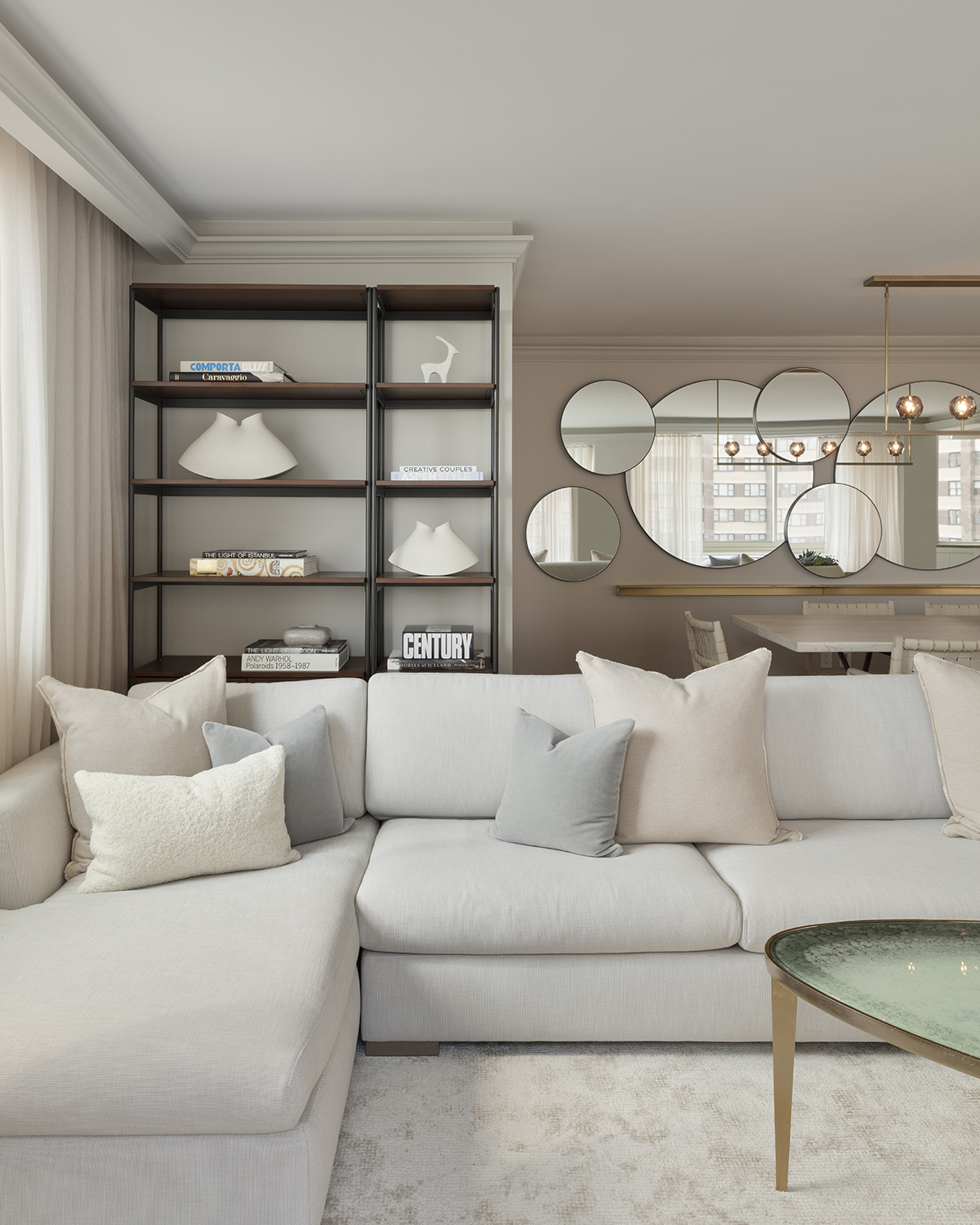
A very modern example of how cyclical color trends are. Beige walls were the preserve of the 1990s, then were seen as outdated, outmoded and even ugly by the time of deep color saturation approach in the mid-2000s.
But beige is back, more nuanced and beautiful than ever before. 'Selecting paint is as much an art as it is a science,' says Paul de Andrade, president of the New York-based Studio Kestrel, who created this beige room above. 'Back in the 90s and early 2000s, people just threw around the term beige and didn't realize how many different shades there could be.'
'Back then popular trends gravitated towards muddier, brown-heavy, and yellowish hues that felt very sallow and sepia-tone. Nowadays, savvy designers understand that cleaner hues with more creamy undertones and subtle grays imbue a space with a cleaner and more sophisticated feel. And since the paint color of your walls reflects both the natural light and electrified light in your space, this also tends to create more clean and elegant lighting in the room throughout the day.'
3. Ceilings without lights
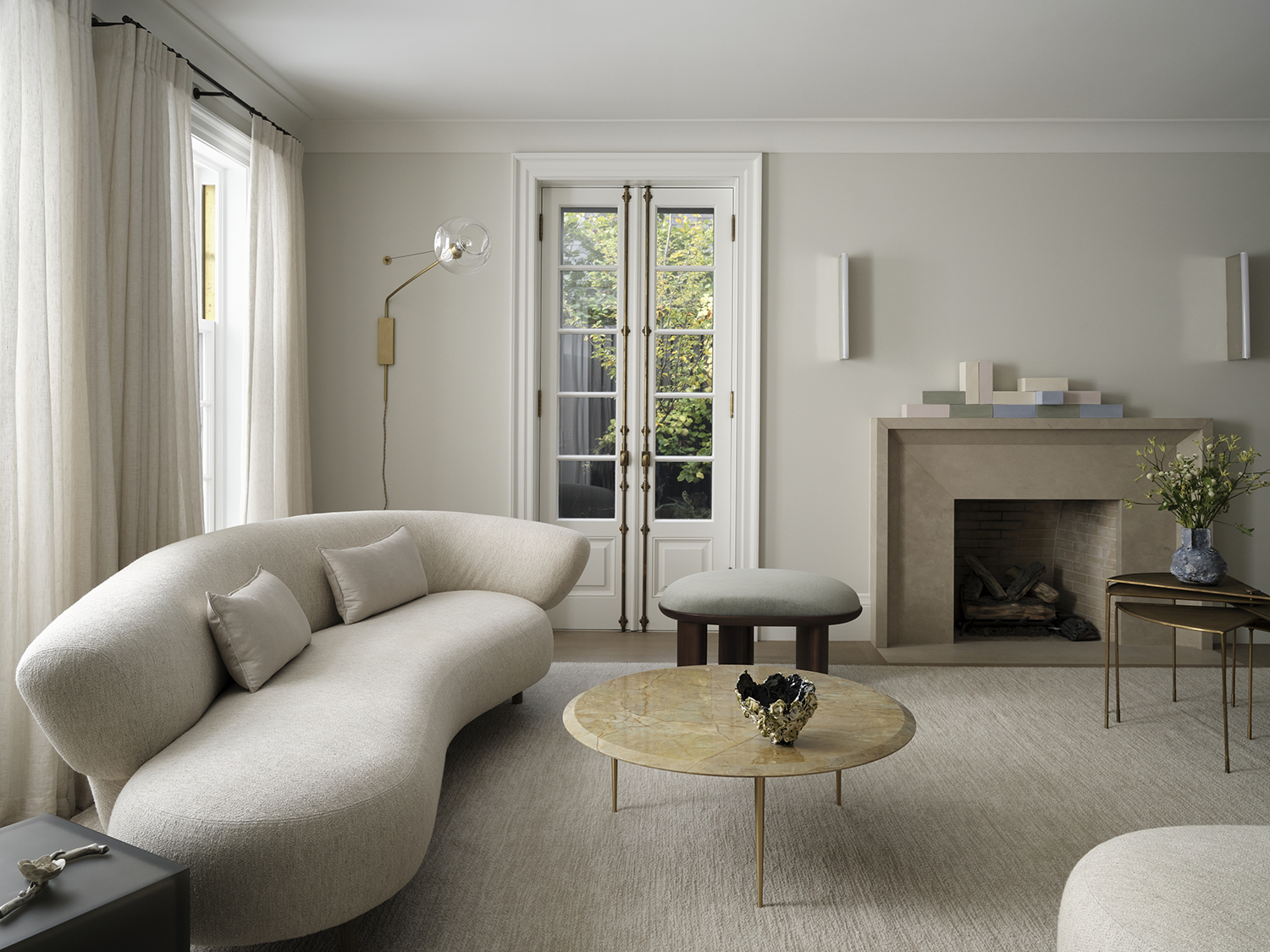
No room ever felt finished without a big central pendant light – it would have been unheard of not to have one hanging above everything. A blank ceiling just felt, well, vast and flat and ugly.
But then designers realized that people rarely turned their big light on, and found new ways to work with a ceiling that wasn't adorned with bold lighting ideas, enhancing their empty serenity.
'There is such a calm and refined beauty to a clean, unadorned ceiling,' says the designer Ashley Botten, who left this ceiling blank. 'In lieu of lighting above, think of having sculptural wall sconces, table and floor lamps. Lighting placed around you can provide that perfect glow; a mysterious and romantic mood, or curated to be purposeful for a specific task. Keep the lights above for the stars.'
4. Dark woods
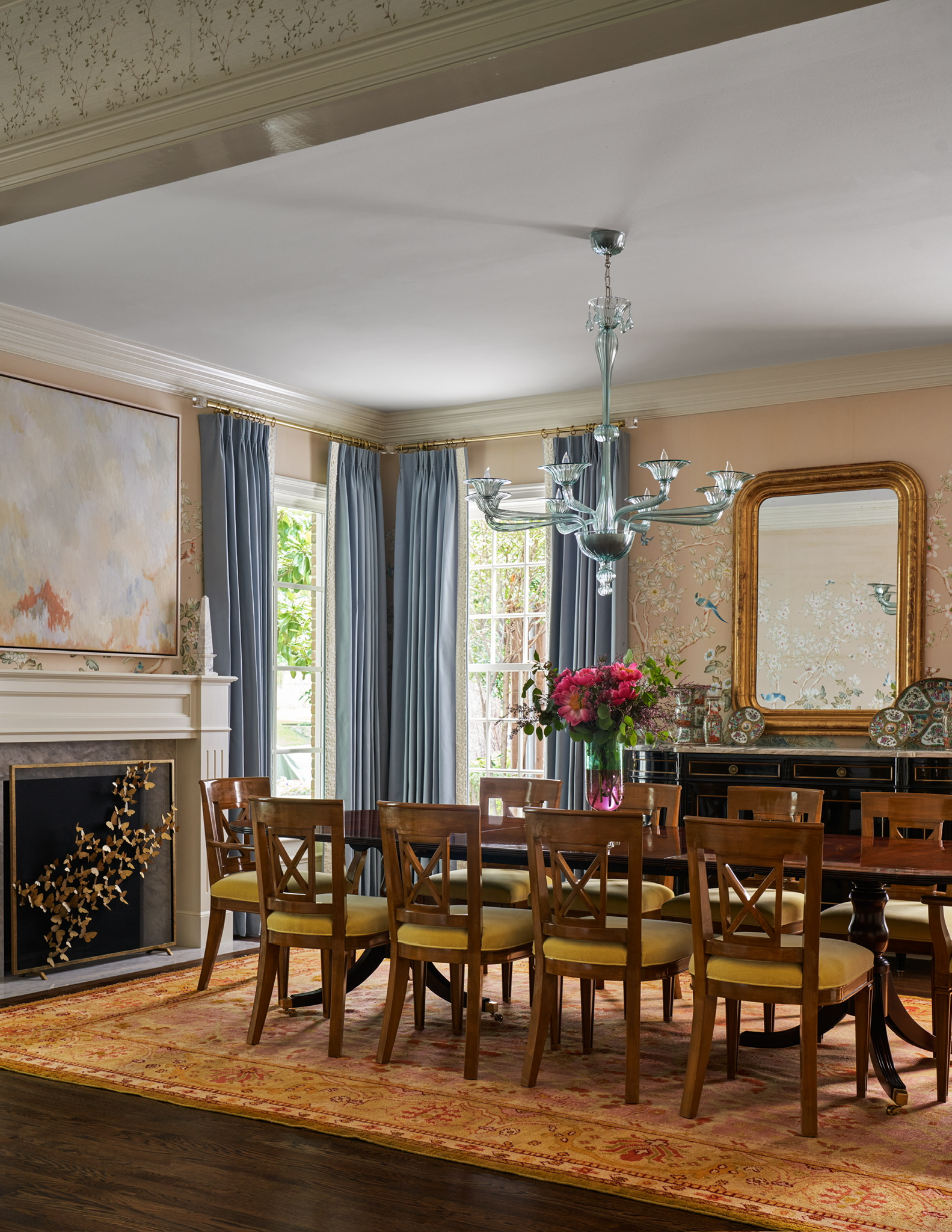
The Scandi trend that has dominated for years has seen the design crowd flock to blonde woods. Pared back, bleached out, they felt modern and fresh, with darker woods reading as old fashioned, out of style. But with the rise in interest in decorating with antiques to create characterful schemes, inevitably darker woods are starting to be seen as appealing again.
'We appreciate the value of mixing different wood colors to create interest as well as the feeling of a room being curated with interesting pieces,' says Amy Smith Atkins, founder of Amy's Interiors in Dallas, Texas. She created this beguiling scheme above, showing how darker woods can, in the right space, read warm instead of heavy. 'The mix of antiques creates the same experience so we are trying to recreate it with custom chairs and antique sideboard.'
5. Tiled floors in living areas
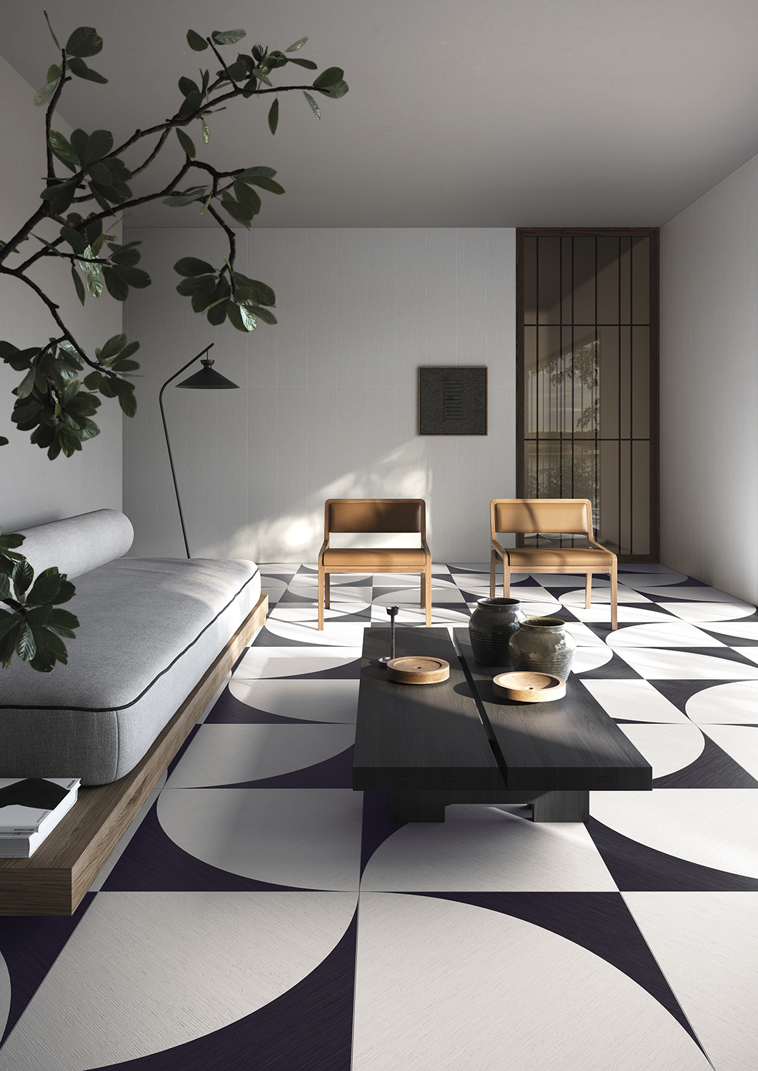
For years, all anyone wanted in living areas was carpet. Then it was bare wood floors. Then it was large area rugs. But tiles were never desired for living rooms, seen as too shiny, too cold, the gridlines between them too ugly.
But new designs have changed all that, with large graphic tiles becoming works of art in their own right. 'The tradition of Japanese domestic interiors has always featured a marked graphic quality,' says Rino Bedogni of Ceramiche Refin, the brand behind these tiles. 'A surface is made even more vibrant by the arrangement of [strong patterns like this], which truly becomes a space-identifying element.'
6. Black kitchen worktops
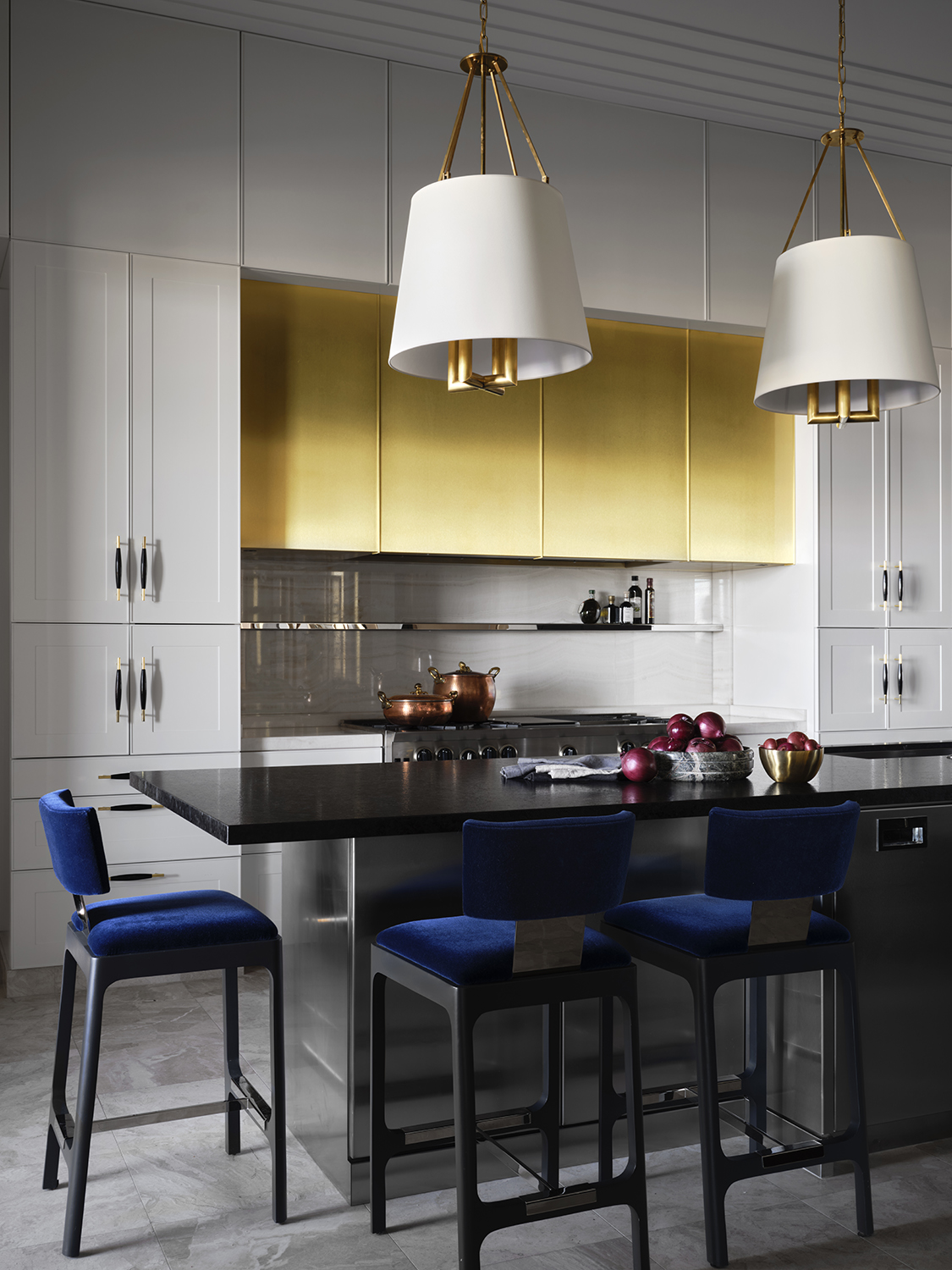
The Instagram age changed home decor beyond recognition. Suddenly, we all needed light surfaces on which to photograph our food, and marble became the most sought-after stone. Shiny black kitchen countertops that weren't so appealing as Insta backdrops, fell out of favor.
But now the drama they bring is sought after again, the sense of pure luxury and sophistication. 'Combining a light kitchen with a dark island creates a striking visual contrast that not only defines the space but also enhances the sense of depth and dimension,' says the interior designer Daniel Joseph Chenin, who worked on this kitchen, above. 'This interplay of light and dark elements brings a layer of sophistication and a dynamic balance to the room, making it feel both expansive and inviting.'
7. Dark ceilings
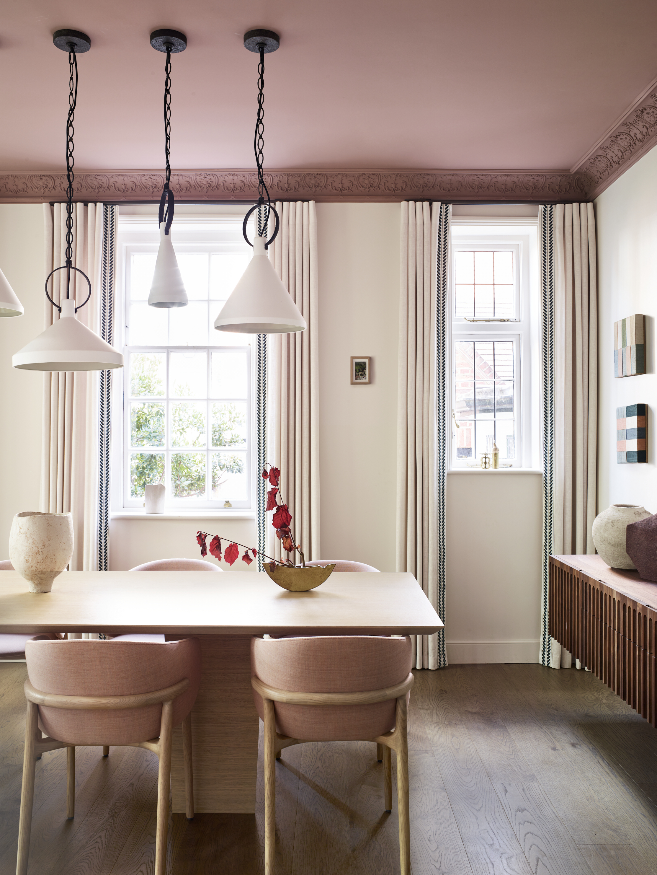
It's been years that white has been the go-to color for ceilings, with conventional wisdom suggesting that it opens up the space and allows the light in more. But dark ceilings are being turned to be designers who might once have avoided them for fear of rooms reading as cramped.
'Sometimes I want to make the ceiling seem lower,' says the interior designer Irene Gunter who decorated this incredible dining room with its deep, pink ceiling. 'That’s not a bad thing when you’re looking to foster intimacy in a space like a dining room, where you want people to draw together.'
Really, there's no such thing as 'ugly' interiors, each to their own and all that. But in 2024 we are definitely seeing a return to many looks we once may have considered dated. This year has been the year of the anti-trend, looking to the past for classic looks rather than focusing on the very short-lived micro-trends of the present and all of these comeback styles lean into that.


