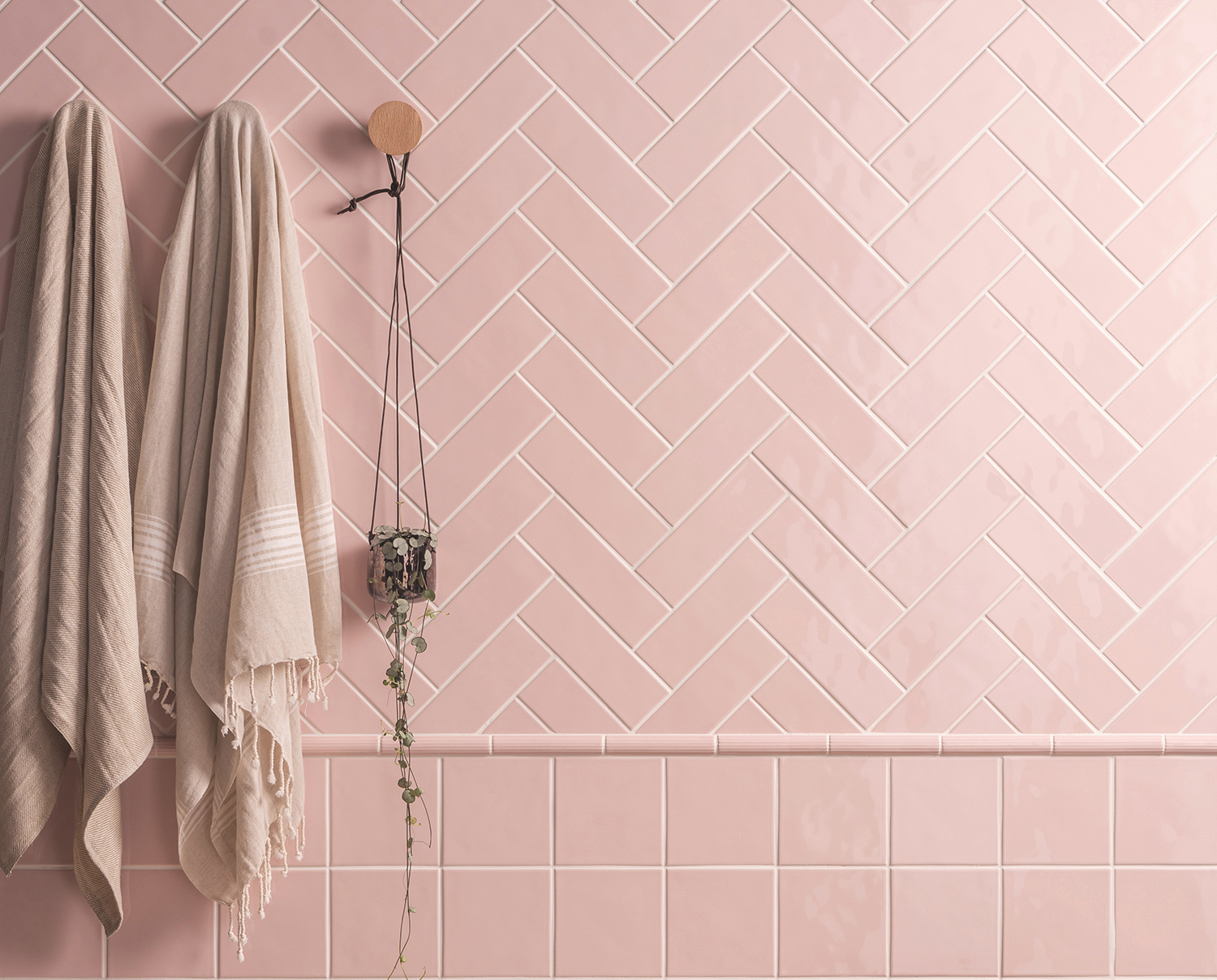
The humble brick tile is a design classic, but did you know there are a host of interesting layouts for basic subway tiles that can add a contemporary update to your bathroon and kitchen ideas?
The subway tile first found popularity after it was used throughout the subways of New York in the early 1900s. It quickly became a sought-after, popular choice in pre-war homes thanks to its simple aesthetic, easy-clean properties and affordability.
'Tastes have evolved over the years, but the popularity of subway tiles remains, spurred on by the plethora of colors and finishes that have revitalized this classic style,' says Hannah Guilbert, Product Marketing Manager at Original Style. 'Depending on the tile you choose, these tiles can look equally at home in modern kitchens, bathrooms and hallways in traditional and contemporary homes.
'Not only are there an incredible number of subway tiles to choose from, once you have made your selection you’ll then need to decide how you want them to be installed. Whilst the traditional way to install bricks is in a standard offset pattern, there’s an increasing trend for laying them in a grid-like pattern, herringbone and other visually compelling patterns.
'Playing with angles and patterns is a brilliant way to add interest and a new dimension to your bathroom tile ideas. Even the simplest of schemes will stand out with these interesting layouts for subway tiles.'
Interesting layouts for basic subway tiles
'The classic running bond is extremely versatile as a quiet and often neutral backdrop, but when you want the tile to help transform a space, investing time in other layout patterns and arrangements that work with the elements in the room can really increase the cohesiveness of the total design,' says Mindy O'Connor, Principal of Melinda Kelson O'Connor Architecture & Interiors.
See how you can shake up your subway tile game below...
1. Stacked horizontal
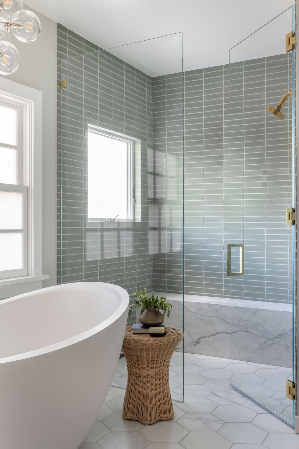
The stacked horizontal layout, also known as the horizontal stacked bond and demonstrated beautifully in the bathroom by Banner Day Interiors (above), is a modern take on the classic horizontal running bond.
It can be used to bring a fresh look to a shower room, kitchen backsplash or bathroom.
Sarah Rosenhaus, Principal and Owner of Sarah Rosenhaus Interior Design, says: 'Subway tile is such a classic and using them in non-traditional ways is an affordable way to make a statement.
'To get a more modern look from subway tiles, I love the gridded look when they are stacked. If you are feeling bold, add a light grey grout to give it some pop and if you are feeling really bold, use a tile and grout color combination like terracotta or a warm brown.'
Just as a vertical stacked bond can make a room feel taller, a horizontal stack layout is a great small bathroom tile idea as it can work to make the room feel wider.
Sarah confirms: 'Running tile vertically will add height to the room, while a horizontal pattern will open the room.'
2. Stacked vertical
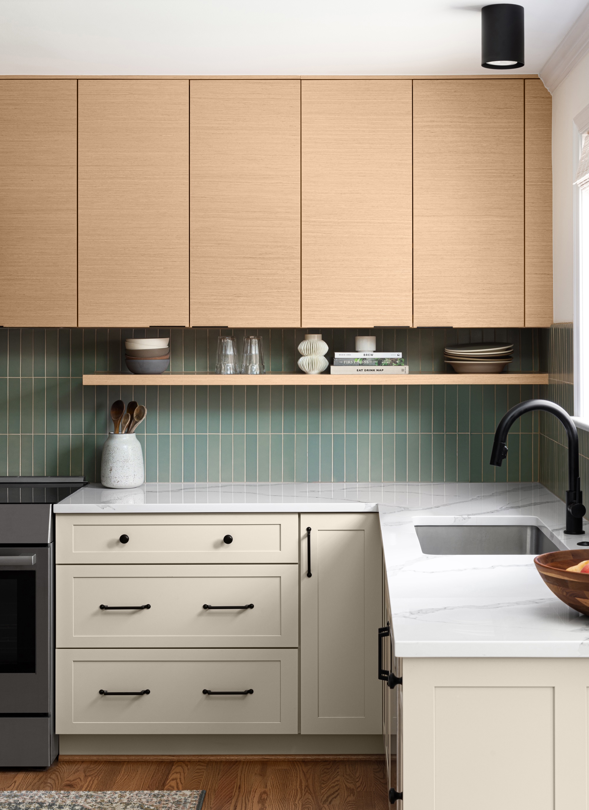
Stacking subway tiles vertically on top and beside each other is a good way to elongate a space as well as add visual interest.
This kitchen by Erika Jayne Design + Build above began with, and was centered around, the tile.

Erika Chaudhuri, Principal of Erika Jayne Design + Build, says: 'The project had two goals: honor the mid-century style of the home and feature handmade tile by Heath Ceramics.
'We selected a matte finish Ogawa Green (a subtle blue-green) in 2"x9" tiles. Slightly narrower and longer than a traditional 3x6 subway tile, the elongated shape provides a more modern look.
'Stacking tiles (rather than staggering them in a brick pattern) provides a clean, contemporary look while drawing the eye upward to give the illusion of more height. The result is a purely mid-century vibe.'
3. Vertical brick bond
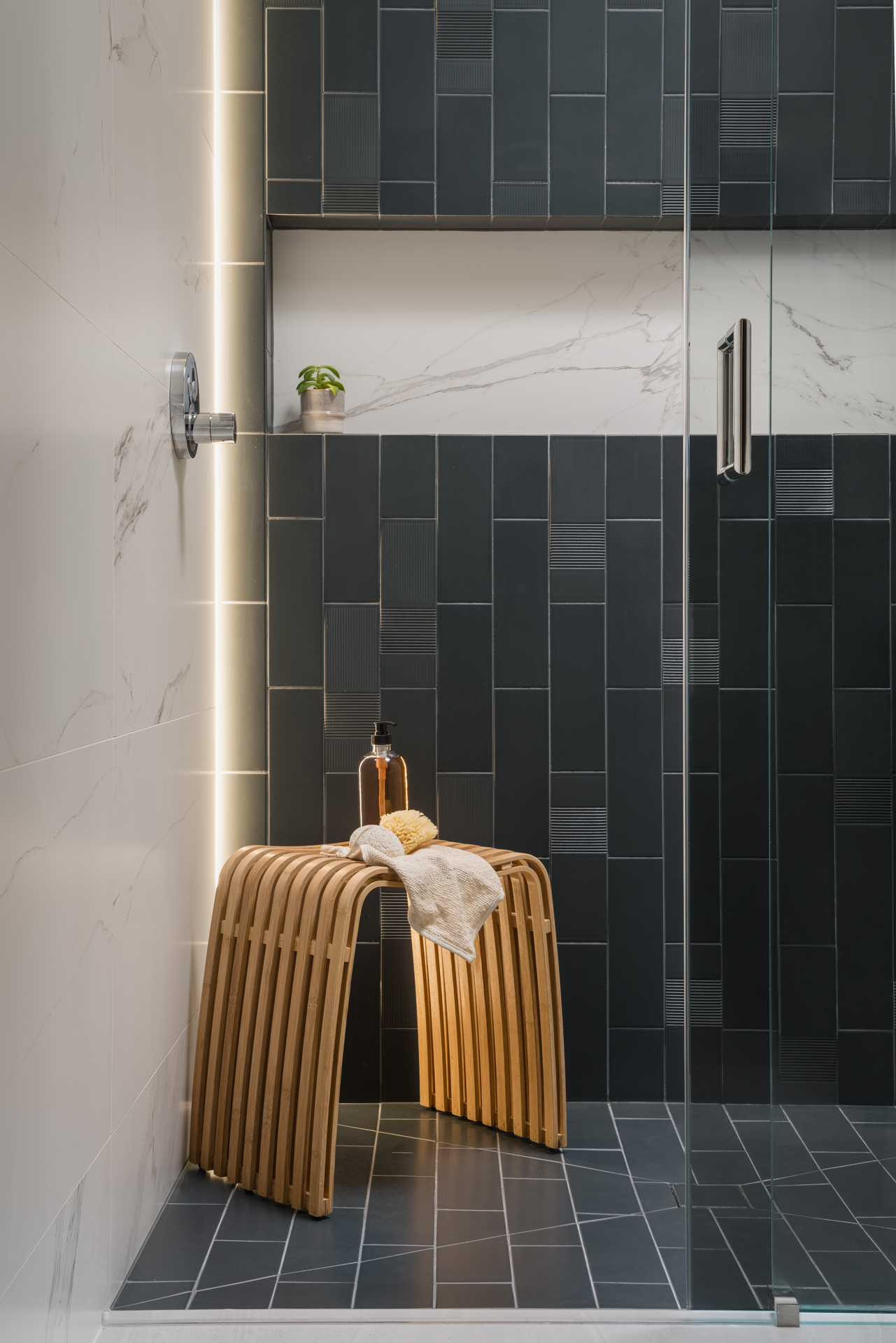
The vertical brick bond (also known as vertical running bond) is basically the classic subway tile layout turned 90 degrees.
'Often in a low ceiling situation we take advantage of the rectangular shape of the subway tile and lay it in a vertical running or stacked bond,' says Anna Popov, Principal and Founder at Ineriors by Popov. 'This allows us to emphasize the vertical line in the room. Emphasizing the vertical line in a room with a low ceiling creates a visual effect of elevating the ceiling and elongating the walls. The effect is subtle yet prominent.'
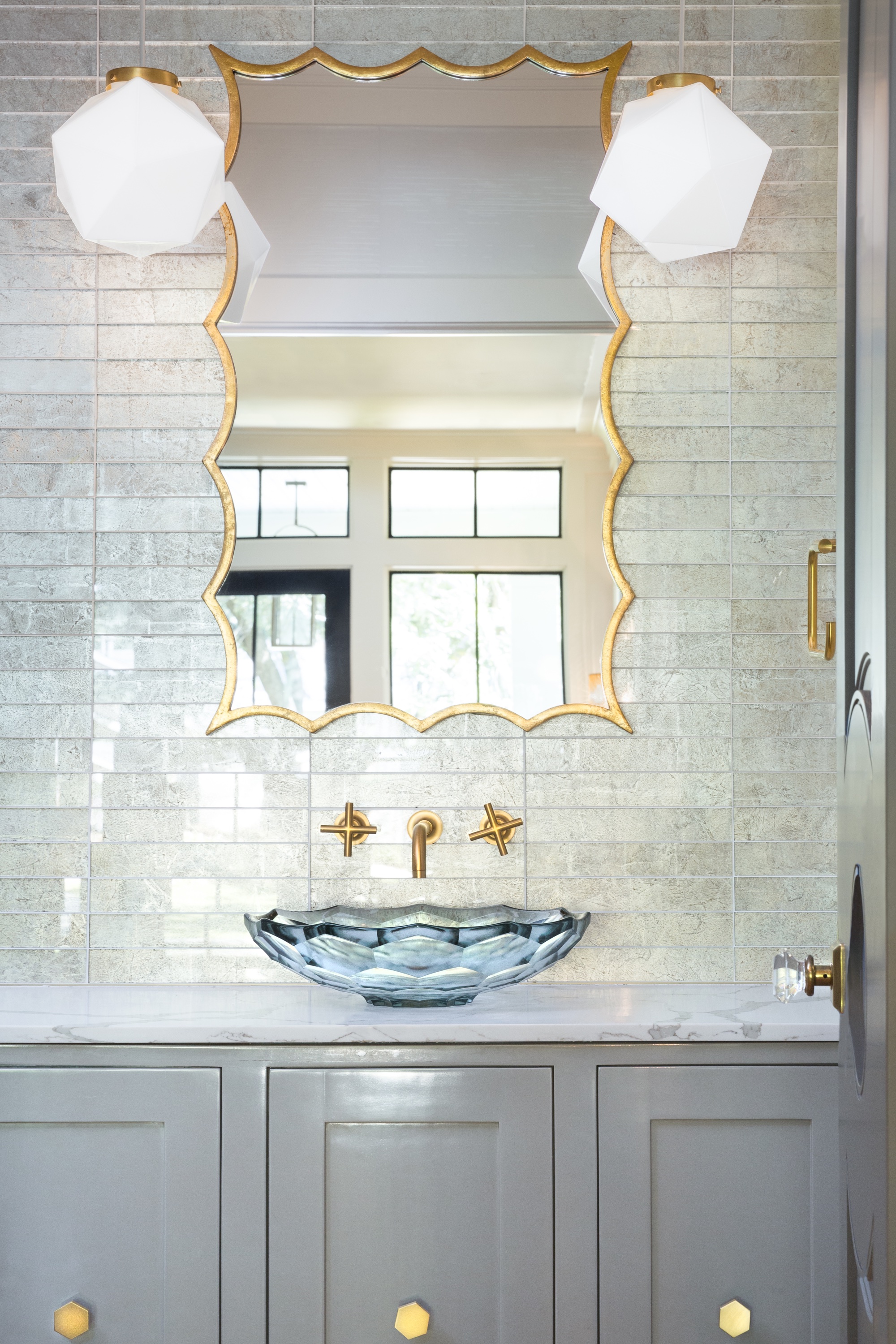
Speaking about the design above, Anna says: 'Some of the modern subway tile collections come in a variety of textures allowing designers to come up with some very creative ideas.
'We laid vertical bonds of textured tile in the bathroom above, and played with some LED lights to further emphasize the texture and the vertical brick bond pattern.'
Sarah Rosenhaus is also a fan of this layout, adding: 'A modern subway tile layout look I love is the offset stack. This gives you the movement of a traditional running bond with the modern feel of the stack.'
4. Herringbone
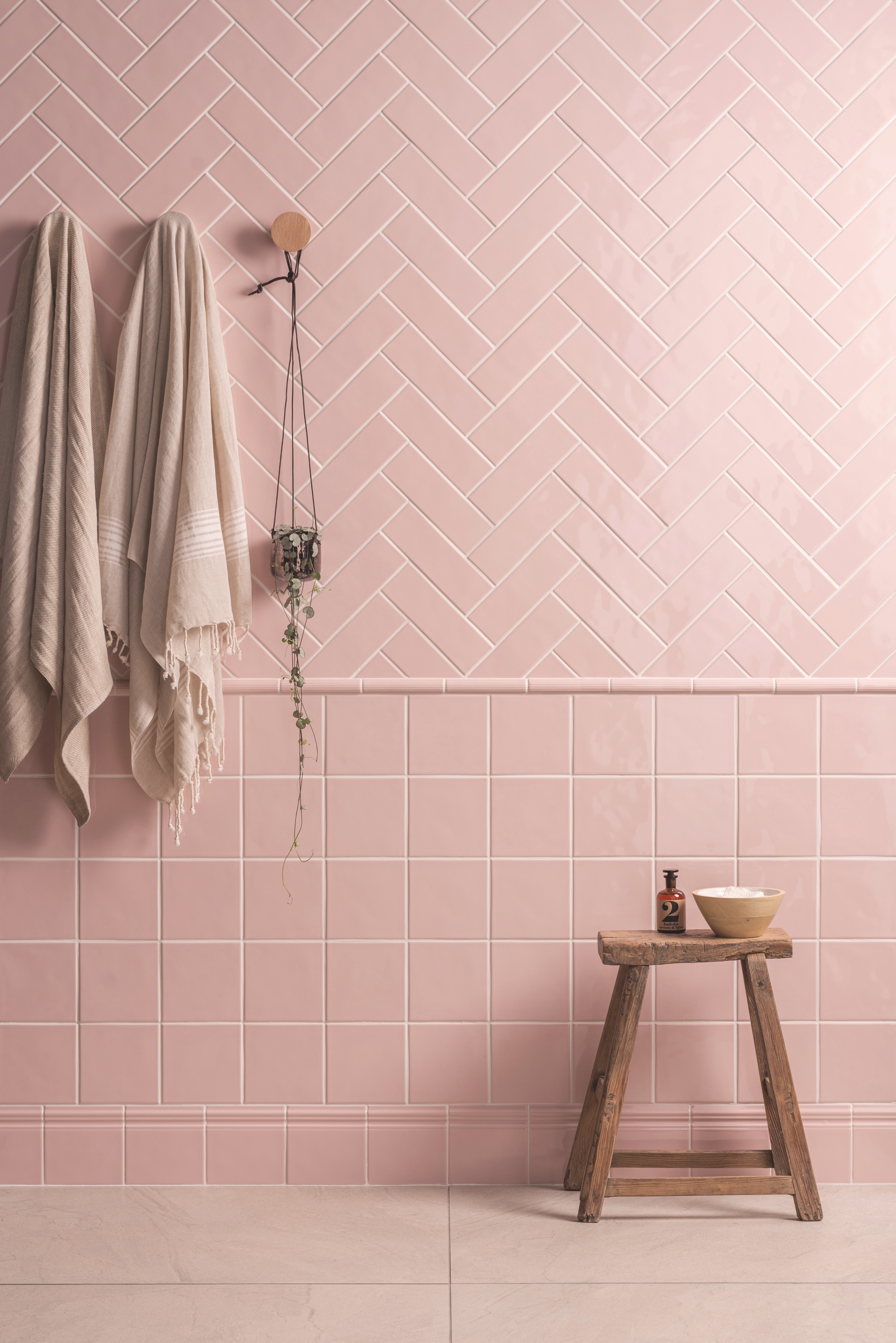
Herringbone is a classic design that dates all the way back to the Roman Empire, when it was used to build roads. It became particularly popular in interior design during the Art Deco period, and can be used on flooring, backsplashes, half walls or full walls for a timeless, elegant effect.
'This style of tiling is becoming increasingly popular and works well with both half tiles and brick style tiles,' says Hannah Guilbert. 'While this layout may look complex, it can be easily achieved when prepared and planned correctly.'
Hannah adds: 'Providing a simple yet beautiful visual interest, this subway tile layout can make a space appear bigger that it is - try tiling from the floor to the ceiling to help draw the eye along the length of the room.'
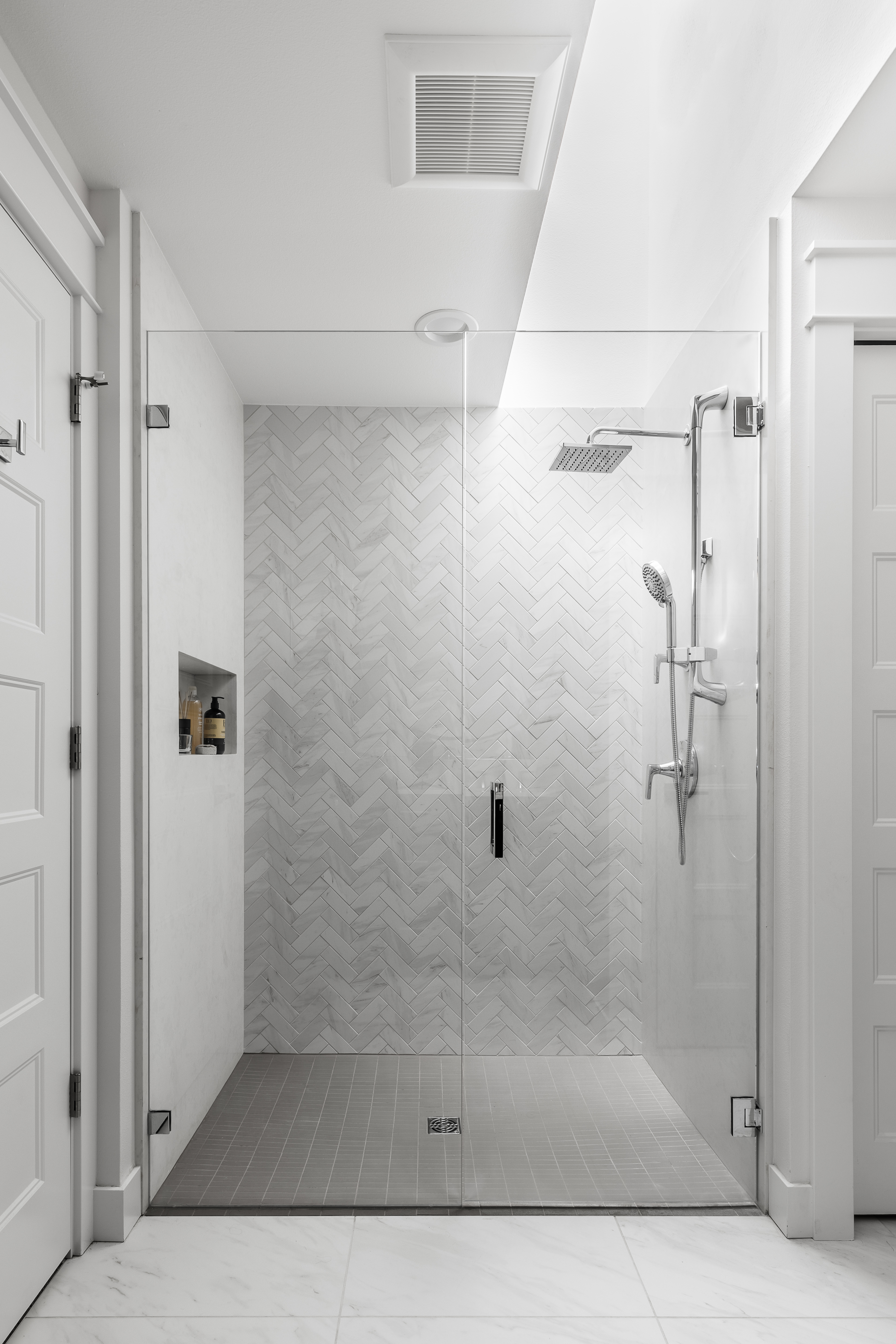
And Anna Popov loves to use a herringbone pattern in her design projects.
She says: 'A beautiful diagonal pattern can be achieved with a classic rectangular subway tile.
'Our three favorite patterns are herringbone, double herringbone, or a chevron pattern. With these three layouts there is a myriad of appearances and design solutions that can be achieved.
'Using contrasting grout will emphasize the pattern, making the wall very dynamic and prominent. While using a matching grout would achieve a very soft, subtle result.
'This is what we did in the above bathroom. We used a very soft-looking natural marble tile and laid it in a herringbone pattern with a matching grout for a seamless finish.'
5. Straight herringbone
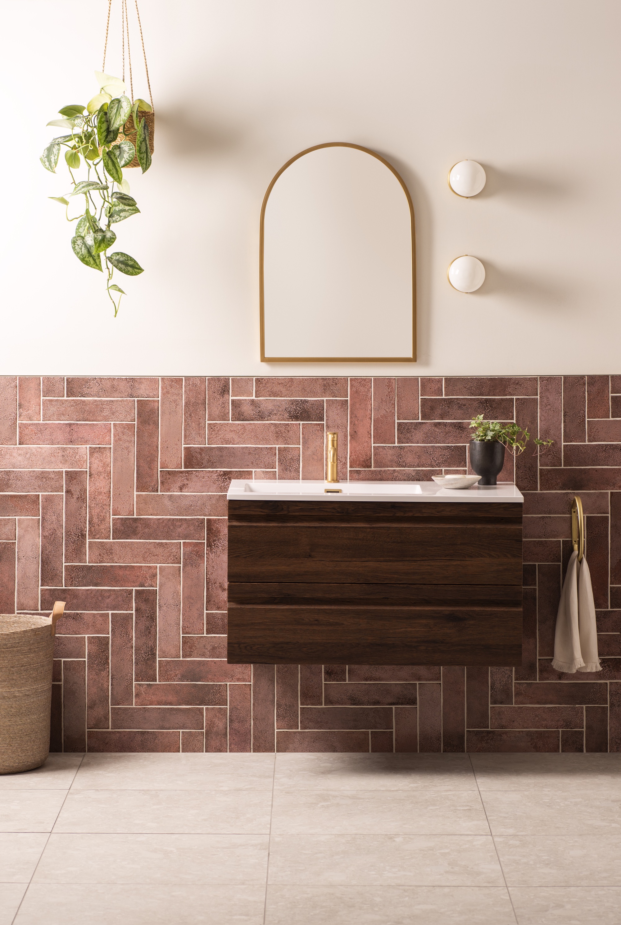
The straight herringbone, also known as the step ladder, is a more modern take on the traditional herringbone pattern.
Original Style's Hannah Guilbert says: 'This take on the herringbone pattern has a more contemporary vibe with the tiles laid at a 90 degree angle instead of 45 degrees, creating a sharper edge.
'This layout can enhance the size of a smaller room, but laying tiles in this way also adds a visual impact, even if only used as a small splashback.'
And, if you want to push the design statement further, opt for a 90 degree herringoe layout.
'A vertical 90-degree herringbone can be a fresh take on the ever-classic and widely used 45-degree herringbone,' says Mindy O'Connor.
'This turns the whole pattern from the more traditional 45-degree angle on its side to an upright position with straight lines resulting in fewer cuts across the tile. This can work well in spaces with a lot of visible walls like larger showers.'
6. Double herringbone

If you love the herringbone layout but want something even more unique, make a design statement with a double herringbone pattern instead.
'For a more dramatic herringbone layout, place two tiles next to each other to create a double layer of tiles, and tile in the same way as you would a herringbone,' says Hannah Guilbert.
7. Basket weave
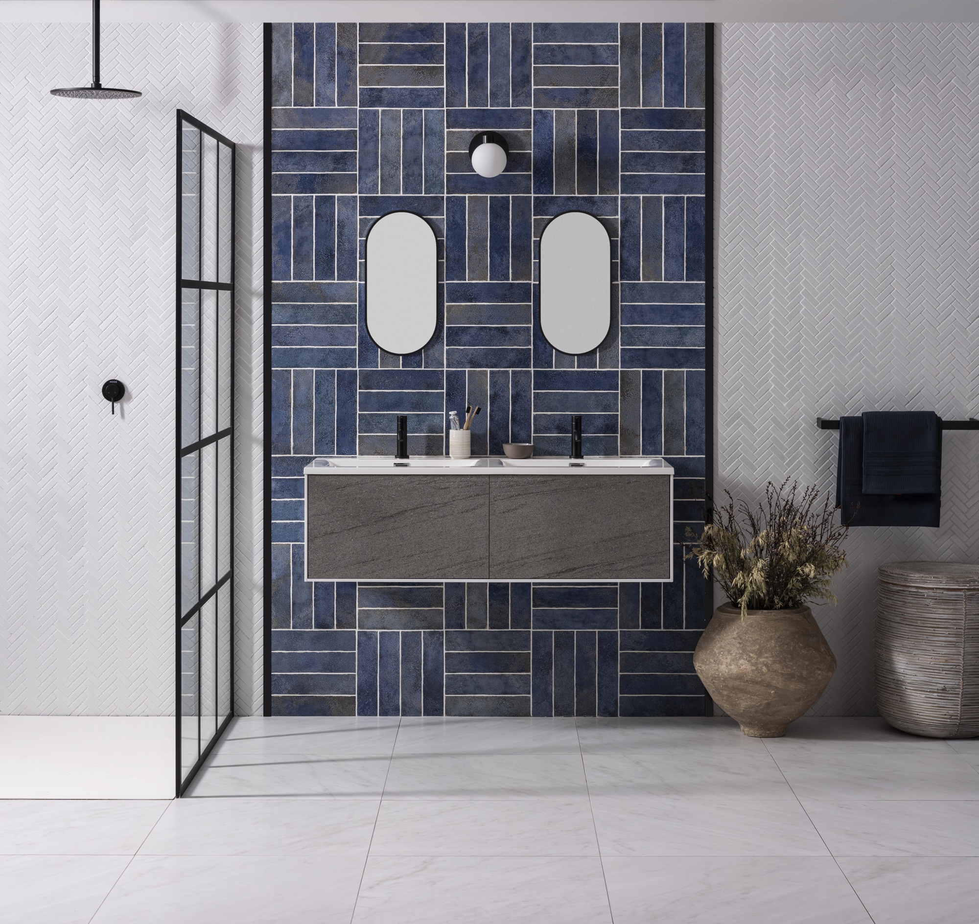
This basket weave is a classic pattern made up of rectangles and squares to create a woven basket effect, but you can also create a similar, more modern look with brick tiles.
'Creating this look is easier than you think,' says Hannah Guilbert. 'stack four to five tiles to create a large square (the square needs to be as wide as it is tall and will be dependent on the size of the brick tile and grout gaps), then alternate the block of tiles 90 degrees each time.'
How can I make my subway tile more interesting?
There are myriad ways to make your subway tile more interesting, including changing the tile layout from classic to stacked, herringbone or basket weave, among others.
'Subway tile is a classic and classics are classic for a reason,' says Sarah Rosenhaus. There are a number of super affordable options that makes it accessible and there are so many creative ways you can install it to make it feel more personal. Subway tiles are also wonderful tiles that work with a variety of different styles, allowing for other elements to be the star of the show without sacrificing style.'
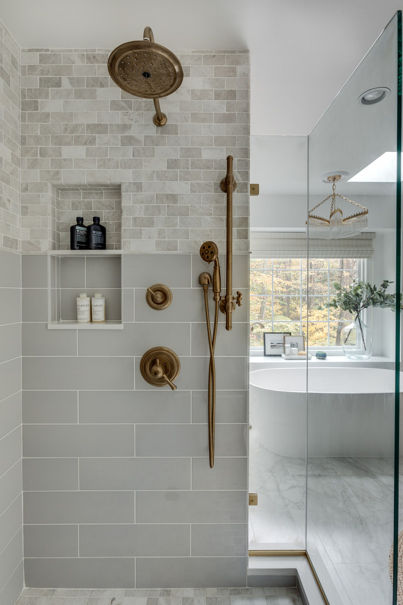
There's also a number of design tricks you can use to add interest to a classic subway tile layout, including mixing different sized subway tiles on the lower and upper wall.
'To mix multiple subway tiles within a space, focus on allowing a common thread to run through all materials,' says Erika Chaudhuri. 'In the image above, the warm grey tone of the large format subways is present in the smaller marble tiles. Despite the size and material difference, the tiles are installed in the same format (a traditional brick bond). This provides an additional sense of consistency.
'The two tiles are as alike (shape, color palette, installation format) as they are different (size, material, proportion). This subtle tension of similarities and differences is what creates a successful mix of tile.'
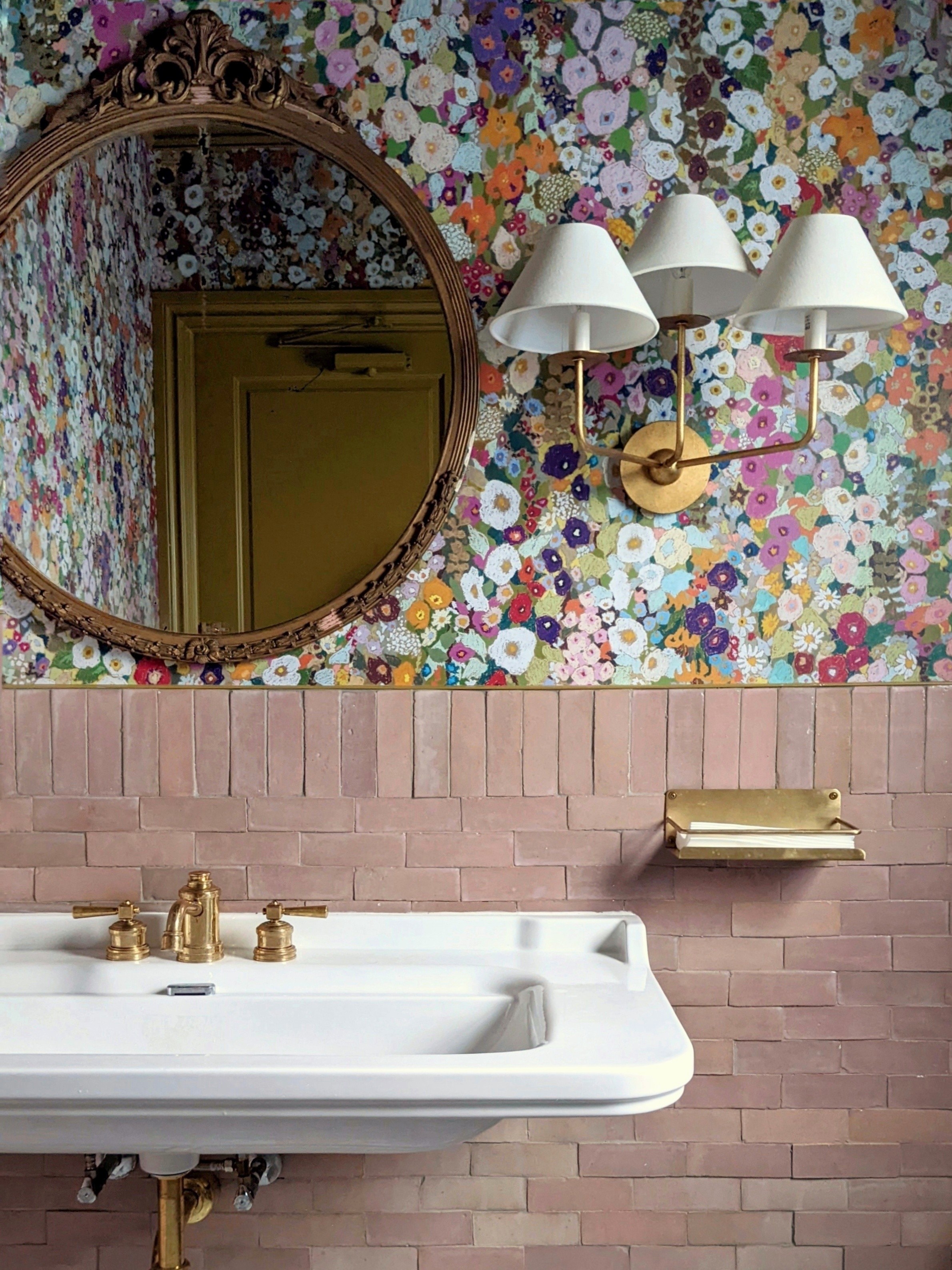
If you're a fan of maximalism in interior design, don't be afraid to pep up your subway tiles with a bold statement wallpaper, like in the beautiful bathroom by Crystal Sinclair Designs above.
Extra interest is added to the look with a vertical tile border between the brick bond layout and the wallpaper for a clever finish.
Another way to make your subway tile more interesting is to play with grout colors to create a seamless or bold look.
Original Style's Hannah Guilbert explains: 'To add further detail, you can experiment with grout colors. Matching the grout to the color of the tile will help to create a seamless feel. A contrasting grout color, meanwhile, will draw the eye to the shape of the tile and the pattern layout (as seen below).

What is the most popular subway tile layout?
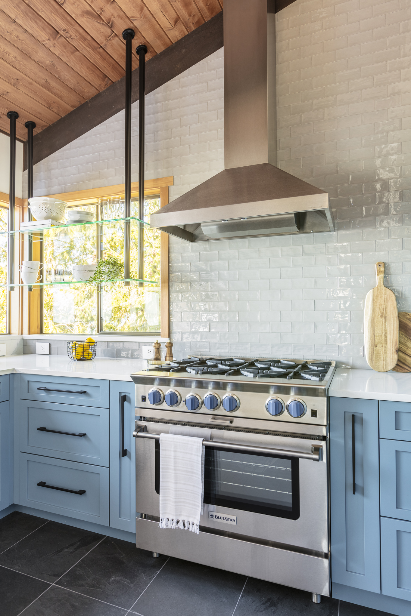
The most popular subway tile layout is the classic horizontal brick bond, also known as the horizontal running bond.
It's an enduring layout that offers a timeless, elegant aesthetic and pairs well with other decor styles thanks to its simplicity.
'Also known as the classic brick bond, this popular layout see’s tiles laid in a 50:50 stack style to create the traditional brick layout,' says Hannah Guilbert. 'Using an oversized brick or even a large format 23" by 12" tile is a great way to add a fresh twist to a classic style.
'Using large format tiles will also help to minimize the visual impact of grout, and gives the tiles a more seamless appearance.'
Anna Popov designed the elegant kitchen above, and says: 'A prime example of a classic application called brick or running bond was used in this kitchen backsplash.
'The handmade beautiful subway tile has an uneven surface which creates a textured appearance, adding interest to an otherwise very classic choice.'
What is the easiest subway tile pattern to install?
'The stack bond pattern is one of the easiest tile patterns to install,' says Hannah Guilbert. 'The tiles are aligned to form a basic repeating grid. The overall aesthetic is a clean, modern look that will bring any kitchen or bathroom up to date.'
