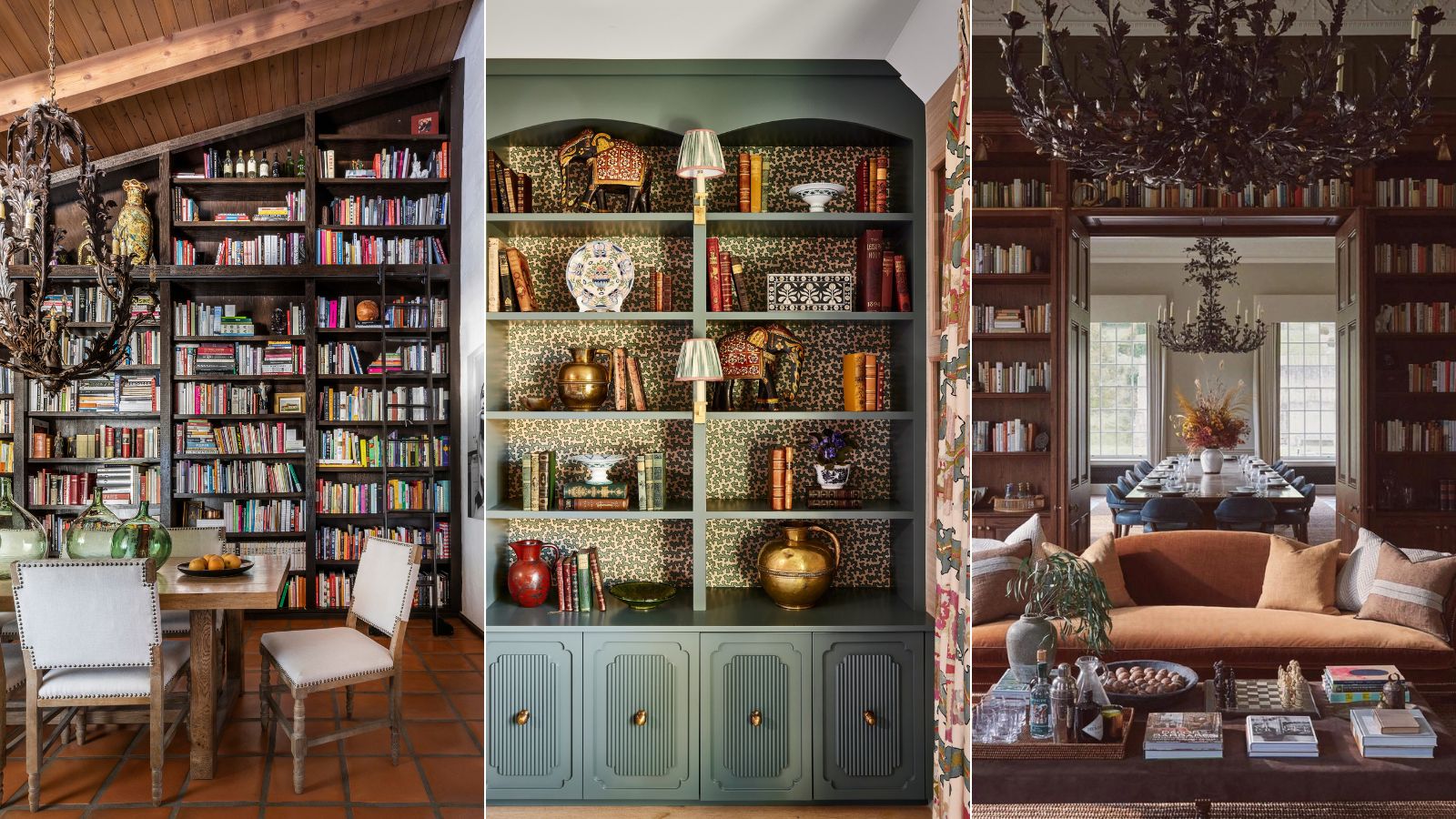
We are all very aware that trends come and go, but some stick around so hard they don't even warrant being called a trend. The Bookshelf Wealth style is one such trend. The term may have been coined in the last few weeks but the look behind it has been going on for hundreds of years.
Bookshelf Wealth is all about creating displays using (of course) books, knick-knacks, and decor that really mean something to you. It's essentially ever so slightly curated clutter. And the reason it's on the rise as an interior design trend for 2024 is very clearly linked with the overall feeling that this year we aren't really about trends at all. The last few years may have been all about fun, albeit short-lived styles, but 2024 is focused on creating spaces that are timeless.
So while your bookshelf will be a very personal project, that's not to say you can't take influence from all the gorgeous examples out there. We rounded up our favorites, and asked the designers behind them about what decorating with books can add to a space (as well as a few styling tips for that very unstyled look).
The best examples of Bookshelf Wealth
You'll note all these bookshelf wealth examples have one thing in common, they are all filled with character and depth and interest. And that's what this look is all about, however, there is a slack to style a bookshelf, even to achieve this very relaxed, 'unstyled' look. So we asked designers for there tips and what these beautiful bookshelves add to the rooms they are in.
1. Reflect what you love with your bookshelves
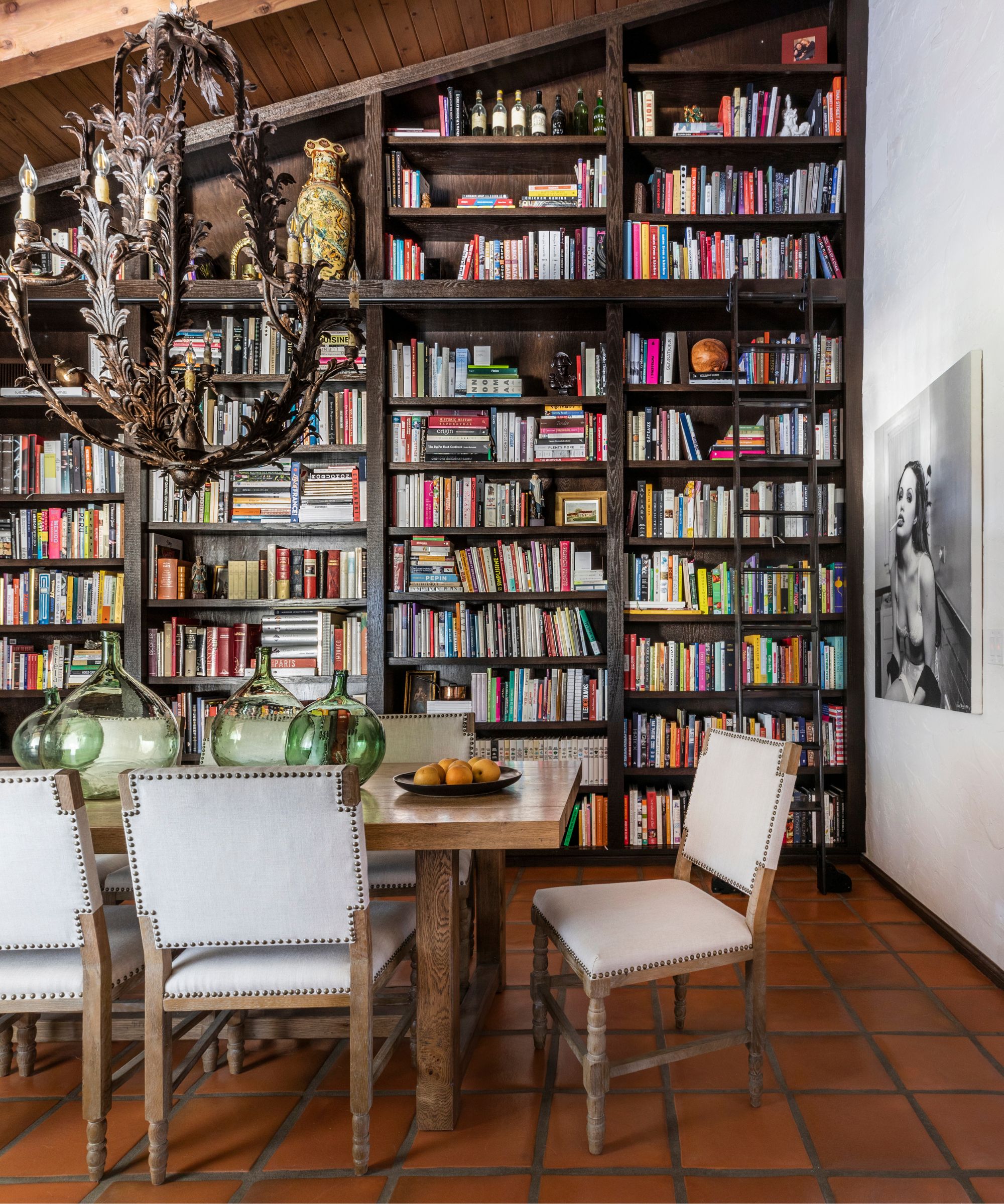
'Bookshelves are a beautiful way to display things that are important to a homeowner. Whether it is items from travel, inspirational books or stunning artwork, a bookshelf is a great place to incorporate meaning within a space,' says designer Marie Flanigan.
'In this case, we worked with Chef Ludo Lefebvre to fill his gorgeous built-in with his cookbook collection. His collection is extensive but important to his work, so we made sure that the books were accessible and mixed in a few other meaningful pieces to break up the space.'
2. Contrast a minimalism with a cozy reading room
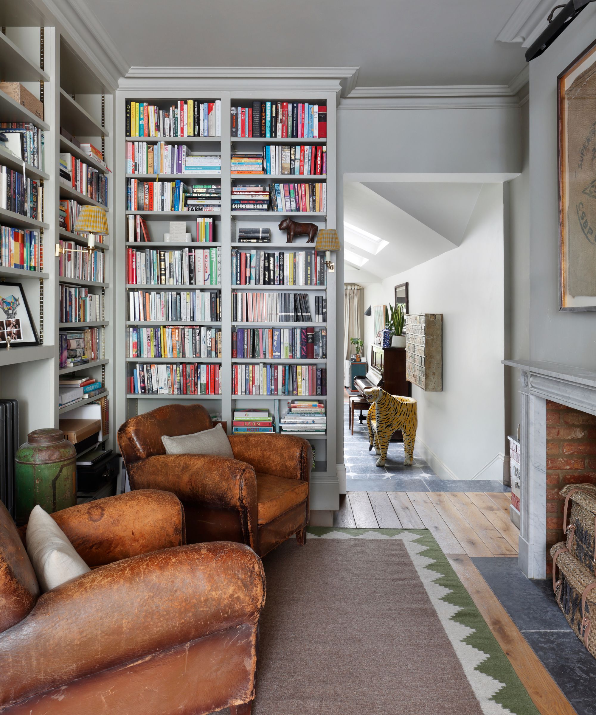
'A well-curated library or bookcase weaves warmth and personality into a home, transforming a space into one of comfort and charm. By displaying books alongside personal treasures and decorative objects, it reflects the unique personality of its inhabitants, creating an inviting atmosphere,' explains Thomas Cox, founder of HÁM Interiors.
'In our Hideaway project, we wanted to create a useful and distinct space from the adjoining living area. Moving away from the home's previous minimalist aesthetic, we introduced floor-to-ceiling joinery and a traditional fireplace with reclaimed brick. A choice of moody paint for the walls and woodwork added depth and character.'
3. Leave space to create vignettes
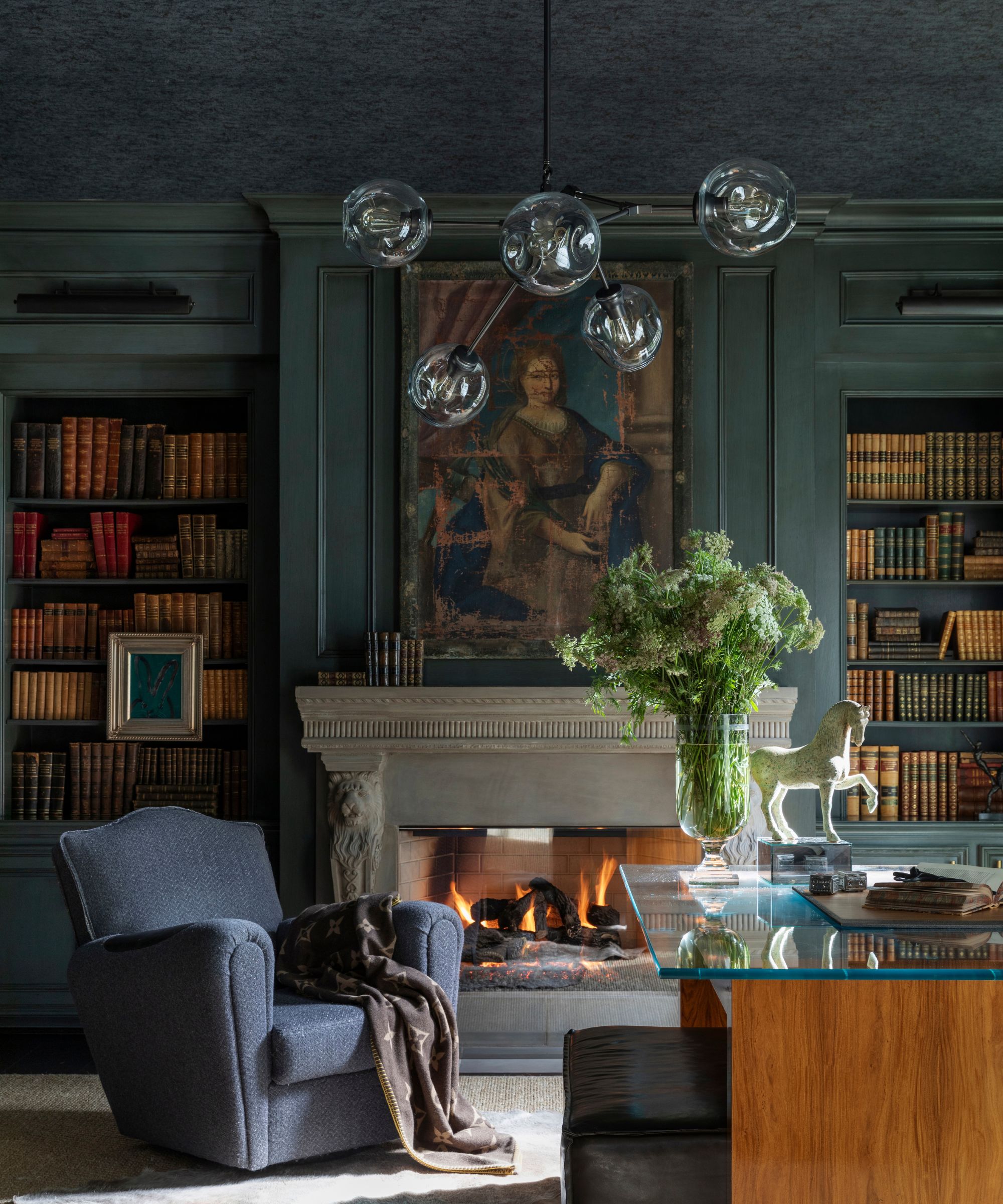
'Styling a bookshelf takes patience, but when done well, establishes an elegant sophistication. I like pairing books of similar size and color to illustrate a streamlined flow. Lastly, I will fill in any holes with items of personal significance or hang small pieces of art for an unexpected surprise,' explains designer Kara Childress.
The bookshelf wealth trend is of course firstly about the books, but you'll also notice the odd piece of decor or artwork interrupting the rows of colorful spines. These allow space to bring in meaningful pieces, pieces that in a minimalist-ruled time not so long ago would be called 'knick-knacks' but now are a key part of this look. When curating your shelves start with the books but do leave the odd negative space to break them up and create little vignettes.
4. Cover the backs of bookcase with wallpaper
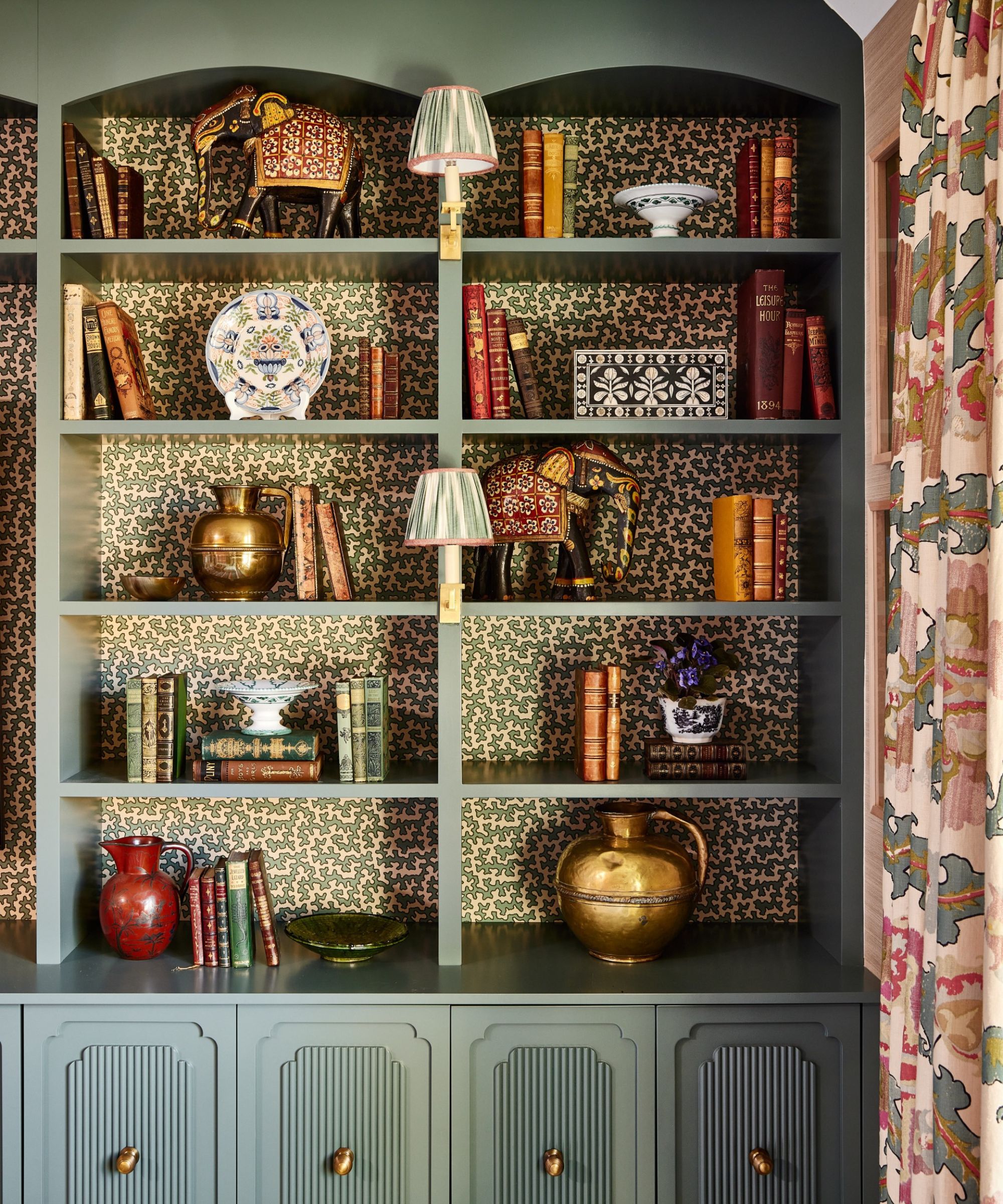
This is a great trick for adding even more character to a bookcase, especially if you aren't a book hoarder but still want that very maximalist look that bookshelf wealth is about. By adding a wallpaper to the back of a bookcase you already have an interesting base to start from, you can leave gaps without the shelves ever looking bare.
'We love to cover the backs of our bookcases in a small-scale wallpaper to make them pop and add interest: this is particularly effective if you don't have a huge collection of books as it doesn't matter if the bookcase is full or not,' explains designer Elizabeth Hay. We always love to have some cute little library bookcase lights with shades which adds further detail and soft lighting in the evenings.'
5. Blend old and new with the choice of books and colors
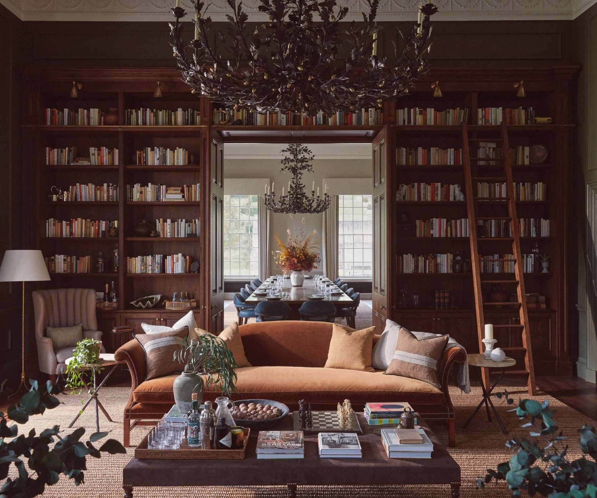
'For this living room, Albion Nord, a design studio known for its expertise in blending traditional and contemporary styles invited Ultimate Library, the bespoke book company to collaborate with them on the library at Benham Park; a former call center that they were transforming back into a period house, albeit with a contemporary twist.' explains Philip Blackwell, a book curator and founder of Ultimate Library.
'Gone, are the serried ranks of dark leather-bound books. An in comes a more contemporary book selection of varying heights and shades, more casually shelved. And mixed with objects that give it a much more informal look. The book content gives it the gravitas and authority, the pale tones of some books, lift and lighten for effect.'
'It is as if the old family home has been passed onto the next generation who have injected their contemporary twist.'
6. Bring books into more practical rooms
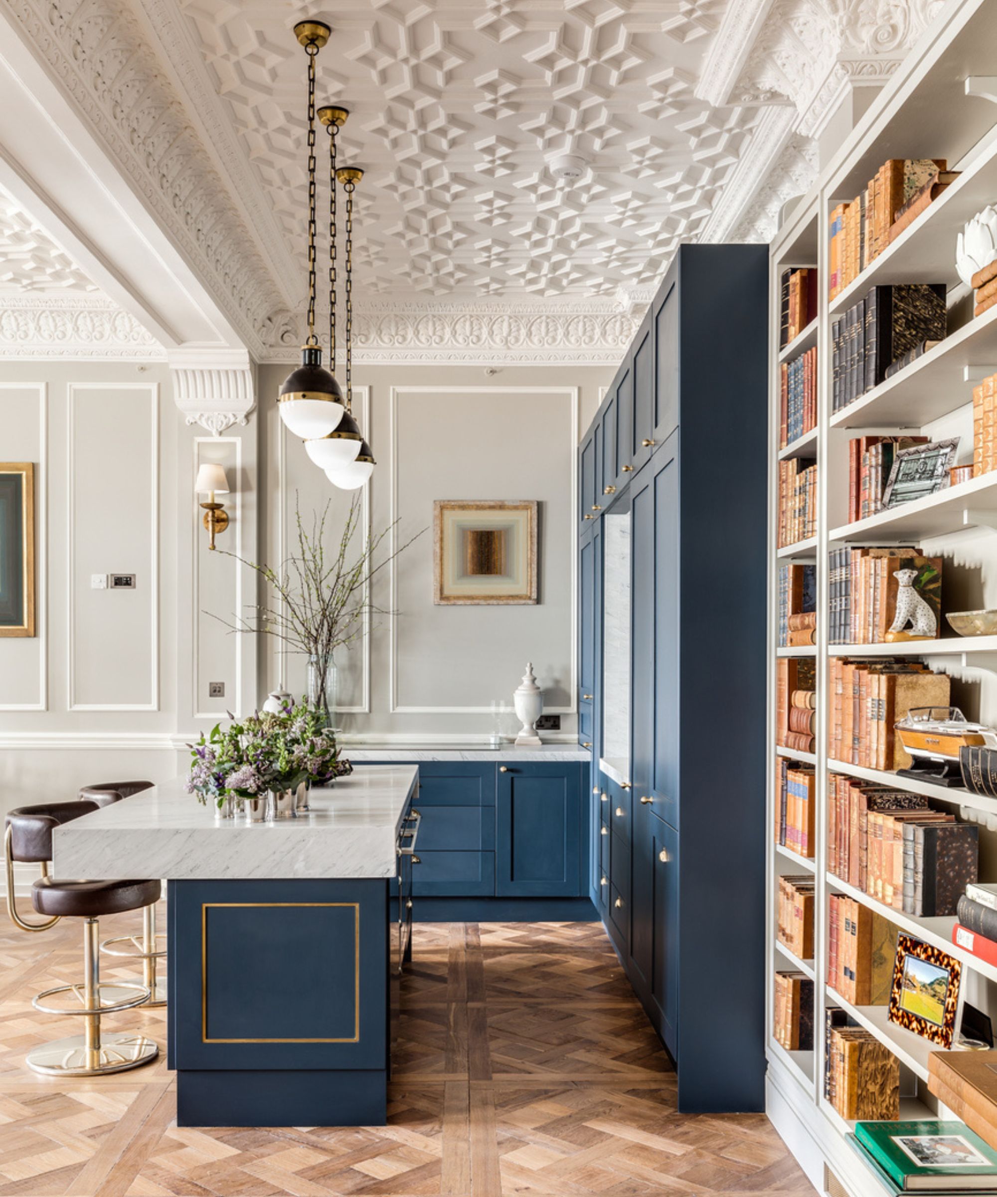
This kitchen designed by Barlow & Barlow proves that a bookshelf works just as well in practical spaces. It's a huge (and very timeless) kitchen trend for kitchens to no longer look like a kitchen but be softer spaces, more like a living room, and adding in a bookshelf is a really simple starting point this achieve this style. Adding in a bookshelf is also a nice way to blend spaces in an open-plan room.
Cookbooks are an obvious choice, however, mix in other books to to add more character and interest. And you can introduce some more 'kitcheny' items too like jars and crockery if you want the shelves to double as kitchen storage.
7. Create the perfect room divider
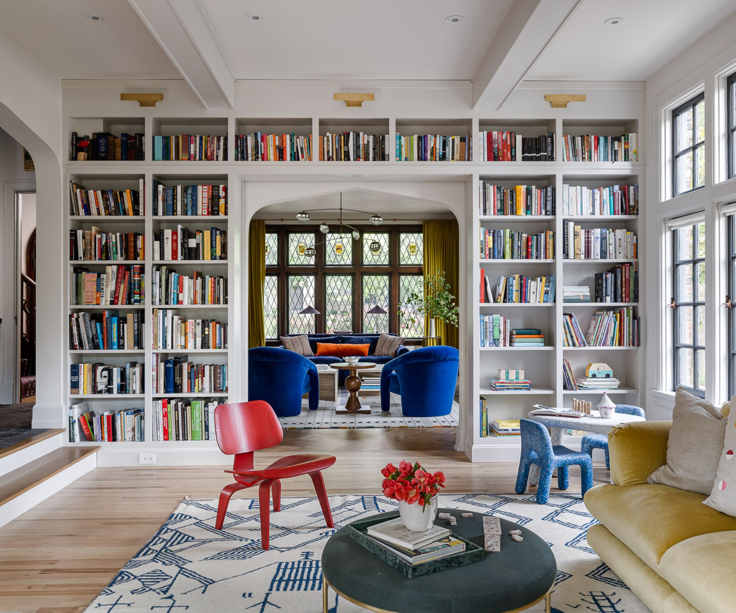
'With a combined five degrees between them, these clients made it clear from the beginning that their beloved book collection was going to play an integral role in their redesigned home,' explains Bethany Adams.
'Positioning the new floor-to-ceiling bookcase between the living room and the family room allowed for a wonderful continuity of the color scheme as it is unified by the rainbow of spines between the two rooms. Additionally, the new library wall hides a secret: pocket-reeded glass doors that can close the two rooms off when one partner is more in the mood for reading, and the other wants to watch TV.'
As all these spaces demonstrate, the bookshelf wealth trend goes beyond a trend, it's reflective of a lifestyle, reflective of a person and their passions. The love of this look is a big indication that we are coming out of that era of the 'core' trends (cottage-core, Barbie-core, etc.) that dominated in 2023 and looking to design homes that feel like us, and are transitional and timeless.


