If you've ever wondered how to make a room appear more expensive than it actually is, starting with your color palette is a good idea. According to designers, certain colors tend to feel more elevated than others, making them a good starting point to build your scheme around.
While you may have guessed that neutrals are favorites when creating expensive-looking schemes, they're not the only option. This year, designers are increasingly turning to rich, warming shades that add depth and excitement to a room, while still offering that much-desired sophisticated look.
To help you on your way, I asked interior designers for the top shades they use when an expensive look is the goal. From ochre to olive green, these are the color trends worth considering.
1. Warm White
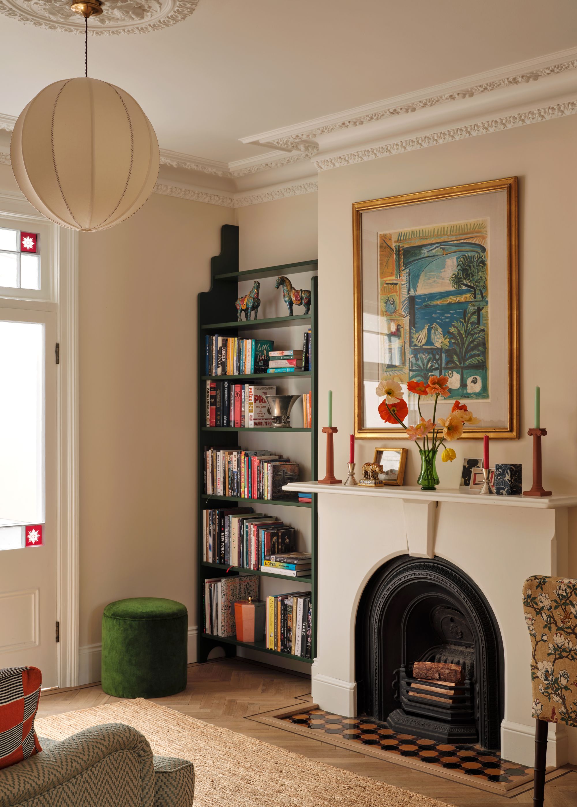
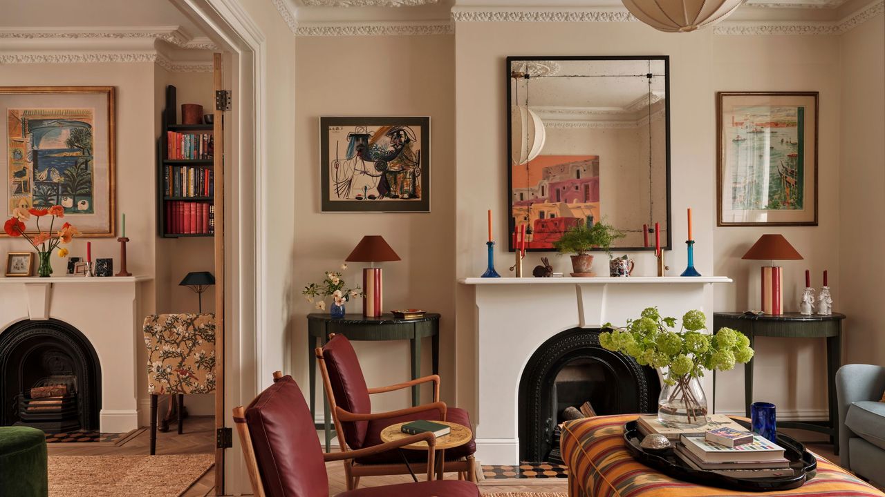
Sometimes, the most effective way to create an elevated look is with well-chosen neutrals. But gone are the days of cool neutrals that appear flat; designers turn to warming shades that offer a refined, timeless look instead.
"Using a warm white means the walls can act as a backdrop for beautiful colors and patterns introduced through furniture and art," explains London-based designer Sophie Garland. "This allows a space to feel layered and considered, with a real sense of depth rather than everything competing for attention."
In this living room, Sophie used Farrow & Ball's Dimity on the walls — a soft and warming neutral paint — along with All White on the ceiling — a brighter, pure white. "We wanted to create a calm space that included color and pattern without feeling overwhelmed by it," she explains. "Using neutral walls meant each color, pattern, and piece of furniture had room to stand out and feel special."
2. Rich Ochre
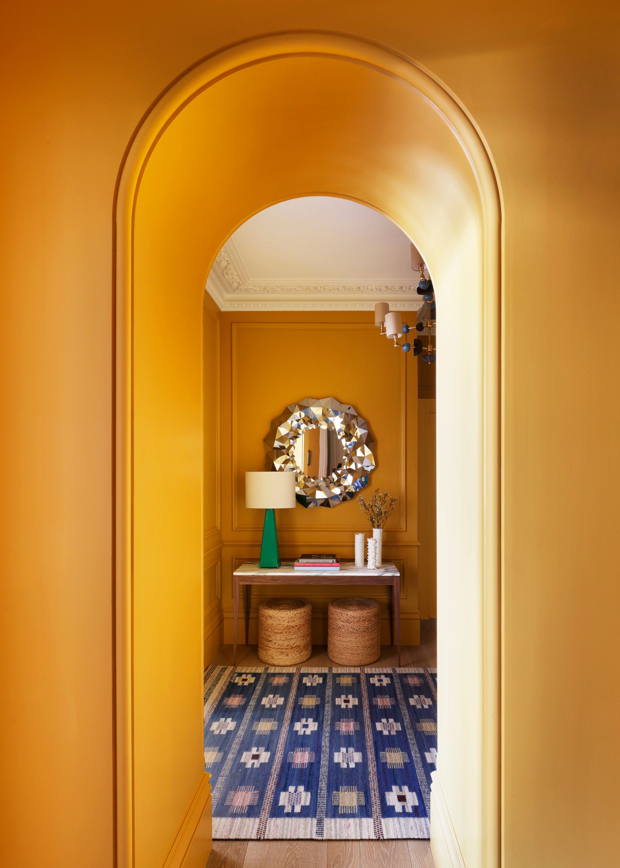
Colorful, saturated shades can lend an expensive feel to rooms, but getting the tone right is key. Rich and warming tones tend to feel more elevated than anything washed out or pale, so don't be afraid to try something bold, like the ochre tone used in this hallway (Argile's Terre Jaune).
"This apartment lacked natural light, particularly in the hallway, which had no windows at all," explains Sarah Peake, founder of Studio Peake. "Rather than fighting that darkness, we leaned into it. The warm yellow undertone of the ochre works with the shadows, instead of against them, instantly creating a sense of warmth on arrival."
"As you step inside, there’s an enveloping feeling, almost like walking into a warm hug," she adds. "It transforms what could have felt dim and flat into something intimate, cocooning and quietly atmospheric."
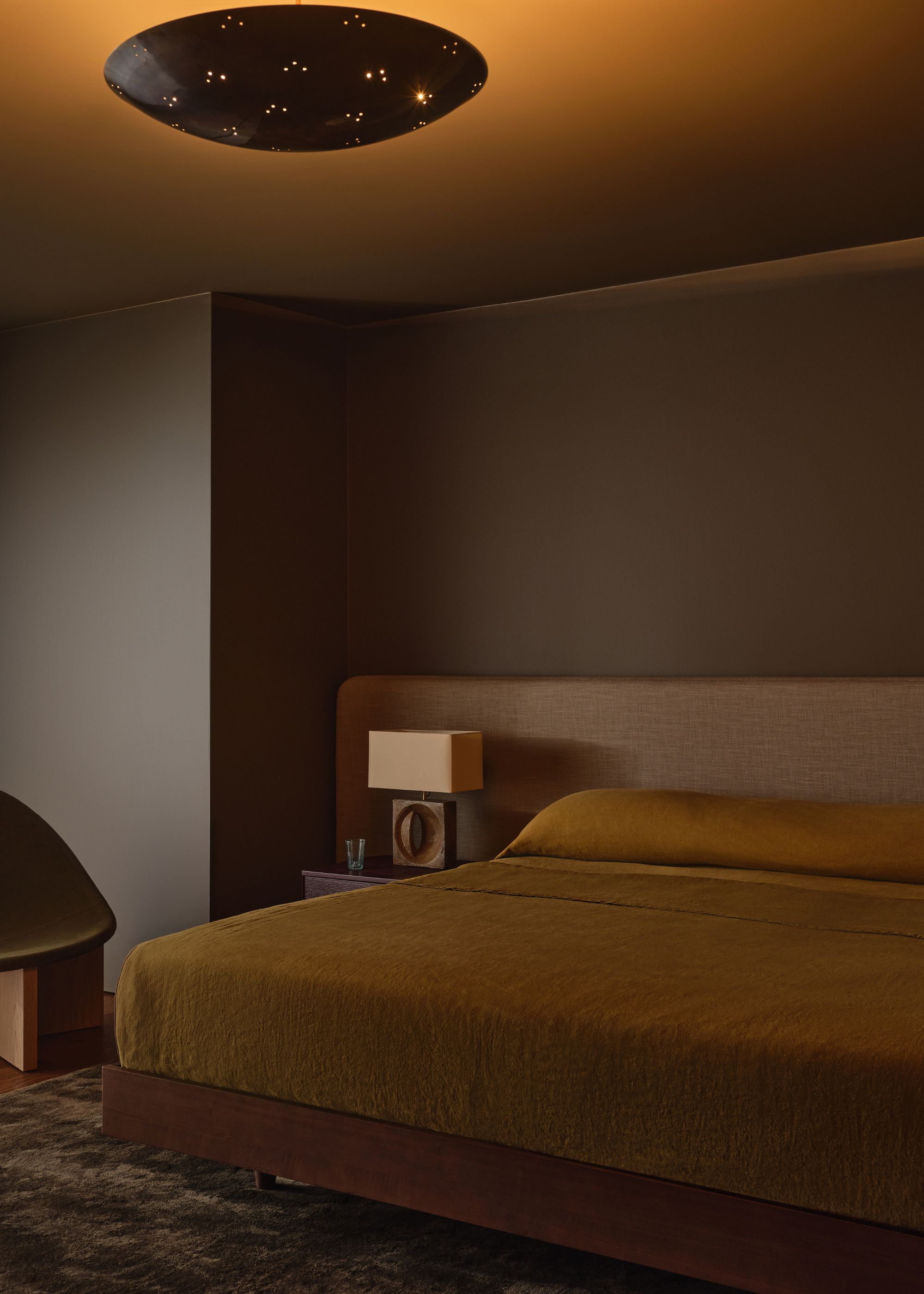
3. Olive Green
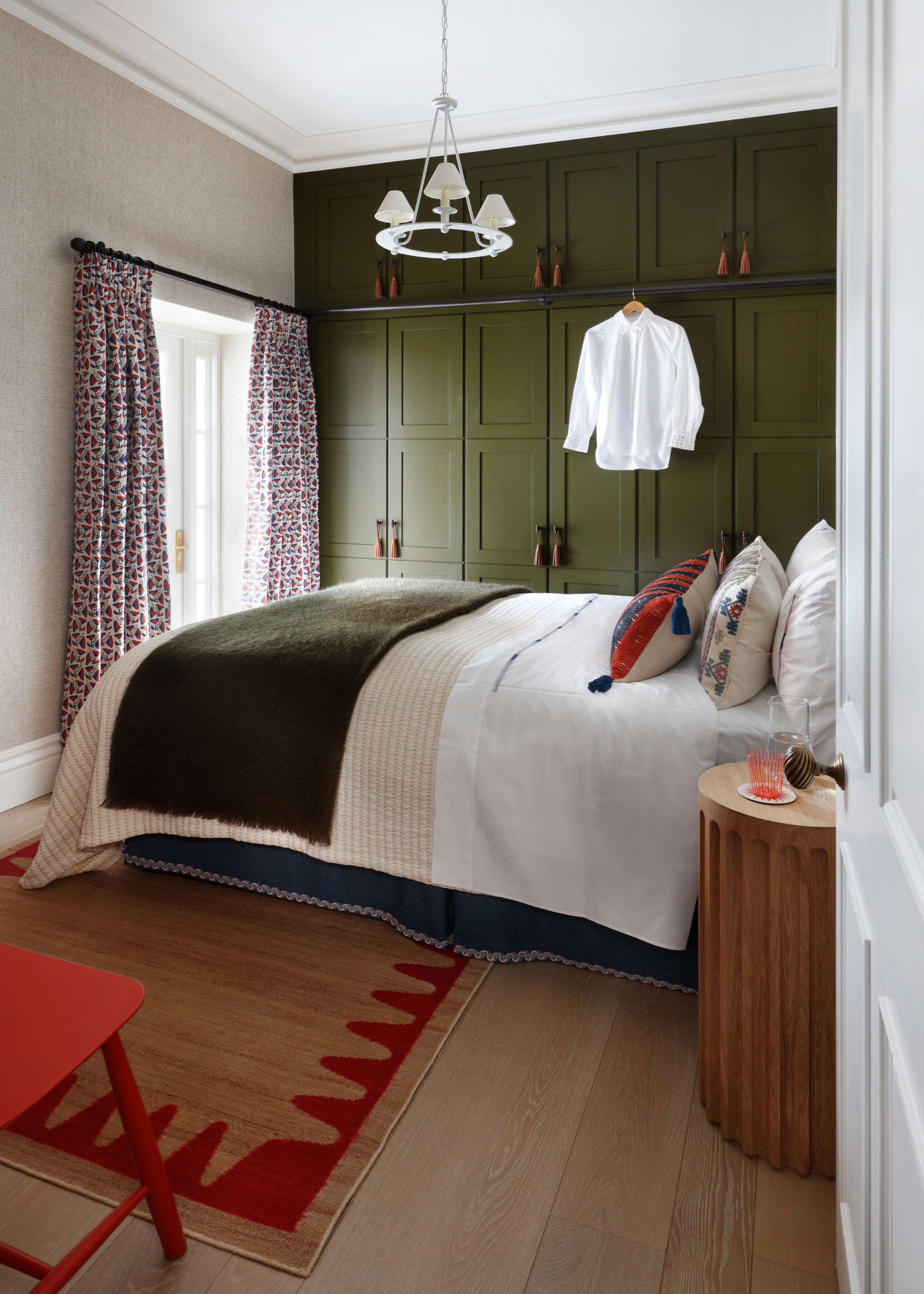
Decorating with olive green is similar to decorating with neutrals, adding a calming feel to rooms but with more depth than light tones. A dark olive green paint is a great way to warm up a room and create an expensive look, especially when paired with natural materials and warm metals.
In this bedroom (also designed by Studio Peake), Papers and Paints' Camo 7 was used on the wardrobes, adding a cozy feel to the neutral walls. Discussing warm olive greens, Sarah explains that these tones "have a beautifully understated quality — they’re earthy, grounded tones that don’t shout for attention."
"There’s a quiet confidence to them," she adds. "They feel as though they’ve always belonged in a space, which gives a room a sense of permanence and depth. Because they don’t try too hard, they create an effortless richness, the kind of luxury that feels considered rather than contrived."
4. Soft Beige
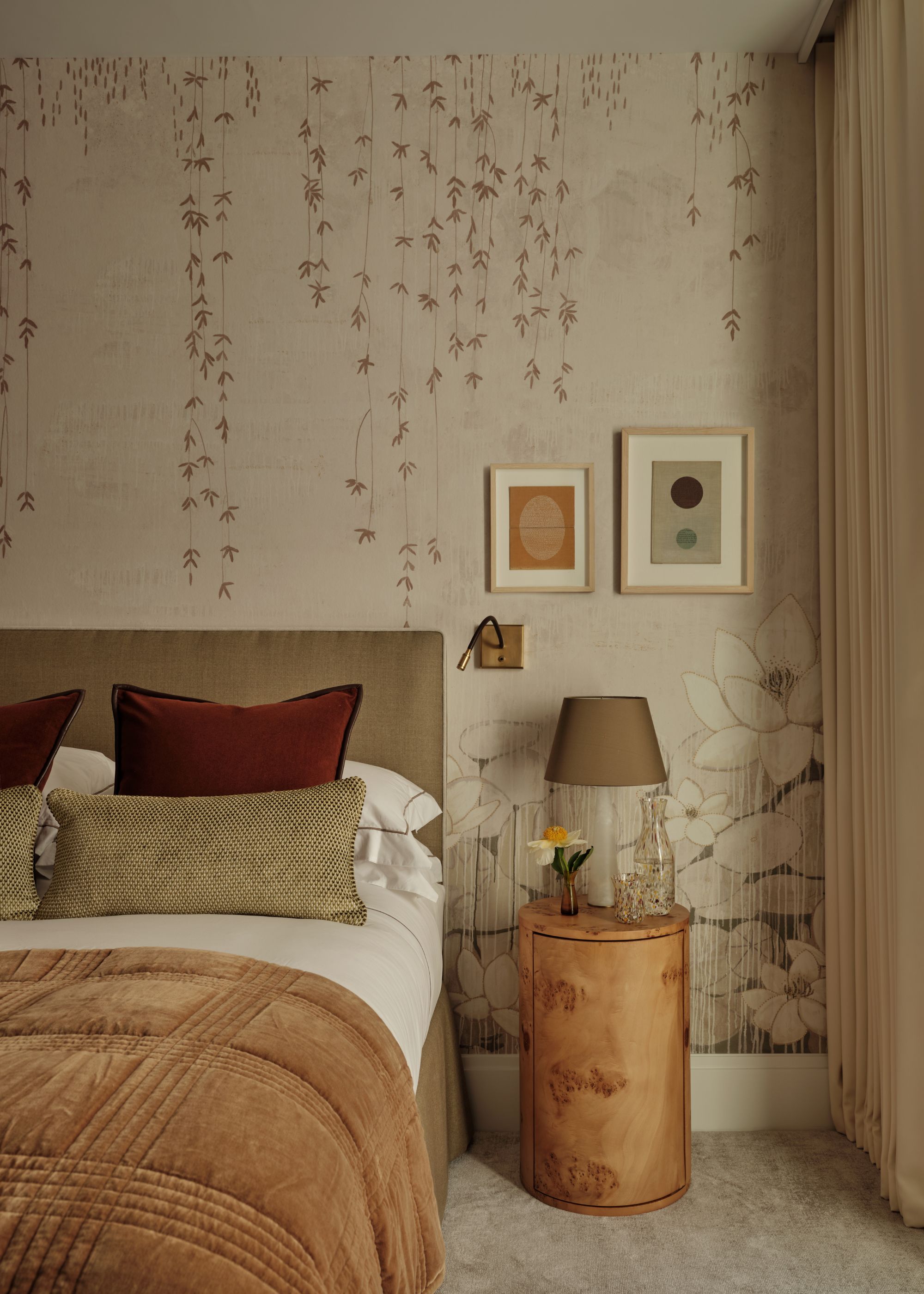
Soft beige and taupe tones are another favorite among designers when creating neutral rooms, but with more depth and softness than white. “Beige is neutral and timeless — the perfect backdrop for bolder colors and patterns," says Rebecca Hughes, founder of Rebecca Hughes Interiors.
In the room pictured above, Rebecca used "a warm beige as the foundation for the bedroom, layering it throughout the space in the wallpaper, headboard, lampshades, and curtains," she explains. "The beige is complemented by a subtly detailed flora and fauna wallpaper, adding depth without overwhelming the space. The result is a scheme that feels calm, cohesive, and effortlessly comfortable — the perfect ambience for a bedroom."
5. Deep Maroon
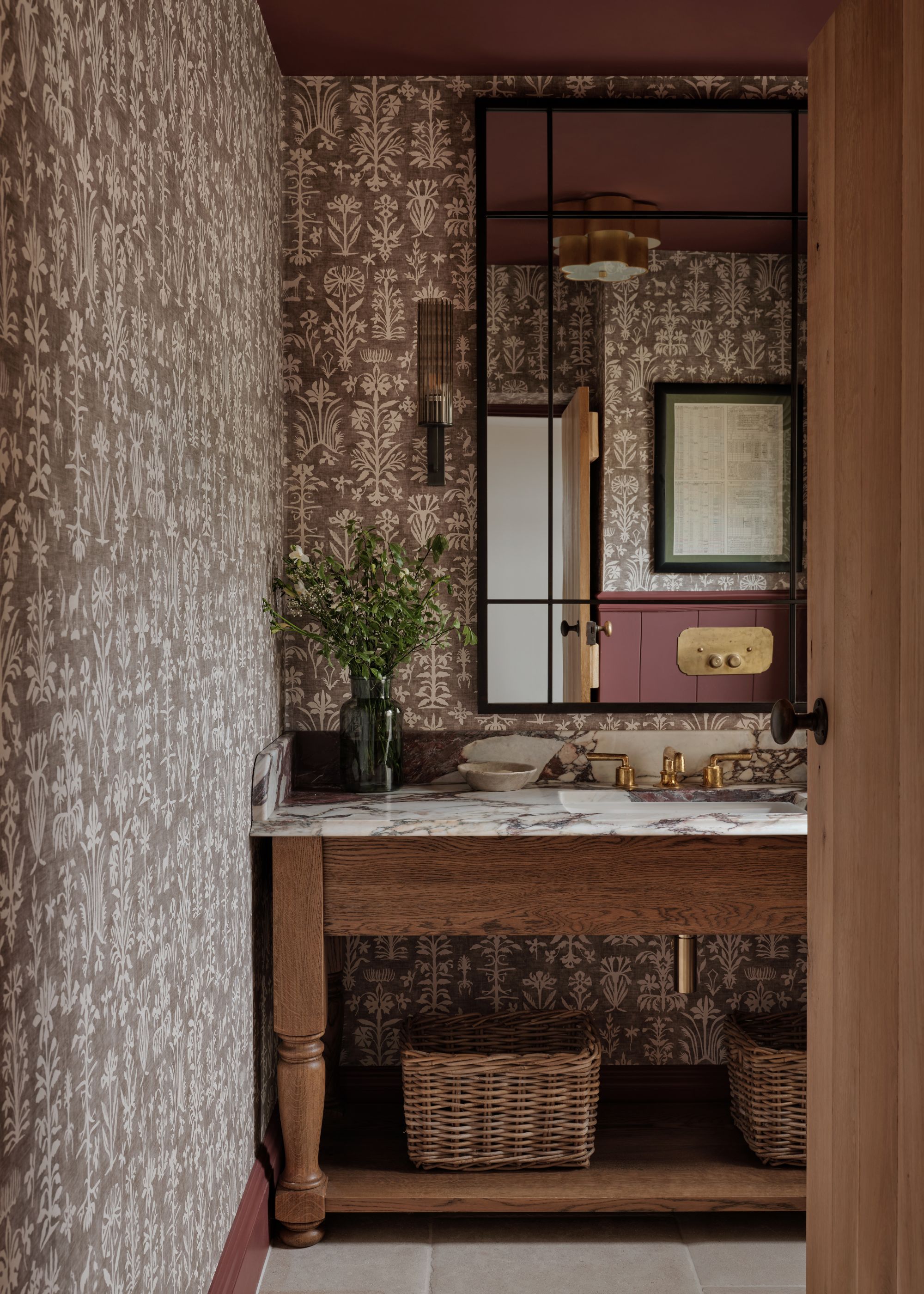
Warm red tones are synonymous with expensive-looking interiors. Think rich shades of maroon and burgundy that feel grounding and immersive rather than vibrant and bright, such as Little Greene's Adventurer, which was used in this cloakroom.
“Often, it’s about richness and heritage," comments Tori Young, interior design creative lead at HollandGreen, on what makes colors feel elevated. "Maroon has both. Historically, a color of rich velvets and expensive dyes, it brings an intrinsic sense of quality to modern interiors."
"In a cloakroom, it creates a confident and enveloping space, particularly with warm brass fittings," Tori adds. "It manages to be both earthy and striking, creating rooms that feel grounded, compelling, and unquestionably special.”
6. Teal
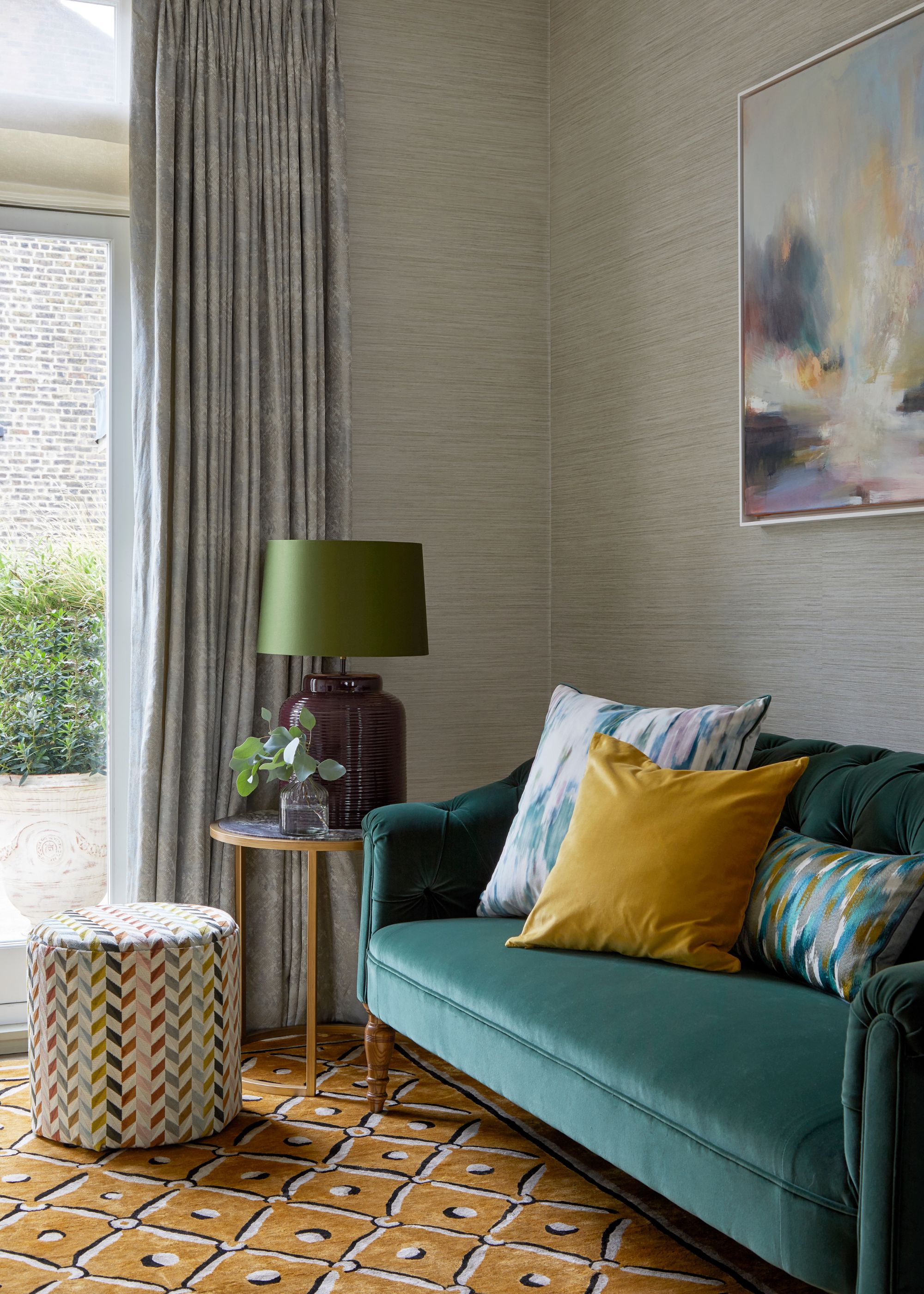
Decorating with teal has been making a comeback lately, and with the right styling, it can feel modern and elevated rather than dated. "Teal possesses remarkable depth and strength of color," says Caroline Milns, head of interior design at Zulufish. "Its innate richness never feels contrived or overwhelming; instead, it carries a subtle translucence that lends an effortless sophistication, making it feel elegant and timeless."
"In this sitting room, teal is an exceptional choice for the velvet upholstery, where the fabric’s gentle lustre enhances the color’s dimensionality and depth," she adds. "Versatile by nature, teal works harmoniously with adjacent tones of blue and green, echoing the layered hues found in the natural world. It also pairs beautifully with vibrant accents, where it provides a calming counterbalance to the saffron-colored cushion and ochre rug.”
7. Warm Brown
"For me, rich, deep colors feel inherently expensive because they carry a sense of luxury and decadence," explains Milan-based color consultant Charlotte Cropper. "They’re less commonly used in everyday interiors, which gives them an elevated and considered quality."
One of Charlotte's favorite rich colors to decorate with is dark, warm browns. "These shades work particularly well in bedrooms, libraries, living rooms, and dining rooms… spaces where atmosphere really matters," she says.
When decorating with tones like dark brown, Charlotte recommends using them boldly. "What makes these colors feel expensive isn’t just their depth, but the confidence to let them dominate a space rather than using them sparingly," she says.
"They require courage, the bolder the better: color drenching or color capping is the perfect way to fully embrace these tones," she adds. "Wrapping the color across walls, ceilings, woodwork, and even built-in furniture instantly elevates a space and makes it feel considered and high-end."
Just like the most classic colors, these expensive-looking hues aren't going to date anytime soon — they feel timeless and can evolve over the years.
For more inspirational color ideas, and more, sign up to our newsletter, and they'll land straight in your inbox.