
Get all your news in one place.
100's of premium titles.
One app.
Start reading
Homes & Gardens
Homes & Gardens
Chloe Frost-Smith

7 Colors Designers Say Instantly Make a Home Look Cheap – And What To Definitely Use Instead

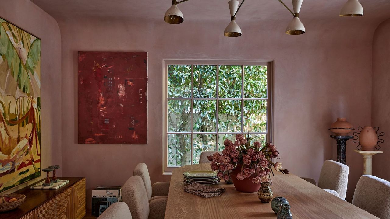
Blush-pink plaster walls, a long oak dining table, sculptural lighting, contemporary art, and lush garden views create a warm, layered dining room with modern organic style.

Color has the power to completely shape how a space feels – and crucially, how expensive your home looks. The difference often comes down to nuance: undertones, saturation, and how a shade interacts with natural light.

While no color is inherently ‘wrong,’ designers agree that certain tones can unintentionally make a space feel flat, harsh, or overly mass-produced. Highly saturated hues, stark contrasts, and overly clean pigments tend to lack the depth that gives interiors a layered, lived-in quality.

Sign up to read this article
Read news from 100's of titles, curated specifically for you.
Already a member? Sign in here
Related Stories
Top stories on inkl right now
One subscription that gives you access to news from hundreds of sites
Already a member? Sign in here
Our Picks
Fourteen days free
Download the app
One app. One membership.
100+ trusted global sources.