
Let’s make one thing clear — we like mobile apps. They make our live easier and our iPhones and Android devices more fun to use. We’d even go so far as to say that some apps are absolutely essential to our daily lives.
And yet, that doesn’t mean we don’t also get irritated by some of the recurring annoyances that mar many an otherwise fine mobile app.
From intrusive ads to impenetrable interfaces, there’s an entire laundry list of grievances we could assemble about today’s apps. But when we talked about our biggest gripes, these seven irritants stood out from the rest.
These are the biggest app annoyances currently plaguing our mobile devices.
Free-to-play games
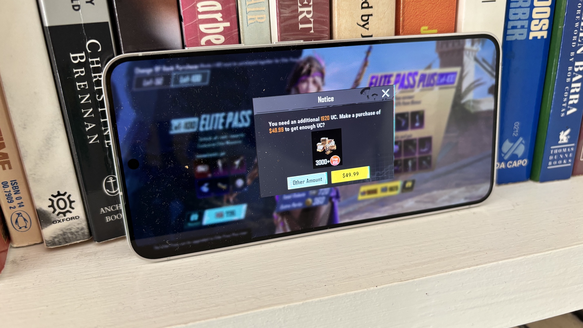
I’m the most casual of gamers, so maybe the world at large has long made their peace with free-to-play games on their mobile devices. But nothing is turning me from a casual gamer into a nope-not-at-all gamer faster than the scourge of these freemium offerings.
I understand that people want to get paid for their work. Heck, I’m willing to pay people a mutually agreed upon one-time fee in exchange for goods and services. What I cannot abide, though, is someone constantly approaching me, hat-in-hand, suggesting that I pony up for something that will make the game slightly more playable. Perhaps the quality of gameplay is something that should have been worked out before I downloaded your app.
The worst kind of model is when you’re peppered with microtransactions that promise to boost your chances against other opponents. Games should be won or lost based on skill and strategy, not on who’s willing to run up the largest credit card balance for the tainted taste of victory.
To my mind, “free to play” has come to mean “costly to enjoy.” There’s no type of app out that I steer any wider away from. — Philip Michaels
Subscription models
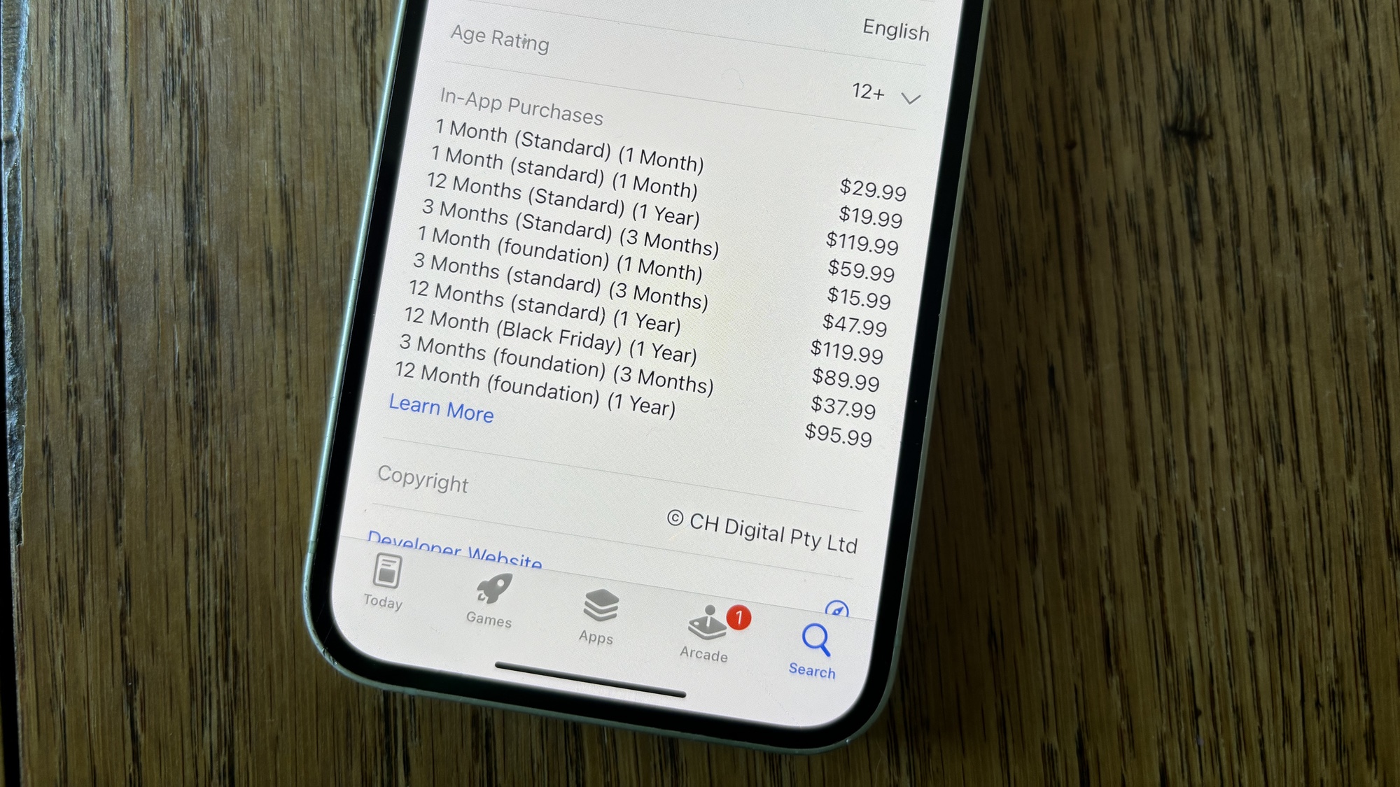
While we’re on the subject of dubious payment schemes, let’s talk about the increasing number of apps that use subscription models instead of one-time payments. My colleague John Velasco wrote about his problems with subscription-based apps recently, so I’ll sum up his criticisms, with the bottom line being that when multiple apps charge you a monthly or annual rate, those costs really start to add up.
In many cases, you’re not even paying for new features — just for the ability to keep using features that you’ve gotten accustomed to. Subscription rates also rarely follow the laws of gravity, in that they nearly always go up, but never drop back down.
Part of the problem here is the way mobile app stores were set up many years ago, where developers could charge a fee for their initial release, but subsequent updates were expected to be freebies. It would be preferable to switch back to the pre-App Store model where you paid a set fee for a specific software version, and upgrade fees for future releases. (Or, if you didn’t pay for the upgrade, you simply went on using the version you had, without any new capabilities.) We’d sure like to see Apple and Google adopt that approach, rather than have more developers turn to subscription models in order to guarantee any future revenue. — PM
Separate mobile and desktop apps
Not only do apps increasingly charge subscriptions, but for a lot of the video and photo editing tools on my phone, I’m now paying for features I’ve already paid for with the desktop version. The desktop subscription doesn’t cover the mobile app, and it feels like it should via some sort of bundle.
I use a bunch of tools that are part of CyberLink’s Director Suite 365 package on my laptop, paying $29.99/month for access. If I want to then use the mobile versions of PowerDirector or PhotoDirector, that’s a separate charge. What I’d like to see is an agreement covering both versions. — John Velasco
Over-the-top file sizes
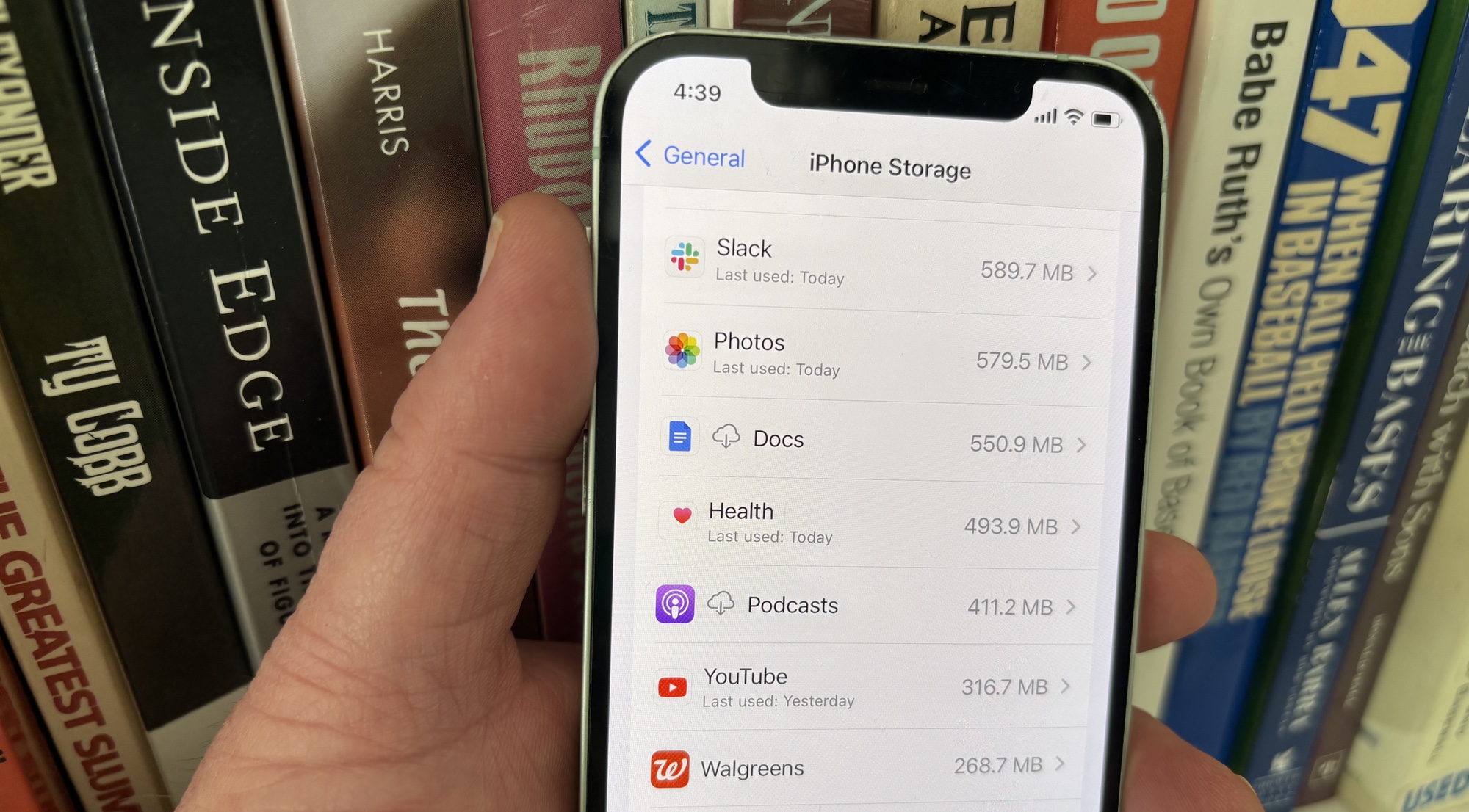
Freeing up space on your phone can be a challenge sometimes, but it’s made worse by the fact some apps are far larger than they have any right to be. I’m not talking about apps that end up being larger because you’ve downloaded or saved stuff, like my 5.5GB Audible library. I mean apps that are large simply because they are.
My biggest pet peeve used to be Paramount Plus on iPad, which took up 600MB by itself — never mind any of your offline downloads. Recently, the Paramount has shrunk down to 483MB, which is a lot more manageable, even if it’s still larger than Disney Plus and Netflix combined (425MB). There’s absolutely no need for that, if you ask me.
And Paramount Plus is far from the only offender. Uber Eats needs 383MB, YouTube is 291MB and my robot vacuum control app is 402MB.
On their own, these file sizes are manageable, but throw in dozens of other apps and things start taking up a lot of space and it makes me wonder where all that data is coming from. —Tom Pritchard
Constant notifications
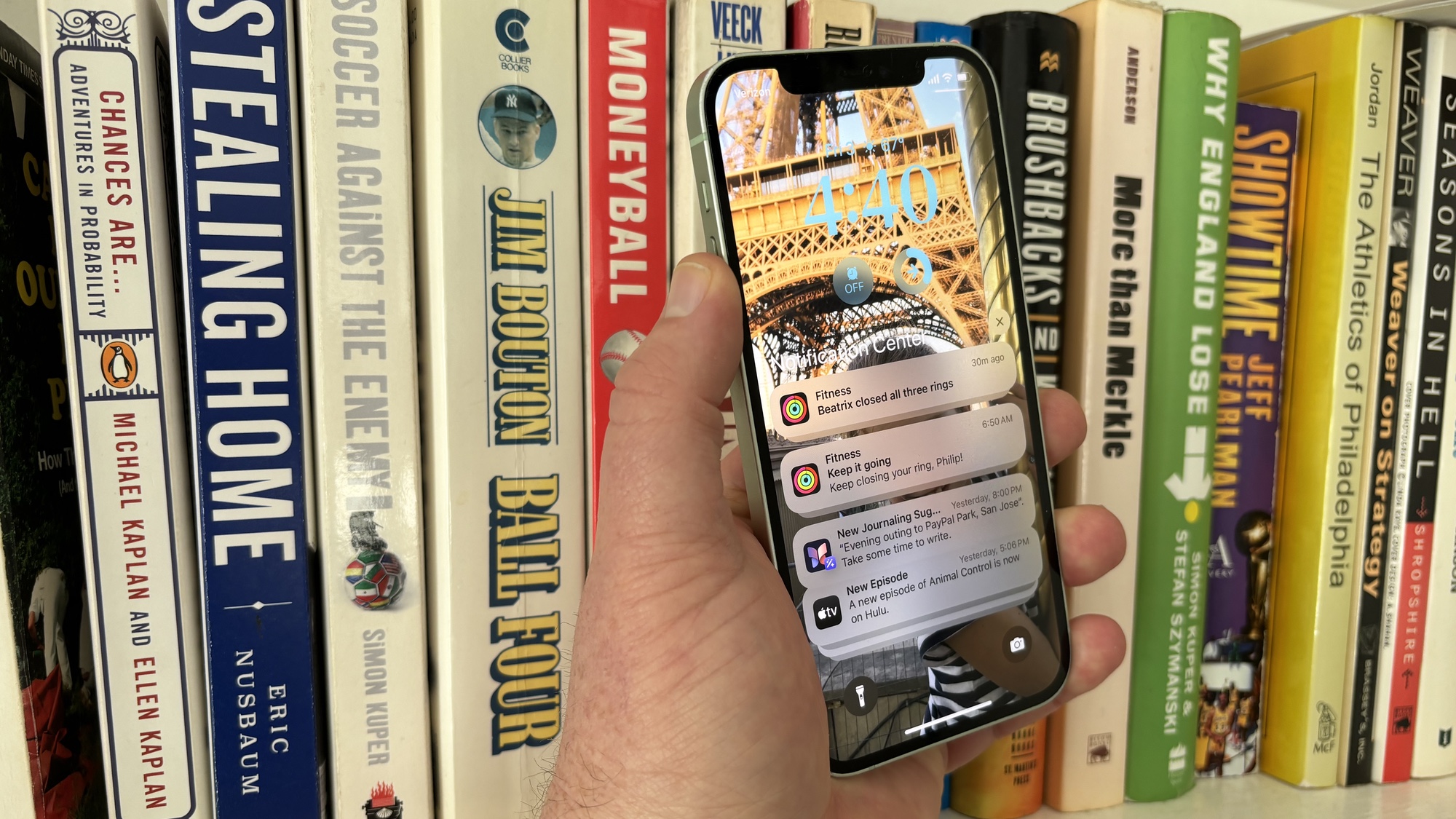
Mobile apps are an attention game, where developers have decided that if my eyeballs aren’t glued to their app, they are somehow losing. This is the only explanation I can think of that justifies all the notifications constantly making my phone ping.
Some notifications are good. When I have a Lyft driver arriving, I want my phone to tell about it. But I am less interested in hearing about new promotions with the ride-sharing service — a distinction Lyft is either unable or unwilling to make. Similarly, I don’t want to hear from Instagram… well, ever. But that’s not stopping the social network from letting me know when a mid-grade starlet has a new Insta story to share.
Yes, you can manage notifications from within the Settings app on your phone. On my iPhone, for example, I can send non-urgent notifications to the land of wind and ghost that is the notifications summary feature. But particular push apps? Those get deleted straight away. — PM
Begging for reviews
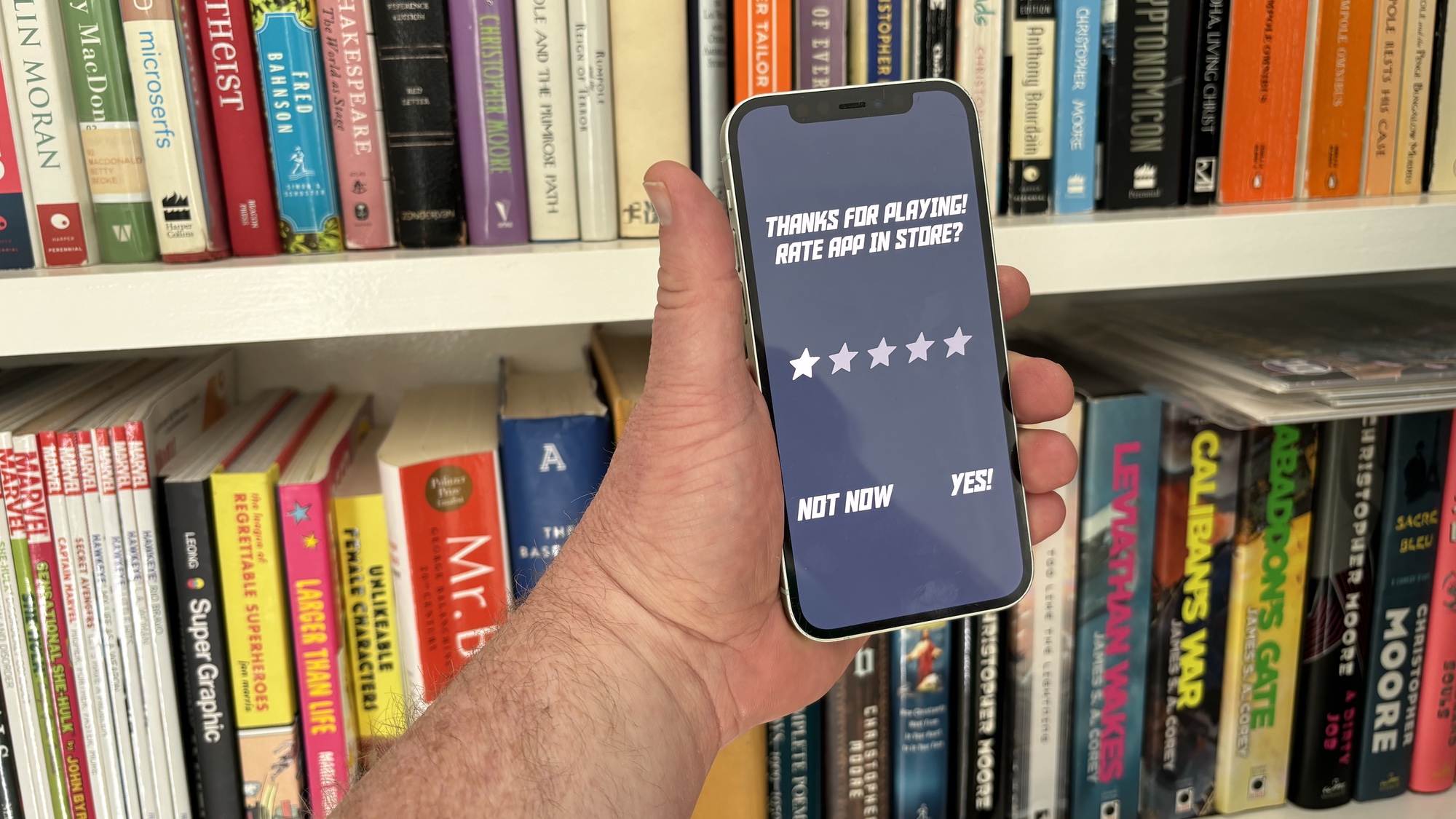
Another bad habit of particularly needy apps is the near-constant requests for reviews. Again, we understand that it’s the cost of doing business in the mobile app world, where high user ratings mean an elevated place in app stores. And we’re happy to do our part to help — most of the time.
But sometimes, we don’t want to break our flow to pause and write a five-star review. (And sometimes, that review is not going to be five stars, if we’re being honest.) And so we tap the Not Now button, only realizing far too late that we’re going to get inundated with review requests from now until we finally cave and tap out that review.
Here’s a humble request — in addition to that Not Now button, add an opt-out button. It would be a indication that you respect the app users’ time and you don’t want to stand in the way of them enjoying your app. — PM
Inconsistent feature rollouts
It's exciting when an app you regularly use gets a big new feature added. But what's less exciting is when that feature — say, body temperature measurements for the Thermometer app on the Pixel 8 Pro — isn't available in your country. Or when the update takes place on the company's servers rather than on your phone, meaning it can be days or weeks between a new ability being launched, and it actually being available for you to try.
It feels much better as a user to have a solid guarantee of when a feature will be usable, rather than the all-too-common uncertainty of when it'll be ready for you and your device, if at all. — Richard Priday


.jpg?w=600)


