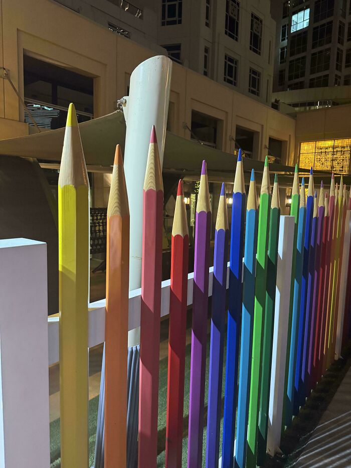
Being a designer – whether it's interior, graphic, advertising, or public space – takes a lot of creativity and skill. Sure, lots of people are good at their jobs, but only a few might be geniuses. This time, we're highlighting the best of the best in design: creations so practical and satisfying to look at that one can't help but say, "Wow."
The pics come to you from the subreddit whose name we can't really mention here, but let's just say that it rhymes with "Design Horn." It's a subreddit dedicated to amazing "architectural, graphic, industrial, furniture, & product design." So scroll down and be inspired or simply marvel at the things the human mind and hands are able to create!
More info: Reddit
#1 Poster About Reproductive Choice In The US With Stitches As President's Signature
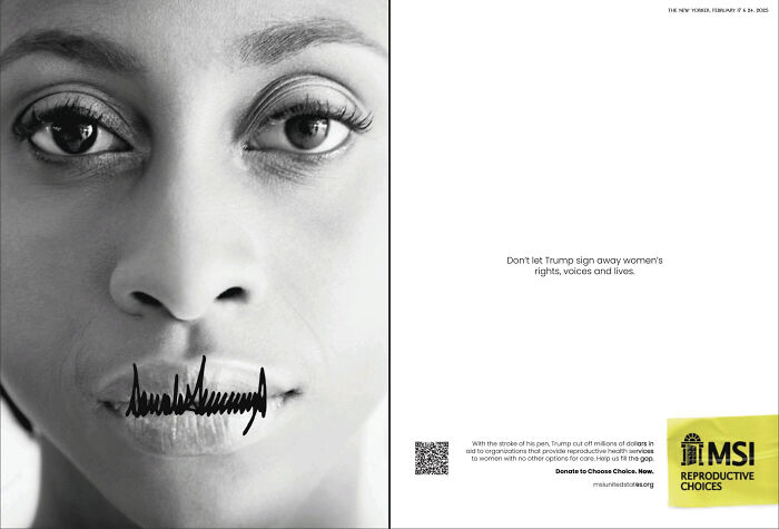
© Photo: rustyyryan
#2 Fountains That Look Like Dandelions
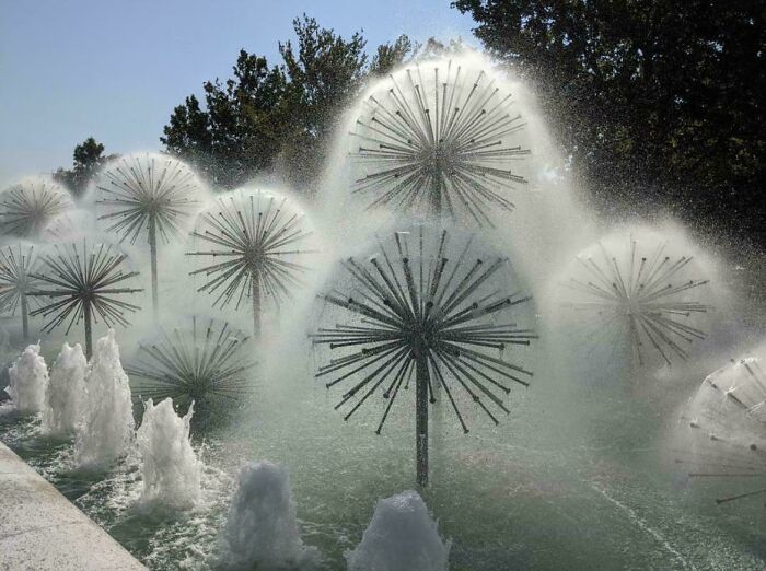
© Photo: grandeluua
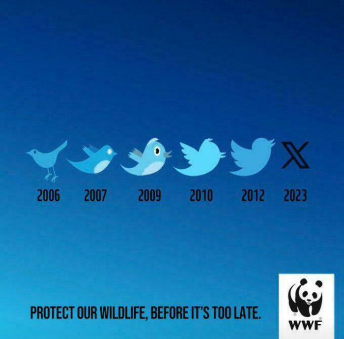
#3 A Very Clever Ad For The World Wildlife Fund
© Photo: zzill6
If there's one thing Mad Men taught us (aside from how to cheat on your wife with multiple women), it's that working in advertising takes a lot of creativity and pizzazz. Some of the awesome design examples you see on this list are from advertisements, and their genius often lies in a perfectly executed idea through beautiful graphic design.
Take the WWF campaign urging people to protect wildlife. The Twitter bird turning into an X is a clever representation of what happens when we ignore conservation efforts, but in the animal kingdom. The campaign was created by a German chapter of WWF in 2023 together with the advertising agency McCann Germany.
"The whole world mourns the loss of the Twitter bird," the caption of the ad reads. "Around 1 million real animal species are threatened with extinction. Today we are in the midst of the greatest extinction of species since the end of the dinosaur era. A quarter of mammal species, one in eight bird species, more than 30 percent of sharks and rays, and 40 percent of amphibian species are threatened. Help us save the animals. An initiative of WWF Germany & us!"
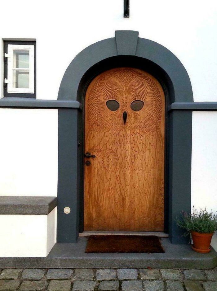
#4 A Wooden Door From The 1930s With An Owl Design In Copenhagen, The Beak Being The Door Knock 📸frans De Waal
© Photo: brzrk
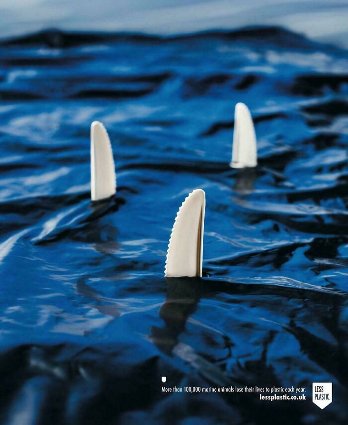
#5 [ad Campaign] Sea's Biggest Predator- Plastic
© Photo: nazaol
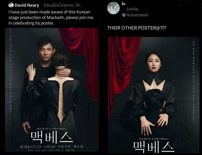
#6 Macbeth Advert Poster
© Photo: BouncingPost
Fountains shaped like dandelions sure look pretty. Many cities know that; that's why they've built similar versions of the one you see in this list. Our example is from Baku, Azerbaijan, aptly named Fountains Square. There's also one in Houston, a small version in Dresden, and one along 6th Avenue in Manhattan.
Sydney, Australia, also has one. It was built in 1961 as a commemoration of the Battle of El Alamein in Egypt during WWII. It has 211 "stalks," but it's the hundreds of saucer-shaped films that extrude water, making it look like a giant thistledown. The fountain's artist, architect Robert (Bob) Woodward AM, became so famous after designing this piece that he gained prominence internationally.
#7 Save Driving Awareness Ad
© Photo: grandeluua
#8 Creative Wording
© Photo: glitterenthusiast76
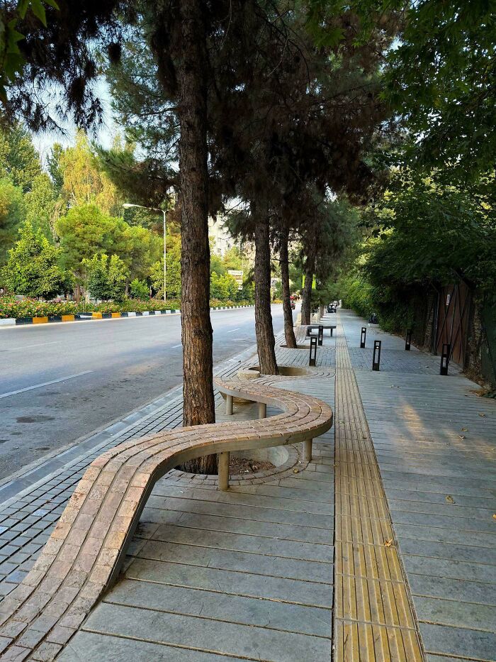
#9 Brickwork On Sidewalk Which Turns Into A Public Bench In Shiraz, Iran
© Photo: HangingWithYoMom
The "Less Plastic" campaign in the UK that depicts plastic knife heads as shark fins was created by a U.S. ad agency, Project Worldwide, in 2018. Other posters included in the campaign used other plastic cutlery as symbols. Forks resembled the hands and arms of a possibly drowning person. A plastic straw looked like the Loch Ness monster. And a plastic bag formed a wave, reminding people that there might soon be more plastic in the oceans than water.
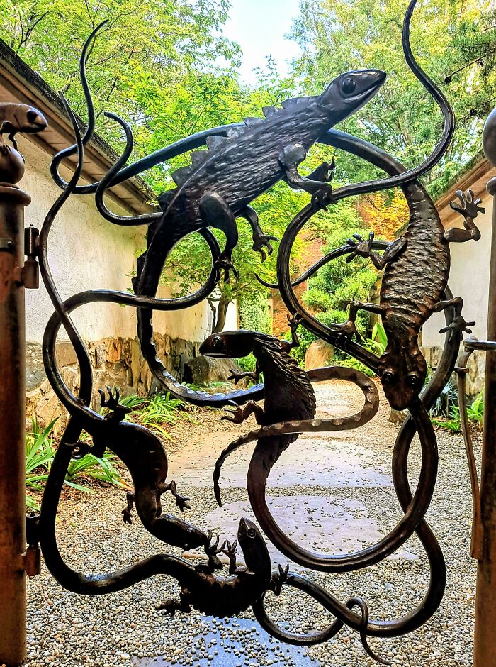
#10 A Gate At The Atlanta Botanical Gardens
© Photo: hot-rod-lincoln638
#11 My Power Went Out And I Realised This Fridge Magnet Glows In The Dark
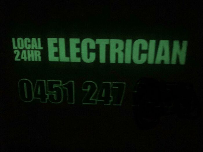
© Photo: false_serenity
#12 "The Swimmers", Bathroom Floor Mosaic Tiles By French Atelier Suzanne Manufacture
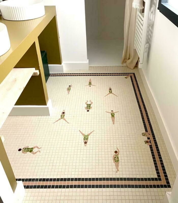
© Photo: loggiews
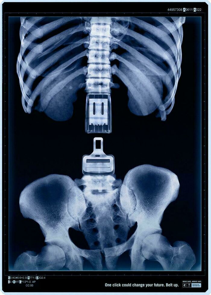
The "One click could change your future. Belt up. Drive safe. Arrive safe" poster you see on this list is one of three that Western Australia's Road Safety Council made for its road safety campaign in 2008. It was the creative baby of the Perth-based agency Marketforce, and the other two posters depicted X-rays of a brain and a skull detached from the cervical spine.
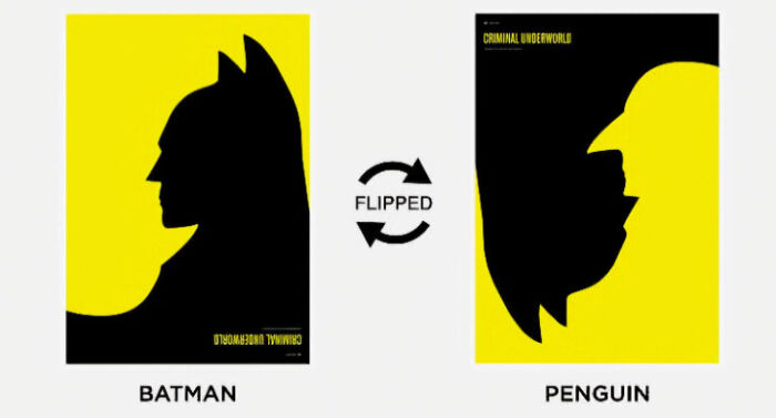
#13 Batman Cover Showing The Villain Penguin When Flipped
© Photo: ImYouBut_Better
#14 Akhavan Historical House In Kashan, Iran
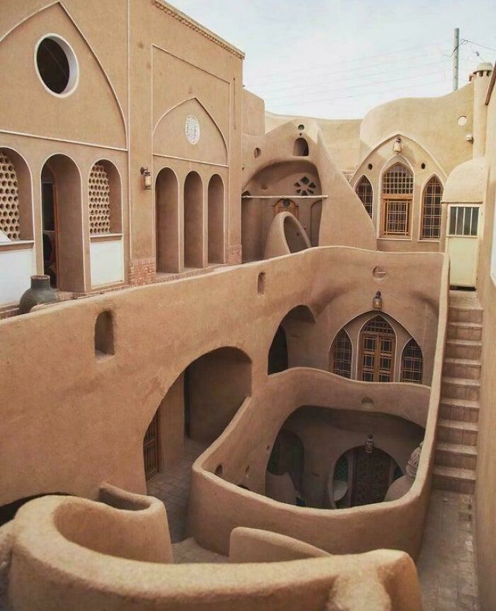
© Photo: SoggyConclusion4674
#15 The Rear Elevation Of This Architect’s Office
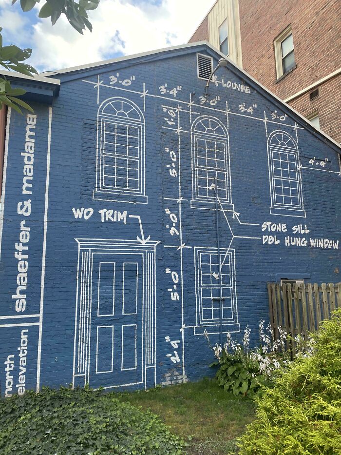
© Photo: Realistic-Care-5502
The incredible posters for the Korean stage production of Macbeth are the creation of the Japanese photographer Yuni Yoshida. Many experts praised Yoshida's use of negative space and incorporation of the play's themes into the artwork. The director of the play, Yang Jung-woong, described how his staging is still relevant to modern audiences. "It vividly portrays the inescapable downfall that follows ambition, along with the sense of loss, guilt and moral conflict that come afterward."
#16 Storm Drain Covers Designed To Look Like Rain Hitting Water
Found in Somerville, MA, near the Union Sq. T stop.
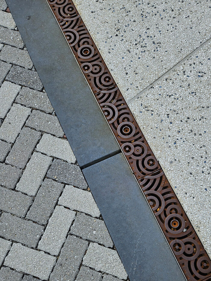
© Photo: rag_bun
#17 Japanese Designer Yasuhiro Suzuki Created A Giant Zipper-Shaped Boat That Gives The Illusion Of Unzipping The Water As It Moves
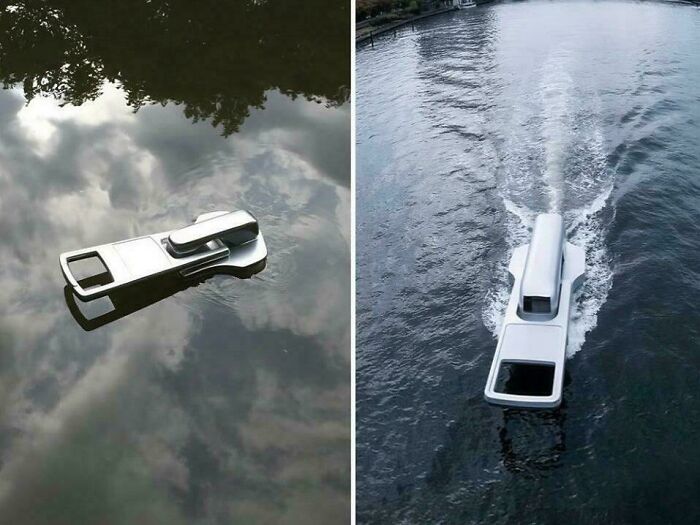
© Photo: Huge_Macaroon_8728
#18 A Preschool In My Neighbourhood
© Photo: Swanky_muah
The lizard gate at the Atlanta Botanical Garden looks cool and fits its location perfectly. Created by blacksmith Andrew Crawford, it was installed at the Gardens' entrance to the Japanese Garden in 2012. That year, an Atlanta Blooms event took place, and the gate was the addition to the Gardens for that occasion. Crawford has also designed another gate for the Atlanta Botanical Gardens, the "Herb Garden Gate."
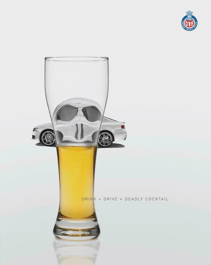
#19 Ad Against Drive Drunk In India
© Photo: mohamed_Elngar21
#20 Norway’s Powerlifting Logo Is A Barbell That Looks Like Their Flag
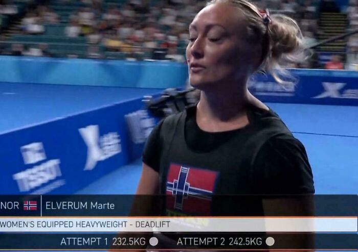
© Photo: oxwof
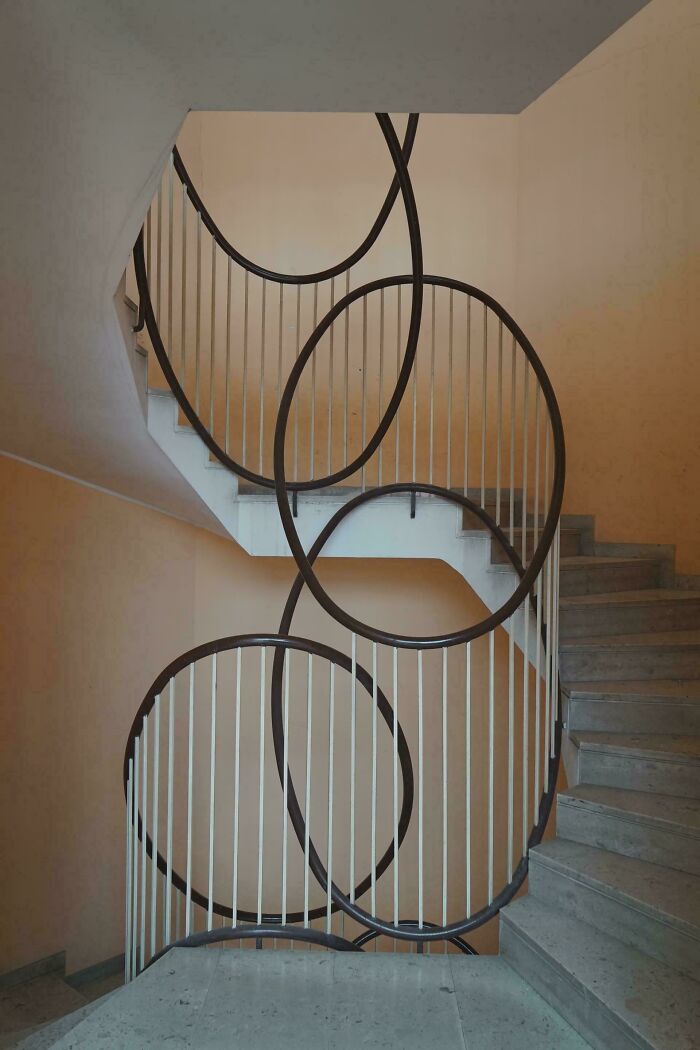
#21 Staircase, Apartment Building, Rome, 1977. Designed By Gaetano Rebecchini And Julio Lafuente
© Photo: SebastianPhr
Which of these showcases of excellent design impressed you the most, Pandas? Rank your favorites in the comment section below! And while you're here, don't forget to visit our previous design appreciation posts featuring pics from the very risqué-titled subreddit here and here!
#22 This Graphic From The Atlantic. *chef's Kiss*

© Photo: Webby1788
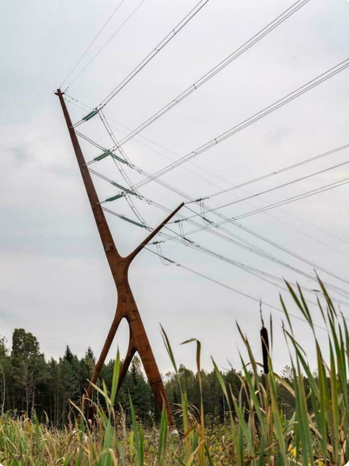
#23 A Nature Inspired Electrical Pylon In Estonia
© Photo: ImTheVayne
#24 This Orange Juice Cap Didn’t Need To Be So Designed As Such But They Did It Anyway

© Photo: rastroboy
#25 My Friend's Helmet Comes With A Tag For His Blood Group In Case An Accident Happens
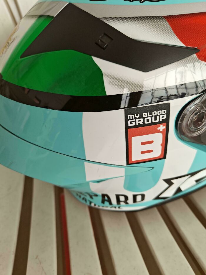
© Photo: run_the_familyjewels
#26 Hide Restaurant Sign From UK
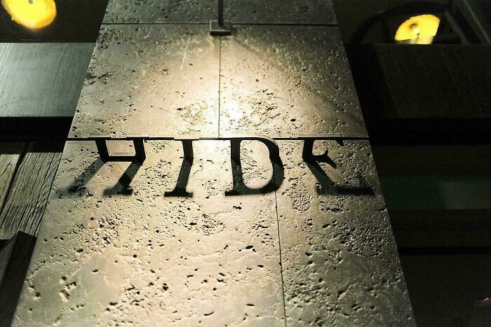
© Photo: anikkundu1998
#27 Ogilvy Singapore Created This Brain Themed Design For The Economist In 2004
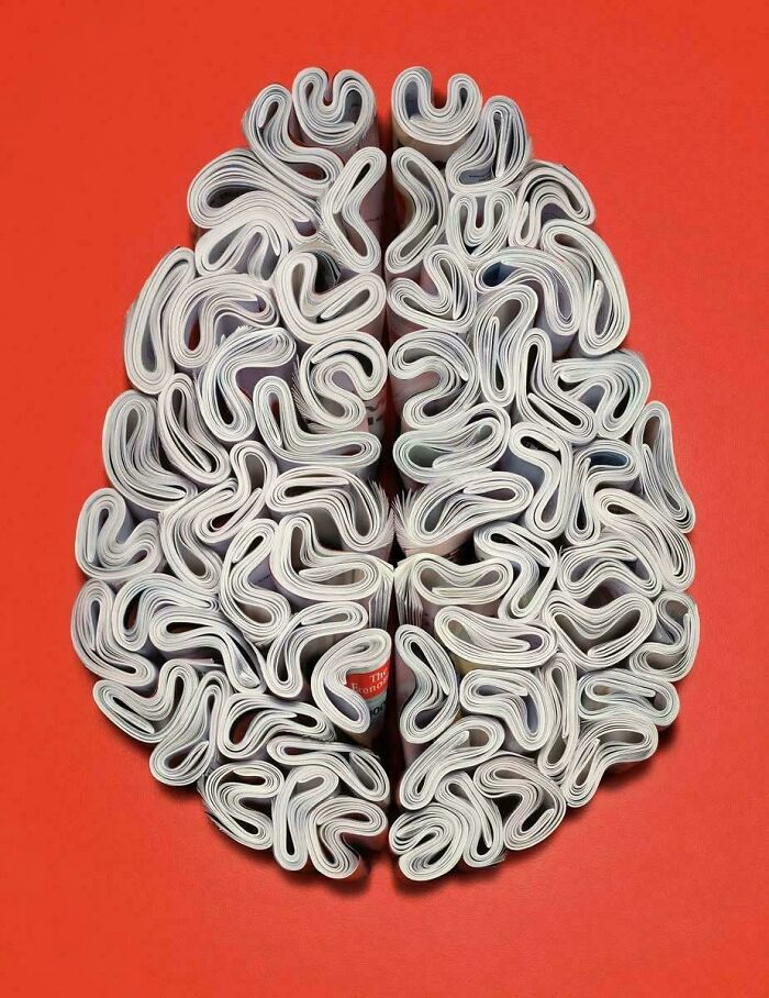
© Photo: JudgeJudyJr
#28 Gamecube Logo
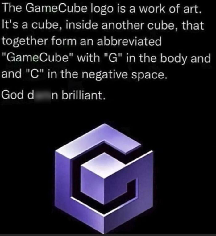
© Photo: Gentlemau
#29 Samurai Vodka (First Place In The Dieline's 50 Favorite Liquor Package Designs World Competition)

© Photo: Few_Simple9049
#30 "It Was This High." Yahoo Japan's Banner For Remembering The 2011 Tōhoku Earthquake And Tsunami
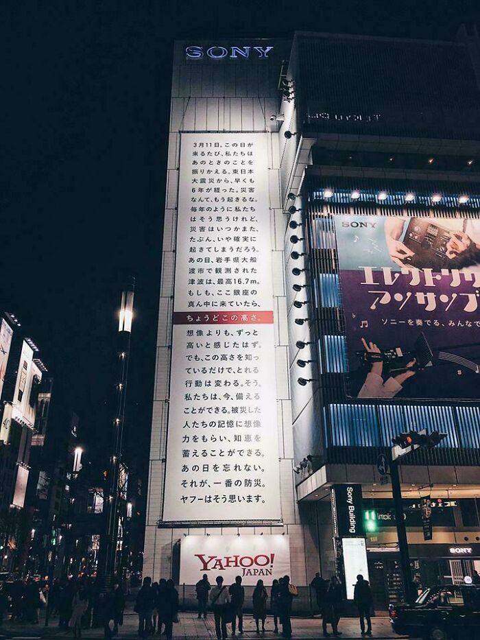
© Photo: UMEBA
#31 Building Number 909
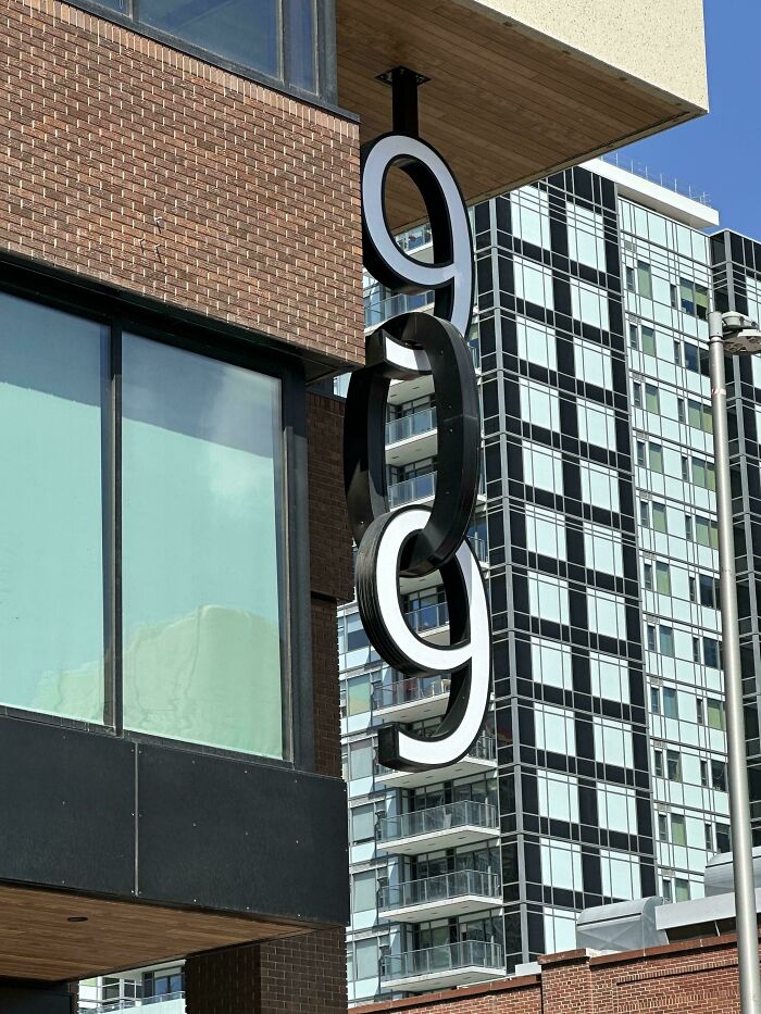
© Photo: Pinapple_Juice
#32 Japanese Restaurant Ad Leading The Way To The Place
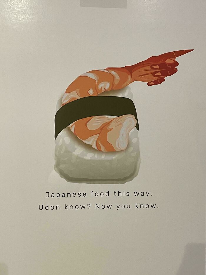
© Photo: Exotic_Particular788
#33 Non-Electronic Study Aid Shows Answers When You Push Its Translucent Buttons
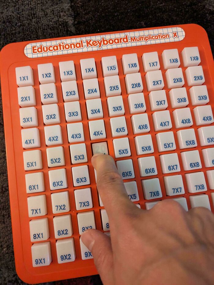
© Photo: ransoing
#34 Umbrella Stand
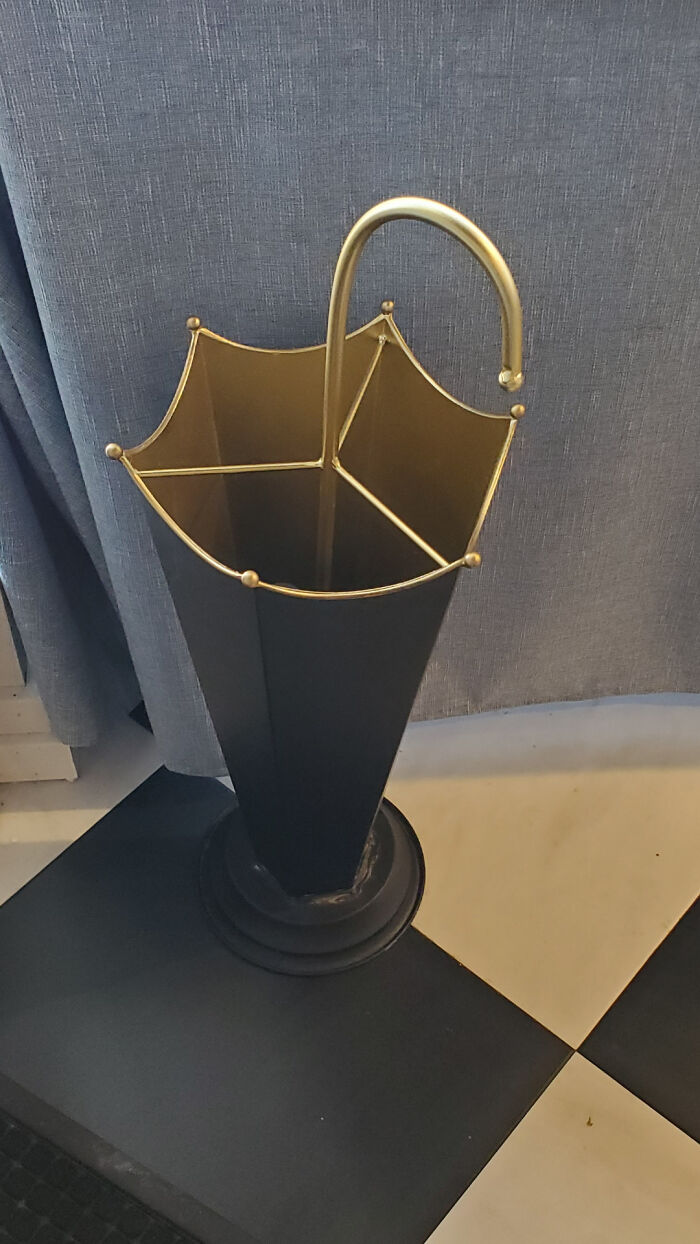
© Photo: mattandimprov
#35 This Opticians Advertisement
© Photo: Coops_tv
#36 Chair Designed Like Water Ripples
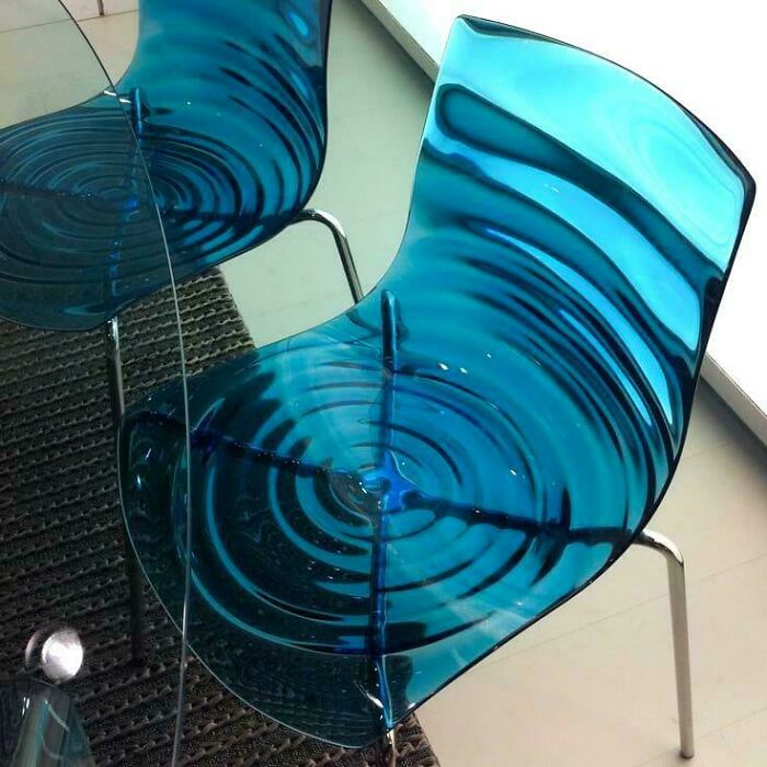
© Photo: anikkundu1998
#37 Love This One
© Photo: faysal1234
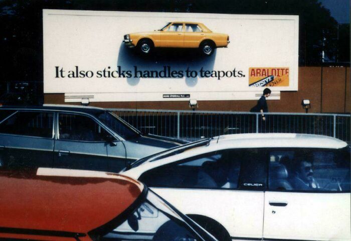
#38 1983 Araldite Glue Print Ad ‘It Also Sticks Handles To Teapots.’
© Photo: kervokian
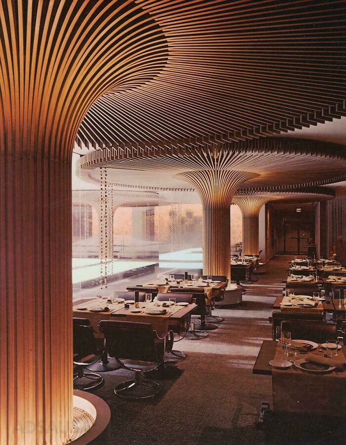
#39 The Midnight Sun Restaurant - Atlanta, Georgia - 1968
Located in Peachtree Center (originally named Garden Mall), the restaurant opened in 1968. Later, the restaurant closed in the late 1980s.
© Photo: Virtual-Bee7411
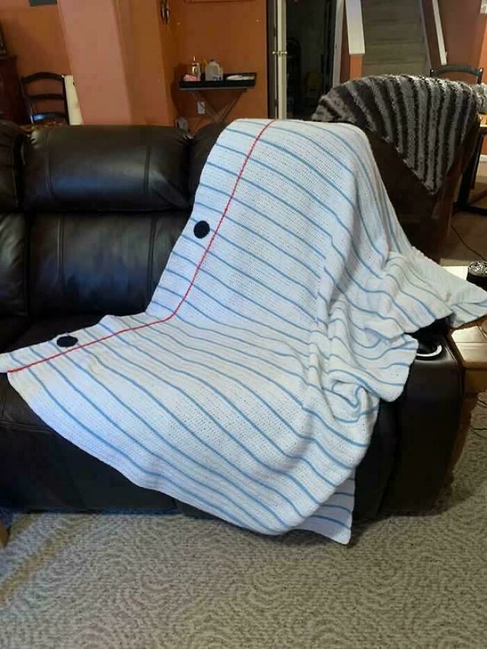
#40 Lined Paper Blanket !
© Photo: na7oul
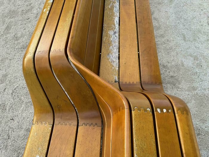
#41 Amazing Bench(S) Bratislava, Slovakia
© Photo: Sprostee
#42 The Entrance To A Furniture Store In The USA
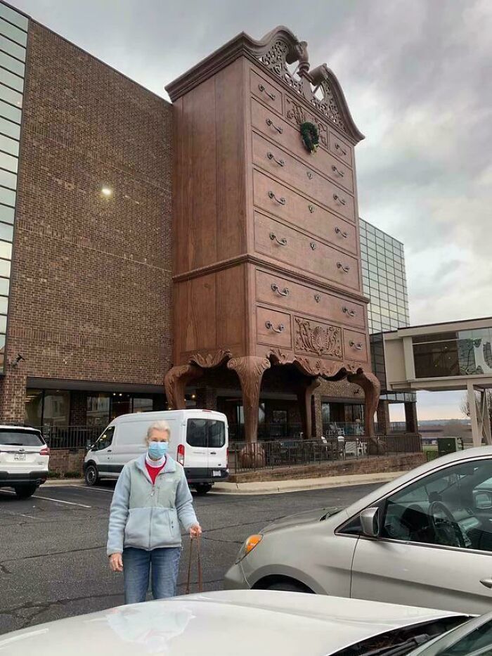
© Photo: grandeluua
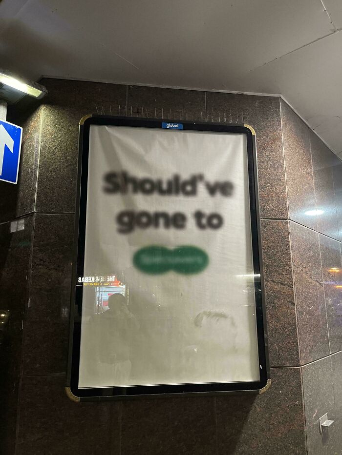
#43 This McDonald's Ad/Poster
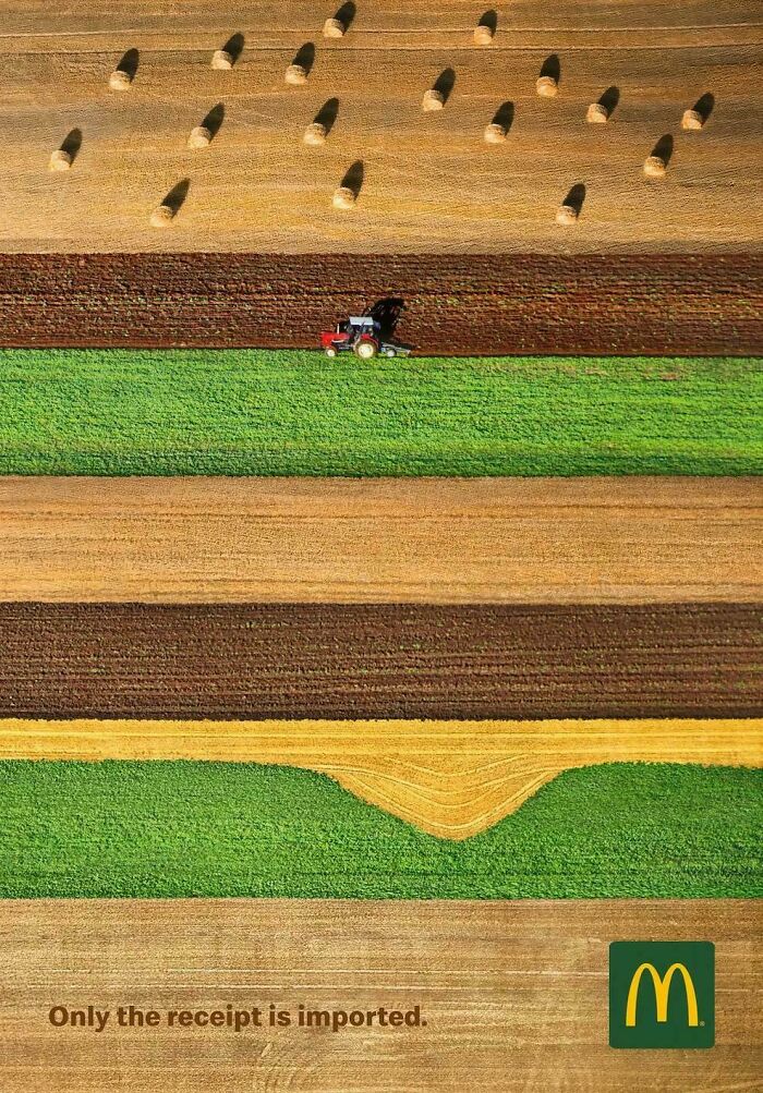
© Photo: Julczyk0024
#44 Logo For Local Kuhar Family Farm
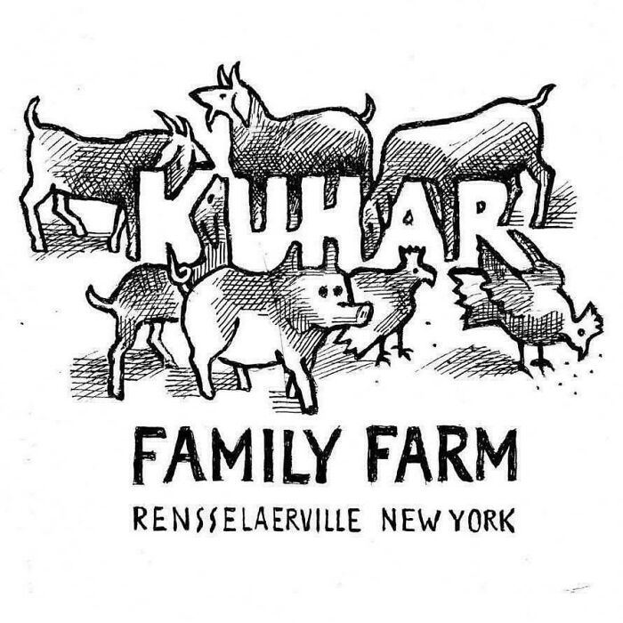
© Photo: SEND_NOODLESZ
#45 WWII Lithograph By Abram Games At Philadelphia Museum Of Art
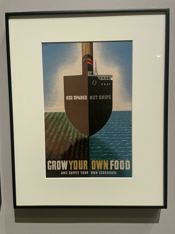
© Photo: idontevenknowatall
#46 Canberra (Australia) Bus Stops Are Angled Towards The Direction The Bus Is Coming So You Can See It Approaching
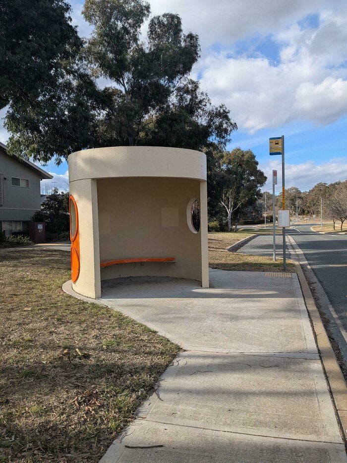
© Photo: Bosuns_Punch
#47 This Cassette Design
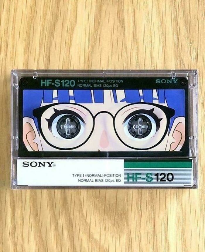
© Photo: anikkundu1998
#48 The Key Fob For The Hyundai Is The Brand Logo
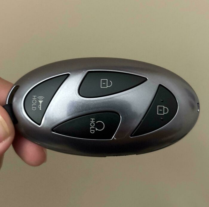
© Photo: Burger_com
#49 A Signature Designed Like A Sailing Ship (Early 19th Century)

© Photo: BritishBeast-
#50 Aston Martin Lagonda (1982)
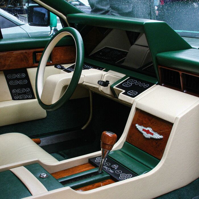
© Photo: ty003
#51 Oikos Yogurt Drinks “Shake Well”
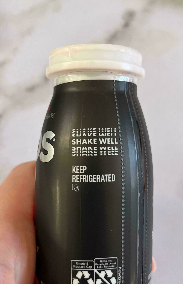
© Photo: emmalump
#52 A Captcha-Inspired Mirror Design
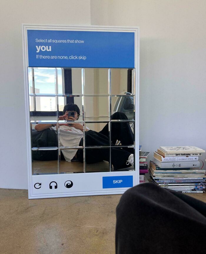
© Photo: Redditor_in_Space
#53 Impressive Poster For Her By @messypandas
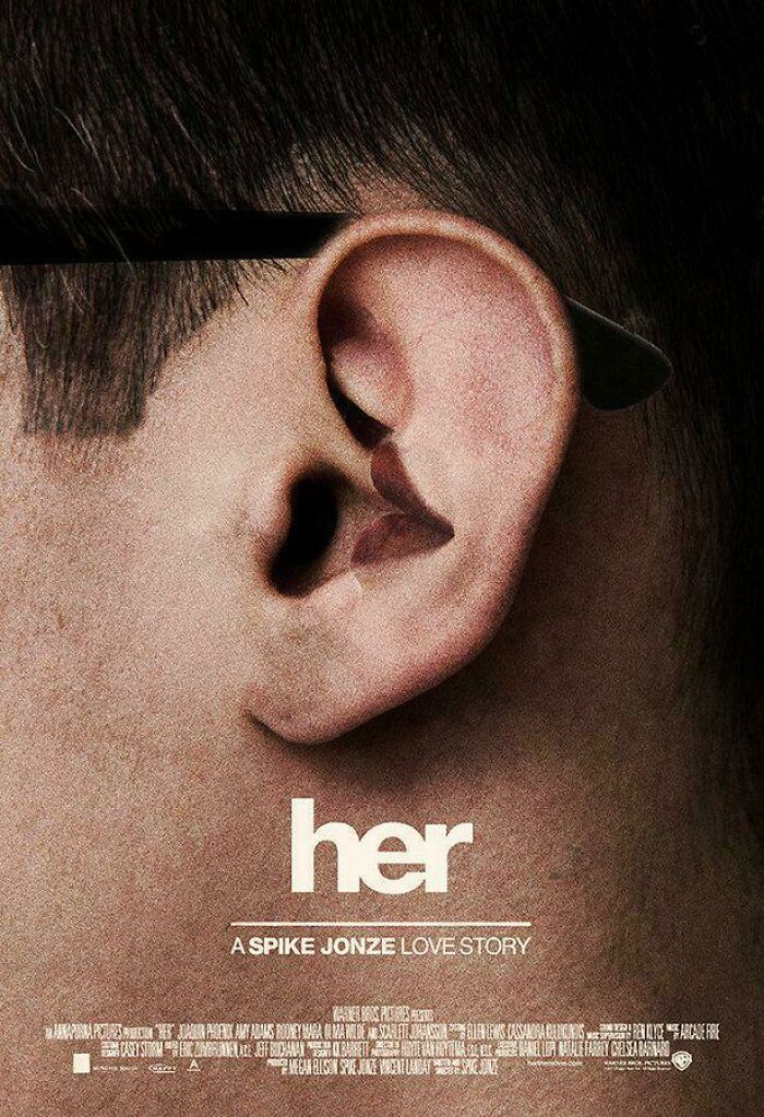
© Photo: Intelligent-Scar-655
#54 The Florida Aquarium's Sea Change Logo
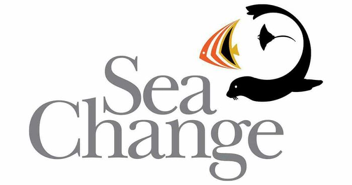
© Photo: Expensive_Kangaroo33
#55 Manufacturing Consent
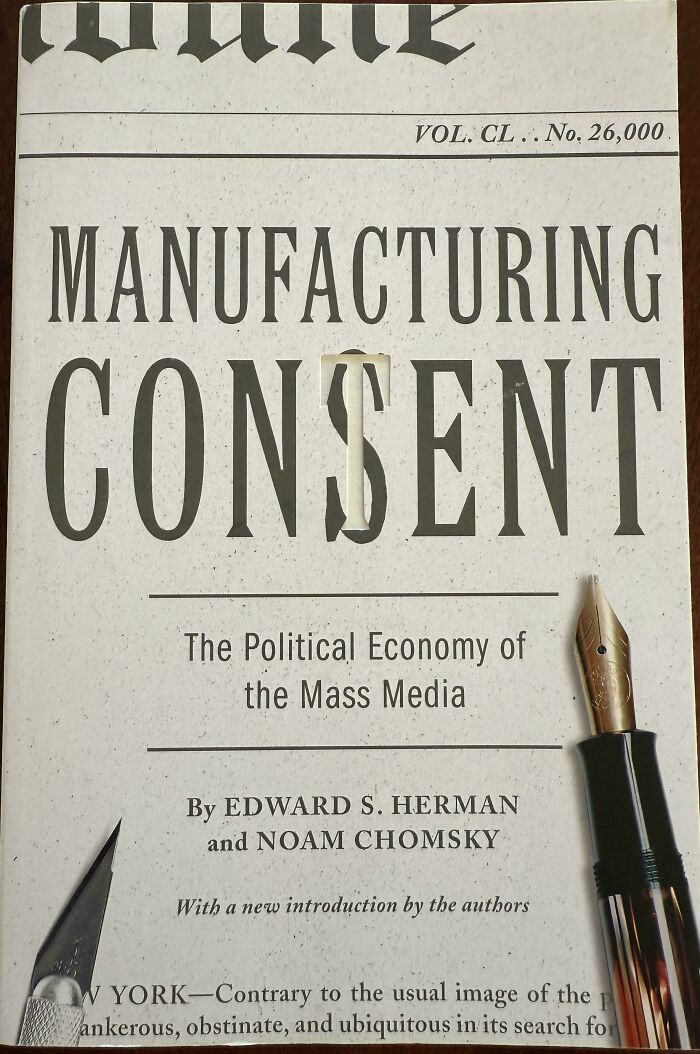
© Photo: stopothering
#56 This Billboard Ad For The Studio On Apple TV+
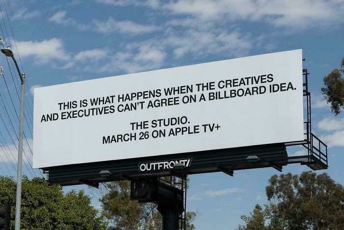
© Photo: Chillax_net
#57 Movie Tickets Look In South Korea
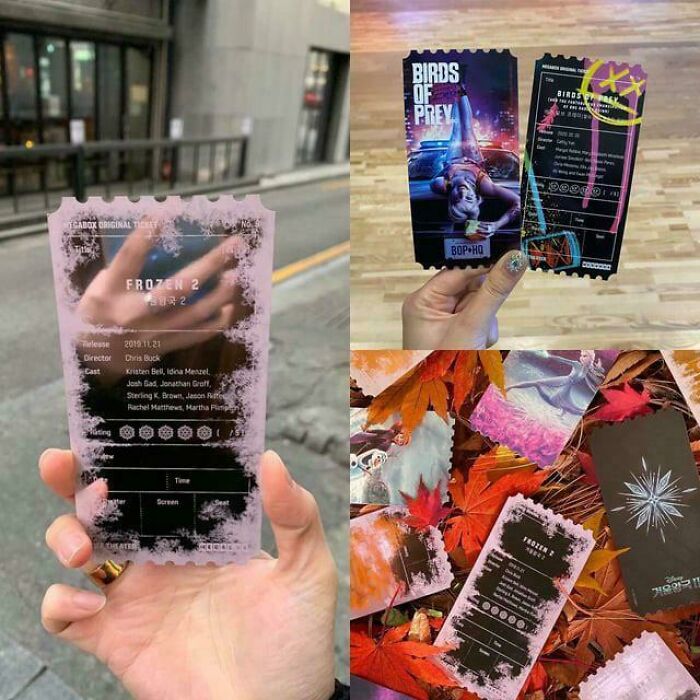
© Photo: SeaWolf_1
#58 The Reception Desk At General Motors Technical Center, 1965
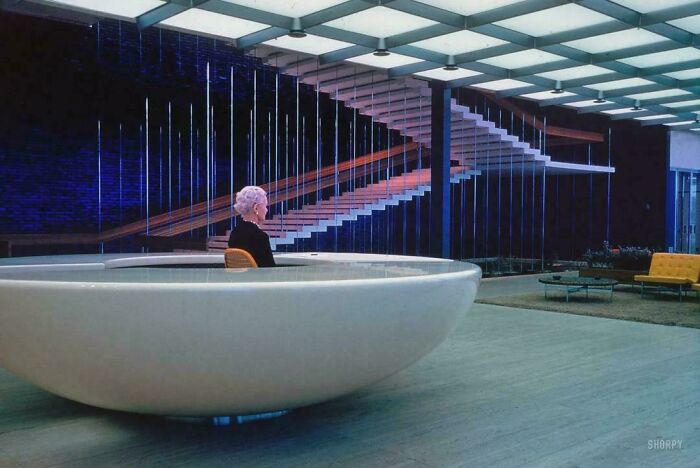
© Photo: StephenMcGannon
#59 Local Burger Place’s Graphic Menu
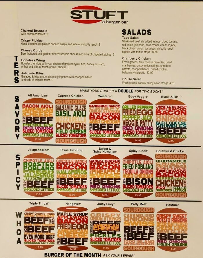
© Photo: LupahnRed
#60 The Interesting Design Of This Staircase
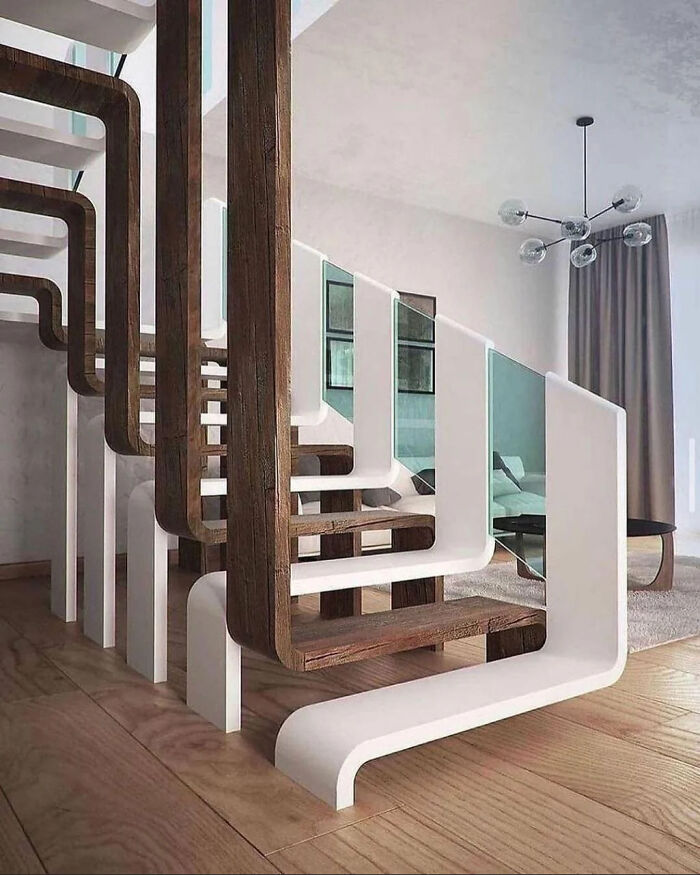
© Photo: agariopro365
#61 Nokia N93i. One Of My Favourite 2000's Era 'Smart'phones
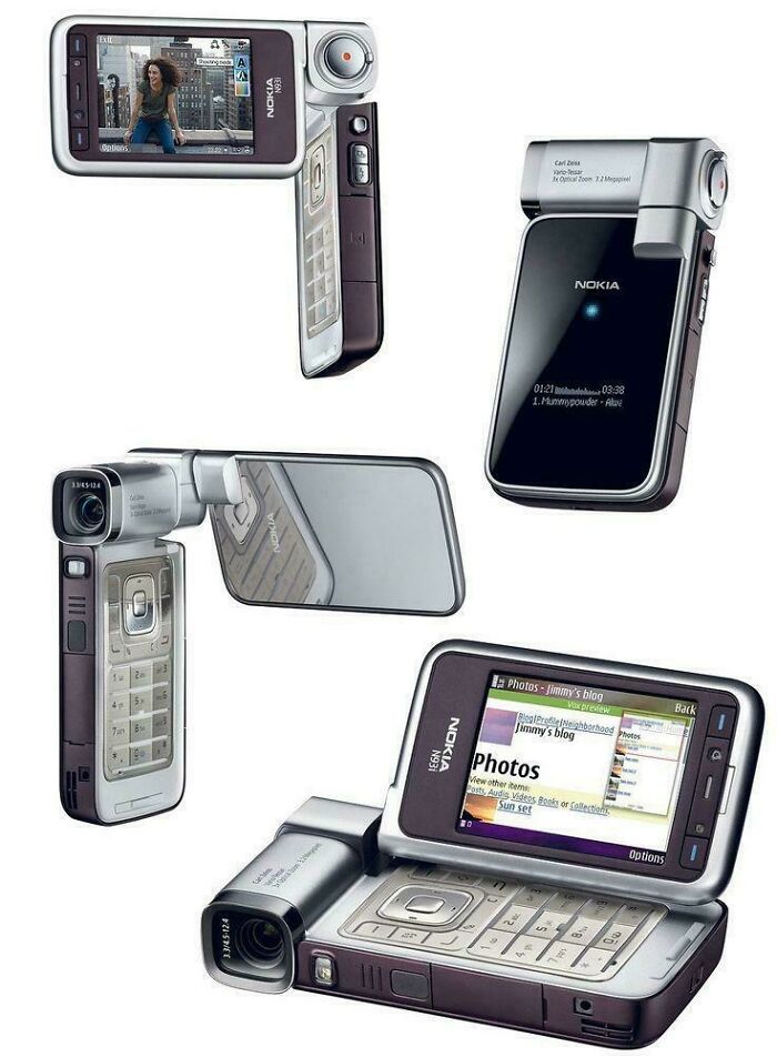
© Photo: majin_buu03
#62 Apple Graphic To Celebrate 20 Years Of Podcasts
© Photo: dhdeckard
#63 Lacoste Ad

© Photo: Brone9
#64 Mercedes Ad
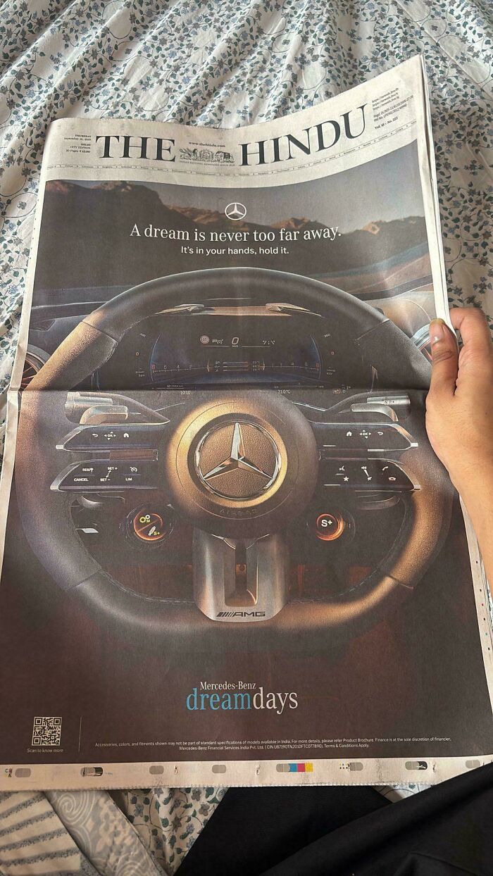
© Photo: forsaker1212
#65 Portrait Of A Lady On Fire Poster
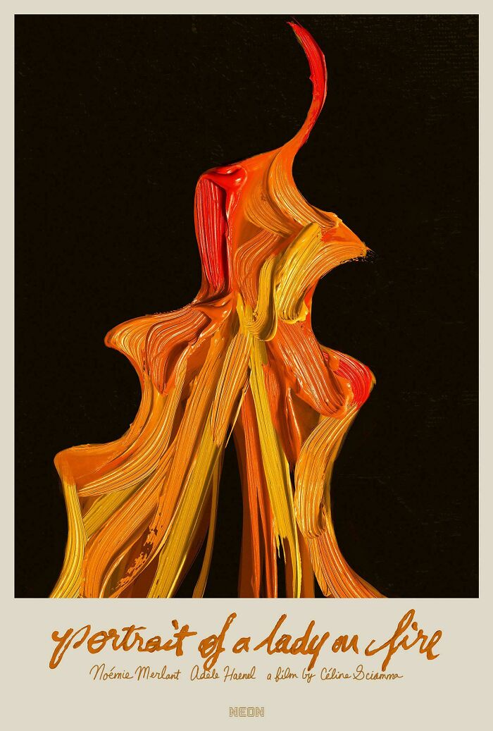
© Photo: Gloryflux
#66 “American Policies Remain The Same, Only Their Faces Change” — Iranian Poster (2018) Showing Presidents Trump And Obama As One

© Photo: ComradeKimJongUn