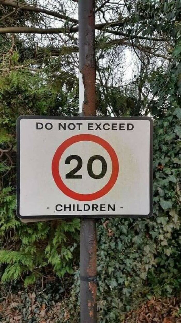
Signs have one pretty simple task, give us little pieces of soon-to-be relevant information. Naturally, brevity and clarity helps, as well as actually thinking about where all the words actually sit. Unfortunately, not all signs are created equal.
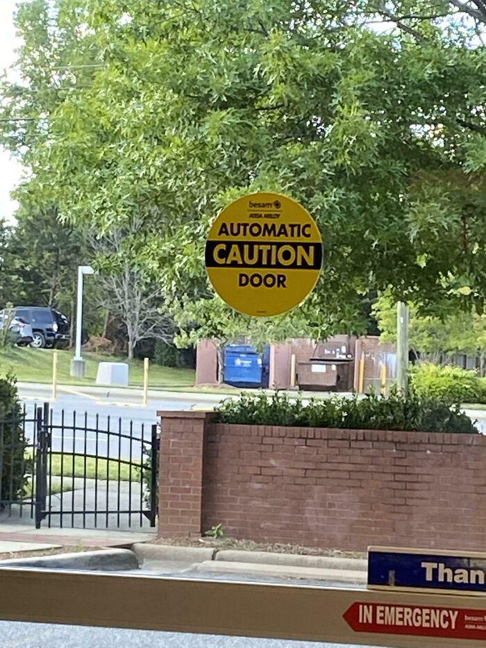
The “AutomatiCautionDoor” internet group appears to have a confusing and random name until you get that it’s part of the joke. It’s dedicated to signs that are absurd, confusing and funny, much like the one that inspired its name. So get comfortable as you scroll through, upvote your favorites and be sure to share your own ideas in the comments below.
#1 It Is Against The Law To Keep Alcohol Out Of The Hands Of Youth - Supply Alcohol To Minors
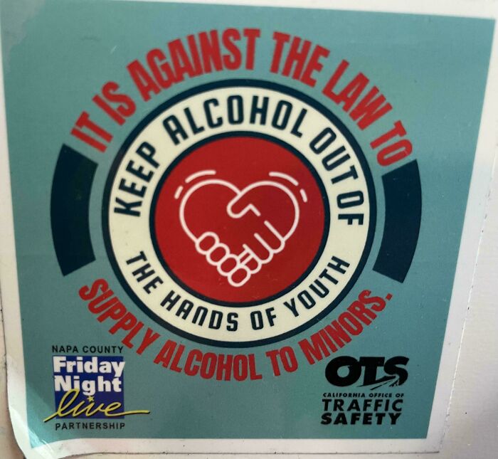
© Photo: Damaniel2
#2 That's A Little Excessive
© Photo: Freemancher
#3 My Package Was Made By Fragile La Artists
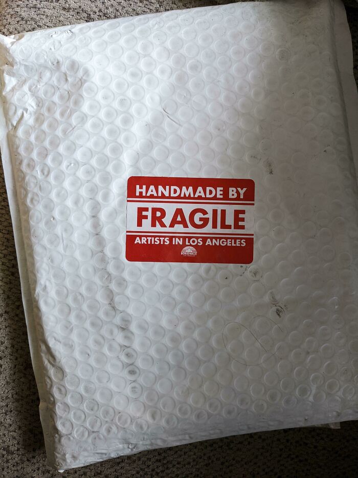
© Photo: reddit.com
Good signage is genuinely a small science, and the gap between a sign that works and one that confuses everyone is usually not that wide. Most of the time, a bad sign isn't the result of someone being careless. It's the result of someone who knew too much about what they were trying to say and assumed everyone else would too. The moment you forget that your reader has about two seconds and zero context, things start going sideways fast.
The starting point for any effective sign is simplicity, and not in a vague, inspirational-poster kind of way. Many people encounter signs while driving or walking past, which means they only have a few seconds to read and understand the message.
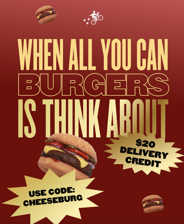
#4 We Have The Best Period Pizza
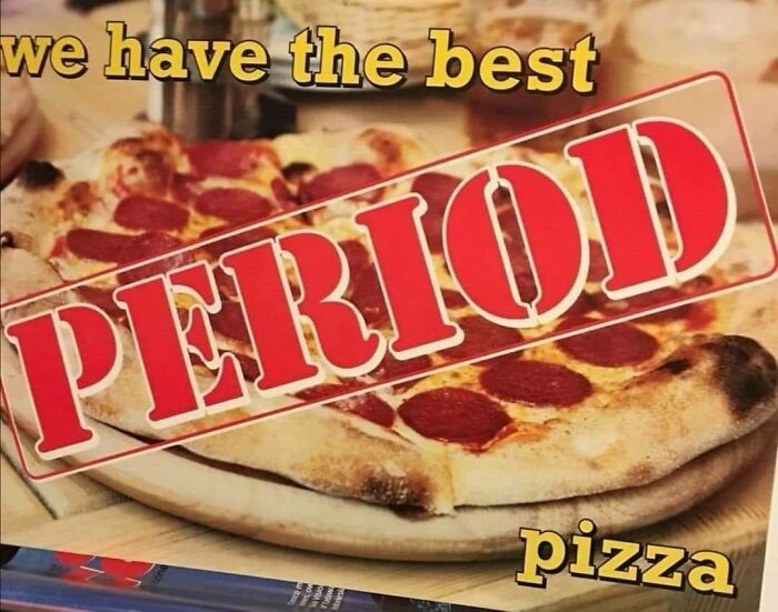
© Photo: reddit.com
#5 Don’t Save A Life
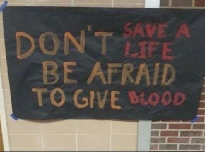
© Photo: reddit.com
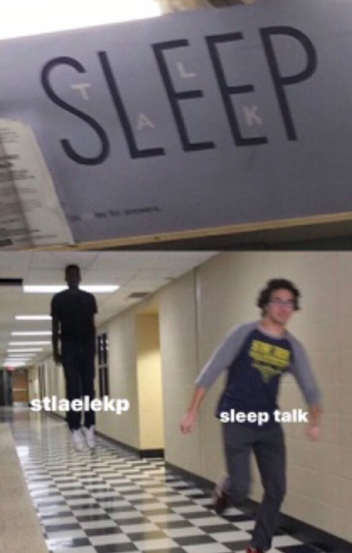
#6 No Everything Im Is Possible
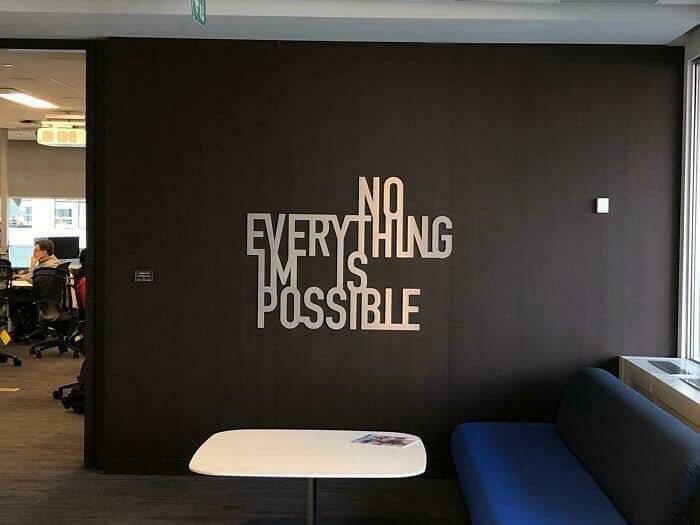
© Photo: itsSIR2uboy
That's not a lot of runway. The job of a sign is to deliver one clear idea, not three ideas wrapped around a disclaimer. Every extra word is a small tax on the reader's attention, and attention is the one thing signs absolutely cannot afford to waste. If you find yourself writing a sentence that starts with "Please be advised that," you've already lost.
#7 Don't Be Happy Worry
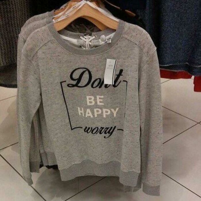
© Photo: VioletNocte
#8 Title
© Photo: redditkitty109
#9 The Danger Pipe Is Submerged
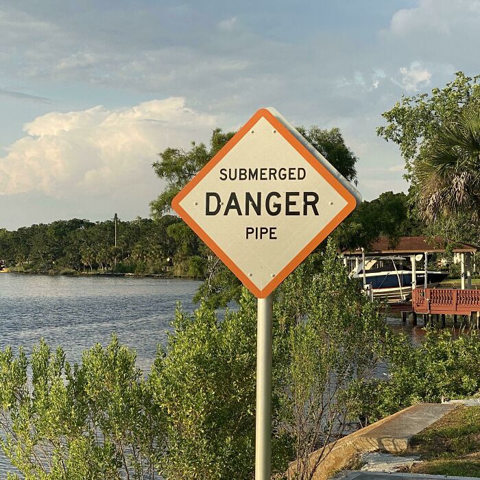
© Photo: blacknthebeanstalk
After simplicity comes the visual stuff, which is where a lot of signs quietly fall apart. High contrast between the text and the background is one of the most critical factors in making signage readable, especially from a distance. A dark background paired with light-colored text, or vice versa, helps catch the eye and keep the content legible even at a glance.
#10 Eat Kids Drink
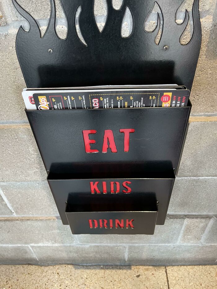
© Photo: JustSomeFeedback
#11 People Are Eating Children In This Area
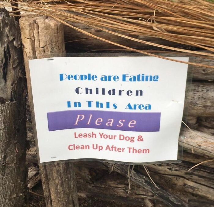
© Photo: reddit.com
#12 Tf Am I Supposed To Do?
© Photo: aa13-
This isn't a stylistic choice so much as a biological one. The human eye processes contrast and shape before it ever reads a single word, which means if a sign doesn't stand out immediately, it simply doesn't get a second chance. Research has consistently backed this up, with studies finding that color pairings like yellow on black or white on blue tend to outperform others when legibility is the priority.
#13 I Understand It's On Purpose, But It's Still Pretty Funny
© Photo: Deminla
#14 Do Not Sacred Land Enter
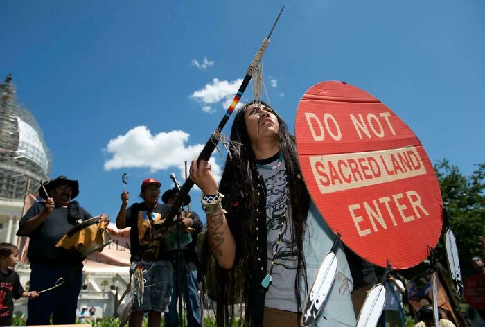
© Photo: tries-toohard
#15 Don’t Vote, Forget
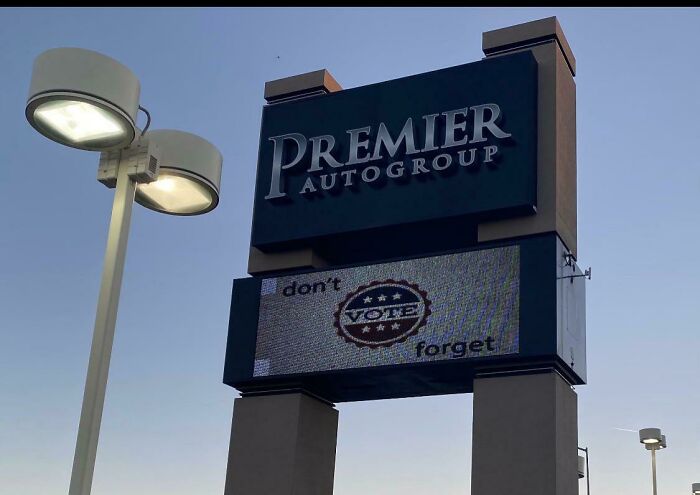
© Photo: videogamebruh
Fonts matter more than most people think, and the wrong choice can quietly sabotage an otherwise decent sign. Overly decorative or handwritten-style fonts can be difficult to read from a distance, which is why clean, simple typefaces consistently outperform ornate ones when the goal is fast comprehension.
#16 Such Unfortunate Placement Of Two Nice Sentiments
© Photo: Ptdgty
#17 Quiet Have A Wednesday
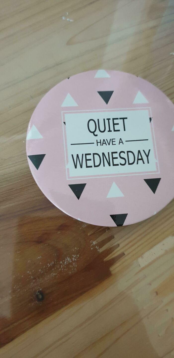
© Photo: Frostmage82
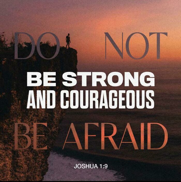
#18 Do Not Be Strong And Courageous. Be Afraid
© Photo: Wqiu_f1
Sans-serif fonts like Arial or Helvetica tend to be the workhorses of effective signage precisely because they don't ask anything of the reader. The sign does its job and gets out of the way. Script fonts, meanwhile, are charming on a wedding invitation and quietly baffling on a sign telling you where the emergency exit is.
#19 Guaranteed Reduced Quality
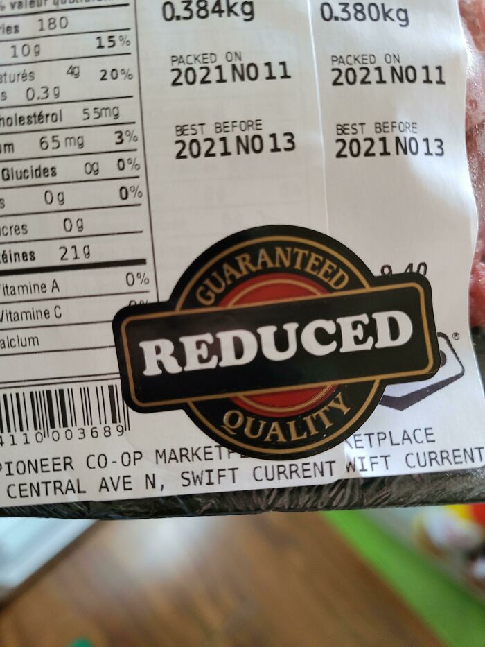
© Photo: colin_powers
#20 People Write Because They Congrats Can't Spell Congrajilashins
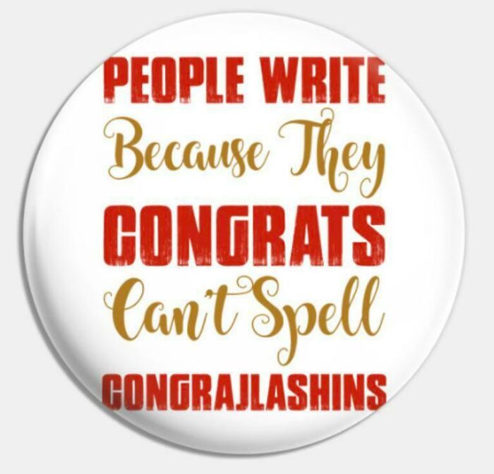
© Photo: wass_poppin_
#21 My Muffin Was Thanks! Prepared Safely
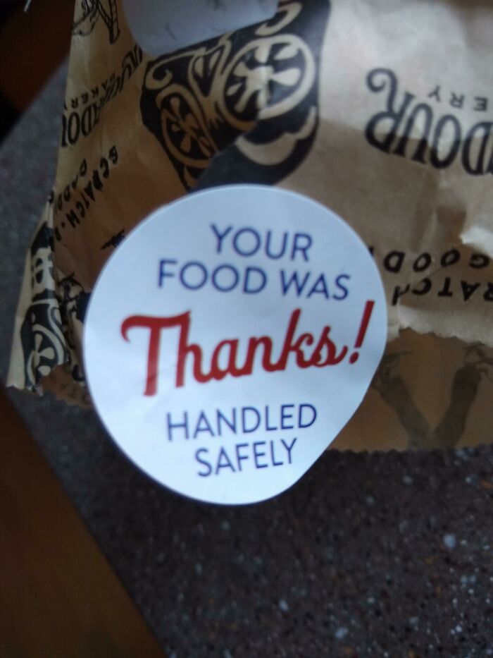
© Photo: unitedshoes
Then there is the question of placement and context, which is where even well-designed signs can go completely off the rails. Signs aimed at pedestrians can afford to include more detailed text, while signs designed for drivers need larger, bolder lettering that can be absorbed at speed. Context shapes everything. A sign that works perfectly in a quiet hallway might become invisible on a busy street corner, and a sign that reads fine up close might dissolve into visual noise from thirty feet away. Good sign designers actually test their work from different distances before finalizing anything, which sounds obvious but is apparently not universal practice.
#22 Have Black I Ever Lives Told You Matter
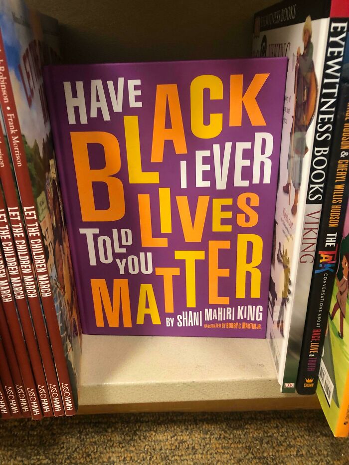
© Photo: ThePhantom1994
#23 Guilty As Charged. “Is Calling Adventure & I Must Go”
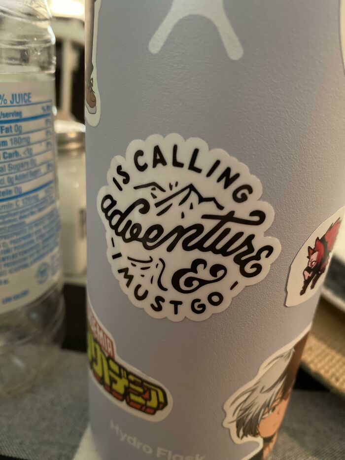
© Photo: reddit.com
#24 Bat Gun Tle
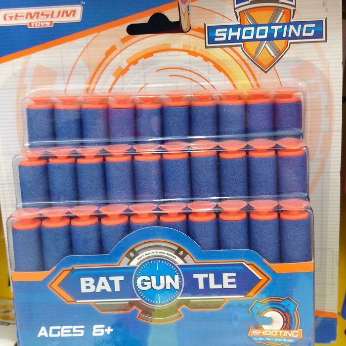
© Photo: CheckItFace14
Color also carries meaning beyond just contrast, and tapping into that psychology is one of the subtle tools in the sign-maker's kit. Red signals urgency and caution, blue conveys direction and calm, and green indicates safe navigation. These aren't arbitrary choices but conventions built on decades of behavioral research. Ignoring them doesn't make a sign creative. It usually just makes it confusing, because people are pattern-matching machines and they expect certain colors to mean certain things.
#25 Casper Mattress Ads On The Subway
© Photo: ChuckieCHO
#26 Spread Cream Not Cheese Disease
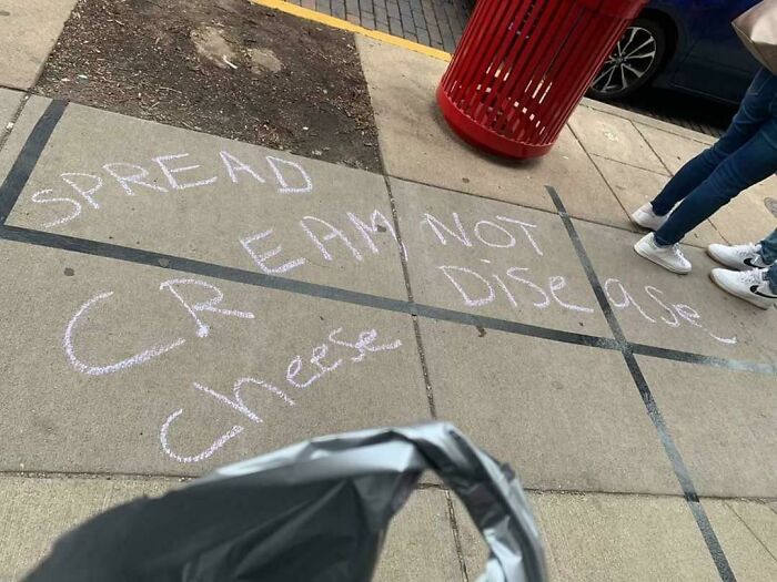
© Photo: WolfBeard_1
#27 All Hail Our Lord And Savior
© Photo: reddit.com
Finally, there is the idea of visual hierarchy, which is just a fancy way of saying that not everything on a sign deserves equal attention. Making all elements equally prominent prevents viewers from identifying the primary message and creates a cluttered, unprofessional look. The most important information should hit first, everything else should support it, and nothing should be fighting for the spotlight. A sign with good hierarchy feels effortless to read. A sign without it feels like homework.
#28 Grandpas Dads Are Rules Without
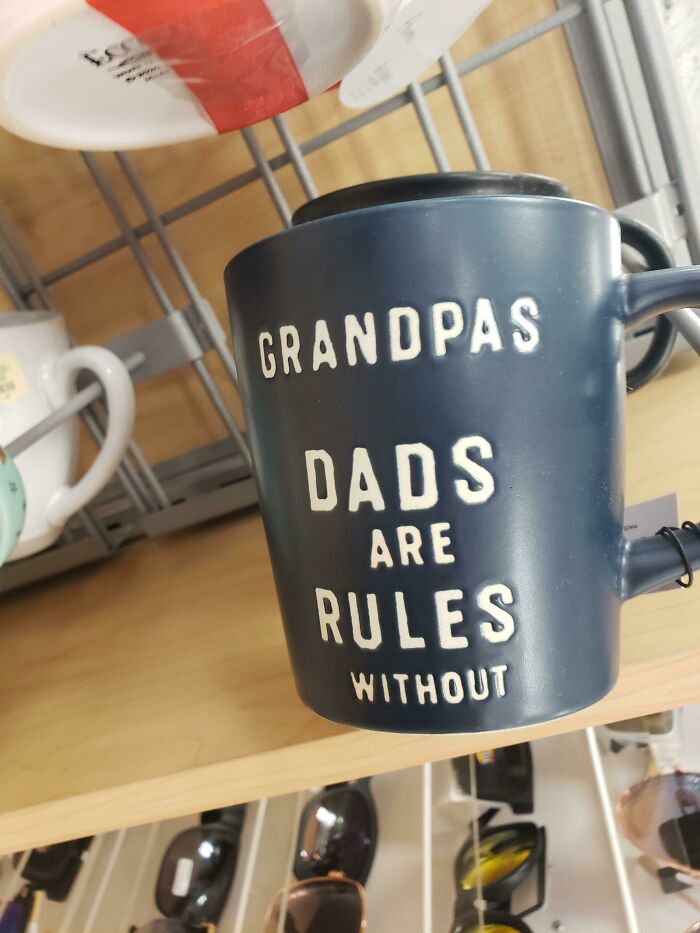
© Photo: thedudefromsweden
#29 Those Who Love The Best People To Eat Are Always
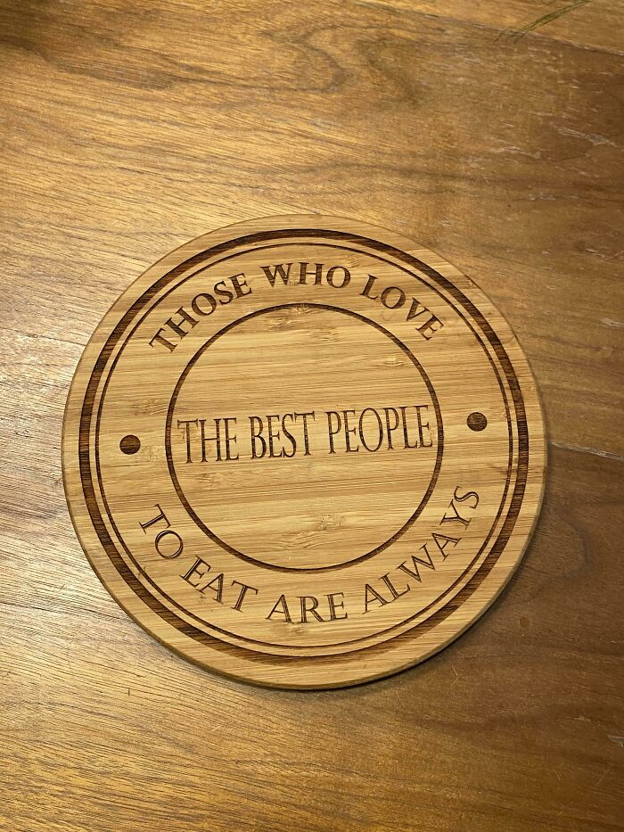
© Photo: Noahsch19
#30 WiFi Free Spot
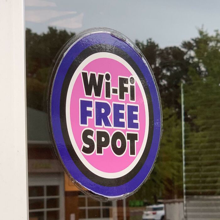
© Photo: hello_raleigh-durham
When all of these pieces come together, a sign becomes almost invisible in the best possible way. It just works, people absorb the information, and they move on with their day. When they don't come together, you get something confusing enough to be photographed and shared with thousands of strangers on the internet.
#31 "Mom, You Don't Have A Brother Named Usmc."
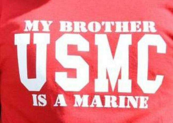
© Photo: CAdamH
#32 !do Not Private Enter!
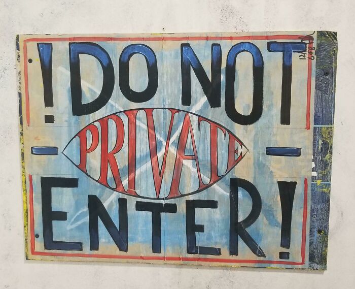
© Photo: berfle
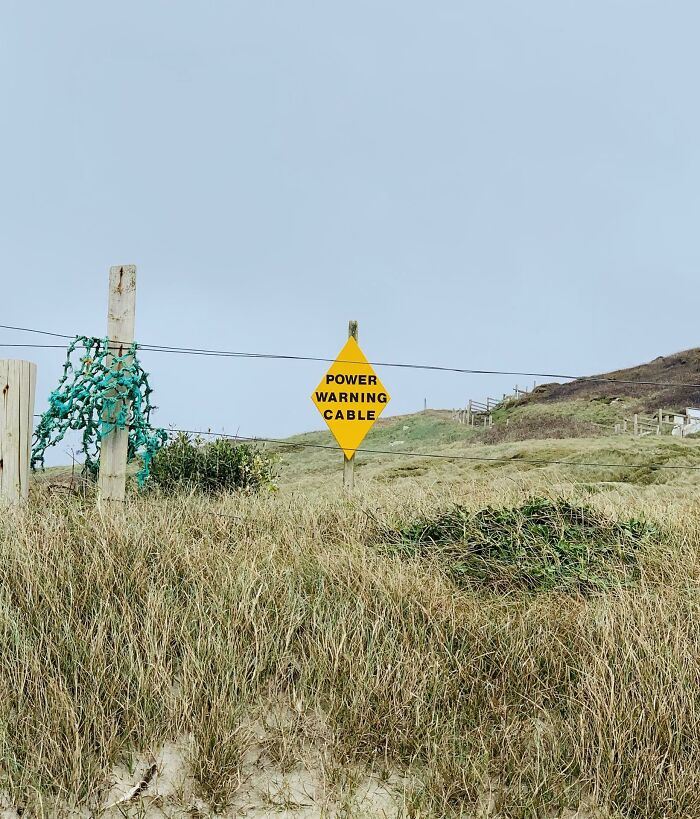
#33 Power Warning Cable
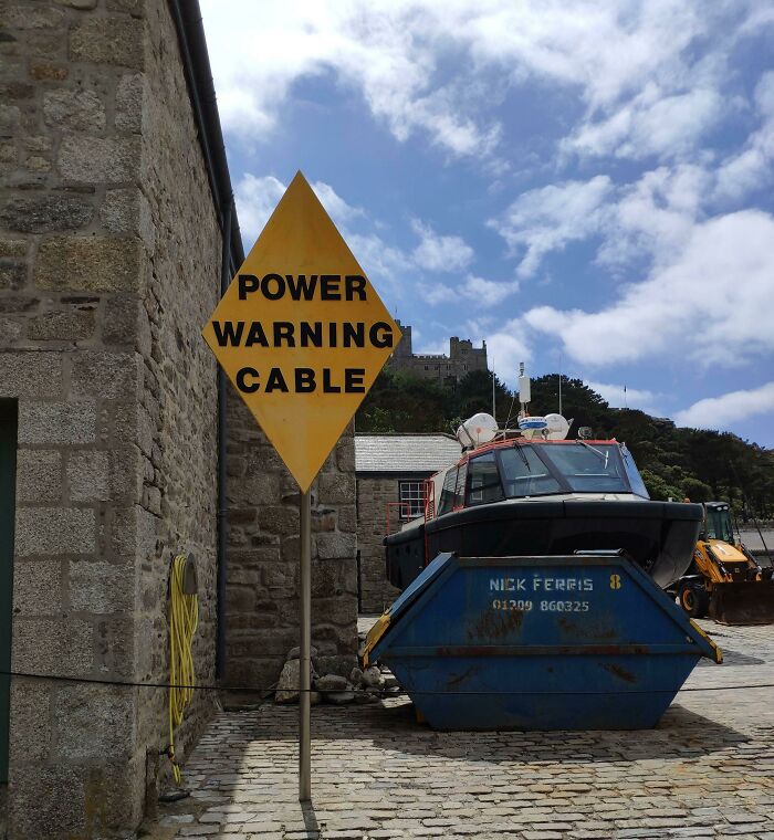
© Photo: dalbyman
#34 Be Work Zone Alert
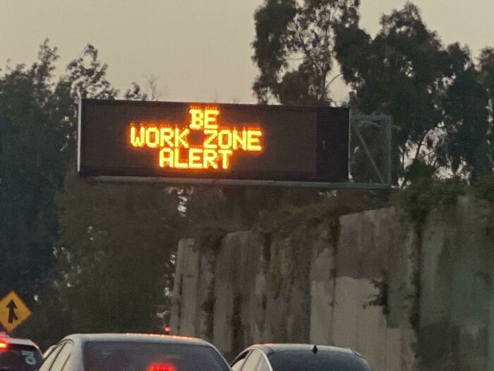
© Photo: SoccerBallPenguin
#35 Go Children Slow
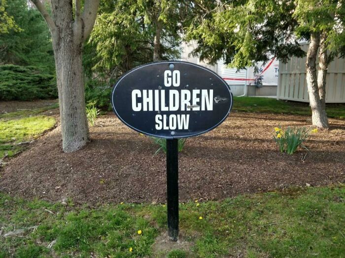
© Photo: thedudefromsweden
#36 Found This Little Gem The Other Day
© Photo: Pickledpeppers19
#37 Submerged Danger Structure!
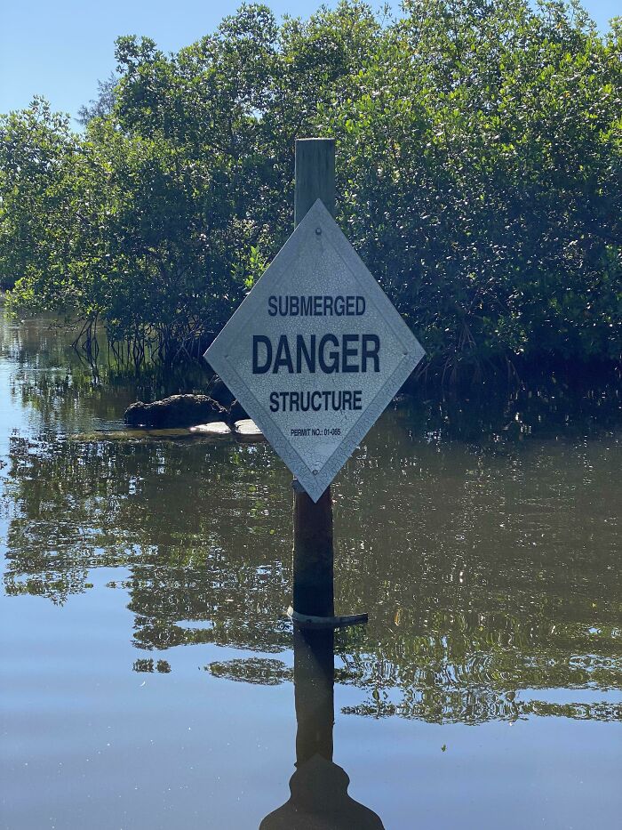
© Photo: BenjiBonZ
#38 High Driver Fan Low
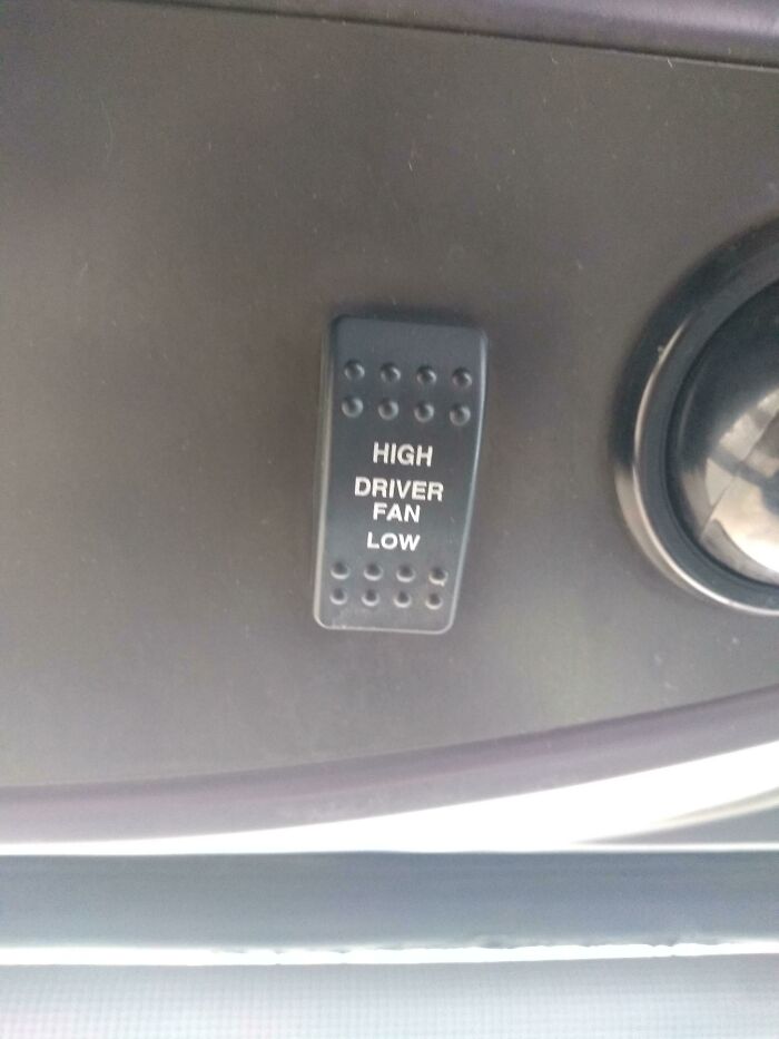
© Photo: emzirek
#39 Artificially Maple Flavored Syrup
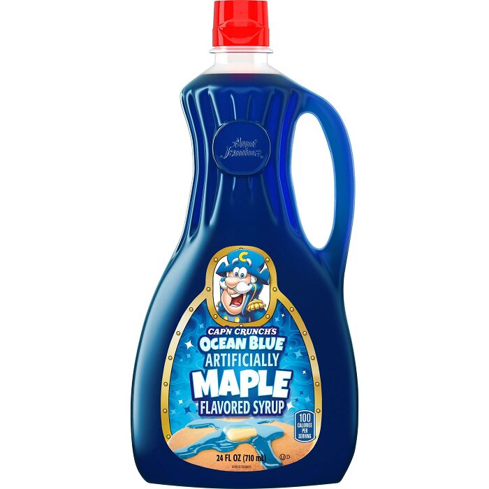
© Photo: blobinsky
#40 Good Thing The Danger Channel’s Over, Not Like You Were Trying To Communicate The Opposite Or Anything
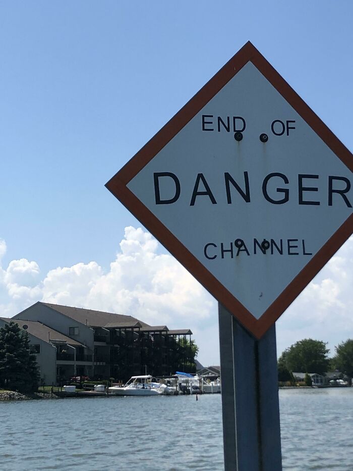
© Photo: jimmyk22
#41 Wait Here To Be Stop! Called Thank You!
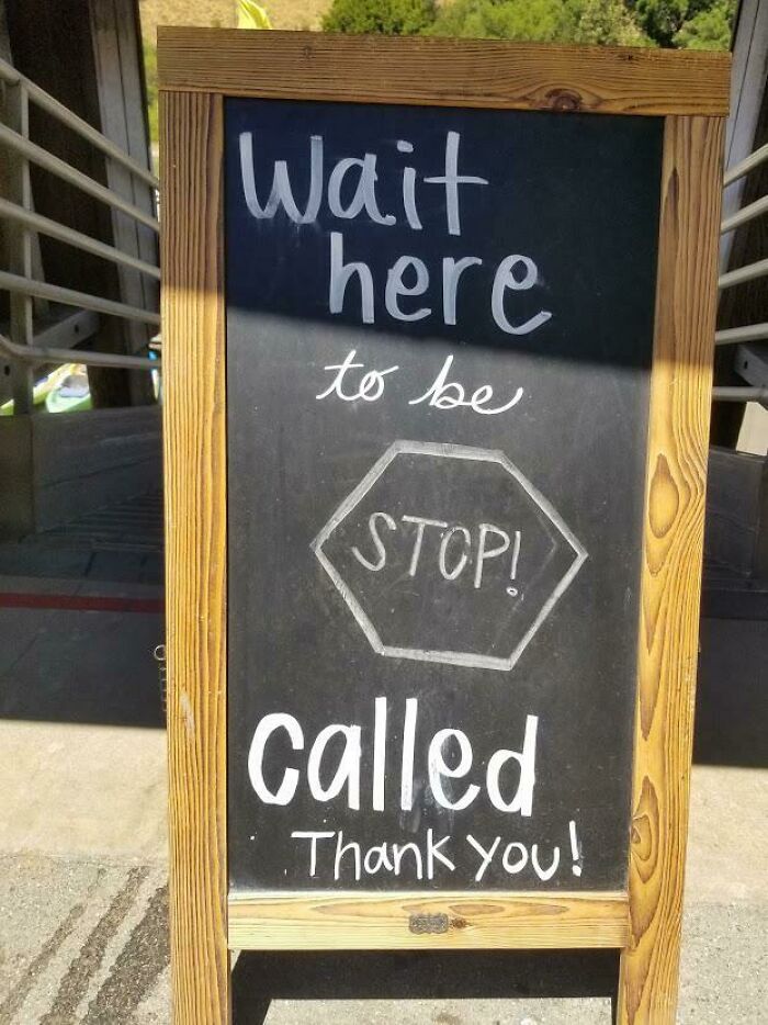
© Photo: chfabbro
#42 Thank - Drake Me Later
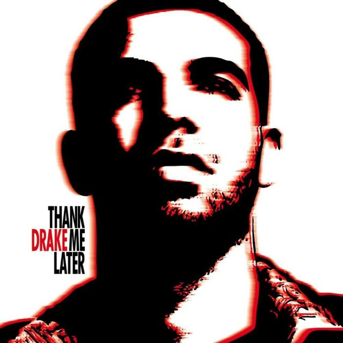
© Photo: KaxeyTV
#43 Roland Ennos The How One Material Wood Shaped The Whole Age Of Human History
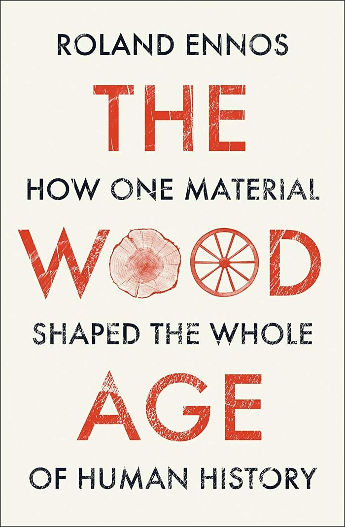
© Photo: ohdearitsrichardiii
#44 Is A State Happin Of Ess Mind
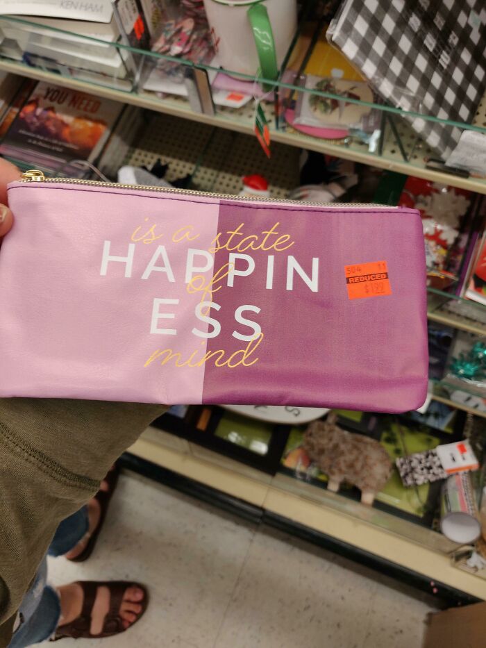
© Photo: originalfreckle
#45 Thank Because Sneakers You
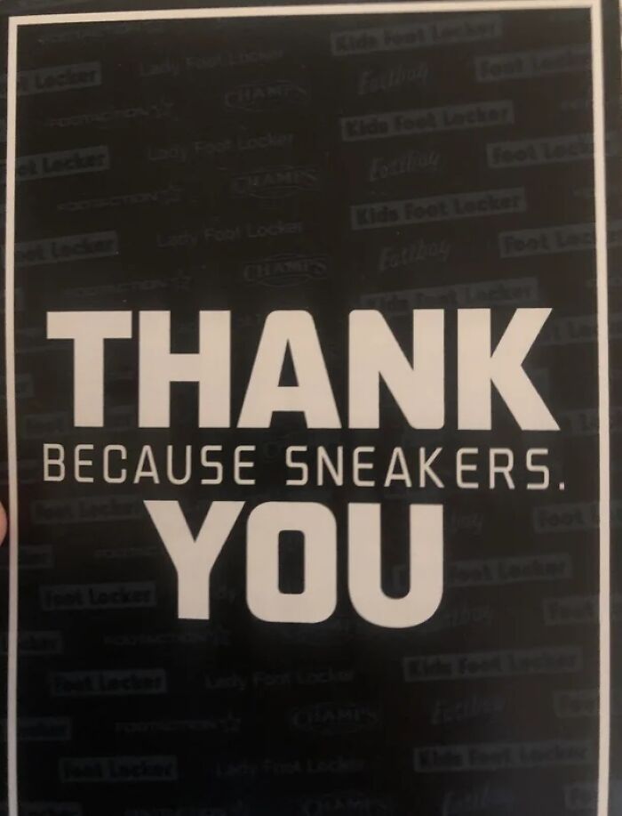
© Photo: PieCreeper
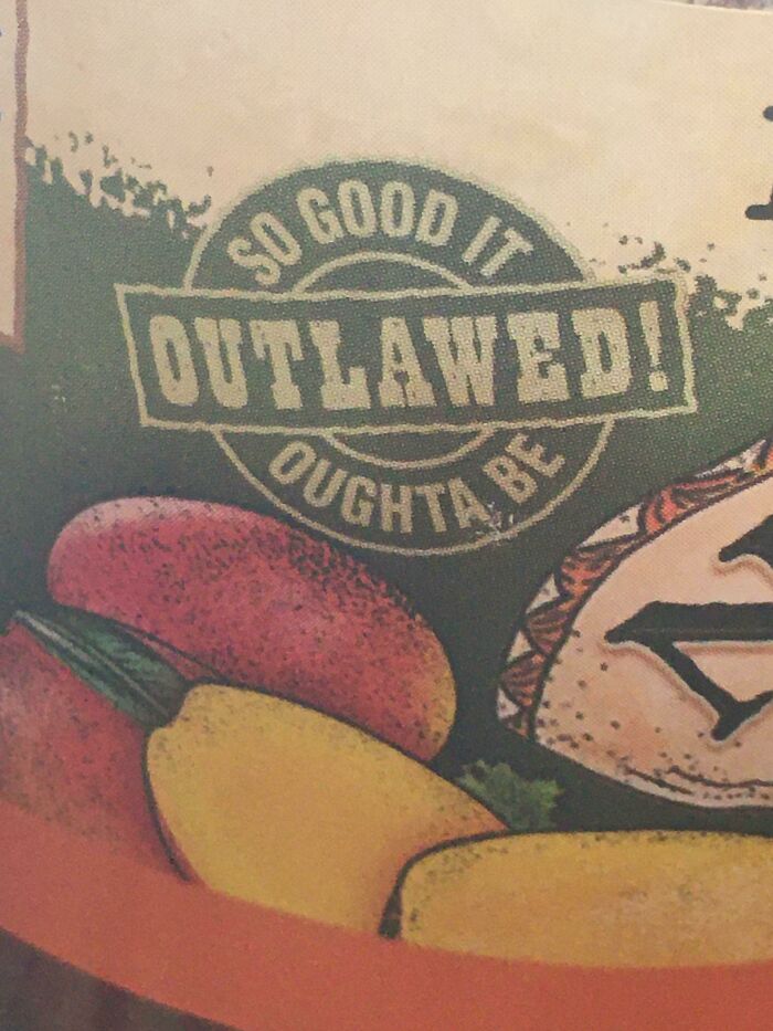
#46 So Good It Outlawed! Outta Be
© Photo: Shreks_stepfather
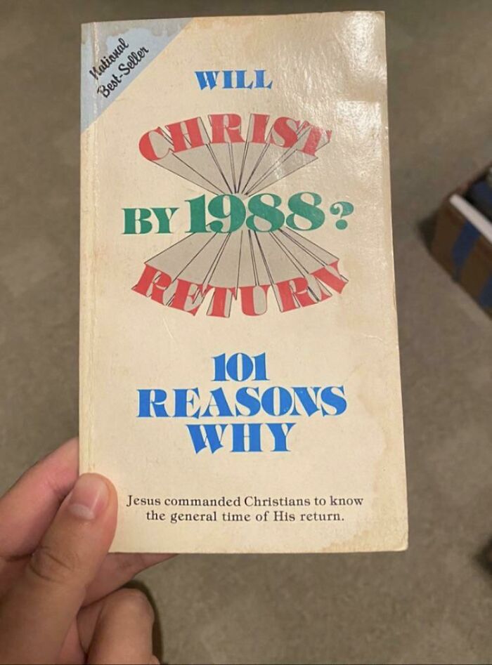
#47 Will Christ By 1988? Return (101 Reasons Why)
© Photo: youtookmycake
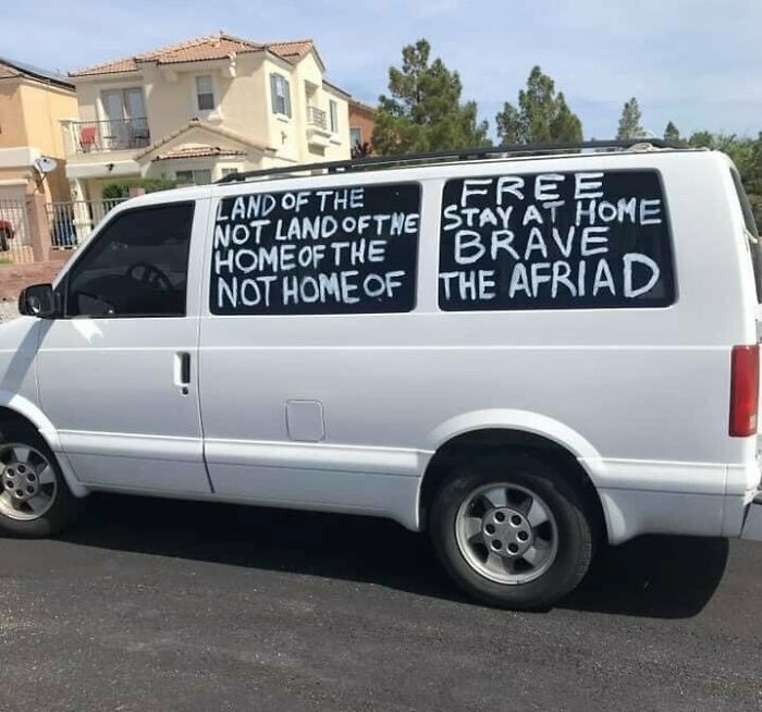
#48 Land Of The Not Land Of The Home Of The Not Home Of
© Photo: TotemRiolu
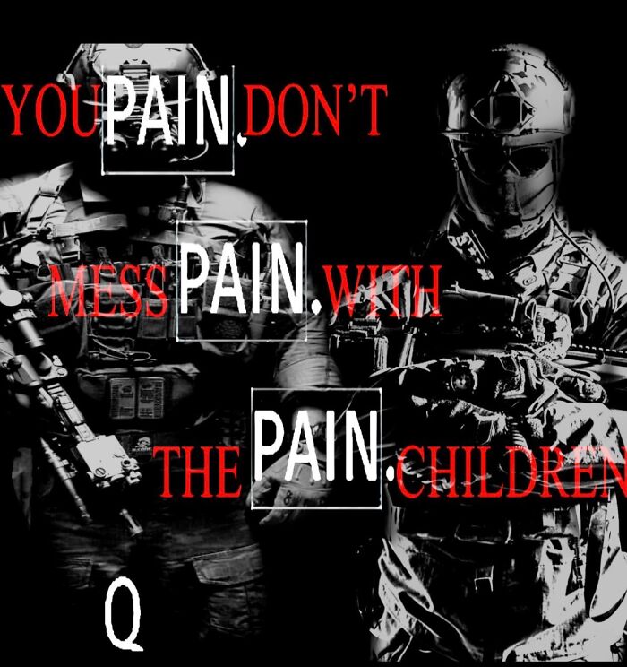
#49 “You Pain Don’t Mess Pain With The Pain Children” - Q
© Photo: yanmagno
#50 This Email I Received From Postmates
© Photo: BurritoSOFTWARE
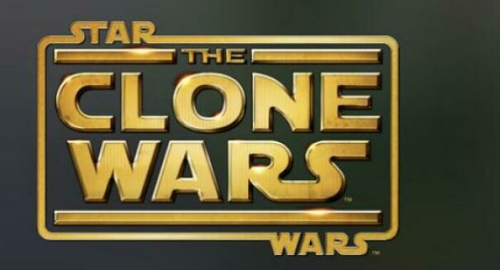
#51 Star The Clone Wars Wars
© Photo: Predatedtuna870
#52 One Of These Things Is Not Like The Others
© Photo: xtratopicality
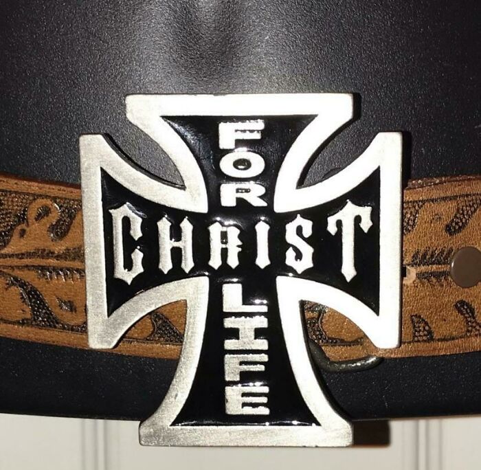
#53 For Christ Life
© Photo: spiritualgrandma
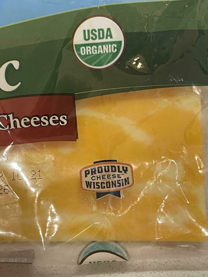
#54 Never Seen A Prouder Cheese Wisconsin
© Photo: jlb190
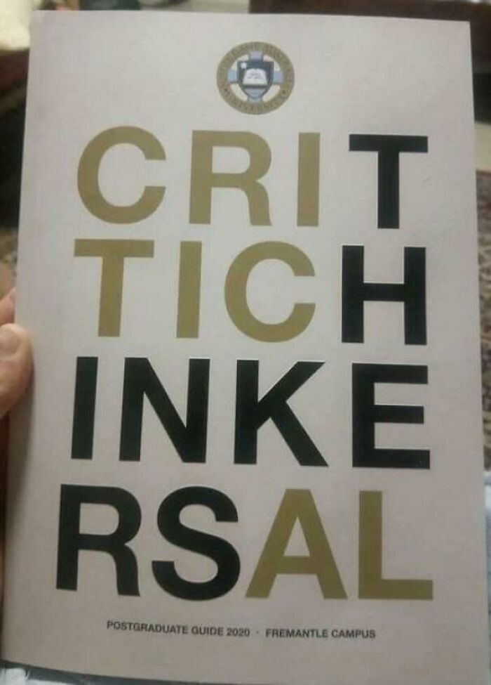
#55 Crit Tich Inke Rsal
© Photo: ThunderousKhunt
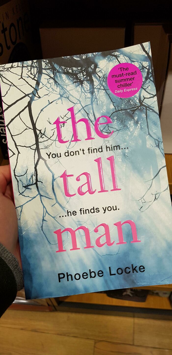
#56 I Love This Book! Its Called...uh
© Photo: Cooldude075
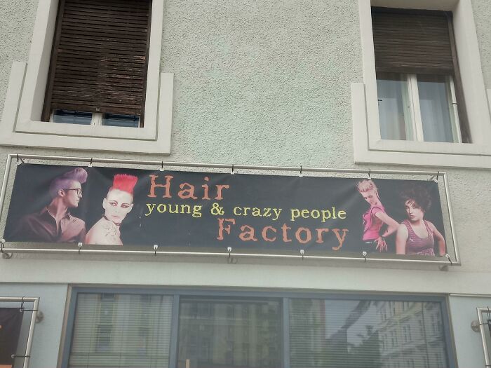
#57 Hair Young & Crazy People Factory
© Photo: Apocalypse_One
#58 This Purchase Supports Ocean Spray 100+ Canadian Farmers
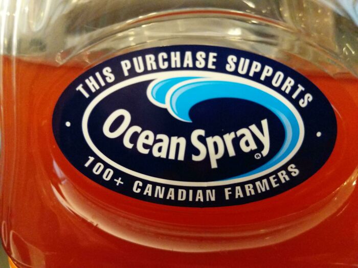
© Photo: Lexotron
#59 "Not Reserved, Available" Or "Reserved, Not Available"?
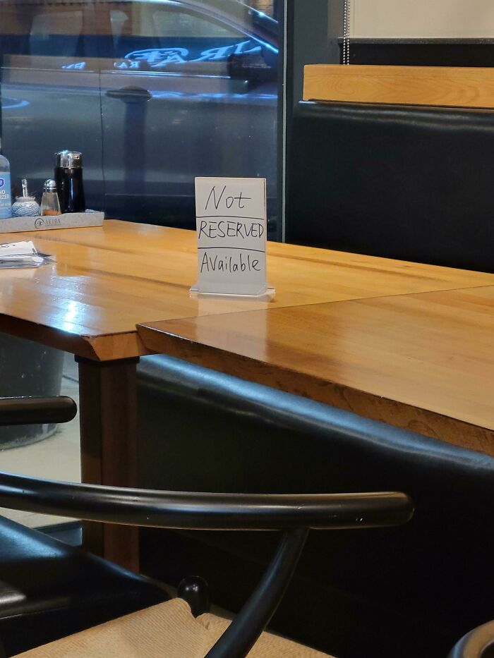
© Photo: TonyDanza888
#60 Every Please Wash Your Hands Body
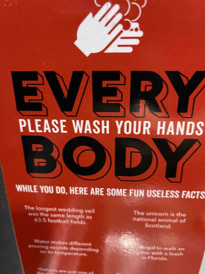
© Photo: thefearedturkey
#61 Covid-19 Connecticut Prevention
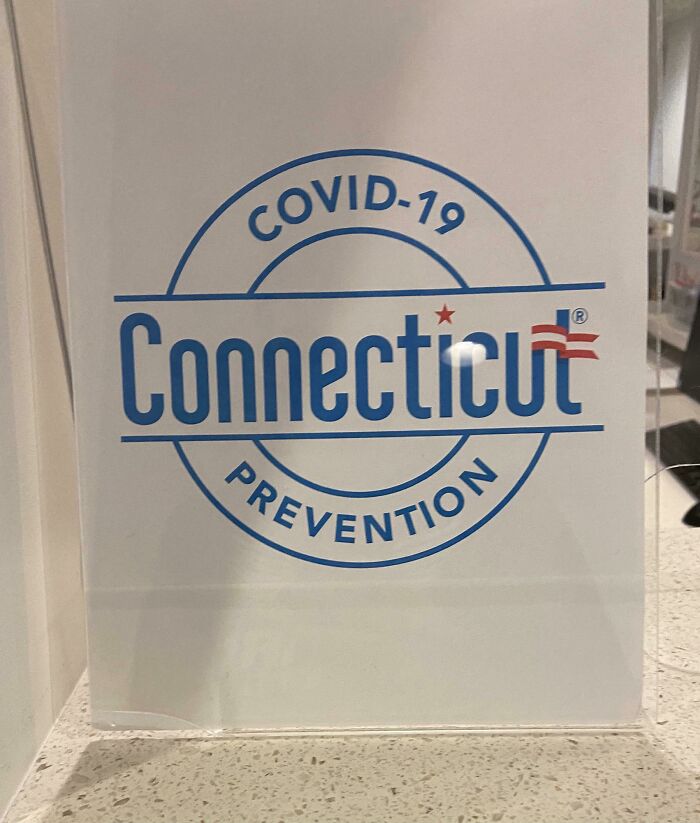
© Photo: swegman24
#62 Power Warning Cable - Warn Me Of Thy Power
© Photo: ThunderousKhunt
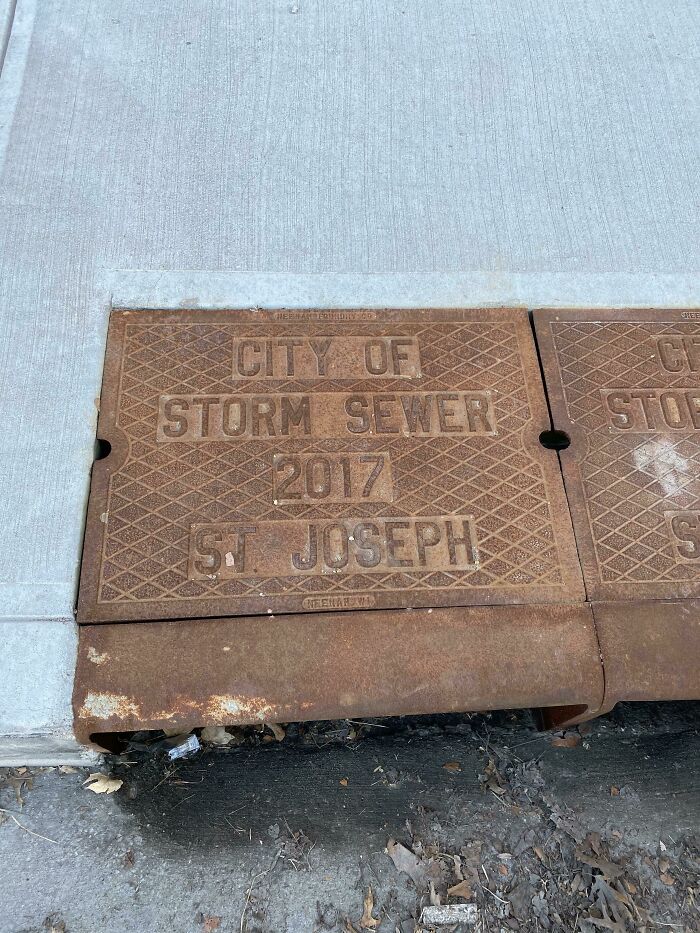
#63 Welcome To The City Of Storm Sewer's St Joseph
© Photo: hombreofsteel
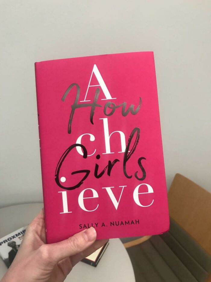
#64 A How Ch Girls Ieve?
© Photo: Ieatbonbons
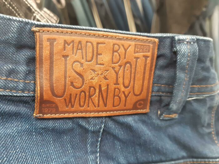
#65 Made By Us You Worn By
© Photo: DogInCheetosBag