Gray hasn't had the best rep in the last few years. There's been a lot of focus on warmer shades, brighter shades, more color, less neutrals, and gray has taken a bit of a back seat when it comes to color trends.
However, we all know, that no matter what trends come and go, gray will always be timeless. And it's proved in the fact that so many paint brands' best-selling and most popular paints are some variation on gray. Benjamin Moore's Revere Pewter is one such paint, and it also comes up a lot when we ask designers about their favorite shades.
Revere Pewter is a very warm gray, so it does indicate that gray in its cooler form is still on the out in interior design trends. However, it's praised for being one of those shades that's 'a versatile bridge between warm and cool tones', so is incredibly adaptable and versatile.
What color is Revere Pewter?
'Revere Pewter is an iconic neutral that provides a versatile bridge between warm and cool tones. It feels contemporary and harmonious yet adds warmth to an otherwise sterile grey. Its versatility means it can effortlessly work with a breadth of design styles and accent colors, making it a perfect base to build any scheme,' explains Helen Shaw, director of marketing (international), at Benjamin Moore.
The paint is essentially a griege, a griege that's slightly more gray than beige, but this does mean it's a wonderful backdrop shade as it works with so many other colors.
How to decorate with Benjamin Moore's Revere Pewter
Revere Pewter is such an easy neutral paint to decorate with. Being a warm shade that also works with cooler colors means its pairings are almost endless and it works wonderfully layered with similar soft neutrals or when it's grounded by darker hues. It's a shade that's much loved by interior designers due its warmth and versatility.
1. Layer with neutrals and textures for a tonal look
This greige paint makes for the perfect base for a gorgeous tonal neutral scheme. Layer it up with whites to freshen and beiges to soften, plus a ton of texture to add extra depth and interest.
'Revere Pewter, with its warm yet subtle gray undertones, serves as an exceptional foundation for decorating a space. To leverage its versatility, consider combining this color with a spectrum of neutrals like soft whites or light grays, either painting an accent wall or enveloping the entire room. Play with textures by mixing materials and layering textiles to infuse depth and warmth,' suggests designer Jennifer Davis.
'With the moody trend we are seeing in design, we have been using it as the millwork color against a warm Alabaster wall. When using Revere Pewter as a trim paint against Alabaster walls it amplifies the contrast of rich wood-toned furniture or natural brass or pewter accessories. Whether in bedrooms or living rooms, Revere Pewter provides a canvas adaptable to various styles, allowing you to craft a harmonious and inviting environment.'
2. Create contrasts with darker hues
'When painting walls with Revere Pewter contrast is key,' continues Jennifer. 'Introduce darker hues such as navy blue, charcoal, or deep greens through accessories like pillows, rugs, or statement furniture to create visual interest against the Revere Pewter backdrop.'
Helen Shaw agrees that this gray paint pairs perfectly with darker shades, but she does note the key to getting a good match is in the undertones. 'Pair with colors that have the same undertones to provide a balanced feel, for example, opt for a pale pink to create a smart Scandi-style interior scheme.
'Alternatively, a beautiful combination is pairing a dark chocolate brown with red undertones alongside this greige. The two shades will blend effortlessly into what is undoubtedly a reassuring and restful environment. As with every part of the color spectrum, Revere Pewter colors are influenced by light and it's always important to try a color in your space before taking the plunge,' adds Helen.
3. Try out in rooms of any size or aspect
As Helen just mentioned, Revere Pewter is a bit of a chameleon shade. It changes quite drastically under different lights, going from a dark greige to a barely their beige depending on the lighting in the room. However, it's this that makes it such a versatile paint.
'Probably one of Ben Moore’s most versatile colors, Revere Pewter is a workhorse because it balances the warmer and the cooler in any room and almost always works! It can be used in many applications and many light directions. It’s also a go-to for larger spaces because it can hold its own as a darker gray/beige neutral and still feel like a color,' explains Jennifer Walters, founder of Folding Chair Design.
Jennifer Davis adds 'Consider lighting as it can significantly influence how Revere Pewter is perceived - natural light can emphasize its warmth, while artificial lighting choices can accentuate its gray tones. Before committing, always test paint samples in your specific lighting conditions, ensuring the color resonates well within your space.'
4. Choose Revere Pewter for your kitchen cabinets
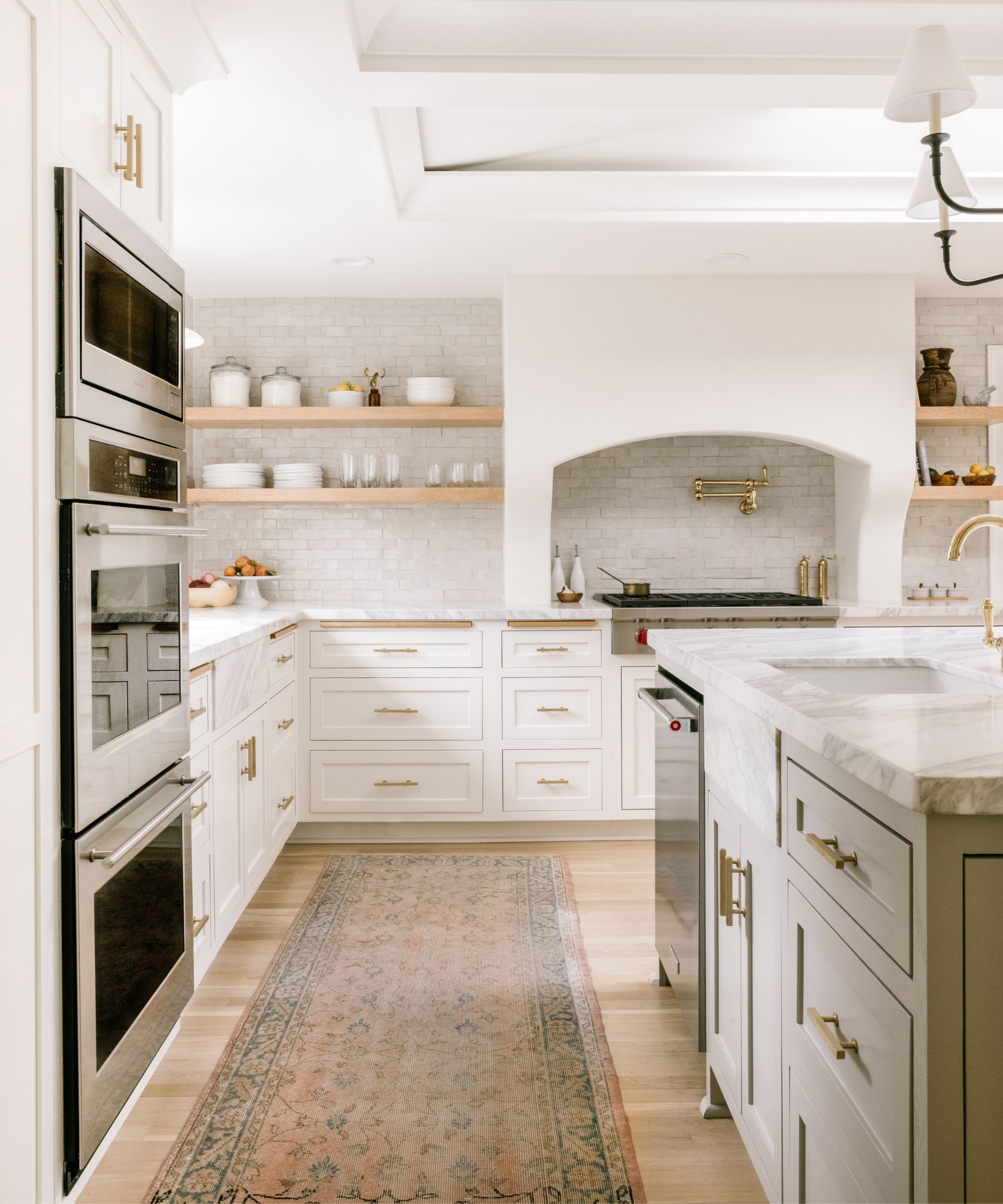
Gray kitchens may not be the top of kitchen trends right now, but we know underneath they are timeless. The key is to pick a warmer gray shade, as it's those cooler, steely grays that make a kitchen look dated. Revere Pewter is perfect because it's that perfect balance between not too gray and not too beige. It will adapt to changing trends, and you can use it as a backdrop to introduce most other shades and any style.
This kitchen designed by Jessica Nelson combined Revere Pewter for the kitchen island color, and a fresher white on the rest of the cabinets. You can see here how when used against white how much darker it becomes, grounding all the white, without creating too much contrast.
5. Bring together warm and cool colors
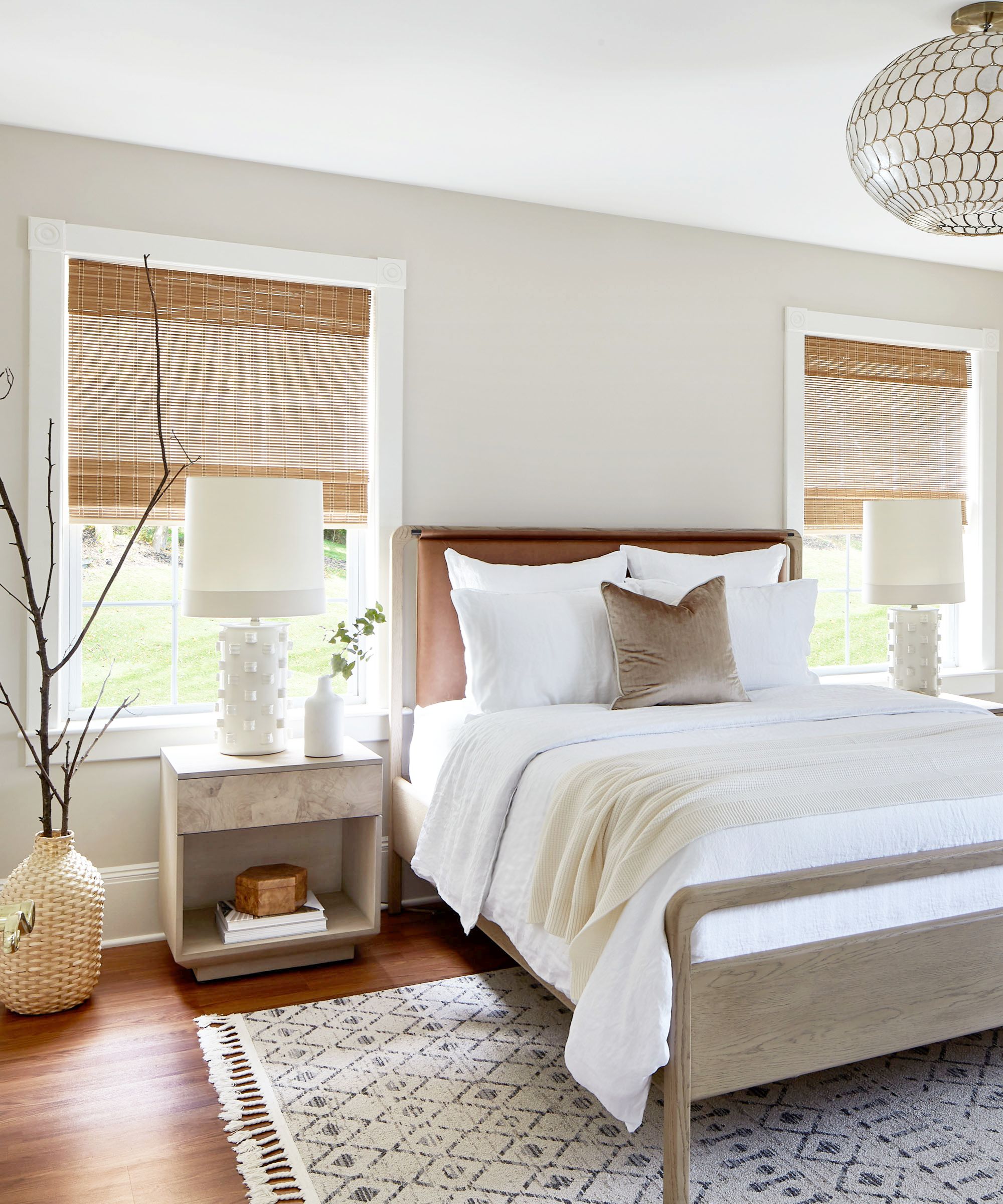
A color that works with both cool and warm shades is rare, but Revere Pewter is one of them, making it the perfect backdrop to bring both sides of the color wheel together. The gray tones mean you can pair with cooler grays, blues even, and those creamier beige tones mean it also works with richer, warmer earthy colors.
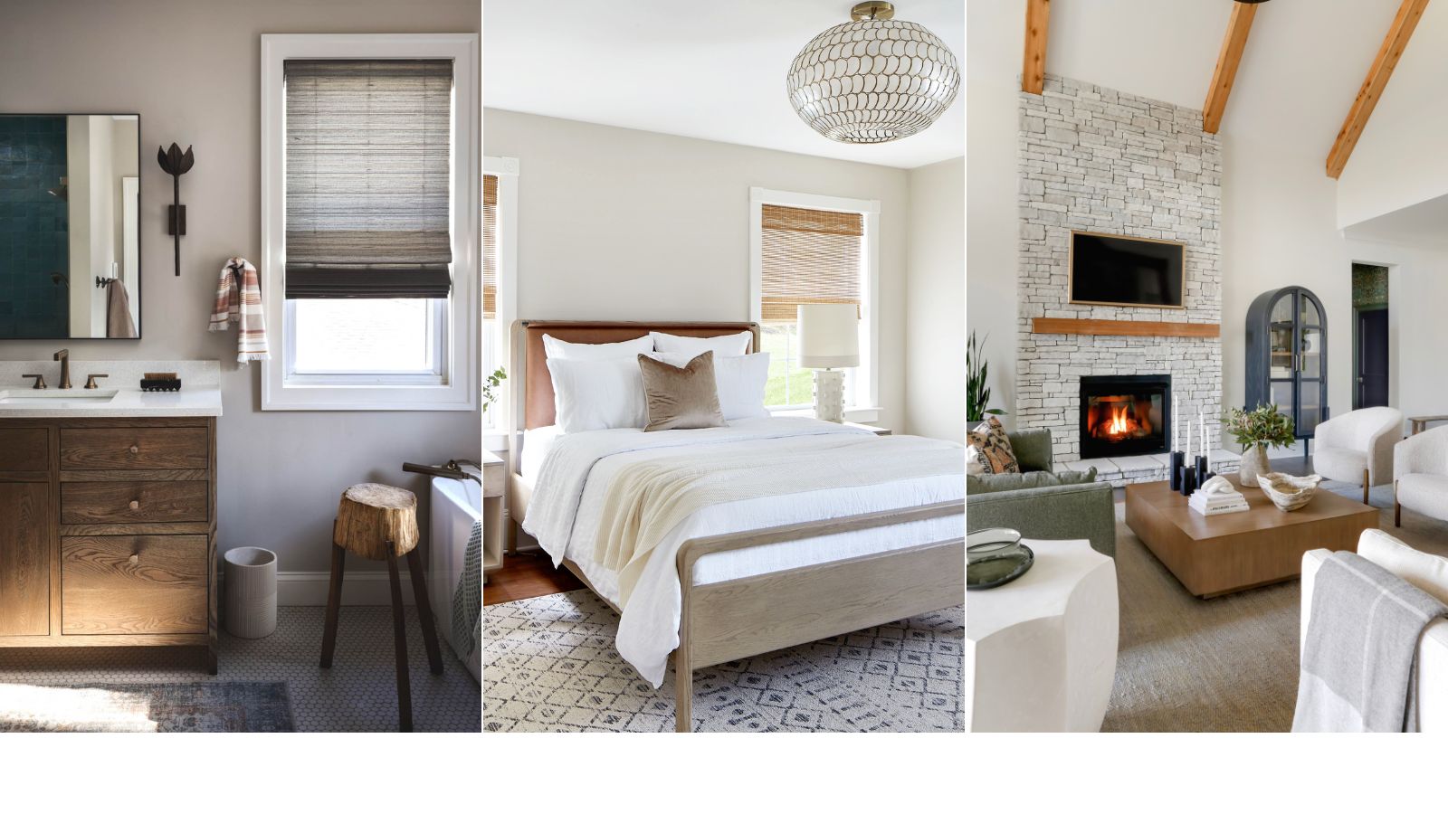
In this neutral bedroom designed by Kathy Kuo the combination is subtle, but cool ashy grays meet warm woods and pale creams to create a color scheme that's perfectly balanced.
'Anyone who knows me knows that I have a real affinity for all things pewter, and that certainly includes this complex and versatile paint color. Revere Pewter is such a lovely color because it features subtle undertones of warmer beige and cooler green. It really is the ultimate connector between warm and cool color families, so it's easy to pair with a variety of decor styles and contrasting colors,' comments Kathy.
6. Use it as the perfect backdrop for bolder shades
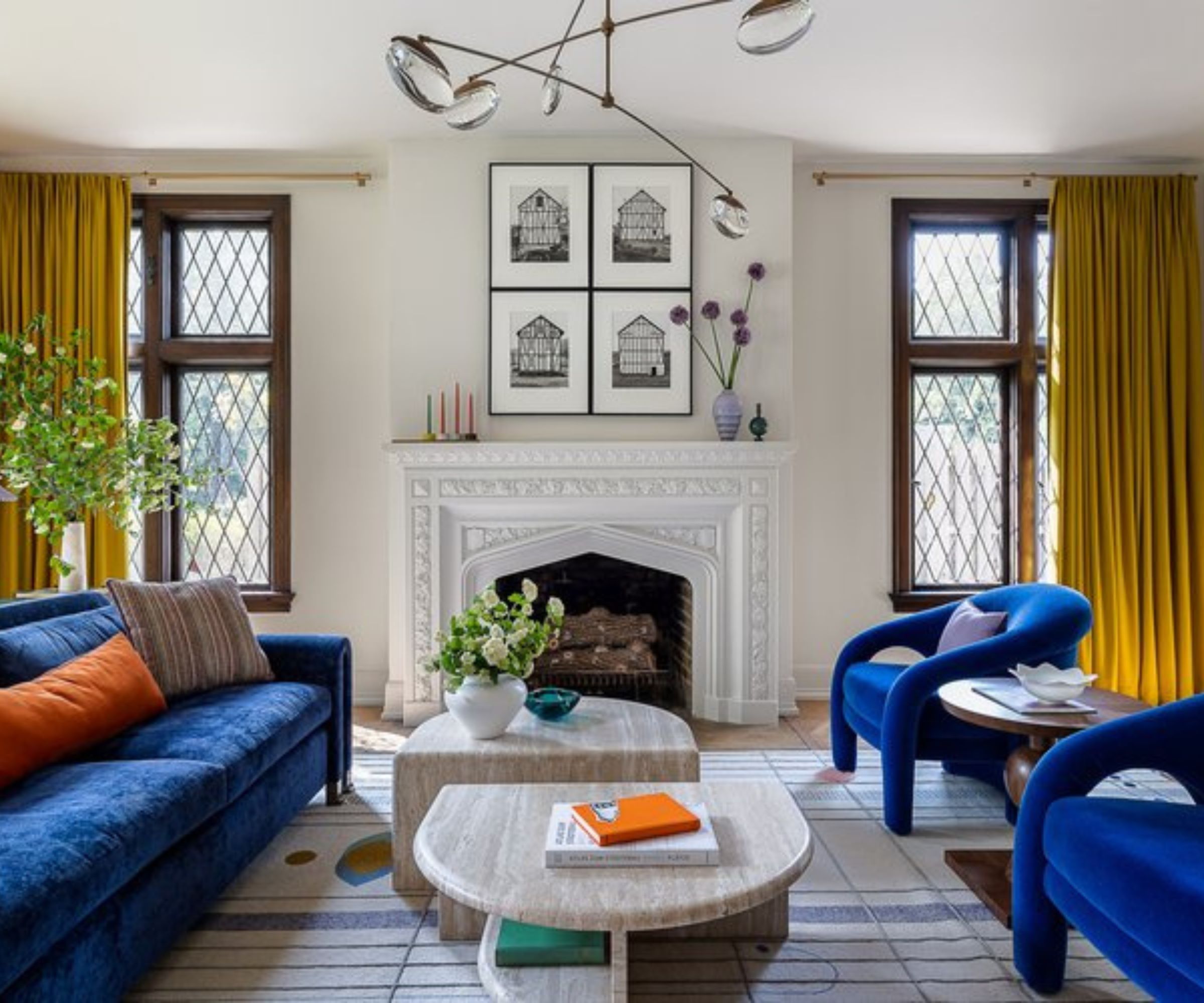
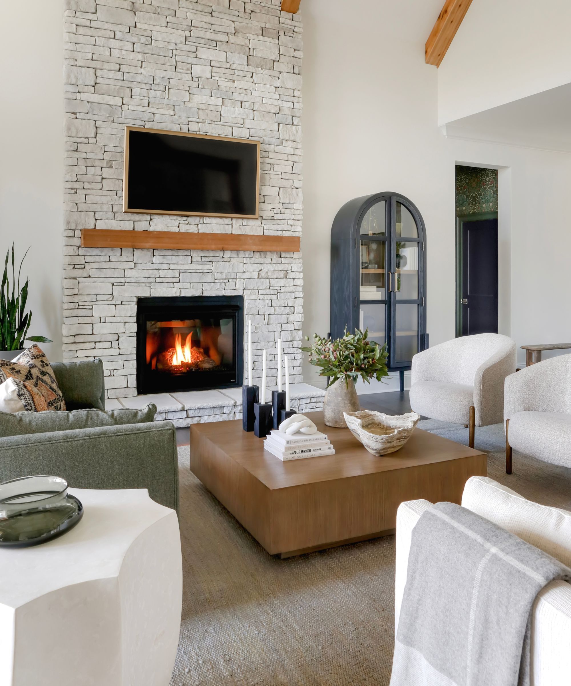
We've seen a lot of neutral spaces so far, and while Revere Pewter is an ideal shade for decorating with a softer more muted color scheme, it also works with more vivid colors too. Case in point this living room, designed by Bethany Adams which combines beige walls with vivid primary colors. The softness of the beige balances those bright hues and what you get is a space that feels both bold and fresh but also liveable and welcoming.
'Revere Pewter has been one of my go-tos for over 10 years. I particularly love it on trim or cabinets as it has a sort of chameleon-like quality of reading warmer or cooler depending on what you pair it with. It always looks chic, timeless, and appropriate, which is why I keep going back--I've never seen it look anything less than fabulous,' explains Bethany.
It's obvious why Revere Pewter is a bestseller, it's classic, versatile, and works with any style. The main thing to be aware of is how much this shade can change under certain lights - every version of it is chic, however, do be sure to order a sample so you can see how it adapts in your own home.