There's no denying the timelessness and enduring appeal of neutral color schemes, but sometimes, they can fall flat. The solution? Designers are adding pops of unexpected accent colors to bring them to life in 2026.
Taking inspiration from the most stylish color trends of late, designers are breaking the rules by disrupting all-neutral spaces with these bolder hues, and the result is spaces that feel more layered with contrast, warmth, and richness.

This doesn't mean you need to repaint neutral walls; it can be as simple as adding one of these designer-approved shades to your scheme through small decor accents. These are the exact shades that feel fresh for 2026.
1. Rich Plum
In living rooms with neutral walls, in this case, Paint & Paper Library's Leather II, going for a more colorful and richer sofa can help to ground the room. "Introducing a sofa in a rich plum velvet creates a deliberate point of tension," says Andrew Griffiths, founder of A New Day Design.
"It acts almost as a neutral in its own right, adding depth, warmth and a sense of quiet luxury while giving the space a stronger identity," he adds. "We often favor colors with complexity over brighter statement tones, as they shift beautifully throughout the day and make an otherwise restrained palette far more layered."

2. Cobalt Blue
Neutral kitchens are a popular choice for good reason — they're timeless and feel light and airy. That said, adding a pop of fun color can do wonders to elevate the space. Against the COAT Paper Plane walls, a cobalt blue kitchen island brings a cool and contemporary edge.
"The vivid blue asymmetric Durat island was introduced as a sculptural centerpiece, bringing energy and personality to the space," explains designer Sophie van Winden of Owl Design. "Bold blue works particularly well with soft neutrals because it provides a confident focal point without overwhelming the space."
"Our advice is to keep the surrounding finishes simple and tactile, then use one bold color with conviction rather than introducing lots of competing tones," she adds. "This creates a scheme that feels balanced, timeless, and full of character."

3. Bright Orange
"This room was intentionally designed as a calm, neutral backdrop, so I knew it needed one strong moment to bring it to life," says designer Lindsey Herod, who opted for a bright orange artwork to do so.
"I loved that it picked up on a few subtle colors already woven throughout the room, but did so in such a bold, unexpected way," she says. "It adds warmth, energy, and personality without overwhelming the space. It felt like exactly the right punch of color the room was asking for."
To soften the room slightly, light blue was added with the armchairs. "The blue acts almost like a neutral, balancing the warmth of the artwork while keeping the overall look feeling fresh, relaxed, and inviting."

4. Mustard Yellow
If you want to add more warmth to a neutral scheme, go for yellow. In this kitchen, a deep yellow paint (Farrow & Ball's India Yellow) adds an unexpected look to the ceiling, along with soft yellow used on some of the cabinets.
Discussing the addition of yellow to the room, the designer Jessica Helgerson says that it was "absolutely transformative and made a room that was formerly cold and sterile feel warm, earthy and inviting."
"I love the contrast of warm tones with cool ones; it creates a dynamic and visually interesting space," she adds.

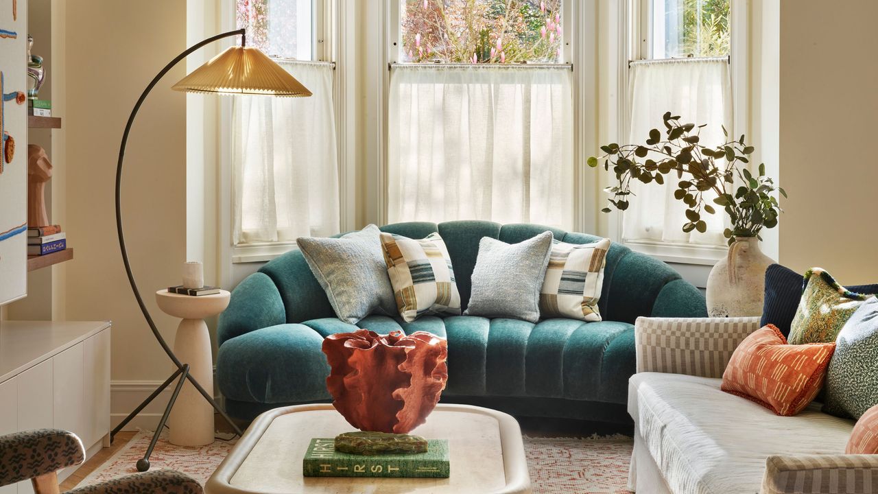
5. Rich Teal
Decorating with teal is a sophisticated and timeless accent, elevating neutral rooms with a sense of moodiness.
"There's timber flooring throughout and a good deal of wooden joinery, with hints of aged brass catching the light, so the sofa needed to hold its own against all that texture, to ground the space and draw the eye out towards the bay window rather than compete with the view," says Alicia Meireles, creative director at OWN LONDON. "Teal does that beautifully as it has enough depth to balance the warmth of the wood without disappearing into it."
"This is a bespoke sofa with a really intricate, sculptural shape that we didn't want to lose," she says. "Against a neutral background, that shape would simply have melted away. The teal gives it definition; it lets you actually see the design, the curve of the arm and the tailoring."

6. Deep Red
In this neutral bathroom, the deep red bathtub adds warmth, moodiness, and depth. "We kept the architectural shell warm and understated, using a palette of yellow- and earth-toned neutrals to create a soft, inviting backdrop," explains designer Holly Vaughan of Vaughan Design & Development.
"Against this, we introduced carefully considered accents: a rich cherry red bath and a sunny yellow vanity, bringing personality and warmth without overwhelming the space."
"With its generous ceiling height and abundant natural light from the rooflights, the room comfortably embraces these bold color moments."

Decorating with neutral colors need not be boring — elevate your scheme with these unexpected accents to add depth and contrast, and keep the space from feeling predictable. If you're not quite ready to paint the walls a bold color, start with small decor accents.
And for more color and design ideas, why not subscribe to the Livingetc newsletter?