Image source: shutterstock.com
Toy shopping can feel innocent until the cart starts filling itself. Stores aren’t just “organized,” they’re designed to guide your feet, your eyes, and your impulse control. Once you understand how a toy store layout nudges parents into “just one more” decisions, it gets easier to stick to your budget without turning every trip into a battle. The goal isn’t to never buy fun things—it’s to buy on purpose. Here are six common layout tricks and simple ways to outsmart them.
1. Toy Store Layout “Speed Bumps” Hit You at the Door
That big, exciting display near the entrance is meant to slow you down and warm up your spending mood. It often features “new,” “limited,” or seasonally themed items that feel urgent even when they’re not. Walk in with a short list on your phone and don’t stop until you’ve oriented yourself to the aisles you actually need. If your kid locks onto the first display, try a calm redirect like, “We’re doing our plan first, then we’ll look.” You’ll make better decisions after you’ve settled into the store instead of spending in the first thirty seconds.
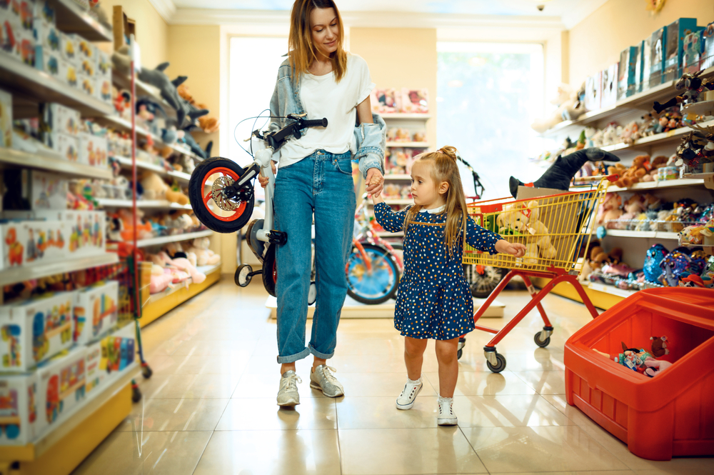
2. Eye-Level Shelves Are Built for Little Hands, Not Your Budget
The most tempting products are placed where kids can see them without asking or reaching. That “perfect height” is often packed with bright packaging, character tie-ins, and small items that feel easy to toss in. Scan the top and bottom shelves first, because better-value sets and less-hyped options are frequently placed there. When toy store layout choices push your child’s attention to one zone, you can shift the game by letting them “compare two choices” you pick from different shelves. It still feels like autonomy, but you’re controlling the price range and the options.
3. Wide Aisles and Endcaps Encourage Wandering and Add-Ons
Stores love roomy aisles because they keep families from feeling rushed and increase browsing time. Endcaps are especially powerful because they catch you when you turn a corner and your brain is between decisions. You’ll often find “small upgrade” items there—extra accessories, tiny blind boxes, or add-on packs that don’t feel expensive alone. If you notice the toy store layout pulling you into extra aisles, try the “one aisle rule” where you only enter aisles tied to your list. The fewer corners you turn, the fewer surprise purchases get a chance to happen.
4. Checkout Zones Are Designed for “One More Thing” Energy
The checkout area is basically a final boss fight for parental willpower. It’s packed with low-cost items that look harmless but add up fast across repeat trips. You’ll see mini figures, trading packs, fidget toys, and candy positioned to catch kids while they’re bored and waiting. Decide before you get in line: either “no extras” or “one small extra under $X,” and say it out loud so everyone knows the rule. When toy store layout tactics crank up the pressure at checkout, having a pre-made rule keeps you from negotiating in public.
5. The Most-Wanted Items Are Often Placed Far From the Entrance
Stores frequently put popular categories deeper inside so you pass dozens of tempting sections on the way. Even if you came for one thing, you end up walking through “maybe” items that trigger gift ideas and impulse buys. If your child is old enough, make the trip a mission: go straight to the target aisle, grab the item, then leave. You can also park the cart at the end of the aisle and bring only the item you planned to buy to the register. When toy store layout strategy turns the store into a maze, the fastest route is your best defense.
6. “Theme Zones” Make Everything Feel Like It Belongs Together
Many stores group items by characters, movies, or play themes so each product feels incomplete without another one. The lighting, signage, and color choices make the section feel like a mini world, which is incredibly effective for kids and nostalgic adults. That’s why you’ll see matching accessories placed close to the main toy—because it feels like a natural “set.” Before you shop, set a clear boundary like “one main item, no accessories today,” and stick to it. A toy store layout can make add-ons feel necessary, but “necessary” is usually just clever grouping.
The Smartest Toy Trips Start With a Plan
A store can’t manipulate what you already decided before you walked in. The easiest way to beat toy store layout pressure is to use a simple script: list, limit, and leave. Keep your budget visible, like a note on your phone, and name the rule you’ll follow before you hit the first aisle. If your child struggles with surprise temptations, try taking photos of options and buying later, so the decision happens outside the store. When you shop like a planner instead of a browser, you get the fun without the financial hangover.
What’s the sneakiest in-store trick you’ve noticed that makes your kid ask for “just one more” thing?
What to Read Next…
Why It’s Smart to Postpone the Big Toy Buy Until After January Sales Return
Tips for Parents to Navigate Toy Sales Without Being Oversold
How to Pick the Right Inflatable Snow-Toy for Your Kids Without Overpaying
9 Toys That Passed the Drop Test—and 4 That Didn’t Survive a Week
How Much Are You Really Paying for Developmental Toys?
The post 6 Toy Store Layout Tricks That Manipulate Your Wallet appeared first on Kids Ain't Cheap.