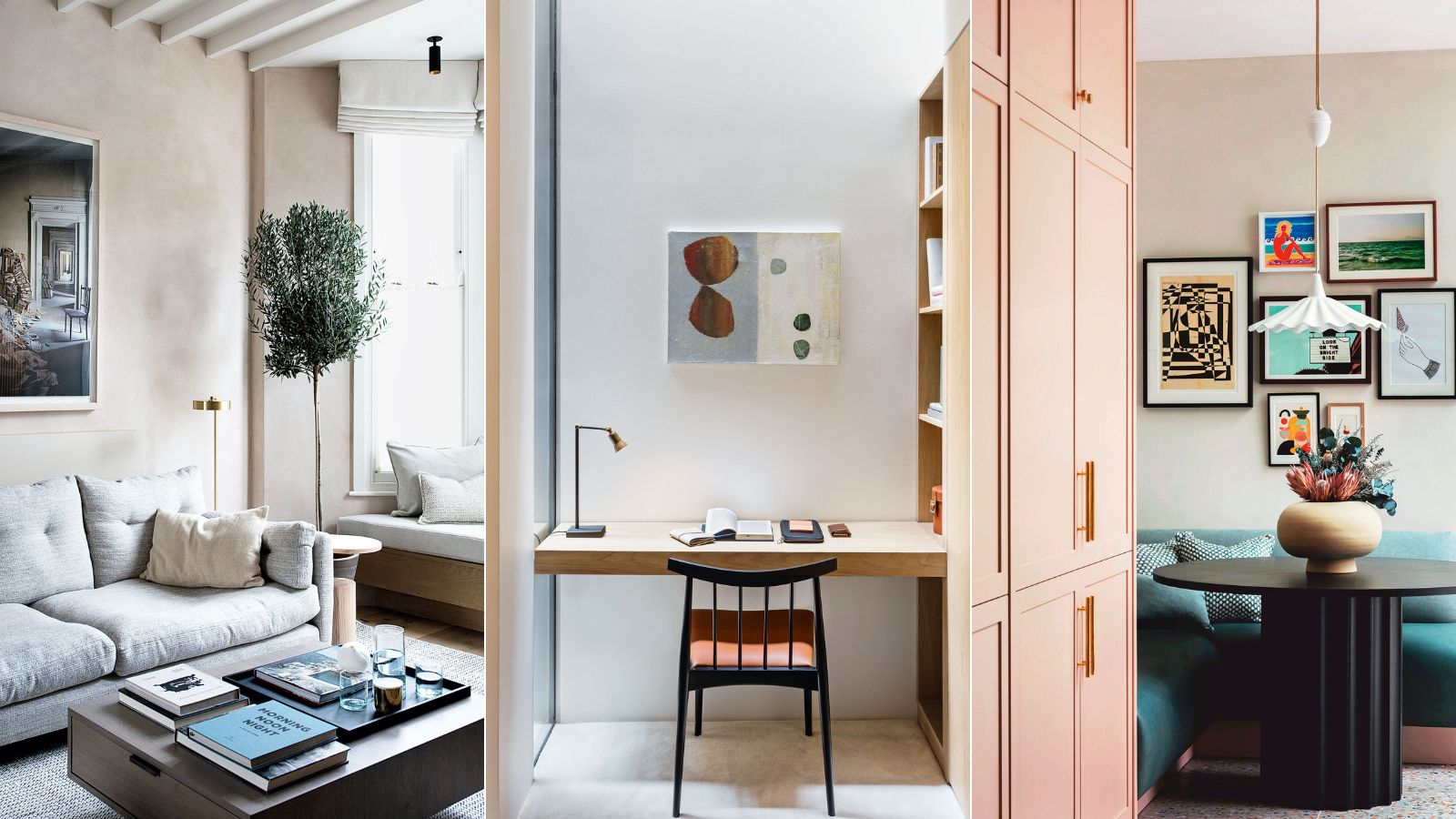
If your small room feels dark, clinical, or uninviting, then you could be making a few fundamental small room mistakes. Believe it or not, modest spaces are full of unlimited design potential and are often some of the most interesting spaces in our homes, when designed right.
Though small rooms can present many interior design challenges, there are several benefits to residing in a home that has a limited footprint, and you'll be surprised by how many decorating opportunities a small home can unlock. But, before you begin a complete home renovation or even a minimal update, there are a few fundamental home decor mistakes that can, in fact, make a small home feel dark, dingy, and dull.
While there's certainly no one size fits all formula for making a small room look expensive, there are still a few basic interior design rules we should master if we want to make a small room look light, bright, and spacious.
Small room mistakes
From clever tricks to make a small room look bigger and smart storage ideas to paint tricks for small rooms and statement lighting, our designers' beautiful but simple decorating ideas will help you curate the home you've always wanted.
Luxury comes in all shapes and sizes – here, we some of the best interior designers in the world show how to make modest rooms feel chic and spacious.
1. Thinking you can't carve out a space for a nook
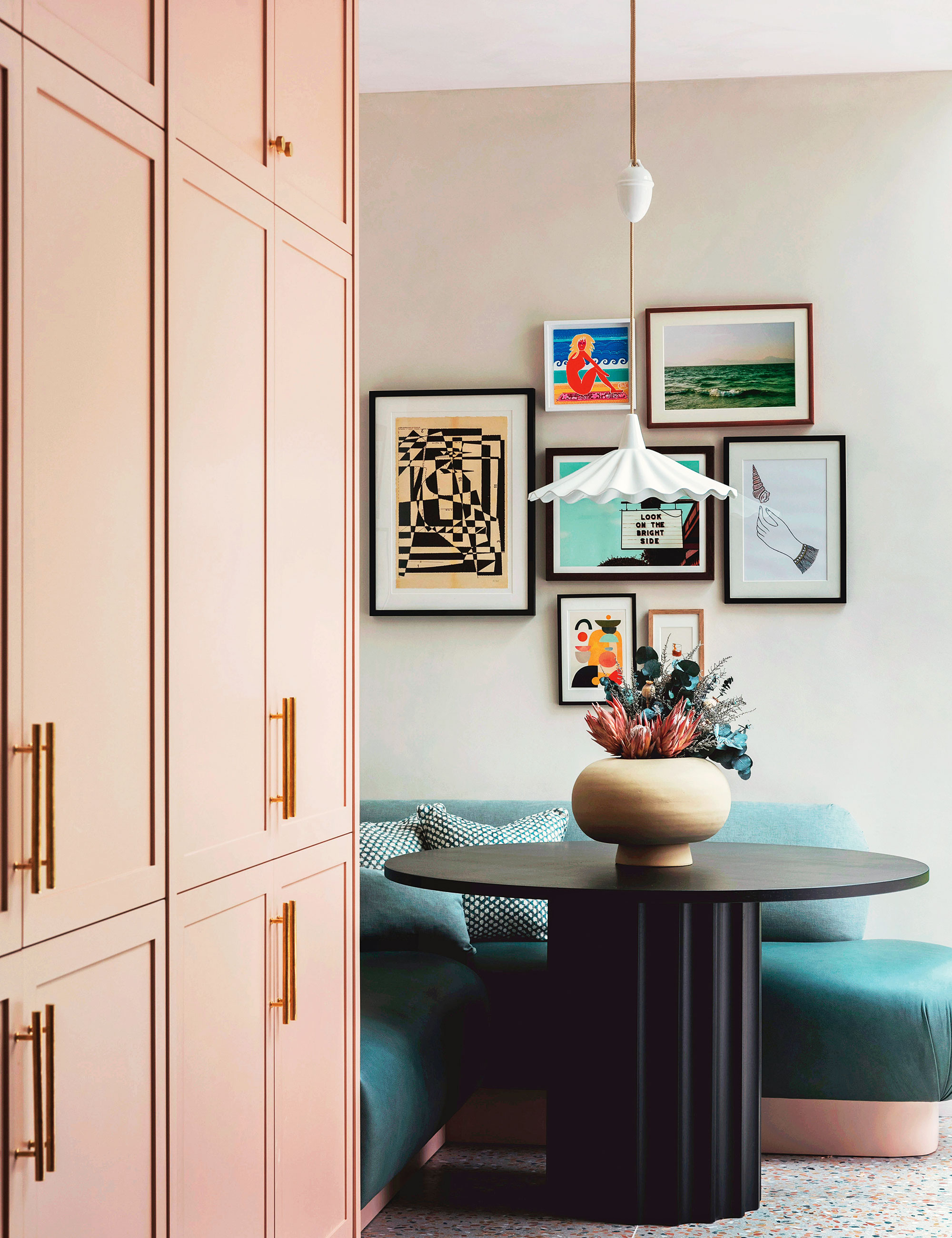
Maximizing space is sometimes just a matter of turning unused spots into practical –and pretty – features.
Carving out room for a table where floor space is at a premium will often require putting one in the corner. For that to work, there are two rules: firstly, the table should be round both to set a contrast to the right angles of the corner, but also to avoid anyone catching themselves on the table edges and, secondly, to use bench seating.
‘A breakfast nook is such a cozy spot,’ says Tiffany Duggan, founder of Studio Duggan, who created this scheme. ‘We’ve designed lots of these recently and tend to add a pendant light to make it more “hygge”. We often upholster the seat in a hard-wearing fabric such as leather. We wanted this one to feel “loungey”, so we kept the back low and rounded the edges.'
2. Letting your small room become cluttered
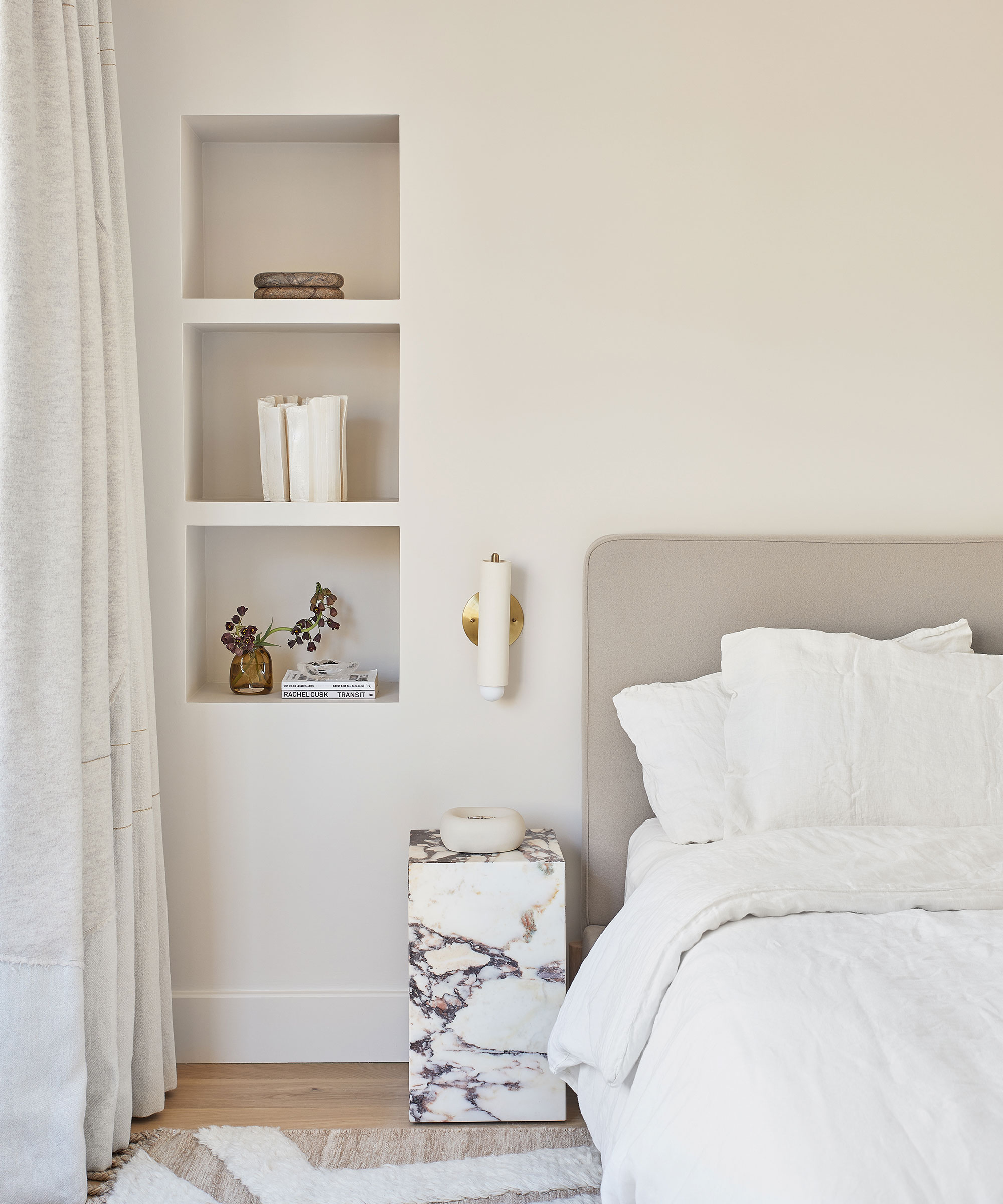
Clutter and chaos are the number one enemy of a stylish and successful small space. One way to create the illusion of space is to rid the surface areas of clutter but be realistic before setting out.
It’s never going to be entirely possible to live without various small useful things, which need storing away somewhere, believes Sandrine Zhang Ferron, founder of Vinterior. ‘So create small areas of storage that are both practical and add style to your home, from roomier pieces like library cabinets down to biscuit tins to squeeze into a corner.’
3. Getting the layout wrong
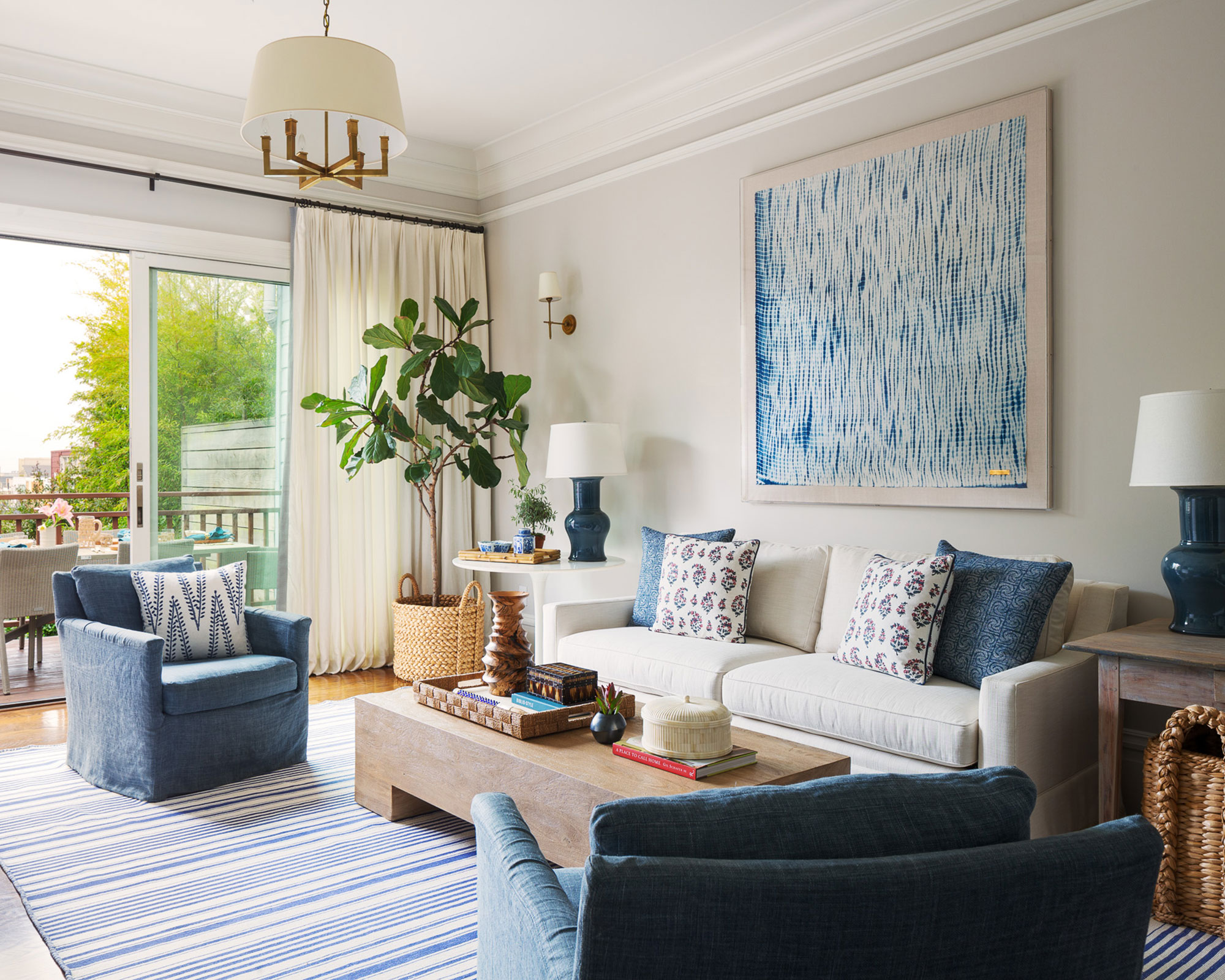
Functionality is key for small rooms, and the layout you select should not only be able to accommodate your lifestyle but enhance it.
When trying to make the most of limited space, and avoid any small living room mistakes, take time to consider the natural flow through rooms, recommends Margaret Ash of Margaret Ash Design.
‘Think about how people are going to pass through the space and ask if you really need each and every door [but be aware that some will need to be retained for fire regulations, particularly when it comes to kitchens]. Where possible, remove doors and architraves to improve the flow.’
'The flow is entirely dependent on the space available, how you plan to use it, and how often,' says Oana Sandu, lead designer, at Blakes London. 'Think about circulation: Where do you want people to congregate? Do you plan to entertain in said space? Will it be used for at-home work? Make sure that your small space design factors enough space for everyone to move around freely without interruption or annoyance.'
4. Skimping on the decorative details
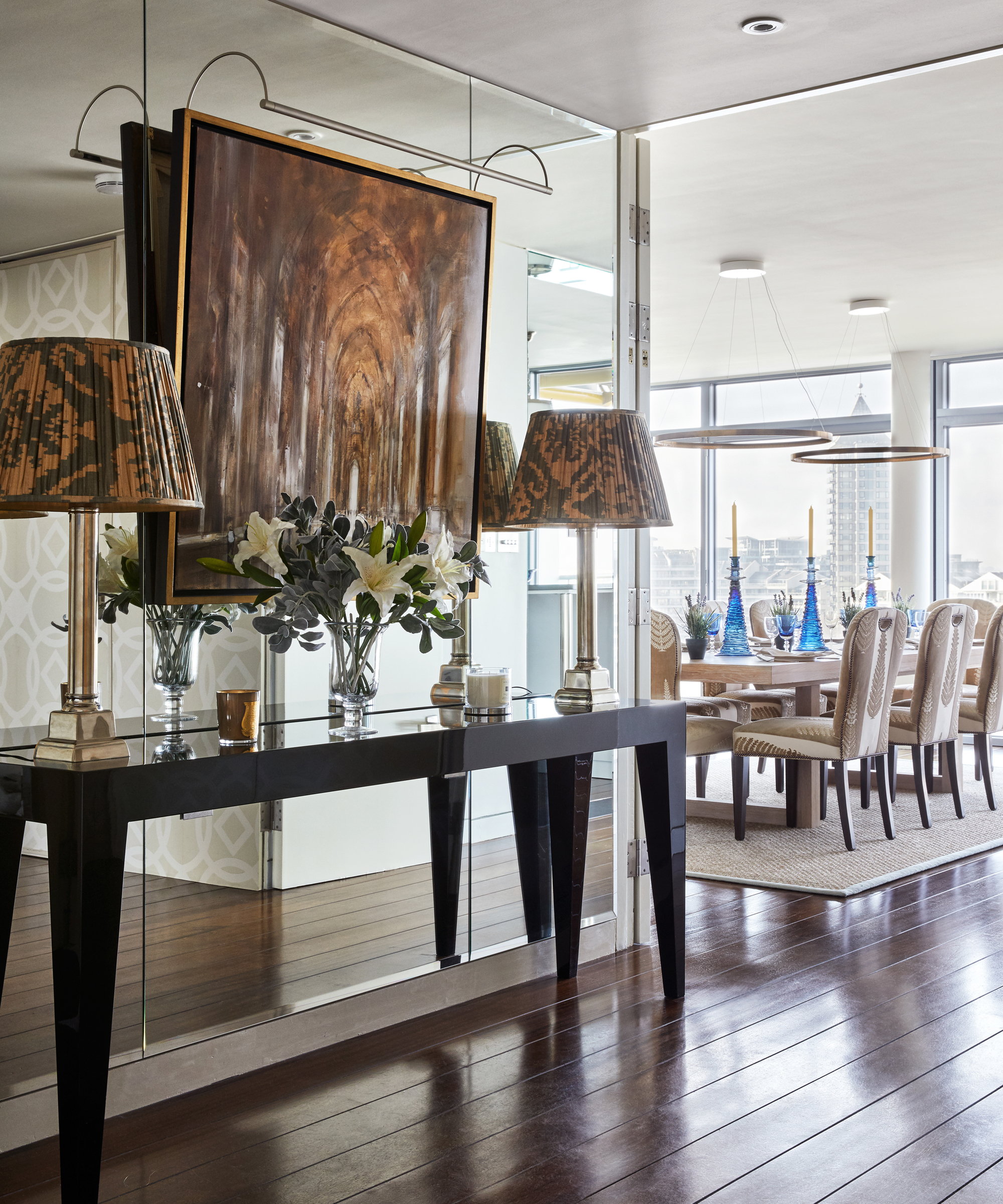
Furnishings and decoration play an essential role in how small spaces are received. A common mistake is to go forgo all decorative details in favor of an entirely minimalist aesthetic. In fact, certain details have the ability to transform the ordinary into the extraordinary – and help avoid any unnecessary small entryway mistakes.
Use color and surface finishes to maximize the feeling of space, in lieu of being able to enlarge room dimensions. Antique mirrored walls can be an effective way to create the illusion of a much wider space – being particularly effective either on the backs of the recesses on either side of a chimney breast or in a narrow galley-style kitchen or entrance hall.
Everyone knows mirrors are good at doubling a sense of space but I love a mirror for how it magnifies the light and adds a magical mood. ‘Take it further and use reflective finishes on the joinery and recessed handles,’ says Nick Stuttard, co-founder of London Projects. ‘They reflect light back into the room and streamline surfaces, minimizing any awkwardness in moving around a narrow space.’
5. Investing in the wrong furniture
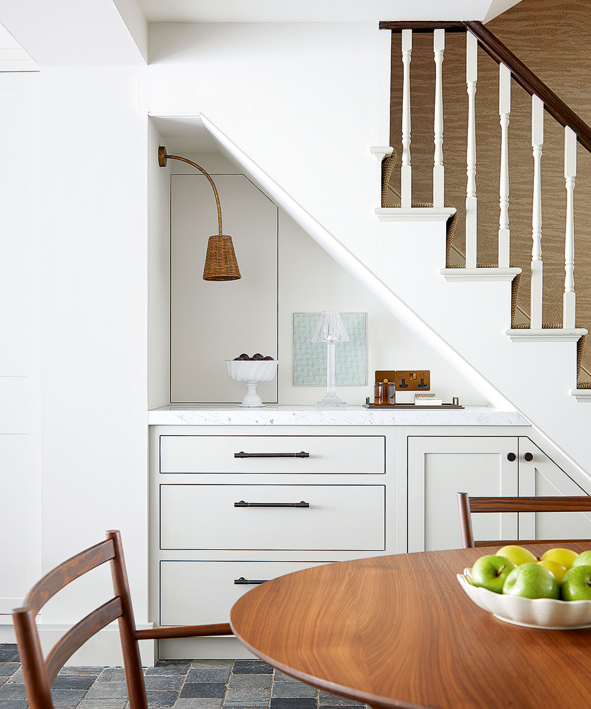
The furniture in your home can make or break your space, so it is crucial to get it right.
Built-in furniture will make every nook and cranny work as hard as possible and offers the chance to be inventive when it comes to finding extra spaces that can house cupboards and drawers.
‘We’ve seen substantial growth over the past few years in homeowners converting their under-stair area due in no small part to the increasing strain our homes are under in terms of space,’ says Simon Tcherniak, senior furniture designer at Neville Johnson.
'Currently, the focus seems to be on using it as a workspace or breakfast area for all the family – though it’s also being transformed into more of a multifunctional area, especially now that more of us are deciding to renovate rather than relocate.’
6. Thinking flooring should be plain
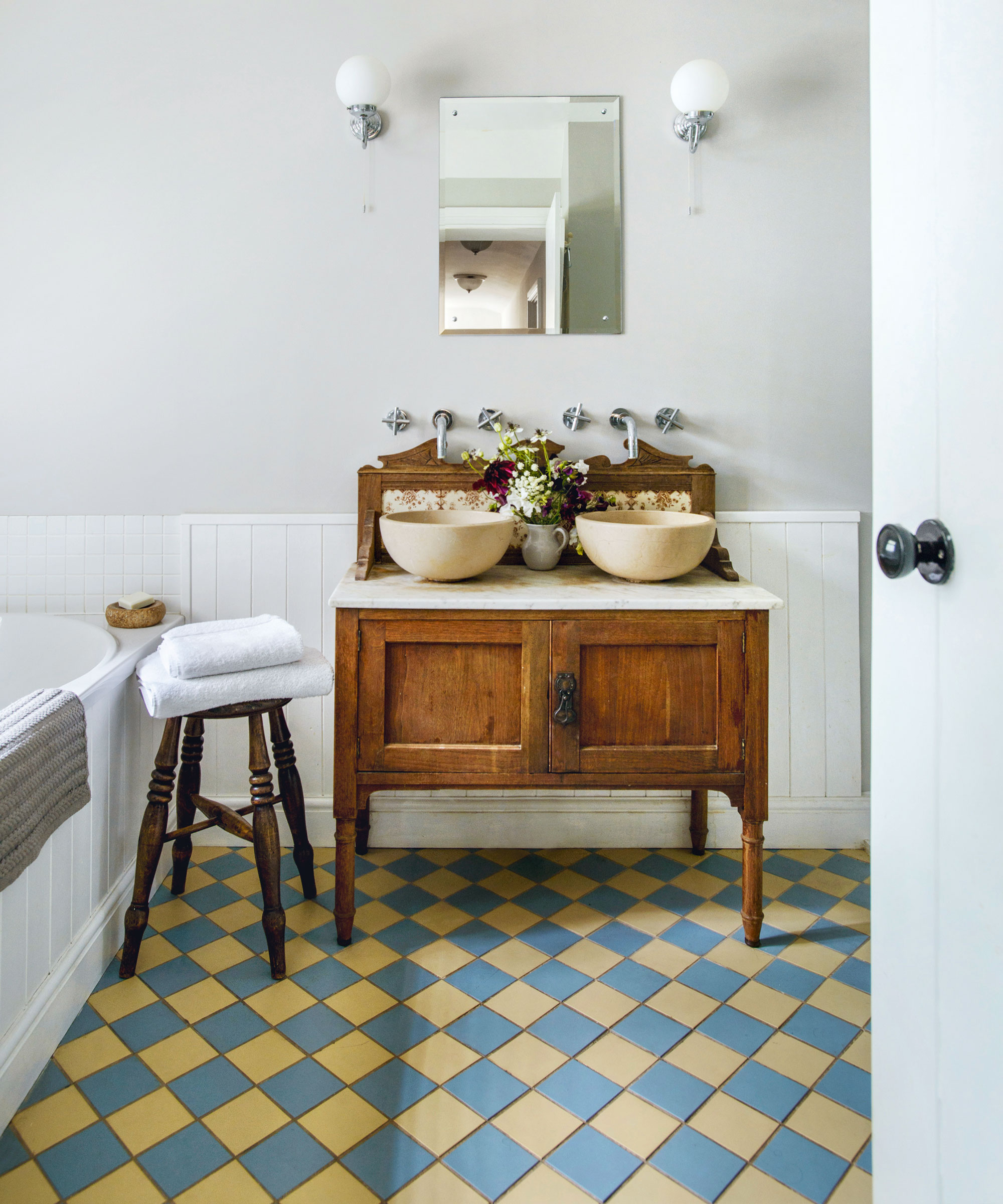
Taking the focal point to your floor is a fantastic way to liven up an otherwise dull space, and the same goes for diminutive rooms too.
Patterned floors work well in smaller spaces such as bathrooms. Where a busy pattern on a wall might be overwhelming, introducing a pattern on the floor with a mosaic or encaustic tile can add interest without taking over the space.
‘We often use boldly patterned or brightly colored carpets in small rooms or forgotten back stairs – they liven themselves up when you introduce something unexpected and strong,’ says interior designer Adam Bray.
There’s a lot of interest in patterned flooring and in surface design in general, believes Mark Findlay, founder of vinyl flooring specialists Harvey Maria. ‘Floors are no longer an afterthought; they’ve become an integral part of interior design and are now seen as a key feature,’ he says.
In a modest space, zoning is key. Make the most of a small room by planning a hard-working layout, investing in multi-functional furniture and picking the right color scheme. So whether you're working with a small living room, small kitchen or a small bedroom, you can make the space work best for you.


