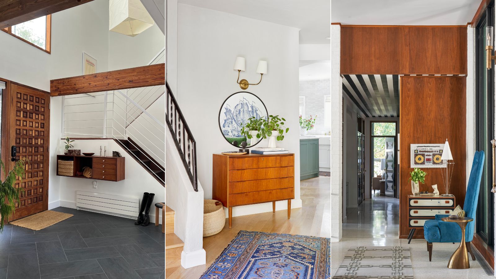
The first space you see when entering a home, an entryway should be a preview into the rest of your interiors, and create a welcoming atmosphere. At the same time, it's a hard-working area that sees a lot of footfall, so the space needs to be hardwearing as well as aesthetically pleasing – a sometimes difficult balance to achieve.
If you've been looking through entryway ideas, you've probably come across examples designed in mid-century modern style. This timeless interior design style features neutrals with bold accents, clutter-free, functional spaces, and lots of sleek, wooden additions. This interior design style offers a balance between vintage and contemporary, and seamlessly blends beauty and function.
So, how do you create a mid-century modern entryway that feels elevated, stylish, and functional? We've asked that very question to interior designers to find out exactly how they'd create an entryway that masters the style.
Mid-century modern entryway ideas
Designing a mid-century modern entryway is about more than adding wooden accents and tidying up. Color, texture, and dimension all come into play when creating a successful scheme. From creative storage solutions to sleek installations, these ideas are sure to inspire.
1. Prioritize closed storage
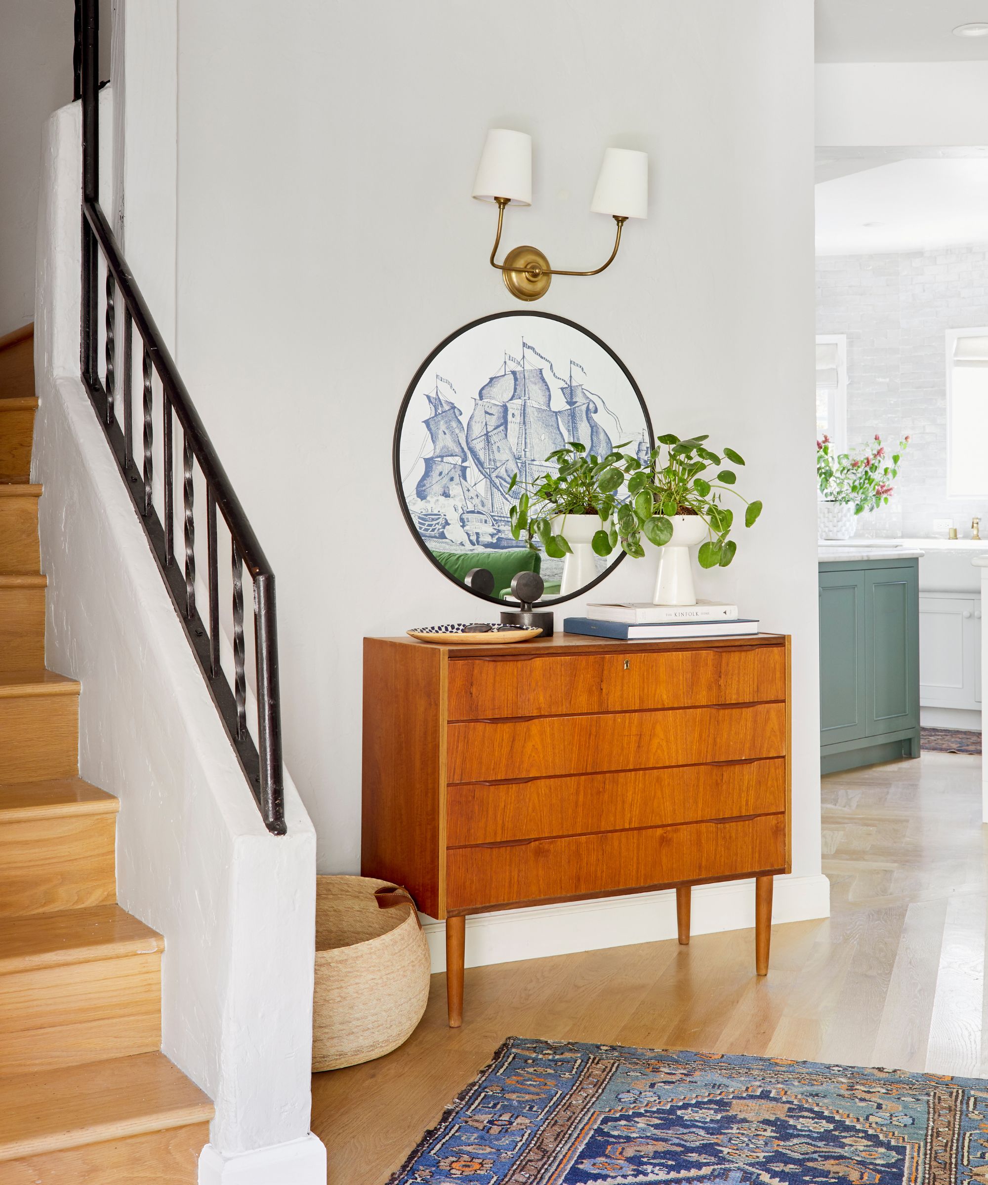
Mid-century modern design is all about sleek lines and clutter-free spaces, so introducing closed entryway storage is a must. To embrace mid-century modern style, opt for a wooden dresser or cabinet that leans more orange in tone than grey or dark brown.
'Mid-century modern furniture is so versatile stylistically. But if you want more of an MCM look, you can easily get a small dresser for some great storage and a place to set mail and keys, as well as add a simple round mirror or a piece of art,' says interior designer Emily Henderson.
In this entryway, a dresser with tall legs has been added for ample storage, while a large round mirror and wall light have been added on the wall above it to add decorative detail and practical lighting. This result is a sleek, simple entryway that includes key elements of mid-century design.
2. Introduce contrasts with different materials
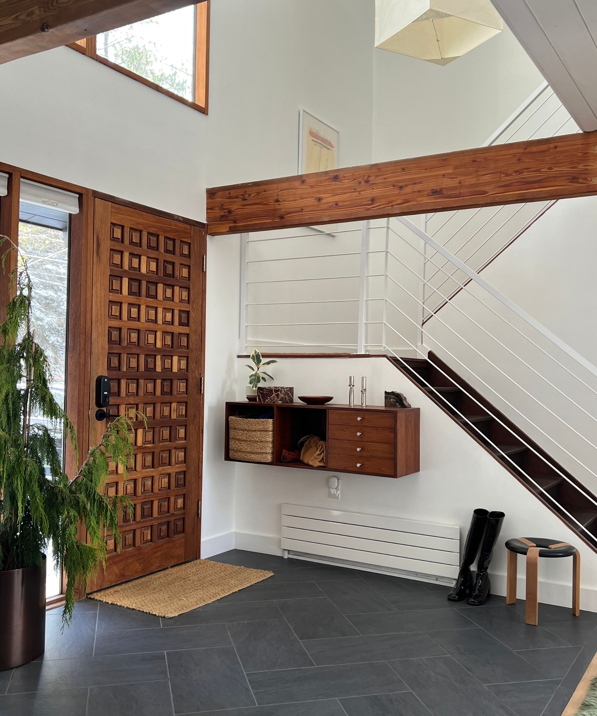
When you're designing your mid-century modern entryway, make sure you don't go overboard with wood. A space decorated floor to ceiling with wooden materials and furniture can quickly start to feel more cabin the mid-century. Instead, opt for a blend of materials that complement each other while still maintaining a sense of mid-century modern style.
'We think styling for mid-century is about different materials and textures living in harmony. Slate or stone foyers are common in mid-century entryways – it's no problem if they get wet,' explains Meghan Lavery and Daniel King, owners of Home Union.
While the larger installations are important to your entryway scheme, so are the decorative details and storage solutions to make your mid-century modern scheme feel complete. 'A potted plant is welcoming and adds a touch of life. A practical and beautiful piece of furniture to remove your shoes. And a storage piece for mail and keys to avoid clutter,' they add.
3. Add retro furniture and decor
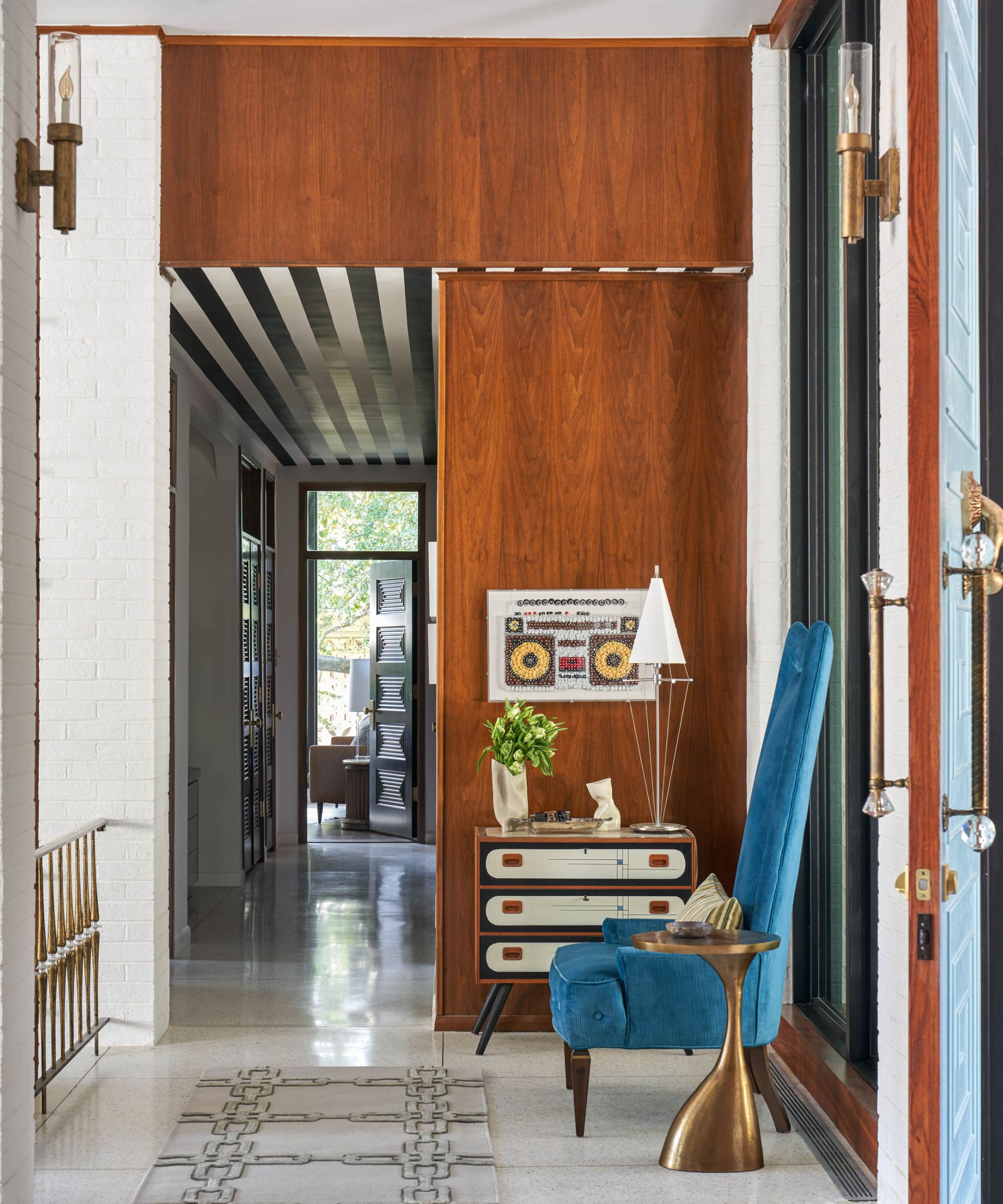
Mid-century modern style is known for its bold designs, so more retro additions add a lot of personality to a space, especially an entryway. 'When crafting a mid-century modern entryway, search for pieces that add some spunk and personality to the space while utilizing clean lines and organic materials to help execute the look,' says Eddie Maestri, principal architect and creative director of Maestri Studio.
In this entryway design, the bones of the space are kept simple with wood and neutral colors for the walls and floors, but interest is added with the entryway furniture. 'We loved how the hand-painted front of this console gives a bespoke and playful vibe to the otherwise formal vibe of this entryway. Additionally, bold geometric light fixtures are a great way to spruce the space and add extra interest,' he adds.
4. Inject personality with a colorful rug
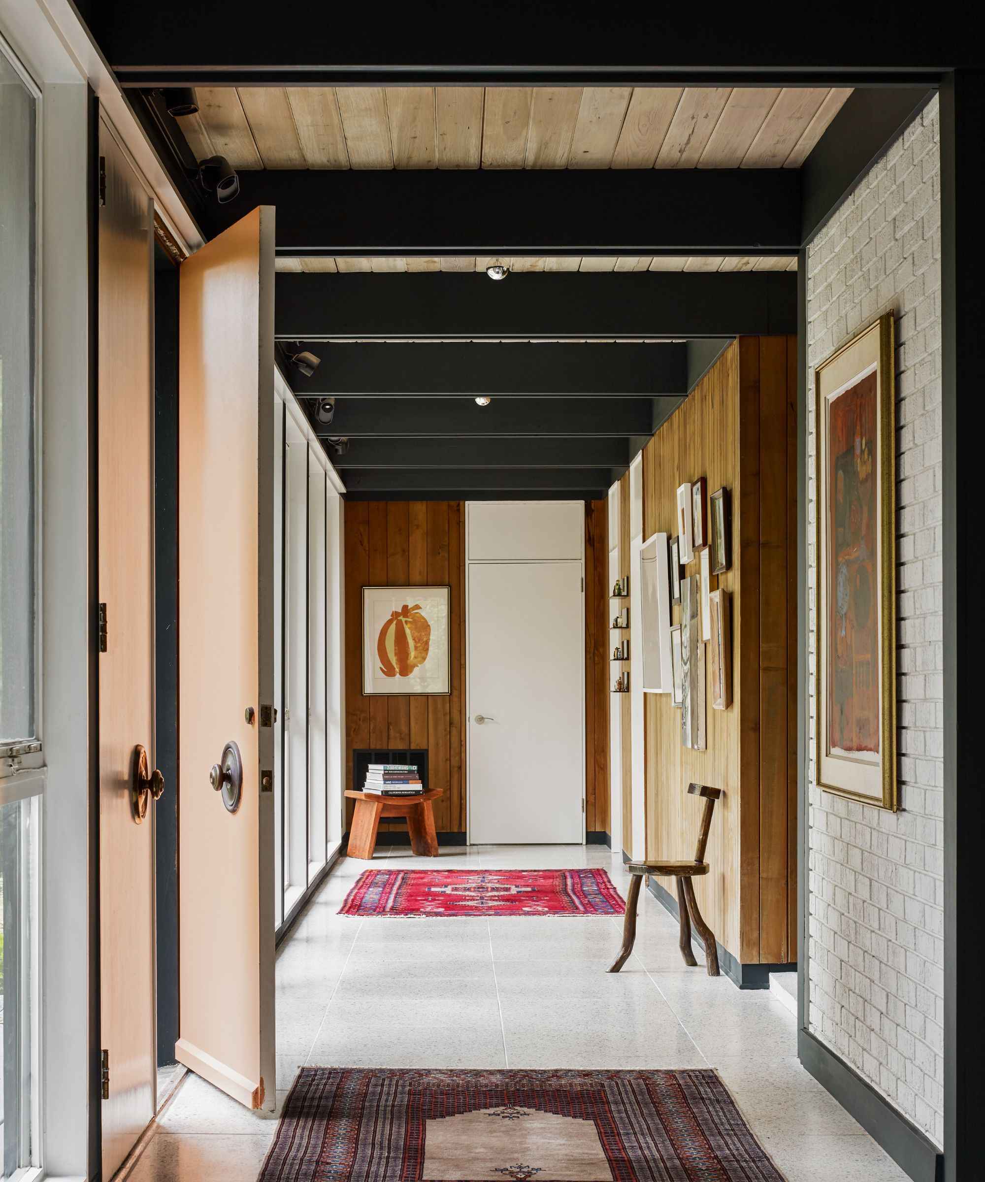
Entryways are often on the smaller side, and sometimes long, narrow spaces. As such, it can feel difficult to add color and personality without overcrowding the area. As the first point of entry in your home, you want to ensure you strike a balance between giving a preview of your home's character and creating an entryway where you and your guests have space to remove outerwear without fear of knocking into anything.
'I like to think of an entry as a point of pause, but also a way to set the vibe for the entire home,' says Jessica Davis, interior designer at Atelier Davis. 'It's a great spot to have a feature piece of art and a statement entryway rug, like I did in our mid-century renovation. If you have more space, some sort of console/credenza and a mirror is also great too,' she adds.
5. Add elegance with wood tones and black accents
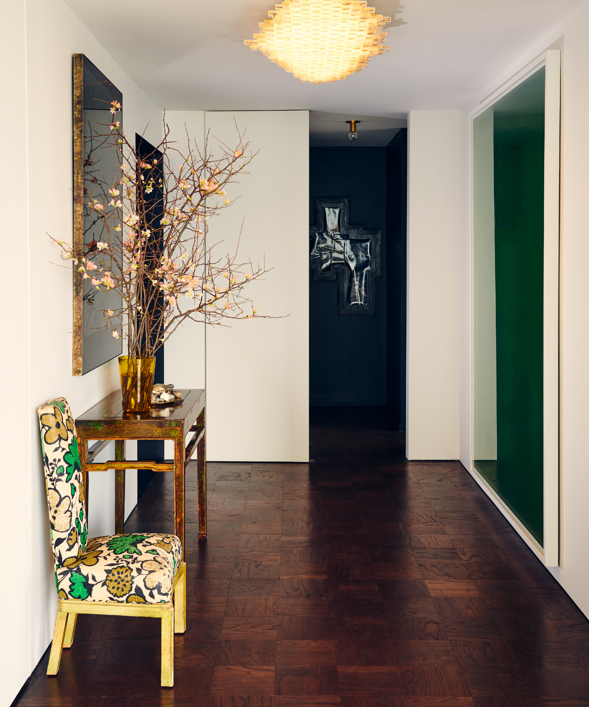
In recent years, mid-century modern design has evolved from what it once was. Nowadays, this interior design style takes on a more elegant form with sleek lines and considered furniture items.
'The collective definition of mid-century modern has evolved over the past 20 years to mean something more elegant and abstract than the punchy colors and cone-footed walnut furniture we all first fell in love with in the early aughts,' explains interior designer Bethany Adams. 'Now, to bring the style into your home in an easy way, start in the entry with a small table of teak, rosewood, or walnut (all the better if you can incorporate some storage drawers for keys or the dog's leash),' she adds.
The decorative details are crucial for executing a successful scheme – whether you decorate with art, books, or statement lighting, these finer details will pull the whole entryway design together. Once you've added larger furniture items, Bethany suggests adding 'a black vase with a branch from the yard, a favorite piece of art above, elegantly and simply framed in black, and a small stack of art books by your favorite mid-century artists. Throw down a colorful kilim in this neutral atmosphere and see the space really come to life.'
6. Embrace a mid-century modern color palette
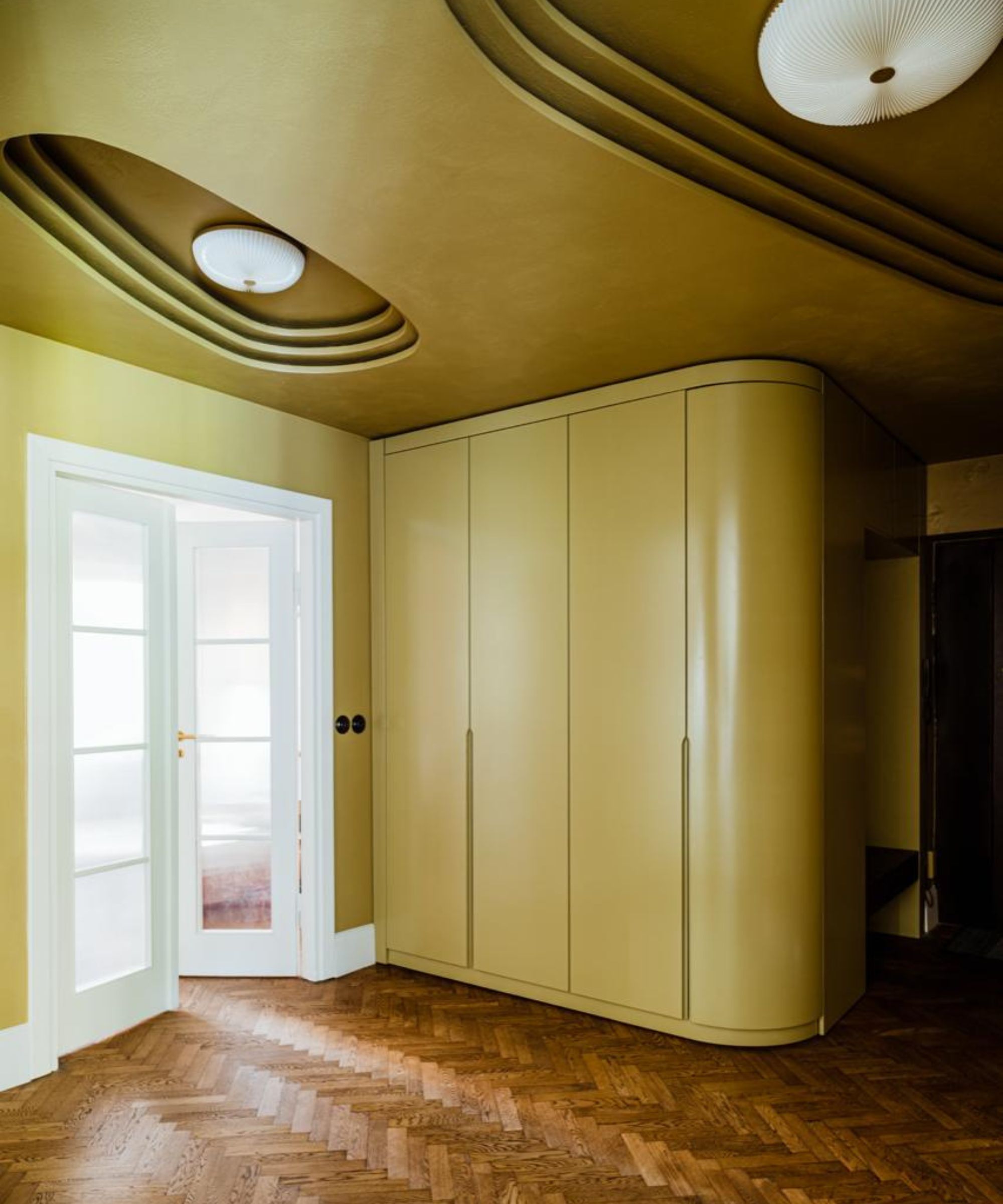
Although a lot of mid-century modern entryway schemes tend to lean more towards pairing wood tones with neutral paint colors, there is still space for introducing brighter hues. Greens, oranges, yellow, blues and reds are most typically associated with mid-century modern design, so leaning into these palettes will aid a successful design.
In this entryway by Paradowski Studio, a green-yellow tone has been painted over the walls, storage cabinets, and ceiling, allowing the dark wooden herringbone flooring to really pop. The finish here has been kept sleek with clean lines, but interest has been added to the ceiling with organic-shaped indents added to frame the lights.
Your entryway is the first time your guests see your home, so making sure you showcase your style and personality is key to creating an inviting and cohesive scheme. Mid-century modern design is the perfect balance between a sleek, organized space and a design that feels vibrant and full of character.
Wood tones are timeless, as are neutral paint colors – adding a more retro, daring design element through furniture and decor is a subtle yet effective choice. Have fun with decorating your mid-century modern entryway – it's a design style that celebrates experimenting with fun decor.


