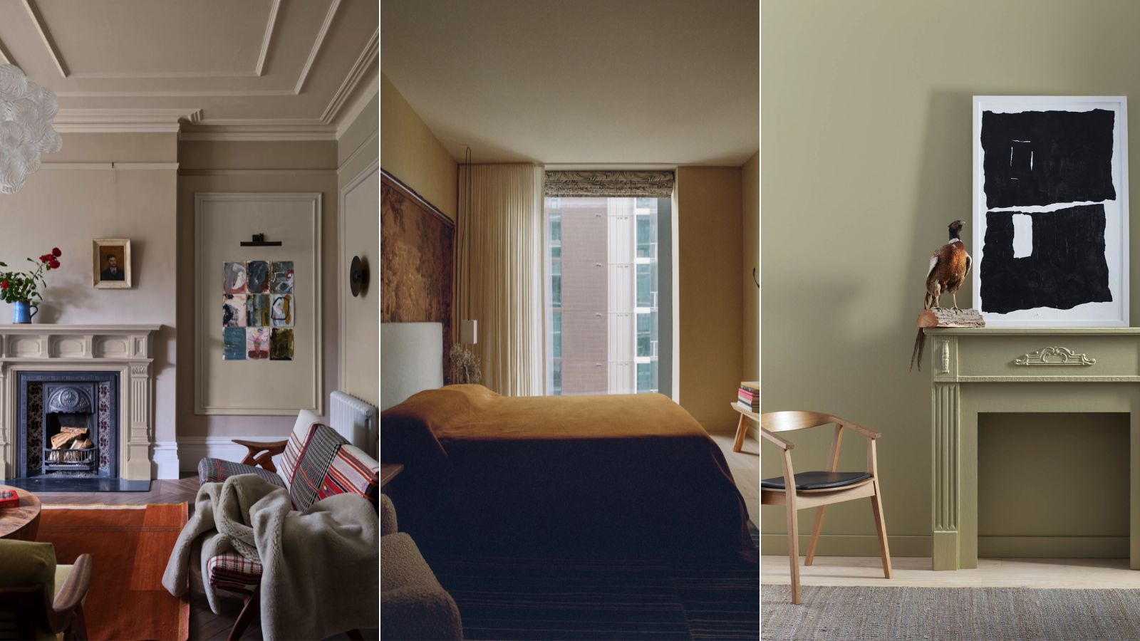
Earthy neutral paints are everywhere right now. White walls are out add deep beige shades are in style. Just look at the Colors of the Year we have seen so far, apart from a lot of love for blue, there are so many earthy green-toned neutrals, browns, and dark beige paints.
White has been slowly on the out for a while as soft warm spaces become the top of trends, even minimalism has had a soft rebrand, with terms like warm minimalism, quiet luxury, and low-key luxe frequently being bounced around this year. We want cozy, lived-in spaces that feel homely and welcoming, and those deeper, more earthy neutrals are going to achieve just that.
And don't just take our word for it. Designers agree that even though browns and beiges used to be shunned in the world of interiors, they are back and proving how chic and versatile they can be. We asked designers to talk us through their favorite earthy paint shades to embrace this ever-growing color trend.
The best earthy neutral paint colors
It's a shift that's been happening for a while in interior design trends, a move away from those cooler, once ever so chic, and popular cooler neutrals like gray and white towards warmer, softer more earthy shades. And designers are frequently using these far deeper and more cocooning shades instead of reaching for white paint. So we asked them to talk us through their favorites and why this trend has the potential to become a classic.
'When it comes to earthy hues, I'm fond of soft creams and warm desert-influenced shades as calming subtle alternatives to a more clinical white or an overdone gray,' explains Eleanor Taylor-Roberts. 'Although bolder, deep rusty shades and terracotta tones still also inject that earthy warmth into a space that a customary white cannot; a comfort which consumers are naturally favoring given the increased priority of wellness within the home.'
1. Oxford Stone, Farrow & Ball
'The modern white box aesthetic is evolving; a shift from the sterile white walls towards richer, warmer hues reflective of the earth's natural palette. These shades, reminiscent of the plaster walls of Italy or the warm adobe walls of Mexico, exude a sense of comfort and tranquility that resonates with people’s yearning for warmth and familiarity,' explains designer Kati Curtis.
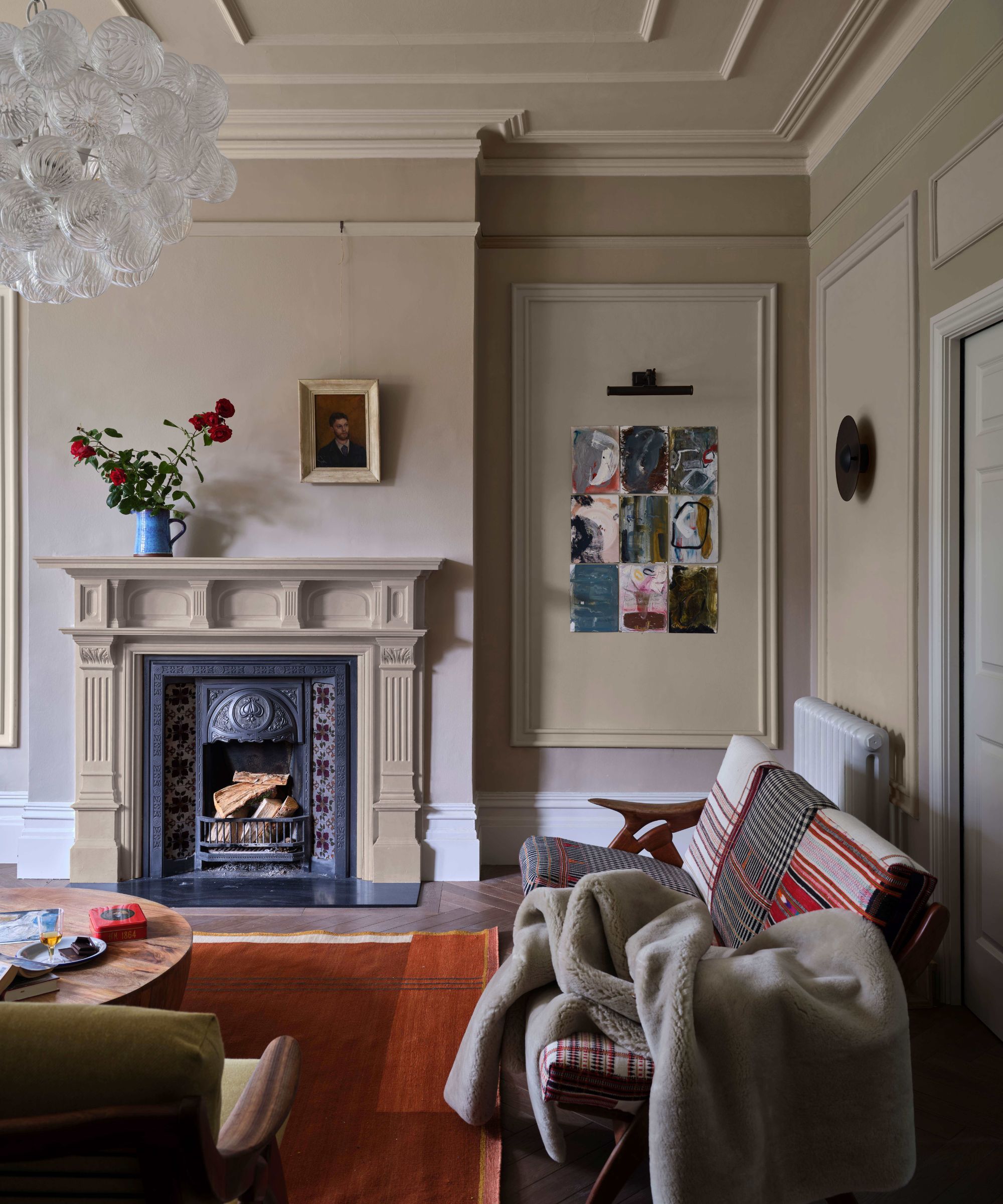
'My favorite “new neutrals” include Farrow and Ball's Oxford Stone. It's a versatile and neutral beige, complements a variety of interiors, adding a subtle touch of earthy warmth.'
Oxford Stone is a gorgeous super livable pale brown (Farrow & Ball describe it as a taupe) that works wonderfully as part of a layered earthy neutral scheme. Pair it with paler beiges and stronger browns for a lovely warm and welcoming palette that still feels fresh.
'Many of us are drawn to clay tones, however, we also want to make our homes feel as bright and spacious as possible,' explains Farrow & Ball color curator Joa Studholme. 'Using a lighter tone like Oxford Stone on the walls and the much stronger Tanner’s Brown on the trim instantly makes the walls feel lighter and the small room feel bigger.'
2. Venetian Portico, Benjamin Moore
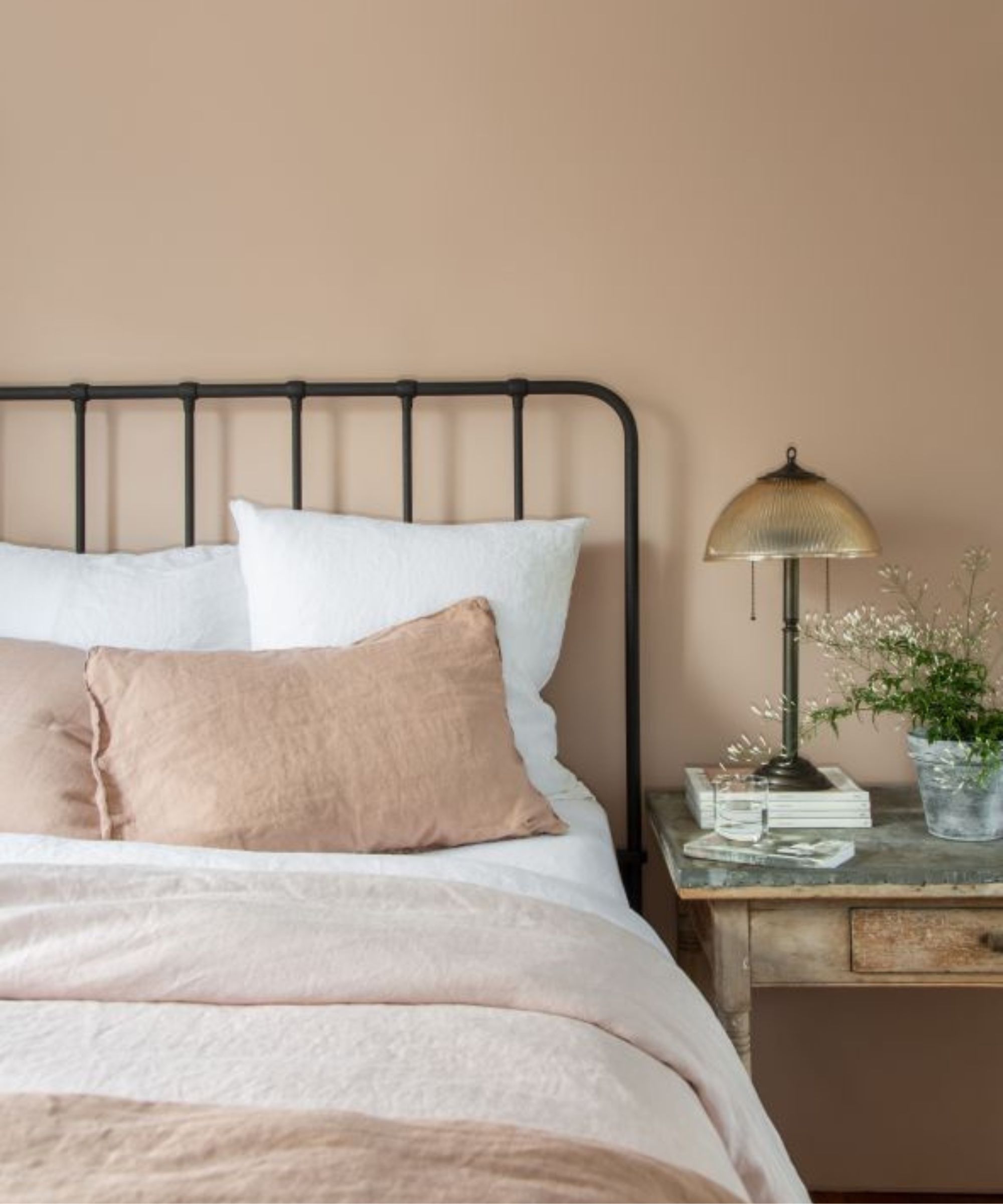
If you are after an ever so slightly pink beige, Venetian Portico is perfect. In some lights, you don't even get the pink, it's just an undertone of warmth to this very soft, sandy, earthy beige. 'Venetian Portico by Benjamin Moore delivers a golden tan hue, invoking images of sun-drenched ancient buildings, infusing spaces with a sense of timeless elegance.' explains Kati.
'Over the last few seasons, we have gradually seen neutrals with pink and red undertones taking over from our traditionally cooler greys,' adds Helen Shaw, director of marketing, Benjamin Moore.
'Plaster pink paint shades such as Springtime Peach 2014-50 and Venetian Portico AF-185 flatter any space and work perfectly as a blank canvas. The soft, dusky rose tone creates a wonderful earthy natural feel in a room. They look particularly eye-catching in well-lit spaces and when paired with natural materials or painted wood.'
3. Farrow & Ball, Setting Plaster
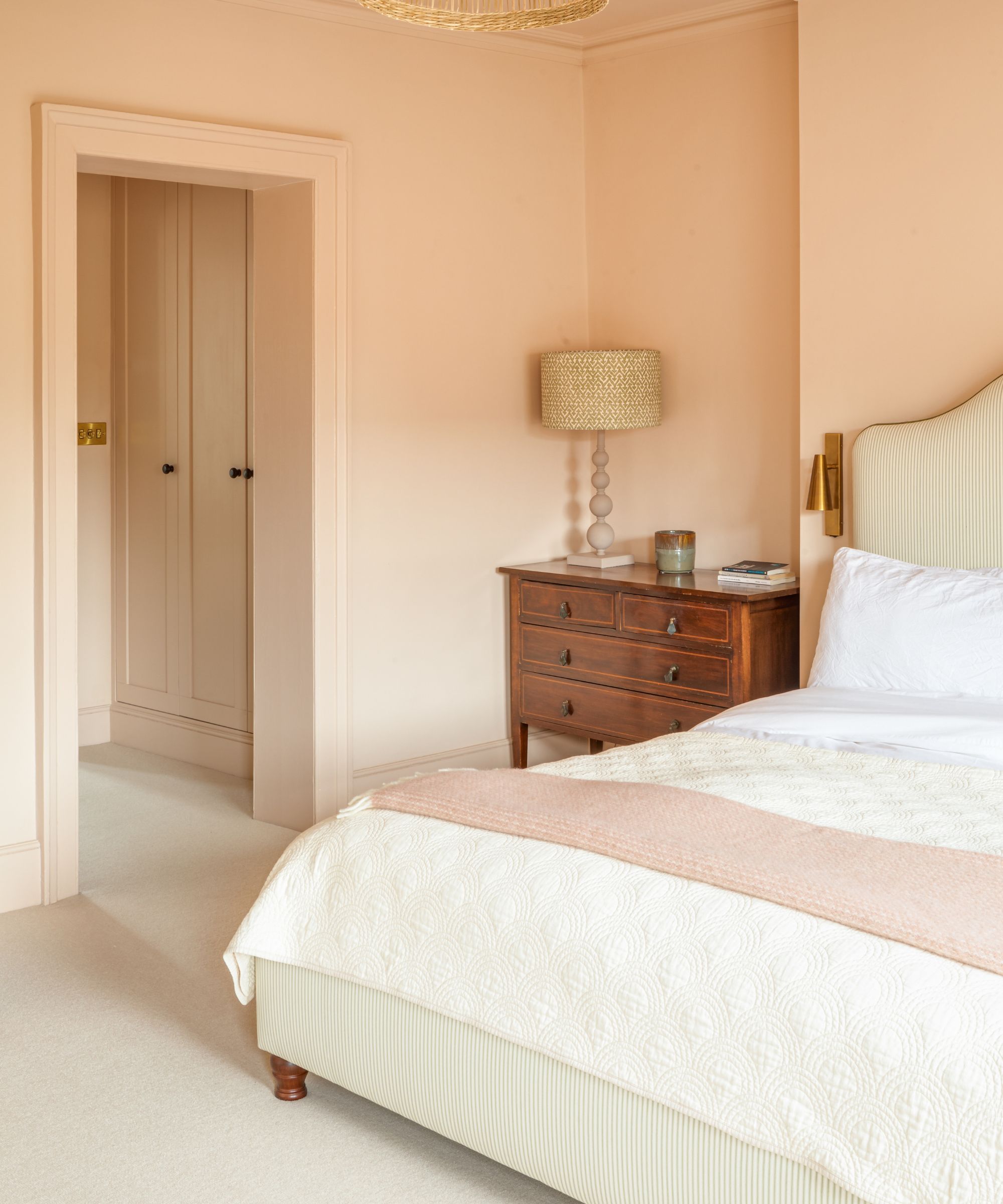
Another earthy pink favored by designers and homeowners the world over. Setting Plaster is an iconic Farrow & Ball shade, again not quite pink not quite beige, it's some dreamy color in between. It's the perfect alternative to a safer neutral like a white or cream.
'Earthy tones can create a relaxing and grounding vibe to a home. They can also be some of the less popular colors chosen so bring a sense of uniqueness to a home.' explains designer Nick Cryer.
'For a project called the House of Colour, we hired a Farrow & Ball color consultant to help select more statement colors and finishes for each room. One of the notable quirky aspects of this project was the use of less common colors chosen from the Farrow & Ball color library.'
'The earthy tones of the colors in the master bedroom automatically bring you down to earth to relax. The main bedroom and dressing room featured Farrow & Ball's Setting Plaster on the walls, skirting, and windows. The warm hue of Setting Plaster provided an excellent backdrop for the client's antique furniture, creating a contemporary feel within a modern home.'
4. Dry Sage, Benjamin Moore
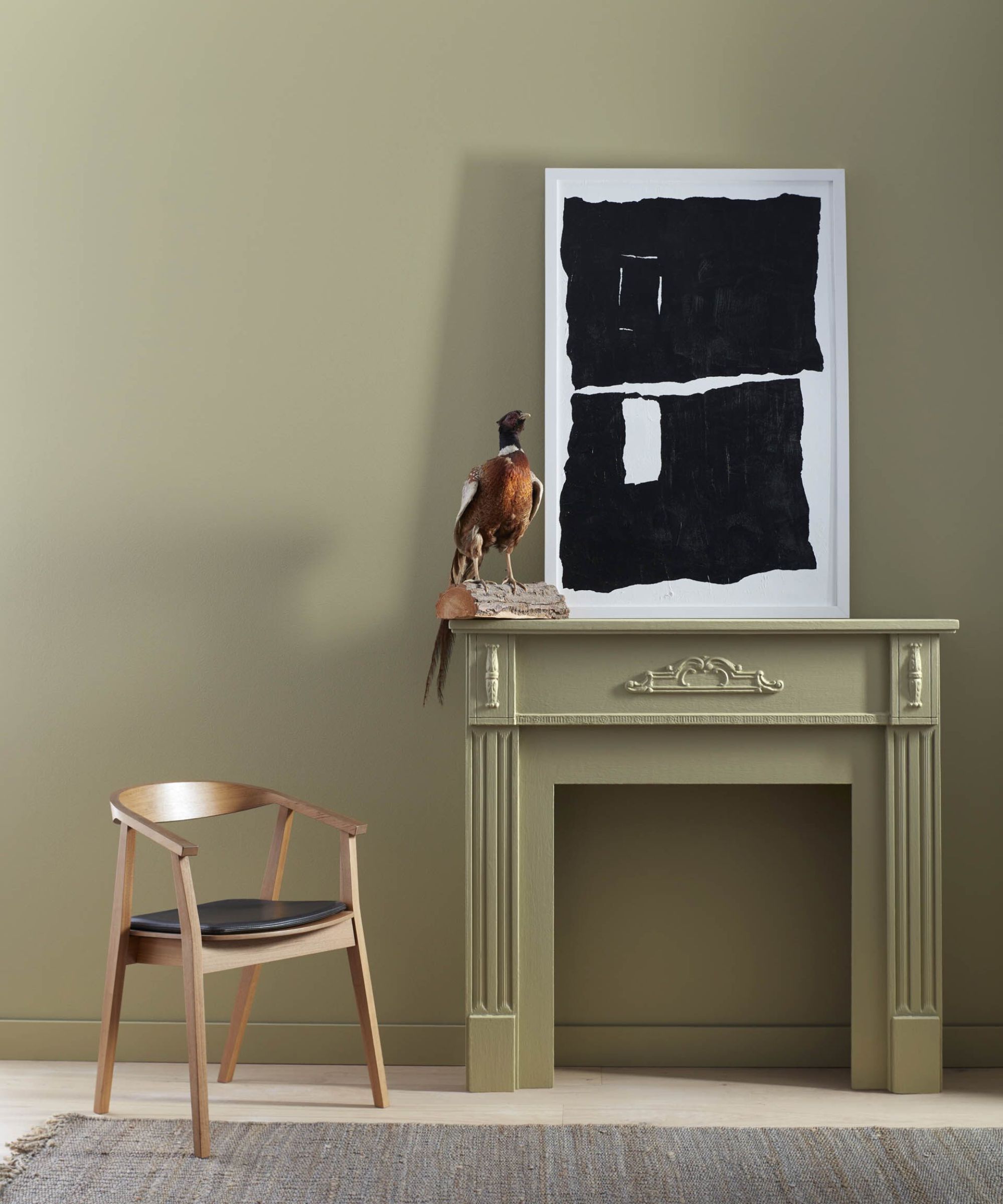
Earthy neutrals aren't all about the pinks and the beiges and the creams, green in its very muted earthy form can work so well when decorating with neutrals.
'When it comes to earth-toned paint colors, I feel like you can never go wrong with a classic sand, beige, or taupe. These are colors that are super-organic but also versatile and not too heavy. I'm a fan of Taos Taupe, Lenox Tan, and Alexandria Beige- all from Benjamin Moore - and if you're craving a splash of earthy green, I love Benjamin Moore's Dry Sage. 'explains designer Kathy Kuo.
Benjamin Moore also describes it as an 'almost neutral shade of green' it's a very soothing color that would work as a lovely backdrop for a neutral bedroom or living room.
5. Pewter Green, Sherwin Williams
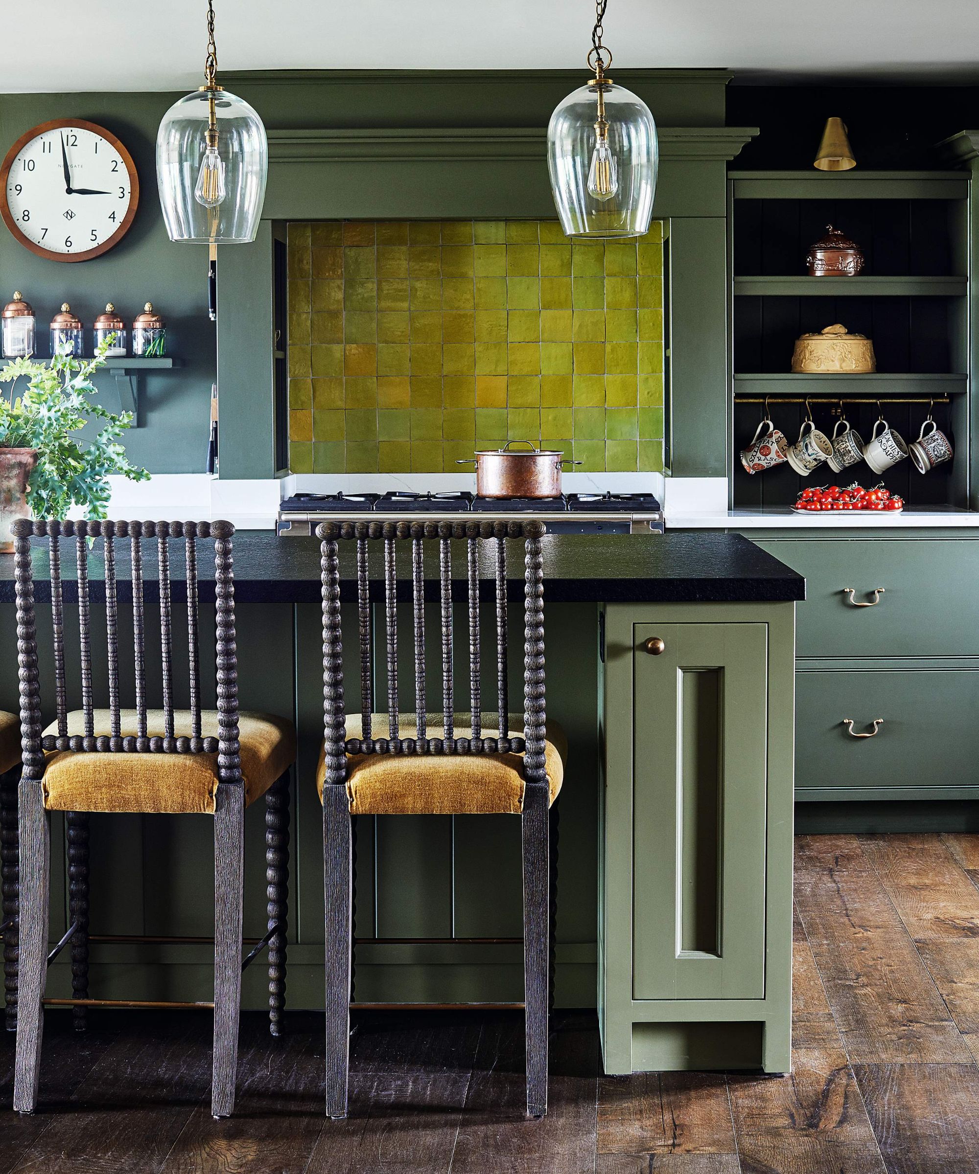
'Earthy paint colors, particularly taupes, and greens, are emerging as popular alternatives to traditional white walls as a result of the "moody" design trend we are seeing right now,' explains designer Jennifer Davis. 'Taupes, like Benjamin Moore's Edgecombe Gray and Poised Taupe, offer a versatile and sophisticated backdrop that adds depth and warmth to a room. Greens, such as Pewter Green, give a natural and calming ambiance and connect us to nature.'
Pewter Green is a dark, more moody shade, it sounds dramatic but it's such a soft cocooning shade it doesn't feel bold or overly dominant and can pair beautifully with lighter earthy tones. It would work wonderfully as a dark living room color.
Designer Tom Rutt agrees that 'Deeper sage green and rust are both great earthy tones which provide a great depth. They’re very versatile and can be layered with both cool and warm neutral tones and materials. Unlike white, they can create a more cocooning and sanctuary-like interior for a space that feels comfortable and calming.'
6. Veneto lime wash, Domingue
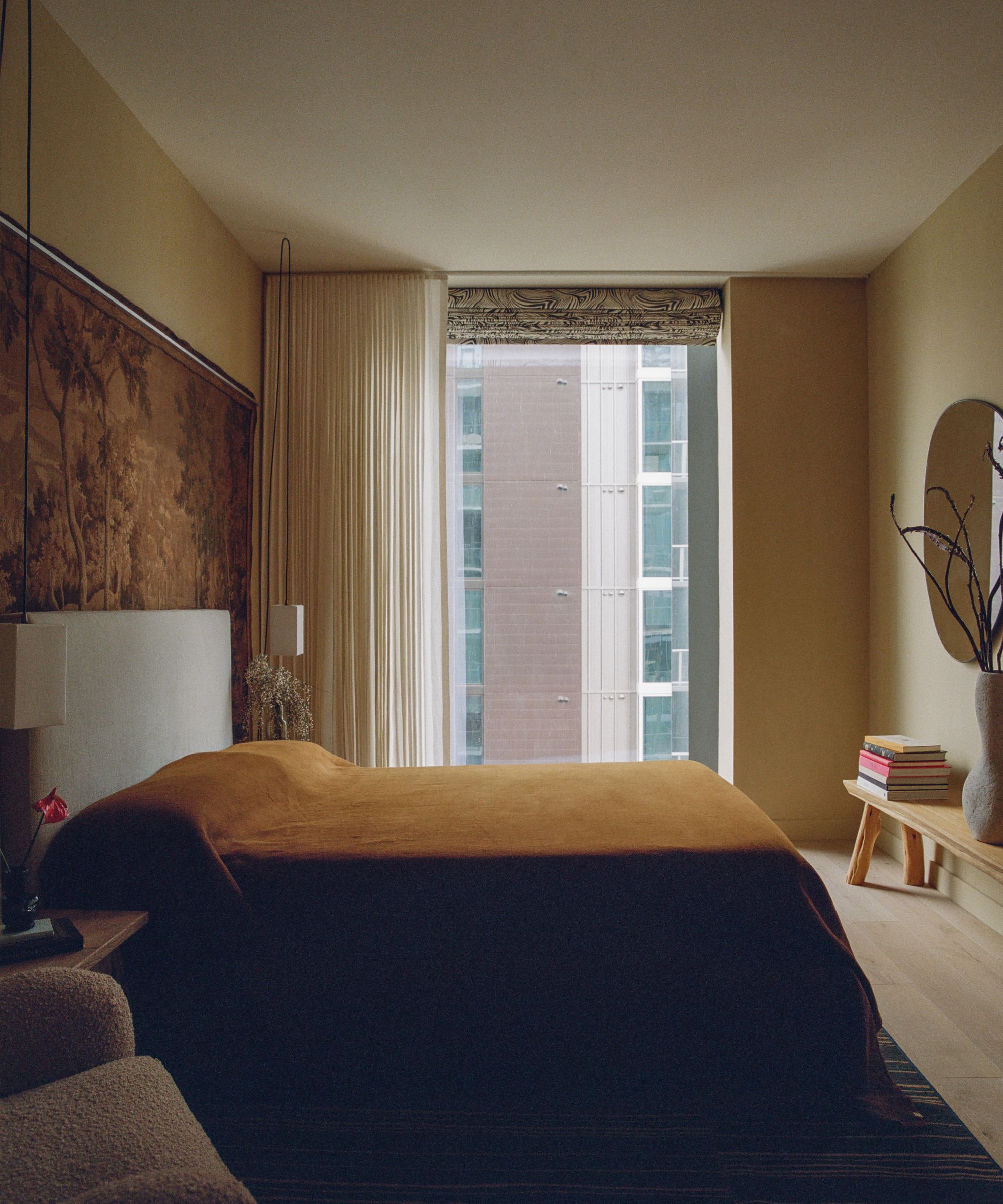
Limewash paint ideas are perfect for earthy tones, and you get that lovely texture that works so well with warm, muted colors. You can create the effect to an extent yourself with watered-down paint, but brands make it far easier and more effective with their specialized products.
'We often specify more browns and yellows in our projects which we find offer more texture and warmth than whites. In our 44 East Project, a lighter yellow 'Dauphine limewash' by Domingue was used in the living areas to create ambiance with a subtle luminosity,' explains Tanya Selway, co-principal at Stelly Selway.
'The light through the large windows was stark against the prior white walls, and this paint warmed up the space without taking away the feeling of spaciousness. A darker yellow, Veneto lime wash by Domingue was used for the bedroom, which was used to make it feel cozier and more textural. The shadows that caught the lime wash finish in the evenings were really beautiful.'
Earthy neutrals are such an accessible and liveable way to bring a bit more color and depth into your home. It's like a one-up from whites, creams, and grays, it's more exciting and yes, slightly bolder in some cases but still very soft, and versatile too as you can make these earthy paint colors work with so many different styles.


