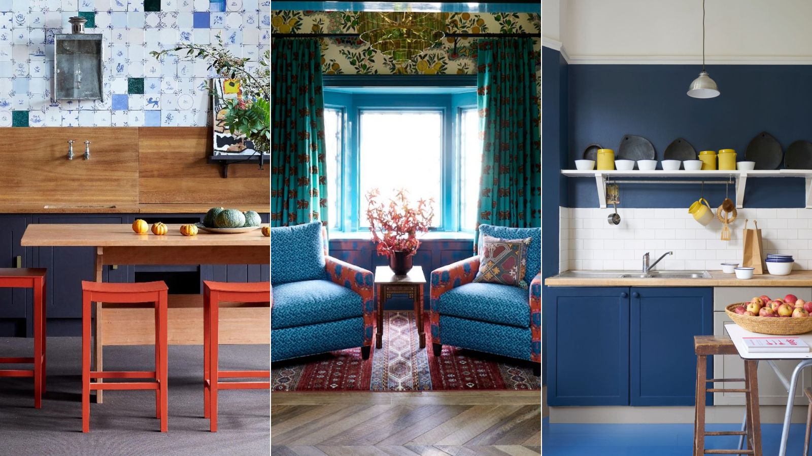
In the interior design world, blue is one of the most versatile shades going. It's treated almost like a neutral, which makes sense because think about the fashion world too – denim is one of the most used materials based on the fact that it goes with pretty much any color and style. But when it comes to our home's color schemes are there any colors we should be avoiding pairing with blue?
We spoke with interior designers and color experts to find out which colors you should approach with caution when decorating with blue.
6 colors to avoid pairing with blue
Let me preface this slightly, out of all of the designers I spoke to on this topic, they were all at pains to choose a color that doesn't go with blue. So while this list here are colors you might want to avoid pairing with blue, there will always be a shade of blue you can find that will work with any color on the color wheel – it's just about finding the right tone.
As designer Bethany Adams explains, 'After considerable thought and research, I've come to the conclusion that there is no color under the sun which does not have a shade of blue with which it pairs beautifully. Which makes perfect sense, when you think about the fact that we spend our days under said sun and the ever-changing blue of the sky which somehow manages to look perfect with every landscape beneath it.'
'Take care, though, when pairing your blues with other shades, as the blue sky of a Caribbean summer evening is not the same as that of a Scottish winter morning and neither are the colors that compliment them. Hue, vibrancy, texture and material all matter when choosing color pairings in interiors and a misstep can leave you feeling, well, blue.'
1. Orange
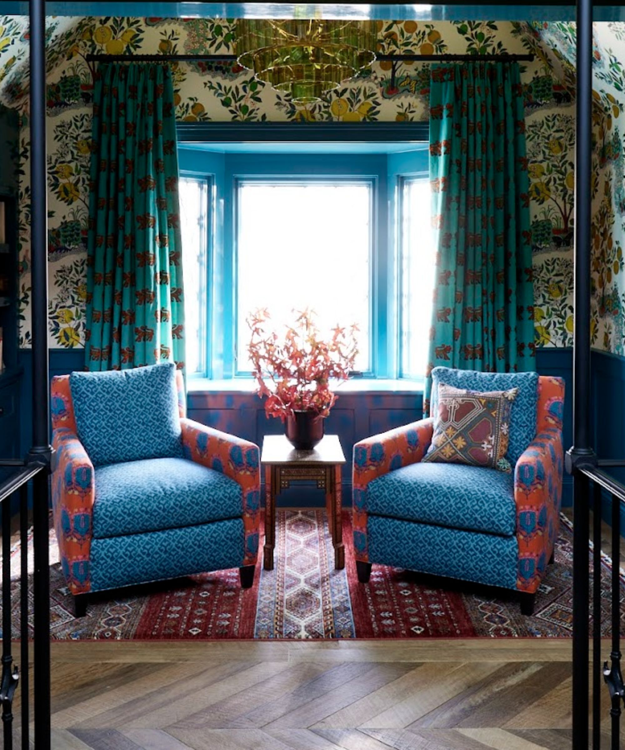
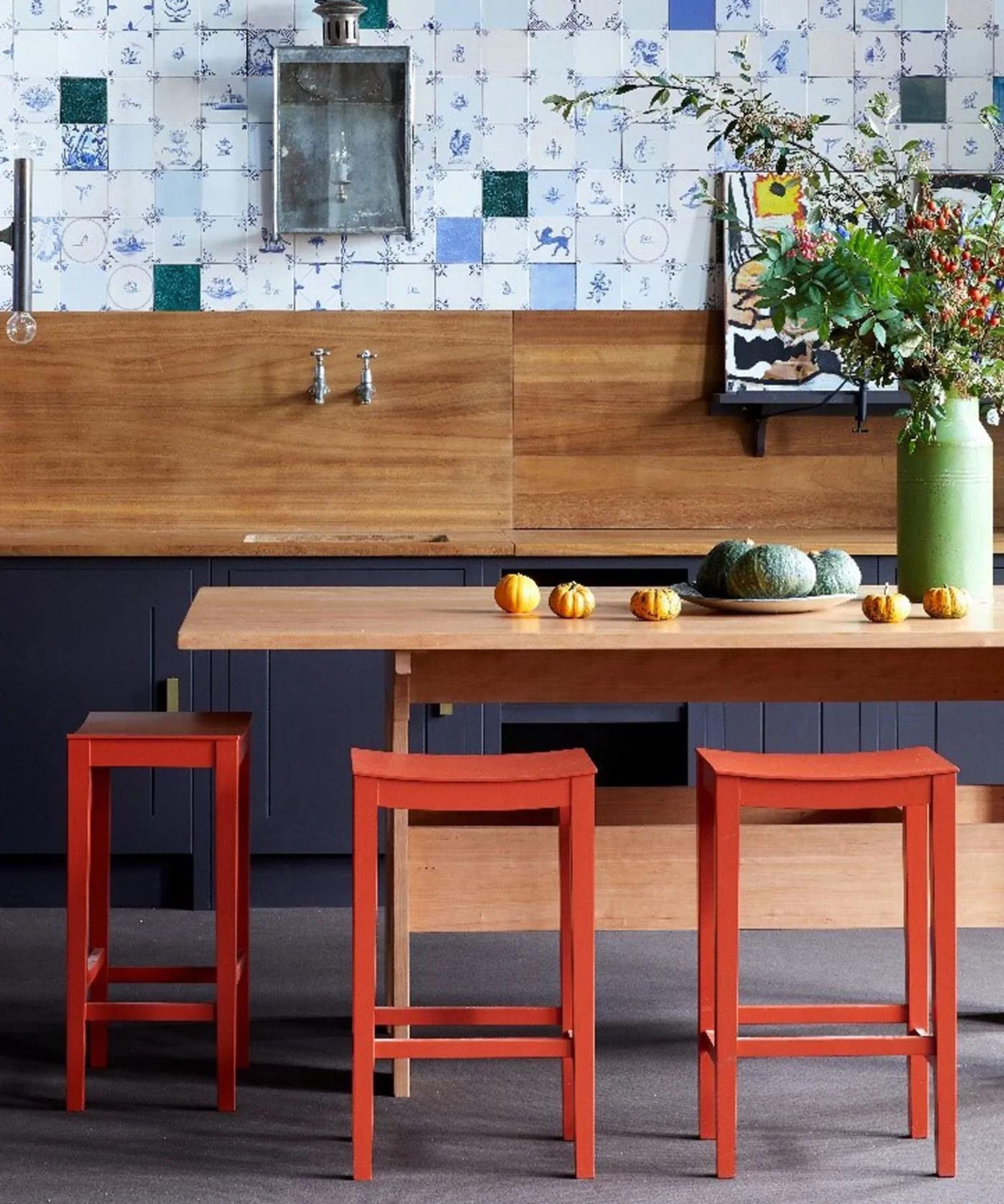
'Blue is one of my favorite colors and in my opinion, mostly works with everything, but pairing orange with blue can be a tricky color combination,' explains designer Kati Curtis. 'Although these colors are complementary, meaning they are opposite each other on the color wheel, in their most saturated form can be too high contrast and visually jarring.'
'The vibrant nature of both colors can create a sense of tension and imbalance, rather than harmony, and appear too much like a team sports color scheme. This stark contrast demands attention and can easily overwhelm the viewer, making it difficult to focus on other elements. Therefore, it is often advisable to use these colors more thoughtfully, ensuring that their combination does not detract from the overall design aesthetic.'
2. Brown
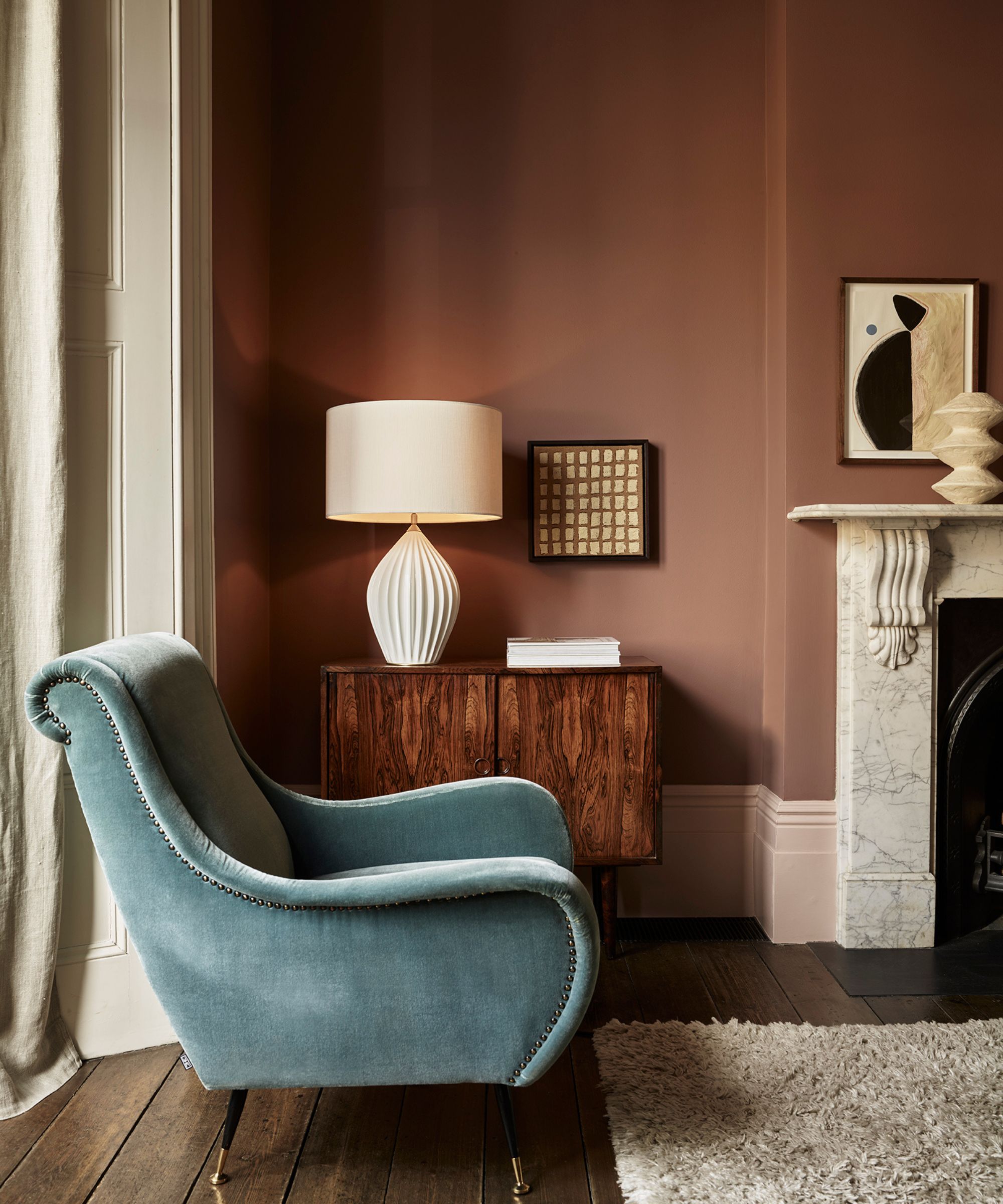
Brown and warmer yellow tones came up a lot when talking with designers about colors not to pair with blue. Decorating with brown being is such a huge color trend right now, and while it can work with blue if you pick the right shade, the cooler tones of a bright blue paired with the muddy tones of brown does have the potential to create a jarring clash.
'When considering color combinations with blue, it's important to note that almost any color can pair well with blue in my opinion but the success of the pairing often depends on the tones and light values involved. For instance, pairing blue with neon or overly bright shades of yellow might create a jarring contrast which might be desired considering the space, while a muted mustard yellow can create a harmonious balance,' says designer Jennifer Davis.
'Similarly, pairing blue with certain shades of brown can sometimes appear dull unless the brown is a rich, warm tone. Ultimately, the key to a successful color combination with blue lies in selecting complementary tones and considering the overall lighting and ambiance of the space.'
Emily Kantz, Color Marketing Manager at Sherwin-Williams agrees, 'This is a tough one because when you think of blue, I think of a pair of blue jeans and honestly, everything is supposed to go with jeans. However, when it comes to interiors, for light blues, I would avoid pairing them with sharp golden tones or a deep muddy brown with a green undertone.'
3. Red
'We know that red and blue have had their time but if we can separate the colors of the flag when decorating to avoid too much of an Americana look, we should! Subtle burgundies and deeper tones are ok but plain red and blue can read too dated,' explains designer Jennifer Walter.
And designer Kathy Kuo agrees, while red, white, and blue might sound like a classic color combination it does risk looking too 4th of July all year round. She says, 'Blue is a super versatile color that often functions almost like a neutral because it's so easy to mix and match. That said, there are certainly color combinations that you may want to be careful with when pairing with blue. For example, a color combination of red, white, and blue, or a combination of blue and yellow aren't necessarily a 'no,' but they definitely make really strong color statements that you may just want to think through from all angles before you commit to them.'
4. Yellow
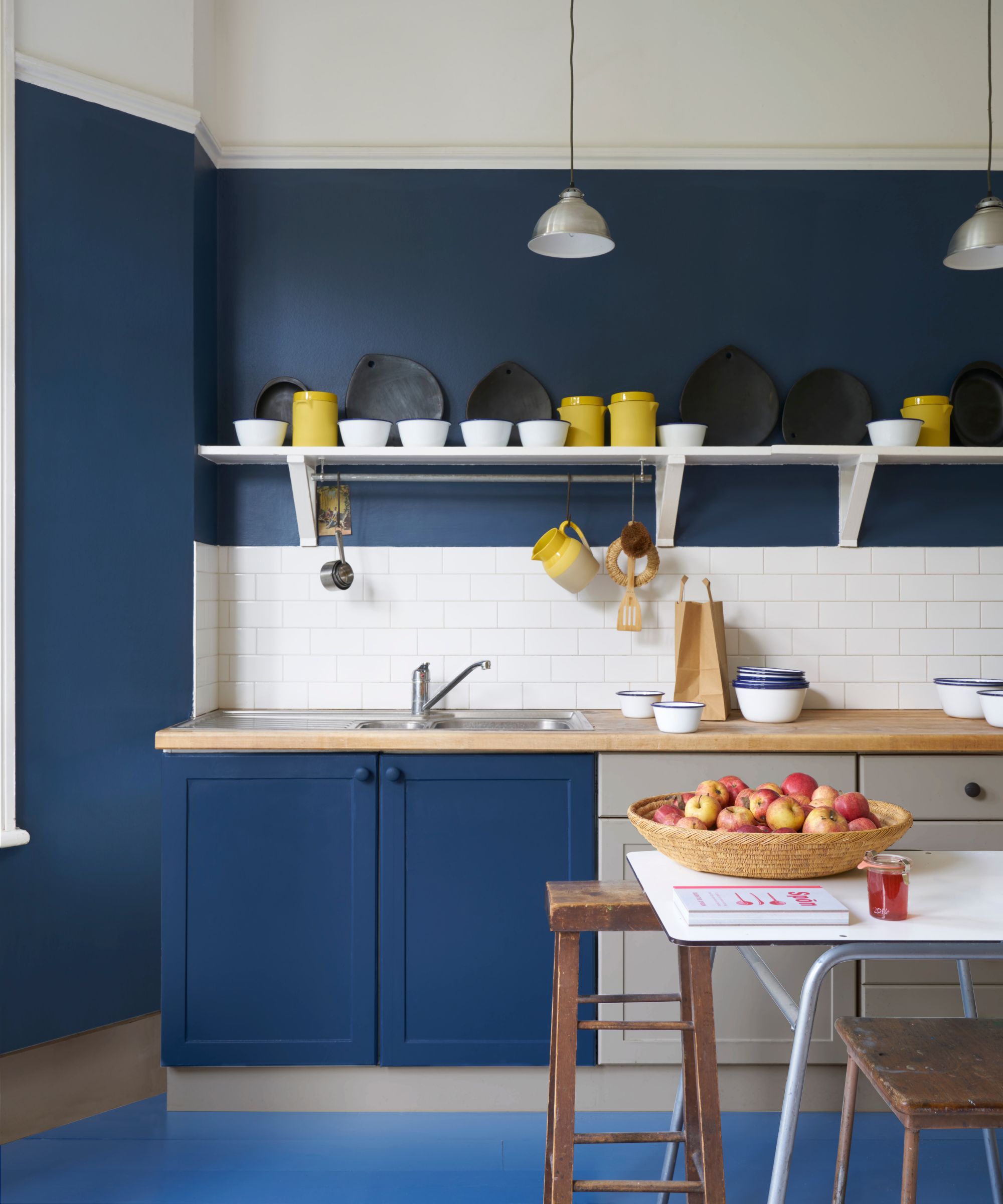
Another shade that came up a lot as not to pair with blue was yellow. It's a bold combo and as with all complementary color schemes (schemes that are based on colors from opposite sides of the color wheel), you have to get the colors spot on for it to work.
'In spite of logic suggesting that yellow is a good match with blue, I find that the combination can imply the bad '80s taste. If a client said that a blue and yellow scheme is what they're after, instead of looking at tones that are overly sunny, I'd likely knock the blue into the greyer, more powdery spectrum and explore yellows that are richer or more ginger,' explains designer Benji Lewis.
'I'd also be careful about how to combine blue and green, I know that they sit side by side on Newton's color wheel but there's potential for some terrible jarring. On the contrary to an approach I'd adopt for a blue and yellow scheme, should blue and green be discussed as a potential color combo I'd look at stronger more jewel-like tones.'
5. Black
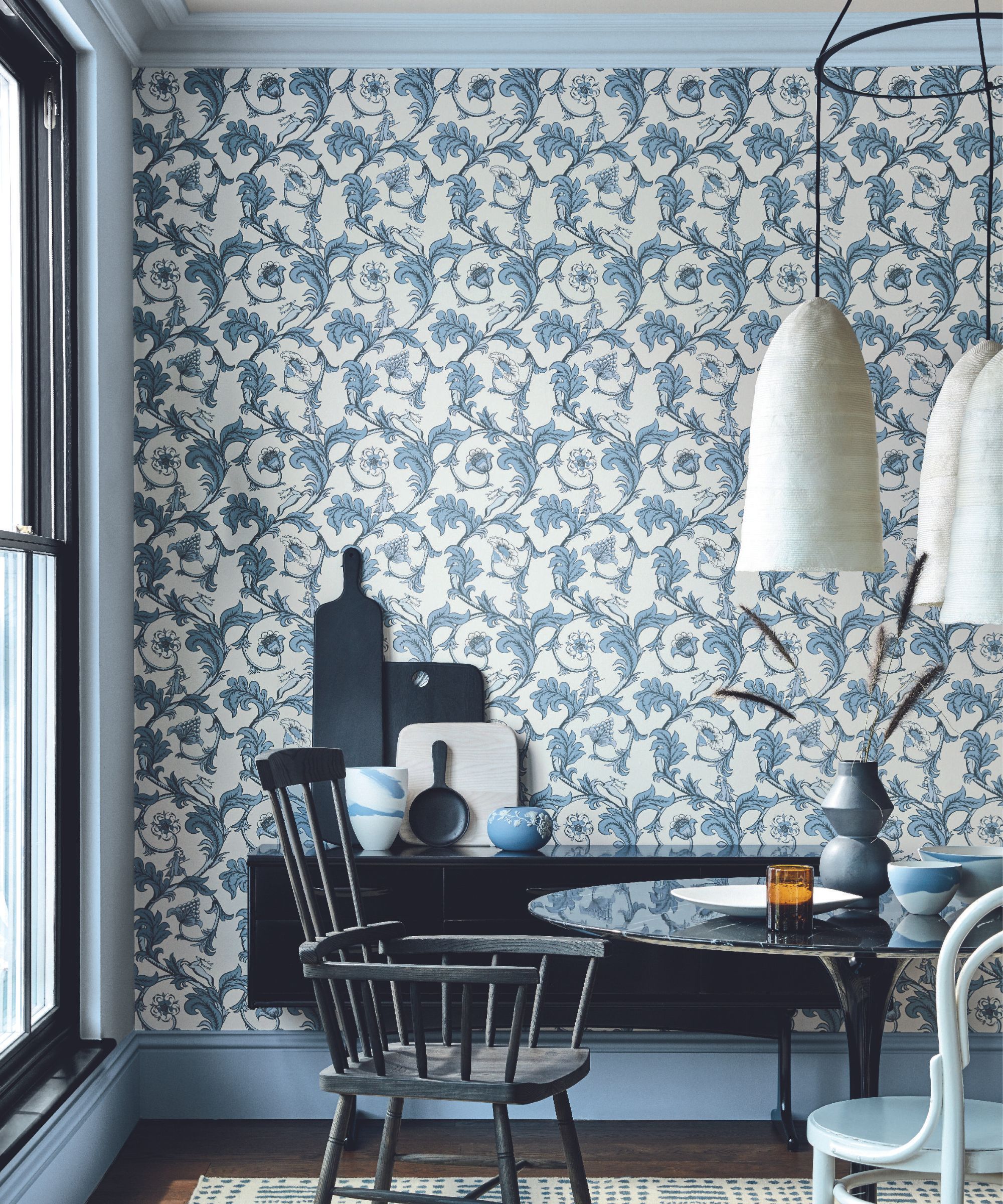
'When considering which colors to pair with blue within your interior design scheme, it’s essential to first identify the specific shade of blue you are working with. Different tones of blue, such as navy, cobalt, and sky blue, each have unique characteristics that influence their compatibility with other colors,' says Lick’s Director of Interior Design and Colour Psychologist, Tash Bradley.
'Cobalt blue is inherently a cold color, so pairing it with other cool tones like silver or grey can make the space feel uninviting. This is where warm neutrals, will be your best friend. Warm whites, soft yellows, gentle peach tones or even bold orange can create a striking balance and add vibrancy to the space.'
'But I would say navy and black are a color combination to avoid, as they are essentially competing to do the same job within your space. As a general rule, you should avoid pairing dark and intense colors with blue, which lack contrast and therefore can make a room feel too heavy and somber.'
6. Gray
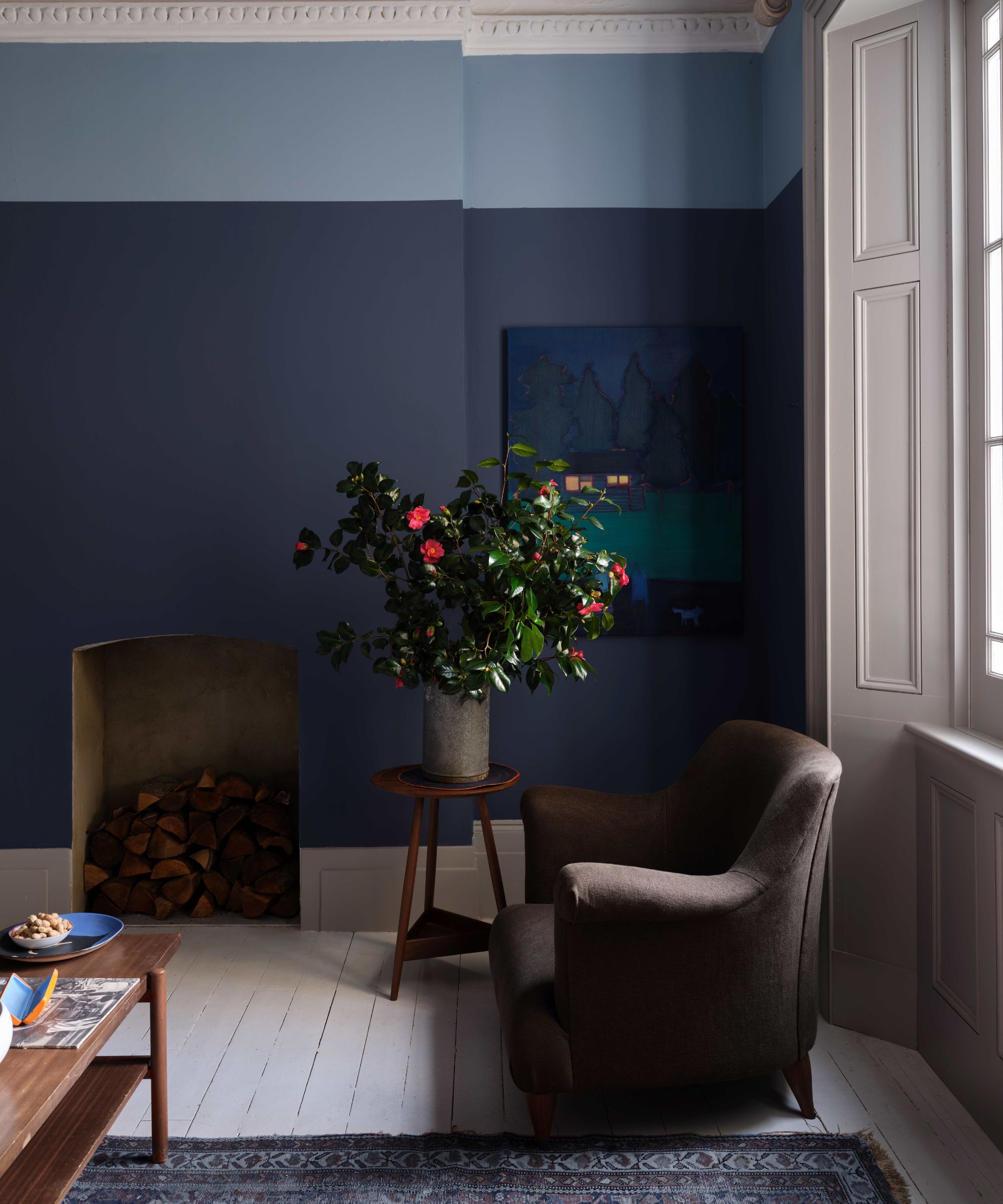
When it comes to the most versatile colors, gray is potentially on par with blue, but despite both being very easy to use, popular colors, designers say avoid using them together.
'Since gray paint is happening less and less, we suggest not pairing them with blue either. Blue is such a wonderful neutral and works so well with yellows, orange, and white. Grays are typically cooler in the lighter tones, and really moody in their darker tones. Blues can often compete with the tonality of grays and make for a tough match,' says Jennifer Walter.
While there might be a few shades you shouldn't pair with blue, what researching for this piece proved to me is that you can make any shade work with blue. It's more about picking the right shade of blue and the right shade to pair it with. So when experimenting with blue color combinations, just be sure to order plenty of swatches to see how the colors look and change in your space, and always pay close attention to the undertones.
